According to data just released by the U.S. Census this morning, in 2010, the median income earned by an individual American was $26,197, or rather, 50% of Americans earned more than that amount and 50% earned less than that amount. The average (or mean) income was $38,337.
Update 20 September 2013: Before going any further, please note that we've posted a newer version of this tool based on the most recently available data! Go here to find out more!
We've presented the cumulative distribution of the total money income earned by individuals in the United States in the chart below:
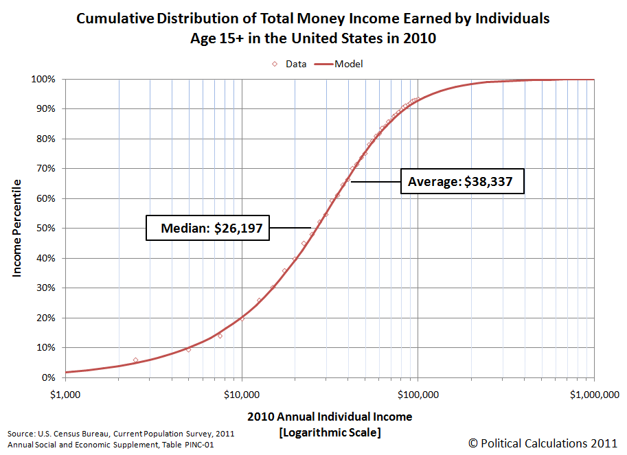
So what percentile does your income place you on that chart?
Well, wonder no more! Our latest tool will tell you exactly where you rank among all Americans, or rather, the 211,492,000 Americans over the age of 15 who earned money in 2010, based upon the U.S. Census' data for 2010, for which we modeled the distribution using ZunZun's invaluable 2D Function Finder.
Just enter your annual income into the tool below, and we'll give you a good idea of where you rank among all income earning individuals in the United States, at least for 2010! One last quick note before you start plugging away - our mathematical model tops out with the highest 0.13% of U.S. income earners and bottoms out with the lowest incomes, so entering either very high or very low annual incomes will produce static results.
Not an American?
If you don't work in the United States, you can still find out where you might rank by income in the U.S., but you'll need to convert your income into equivalent U.S. dollars. We recommend using XE's Universal Currency Converter to do that math before you enter your equivalent income in U.S. dollars in our tool above.
How Does That Compare to 2009?
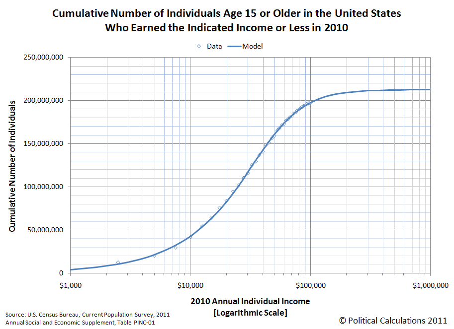
You can find out with our "What's Your U.S. Income Ranking?" tool, which is set up with 2009's income data! Here's a companion chart to go along with the percentile chart we showed above, which shows the cumulative number of thousands of working age Americans who earned the indicated incomes shown on the horizontal axis or less in 2010. (Update 18 September 2011: We retitled the chart below to better describe the information it presents. The original version of the chart is still available here.): Labels: income distribution, tool
Another Cool Graph
Welcome to the blogosphere's toolchest! Here, unlike other blogs dedicated to analyzing current events, we create easy-to-use, simple tools to do the math related to them so you can get in on the action too! If you would like to learn more about these tools, or if you would like to contribute ideas to develop for this blog, please e-mail us at:
ironman at politicalcalculations
Thanks in advance!
Closing values for previous trading day.
This site is primarily powered by:
CSS Validation

RSS Site Feed
JavaScript
The tools on this site are built using JavaScript. If you would like to learn more, one of the best free resources on the web is available at W3Schools.com.
Other Cool Resources
Blog Roll


