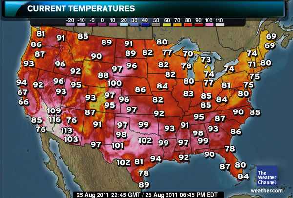
At this late summer date, the Weather Channel's map of high temperatures in the U.S. looks like this:

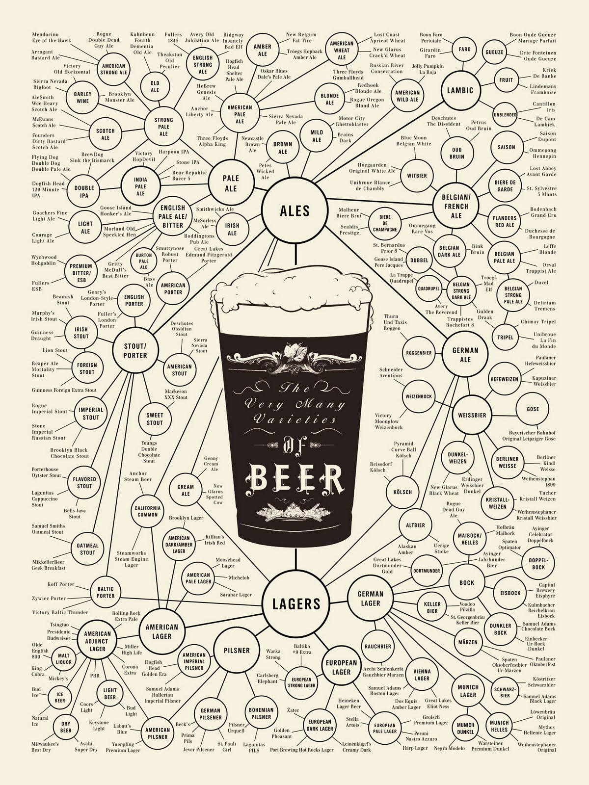
Which made us think the following diagram might be especially helpful for deciding how to best keep cool this weekend:

As for how to keep your beverage of choice cool once you've selected it, be sure to see what science has to say on the matter....
Labels: data visualization, food
Welcome to the blogosphere's toolchest! Here, unlike other blogs dedicated to analyzing current events, we create easy-to-use, simple tools to do the math related to them so you can get in on the action too! If you would like to learn more about these tools, or if you would like to contribute ideas to develop for this blog, please e-mail us at:
ironman at politicalcalculations
Thanks in advance!
Closing values for previous trading day.
This site is primarily powered by:
CSS Validation
RSS Site Feed
JavaScript
The tools on this site are built using JavaScript. If you would like to learn more, one of the best free resources on the web is available at W3Schools.com.