
When the price of fuel soars, drivers who seek to avoid spending money on petroleum have two options. They can:
- Drive less, or
- Slow down.
For many, driving less is an obvious solution, but one that isn't necessarily achievable. That's comes down to why people have cars in the first place. They need them to travel to and from work and also to and from where they buy the goods and services they need.
In today's world, whether they drive a gas-powered, battery-powered or hybrid vehicle, some non-zero percentage of the fuel or energy needed to enable their ride will be produced by fossil fuels. When the price of oil and other fossil fuels rise, the cost of essential commuting goes up as well. But you can limit your exposure to those higher costs by slowing down to drive your vehicle at speeds where it is more efficient.
That fact was established by a nearly three-decade old study by the U.S. Department of Energy that found that most gasoline-powered vehicles in the U.S. are operated at speeds at which they do achieve their peak level of fuel efficiency. At highway speeds, for instance, the forces of aerodynamic drag can substantially increase the amount of fuel an automobile engine has to burn in order to sustain a high velocity. A simple back-of-the-envelope calculation reveals that the amount of drag force that a car being driven at 75 miles per hour sees is some 33% higher than the same car being driven at 65 miles per hour would see.
Though today's roads have more electric and hybrid vehicles driving upon them, they are still affected by the same laws of aerodynamics. Like gas-powered vehicles, it takes less energy to sustain them moving at lower speeds, which means their batteries can hold their charges for longer.
But not too slow. Driving too slow also comes not just with a time penalty but also an increased penalty for fuel consumption. Most modern vehicles are designed to operate most efficiently at speeds ranging from 30 to 55 miles per hour. That's the sweet spot in which you can get the most distance driving out for your fuel consumption dollar.
We've tapped that old study to reverse-engineer the Fuel Economy vs Speed average vehicle profile developed by the U.S. Department of Energy and create the following tool, in which you can find out who much money you might save by going slower. If you're accessing this tool on a site that republishes our RSS news feed, please click through to our site to access a working version of the tool.
The cool thing about this tool is that you now have more weapons in your arsenal to help fend off the effects of higher gasoline prices! Armed with this information, you can now make whatever trade-offs you might need to your greatest advantage. For example, if getting the greatest possible savings is most important to you, you'll want to drive at speeds that produce the lowest equivalent cost per gallon of gas compared to your normal driving speeds. If you want to save gas money and time, you'll want to drive at speeds that give you the greatest equivalent "tax free" income compared to how you drive today.
Image credit: Lighted Automotive RPM, Temperature, Fuel, and Speedometer Gauges photo by Kevin kevin on Unsplash.
Labels: gas consumption, gas prices, personal finance, tool


How high can Americans expect to see the average price of a gallon of gasoline in the United States rise?
The specific answer to that question depends on a lot of factors, but the one that matters most in the current geopolitical climate is the price of crude oil. That price was already rising for American consumers because of President Biden's environmental policies that have constrained the production and supply of oil and gas in the U.S. But now, with the added factor of Russia's invasion of Ukraine in the developing geopolitical environment, crude oil prices are soaring because many expect economic sanctions being enacted against Russia will be expanded to include its oil exports.
That's significant because Russia is the third largest producer of crude oil in the world, following the U.S. and Saudi Arabia. Reducing the supply of crude oil in much of the world by what Russia currently supplies to it without any change in demand would be expected to cause prices to rise, which is exactly how oil prices have behaved.
Knowing that then, we're updating the math behind a tool we first presented in 2012, which answered the question: "Where Are U.S. Gas Prices Going?", which we've adjusted to account for today's slightly higher average state and local gas taxes. To use the tool, you only need to enter the price of Brent crude oil into it, which if you're accessing our site directly, appears in the upper right corner of this article (via Oil-Price.Net)! [If you're accessing this article from a site that republishes our RSS news feed, please click through to our site to access a working version of the tool.]
Our default value of $118.11 represents the price of Brent crude oil at the end of trading on 4 March 2022, which corresponds to an average U.S. price of $3.85 per gallon, which is very close what AAA reported for the national average price for a gallon of gasoline on this date. Depending on where you live, you'll want to consider how state and local fuel taxes affect the price you pay at the pump, which can add quite a lot to the price you pay per gallon.
That said, even with that adjustment, the tool's results won't give you a perfect match. That's largely because of volatility in the price of Brent crude oil. Frequent fluctuations in the market price for a barrel of Brent crude oil makes it difficult to pin down the exact average price for a gallon of gas at the pump. Regardless, our tool will put you close to the right ballpark for determining what you can expect to pay on average for a gallon of gas. Whether the price of crude oil drops to $50 or rockets to $200 per barrel, it will give you a good idea of how much you'll pay for each gallon of petrol at the pump.
So go ahead, take our tool for a test drive to see what kind of price you can expect to pay at the pump using your best guess of what crude oil prices will be in the future. Or just do it using the latest "live" Brent oil price, because in our fast moving world, it's already noticeably different from what it was when we drafted this edition of the tool.
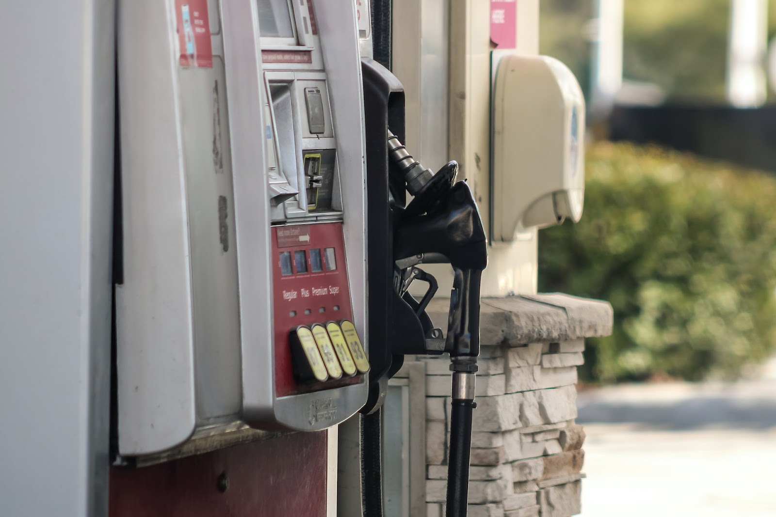
Image Credit: Photo by Dawn McDonald on Unsplash.
Labels: gas prices, personal finance, tool

Do you have any idea how much money you're paying to the government each time you fill up your gas tank? We're not just talking about the federal government. State and local governments across the U.S. are also getting in on that action!
It's a question that's taken on more significance in recent weeks, with politicians up for re-election this year reacting to sharply inflating fuel prices by proposing a federal gas tax holiday. That could save you up to 18.4 cents a gallon, but how much would you save at the pump over the course of a full year?
We've built the following tool to help you estimate how much you'll pay in vehicle fuel taxes this year and to answer questions like that. To use it, update the fuel tax rates that apply for your state or local jurisdiction, update the gas mileage data for your specific vehicle of interest, then click the "Calculate" button to find out how much you're paying in gas taxes! [If you're accessing this article on a site that republishes our RSS news feed, please click through to our site to access a working version of the tool.]
For the default data, we find that 20.7% of what was paid for fuel at the pump for this single vehicle went to the federal, state, and local government. $66.91 of that was for federal fuel taxes, which is a little under 4.8% of what was paid for fuel in the default example. The more that fuel prices rise, the smaller the benefit you might get from having the federal fuel tax suspended would be in terms of your annual fuel bill.
The default data in the tool is based on the applicable fuel excise taxes, sales taxes, and government-mandated fees that applied to fuel sales in Erie County in New York in January 2022. We've simplified the local sales tax calculation to make the math more generally applicable to other jurisdictions, so it won't perfectly match the more precise sales tax math that specifically applies in Erie County.
While these state and local taxes are high, they're not the worse in the U.S. For that scenario, replace the default data with California's fuel taxes and fees. For the numbers that would matter most to you, update the tool with the fuel tax data that applies for your state.
Image credit: Photo by Suzanne Emily O’Connor on Unsplash.
Labels: gas prices, taxes, tool
The Biden administration has taken a strange view that the rising prices many American households have faced throughout 2021 are a good thing because more people are buying goods.
Watch the following exchange between CNN's Jake Tapper and White House Press Secretary Jen Psaki in this short video clip from 15 October 2021:
Jen Psaki Defends Rising Prices: 'Good Thing' Because it Means 'More People are Buying Goods' pic.twitter.com/IaKVYVSCbR
— Jason Rantz on KTTH Radio (@jasonrantz) October 15, 2021
If prices are rising because more people are buying goods, the economic law of supply says we should also be seeing the supply of those goods increase. That's because rising prices, all things being equal, gives producers an incentive to sell more of the things they produce. More importantly, rising prices give marginal producers who can dial up their production a very strong incentive to produce more. Otherwise, they're losing out on easy profits.
For much of 2021, you can see the Law of Supply at work, with some very noticeable exceptions, in the following diagram charting the weekly price and quantities of crude oil being processed at U.S. refineries throughout 2021.

Those very noticeable exceptions include:
- Supply disruptions related to the February 2021 Cold Weather Event that shut down oil production and refining in the U.S.' gulf coast states.
- Supply disruptions from the impact of Hurricane Ida in September 2021.
In the case of the February 2021 Cold Weather Event, oil production in the U.S. fully recovered, with rising prices coinciding with rising supplies. The recovery from Hurricane Ida looks similar, up to a point. We see that something went very awry after 1 October 2021. Instead of the supply of crude oil rising with rising prices as it did earlier in the year, the supply of crude oil going into U.S. refineries has fallen, while prices have continued to escalate. Not only that, refineries never recovered to the levels they were producing before Hurricane Ida disrupted production.
Since 1 October 2021, something very different is at work in the U.S. economy. To confirm that's the case, here's our tool for determining whether supply or demand is behind changes in price. We've set the default entries to apply to the situation with oil being processed at U.S. refineries since 1 October 2021.
We confirm that oil prices are rising now because the supply of crude oil being processed at U.S. refineries has fallen. That is something that's now showing up across the U.S. in the form of rising gasoline prices.
The U.S. Energy Information Administration is claiming that demand is rising faster than supply, but their own data says otherwise. We also looked at the weekly number of barrels of crude oil from U.S. field production and being imported into the U.S., and find they have recovered to pre-Hurricane Ida levels.

The only explanation we've found that correlates with the price and quantity data points to refineries temporarily shutting down to change over to approved winter blends of petroleum products. If that's indeed all it is, that environmental regulation-driven change has a negative economic effect similar to a sustained, small-scale supply disruption caused by a natural disaster.
References
U.S. Energy Information Administration. Petroleum & Other Liquids: Weekly Crude Oil Spot Prices (West Texas Intermediate). [Online Database]. 27 October 2021.
U.S. Energy Information Administration. Petroleum & Other Liquids: Weekly U.S. Refiner Net Input of Crude Oil. [Online Database]. 27 October 2021.
U.S. Energy Information Administration. Petroleum & Other Liquids: Weekly U.S. Field Production of Crude Oil. [Online Database]. 27 October 2021.
U.S. Energy Information Administration. Petroleum & Other Liquids: Weekly U.S. Imports of Crude Oil. [Online Database]. 27 October 2021.
Labels: economics, environment, gas prices, tool
As often as we generate charts as part of our analysis, and as often as we use automated tools to generate them, there's actually quite an art that goes into making them. Today's is no different, other than we're going to push the envelope beyond what we've done before as we resume and update a story we've been following by retelling how it goes and how we expect it will go in a single picture.

It would seem that OPEC's "miserable failure" will likely have measurable negative consequences in the eight states indicated.
Labels: data visualization, gas prices, jobs
By request, we've updated and begun refining our earlier presentation showing the major trends in the number of employed by age group as correlated with changes in the average retail price of gasoline in the U.S.

One thing we observe is that with the recent rise in average fuel prices, the number of employed teens has nearly dropped back to where it was in the period from October 2009 through September 2014, suggesting that the recent benefits for employment growth to having had fuel prices fall from July 2014 through February 2015 may now be lost as fuel prices rise. Curiously, when we dug deeper into the data, we found that almost all of the reversal for U.S. teens occurred for male teenagers.
We also see that the effect of rising fuel prices isn't limited to younger Americans, as we see that once those prices began rising, the improving trend and momentum in the job picture for older Americans began to stall out in recent months. It is as if the relative increase in the disposable income that Americans gained as a result of having fuel prices fall is no longer available to fuel growth for firms whose business prospects are particularly sensitive to changes in the disposable income of American consumers.
Looking at the larger picture and what it means for the U.S. economy, the reason we focus special attention on the employment trends for both U.S. teens and young adults betwen the ages of 20 and 24 because these individuals are, almost by definition, on the margins for the U.S. job market. And of course, as any competent economist knows, all the important action in a nation's economy occurs or is most evident at its margins, which is why a capable analyst would go to the trouble of attempting to visualize the nation's changing employment situation against the context of the major factors that influence it.
Admittedly, we're still working at it because we're adapting a chart that we originally developed for another purpose by, in effect, using crayons to color in the relevant context.
References
U.S. Bureau of Labor Statistics. Labor Force Statistics from the Current Population Survey. Household Data: Both Sexes, All Races, All Origins, 16 years and over, 16 to 19 years, 20 to 24 years, All education levels, All marital statuses, Employed, Seasonally Adjusted, Monthly, November 2007 through June 2015. [Online Application]. Accessed 5 July 2015.
U.S. Energy Information Administration. U.S. All Grades All Formulations Retail Gasoline Prices, November 2007 through June 2015. [Online Application]. Accessed 5 July 2015.
Labels: demographics, gas prices, jobs
Welcome to the blogosphere's toolchest! Here, unlike other blogs dedicated to analyzing current events, we create easy-to-use, simple tools to do the math related to them so you can get in on the action too! If you would like to learn more about these tools, or if you would like to contribute ideas to develop for this blog, please e-mail us at:
ironman at politicalcalculations
Thanks in advance!
Closing values for previous trading day.
This site is primarily powered by:

CSS Validation

RSS Site Feed

JavaScript
The tools on this site are built using JavaScript. If you would like to learn more, one of the best free resources on the web is available at W3Schools.com.
Other Cool Resources
Blog Roll


