Since the level of the U.S. National Debt passed the 8 trillion USD mark in October 2005, I've had a nagging question: how come the share of the national debt that would be shared equally among all American men, women and children only amounts to $26,727?
In constant Year 2000 U.S. dollars, that's $6,193 more per person than the peak level of the U.S. National Debt per capita achieved in 1945 thanks to the financing requirements of World War II (the 2005 National Debt per Capita figure is $23,799 in Year 2000 USD, while the 1945 National Debt per Capita figure is $17,606). So, again, if one assumes that the national debt is spiraling out of control, as the editorials posted beside the “U.S. National Debt Clock" seem to suggest, why isn't the amount of the U.S. National Debt per Capita substantially higher?
Growth
In one word, that’s it. To be more specific, the reason the U.S. National Debt per Capita isn't higher than it is the result of the combination of economic growth and population growth. Political Calculations has previously looked at the relationship between the U.S.' National Debt and National Income from 1900 into 2005, but looking at the National Debt-to-Income Ratio doesn’t capture the growth of the U.S. population. So, we went back to the drawing board to figure out how to add population to the debt/income mix.
On the Drawing Board
To begin, we’ll start with the National Debt to Income ratio (DTI), which is obtained by dividing the National Debt (D) by the National Income (GDP):

At this point, I should note that the Debt to Income ratio is also equal to the ratio of National Debt per Capita (D/P) to National Income per Capita (GDP/P), where P represents the U.S. Population:

We can rearrange the terms in the expression above to come up with the Debt to Income per Capita Index (DTI/P):

So, the Debt to Income per Capita Index is really the Debt per Capita (D/P) divided by the National Income (GDP). Doing this math for economic and population data from 1900 through 2005 gives us the following chart, which shows the Debt per Capita to Income ratio (multiplied by 1 billion, since the numbers come out to be really, really, really small, which we find to be really, really, really annoying):

As noted above, we get the numbers in this chart by multiplying the actual number produced by the math by 1 billion, which accounts the “Nominal GDP billions USD” part of the title displayed in the chart above.
So, again, what does this do for us? As it happens, perhaps the most useful application of this index is to allow us to quickly calculate the equivalent National Debt per Capita for any year automatically adjusted in terms of the economy of the year for which we select a GDP figure. We accomplish this by taking a given year's nominal GDP data and multiplying it by the Index value for a year in which we're interested. This allows us to express the relative debt load carried in previous years with the current year and vice versa.
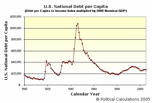
For example, if we select the 2005 GDP figure of $12.589 trillion USD (or $12,589 billion USD), we can show that in terms of today's economy and population, the National Debt per Capita figure in 1995 was an equivalent $32,210. Likewise, in terms of 1995’s GDP level of $7,398 billion USD, we see that today's National Debt per Capita is $15,705 USD, a 17% reduction (in terms of 1995's national income) from the 1995 National Debt per Capita figure of $18,926 USD. The following chart shows the equivalent National Debt per Capita for the period from 1900 to 2005 in terms of 2005 National Income:
Given how relatively flat the National Debt per Capita has been in the last 5 years, I would almost argue that the amount of debt spending agreed to by the U.S. Congress each year takes something like the National Debt per Capita to Income Index into account. Now that the federal government is pushing the edge of the arbitrarily legislated nominal National Debt Limit, it will be interesting to see if this factor plays a role in setting the amount of the increase of this artificial limit.
Previously on Political Calculations
The following posts provide additional background and links to the original data sources used in the calculations described above:
- Picturing the National Debt
- Looking at the National Debt on a Personal Level
- Picturing the National Debt on a Real Personal Level
- Picturing the U.S. National Debt-to-Income Ratio
Welcome to the blogosphere's toolchest! Here, unlike other blogs dedicated to analyzing current events, we create easy-to-use, simple tools to do the math related to them so you can get in on the action too! If you would like to learn more about these tools, or if you would like to contribute ideas to develop for this blog, please e-mail us at:
ironman at politicalcalculations
Thanks in advance!
Closing values for previous trading day.
This site is primarily powered by:
CSS Validation

RSS Site Feed
JavaScript
The tools on this site are built using JavaScript. If you would like to learn more, one of the best free resources on the web is available at W3Schools.com.
Other Cool Resources
Blog Roll


