Mostly for the sake of presenting the nominal (non-inflation adjusted) income data we have for 1995, we're going to offer a look at two other area strata charts for that year. The first chart provides an estimate of the distribution of total income earned in 1994, which we approximated by taking the midpoint of our income ranges and multiplying it by the number of people within the indicated income ranges for that year:

The chart provides a measure of the relative economic clout of each age group in 1994. Here, we see pretty much what we would expect - the Age 15-24 group has the lowest collective income, as large numbers of people within this group only work part time, are actively engaged in their schooling (both high school and/or college), or don't earn much income given their low levels of experience and training.
The next lowest group on the economic clout scale is in the Age 65-74 bracket. Here, the wide majority of individual in this group is retired.
By far, the group with the greatest collective economic impact is the Age 35-44 cohort, who altogether aggregated over $1 trillion (in 1994 US dollars.) But, as we saw in the data for 2004, it's the Age 45-54 period where individuals rake in the most money per person! Even though this age group only accounts for just over 77% of the income accumulated by those in the Age 35-44 bracket, they take home an average $26,318 per capita, compared to the average $24,783 for the 35-44 year olds (again, these figures are 1994 US dollars!)
We can see the reason why this occurs in the chart's income level strata - within the 45-54 age group, a higher proportion of individuals earn higher incomes than those in the 35-44 age group, as the income bands are proportionately wider at these income levels.
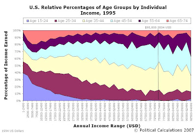
We can confirm this using our next chart, which reveals the relative percentages of individuals by age group for each of the income ranges:

Here, as we saw in similar 2004 data, we see that as income increases, the proportion of people in the older age groups also increases.
In the chart above, we added a vertical line to represent the effect of inflation from 1994 to 2004. We'll soon be making direct comparisons between these two years after accounting for inflation, and since the data we have for 2004 only goes up to $95,000 (in 2004 U.S. dollars), we wanted to show where the equivalent cut-off will be (the cut-off is at $74,575 1994 U.S. dollars.)
Previously on Political Calculations
- The Distribution of Income by Age in 1995
- Income Distribution Percentages by Age in the U.S. (2005)
- Peak Earning Years for U.S. Individuals (2005)
- The Distribution of Income by Age in the U.S. (2005)
- Generations
Labels: income, income distribution
Welcome to the blogosphere's toolchest! Here, unlike other blogs dedicated to analyzing current events, we create easy-to-use, simple tools to do the math related to them so you can get in on the action too! If you would like to learn more about these tools, or if you would like to contribute ideas to develop for this blog, please e-mail us at:
ironman at politicalcalculations
Thanks in advance!
Closing values for previous trading day.
This site is primarily powered by:
CSS Validation
RSS Site Feed
JavaScript
The tools on this site are built using JavaScript. If you would like to learn more, one of the best free resources on the web is available at W3Schools.com.