 We're picking up the job that Mickey Kaus "commissioned" as it provides the opportunity to, as Mickey put it, "extract the trend [the New York Times David Cay] Johnston failed to extract," while also allowing us to discard the rather lame attempt at such produced by the leftist-financed Economic Policy Institute whose work, as we've found in our experience, suffers from too many deficiencies to be taken simply at face value.
In looking at the spreadsheet data from the Congressional Budget Office, the first thing we noted is that it seemed to be undercounting the number of households in the top percentiles by significant numbers. We know this because we cross-checked the percentile figures with data we found at the IRS' Tax Statistics web site. The discrepancy was large enough that we decided to instead use the original source data from the IRS for all households with positive Adjusted Gross Incomes (AGI).
Update: David Cay Johnston e-mails to help clarify where the difference in the numbers between the CBO and the IRS arise:
... the IRS data, on which I have reported extensively, does NOT measure households, as you posted. It measures taxpayers, who can be a individual or a married couple.
It would appear that the CBO consolidated these types of return filers purely into households, which would largely account for the differences between the two sets of data.
The downside of using this data is that it only covers the twenty year period from 1986 to 2005, rather than the twenty-seven year period covered by the CBO's data. The advantage of using this data is the greater accuracy of the numbers from an original source (the CBO would be a secondary source) and the twenty year period covered by this data is more than adequate from which to determine any trends.
In our next step, we extracted the number of households within the IRS' data sources' percentile groupings and found how much income each of the resulting groupings had from 1986 through 2005. The groupings of households for which we found this data include:
- Households in the bottom 50% of positive AGI earners
- Households between 50% and 75% of positive AGI earners
- Households between 75% and 90% of positive AGI earners
- Households between 90% and 95% of positive AGI earners
- Households between 95% and 99% of positive AGI earners
- Households in the top 1% of positive AGI earners
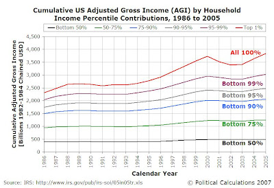
Having extracted the household data the way that we have, we can now "stack" each group on top of each other to gain a sense of measure the total Adjusted Gross Income "base" for each year from 1985 through 2005 from which income taxes would be applied. Our results are revealed in the following chart, in which the income data has been adjusted for inflation using 1982-1984 as the base period of the Consumer Price Index for Urban Consumers:

This chart reveals that the years from 2001 through 2004 were exceptionally bad years for those at the top of the income spectrum in the United States, as their contribution to overall adjusted gross income earned dipped the most in these post-Dot-Com Bubble, post-2001 recession years.
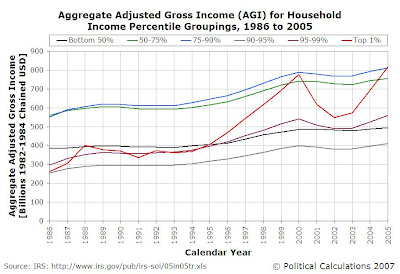
In our next chart, we'll "unstack" the year-to-year data from 1986 to 2005 for each of our household income percentile groupings. This step allows us to directly compare the annual contribution of each year's groupings with respect to one another:

Looking over the entire span of the data, we find that all the percentile groupings in 2005 are well ahead in the aggregate of where their counterparts were in 1986, as their accumulated adjusted gross incomes generally rose throughout this twenty year period.
What's more interesting is shown by the red line representing the Top 1% of positive AGI-earning tax filers, which confirms the extent to which the years between 2000 and 2005 were bad ones for billionaires. It's only in 2005 that the households represented by this grouping reached and slightly topped the levels seen last in the year 2000. Meanwhile, the other top percentile groups show either minor dips or relative flatness in their aggregate income for these years, but nowhere near the degree that we see for the Top 1% of income tax filers.
The volatility in the top-tier of household AGI earnings is underscored in the next chart. Here, we've simply charted the number of positive AGI-earning tax filing households for each year from 1986 through 2005 that fall within the Top 1% Household AGI Percentile:

Update 15 February 2008 The chart we had originally posted was mislabeled. It showed the non-inflation adjusted income for each tax year from 1986 through 2005, instead of the number of tax filers in the Top 1% based on adjusted gross income, which we now show above!
The level of volatility seen in just this twenty year period has important implications for determining an appropriate and sustainable tax policy for the United States. To see why, consider an incompetently designed tax policy, such as California's 2006 Proposition 82, which would have paid for universal preschool in that state with a dedicated 1.7% tax on individual incomes over $400,000 and couples' incomes over $800,000, above and beyond California's already high income tax rates for these income levels.
As this group falls within the Top 1% of income tax filers, the consequence of having a series of bad years for billionaires, much like the period from 2001 through 2004, would put California's entire preschool system at risk as the funds needed to operate the universal preschool system would simply not be available. The consequences of this funding "shortfall" would obviously spill over to the entire California state budget as the state would be forced to reconsider all its spending priorities. This inevitable outcome would be true for any tax imposed on a specific group or product to provide dedicated funding for a government program.
So we see that rather than just soaking the rich to benefit the children, the advocates of Proposition 82 would actually be screwing over the children too! If only these advocates really cared about them....
Fortunately, for Californians and especially preschool-age children and their families, California's 2006 Proposition 82 failed. And now you know why that was a good thing, as well as why jacking up taxes on "the rich" to pay for "universal" programs may not be such a great idea.
Labels: income distribution, taxes
Welcome to the blogosphere's toolchest! Here, unlike other blogs dedicated to analyzing current events, we create easy-to-use, simple tools to do the math related to them so you can get in on the action too! If you would like to learn more about these tools, or if you would like to contribute ideas to develop for this blog, please e-mail us at:
ironman at politicalcalculations
Thanks in advance!
Closing values for previous trading day.
This site is primarily powered by:
CSS Validation
RSS Site Feed
JavaScript
The tools on this site are built using JavaScript. If you would like to learn more, one of the best free resources on the web is available at W3Schools.com.