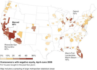
Sound Politics' Jim Miller found a pretty interesting correlation in the incidence of where homeowners have the greatest amount of negative equity and the predominant political affiliations in those areas. We thought it might be fun to show those maps together in the same post!
The first map, showing the percentage of homeowners with negative equity in April-June 2008 for U.S. metropolitan statistical areas, was created by Hannah Fairfield of the New York Times as a reference for an article about the aftermath of the housing bust in the central valley of California:

The second map, which was created by David Leip, shows the degree to which voters in the U.S. voted in favor of a particular political party, by county. Note that in this map, blue represents voter preference for the Republican Party, while red indicates voter preference for the Democratic Party:

Here's how Jim interpreted the apparent correlation:
In general — please note that I said, in general — the areas that have the highest levels of negative equity are the areas that vote Democratic, that elect Democrats to state legislatures and city councils.
There are exceptions. The heavily black areas along the Mississippi river and the Hispanic areas along the southern border vote Democratic, but do not have problems with declining equity (or even equity, some might quip). But on the whole the declining equity map is also a map of Democratic strongholds, Los Angeles and other urban areas on the West coast, the Twin Cities, Chicago, Detroit, New York, and so on.
Allowing for those exceptions, the negative equity map looks like a map of Obama's supporters, except for southern blacks.
Why might this be so? Here's my speculation, and it is no more than speculation, but it is consistent with a number of academic studies. Democrats, especially culturally left Democrats (latte-sipping, arugula-nibbling Democrats, as opposed to beer-drinking, hot-dog-eating Democrats), regulate housing markets, causing shortages. These shortages cause prices for homes and condominiums to rise rapidly. Once prices have been rising rapidly for several years, many begin to believe that they will always rise, and soon you have a bubble, with speculators trying to make quick profits, and home buyers trying to beat price increases. Eventually, the bubble pops, the prices drop, and the foreclosures start.
As it happens, there are a number of exceptions, including Merced County in the central valley of California, which was a central focus of the New York Times article. Here's how Jim accounted for it:
(Unfortunately for my thesis, the county that they chose to illustrate the negative equity problem, California's Merced, gave more than 56 percent of its vote to George W. Bush in 2004. But the housing bubble seems to have been mostly created by people from outside the county, and the land rules in Merced, as in the rest of California, are mostly set by the legislature, which has been run by Democrats for years.)
We'll note that would also apply for the Riverside-San Bernandino metropolitan area as well, which has the second highest percentage of negative equity homes in the U.S.
As for why that might be, the answer might be found in that there are fewer obstacles to new building and construction in these areas of California than in those areas that strongly trend toward the Democratic Party. Our best guess is that the relatively higher level of restrictive housing codes in these political strongholds pushed sharply inflated levels of development into these comparatively less regulated areas.
That effect might also account for the higher incidence of negative equity among homeowners in Maricopa County in Arizona, which has seen a great deal of in-migration from California residents seeking greater affordability and a relatively higher standard of living in recent years. Here though, the effect of the fallout hasn't been as great as Arizona doesn't restrict new development to the same extent as does California, which prevented housing prices from rising as much.
Labels: development, economics, politics
Welcome to the blogosphere's toolchest! Here, unlike other blogs dedicated to analyzing current events, we create easy-to-use, simple tools to do the math related to them so you can get in on the action too! If you would like to learn more about these tools, or if you would like to contribute ideas to develop for this blog, please e-mail us at:
ironman at politicalcalculations
Thanks in advance!
Closing values for previous trading day.
This site is primarily powered by:
CSS Validation
RSS Site Feed
JavaScript
The tools on this site are built using JavaScript. If you would like to learn more, one of the best free resources on the web is available at W3Schools.com.