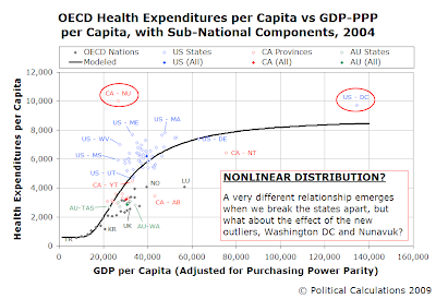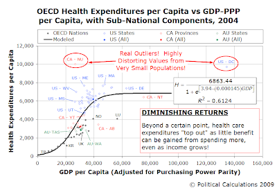
First, let's begin with the evidence that the advocates of universal health care in the United States frequently toss out to support their contentions that the cost of health care in the U.S. is excessive. The chart to the right shows the relative position of each developed nations of the world total health expenditures per capita with respect to its Gross Domestic Product per capita.
At a level of $6,194 per person in 2004, it would appear from this chart that people in the U.S. are paying way more than everyone else in the world for health care. But, as we note in the chart, can you really compare the United States, a nation of around 300 million people, to nations like Luxembourg, whose population is less than half a million?
It seems to us that there is far too much variation represented by the data point for the United States for there to be any meaningful comparison to the other, often much smaller, developed nations of the world, as represented by the members of the Organisation of Economic Co-operation and Development (OECD).

Before doing that however, we notice that there are some really unexpected outcomes. We find that the highest health expenditures per capita in the world aren't in the United States, but instead are found in Canada. Specifically, the province of Nunavut, which is home to 31,000 (mostly Inuit peoples) and which must literally transport all its building supplies from Canada's southern provinces given its remote Arctic Circle location. Consequently, we view Nunavut as an extreme outlier, whose health care expenditures per capita reflect extraordinarily high costs not typical elsewhere in the world.

Performing a regression analysis using ZunZun's 2-D Function Finder, we do however find that the relationship that exists between health expenditures per capita and GDP per capita is not linear. The curve shown in the chart represents that for a Weibull distribution, with an R-squared value of 0.5487. However, that represents the influence of the two components, Canada's Nunavut province and Washington D.C. in the United States, to the overall relationship. What might happen if we omit these two extreme outliers from our dataset?

We also note the relative positions of the various nations with respect to the curve defining the basic correlation between health expenditures and GDP per capita. What we find is that those nations whose national health care systems constrain their costs of operation through rationing mechanisms (making certain kinds of health care less available) tend to fall to the right of and below the level that would otherwise be indicated by their level of GDP per capita. The more extreme nations in this regard include Japan, Italy, New Zealand, Norway, Spain and the United Kingdom.
Both Canada and Australia utilize similar constraints on the availability of various types of health care, which accounts for the presence of many of their provinces and states in this zone.
Data Sources
The data sources from which we obtained the values presented in the charts are below. All data was accessed on 7 July 2009:
[1] U.S. Personal Health Care Expenditures by State of Residence, 2004 - This is why we looked just at 2004 and not more recent years. The United States' government has not updated this information since 2007, which then was only current through 2004. This is why we're not presenting more recent data, even though nearly current state, provincial and territorial data is available for both Canada and Australia for more recent years.
[2] U.S. Census Population Estimates by State, 2004 - Excel spreadsheet with data for multiple years. We used this data to convert each state's GDP data to GDP per capita.
[3] U.S. Bureau of Economic Analysis GDP by State, 2004, All Industry Total - This data is available through an online database.
[4] National Health Expenditures Aggregate, Per Capita Amounts, Percent Distribution and Average Annual Percent Growth, by Source of Funds: Selected Calendar Years 1960-2007 - We used these figures to correlate the recorded data for 2004 with that the OECD provides in [5] for the U.S in that year. The national data also accounts for elements not given by the personal health expenditure data by state provided by [1], so this data was also used to adjust each state's per capita health expenditures by applying a consistent multiplier to each state's data, which equally distributes these national level expenditures among the separate states.
[5] OECD Health Data, 2009 - Excel spreadsheet with a wealth of various health care system measures for OECD countries beginning in the 1960s.
[6] GDP-PPP per Capita, 2004 - Nationmaster presents the OECD's Gross Domestic Product data for its member nations for 2004, adjusted to account for Purchasing Power Parity.
[7] Health Expenditure Australia, 2004-05 - we excerpted data for the 2003-04 and 2004-05 fiscal years from Table 9, which presented the Average Health Expenditure per Person, in Current Prices, by State and Territory, from 1996-97 through 2004-05. Since Australia's fiscal year runs from July 1 through June 30, we equally weighted the data in the table to determine just a value for 2004, which we then adjusted to correlate with the OECD's per capita health care figure, the latter process was similar to that we did for U.S. data.
[8] Australian National Accounts State Accounts (5220.0) - Here, we extracted GDP by state data from Table 4, which presented Australia Gross State Product per Capita, Current Prices, 2003-04 and 2004-05. We handled the fiscal year data similarly to what we described above.
[9] Canada National Health Expenditure Trends, 1975 to 2008 - We extracted and adapted the data from Table 4, which gave the Provincial/Territorial Government-Sector Health Expenditure, by Province/Territory and Canada, 1975-2008 - Current Dollars, which is Table B.4.2 in the actual report.). We once again correlated the national level data with the OECD data to determine the provincial and territorial health care expenditure figures.
[10] Canada Gross Domestic Product, Expenditure-Based, by Province and Territory - We correlated the Canadian GDP figure with the OECD data to determine the provincial and territorial GDP figures.
[11] Canada Population by Year, by Province and Territory - We used this data to convert the provincial GDP figures into GDP per capita.
Labels: health care
Welcome to the blogosphere's toolchest! Here, unlike other blogs dedicated to analyzing current events, we create easy-to-use, simple tools to do the math related to them so you can get in on the action too! If you would like to learn more about these tools, or if you would like to contribute ideas to develop for this blog, please e-mail us at:
ironman at politicalcalculations
Thanks in advance!
Closing values for previous trading day.
This site is primarily powered by:
CSS Validation
RSS Site Feed
JavaScript
The tools on this site are built using JavaScript. If you would like to learn more, one of the best free resources on the web is available at W3Schools.com.