You can blame Felix Salmon for this post on our site, since he inspired it by linking to this map of Europe's "alcohol belts", which depicts the predominant forms of alcohol consumed across the geography of Europe.

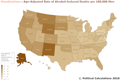
One thing led to another, and we started wondering what a similar map would look like for the United States. Unfortunately though, that kind of map doesn't exist. So we decided to create it ourselves.

Then we tweaked the data to account for the age-adjustment presented in the original report by multiplying our estimated death rate per 100,000 men by the percentage adjustment taken to get from the death rate for the entire population to the age-adjusted death rate. It's not a precise calculation, but should put us in the right age-adjusted ballpark.
We've posted all our data on ManyEyes, with direct access to the interactive version of our U.S. map also available on the site.
The U.S. map showing the death rate per 100,000 men for alcohol-induced causes of death for each of the United States does not include fatalities resulting from accidents, homicides, and other causes indirectly related to alcohol use, as well as newborn deaths associated with maternal alcohol use.
Comparing the two maps, we find that Europeans, especially in northern and eastern Europe, have a much higher rate of mortality from alcohol-related medical conditions than Americans. New Mexico, the U.S. state with the highest proportion of alcohol-related deaths per 100,000 men, would fall into the middle of Europe's alcohol-induced death scale. We're also surprised by the high incidence of alcohol-related deaths recorded in northern and central France, which is on par with those seen in the former nations of the Warsaw Pact in eastern Europe.
As for Felix, who deserves the blame for this post, we'll conclude by disrupting his world. Last November, Barry Ritholtz described Rolfe Winkler as being a "thinking man's Felix Salmon." Applying what we know from Peabody's Improbable History, where a "boy and his dog" also implies that there's a "dog and his boy," we wonder just who exactly is Felix Salmon's thinking man?
Labels: data visualization, health
Welcome to the blogosphere's toolchest! Here, unlike other blogs dedicated to analyzing current events, we create easy-to-use, simple tools to do the math related to them so you can get in on the action too! If you would like to learn more about these tools, or if you would like to contribute ideas to develop for this blog, please e-mail us at:
ironman at politicalcalculations
Thanks in advance!
Closing values for previous trading day.
This site is primarily powered by:
CSS Validation
RSS Site Feed
JavaScript
The tools on this site are built using JavaScript. If you would like to learn more, one of the best free resources on the web is available at W3Schools.com.