
We previously found that while we can get census-based data for both Canada and the United States that breaks down each nation's total population into various racial or ethnic components, we can't directly compare the two nation's populations using each nation's presented data because each uses a different system for classifying people within its population.
Here, Canada uses a geographic-based system for classifying the origins of its minority populations, while the U.S. uses race and Hispanic origin to classify its minority populations.
In order for us to be able to directly compare each nation's racial or ethnic diversity, we'll need to find a way to take that apples-to-oranges data and convert it into a form that makes an apples-to-apples comparison possible.
There are two ways we could do that conversion. We could either take the U.S. population data and mine through the data to dig out the geographic origin of the various minority populations, which would make it match the Canadian data. Or we could take the Canadian geographic-categorized data and work out how that might translate into the U.S.-based population classification system.
It then occurred to us that we could do literally do a translation of the Canadian minority population data into the relevant U.S. classifications using a "linguistic-mapping" approach!
Here, we recognize that the world can be divided into geographic regions according to the language families that have evolved over time, which in turn, also reflects the racial origin approach used by the U.S. to describe its resident population. The map below shows the geographic distribution of the world's major human language families:


This map allows up to directly translate Canada's geographic-based minority population classification system to the U.S. racial origin-based system. Here, the various green and yellow-shaded regions would be counted as "White" in the U.S. system, while people who's ancestral origin spans the red and pink-shaded regions and adjacent areas of the map would most likely be classified as "Asian", which addresses nearly all of the disputable categories. It's not perfect, but as they say, it's probably good enough for government work, or perhaps just the study of pharmacogenetics in ethnically diverse populations....
We can now then deal with the problem of hispanic origin. Here, Canada's remoteness from Spanish-speaking populations allows them to classify those with hispanic origin as originating from "Latin America", which makes it possible to specifically identify this demographic segment within the Canadian population. We should note that a similar logic would hold true for Canada's "black" population as well, which directly translates as well. We can then group all the other Canadian visible minority categories we haven't yet accounted for into a group called, well, "Other" for both nations to get our direct comparison.
Our next chart shows what we found in comparing the numbers of people using our approximation of the U.S. racial and Hispanic origin-based classification system:
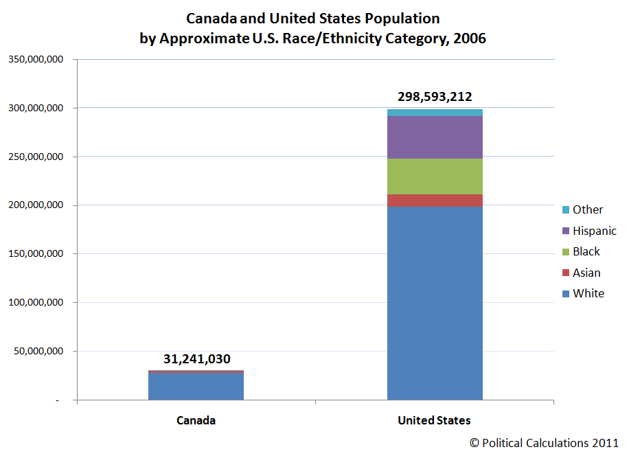
What we find right off the bat is that the U.S. population is far greater than the Canadian population, and that the U.S. is comparatively far more racially and ethnically diverse, as we can really only see an Asian minority population in Canada, while we can see Black, Hispanic, Asian and Other populations in the United States.
But that reading may be an artifact of the scaling of the chart, which may not make it easy to see the relative share of these minority populations within Canada given its much smaller total population. To account for that scale issue, we next re-visualized the data as pie charts, specifically to compare the relative size of these minority populations within each nations' total population:

What we find is that Canada is far more racially homogeneous than the United States, with the "White" population representing 89.2% of the total population in Canada, while the same population category in the U.S. only represents 66.5% of the total population.
We also see that Canada has larger Asian population than does the United States, representing 6.7% of its population while accounting for 4.2% in the U.S. That situation is largely reversed for the "Other" category, which for the U.S. represents 2.3% of the total population, while "Other" covers just 0.7% of the Canadian population.
But it's Canada's comparative absence of black and Hispanic minority populations that really sets it apart from the United States. Here, blacks and Hispanics make up a combined 3.5% of the total Canadian population (2.0% for blacks and 1.5% for Hispanics), while the black and Hispanic population together represents 27.0% of the total U.S. population (12.23% black, 14.74% Hispanic, the latter figure encompassing all races).
Our next chart omits the black and Hispanic minority populations from both nations, while combining the "Asian" and "Other" categories, just to see how similar or different the two countries are after accounting for this major difference. Update 16 July 2017: Canada's "Visible Minority" categorization groups its "Aboriginal peoples" in with its "White" population. In the corrected chart below, we've matched that treatment with the U.S. data, transferring the populations of Native Americans, Alaskans, Hawaiians and Pacific Islanders from the "Asian and Other"
category to the "White" category in a similar fashion to Statistics Canada's methods.
![Canada and United States Resident Population by Approximate U.S. Race Category, Minus Black and Hispanic Population, 2006 [Corrected]](https://blogger.googleusercontent.com/img/b/R29vZ2xl/AVvXsEg6OjKPZTw93BlRw_jKVyJbk_-xqynAataTipSb6d204inMwKj1NFyxAE3tXexjguHx7HoT0ScqlSVrT6ZRJtNAe1HLi35j_xPc-yShZd6AQPWugiCv63SxzA0enSUF8p-cAdNsPg/s1600/Canada-and-US-resident-population-by-approximate-US-race-category-minus-black-and-hispanic-population-2006.png "Canada and United States Resident Population by Approximate U.S. Race Category, Minus Black and Hispanic Population, 2006 [Corrected]")
Original version of chart here
We find that the racial and ethnic distribution of the total Canadian population, as represented by the 96.5% of its total population after omitting the black and Hispanic portions of its population, very closely resembles the white, Asian and Other portion of the total U.S. population.
Why Compare the U.S. and Canada This Way?
The reason why someone would want to know this kind of information is to directly compare other data from the United States and Canada, which makes it possible to account for racial or other ethnic factors that might otherwise influence the results of the comparison and lead to inaccurate conclusions.
For instance, the U.S. breaks down a number of its statistics to account for racial or ethnic factors, while Canada, likely because of its much smaller minority populations, does not. Knowing which sections of the U.S. population most closely match up with the Canadian population would allow for the kind of apples-to-apples comparisons that would help tell whether the differences in the statistics being looked at are due to these factors or to other differences between the two countries.
Here, what we found means that we can most directly compare the statistical data that applies for the total Canadian population with statistics applying to just the White, Asian and Other portions of the U.S. population, omitting the Black and Hispanic portion of the U.S. population, which largely isolates racial and ethnic differences between the two nations, as there would only be a very small error on the Canadian side of the data as a result.
Image Credits: USDA, SOPHIE Study (which we found after we did our analysis) and Wikipedia.
Data Sources
Statistics Canada. 2006 Census. Visible Minority Population, by Province and Territory. Accessed 16 March 2011.
Statistics Canada. 2006 Census. Visible Minority Population and Population Group Reference Guide, 2006 Census. Accessed 16 July 2017.
Update 16 July 2017: Individuals who identified as "Aboriginal peoples" in Canada's census survey are "included in the 'Not a visible minority' category in the Visible minority population variable, along with persons reporting other selected groups such as 'White.'"
U.S. Census Bureau. Population Estimates. Annual Estimates of the Resident Population by Sex, Race, and Hispanic Origin for the United States: April 1, 2000 to July 1, 2009 (NC-EST2009-03). Accessed 16 March 2011. [Data from American Factfinder].Labels: data visualization, demographics
Welcome to the blogosphere's toolchest! Here, unlike other blogs dedicated to analyzing current events, we create easy-to-use, simple tools to do the math related to them so you can get in on the action too! If you would like to learn more about these tools, or if you would like to contribute ideas to develop for this blog, please e-mail us at:
ironman at politicalcalculations
Thanks in advance!
Closing values for previous trading day.
This site is primarily powered by:
CSS Validation

RSS Site Feed
JavaScript
The tools on this site are built using JavaScript. If you would like to learn more, one of the best free resources on the web is available at W3Schools.com.
Other Cool Resources
Blog Roll


