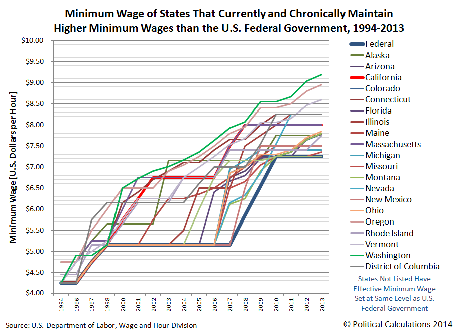
We thought it might be fun to update some of our previous analysis of the U.S. minimum wage, now that we have both minimum wage and inflation data through 2013. First, we should note that there is more than one minimum wage in the United States, with the federal minimum wage often setting the effective floor for those states that don't set their minimum wage at a higher level. Here's what the last 20 years looks like for the federal minimum wage and those states that do set their minimum wage at significantly higher levels:
While kind of cool to look at, with so many different minimum wages, we think that most people would rather refer to a single number that represents what we'll call the national average minimum wage. So we calculated what that single number is for each year from 1994 through 2013, weighting each state's minimum wage by its percentage of the U.S. population. Our next chart shows the results of our calculating the nominal (non-inflation-adjusted) minimum wage for each year of the last two decades:

But wait! What about inflation? Well, we redid the math we did above to calculate the national average minimum wage to adjust it for inflation as well, showing the last 20 years in terms of constant 2013 U.S. dollars!

Now for a real challenge! How would changing the national average minimum wage affect the people most likely to earn the minimum wage?
For that, we'll need to create a demand curve, pairing the inflation-adjusted national average minimum wage with the number of Americans between the ages of 16 and 24 who earn incomes. Or rather, the U.S. teens and young adults who collectively have represented approximately half of all Americans who earn incomes that are consistent with the minimum wage over the past decade (and probably much longer than that, since the BLS only provides data on the characteristics of minimum wage earners back to 2002).
Our U.S. minimum wage demand curve chart is below. The data for the number of teens and young adults with income is taken from the U.S. Census' Annual Social and Economic Supplements going back to 1994 (the first year the Census began publishing this data in digital-friendly format). The data for state minimum wages is from the Bureau of Labor Statistics, where we adjusted the data to account for inflation, according to data also published by the BLS. All we did was to connect the dots, or at least those that weren't skewed by the impact of the 1997-2003 Dot-Com Bubble, and run a simple linear regression....

Going by the regression, for every $1 increase in the inflation-adjusted national average minimum wage (expressed in terms of constant 2013 U.S. dollars), some 1,265,000 fewer teens and young adults can expect to have incomes.
So what would increasing the U.S. minimum wage to $10.10 per hour, as desired by a number of politicians in Washington D.C., affect the teens and young adults who make up half of all minimum wage earners? Especially if the politicians have no plan or even a clue for how to increase the revenues earned by the businesses that pay U.S teens and young adults to cover the higher cost of keeping these least experienced, least educated and least skilled Americans on their payrolls?
To answer that question, we built a tool you can use to answer that question for yourself, or perhaps for some other hypothetical minimum wage that you would like to consider. Enjoy!
To put that result in context, we estimate that about 26.6 million teens and young adults earned incomes in 2013 (we won't have a firm number until September 2014, as the data won't be collected until this upcoming March.) That means that about 1 in 8 Americans between the ages of 16 and 24 could reasonably expect to no longer be able to earn incomes after this particular minimum wage increase would go into effect. Unless there's a "lot" of inflation!...
As for those pushing the minimum wage increase, we would recommend that if they really think its a good idea, they should commit to doing everything possible to have the increase take effect in April 2014.
Labels: data visualization, economics, minimum wage, tool
Welcome to the blogosphere's toolchest! Here, unlike other blogs dedicated to analyzing current events, we create easy-to-use, simple tools to do the math related to them so you can get in on the action too! If you would like to learn more about these tools, or if you would like to contribute ideas to develop for this blog, please e-mail us at:
ironman at politicalcalculations
Thanks in advance!
Closing values for previous trading day.
This site is primarily powered by:
CSS Validation

RSS Site Feed
JavaScript
The tools on this site are built using JavaScript. If you would like to learn more, one of the best free resources on the web is available at W3Schools.com.
Other Cool Resources
Blog Roll


