We've been exploring data found in the U.S. Bureau of Labor Statistics and U.S. Census Bureau's Consumer Expenditure Survey, which has provided a window into the annual consumer expenditures of American households (or rather, "consumer units") since 1984. Today, we thought it was time to take a look at how the major categories of that spending has evolved over the thirty years for which we have data.
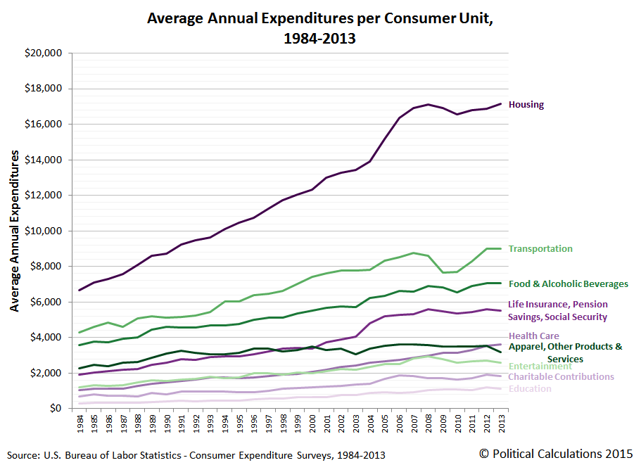
Our first chart shows the average annual amounts that American households spend on things like housing, transportation, food and alcoholic beverages, life insurance and pension savings (IRAs, 401(k), Social Security), health care, apparel and other consumer products and services, entertainment (including reading), education and also how much they donate to charitable organizations.
Next, we calculated the percentage share of these major categories with respect to the average annual total expenditures of U.S. consumer units, which reveals how much Americans have changed how much they spend on these major categories over the thirty years from 1984 through 2013:
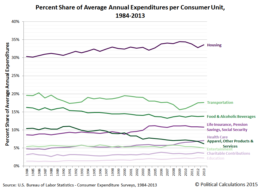
Because we've already demonstrated that in real terms, the total amount of money that the average American household spends on their annual expenditures has been essentially flat over the past 30 years, this chart reveals how Americans have shifted their spending over that time, increasing the share of money they spend on housing, life insurance and pension savings, health care, charitable contributions and education, while reducing the share of money the spend on transportation, food and alcoholic beverages, apparel, and other products and services, and entertainment.
Speaking of which, note the trends for health care and entertainment, which are nearly equal to one another from 1984 through 2008, but which diverge beginning in 2009. It is as if Americans are increasingly paying their increasingly higher health care insurance bills and expenses with money they might previously have spent on entertainment related expenditures, which means that the efforts of so many Hollywood celebrities to push Obamacare onto financially illiterate consumers has backfired on their industry.
Our final chart stacks these percentage shares to reveal how they fit into the whole of annual consumer expenditures for the average American household:
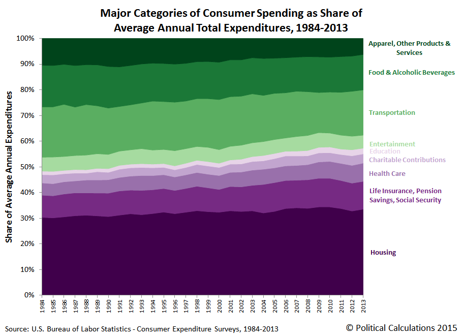
In this chart, we've ranked the major categories from greatest percentage share reduction at the top (in green) to greatest percentage share increase at the bottom (in purple) from 1984 through 2013.
Data Sources
U.S. Bureau of Labor Statistics. Consumer Expenditure Survey. Multiyear Tables. 1984-1991. [Text Document]. Accessed 23 March 2015.
U.S. Bureau of Labor Statistics. Consumer Expenditure Survey. Multiyear Tables. 1992-1999. [Text Document]. Accessed 23 March 2015.
U.S. Bureau of Labor Statistics. Consumer Expenditure Survey. Multiyear Tables. 2000-2005. [Excel Spreadsheet]. Accessed 23 March 2015.
U.S. Bureau of Labor Statistics. Consumer Expenditure Survey. Multiyear Tables. 2006-2012. [Excel Spreadsheet]. Accessed 23 March 2015.
U.S. Bureau of Labor Statistics. Consumer Expenditure Survey. 2013 Current Combined Expenditure, Share, and Standard Error Tables. Region of Residence. [Excel Spreadsheet]. Accessed 23 March 2015.
If you're one of those people (such as "Seeking Alpha commenters") who would like to see any the data we've presented above in real terms, you're welcome to do that math yourself. All you need is the data from the original sources we've linked above and the relevant Consumer Price Index data, which we've linked below, to do the math you want to do - it's super easy!
U.S. Bureau of Labor Statistics. Consumer Price Index - All Urban Consumers (CPI-U), All Items, All Cities, Non-Seasonally Adjusted. CPI Detailed Report Tables. Table 24. [Online Database]. Accessed 24 March 2015.
Labels: data visualization, economics, personal finance
Welcome to the blogosphere's toolchest! Here, unlike other blogs dedicated to analyzing current events, we create easy-to-use, simple tools to do the math related to them so you can get in on the action too! If you would like to learn more about these tools, or if you would like to contribute ideas to develop for this blog, please e-mail us at:
ironman at politicalcalculations
Thanks in advance!
Closing values for previous trading day.
This site is primarily powered by:
CSS Validation

RSS Site Feed
JavaScript
The tools on this site are built using JavaScript. If you would like to learn more, one of the best free resources on the web is available at W3Schools.com.
Other Cool Resources
Blog Roll


