The arrival of the coronavirus pandemic in the United States in March 2020 and, perhaps more significantly, the lockdown measures that state and local governments imposed on Americans as their response had a major impact on how Americans spent money in 2020.
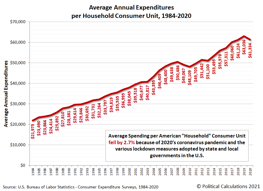
That much is evident from the results of the 2020 Consumer Expenditure Survey, which saw the average annual expenditures of American "consumer units" drop by 2.7% from their 2019 level. "Consumer units" is the affectionate nickname given by the BLS' data jocks to what are predominantly made up of U.S. households. Our first chart featuring data from the 2020 CEX survey shows that measure for each year from 1984 through 2020.
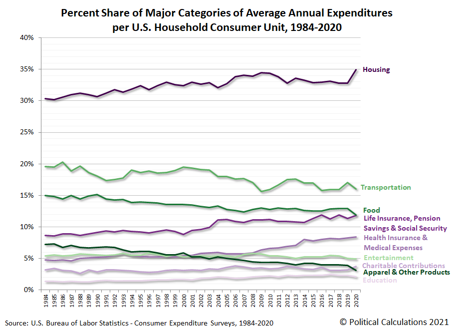
That's the big picture, but the Consumer Expenditure Survey breaks down the average annual expenditures of U.S. household consumer units into major categories of spending. Our second chart show the amount of spending from 1984 through 2020 for housing; transportation; life insurance, pension savings and Social Security; health expenditures and medical expenses; entertainment; charitable contributions; apparel and other products; and finally education, to rank them from largest to smallest.
The major categories of spending that rose in 2020 include housing; life insurance, pension savings and Social Security; and finally charitable contributions. Every other category fell, with the largest declines in expenditures for transportation; food; and apparel and other products.
This outcome confirms the extended negative impact of the various lockdown measures imposed by state and local governments. What's important to recognize here is that they continued in much of the country well beyond the two month-long recession that arrived when large population states first mandated their residents stay at home and shuttered businesses in March 2020 during the first wave of coronavirus infections in the U.S.
Our next chart presents the share of each of the major categories of household spending as a percentage of total annual average expenditures.
The most significant item here is housing, which jumped to represent 35% of the average American consumer unit household's spending, an all-time high for the data series.
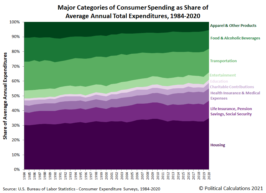
Our final chart stacks all these major categories of household spending together to assemble the full picture of how the spending of American consumer unit households has changed each year from 1984 through 2020.
This last chart is one of our favorites, in part because the colors convey which major categories of spending have generally risen over time (the purple-shaded components) or fallen over time (the green-shaded components).
We'll be exploring the wealth of data contained within the 2020 Consumer Expenditure Survey more over the next several weeks.
References
U.S. Bureau of Labor Statistics. Consumer Expenditure Survey. Multiyear Tables. [PDF Documents: 1984-1991, 1992-1999, 2000-2005, 2006-2012, 2013-2020]. Accessed 9 September 2021.
Labels: coronavirus, data visualization, demographics, personal finance, recession
Welcome to the blogosphere's toolchest! Here, unlike other blogs dedicated to analyzing current events, we create easy-to-use, simple tools to do the math related to them so you can get in on the action too! If you would like to learn more about these tools, or if you would like to contribute ideas to develop for this blog, please e-mail us at:
ironman at politicalcalculations
Thanks in advance!
Closing values for previous trading day.
This site is primarily powered by:
CSS Validation
RSS Site Feed
JavaScript
The tools on this site are built using JavaScript. If you would like to learn more, one of the best free resources on the web is available at W3Schools.com.


