The S&P 500 (Index: SPX) closed at a peak of 4,796.56 on 3 January 2022. In the six and half months since, the index has dropped by as much as 23.4% as measured by its daily closing values.
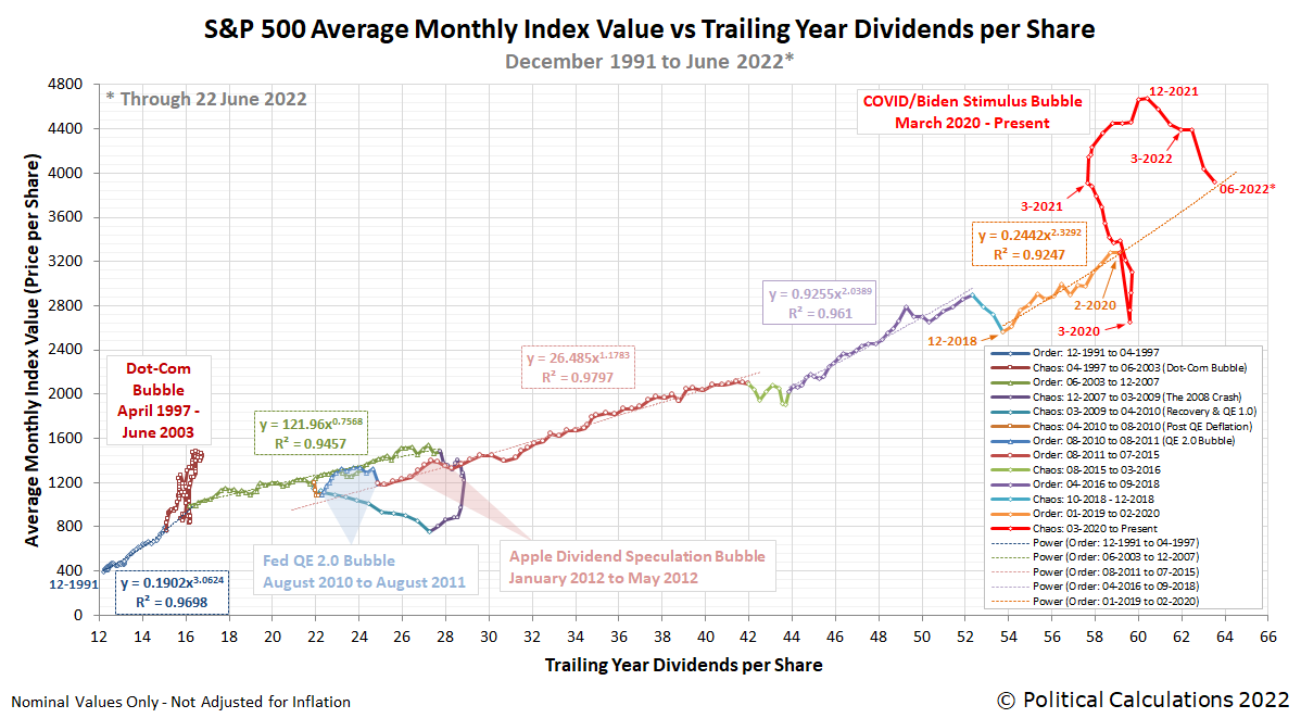
That sharp decline has reached a point where we can say the asset bubble the Federal Reserve began inflating in March 2020 and which President Biden's American Rescue Plan Act stimulus blew up even bigger through December 2021 is reaching a significant milestone. Based on the available data through 22 June 2022, the average monthly index value for the index is on track to intersect the projected trajectory the S&P 500 was on with respect to its trailing year dividends per share prior to the arrival of the coronavirus pandemic.
That means the COVID/Biden Stimulus Bubble, shown in red on the following chart tracking the relationship between the average monthly value of the S&P 500 and the index' trailing twelve month dividends per share, has almost fully deflated with respect to that last relative period of order over the last six months. Here's the chart:
The following tool, updated from the version we introduced last month with a projection of June 2022's projected dividend data, reveals what the level of the S&P 500 would be if that period of order has continued to the present. If you're accessing this article on a site that republishes our RSS news feed, you may need to click through to our site to access a working version of the tool.
Using the default selection of the most recent period of order that lasted from December 2018 through February 2020, we find that with June 2022's estimated $63.51 trailing year dividends per share, the corresponding value of the S&P 500 would be $3,863. Or rather, had that relative period of order continued to the present, that's what the math suggests would be a reasonable monthly average for the S&P 500 to go along with this amount of dividends per share.
But that period of order hasn't existed since February 2020. In the current chaotic state of the market, stock prices can and have ranged well above and below this mean trend line. Until a new relative period of order is established, there is as yet no new mean to which stock prices could revert.
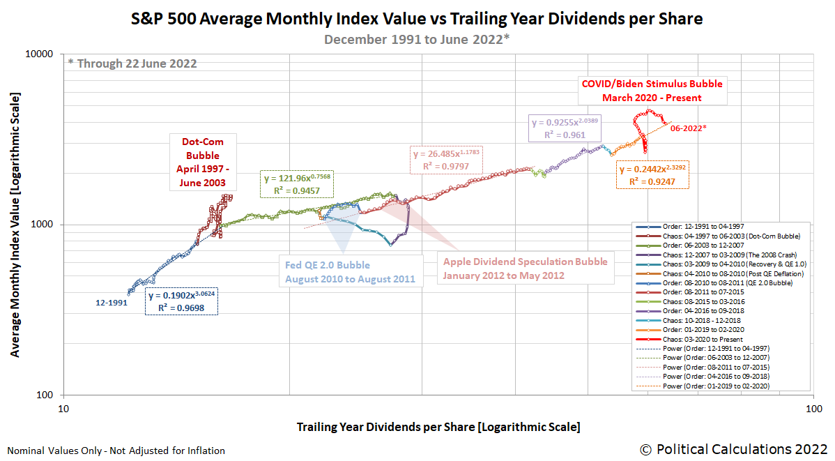
We'll close by presenting a version of the first chart showing its vertical and horizontal axes using logarithmic scale to provide sense of the relative magnitude of the stock market events shown on the chart.
At this point, both the Dot-Com Bubble (April 1997-June 2003) and the 2008 Crash represent bigger stock market events than the COVID/Biden Stimulus Bubble. We'll find out soon enough how much more momentum there still is in the deflation phase of the current bubble event to see how much bigger this disruptive event for the market might become.
Previously on Political Calculations
Labels: chaos, data visualization, SP 500, tool
Welcome to the blogosphere's toolchest! Here, unlike other blogs dedicated to analyzing current events, we create easy-to-use, simple tools to do the math related to them so you can get in on the action too! If you would like to learn more about these tools, or if you would like to contribute ideas to develop for this blog, please e-mail us at:
ironman at politicalcalculations
Thanks in advance!
Closing values for previous trading day.
This site is primarily powered by:
CSS Validation
RSS Site Feed
JavaScript
The tools on this site are built using JavaScript. If you would like to learn more, one of the best free resources on the web is available at W3Schools.com.

