Previously, we uncovered the fundamental relationship between stock prices and dividends per share that describes how the stock market behaves when the market is characterized by relative stability. Today, we're going to use that relationship as a tool to recognize when order in the stock market has broken down.
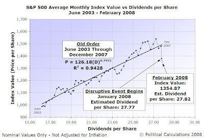
First, here's the latest update of a chart we've previously featured, showing where the stock market was as of the end of February 2008:

Reviewing this chart, a good question to answer at this point is: "How did you recognize that order in the stock market broke down in January 2008?"
The short answer to that question is that we look to see if the data in our chart has shifted sharply away from an established trend line, which is defined by our fundamental stock market equation, moving along something close to a vertical line or trajectory.
The longer answer is that in periods of relative stability, we assume that we can treat the stock market price and dividends per share data as if they are normally distributed about a central tendency, which is defined by our fundamental relationship. While this is a really bad assumption over medium to long terms, in the short periods that characterize when order has emerged in the stock market, it seems to work pretty well. Or rather, we can't determine that a normal distribution does not exist, so we're running with it!
For those short periods of relative stability, as a loose rule at this point, we simply look for a shift, either positive or negative, that exceeds three times the standard deviation of that for the data that corresponds to the existing period of order. Much like how a control chart on a production line might be used to determine if a particular manufacturing process is sufficiently stable and in control.
For the sake of avoiding putting lots of math in this post, let's use our data visualization skills to see how well this method works with recent stock market history. The following chart shows the average monthly index value for the S&P 500 and the index' dividends per share from March 1991 through February 2008:

We selected this period since our first data point of March 1991 coincides with the end of a period of recession in the U.S.. The trend line defined by the subsequent data for what we've identified as the pre-Bubble order, and shown by the dashed line extending over the purple data line, is characterized by the following equation:
Index Value = 0.1454(Dividends per Share)3.1645; R2 = 0.9659
As you can see by the orange line that represents the Dot-Com Bubble in the stock market, a disruptive event began in April 1997 and subsequently ended in May 2003. We have a significant vertical shift upward beginning at that point, which ultimately peaks, pops and drops well below the extended trend line we've shown, before recovering to a higher level and establishing a new period of relative order in the market beginning in June 2003 (the equation describing that order is presented in our first chart.)
That latter period of order lasted through December 2007, as January 2008 marks the period in which a new disruptive event began. And that's where we find ourselves today!
Really, this stuff isn't rocket science. And we'd know!
Labels: data visualization, dividends, SP 500, stock market
Welcome to the blogosphere's toolchest! Here, unlike other blogs dedicated to analyzing current events, we create easy-to-use, simple tools to do the math related to them so you can get in on the action too! If you would like to learn more about these tools, or if you would like to contribute ideas to develop for this blog, please e-mail us at:
ironman at politicalcalculations
Thanks in advance!
Closing values for previous trading day.
This site is primarily powered by:
CSS Validation
RSS Site Feed
JavaScript
The tools on this site are built using JavaScript. If you would like to learn more, one of the best free resources on the web is available at W3Schools.com.