 Once upon a time, we deliberately set out to do something wrong when we began applying statistical control charting techniques to the relationship between stock prices and their underlying dividends per share.
Why is that wrong, you ask? Because, it's long been established that stock prices don't adhere to any sort of normal, or Gaussian, distribution. Thanks to Broken Symmetry's Michael F. Martin however, we find that's not necessarily always true.
After reviewing two separate papers, Constantino Tsallis' Nonextensive statistics: Theoretical, experimental and computational evidences and connections from 1999 and Marcelo Kuperman and Damian Zanette's November 2008 paper Synchronization of multi-phase oscillators: An Axelrod-inspired model, Michael describes the math being developed to describe how order might emerge within highly complex systems:
The review article linked to the post on Tsallis entropy provides an excellent introduction to this generalization of Boltzmann-Gibb (BG) statistics. In particular, section 2.2 explains how BG statistics obtain at certain limits of the generalized q-statistics (a/k/a Tsallis entropy). What are these limits?
First, BG statistics apply at the limit of independence. So, for example, in a series of N binary events, Tsallis entropy is approximately 2^[N(1-q)]-1/(1-q), and if the events are independent, q = 1 and this reduces to the BG entropy 2^N. This limit is not all that surprising.
Second, BG statistics also apply at the limit of perfect correlation. So, for example, if events are correlated at all scales in accordance with some power law N^r, then the Tsallis entropy is approximately N^[r(1-q)]-1/(1-q). If and when q takes on the value q* = 1 - 1/r, then again BG statistics obtain, albeit to a different set (of rescaled) microscopic variables.
That is really surprising. What that means is that we might see normal (i.e., gaussian statistics) apply even to highly correlated "equilibrium" states. One can't help wondering whether, in fact, that is exactly what we are calling a market equilibrium.
Next, he considers the impact of what that might mean for how macro-level statistics can emerge from the micro-dynamics occurring between market participants:
Statistics are all well and good, but what is going on at the micro level to produce these statistics? Tsallis talks in very general terms about "multi-fractal" states. What's that mean? Sounds cool at least, doesn't it?
The paper from Zanette and Kuperman I posted on Friday provides some interesting clues about how microscopic dynamics go from uncorrelated to correlated through a phase transition. The figure posted shows how the number of clusters with different phase characteristics is maximized during phase transitions, and that the process of going from uncorrelated to correlated states involves "cross sync" of spatially dispersed clusters during the phase transition.
Read in conjunction with the papers on Tsallis entropy, I think a picture of how the micro dynamics change with the macro statistics starts to emerge. In particular, we should see Levy statistics during phase transitions, and Gaussian statistics in periods of relatively good synchronization/high correlation.
That's important because these dynamics are exactly what we have observed in how stock prices change with respect to their underlying dividends per share over time! In practical terms, that means that we can indeed apply Gaussian distribution-based statistical control charting techniques during periods where we observe high correlation factors between stock prices and dividends per share to gain insight on whether the changes we observe in stock prices are the result of normal, natural variation, or are perhaps being driven by other factors.
Michael continues to consider the impact on what this development means for modeling markets:
It's a new way to model markets, but the math is all there, folks. Look at the statistics for price shifts within a window to see if they're gaussian or levy distributed. If gaussian, then buyers and sellers are either acting completely independently of one-another (possible, but unlikely) or counterparties are acting synchronously in accordance with share perfectly antisymmetric expectations of future value/revenue (more likely). If levy, then the perfectly antisymmetric synchronized flow among buyers and sellers has broken out into multiple cross-synced clusters.
Who knew that we were that cutting edge in developing our model of how stock prices work? At least now though, we can state that our methods are not necessarily wrong, but useful!
A Quick Review of the Modern Era of the Stock Market
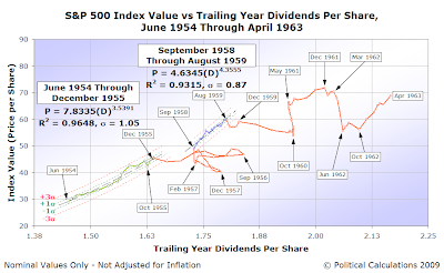
We thought it would be appropriate to close out this post by reviewing the modern era of the stock market (or rather, most of it!) with our charts that identify the periods where Gaussian rules would apply, and the periods where Lévy flights rule. While we consider the modern era of the U.S. stock market to have begun in January 1952, we'll pick up the action in June 1954, extending to when the most recent period of disorder began in January 2008:
June 1954-April 1963

During the period from 1954 through 1963, the stock market would move in and out of what we'll now call "Gaussian equilibrium" twice, and possibly three times. Those periods occurred between:
- June 1954 through December 1955
- September 1958 through August 1959
- May 1961 through March 1962
Of these periods, we've arbitrarily included the final period of May 1961 through March 1962 in the period of disorder beginning after December 1959 because this apparent period of order was less than 12 months in duration.
Update 21 June 2009 8:00 AM PDT: We found an error with our calculation of the standard deviations for each of the "in-control" periods on the chart, which also affects the relative location of the "control limit" thresholds indicated on the chart. The corrected version is above, the original is here.
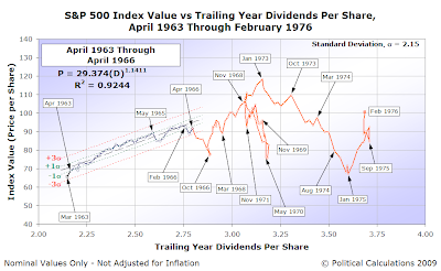
April 1963-February 1976

The period from April 1963 through February 1976 was largely characterized by a series of disruptive events. The main period of Gaussian equilibrium ran from April 1963 through April 1966.
February 1976-September 1981

"Anemic" best describes the performance of the stock market during the weak Gaussian equilibrium that ran from February 1976 through April 1980. This period of time barely qualifies by our working definition of what constitutes a period of order (when stock prices and dividends per share both have exponential rates of growth for more than twelve months in duration).
September 1981-October 1987

By contrast with the period from February 1976 through April 1980, the stock market's performance during the time from September 1981 through December 1986 was very robust. We should note that we've broken the period of disorder beginning after December 1986 into two parts between the chart above and the next, right at the October 1987 crash.
Update 23 June 2009 9:30 AM PDT: It has occurred to us that the period from September 1981 through December 1986 could reasonably be divided into four distinct, consecutive periods of order. While that may be, we recognize that this period is primarily defined by the beneficial effects of having inflation decline from the double-digit levels recorded at its beginning.
With inflation subsiding, companies benefited by paying relatively lower costs while not seeing the same drop off in their revenues, increasing their profitability and preserving dividend growth, even as the U.S. went through a major recession from July 1981 through November 1982.
Consequently, we see this period as being more of a whole than of parts, where stock prices first declined in reaction to the recession, then rose rapidly from August 1982 through June 1983 in anticipation of a strong recovery, overshooting its equilibrium level and then slowly settling back to stabilize around that level after August 1984.
November 1987-December 1991

Order quickly resumed in the stock market following the October 1987 crash, running from November 1987 through July 1990. What broke that order was the July 1990 Saddam Hussein-led Iraqi invasion of Kuwait, an event which also precipitated a recession in 1991.
December 1991-April 1997

The next period of Gaussian equilibrium began as recession waned in December 1991 and ran solidly until the onset of the Dot-Com Bubble in April 1997.
April 1997-June 2003

We had previously described the period of the Dot-Com Bubble, April 1997 through June 2003, as resembling Brownian motion. As it happens, it also describes a Lévy flight (although with no great leaps in position) as stock prices almost, if not wholly, disconnected from their fundamental relationship with their underlying dividends per share during the bubble.
June 2003-December 2007

The most recent period of Gaussian equilibrium ran from June 2003 through December 2007, officially breaking down when stock prices began collapsing in January 2008 during the most recent period of disorder.
January 2008-June 2008
The most recent period of disorder is still running - our post looking at where the stock market was going into June 2009 provides our most recent chart of the market's latest Lévy flight of fancy!
Update 17 June 2009 3:20 PM PDT: We've added descriptive text for each of the charts we originally presented, and performed the usual silent cleanup of typos, misspellings and the carnage from our never-ending battle with grammar.
Labels: chaos, quality, SP 500, stock market
Welcome to the blogosphere's toolchest! Here, unlike other blogs dedicated to analyzing current events, we create easy-to-use, simple tools to do the math related to them so you can get in on the action too! If you would like to learn more about these tools, or if you would like to contribute ideas to develop for this blog, please e-mail us at:
ironman at politicalcalculations
Thanks in advance!
Closing values for previous trading day.
This site is primarily powered by:
CSS Validation
RSS Site Feed
JavaScript
The tools on this site are built using JavaScript. If you would like to learn more, one of the best free resources on the web is available at W3Schools.com.