Good morning, Kremlinologists! For some seemingly inexplicable reason, we're breaking our pattern of recent weeks where we would only look at the recent performance of the S&P 500 or its dividend futures just once during a week, if that, with our third post on the topic this week! Even more curiously, it comes after one of those posts, with the cryptic title of "The Ultimate Sell Signal", where we looked at Great Crash of 1929, went viral.
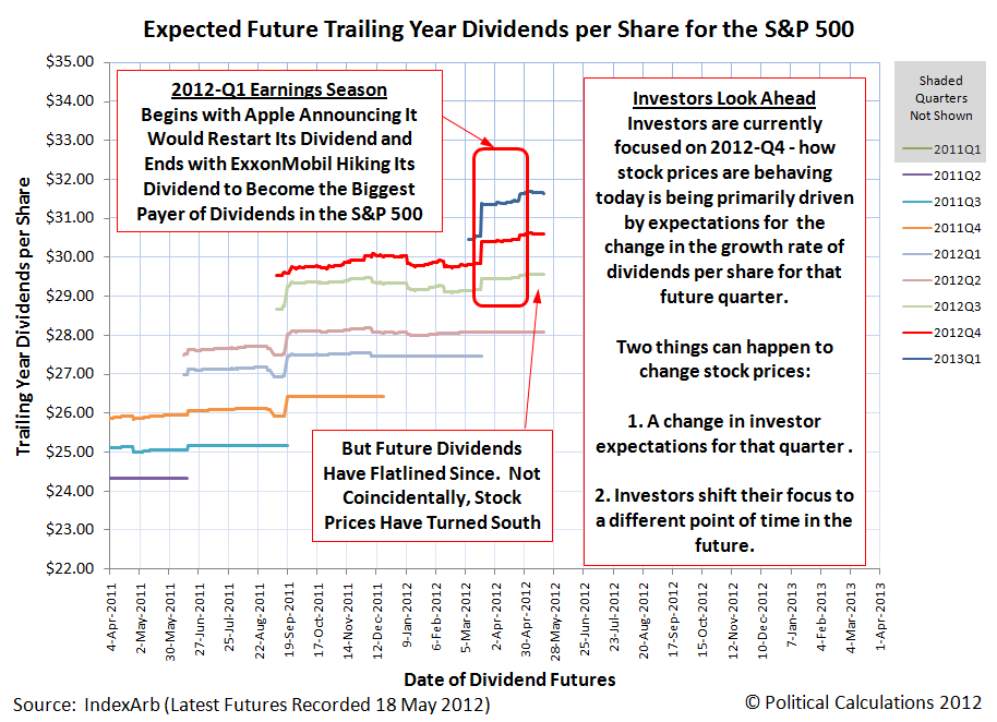
But we're really taking a breather today. And perhaps for the next several days, before we'll resume posting on the topic again [3]. In the meantime, here are our three favorite charts showing the relationship between stock prices as represented by the S&P 500 and their underlying dividends per share. First up, let's look at the recent history of how the future for the S&P 500's trailing year dividends per share has changed over the past two months [1][4]:
Next, let's see how the chart we featured at the end of "The Ultimate Sell Signal" changed from 11 May 2012:

Finally, let's see why we might be okay in taking a breather for a short span, with our third chart showing how closely the change in the growth rate for stock prices is pacing the expected amplified change in the growth rate for trailing year dividends per share in the fourth quarter of 2012, where investors would seem to currently be focused [2]:

Have a good weekend!
Notes
[1] Yes, we know sentences like that are difficult for many to follow. But as those of us who navigate through the time vortex that is the stock market well know, "tenses are difficult, aren't they?"
[2] See what we mean?!
[3] Update 18 May 2012, 6:40 PM EDT: Make that "hours" instead of "days".... See you next week!
[4] Chart commentary corrected to fully apply for the fourth quarter of 2012 - a portion of the comments for the original version applied to the third quarter of 2012. Our apologies for missing the error!
Labels: chaos, dividends, SP 500
Welcome to the blogosphere's toolchest! Here, unlike other blogs dedicated to analyzing current events, we create easy-to-use, simple tools to do the math related to them so you can get in on the action too! If you would like to learn more about these tools, or if you would like to contribute ideas to develop for this blog, please e-mail us at:
ironman at politicalcalculations
Thanks in advance!
Closing values for previous trading day.
This site is primarily powered by:
CSS Validation

RSS Site Feed
JavaScript
The tools on this site are built using JavaScript. If you would like to learn more, one of the best free resources on the web is available at W3Schools.com.
Other Cool Resources
Blog Roll


