Several weeks ago, Political Calculations launched a new series, "Examples of Junk Science", where we are specifically focusing on where flawed analysis and the misuse of data leads to the spread of false or misleading information in the fields of investing, finance and economics.
More than that, we're also seeking to present explanations for why the examples of flawed analysis and misuse of data that we present lead to results that are not valid, which we hope will be beneficial for analysts who seek to make positive contributions in these fields, where the ultimate goal is be to improve the general quality of analysis that is produced altogether. We hope to do that in part by highlighting real examples so you can more quickly recognize them as the pseudoscientific junk they are so you can directly challenge the people who propagate them.
Today's example of junk science is representative of what may quite possibly be the most common way that analysis is twisted to present a misleading picture of the economy. Coincidentally, it is also perhaps the simplest: stating changes in values as a percentage of a percentage.
This is a technique that can greatly exaggerate the significance of a claim, which often will fall apart when put into a more appropriate and relevant context. As such, this kind of data mishandling falls under the precision category of the checklist for how to detect junk science.
| How to Distinguish "Good" Science from "Junk" or "Pseudo" Science | |||
|---|---|---|---|
| Aspect | Science | Pseudoscience | Comments |
| Precision | If numbers are presented in support of a scientific explanation, they must be stated with the precision and accuracy required by their level of significance as determined by known measurement error in the data from which are derived, neither more nor less. | Pseudoscience practitioners will often present numbers with a level of precision and accuracy that exceeds that supported by the known accuracy of real world data in order to give the appearance of greater validity for their claims. | A recent example of pseudoscientific deception by precision include certain economists suggesting that "a Keynesian multiplier of 1.57" specifically applies for government stimulus spending, when a wide range of studies suggest the actual multiplier may be "anywhere from 0 to 1.5" (note the difference in the number of decimal places and potential range of values!) |
Today's example isn't so much about decimal places as it is representative of the kind of deception that results when precisely calculated values are placed into an inappropriate context. Let's go over the details....
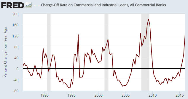
A chart similar to the one below was included in a blog post under the heading “Bank C&I Loan Charge-Offs Soaring Again”. This chart caught my attention because it seems to indicate that bank C&I (Commercial and Industrial) loan charge-offs are happening at one of the fastest rates of the past 30 years — the sort of rate that would be consistent with the US economy being in recession.
The problem is that the above chart shows the percentage change of a percentage, which opens up the possibility that what is in reality a small increase is being made to look like a large increase. For example, an increase from 1% to 2% over the course of a year in the proportion of loans charged-off would be a 100% increase if expressed as a year-over-year percentage change in the percentage of charge-offs, whereas all you’ve actually got is a 1% increase in the total proportion of loans that have been charged-off.
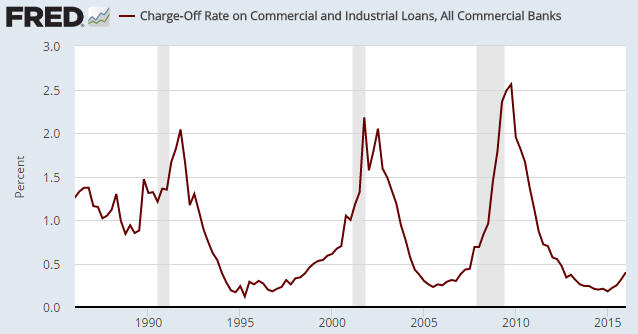
The next chart is based on exactly the same data, but instead of displaying the year-over-year percent change in the percentage of C&I loans that have been charged off it simply displays the percentage of C&I loans that have been charged off. This is not just a more correct way of looking at the data, it is a way that has not given any false recession signals over the past 30 years.
The first chart’s message is: an economic recession is either in progress or imminent. The second chart’s message is: the US economy is not in recession and is presently not close to entering recession.
The same data, opposite messages.
No matter how you slice it, the presentation of a percentage change of a percentage is always highly misleading, even if mathematically correct. At the very least, it is more than one step removed from the actual numbers used to calculate the original percentage, which is the appropriate context in which the percentage can be understood.
Believe it or not, the use of percentage changes of percentages in place of the more accurate and direct presentation of percentage changes of numbers can have legal consequences, as Republican members of Arizona's state legislature discovered in 2008.
Judge orders rewrite of sales tax analysis
PHOENIX — A state judge ordered late Friday that the description of a proposed tax increase for transportation be rewritten to exclude a calculation of how much the levy will increase.
The description is to be put into pamphlets mailed to the home of every registered voter.
Maricopa County Superior Court Judge Edward Burke said it may be "mathematically correct" to say that Proposition 203, which would boost state sales taxes from 5.6 cents on every dollar spent to 6.6 cents, equals a 17.8 percent increase in what people will pay in sales taxes.
But the judge said such calculations "are likely to mislead many voters."
He accepted the arguments by Paul Eckstein, the attorney for tax backers, that the figure was deliberately inserted by Republican lawmakers to convince voters to reject the levy.
Mike Braun, who represents the Legislative Council, told Burke the law requires the panel to not only explain each ballot measure but also how approval would affect existing law.
He said it would be "helpful" to tell voters that whatever they are paying in state sales taxes would increase by 17.8 percent if Proposition 203 is adopted.
Eckstein, however, told the judge the accuracy of the calculation is beside the point.
"An analysis can be 100 percent accurate, and it can be unfair and misleading," he said.
Burke agreed.
For example, he said, raising the tax rate from one cent per dollar to two cents has an "absolute percentage increase" of 1 percentage point. But it has a "relative percentage increase" of 100 percent.
"Many voters are likely to confuse relative and absolute percent increases," the judge wrote.
As you can see, the components for the state sales tax example has a direct parallel component in the loan charge-offs example. The problem, as described by the judge in this case in non-mathematical terms, comes when the absolute percentages represented by the math above, the percentages of numbers, are confused with relative percentages, the percentage changes of percentages. The presentation of the relative percentages is misleading because their calculation is too many steps removed from the original base values from which the original percentages were calculated, which breaks the link to the specific context to which they are relevant.
In the case of today's example of junk science, it's the difference between suggesting that the risk of recession is imminent or of there being a comparatively low risk of recession in the near term. Given how different those outcomes are, expressing calculated values in the correct context is essential to avoiding the consequences that would come from taking the wrong actions in response to misleading information.
References
Saville, Steve. You can make statistics say whatever you want. The Speculative Investor. 19 July 2016. Republished with permission.
Political Calculations. How To Detect Junk Science. [Online Article]. 19 August 2009.
Labels: junk science
Welcome to the blogosphere's toolchest! Here, unlike other blogs dedicated to analyzing current events, we create easy-to-use, simple tools to do the math related to them so you can get in on the action too! If you would like to learn more about these tools, or if you would like to contribute ideas to develop for this blog, please e-mail us at:
ironman at politicalcalculations
Thanks in advance!
Closing values for previous trading day.
This site is primarily powered by:
CSS Validation
RSS Site Feed
JavaScript
The tools on this site are built using JavaScript. If you would like to learn more, one of the best free resources on the web is available at W3Schools.com.

