
The S&P 500 (Index: SPX) fell 1.5% during the final full trading week of March 2025, dropping to 5,580.94 on Friday, 28 March 2025, after dropping 1.97% that day.
By our standards, Friday's trading action doesn't quite qualify as an interesting day for the U.S. stock market, where we define "interesting" as a change in the level of the S&P 500 from the previous day's closing value of 2.00% or more for statistical reasons. Still, it was close to that threshold and came as we're trying to determine whether the U.S. stock market has undergone a regime change since Friday, 21 February 2025.
We're not quite 100% to a full determination, but the data so far is more consistent with the market regime change hypothesis being true than not. The latest update of the alternative futures-based chart is based on the observation that such regime change got underway on 24 February 2025, with the basic trajectory of the S&P 500 following the dividend futures-based model's projection that assumes investors are mostly focusing on the now-current quarter of 2025-Q2 in setting current day stock prices.
 - Snapshot on 28 Mar 2025")
As we've kept hammering home, most of the negative change in the S&P 500 since 21 February 2025 has been associated with the deflation of the AI-bubble in stock prices. This deflation has ensnared several companies whose stocks represent the highest weighted components of the S&P 500 index. Collectively known as the "Magnificent Seven", the next chart reveals how they've changed from Friday, 21 February 2025 through Friday, 28 March 2025:

Of these seven stocks, only the stock price of Microsoft (NASDAQ: MSFT) has fallen by a smaller percentage than the overall S&P 500 during this period. Regardless, because of their high weighting within the index, each has made an outsized contribution to the index' decline.
Here are the week's market-moving headlines, many of which from mainstream news outlets are still missing out on what's been the biggest stock market-moving story of the year to date. We've selected some minor headlines to include in this week's edition just to emphasize the extent to which AI-technology associated stocks have dropped.
- Monday, 24 March 2025
-
- Signs and portents for the U.S. economy:
- Oil prices hold steady as investors monitor Russia-Ukraine ceasefire talks
- US copper imports soar to 500,000 tons amid tariff threats, says Bloomberg
- Fed minions try to pull back expectations of more rate cuts in 2025:
- Bigger trouble developing in Japan:
- Eurozone gets some better economic data, ECB minions getting excited to cut rates again:
- Euro zone economy growth accelerates to seven-month high in March, PMI shows
- Key ECB dove makes case for more easing, others more cautious
- S&P 500 ends sharply higher, Nvidia and Tesla rally
- Tuesday, 25 March 2025
-
- Signs and portents for the U.S. economy:
- Oil rises for fifth day on supply concerns after Venezuela tariffs
- US new home sales rebound in February
- Stagflation on the radar for the US economy, but no repeat of the '70s
- How companies are responding to Trump's tariffs
- Fed minions worry about persistent Bidenflation:
- Bigger trouble developing in China:
- Trade of Venezuelan oil to China stalls after new Trump order
- Chinese Tech Stocks Plunge From 3 Year High To Correction In Just 5 Days
- ECB minions getting super excited for more rate cuts:
- Wall Street posts first three-day win streak since early Feb
- Wednesday, 26 March 2025
-
- Signs and portents for the U.S. economy:
- Oil settles up 1% on US crude and fuel stock draw, Venezuela supply worries
- Front-loading ahead of tariffs boosts US durable goods orders
- Trump sets auto tariffs announcement for Wednesday
- Fed minions worried about persistent inflation staying higher for longer:
- St. Louis Fed's Musalem says tariffs could trigger more persistent inflation
- Fed should stay put for extended period amid policy uncertainty, Kashkari says
- Fed's Goolsbee sees lower interest rates in a year's time, but warns of uncertainties, FT reports
- Bigger trouble developing in China:
- ECB minions trying to curb some of their enthusiasm for more rate hikes:
- Wall Street's three-day rally turns sour as traders brace for new auto tariffs
- Thursday, 27 March 2025
-
- Signs and portents for the U.S. economy:
- Fed minions worry over how tariffs might affect auto industry:
- Fed's Barkin: Auto firms under tariffs will face tough choices on pricing, margins
- Fed's Collins says it is clear tariffs will drive inflation up near term
- Bigger stimulus developing in China:
- China vice premier pledges more policy support, says economy started 2025 well
- China accelerates government bond issuance in Q1 to highest on record
- China's central bank says debt level rising, easing on track
- BOJ minions say they'll raise rates to fight inflation, but also that inflation is making real interest rates in Japan very low:
- BOJ's Ueda vows to raise rates if inflationary pressures broaden
- New BOJ board member Koeda says real interest rates very low
- ECB minions claim they're keeping close watch on how solvent Eurozone banks are:
- U.S. stocks close slightly down as traders mull over auto tariffs
- Friday, 28 March 2025
-
- Signs and portents for the U.S. economy:
- Moderate US consumer spending, increasing prices raise specter of stagflation
- Oil slips on recession fears but posts 3rd weekly gain
- Surge in gold imports continues to distort trade figures, analysts say
- Fed minion admits they failed to fix Bidenflation, think it will persist longer:
- Bigger trouble, stimulus developing in China:
- China's top airlines post fifth year of losses in 2024 as competition weighs
- Top Chinese banks' profits stagnate, margins shrink as economy weighs
- China will resolutely respond to US reciprocal tariffs, state media says
- Bigger inflation trouble developing in Japan:
- ECB minions think Eurozone consumers are idiots, see more lending in Eurozone:
- Euro zone consumers may be put off by inflation 'misperception,' ECB's Schnabel says
- ECB's Nagel encouraged but warns against 'over-optimism' on inflation target
- Euro zone lending growth accelerates further, ECB data shows
- Wall Street puts in worst session since early March, slides to weekly loss
The CME Group's FedWatch Tool's projections are mostly unchanged going into this week. The FedWatch Tool projects the Fed will resume cutting rates with a quarter point rate reduction when Fed meets on 18 June (2025-Q2). The FedWatch tool also anticipates additional quarter point rate cuts at 12-week intervals in the second half of 2025, coinciding with the Fed's FOMC meetings on 18 June (2025-Q2), 17 September (2025-Q3), and 10 December (2025-Q4). The only notable change is there's now a dividend cut projected in mid-2026, which outside investors' typical 0-12 month investment horizon window.
The Atlanta Fed's GDPNow tool's projection of what real GDP growth will be in 2025-Q1 hels steady at -1.8%. However, the GDPNow tool is now providing an alternate model forecast that corrects for the surge in gold imports, which are skewing it's projection. That adjusted forecast indicates -0.5% growth.
Image credit: Microsoft Copilot Designer. Prompt: "An editorial cartoon of a Wall Street bear looking at a stock chart that's falling. The chart says 'Magnificent Seven'."
It's always interesting to us to see how other data visualists who draw from the same data sources we do go about developing and presenting their own visualizations of that data.
In October 2024, we featured several visualizations drawn from the Consumer Expenditure Survey about a month after the data had just been published. That data represents how American households spent money in 2023 and our approach was to break that spending down into major categories and explore how that spending has evolved over the past 40 years.
About three months later, Visual Capitalist's Dorothy Neufield and Sabrina Lam visited the same data source, but chose to focus on just 2023 itself. They used the data to create an infographic showing how much and on what the average American household spent their money on during that year. Here's their visualization:

Since we just covered where the total compensation earned by the average American in December 2024 comes from, we thought this graphic made for a nice companion feature because it shows a good part of what Americans do with their take-home compensation. That assumes the relative share of what Americans spend on each category it shows hasn't much changed from 2023 to 2024.
The Consumer Expenditure Survey showing how Americans spent money in 2024 won't be available until sometime in September 2025, so we won't be able to properly match the spending of American households in 2024 with the average total compensation of an individual American in 2024 until then.
Reference
Dorothy Neufeld and Sabrina Lam. Visualizing How Americans Spend Their Money? [Online article]. Visual Capitalist. 26 January 2025.
Labels: data visualization
How much is the average American employee compensated for every hour they work?
Would you believe $47.20 per hour? That's the figure reported by the U.S. Bureau of Labor Statistics for December 2024, which includes all compensation for civilian members of the nation's workforce, including benefits like vacations or retirement benefits and also the taxes paid to provide them with government-mandated benefits, like Social Security and unemployment benefits.
Altogether, we estimate the average American employee receives about 72.5% of their compensation in the form of wages and salaries plus supplemental pay for working overtime and bonuses. The remaining 27.5% of their compensation is in the form of benefits, including health insurance, retirement benefits, paid time off from work, and various government-mandated benefits.
The following chart provides an overview of the costs employers pay per hour for each of these major categories.

We could have stopped there, but since we had the BLS' underlying data for each subcomponent of these compensation categories, we created an additional chart to illustrate where each cent of the $47.20 per hour the average American receives in compensation comes from:
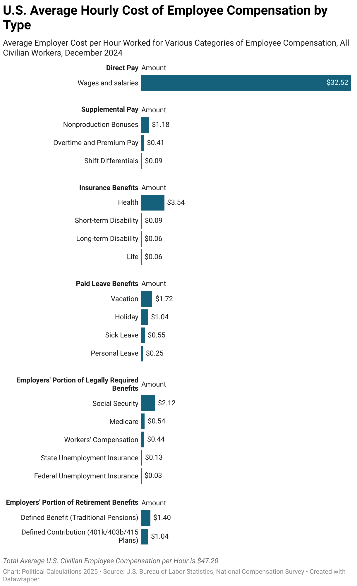
Assuming 2,080 hours worked per year, the annual income the average worker would report on their income tax return as their base wage and salary income is $67,641, which rises to $71,136 if we count the supplemental pay category as part of their direct annual income.
But including employer-paid benefits boosts the average U.S. wage or salary earner's annual compensation to $98,176. That additional $27,040 is largely not subject to individual income taxes, which is one reason why the portion of an American employee's compensation represented by employer-paid benefits has increased over time.
Reference
U.S. Bureau of Labor Statistics, National Compensation Survey. Employer Costs for Employee Compensation: Civilian workers. [Excel spreadsheet]. December 2024.
Labels: data visualization

The U.S. new home market continued shrinking for the seventh consecutive month in February 2025.
We estimate the total valuation of new homes sold in the U.S. last peaked in July 2024 at approximately $28.91 billion. Political Calculations' first estimate of the time-shifted trailing twelve month average of the market capitalization of new homes sold in February 2025 is $26.77 billion.
Over the last seven months, a combination of downward revisions has combined with falling new home sales and flat-to-slowly falling new home prices to result in this outcome.
The downward revisions in the data during this period have been significant. There was a brief moment in August 2024 when it appeared the initial estimate of the market cap of new homes sold in the U.S. exceeded the December 2020 peak of $30.12 billion. Subsequent revisions however have changed that view to the negative.
Overall, there's now enough data to support the observation that at no time during the Biden-Harris administration did the volume and price of new home sales ever exceed the December 2020 peak. The U.S. new home market of February 2025 is effectively about 11% smaller than it was at that time. And it's still shrinking.
The following charts present the U.S. new home market capitalization, the number of new home sales, and their sale prices as measured by their time-shifted, trailing twelve month averages from January 1976 through February 2025.

Flat-to-falling new home sales trend:

Slow downtrend for home prices:

Speaking of initial new home sale price data that will be revised, here's how Reuters reported the initial data for February 2025:
New home sales increased 1.8% to a seasonally adjusted annual rate of 676,000 units last month, the Commerce Department's Census Bureau said on Tuesday. The sales pace for January was revised up to a rate of 664,000 units from the previously reported 657,000 units....
The median new house price fell 1.5% to $414,500 in February from a year earlier.
The median new house price is a figure that we use to measure the relative affordability of new homes. We plan to take a closer look at the affordability of new homes in February sometime next week.
References
U.S. Census Bureau. New Residential Sales Historical Data. Houses Sold. [Excel Spreadsheet]. Accessed 25 March 2025.
U.S. Census Bureau. New Residential Sales Historical Data. Median and Average Sale Price of Houses Sold. [Excel Spreadsheet]. Accessed 25 March 2025.
Image Credit: New home construction in Gilbert, Arizona photo by Jay Thompson on Flickr. Creative Commons CC BY-SA 2.0 Attribution-ShareAlike Generic Deed.
Labels: real estate

There are thousands of publicly-traded companies whose stocks trade in the U.S. stock market. Each has its own policy about whether it pays dividends and how much if it does. What do their dividend policies tell us about the quality of their stocks as an investment?
Ned Davis Research has been studying that question using stock price and dividend data that extends back over five decades. We think their approach is pretty unique. Starting from January 1973, they consider how investments in several different groups of S&P 500 (Index: SPX) component stocks differentiated only by their dividend policies in the previous year have performed over time.
Here's how they divided up the groups of stocks:
- Dividend Growers and Initiators: Companies that either started paying dividends or increased their dividends in the preceding year.
- Unchanged Dividend: Companies that held their dividends steady.
- Dividend Nonpayers: Companies that paid no dividends to their shareholders.
- Dividend Cutters: Companies that reduced their dividend payments in the preceding year.
They treated each group as if it were part of an equal-weighted index fund, in which stocks were reallocated among the different groups at the beginning of each year depending on what happened with their dividends in the preceding year.
For example, companies that increased their dividends in Year 1 would be grouped with the Dividend Growers and Initiators in Year 2, but if the company cut their dividends during Year 2, the company's stock would be moved to the Dividend Cutters group in Year 3.
NDR's analysts then measured the total investment returns for each of these categories over time, which includes the effects of both price changes and dividend reinvestment. They also measured the risk of holding each group, which they measured as the standard deviation of the monthly variance in the returns of their hypothetical funds. In the case of returns, higher values represent better performance, and in the case of risk, a higher standard deviation indicates a greater risk for investors. For the purpose of the study, no taxes or trading costs were considered.
We've created the following chart to visualize NDR's results, which we took from a recent report produced by Washington Crossing Advisors. The data represents the annualized rate of return and the annualized risk for all these dividend categories from January 1973 through September 2024.

The study finds that dividend growers and initiators, the companies that either increased dividends or started paying them in the previous year, offer the highest annual returns at 10.4% with the lowest risk, although that risk is such that it doesn't exclude the potential to have a negative year.
That compares with a 9.3% total return for all dividend paying companies of the S&P 500. For the entire S&P 500 itself, the total return drops to 7.9%. We should note that volatility, or risk, has been slowly increasing as each of these groups expand on the Dividend Growers and Initiators category.
Excluding Dividend Growers and Initiators however lead to both substantially lower returns and higher levels of risk for investors. Total returns drop to 6.9% when looking at the group of companies that held their dividends steady in the preceding year, while nonpayers only deliver 4.3% returns on average. Dividend cutters have averaged negative average annual total returns since January 1973, coming in at -0.6%.
What does that say about the quality of the underlying stocks? In a nutshell, a company's ability to sustain and grow its dividends over time is a pretty good measure of its relative quality compared to companies that either don't grow their dividends, don't pay them, or in the worst case, cut them.
Assuming you invest by equal weighting them within your own portfolio. We wonder how different the results might be if they were capitalization weighted like the S&P 500 itself. That's a question perhaps better directed to NDR's analysts who presumably have the data they need to test drive that investing scenario!
Image credit: Cash Dividends by Nick Youngson on Picpedia.org. Creative Commons CC-BY-SA 3.0. Alpha Stock Images.

The S&P 500 (Index: SPX) rose a half percent over its previous week's close, ending the third trading week of February 2025 at 5,667.56
That small increase marked at least a pause in the ongoing deflation of the AI bubble, which continues to be the biggest story in the U.S. stock market. To emphasize that significance, this week's newstreams carried a story noting that nearly all the AI valuation premium in the Nasdaq 100 has evaporated over the past four weeks.
But is the evaporation of the AI premium a short term noise event or does it mark a regime change for the U.S. stock market? In the latest update of the alternative future chart, we find the trajectory has dropped below the levels consistent with how the dividend futures-based model projects, which corresponds to the possibility the drop in the S&P 500 is the result of a noise event for the market.
 - Snapshot on 21 Mar 2025")
The timing of the Federal Reserve's Open Market Committee's interest rate setting meeting on 19 March 2025 however provided a unique opportunity to develop a hypothesis the U.S. stock market is experiencing a regime change, for which the deflation of the AI bubble is a factor. We traced the potential end of the previous market regime to Friday, 21 February 2025, with a new regime then starting from Monday 24 February 2025.
For the dividend futures-based model, what defines a market regime is the value of the model's multiplier. For the previous regime, that multiplier m was set to a value of +1.5, which was effectively a constant from 9 March 2023 through 21 February 2025. For the hypothetical new market regime, we estimate the value of m reset to +4.0 on 24 February 2025. The next chart shows how that change in multiplier, or market regime, affects the dividend futures-based model's projections, in which we assume investors have focused on the upcoming quarter of 2025-Q2 in setting the level of stock prices during the past four weeks.
 - Snapshot on 21 Mar 2025")
If the noise event hypothesis is correct, the S&P 500 will likely rebound to higher levels in the weeks ahead. But if the market regime change hypothesis is correct, the index' trajectory will be comparatively lower.
The random onset of new information will play a role in how either scenario will play out. Here are the past week's market-moving headlines.
- Monday, 17 March 2025
-
- Signs and portents for the U.S. economy:
- Oil up 1% as US vows to keep attacking Houthis
- EU tariff on American bourbon was probably a mistake, French PM says
- US natgas prices slide 2% to 2-week low on record output, Waha turns negative
- Fed minions expected to communicate their expectations for US economy:
- Bigger trouble, stimulus developing in China:
- China's property slump persists as stimulus struggles to stabilise sector
- China Feb bank lending slows more than expected as US tariffs add to uncertainty
- China looks to boost consumption amid consumer squeeze
- ECB minions get additional problems to think about:
- Dow, S&P, and Nasdaq closed in the green as the latest FOMC rate decision looms
- Tuesday, 18 March 2025
-
- Signs and portents for the U.S. economy:
- Oil prices ease as Ukraine peace talks offset Mideast instability worries
- US manufacturing output accelerates in February
- US housing starts rebound strongly in February
- Fed minions expected to keep more U.S. government issued debt in their holdings:
- Bigger trouble, stimulus developing in China:
- Costco is pressuring suppliers in mainland China to cut prices, FT reports
- Previously, on 6 March 2025….
- ECB minions want Eurozone banks to get more money from them, think EU nations paying more for defense will boost Eurozone economy, Germany plans to spend its way out of recession:
- Euro zone banks must get into habit of tapping ECB for cash, ECB argue
- Europe's increased defence spending to prop up growth, ECB's Rehn says
- What Germany's planned spending spree could mean for the economy
- Wall Street resumes selloff and closes down, as investors await Fed decision
- Wednesday, 19 March 2025
-
- Signs and portents for the U.S. economy:
- Fed minions hold U.S. interest rates steady, as expected:
- Fed policymakers project two rate cuts this year, some see fewer
- Tariffs to delay inflation progress, too soon to gauge impact, Fed's Powell says
- Fed says it will slow balance sheet runoff process
- Bigger trouble, stimulus developing in China:
- China's youth jobless rate rises to 16.9% in February
- China holds benchmark lending rates steady as expected
- Hong Kong central bank keeps base rate unchanged as Fed holds steady
- BOJ minions to delay rate hikes until later in 2025, say Japan's economy is growing:
- BOJ keeps interest rates steady as widely expected
- Japan says economy recovering, but flags risks from Trump trade policies
- U.S. stocks close off session highs but notch strong finish after dovish Fed
- Thursday, 20 March 2025
-
- Signs and portents for the U.S. economy:
- Oil prices settle $1 higher after US issues new Iran-related sanctions
- Trump’s Tariffs: A timeline of the ongoing global trade tension
- Is the U.S. heading for a recession?
- US existing home sales unexpectedly rise in February
- Market reacts to Fed minions' inaction:
- Bigger trouble, stimulus developing in China:
- China urged to ramp up support for services consumption
- China's restaurants race to the bottom in deflation-hit economy
- Bigger trouble developing in Japan, pressure building for BOJ minions to hike rates:
- Most central banks following the Fed's example of inaction:
- Central banks turn more cautious on rate cuts
- Bank of England keeps rates on hold, warns against assumptions for cuts in face of uncertainty
- South Africa pauses rate cuts as trade and budget risks overshadow low inflation
- Swiss National Bank flags economic uncertainty after latest rate cut
- Sweden's Riksbank holds rate but is ready to act, highlights global risks
- Taiwan central bank holds rate as expected, sees little impact from US tariffs
- ECB minions think Eurozone is too dependent on U.S., think trade war with U.S. would be costly but don't think tariffs will cause inflation:
- Europe's dependence on U.S. payment firms leave it open to coercion, ECB's Lane says
- ECB to discuss defence spending support in the future, Holzmann says
- EU's necessary defence spending boost makes inflation harder to predict, ECB's Knot says
- ECB's Villeroy: Limitless defence spending should be out of the question
- ECB's Lagarde spells out cost of trade war with US
- ECB's Centeno: trade war unlikely to spur inflation
- U.S. stocks end lower as investors gear up for $4.5T options test
- Friday, 21 March 2025
-
- Signs and portents for the U.S. economy:
- Fed minions lost less money in 2024, want to be more cautious in 2025:
- Fed posts smaller loss on operations in 2024
- Fed officials back cautious policy approach in light of economic uncertainty
- Fed's Waller says no need to slow balance sheet drawdown at this time
- Bigger inflation developing in Japan:
- ECB minions getting excited to cut Eurozone interest rates again:
- Wall Street ekes out gain, halts four-week losing run
The CME Group's FedWatch Tool's projections are unchanged despite the Fed's 'cautious' statements after its 19 March 2025 interest rate setting meeting that left the Federal Funds Rate unchanged, as expected. The FedWatch Tool projects the Fed will resume cutting rates with a quarter point rate reduction when Fed meets on 18 June (2025-Q2). The FedWatch tool also anticipates additional quarter point rate cuts at 12-week intervals in the second half of 2025, coinciding with the Fed's FOMC meetings on 18 June (2025-Q2), and 17 September (2025-Q3) and 10 December (2025-Q4).
The Atlanta Fed's GDPNow tool's projection of what real GDP growth will be in 2025-Q1 improved to -1.8% from last week's projection of -2.4%. Even so, the GDPNow estimate is still believed to be sending a false signal given very high imports of gold to the U.S., which have shown up as imports in trade data, but which have not yet been updated in inventory data tracked by the GDPNow tool. Forecasts of GDP in 2025-Q1 will be revised significantly higher after accounting for the imported gold rush in its 26 March 2025 update.
Image credit: Microsoft Copilot Designer. Prompt: "An editorial cartoon of a Wall Street bull who is happy the stock market had a good week after four losing weeks".
How concerned are you of being exposed to radiation?
If your answer to that question is "very", would you ever consider carrying your own personal Geiger counter around with you to measure how much radiation you're encountering at each point of the day?
Historically, that's something that's not really feasible for most people outside of the geology or nuclear energy professions to do because even handheld units can be bulky.
But what if you could shrink down the essential elements of a Geiger Counter to something you can fit in the palm of your hand. Or make one small enough that you can even use it as a keychain? That's outside the traditional box thinking that can change how accessible this kind of technology is if it can successfully pulled off.
A new Kickstarter project whose fundraising phase will be running through 12 April 2025 offers that potential. Here's the pitch video introducing Doze, the micro-Geiger Counter that can fit in your pocket:
We're not sure if the option to convert their micro-radiation dosimeter into a game controller is the selling point the makers think it is, but since they've already surpassed their funding goal, these things are heading to the consumer market, so well, why not? At the very least, those who are most concerned by the amount of natural radiation emitted by, say, bananas for example, can now collect their radiation exposure data much less conspicuously!
Labels: technology

Between Donald Trump and Joe Biden, which U.S. President's anti-free trade policies did more to negatively impact trade between the United States and China?
You probably answered "Donald Trump". Are you sure?
Well, buckle up, because all the international trade data for the recently departed Biden administration is in and we now have final numbers that directly allow us to compare the real impact each President had on trade with China during their first term in office.
Before we go any further, we should note that our analytical job to answer this question was made a lot easier because of a strange similarity in the timing of each President's first major action involving trade between the U.S. and China. For both Presidents, that action occurred in September of their second year in office. For Donald Trump, that was the start of tariff war with China in 2018. For Joe Biden, that was the start of export restrictions on advanced computer chips in 2022. The practical impact of that strange similarity is their respective trade policies with China can be measured over an equal number of months.
Despite that similarity, there is one important difference. 2020's Coronavirus Pandemic also negatively impacted trade between the U.S. and China. The pandemic affected the trade numbers recorded during President Trump's first term in the period also containing the impact of his China trade policies. It does not however affect the numbers recorded during the period covering the impact of President Biden's China trade policies.
Fortunately, we had already accounted for that complicating factor thanks to a counterfactual of how the total value of goods exchanged between the U.S. and China would have changed following December 2019's "Phase One" trade deal. That counterfactual was based on how trade between the two nations recovered after the 2008-09 recession, which turned out to provide a very good prediction of how this trade would actually recover after September 2020, after the main negative effect of the pandemic had passed. The effect of the pandemic was to deepen and delay the negative impact to U.S. China trade, but the recovery path was very similar within a small margin of error.
The following chart summarizes the cumulative negative impact that resulted from both President Trump's and President Biden's respective China trade policies during their final 29 months in office. It also shows the relative contribution of 2020's Coronavirus Pandemic to President Trump's overall trade figures, while indicating the negative impact attributable to each President's trade policies.
 vs Biden (Sep-2022 to Jan-2025)")
Regardless of whether the negative impact of 2020' Coronavirus Pandemic is included or not, President Biden's trade policies had a greater negative impact on trade with China than President Trump's policies did during his first term in office. After accounting for the negative impact of the Coronavirus Pandemic on that trade, we find President Biden's trade policies had over twice the negative impact.
We've also completed the charts we previously presented in telling a trade story back in January, which now run fully through January 2025 and visualize the data behind our negative impact chart. All the dollar figures are adjusted for inflation and are presented in terms of constant 2017 U.S. dollars. The next chart shows how the total value of goods exchanged between the U.S. and China changed from January 2017 through January 2025, covering both Presidents' first terms in office.

The third chart shows how much the inflation-adjusted total value of goods exchanged between the U.S. and China changed as a percentage of their pre-trade restriction peak for both U.S. Presidents. For Donald Trump's first term in office, this percentage is determined with respect to the peak reached in September 2018, for Joe Biden, that peak is determined with respect to the peak reached in September 2022.

The cumulative values totaled in the first chart are measured with respect to the pre-trade restriction peaks for both President Trump and President Biden.
The answer of which President's trade policies with China were more negative is really clear. It takes a pandemic to even make them close, and even then, President Biden's anti-free trade legacy is more negative.
References
U.S. Census Bureau. U.S. International Trade in Goods and Services (FT900). U.S. Trade in Goods with China, Not Seasonally Adjusted, Nominal Figures, Total Census Basis. [Online database]. Accessed 14 March 2025.
U.S. Census Bureau. U.S. International Trade in Goods and Services (FT900). U.S. Trade in Goods with World, Seasonally Adjusted, Nominal Figures, Total Census Basis. [Excel spreadsheet]. Accessed 14 March 2025.
U.S. Census Bureau. U.S. International Trade in Goods and Services (FT900). Real U.S. Trade in Goods with World, Seasonally Adjusted, Chained 2017 U.S. Dollars, Total Census Basis. [Excel spreadsheet]. Accessed 14 March 2025.
Image credit: Blue, red, and yellow intermodal containers photo by Paul Teysen on Unsplash.
Labels: trade
.")
The outlook for the S&P 500's dividends in future quarters changed quite a bit in the four weeks since our last snapshot was taken. The bad news is how they changed, which on net, was for the negative.
The actual quarter-by-quarter changes present something of a mixed picture for investors however. On the plus side, the outlook changed for the better for the current quarter of 2025-Q1 and the distant future quarter of 2025-Q4. But for the two quarters in between, the change was negative.
Here's a quick summary of how they changed and what the expectations are as of the close of trading on Friday, 14 March 2025.
- 2025-Q1: Increase of $0.19 to $20.34 per share
- 2025-Q2: Decrease of $0.30 to $18.85 per share
- 2025-Q3: Decrease of $0.23 to $19.15 per share
- 2025-Q4: Increase of $0.14 to $19.60 per share
The decreases for 2025-Q2 and 2025-Q3 are large enough to pull the net change in the dividend outlook for the S&P 500 to be negative when compared with the dividend outlook of four weeks earlier.
The following animated chart shows how expectations for the S&P 500's quarterly dividends per share changed from 14 February 2025 and 14 March 2025. If you're reading this article on a site that republishes our RSS news feed, you may need to click through to our site to see the animation.

How changes in the outlook for dividends at specific points of time in the future affects stock prices is described by this math. It's not a coincidence that the momentum of stock prices turned negative in the same period the outlook for dividends have.
More About Dividend Futures Data
For this series, we have been taking a snapshot of the CME Group's S&P 500 quarterly dividend futures data shortly after the second or third week of each month.
Dividend futures indicate the amount of dividends per share to be paid out over the period covered by each quarter's dividend futures contracts, which start on the day after the preceding quarter's dividend futures contracts expire and end on the third Friday of the month ending the indicated quarter. So for example, as determined by dividend futures contracts, the now "current" quarter of 2025-Q1 began on Saturday, 21 December 2024 and will end on Friday, 21 March 2025.
That makes these figures different from the quarterly dividends per share figures reported by Standard and Poor. S&P reports the amount of dividends per share paid out during regular calendar quarters after the end of each quarter. This term mismatch accounts for the differences in dividends reported by both sources, with the biggest differences between the two typically seen in the first and fourth quarters of each year.
Image Credit: Microsoft Copilot Designer. Prompt: "A crystal ball with the word 'SP 500' written inside it". And 'Dividends' written above it, which we added.
Labels: dividends, forecasting
Welcome to the blogosphere's toolchest! Here, unlike other blogs dedicated to analyzing current events, we create easy-to-use, simple tools to do the math related to them so you can get in on the action too! If you would like to learn more about these tools, or if you would like to contribute ideas to develop for this blog, please e-mail us at:
ironman at politicalcalculations
Thanks in advance!
Closing values for previous trading day.
This site is primarily powered by:
CSS Validation

RSS Site Feed
JavaScript
The tools on this site are built using JavaScript. If you would like to learn more, one of the best free resources on the web is available at W3Schools.com.
Other Cool Resources
Blog Roll


