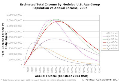
The baby boomers, or rather, those born in the United States in the years from 1946 through 1964, represent the largest single generation to date in the U.S. So, we wondered what impact the members of this generation has had on the U.S. economy as they've fully moved into their peak earning years (45 to 54 years old) in the years from 1995 to 2005 (click for a larger chart).
To find out, we went to our recently created population distributions of income by age group, and generated the total income earned by individuals in each $100 increment for each age group for annual incomes from $0 to $95,000 (in 2004 U.S. dollars). We can then use the total income earned by age group as a key measure in evaluating the impact of the baby boomers, or other generations and age groups, upon the economy.
The math behind this analysis is pretty simple. We took the number of people in each of the $100 increments we considered, which we found by simply subtracting the cumulative number of people at the lower income level from the cumulative number of people at the higher income level. We then multiplied that difference by the midpoint of the income range under consideration.
We arbitrarily selected the $100 increment for the sake of keeping the number of calculations relatively low while still providing really good insight into how the number of people earning a given annual income is distributed across the entire income spectrum for each age group. We'll note that greater accuracy may be achieved by reducing the size of the increment, but that for our purposes, the $100 interval worked really well.
The practical upshot is that all this math allows us to generate the following two charts, which show the respective distributions of the total income earned by individuals at each $100 income increment from $0 to $95,000, all in constant 2004 U.S. dollars. First, here's our chart showing the distribution of total income earned by age group for 1995:

Now, here's the companion chart for the distribution of total income earnd by age group for 2005:

In these charts, we see a really remarkable shift in the income earned from 1995 to 2005 in both the 45-54 age group and the 55-64 age group, which covers the entire baby boom generation to a large extent. The following chart directly compares the total income earned for each age group for both 1995 and 2005:

In this chart, we see that the total income earned by nearly all age groups increased in the period from 1995 to 2005, with the exception of the Age 25-34 group, which saw it's total earned income decrease by 3.1%. (We'll note that we previously showed that the number of income-earning individuals in this group declined by 9.1% from 1995 to 2005. We'll have more on this later....)
Otherwise, the main story is the massive increase in the totals for the amount of income earned for both the Age 45-54 group and the Age 55-64 group, which saw their total incomes earned grow by 35.7% and 58.1% respectively.
We'll ask again - just what do you suppose the impact has been upon the overall distribution of income in the United States after having so many people in the working population of the United States move into their peak earning years?
Coming soon: A quick calculation to see what's happened to the average income per person for each age group over this period, followed by side by side comparisons for each age group (and tools you can use to run your own numbers, we promise!), and then a progressive comparison by age group, since we can, after all, compare the income earned by one age group in 1995 to the 10-year older group in 2005!
Labels: income, income distribution
Welcome to the blogosphere's toolchest! Here, unlike other blogs dedicated to analyzing current events, we create easy-to-use, simple tools to do the math related to them so you can get in on the action too! If you would like to learn more about these tools, or if you would like to contribute ideas to develop for this blog, please e-mail us at:
ironman at politicalcalculations
Thanks in advance!
Closing values for previous trading day.
This site is primarily powered by:
CSS Validation
RSS Site Feed
JavaScript
The tools on this site are built using JavaScript. If you would like to learn more, one of the best free resources on the web is available at W3Schools.com.