What is the lasting economic impact of the men who died while serving their country in war?
In our last installment, we showed that the single greatest factor behind the exponential increase in the number of single person households after the 1930s was the loss of over 416,000 men who died while in military service during the Second World War. The vast majority of these men had been drafted into military service, all between the ages of 18 and 37, where they were inducted after being selected through a lottery process operated by their local draft boards.
That lottery process ensured that approximately equal numbers of healthy American men by year of birth would enter into military service, which explains why the average age of the men who served in the U.S. military during World War 2 was 26. And since over 87% of U.S. military casualties in the war occurred in 1944 and 1945, enough time had elapsed from when President Franklin D. Roosevelt imposed the draft by executive order for the population of American casualties to reflect the age distribution of those who had been drafted.

If these more than 416,000 men had lived, they would have turned Age 65 in the years from 1970 through 1992. Instead, if we assume that the number of American casualties are approximately equally distributed by age, reflecting the age distribution of those who served, beginning in 1970 at least 15,735 fewer men reached Age 65 in each year for the next 22 years than would have been the case otherwise. (87% of the over 416,000 deaths of U.S. servicemen during the war is 361,920, which divided by the 23 years between 1970 and 1992, works out to be 15,735 men per year.)
The Hole They Left Behind in American Society
How can you measure the economic impact of men who died?
The only way that can really be done is to measure the size of the hole they left behind in society. Here, that hole can be measured by the population of women who lost their husbands and boyfriends, who because the number of women outnumbered the number of men after the end of the war, meant that many would have to go on to either live with their families or alone as they aged. Many of the men who had been their contemporaries in age were no longer there.
Since most American women in this era were homemakers, a large majority of these women would be dependent upon their families or upon survivors benefits for widows for their income. Others would find work and earn wages or salaries, but with little education or previous work experience, most would go on earn very low incomes throughout their lives.
But not just low incomes. Their incomes were the lowest of all income earners in the United States:
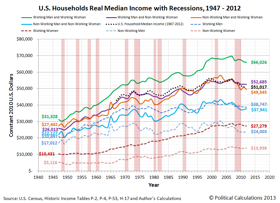
In this chart, we can see the median incomes earned by women who worked (and earned wage or salary income) and those who did not (whose income came from other sources, such as survivors' benefits provided by the U.S. government.) We can also see how they compared to American men and to typical American households consisting of at least one man and woman for the years from 1947 through 2012, all adjusted for the effect of inflation to be in terms of constant 2012 U.S. dollars.
By the time many of these women reached Age 65, they would find themselves living alone in increasing disproportionate numbers, as their parents passed away for those who continued to live with their families or because that's how they had lived for years. The number of households in the United States consisting of just one Age 65 woman living alone would rise dramatically from 1960 through 1992 as a direct consequence of the deaths of so many men during World War 2:

But it is the absence of men surviving to be at least Age 65 from 1970 through 1992 that would have the greatest economic impact on the nation, because the men who were drafted into service represented the majority of casualties for the war. Because they didn't survive and because they didn't live and work to support their families after they came home, that resulted in a very large increase in the number of Age 65+ women living alone beginning in 1970. And since we've already established that such women represent the lowest income earners in the United States, the large increase in this segment of the population caused the amount of income inequality measured among U.S. families and households to begin increasing in these years:

In the chart above, we see that a steady increase in the Gini coefficient, the most common measure of income inequality in the U.S., begins to take place for both households and families in 1970 after bottoming in the late 1960s. Meanwhile, we see that the amount of income inequality among individual American income earners remains essentially flat during that time.
The only way that can happen is if the composition of U.S. households changed so that they consisted of greater numbers of lower income earning households and families. In this case, the change was driven by an increasing number of single person households, and specifically by an increasing number of single person households consisting of women over the Age of 65.
The Women Who Survived the War
How do we know that it was an increase in the number women over Age 65 living alone who drove the rising trend in the amount of income inequality observed among U.S. families and households? After all, that change would also be occurring at the time in which the very large Baby Boom generation, who had been born beginning in 1946, would also be moving out from their parents' homes and setting up their own households in increasing numbers after leaving high school or college.
The difference between these different groups is their income. Almost all baby boomers leaving home or school and establishing their own households would be working and earning wages or salaries, which would put them much higher in the income spectrum for all American income earners, as we showed in our earlier chart showing the median incomes earned by typical one or two-person households.
But the vast majority of women Age 65 or older living alone wouldn't be working - not at that point in their lives. They would instead be drawing upon Social Security benefits for their income. And as it happens, we can demonstrate that the annual amount of income collected by the typical recipients of Social Security benefits is fully consistent with the median income earned by women without wage or salary incomes:
![Real Annual Incomes of U.S. Women Without Wage or Salary Incomes, 1956-2012 [Constant 2012 U.S. Dollars]](https://blogger.googleusercontent.com/img/b/R29vZ2xl/AVvXsEiRjSeMJvP-CbNEmH_MUzic007Su9HJCGWrmxV2wYnugrjTECO_leDeYCJj_lFZEco8bH9bcaJKAMv-7qInS4Kb_mBRgFY88K9Qa3E5oh11TDNePT2XtZseMXLZUXk9s2596DKr1A/s1600/2-real-annual-incomes-us-women-without-wage-or-salary-income-and-average-female-social-security-income-1956-2012.png)
And since Social Security benefits are typically paid to individuals over Age 65, that means that we're looking specifically at the population of women who were the direct contemporaries by age for the men who died in the Second World War.
From there, it is the combination of a large increase in the share of U.S. households consisting of elderly women living alone and their very low incomes that allows us to single out this group as being the primary driver of the rising trend in income inequality among all U.S. households and families. Here, without changing the distribution of income earned by individual Americans, we can account for much of the observed increase in the years after the 1960s. Simply recognizing that the number of Americans at the very lowest end of the income spectrum increased is enough to account for much of that change, given how the math behind the Gini coefficient works.

The men who weren't there also explains why the increase in the income inequality among U.S. families and households shifted to grow at a much slower pace after 1992 (or really, 1993, if you want to include the smaller impact of the 17-year olds who were allowed to enlist to serve in World War 2 in 1945). Men who were 17 or younger in that year were much more likely to survive to reach Age 65, which explains why the percentage share of women Age 65 or older living alone begins to fall and the percentage of men Age 65 living alone increases after 1992, as shown in our third graph above.
Conclusion
Obviously, there's more to the story of why the amount of observed income inequality among U.S. families and households has increased in the years since 1970, as the men who didn't survive World War 2 only accounts for one of the factors behind the changing composition of U.S. households that have driven that change since that time. Higher divorce rates, the increase of out-of-wedlock births and the expansion of the welfare state enabled much of the increase in single income-earner households that combine to explain virtually all of the increase we observe in income inequality among America's families and households since 1970.
But it was the lasting impact of the men who died in World War 2, and the women who survived them to go on to populate the very lowest end of the American income spectrum that explains why it started and also a good portion of why the distribution of income in the United States has evolved as it has.
To us, it's more remarkable that so many economists and politicians insist on focusing on the opposite end of the income spectrum in attempting to blame the highest income-earning Americans for that increase. It's much like the con artist's or magician's trick of misdirection, where they're trying to conceal what really happened in using deceptive means to distract attention away from it, so the uneducated and misinformed buy into such a flawed perception of reality.
That their latest "solution" for that poorly conceived problem has already been shown to be utterly useless as a result is likely lost upon them.
And that observation concludes our ninth anniversary post.
Celebrating Political Calculations' Anniversary
Our anniversary posts typically represent the biggest ideas and celebration of the original work we develop here each year. Here are our landmark posts from previous years:
- A Year's Worth of Tools (2005) - we celebrated our first anniversary by listing all the tools we created in our first year. There were just 48 back then. Today, there are nearly 300....
- The S&P 500 At Your Fingertips (2006) - the most popular tool we've ever created, allowing users to calculate the rate of return for investments in the S&P 500, both with and without the effects of inflation, and with and without the reinvestment of dividends, between any two months since January 1871.
- The Sun, In the Center (2007) - we identify the primary driver of stock prices and describe a whole new way to visualize where they're going (especially in periods of order!)
- Acceleration, Amplification and Shifting Time (2008) - we apply elements of chaos theory to describe and predict how stock prices will change, even in periods of disorder.
- The Trigger Point for Taxes (2009) - we work out both when, and by how much, U.S. politicians are likely to change the top U.S. income tax rate. Sadly, events in recent years have proven us right.
- The Zero Deficit Line (2010) - a whole new way to find out how much federal government spending Americans can really afford and how much Americans cannot really afford!
- Can Increasing the Minimum Wage Boost GDP? (2011) - using data for teens and young adults spanning 1994 and 2010, not only do we demonstrate that increasing the minimum wage fails to increase GDP, we demonstrate that it reduces employment and increases income inequality as well!
- The Discovery of the Unseen (2012) - we go where so-called experts on income inequality fear to tread and reveal that U.S. household income inequality has increased over time mostly because more Americans live alone!
We celebrated our 2013 anniversary in three parts, since we were telling a story too big to be told in a single blog post! Here they are:
- The Major Trends in U.S. Income Inequality Since 1947 (2013, Part 1) - we revisit the U.S. Census Bureau's income inequality data for American individuals, families and households to see what it really tells us.
- The Widows Peak (2013, Part 2) - we identify when the dramatic increase in the number of Americans living alone really occurred and identify which Americans found themselves in that situation.
- The Men Who Weren't There (2013, Part 3) - our final anniversary post installment explores the lasting impact of the men who died in the service of their country in World War 2 and the hole in society that they left behind, which was felt decades later as the dramatic increase in income inequality for U.S. families and households.
Image Credits: Michael Wu.
Labels: data visualization, demographics, income distribution, income inequality
Welcome to the blogosphere's toolchest! Here, unlike other blogs dedicated to analyzing current events, we create easy-to-use, simple tools to do the math related to them so you can get in on the action too! If you would like to learn more about these tools, or if you would like to contribute ideas to develop for this blog, please e-mail us at:
ironman at politicalcalculations
Thanks in advance!
Closing values for previous trading day.
This site is primarily powered by:
CSS Validation

RSS Site Feed
JavaScript
The tools on this site are built using JavaScript. If you would like to learn more, one of the best free resources on the web is available at W3Schools.com.
Other Cool Resources
Blog Roll


