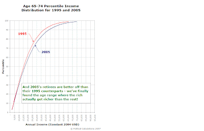
Pretty close to the only way we haven't already looked at how the inflation-adjusted distribution of income by age group changed from 1995 to 2005 is to map out the distributions as percentiles of the number of income earners against their annual incomes.
By looking at how income shifted by age group over time by percentiles, we can adjust (somewhat) for the differences in the number of income earning individuals in each year by instead looking at what percentage of a given year's workforce earned a given annual income or less.
So that's what we did. Since our inflation-adjusted annual income range of $0 to $95,000 covers the bulk of individual income earners in the U.S. (see our back of the envelope calculation we used to confirm this below), we determined the percentiles for each age group in 1995 and 2005.
All that remains is to present the data, which we've opted to show using something like a comic book format! The panels on the left directly compares the same age group for both 1995 and 2005, while the panels on the right shows the changes that occurred when the 1995 age group became the 10-year older group in 2005!


Since the next age group up is the Age 75+ category, which is outside our age ranges of interest (as nearly all people within this category are solidly retired!), we've opted to not show the transition from 1995's Age 65-74 group to 2005's Age 75+ group in the final chart above.
Now tell us, do you get anywhere near this kind of analysis anywhere else?...
Back of the envelope calculation: For Age 25+ in 2005, a $100,000 income in 2005 US dollars represents the 95th percentile [1][2] for individual income earners. After converting to 2004 US dollars to match our previous analysis, this 95th percentile income becomes $97,656, just a bit above our $95,000 figure, which means that we've captured the bulk of income-earning individuals in our ongoing analysis!
This assumes that this figure did not change substantially from 2004. We'll also note that we're examining the age ranges from 15 through 74, which is different from the Age 25+ group for whom the 95th percentile for personal income was obtained.
Previously on Political Calculations
- Comparing the U.S. Distribution of Income by Age Group and Year
- Distributing Income by Age Grop in the US: Ten Years Older
- Estimating the U.S. Distribution of Income by Age
- The Shifting Demographics of Age and Income
- Income/Age Demographic Snapshots of 1995 and 2005
- Raking It In: The Baby Boomers from 1995 to 2005
- The Distribution of Income Earners by Age Group for 1995 and 2005
- Changing Apples into Oranges
- 1995 U.S. Individual Income by Age Group Data
- The Distribution of Income by Age in 1995
- Income Distribution Percentages by Age in the U.S. (2005)
- Peak Earning Years for U.S. Individuals (2005)
- The Distribution of Income by Age in the U.S. (2005)
- Generations
Labels: demographics, income, income distribution, income inequality
Welcome to the blogosphere's toolchest! Here, unlike other blogs dedicated to analyzing current events, we create easy-to-use, simple tools to do the math related to them so you can get in on the action too! If you would like to learn more about these tools, or if you would like to contribute ideas to develop for this blog, please e-mail us at:
ironman at politicalcalculations
Thanks in advance!
Closing values for previous trading day.
This site is primarily powered by:
CSS Validation
RSS Site Feed
JavaScript
The tools on this site are built using JavaScript. If you would like to learn more, one of the best free resources on the web is available at W3Schools.com.