We're going to do our best to tell the story of what happened for the distribution of income by age group between 1995 and 2005 in pictures, simply by comparing the number of people of a given age at given income levels for both years, after adjusting for inflation. Beginning with the Age 15-24 group:

Now, the Age 25-34 group:

The Age 35-44 group:

Next, the Age 45-54 group:

The Age 55-64 group:

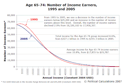
And finally, the Age 65-74 group:

Common Threads
A surprising amount of upward income shifting has occurred at the lower end of the income spectrum in the time between 1995 and 2005. We see this change clearly in the rightward shift of the "peak" number of individuals at a given annual income. We also see this more generally in the 2005 distributions being to the right (greater income) of the 1995 distribution for equivalent numbers of individuals.
For the Age 25-34 and Age 35-44 age groups, there have been substantial decreases in the number of individuals earning low incomes, even though the number of individuals at higher incomes has remained relatively stable for these groups.
For all age groups, we really don't see a significant increase in the number of top income earning individuals, with the exception of the Age 45-54 and Age 55-64 ranges, likely due to the influx of the "Baby Boomers" into these age groups.
For all age groups, the trend from 1995 to 2005 is to have fewer individuals at the lowest end of the income spectrum and substantially more at the mid-to-high end.
Preliminary Conclusions
The net result of these changes suggests that the increase in income inequality in the United States from 1995 to 2005 is primarily driven by reductions in the numbers of low income-earning individuals combined with an upward shift in the number of individuals earning middle-to-high end incomes, as we've demonstrated above in the charts for the Age 15-24, Age 25-34, Age 35-44 and Age 65-74 age groups.
Meanwhile, the impact of the baby boom generation is being felt as the leading edge of this generation entered the Age 55-64 group and continued to grow in the Age 45-54 group. In both these age groups, significant increases in the number of individuals at nearly every income level occurred, most remarkably in the Age 55-64 group, which saw proportionately more high income-earning individuals join its ranks.
Labels: demographics, income, income distribution, income inequality
Welcome to the blogosphere's toolchest! Here, unlike other blogs dedicated to analyzing current events, we create easy-to-use, simple tools to do the math related to them so you can get in on the action too! If you would like to learn more about these tools, or if you would like to contribute ideas to develop for this blog, please e-mail us at:
ironman at politicalcalculations
Thanks in advance!
Closing values for previous trading day.
This site is primarily powered by:
CSS Validation
RSS Site Feed
JavaScript
The tools on this site are built using JavaScript. If you would like to learn more, one of the best free resources on the web is available at W3Schools.com.