One of the great pleasures we've enjoyed over the years was the Discovery Channel's Pitchmen, which featured TV's legendary salesmen Billy Mays and Anthony Sullivan as they searched for newly invented products that they could feature in the kind of 30-minute infomercials that often populate very late-night television programming.
While many of the kind of products that are often presented in that kind of advertising tend to be somewhat offbeat or don't have great reputations for quality, Sullivan and Mays' Pitchmen was fascinating to watch from both the perspective of the stories of the inventors and inventions they were evaluating and also from their make-or-break business assessment of what makes for a successful product, where even the best laid plans for a seemingly compelling product was no guarantee of success. In a lot of ways, Pitchmen was Shark Tank before Shark Tank, but better because it never got mired down in that big broadcast network show's Queen for a Day-type pleading.
We were recently taken back to those days because of a story at Core77 featuring an inventive design solution to the problem of how to protect what's yours inside a refrigerator, which linked to the following vintage two minute-long ad from 2010 (the best part is when the bear makes its appearance!)
You can actually still buy the original Fridge Locker through Amazon, or at brick and mortar retailers like Bed Bath & Beyond, the Container Store, and Wal-Mart.
The best way you can tell if a product is successful is if it's still being sold, years after it was first pitched to the public!
Labels: technology
Is Philadelphia's new soda tax really meeting its backers political expectations?
BillyPenn ran the following headline, which suggests that things might be looking pretty rosy for the city's coffers:
Philly soda tax revenue way up in March
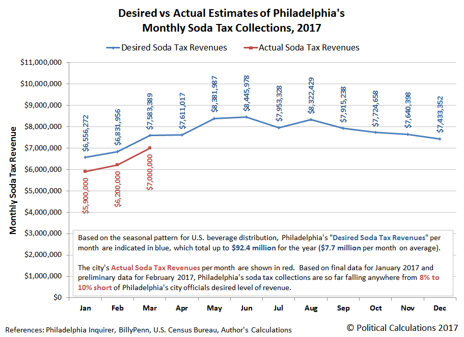
And so they would seem to be! Here are the figures for the revenues collected by the City of Philadelphia from its controversial soda tax from the article, which update previously reported numbers for January and February 2017, and provide a preliminary value for March 2017:
Sugary beverage tax collections increased in Philadelphia this month by nearly a million dollars compared to the previous month, the city's Department of Revenue announced today.
So far, the city has received $7 million in collections for the month of March for the three-month-old sugar-sweetened beverage tax. Those taxes were due April 20. That's well over the $5.9 million revenue collected in February following the first month of the soda tax and also an increase over the $6.2 million collected in March following the second month.
That's three months worth of data, so let's summarize how much of Philadelphia's soda tax was collected for the months of January, February and March 2017, as well as describe how the earlier data was revised:
- January 2017: $5.9 million (previously revised up from $5.7 million)
- February 2017: $6.2 million (revised down from $6.3 million)
- March 2017: $7.0 million (preliminary data)
Those figures seem like an improving trend, however as we're about to demonstrate, they also reveal that Philadelphia's soda tax collections are consistently falling between 8-to-10% short of the figures that the city's politicians were anticipating they would be collecting.
That assessment is based on our estimates of the soda taxes that would need to be collected each month based upon the seasonal pattern for U.S. soft drink consumption to add up to the $92.4 million that Philadelphia's mayor and city council were counting upon to pay for new pre-Kindergarten schooling, "monumental" public park improvements, and to fund generous raises for the city's unionized employees among other general expenses. The following chart updates the previous edition to take the city's newly reported and revised sweetened beverage tax revenue data into account.
If the current pattern for the soda tax collections continues through the whole year, the city of Philadelphia will find itself somewhere between $7.4 million and $9.2 million short of the total funds that its politicians are depending upon to fund their goals for new spending, which would put the city's total soda tax collections for the year somewhere between $83 million and $85 million.
For their part, Philadelphia city officials are holding out hope that they will succeed in collecting every dime they thought they would in 2017:
City officials wrote in a news release that Department of Revenue officials "remain confident" the tax will reach its fiscal year 2017 goal of bringing in $46 million (which covers six months of beverage distribution). The city expects to make more than $90 million over a full year of the beverage tax.
To hit their stated mid-year target of $46 million worth of soda tax collections, Philadelphia's city government will need to collect an average of nearly $9 million per month from April through June 2017.
But if the current pattern for the city's sweetened beverage tax revenues holds and the city's soda tax revenues fall short, it will be interesting to see which political constituency within the city will get stiffed because the city's leaders didn't get all the money they were counting upon.
Previously on Political Calculations
Economics writer Robert Samuelson is worried. Specifically, he's worried about why stock prices have risen so much in response to Donald Trump's election as U.S. President on 8 November 2016.
In worrying, he not only conveys the conventional wisdom that seeks to explain the "Trump Rally" as some sort of outpouring of animal spirits linked to the promised policy changes that Donald Trump advocated on the 2016 campaign trail, but also zeroes in on the historically elevated price-to-earnings (P/E) ratio of today's stock market.
The theory of the Trump Rally is simple: He has brightened the economic outlook. Big business and personal tax cuts, combined with relief from over-regulation and higher infrastructure spending (roads, ports), will boost economic growth. Faster growth will raise profits — and higher profits tomorrow justify higher stock prices today. In theory, stocks represent the present value of (estimated) future profits.
But there's the rub. What if those profits don't materialize?
Immediately after the election, it was possible (though naive) to think that Trump could quickly convince the Republican Congress to pass his economic agenda. Now, that optimism seems unrealistic. The difficulty of repealing the Affordable Care Act showed the limits of the White House's power. Similarly, big tax cuts may be doomed by budget deficits. Progress on infrastructure and regulation is also grudging.
So: If the main reason for the Trump Rally is missing, what's holding stock prices up? Good question.
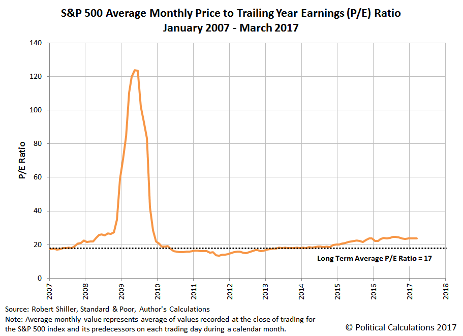
Let's be clear: Stock prices are historically high by many traditional measures. Consider the price-earnings ratio, or P/E. It shows the relation between stock prices and underlying earnings (profits). Since 1936, the P/E ratio of the Standard & Poor's 500 stocks has averaged 17 based on the latest profits and stock prices, says Howard Silverblatt of S&P Dow Jones Indices. Now, the P/E is almost 24.
Leaving aside the modern day paganism of the animal spirits aspects of Samuelson's worries, we can confirm that Samuelson is making a very common and very basic mistake in advancing his narrative, one that many market observers make. That mistake lies in focusing on the ratio of stock prices with respect to their future profits, or rather their earnings per share, in assessing the relative valuation of stock prices, because earnings have very little to do with stock prices. Stock prices are really much more driven by the expectations for their dividends per share.
That's an important distinction because publicly traded firms often set their dividends independently of their earnings. Where earnings can fluctuate considerably from quarter to quarter for many firms, the consistency of dividends lets the stock prices of these firms be comparatively less volatile.
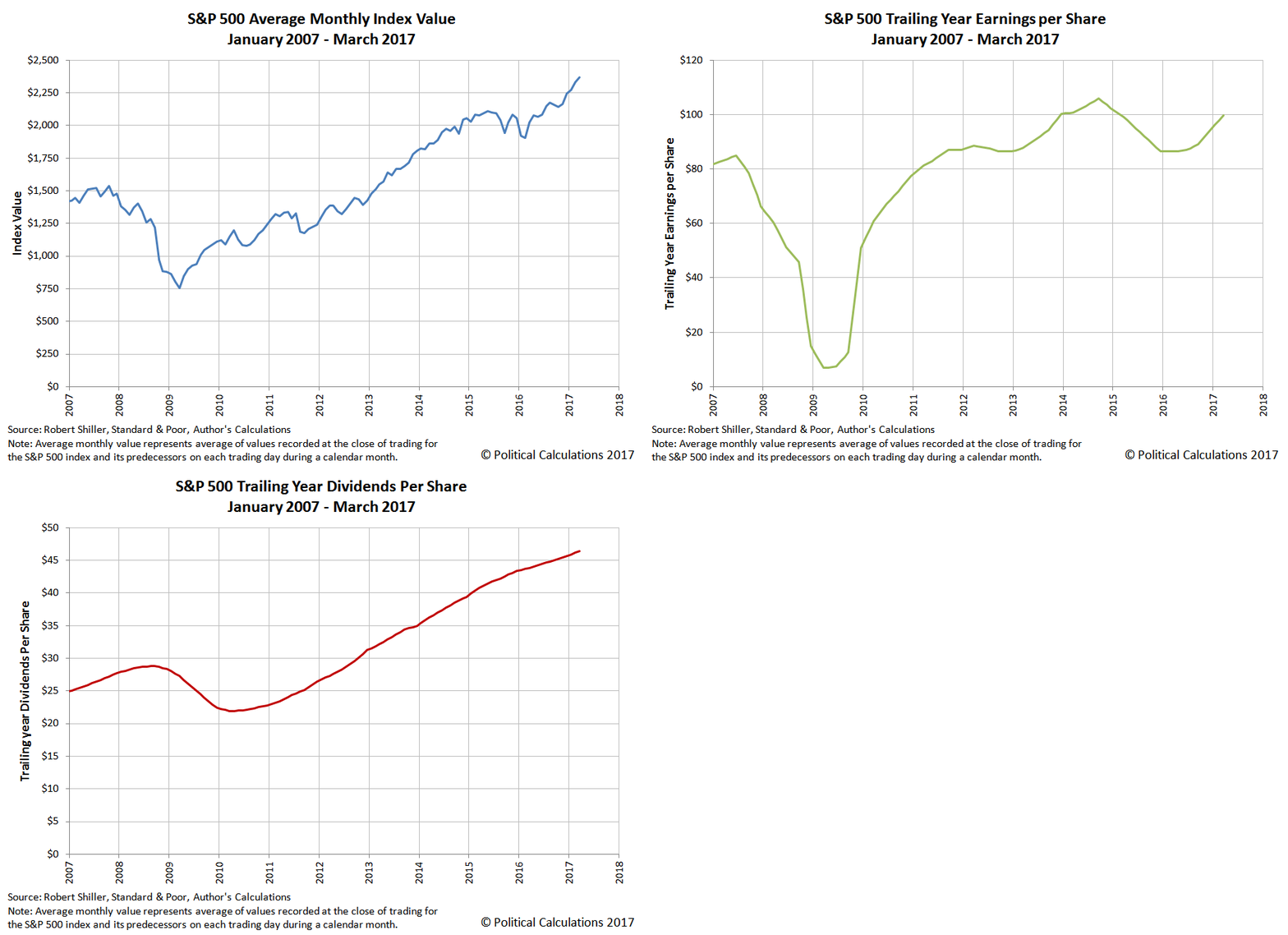
The following animated chart illustrates that point by flipping through the data we have for the average monthly price (blue), trailing year earnings (green) and trailing year dividends (red) per share for the S&P 500 from January 2007 through March 2017. If you're accessing this article on a site that republishes our RSS news feed, you may want to click through to our site to see the animation.
In this chart, you can see that the changes in stock prices for the S&P 500 has been much more proportional in magnitude to the changes in the index' trailing year dividends per share than they have been with the index' trailing year earnings per share.
You can also see that difference is really exaggerated during the period of the Great Stock Market Crash of 2008-2009, when earnings nose-dived, but dividends were considerably more stable. Stock prices behaved much more like dividends than they did like earnings.
The chart also shows that same dynamic on a much smaller, but more currently relevant, scale for the period from July 2014 through February 2016. This period coincides with the timing of when global oil prices collapsed from the record highs they were recording in the previous three years, where many firms in the U.S. energy sector saw their precious earnings drop like rocks right along with their revenues thanks to the collapse of oil prices during that time.
In response to that deteriorating business outlook, many of these firms sought to maintain their dividends at the levels they were before their revenues and earnings fell, betting that they would be able to rein in their costs and continue being able to sustain their dividends unchanged. For these firms, that bet has paid off to this date as their stock prices proved to be far more stable than their revenues and earnings would suggest. The disproportionately larger decline of their earnings per share shrank the value of the denominator in the P/E ratio math, accounting for why their P/E ratios have escalated to be so high.
Since February 2016, oil prices have rebounded and somewhat stabilized, but not by so much to allow both revenues and earnings recover to their pre-oil price collapse levels, so we still have elevated P/E ratios within that sector of the market. That outcome then affects the S&P 500's P/E ratio because the energy sector makes up a significant percentage share of the market index, and a disproportionately larger share of its earnings.
That's the mathematical reason for why today's stock market index can appear to be so apparently elevated when measured by P/E ratios and is why they otherwise inexplicably would seem to be capable of to levitate in the absence of greater earnings.
Samuelson also worries about the lack of growth of those earnings with respect to stock prices as a potential trigger for falling stock prices.
Stock prices have outrun profits' growth. According to Silverblatt, either added profits will materialize or, if they don't, stocks will decline. "The P/E is high," he says. "We are paying [in today's stock prices] for future and expected earnings. At some point, we need to see them."
As we've demonstrated, that's not necessarily true. So long as firms have sufficient earnings and free cash flow to sustain their established levels of dividends, there's every reason to think that they will also sustain their stock prices, even with very high P/E ratios, for prolonged periods of time. It would only be if their business outlooks deteriorated with the dual whammy of declining earnings and free cash flow that they would finally be compelled to announce the dividend cuts that would ensure declines in their stock prices.
Speaking of which, 2016 isn't the only time in U.S. stock market history when firms with falling revenues and earnings bet that they could outlast the business conditions that led to their financial distress. Very similar bets were placed by a lot of economically distressed companies back in 2006 and 2007. A lot of those companies proceeded to lose their bets after their business outlooks soured to the point where they could no longer put off cutting their dividends, which is what really sent stock prices crashing throughout 2008 and into 2009.
On a final note, if you want to play with the math that describes how all that works, here it is!
Labels: dividends, earnings, investing, SP 500, stock market
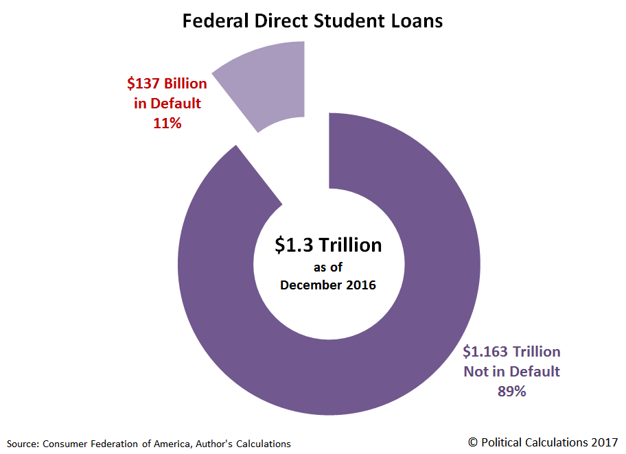
The Consumer Federation of America recently put out a press release that reports that they've found that 1.1 million student loan borrowers in the United States have gone 270 or more days without making payments on their Federal Direct Student Loans, with more than $137 billion worth of the loans issued by the U.S. government now qualifying as being in default by that standard.
Update 27 April 2017: The figure of 1.1 million defaults only applies to the number of student loans that went into default during 2016. Altogether, through December 2016, there were a total of 4.2 million student loans in default, the combined balance of which adds up to $137 billion. We're afraid that the CFA missed noting that total figure in their press release, and we've updated our charts and analysis accordingly to reflect the corrected total of for the number of Federal Direct Student Loans in default.
Data from the CFA's press release has made the rounds among multiple news outlets, but we have a pretty basic question: Are those big numbers?
They certainly seem like big numbers, what with all the millions and billions being thrown about, but how do these numbers fit into the bigger U.S. government-issued student loan story?
We decided to dig down into the press release's details to find out. Let's start with the biggest numbers, where we discover that $137 billion worth of Federal Direct Student Loans are in default, against the larger total of $1.3 trillion worth of Federal Direct Student Loans that have been issued through the end of December 2016.
Here, we calculate that the percentage of student loans that have gone 270 or more days without having had a payment made upon them represents about 11% of the total amount borrowed. That means that some 4.2 million people whose student loans require that they make some sort of scheduled payment went more than 9 months without making any.
To tell if that's a big number or not requires that we put that number into some kind of context. Here, we'll draw on the U.S. Federal Reserve's data for the delinquency rates on loans and leases issued by all commercial banks in the U.S., where for the fourth quarter of 2016, we find that the total delinquency rate is 2.04%. That value had previously peaked at 7.4% back in the first quarter of 2010, following the bottoming of the Great Recession.
But another important thing to consider is that delinquency rate would include all private-sector issued loans and leases that have payments that are past due, including those that have gone without payment for much less than 270 days. That figure tells us that the default rate of 11% for Federal Direct Student Loans is, to put it in Trumpian terms, "Yuge!"
Going by the standard of simple delinquency, the WSJ reported back in April 2016 that 40% of student loan borrowers were delinquent on their scheduled student loan payments, meaning that they were at least 15 to 31 days behind.
The next question that we'll tackle is whether the 4.2 million student loan borrowers who have defaulted on making payments on their Federal Direct Student Loans is a lot. The following chart shows how they fit into the total number of 42.4 million Americans who have taken out Federal Direct Student Loans.
Click here to see the previous version of this chart, which only broke out the 2016 defaulters.
Here, we discover that the 4.2 million Americans that have defaulted on their Federal Direct Student Loans is about 10% of the total number of Americans who have borrowed money from the U.S. government to pay for a university or college education in the United States, and that the 1.1 million defaults in 2016 represent 3% of the total.
What we find here is that a relatively small portion of the total population of federal student loan borrowers is responsible for the very high default rate for the Federal Direct Student Loan program. 38.2 million, or 90% of student loan borrowers, have not gone 270 days or longer without making their scheduled student loan payments to Uncle Sam's hired student loan servicers.
The combination of low number of defaulters and relatively large amount of defaulted student loans tells us that these individuals have truly racked up what might be considered to be gargantuan hefty student loan debt. Let's next find out how much debt that is.
Click here to see the previous version of this chart, which divided the full $137 billion of defaulted student loans among 2016's defaulters.
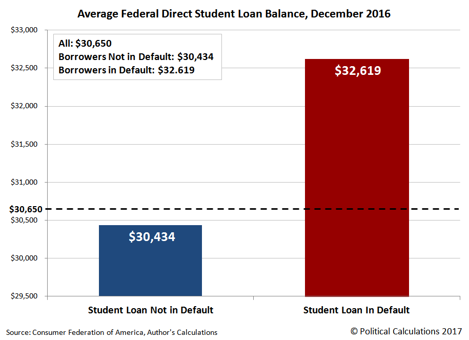
The average student loan balance in the U.S. is $30,650. For Americans who haven't defaulted on their student loans, that average figure drops to $30,434. But for Americans who have defaulted on their payments to their U.S. government creditor, the average balance on their Federal Direct Student Loan is $32,714.
To put that latter number into context, consumer personal finance site Nerdwallet reports that the average amounts of debt for the U.S. households that report having the indicated kind of debt for 2016:
- Credit cards: $16,748
- Mortgages: $176,222
- Auto loans: $28,948
- Student loans: $49,905
- Any type of debt: $134,643
The average amount of a Federal Direct Student Loan in default for a single American is nearly double the amount of credit card debt for the combined accounts of Americans living in a single household. It also exceeds the average amount of the combined auto loans held by American households.
But maybe the most scary aspect of the average balance of a defaulted Federal Direct Student Loan is that only $2,280 separates that loan gone bad from the average balance of a student loan that is not in default.
Because the U.S. Department of Education, which administers the Federal Direct Student Loan program, borrows money through the U.S. Treasury to issue these student loans, it must charge all borrowers a higher rate of interest to make up the $137 billion gap in its direct student loan program that is caused by a small minority of borrowers, or else U.S. tax revenue must either be diverted or additional money borrowed to make up the difference in paying back the U.S. government's creditors.
The U.S. student loan implosion therefore has a very real cost to both U.S. taxpayers and to Americans seeking to borrow money from the U.S. government to pay for their higher education.
Labels: data visualization, education, personal finance
There's an old saying among coders, the polite phrasing of which goes as follows: "To err is human; To really foul things up requires a computer."
We definitely had a mischievous daemon do a number on us last week, where we managed to repeatedly refer to Week 2 of April 2017 as being Week 3 of April 2017, with all references to the week being consistent with a week further ahead in time than the week we were describing (now since fixed)!
So if your last contact with us was that post, and you've now come across this one, that's why it seems like we're talking about the third week of April 2017 again, when in reality, we really are reviewing Week 3 of April 2017 this time. Really!
So let's start with the most significant observation we can offer about what happened to the forward-looking outlook of S&P 500 investors during the third week of April 2017, where we think that the news of the week combined with the onset of earnings season to shift investors more strongly toward focusing on the current quarter of 2017-Q2 as being the most likely period in which the Fed will next hike short term interest rates in the U.S. by what appears to be a 2-to-1 margin.
That's a significant shift compared to what we've seen over the last several weeks, where that probability has ranged near the 50-50 mark, keeping within a narrow margin of an even split.
As for why that's our thinking, here are the headlines we flagged during the week to provide the context in which stock prices reacted. You'll notice that we're starting to pick up news headlines related to the potential shutdown of portions of the federal government as early as Week 4 of April 2017, mainly because it's another element of noise to add on top of the noise from other geopolitical concerns. Outside of noise, history indicates that particular event would be pretty much of a nonfactor where the stock market is concerned, where even a prolonged event would have little to no economic impact as well.
- Monday, 17 April 2017
- Tuesday, 18 April 2017
- Wednesday, 19 April 2017
- Thursday, 20 April 2017
- Friday, 21 April 2017
This was a day that began and ended in France as a greater geopolitical concern....
- Oil off on supply fears; stocks slip before French election
- Trump sets U.S. tax reform announcement, orders tax rule review
- Investors not yet ruffled by looming government shutdown
- Trump administration begins shutdown preparations
- Fed vice chair still sees two more rate hikes this year: CNBC
- U.S. existing home sales surge 4.4 percent in March
- Wall Street dips before French election, but up for week
That's it for the overall context of the market's forward-looking concerns this week, where we've definitely erred on the side of documenting the week's high noise to signal ratio. Be sure to follow this link for Barry Ritholtz's succinct summation of the week's pluses and minuses for the U.S. economy and markets for that additional context and a touch more signal.
We're playing with a new online data visualization tool (for us): Datawrapper, where we've taken data from a press release issued by the American Society of Plastic Surgeons indicating the average cost and number of cosmetic procedures performed in the U.S. during 2016 and visualized it. The results are below....
If you're accessing this article on a site that republishes our RSS news feed, please click here to see the chart (we won't know until after this post has gone live which, if any, republishing sites will have any issues displaying it - it's all part of the test drive process!)
Now, for good measure, here's a map we generated that indicates each U.S. state's most searched cosmetic procedure according to the Plastic Surgery Portal.
Same rules apply as before!
Labels: data visualization
The U.S. stock market has, for the most part, behaved in a very orderly fashion since the first quarter of 2016 ended just over a year ago.
But since 1 March 2017, when the S&P 500 reached its all-time record peak closing value of 2,395.96, the S&P 500 has dropped diagonally by three standard deviations from that peak value with respect to its fundamental trendline, as determined from the relationship between its value and the S&P 500's trailing year dividends per share.
To be fair, some would call that reverting to the mean, but since the S&P 500 peaked on 1 March 2017, the news that influences investors expectations for the future has been characterized by two main themes:
- The often stated desires of Federal Reserve officials to tighten its monetary policies in the United States.
- A series of geopolitical noise events involving, but not limited to Syria, North Korea, Afghanistan, and the United Kingdom.
With all these things going on, a good question to ask might be how much more would it take for the S&P 500's nearly 13-month old period of order to finally break down?
As you can see in the chart, the answer is something of a moving target, but if it were to happen today (20 April 2017), it would take a decline of 56 points, or 2.4%, from its 19 April 2017 closing value of 2,338.17.
That also assumes that order in stock prices can be described by something that looks like a normal distribution with respect to the mean trend line of the relationship between stock prices and their underlying trailing year dividends per share, which is not strictly true, but does make for occasionally useful observations.
Labels: data visualization, SP 500
One of the crazier things about the U.S. national debt is that it often takes a lot of months after the end of a given fiscal year for the U.S. Treasury to sort out who the U.S. federal government owes money, particularly when when that money is owed to foreign entities.
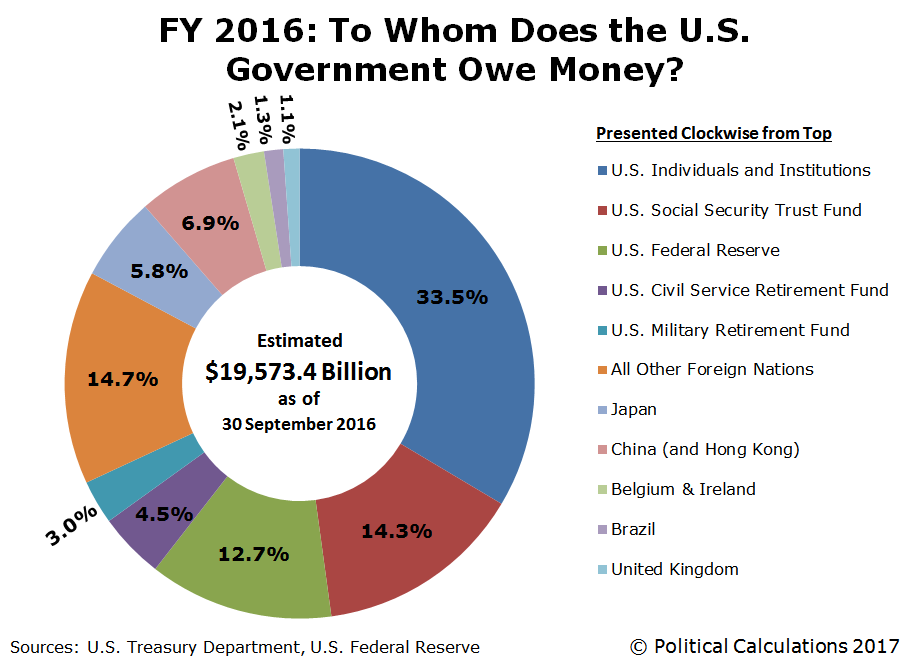
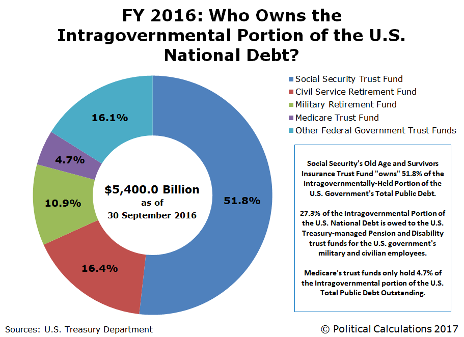
So here we are, just over halfway through the federal government's 2017 fiscal year, before we have a good idea of how much U.S. government-issued debt was held by its major foreign creditors at the end of the U.S. government's 2016 fiscal year, which ended on 30 September 2016! The following chart reveals who the biggest holders of the U.S. national debt were as of that time:
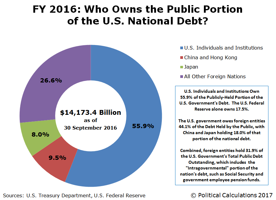
Officially, the U.S. government's total public debt outstanding is divided up into two parts: the "Public" portion of the national debt....
And the so-called "Intragovernmental" portion of the national debt, where the latter category represents money owed to various trust funds established and operated by the U.S. government.
Right now, we can see that Social Security's Old Age and Survivors' Insurance Trust Fund accounts for a little over half of the Intragovernmental portion of the U.S. national debt, which works out to be nearly $2.8 trillion, or about one-seventh of the U.S. government's total public debt outstanding.
If Social Security's Trustees are right, that number will steadily shrink to zero over the next 17 years, as that debt is cashed in to pay retirement benefits to Social Security recipients. When that number does reach zero, Social Security's Trustees have indicated that the program will be forced to revert to the program's original Pay-As-You-Go basis, where benefits can only be paid out of the payroll taxes that fund Social Security. When that happens, they predict that all Social Security benefits will need to be cut by 21%, unless Social Security's payroll taxes are increased from 12.4% of earned income (which is currently equally split between employers and employees) up to 15.78% of earned income.
Data Sources
U.S. Treasury. The Debt To the Penny and Who Holds It. [Online Application]. 30 September 2016.
Federal Reserve Statistical Release. H.4.1. Factors Affecting Reserve Balances. Release Date: 6 October 2016. [Online Document].
U.S. Treasury. Major Foreign Holders of Treasury Securities. Accessed 13 April 2017.
U.S. Treasury. Monthly Treasury Statement of Receipts and Outlays of the United States Government for Fiscal Year 2016 Through September 30, 2016. [PDF Document].
Social Security Board of Trustees. The 2016 Annual Report of the Board of Trustees of the Federal Old-Age and Survivors Insurance and Federal Disability Insurance Trust Funds. [PDF Document]. 22 June 2016.
Labels: data visualization, national debt
 April 18th is U.S. Income Tax Day in 2017, and what better way to mark the day that all Americans' income taxes are due than by providing another form for you to fill out!
Why would you want to do this? Because if you don't, you'll never know just how much you would have been taxed when the original Form 1040 was first issued by the IRS back in 1913....
Our tool below is based upon the first page of the original Form 1040, which originally consisted of just four pages: the summary sheet modeled below (Page 1), the Gross Income calculation sheet (Page 2), the General Deductions sheet (Page 3) and finally, one page of Instructions (Page 4). Yes, you read that right. Just one page of instructions!
We'll make it just a bit easier still. All you need to do is to enter the indicated data (shown in boldface type) below with your figures from this year, and we'll take care of the math:
Excerpts from the Instructions
3. The normal tax of 1 per cent shall be assessed on the total net income less the specific exemption of $3,000 or $4,000 as the case may be. (For the year 1913, the specific exemption allowable is $2,500, or $3,333.33, as the case may be.) If, however, the normal tax has been deducted and withheld on any part of the income at the source, or if any part of the income is received as dividends upon the stock or from the net earnings of any corporation, etc., which is taxable upon its net income, such income shall be deducted from the individual's total net income for the purpose of calculating the amount of income on which the individual is liable for the normal tax of 1 per cent by virtue of this return.
19. An unmarried individual or a married individual not living with wife or husband shall be allowed an exemption of $3,000. When husband and wife live together they shall be allowed jointly a total exemption of only $4,000 on their aggregate income. They may make a joint return, both subscribing thereto, or if they have separate incomes, they may make separate returns; but in no case shall they jointly claim more than $4,000 exemption on their aggregate income.
Well, wasn't that a fun exercise! Are you ready for the "improved" modern version of the same thing now?
Or if you're up for a real challenge, you could try your hand at designing an even simpler tax code for Americans this year and beat President Trump while you're at it!
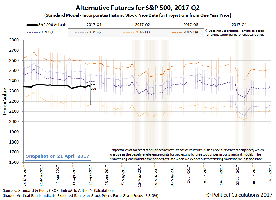
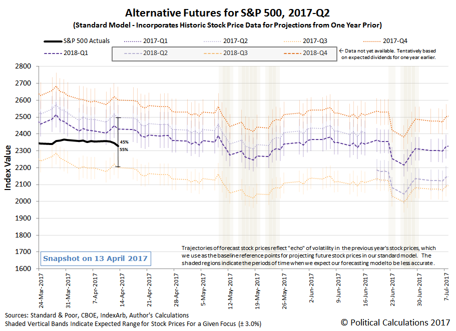
The second week of April 2017 had bigger negatives than positives for the U.S. economy and markets, with stock prices behaving accordingly during the week. In this case, we think that those negatives led investors to bet that the Fed would delay the timing of its next expected rate hikes into the third quarter of 2017, which pulled the S&P 500 closer toward where our dividend futures-based model projects that stock prices would be if investors were fully focused on that period of time in the future.
In the chart above, we observe that investors are still splitting their forward-looking focus between the current quarter of 2017-Q2 and 2017-Q3, where the weighting between these two quarters is now tilted slightly more heavily toward 2017-Q3.
The big reasons for that change are evident from the news for the week. First, from the perspective of economic fundamentals, banking stocks declined because of an apparent deceleration in the rate of growth for their lending operations.
The second reason has more to do with the effect of noise, in this case, arising from geopolitical concerns. Here, our thinking is the increase of tensions between the U.S. and Syria, increasing tensions with North Korea, and also the deployment of the U.S.' largest aerial-delivered ordnance in Afghanistan during the week is contributing to the future outlook of investors in that they are betting that the U.S. Federal Reserve will be more likely to pursue a policy of greater stability with respect to U.S. interest rates, which would be realized by the Fed keeping interest rates steady for a longer period of time.
Combined, these two events, one fundamentally-driven and one noise-driven, led investors to collectively refocus their attention away from 2017-Q2 and toward 2017-Q3 instead.
The interesting thing about this dynamic is that our model indicates that stock prices have considerably more room to move toward either quarter than was the case for the investing outlook during 2016-Q4 and 2017-Q1, when investors could shift their forward-looking attention between the future quarters of 2017-Q1 or 2017-Q2 without any noticeable impact on stock prices. We estimate that there's currently a potential 300 point spread between the alternative trajectories for the two quarters, where as of 13 April 2017, stock prices could fall by more than 130 points if investors were to fully focus on 2017-Q3.
But whether it might will depend upon what new information investors learn during the weeks ahead. As for what news influenced investors in Week 2 of April 2017, just scroll down for our summary of what we identified as the week's more significant headlines.
- Monday, 10 April 2017
- Tuesday, 11 April 2017
- Wednesday, 12 April 2017
- Fed's Kaplan says balance sheet plans won't shift rate hike path
- Oil pulls back as traders eye Cushing build, U.S. supply
- U.S. housing demand seen holding up despite rising rates
- Trump backs away from labelling China a currency manipulator
- North Korea warns of nuclear strike if provoked; Trump 'armada' steams on
- China's Xi urges peaceful resolution of North Korea tension in call with Trump
- Chinese state tabloid warns North Korea against nuclear test
- Wall St down as geopolitical risks trigger rush to safety
- Thursday, 13 April 2017
Barry Ritholtz summarized the holiday-shortened week's positives and negatives for the U.S. economy and markets.
Self driving cars are getting a lot of attention these days, but are they really solving the kind of problems that drivers care most about?
Consider the following commercial that proposes the kind of solution hat many drivers would love to have today, but where we're happy to report that the technology behind today's autonomous vehicles fortunately isn't anywhere close to providing. The first features a science fiction solution to the problem of how to deal with that slower moving vehicle in front of you.
Being able to take control of the slower-moving vehicle in front of you seems like a cool thing, right? But since the car being moved over to the slow lane is clearly the one with the self-driving capability, if that's your car, how would you feel about having control of your vehicle taken from you without your permission and manipulated by other drivers on the highway? Or for that matter, by teenage hackers hanging out in their basement lair?
Or how about by cyberintelligence agents employed by a national government or a terrorist organization? That's something that has been alleged to have already happened.
In 2010, Professor Tadayoshi Kohno of the University of Washington and Professor Stefan Savage of the University of California, San Diego published a paper entitled “Experimental Security Analysis of a Modern Automobile” which outlined the possibility that cars could be hacked. They pointed out that, once hacked, cars could be remotely controlled to produce sudden braking, brake failure or sudden acceleration. Later, at the Def Con conference in August, 2013, well-known hacker and security engineer for Twitter, Charlie Miller, demonstrated how a car’s steering could also be remotely controlled and that it wouldn’t take that much know-how. That led to some to conclude that there may have been a connection between car hacking and the death of journalist Michael Hastings two months earlier.
Michael Hastings was an award winning, though controversial, journalist. It was he who exposed the negative attitudes of the military, and especially General Stanley McChrystal, towards government officials. Hastings became more interested in government surveillance and his last story was called, “Why Democrats Love to Spy On Americans”. Just before his death, he told friends he thought he was being investigated by the FBI and worried that his car was being tampered with. At the time, he was preparing an article on CIA director John Brennan. He claimed to friends that he was working on a big story. But before this story could appear, he died in a fiery car crash.
The subsequent investigation into Hastings' death in the 2013 crash still poses more questions than have been provided definitive answers. Wikileaks' release of documents related to the CIA's cyber intelligence operations earlier this year has rekindled interest in the case, where the potential capability of hackers to seize control of modern automobiles is feeding both fears among conspiracy theorists and more importantly, ethical concerns based on the hypothetical potential of that situation among more serious people.
We think that the latter, along with the risk of exposure to the liability for having knowingly producing vehicles capable of being hacked in this fashion, will influence the development of the coding and technology of self-driving vehicles to ensure that the potential likelihood for their being taken over by people with hostile intentions lies somewhere between minimal and non-existent.
If we have learned anything from decades of science fiction, it is that modern engineering is as much about ethics as it is about producing the wonders of tomorrow. The challenge of developing self-driving cars is providing the latest proof of that contention.
Labels: risk, technology
In January 2017, the trailing year average of the year-over-year change in atmospheric CO2 concentrations peaked at 3.47 parts per million, representing the fastest rate at which carbon dioxide was added to the Earth's atmosphere since Janauary 1960. Since then, that rate of change has fallen to 3.28 parts per million for data reported by the Mauna Loa Observatory through March 2017.
The chart shows that change, along with how that correlates with periods where human activities provide some explanation for the rate at which the concentration of carbon dioxide in the Earth's air changes.
Normally, when the year over year change in the concentration of atmospheric carbon dioxide falls, it represents a negative turning point for the Earth's economy.
In this case however, it represents a more positive development: the dissipation of additional carbon dioxide that was put into the Earth's atmosphere by widespread wildfires in Indonesia back in 2015.
That additional contribution peaked in the Mauna Loa Observatory's measurements of atmospheric CO2 concentration back in April 2016, so we should see a more rapid dropoff in the trailing year average for this data beginning next month. The decline will be similar to that observed in 1999 following 1997's larger Indonesian wildfires. The two events are connected by having occurred in especially strong El Niño years, which created conditions conducive to the outbreak of wildfires in Indonsesia. That's something that can then produce an outsized effect with respect to atmospheric CO2 levels because of that region's large deposits of carbon-rich peat.
We should also note that the interpolated CO2 concentration data that provides the raw data for the trailing twelve month average values presented in the chart above has gone through a substantial revision, where most of the previously reported data for the period between May 1974 and December 2014 was modified sometime between 22 December 2016 and 5 April 2017.
The NOAA's Earth System Research Laboratory provides the following comment about data revisions for the MLO's CO2 data:
NOTE: In general, the data presented for the last year are subject to change, depending on recalibration of the reference gas mixtures used, and other quality control procedures. Occasionally, earlier years may also be changed for the same reasons. Usually these changes are minor.
The average revision was an increase of 0.03 parts per million, where the largest revision were over 10 times that amount, with the largest upward revision of +0.35 ppm for August 1984 and the largest downward revision of -0.37 ppm for March 2005. We were surprised to see that data going back over 40 years had been revised during the last several months.
Data Sources
National Oceanographic and Atmospheric Administration. Earth System Research Laboratory. Mauna Loa Observatory CO2 Data. [File Transfer Protocol Text File]. Updated 5 April 2017. Accessed 9 April 2017.
National Oceanographic and Atmospheric Administration. Earth System Research Laboratory. Mauna Loa Observatory CO2 Data. [Internet Archive Copy of File Transfer Protocol Text File]. Updated 5 December 2016. Archived 22 December 2016. Accessed 9 April 2017.
Labels: environment
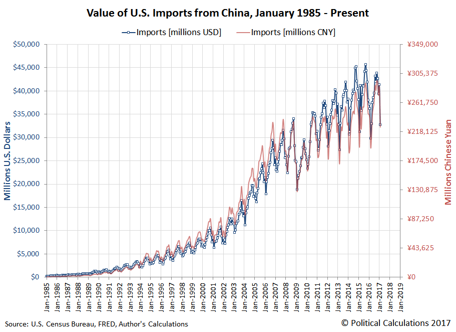
"America's imports from China tumble by a record amount".
We're borrowing the lead sentence for this article from the headline that Business Insider attached to a Reuters news article in describing the U.S. Census Bureau's just-released data for the value of goods and services traded between China and the U.S. in February 2017.
And a record amount it was! In January 2017, the U.S. imported nearly $41.4 billion worth of stuff, things and items from China, which dropped to nearly $32.8 billion in February 2017, marking a record month-to-month decline of just over $8.6 billion worth of imported Chinese goods.
In percentage terms however, we find that the month-to-month change from January to February 2017 only ranks seventh among the biggest month over month declines in goods imported to the U.S. from China since January 1985, so as records go, it's not as impressive as it could be.
While Business Insider's version of the article cited "slowing domestic demand" as the culprit, the Reuters article correctly recognized that "seasonal factors were likely behind the dramatic drop". We know that second scenario is the case because of the timing of this year's New Year/Spring Festival in China, which took place from 28 January 2017 through 2 February 2017, where the China's port facility workers who load goods onto U.S.-bound cargo ships were on holiday for the entire week. Combined with the two-to-three weeks that it takes America-bound goods to be transported from China's ports to their primary destination of U.S. west coast ports, February 2017 would have seen the amount of Chinese goods being unloaded in U.S. ports reduced by one week's worth of Chinese cargo ship traffic.
Taking the monthly value of China's imports to the U.S. for the past year and dividing by 4 (as the number of weeks in each month) would suggest that we should have expected the value of goods to drop by somewhere around $9.7 billion. Instead, they dropped by $8.6 billion, which means that the U.S. may have imported more goods from China than might have been reasonably expected for a month bearing the full effects of China's week-long New Year/Spring Festival holiday.
In any case, when we look at the exchange rate-adjusted, year-over-year growth rate for the value of goods exported from the U.S. to China and imported by the U.S. from China, we can reasonably expect the measured growth rate to rebound sharply in March 2017.
The U.S.' official trade data is coming out at the same time as China's Premier, Xi Jinping, is meeting with U.S. President Donald Trump to address trade issues, where the Chinese Premier has come bearing gifts, with concessions providing better access to China's markets for the U.S. financial service industry and eliminating a 2003 ban on U.S. beef. At the same time, the FT also reported over the weekend that the U.S. and China have agreed to a 100-day plan to resolve a number of other trade issues, which has taken the prospect of a trade war breaking out between the Earth's two largest national economies off the table.
Data Sources
Board of Governors of the Federal Reserve System. China / U.S. Foreign Exchange Rate. G.5 Foreign Exchange Rates. Accessed 5 April 2017.
U.S. Census Bureau. Trade in Goods with China. Accessed 5 April 2017.
Labels: trade
Welcome to the blogosphere's toolchest! Here, unlike other blogs dedicated to analyzing current events, we create easy-to-use, simple tools to do the math related to them so you can get in on the action too! If you would like to learn more about these tools, or if you would like to contribute ideas to develop for this blog, please e-mail us at:
ironman at politicalcalculations
Thanks in advance!
Closing values for previous trading day.
This site is primarily powered by:
CSS Validation
RSS Site Feed
JavaScript
The tools on this site are built using JavaScript. If you would like to learn more, one of the best free resources on the web is available at W3Schools.com.
