We used the metaphor of putting the sun in the center of all the planets when suggesting that the price-dividend growth ratio we've created is a better method than the price-earnings ratio in measuring the health of the stock market. Today, we'll demonstrate that our using that particular metaphor wasn't an accident!
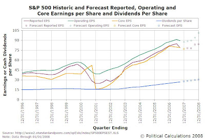
The occasion comes as Standard and Poor has revised their earnings forecast for the S&P 500 through the fourth quarter of 2008. We've updated the chart we previously presented in discussing whether drops in corporate earnings lead to recession early last December with the latest projections:

The good news is that it appears that 2008 will be pretty decent on the earnings and, more importantly, the dividends front. The better news is that we can now anticipate that the stock market, as represented by the S&P 500, will finish the year up as well:

The S&P 500's cash dividends per share are expected to grow from $27.73 in December 2007 to $30.30 at the end of 2008, with a corresponding compound annualized growth rate of dividends per share of 9.27%. Although we're hinting that the value of the S&P 500 could be 1610 in the chart above, we might more reasonably expect it to fall in a range between 1540 and 1680 by year's end, provided S&P's dividend forecast pans out.
We'll see if we can't narrow that range down a bit more in another post later this month. For right now, let's get back to earnings!
After we first plotted the index value of the S&P 500 against its dividends per share over its entire history last year, we repeated the exercise by plotting the S&P 500's price per share against the index's reported earnings per share. The following chart shows the result over the period from January 1871 through December 2007 (the path in time generally goes from lower left to upper right):

Coming from a hard science and engineering background with more than a passing interest in planetary trajectories, the path of the S&P 500's value with respect to its earnings per share is very reminiscent of the path planets like Mars take in the sky: moving forward, stopping, going backward in retrograde, stopping again and then ultimately proceeding forward again!
The path taken by earnings is somewhat more convoluted than that, but at the very least, you can now see why we found the metaphor of putting the sun (dividends) in the center of the orbits of the planets (stock prices) so compelling!
Labels: dividends, earnings, SP 500, stock market
Welcome to the blogosphere's toolchest! Here, unlike other blogs dedicated to analyzing current events, we create easy-to-use, simple tools to do the math related to them so you can get in on the action too! If you would like to learn more about these tools, or if you would like to contribute ideas to develop for this blog, please e-mail us at:
ironman at politicalcalculations
Thanks in advance!
Closing values for previous trading day.
This site is primarily powered by:
CSS Validation
RSS Site Feed
JavaScript
The tools on this site are built using JavaScript. If you would like to learn more, one of the best free resources on the web is available at W3Schools.com.