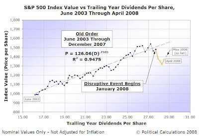
 We've updated our signature tool The S&P 500 at Your Fingertips with all the latest data through April 2008 and we can't help noticing that for all the crises we've seen in the financial and housing sectors since January, the stock market is only seeing, at worst, minor erosion.
Don't take our word for it. Here's our chart showing the previous order that existed in the stock market along with the current disruptive event that began in January 2008 (and a peek at where the market is as of the close of business of 13 May 2008):

Our primary tool for measuring the level of distress in the stock market is the price-dividend growth ratio, high levels of which often correspond to recessions in the U.S. economy.
The key element that drives sharp increases in the stock market's distress level is the year-over-year rate of growth of dividends per share. For the level of distress to really soar, this rate of growth has to decline to a value of zero. This happens when companies, in looking at what their ability to pay dividends to their shareholders from their future earnings (profits), either freeze or reduce their dividends per share to avoid liquidity and other financial survivability issues.
As of this writing, with the exception of financial companies, that doesn't appear to be happening in any meaningful way. Standard and Poor's MarketAttributes Snapshot for the S&P 500 for April 2008 describes how things have played out so far this year (Note: the link will take you to the most recent edition of the MarketAttributes Snapshot - we weren't able to locate a permanent link to an archived edition):
Year-to-date, there have been 117 dividend increases versus 129 increases for 2007 and 17 decreases versus 2 decreases in 2007 (15 of the 17 decreases are Financials). The cuts have come from large Financial issues, and they have been deep. So while the 117 increases added US$ 9.18B in payments, the 15 Financials decreases took away US$ 9.96B which is 6% of the stimulus plan going out.
Note: The "stimulus plan" referred to above represents roughly 1% of U.S. GDP. For math-challenged journalists, the net decrease in dividends per share is US$ 0.78B for the year-to-date, or 0.5% of the stimulus plan going out.
In other words, the damage to the overall stock market from the problems of the mortgage lenders, investment banks and other financial institutions has been very much limited to this sector. With higher levels of earnings anticipated later this year, the stock market will not develop the high levels of distress associated with recessions in the U.S. economy.
But then, that may be because a recession this year is growing increasingly unlikely, at least, according to the WSJ, the NYT and, well, us!
Labels: SP 500, stock market
Welcome to the blogosphere's toolchest! Here, unlike other blogs dedicated to analyzing current events, we create easy-to-use, simple tools to do the math related to them so you can get in on the action too! If you would like to learn more about these tools, or if you would like to contribute ideas to develop for this blog, please e-mail us at:
ironman at politicalcalculations
Thanks in advance!
Closing values for previous trading day.
This site is primarily powered by:
CSS Validation
RSS Site Feed
JavaScript
The tools on this site are built using JavaScript. If you would like to learn more, one of the best free resources on the web is available at W3Schools.com.