 Welcome to the Friday, May 28, 2010 edition of On the Moneyed Midways, where we kick off the Memorial Day Holiday weekend in the United States with a roundup of the best posts we found in each of the past week's money and business related blog carnivals!
We're more than ready for the long holiday weekend, so we'll just let this week's edition do the talking for us!
The best posts we found in the week that was await you below - we'll see you again after the holiday!...
| On the Moneyed Midways for May 28, 2010 | |||
|---|---|---|---|
| Carnival | Post | Blog | Comments |
| Carnival of Debt Reduction | Collections, Debt Negotiation or Bankruptcy? | Ask Mr. Credit Card | Mr. Credit Card identifies the pros and cons of debt negotiation in responding to a reader's question, while identifying bankruptcy as a last resort. |
| Carnival of HR | 1 Fatal Error Most Job Seekers Make That Lengthens Their Search | Mint Resumes | You've had the interview, and they like you, so all you need to do is wait for the offer. Marsha Keeffer says that's the worst thing you can do in Absolutely essential reading! |
| Carnival of Personal Finance | New Ways to Trick Yourself Into Saving for Retirement | Pop Economics | Saving for the long term can be especially difficult - Pop however has learned the lessons of behavioral economics well and describes you can put them to work for you to achieve your retirement goals. Absolutely essential reading! |
| Best of Money | Unemployment Is the Mother of All Invention | Startup Digest | Tim Chen finds the silver lining in the creative part of creative destruction going on in the economy! |
| Festival of Frugality | The Wedding Gift as the Price of Admission | Surviving and Thriving | Donna Freedman reacts to J. Money's solution to the age-old dilemma of how much a wedding present should cost, while considering the potential fallout outcomes for the newlywed couple as she also argues against the rule of thumb that apparently says that the value of wedding gifts should be tied to the cost of the food provided for the guests at the reception. Quite simply, The Best Post of the Week, Anywhere! |
| Money Hackers Carnival | $100 Here, $100 There. $100 Everywhere a Wedding. | Budgets Are Sexy | Getting married? Invite J. Money - he'll give you $100! The post that sparked Donna Freedman's top-notch post in the Festival of Frugality is the best post of the Money Hackers Carnival! |
| Carnival of Money Stories | My Conversation with a Car Salesman | Personal Finance Journey | PF Journey has $10,000 budgeted to buy a used car. The car salesman goes through all the tricks that can make buying a car such an unpleasant experience for a buyer, but in the end, PF leaves without a car. And yes, that's a success story! |
OMM's Running Index for 2010
Presented in reverse chronological order....
- On the Moneyed Midways - May 28, 2010
- On the Moneyed Midways - May 21, 2010
- On the Moneyed Midways - May 14, 2010
- On the Moneyed Midways - May 7, 2010
- On the Moneyed Midways - April 30, 2010
- On the Moneyed Midways - April 23, 2010
- On the Moneyed Midways - April 16, 2010
- On the Moneyed Midways - April 9, 2010
- On the Moneyed Midways - April 2, 2010
- On the Moneyed Midways - March 26, 2010
- On the Moneyed Midways - March 19, 2010
- On the Moneyed Midways - March 12, 2010
- On the Moneyed Midways - March 5, 2010
- On the Moneyed Midways - February 26, 2010
- On the Moneyed Midways - February 19, 2010
- On the Moneyed Midways - February 13, 2010
- On the Moneyed Midways - February 5, 2010
- On the Moneyed Midways - January 29, 2010
- On the Moneyed Midways - January 23, 2010
- On the Moneyed Midways - January 15, 2010
Older Editions
- OMM: The Best Posts of 2009 and our full index for the year!
- OMM's Running Index for 2008
- OMM's Running Index for 2007
- The Best Blogs Found in 2006 (and our full 2006 index)!
Labels: carnival
 Other than weapons, that is!
The statue is the African Renaissance Monument in Dakar, Senegal. The 49 meter (160 feet) tall bronze statue was constructed by North Korea's Mansudae Art Studio to commemorate the former French colony' 50th year of independence. The statue was constructed atop a 100 meter (328 feet) tall hill.
Like the Statue of Liberty in the United States, tourists can go up to the top (inside the man's head) and view the surroundings.
The statue was built for an approximate cost of $29 million U.S. dollars. With an estimated 2009 GDP of $ 22,380,000,000 (adjusted for Purchasing Power Parity), the cost of the statue represents 0.13% of Senegal's total annual economic output. With its 2009 GDP estimated to be $ 40,000,000,000, the cost of the statue also represents 0.07% of North Korea's economic output.
Senegal's GDP per capita is just $1,600, while North Korea's GDP per capita is estimated to be $1,900. That ranks North Korea at 188 out of 227 nations, while placing Senegal just a bit behind in the 195th position.
In 2009, the Millennium Challenge Corporation (MCC) a U.S. government agency, agreed to provide $540 million to support infrastructure improvements within Senegal, such as roads and irrigation projects, over a period of five years. The $29 million North Korean-built statue, while not directly funded through the MCC grant, represents 5.3% of that total planned contribution.
Image Credit: Core 77
 What if, in the interest of controlling costs, the government set the level of wages that all health care workers throughout the country could earn? And what if, in the interest of promoting the goal of eliminating income inequality, they set them to be fairly uniform throughout the nation, so that a nurse in a poor part of the country would make as much as money as a nurse in a more well-to-do region?
It sounds wonderful, doesn't it? And what could be more fair from a social justice standpoint? Health care workers would earn the exactly the same money for doing the same jobs no matter where they do them. Better yet, the enlightened individuals who run the government would reap the rewards from achieving their goals of social justice and equality, all while keeping the cost of government-funded health care well under control!
And it would be pretty nice, if only it didn't end up killing people by denying them access to high quality health care. As it happens, it would seem the trade-off for achieving income equality in health care is a significant decrease in the quality of health care that might otherwise be available.
We know that's the case thanks to a recent study published in the Journal of Political Economy by Carol Propper and John Van Reenen: "Can Pay Regulation Kill? Panel Data Evidence on the Effect of Labor Markets on Hospital Performance":
In many sectors, pay is regulated to be equal across heterogeneous geographical labor markets. When the competitive outside wage is higher than the regulated wage, there are likely to be falls in quality. We exploit panel data from the population of English hospitals in which regulated pay for nurses is essentially flat across the country. Higher outside wages significantly worsen hospital quality as measured by hospital deaths for emergency heart attacks. A 10 percent increase in the outside wage is associated with a 7 percent increase in death rates. Furthermore, the regulation increases aggregate death rates in the public health care system.
The authors looked at the government-run National Health Service in the United Kingdom, which actually has implemented the scheme. Here's a quick summary of their major findings:
The U.K.'s National Health Service (NHS), which is responsible for most of the nation's health care, sets wages for nurses and other health professionals on a national scale. These regulated wages are essentially flat throughout the country, despite the fact that wages for private sector jobs vary widely from region to region. The study finds that in places where private sector wages are higher, death rates for heart attack victims admitted to emergency departments are higher.
The finding suggests that in places where private sector pay is better, it is difficult for NHS hospitals "to attract and retain skilled workers and this will lead to lower quality service," write the study's authors, Carol Propper of the University of Bristol and John Van Reenen of the Centre for Economic Performance at the London School of Economics.
On average, a 10 percent increase in the private sector wages is associated with a 7 percent increase in heart attack death rates, the study found. Heart attack death rates are a common measure of hospital quality.
The research suggests that the most skilled nurses in high-wage areas flee the NHS hospitals to work in health sectors where wages are not regulated, such as nursing homes. Productivity levels in nursing homes are significantly better in areas where private sector wages are higher, the study found.
In a nutshell, the reason why regulating wages to achieve income equality for health care workers results in worse health care outcomes is that the most highly talented and skilled people who might otherwise choose to go to work in hospitals and clinics funded by the government are instead attracted to other, higher paying occupations that are not subject to the government's arbitrary regulations.
After all, why shouldn't these highly capable individuals seek incomes that better match their relative level of quality performance? Especially when being better at providing health care than your lower-performing peers isn't adequately compensated.
This is especially true in those well-to-do areas where there are many other opportunities that might attract these high achievers, with many talented young people bypassing the medical field for other, more rewarding professions altogether.
Carol Propper and John Van Reenen provide the obvious conclusion:
"Publicly run healthcare markets would be wise to relax the regulatory systems and allow local wages to reflect local conditions as they do in the private sector," the researchers conclude. "According to our analysis such deregulation would lead to higher quality public services and fewer deaths."
"As the U.S. government becomes more involved in healthcare, this is a lesson worth heeding," Van Reenen said.
Indeed.
Image Source: New York City Health and Hospitals Corporation
Labels: economics, health care, risk
 Wouldn't it be nice to have some kind of early warning if the bottom is about to drop out of the economy? Or maybe some kind of cool robot around to tell us when the economy is about to enter into a dangerous situation?
Okay, maybe not that robot, or its human counterparts, who might often have their dials wound a bit too tightly, but what about a quick checklist you can use to see for yourself if things really are going to an economic hell in a handbasket?
That's our goal for today. Let's get started.
- 1. Falling Demand for Oil
-
Ashlee Simpson may think that love makes the world go round, but believe us when we say that all its gears are greased by oil! Everything from the shipping and transportation that connects the world to you and you to the world through trade and then on to a myriad of commercial products that rely upon petroleum and its byproducts for their existence is affected by oil, so when the demand for oil falls off, it's good indication that bad things are unwinding in the economy.
- 2. Rapidly Changing Prices
-
If inflation is bad and deflation is bad, how come we can't have just plain old 'flation?
It's an old joke, and yes, a bad one, but what it's really getting at is the idea that rapidly changing prices are a bad thing, regardless of their direction. Let's use oil as a case in point. Here, in the case of inflation, you can have rising prices being driven by rising demand (a good thing, right?) but if its price rises too high too quickly, it can trigger a reaction that will cause the demand for oil to drop off, as people get freaked out by how expensive it's becoming and change their consumption habits to adapt. On the deflation side, you can have rapidly falling prices, which more often than not correlate to falling demand for oil, which we've already established is a bad sign.
Of the two, deflation is worse than inflation. If you think about it, if prices are plummeting and the reason why isn't because the people who make things have become much more productive at what they're doing, that's almost always an indication of some kind of market crash, which is normally not considered to be what Martha Stewart would call a good thing. We could be talking about stocks, houses, oil, cars, wombats, you name it, if the demand for stuff is falling, it's not good for the people who depend upon it for their livelihoods. And if it goes on long enough, the pain will spread to reach you....
- 3. Money Troubles
-
Of course, we know that money is at the root of all evil. Truth be told however, it's just a symptom. What makes it useful, aside from making it easier to buy stuff, is that it can tell us when things are going bad by how it acts.
For instance, the people who actually create money might go crazy and set their printing presses on overdrive. In this case, because they end up making way more money than there's stuff to go around, it makes the value of money drop in comparison (we'll call that "inflation"), which we've already determined to be a bad thing. Or they might just accidentally lock themselves out from the room with the printing presses and not make anywhere near enough money, sending the relative value it with respect to stuff skyrocketing, which makes all other prices fall rapidly in comparison, which is also a bad thing, in this case, called "deflation."
That covers the rapidly changing prices scenario, but money can tell us more than that. In reality, because it's pretty unusual for the printing press operators at the Treasury department to lose their grip on reality or the keys to the building, we don't necessarily get super clear signs like that to tell us that the economy is going wrong.
So, we should look for other kinds of money troubles. Things like sharply increasing debt levels or defaults and bankruptcies or foreclosures. Things like high unemployment and underemployment levels. And we should also look out for money going to places it likes to hang out when times are expected to get tough. Like long term government treasuries.
That last one creates a unique way to gauge whether times will get tough. When times are good, it's pretty common for the yields on short term treasuries to be a lot lower than for long term ones, which is what you'd expect since an investor in a treasury should demand a higher return for locking their money up for a longer period of time.
But when times get tough, money likes to take a long-term holiday until the smoke clears. When that happens, the short term yields of treasuries rise and the long term yields fall, resulting in rates becoming flatter regardless of time, or even inverting, which is what happens when long term rates drop below the level of short term ones.
The key measure here is called the treasury yield spread, which is the difference between long term treasury rates and short term ones. The early warning sign here is that when it becomes smaller, the economic situation is becoming worse. And the smaller it gets, the more danger there is in the economy. Fortunately, there are tools you can use that can help you find out not just if times are already tough, but if they're likely to get tough.
So that's your quick and dirty three point guide to telling if the economy is going south. And now that you know what to look for now, just how many of these things do you see in your economy today?
Image Credit: Wealth Daily
Labels: economics, recession forecast
 Which European Union nations do investors in Credit Default Swap (CDS) contracts believe are most at risk of defaulting on their national debt payments? And how do various U.S. states rank in comparison to those EU-15 nations?
Before going any further, since we haven't covered the topic previously, let's take a moment to discuss just what a Credit Default Swap is! Going by David Van Knapp's handy glossary for today's economic crisis, a credit default swap is "a contract between 'counterparties' that, in effect, insures against defaults in financial instruments. The buyer makes periodic payments to the seller, and in return receives a payoff if the underlying investment instrument defaults."
While Van Knapp has it in quotation marks, "counterparties" simply refers to the direct participants in the transaction - the buyer(s) and seller(s) of these contracts, who may be either individuals or institutions.
If you're not one of the counterparties involved in these kinds of contracts, the main value of these financial instruments is what they communicate by their spread. Here, the spread is the premium the buyer of the CDS contract pays the seller in order to be protected against the risk of a default taking place on the debt against which the contract is being written. The amount of the spread is proportionate to the perceived risk - if the underlying debt against which the CDS is being written is at a high risk of default, its spread will be much higher than that for a CDS contract written against against debt that is at a low risk of seeing the borrower discontinue making full payments on their debt.
CDS spreads are measured in basis points (bps). If a CDS spread is 500 bps, then the buyer of the CDS contract paying a 5% premium to insure the debt. Or as Vince Veneziani describes it, "if you have $1 million in debt, you can insure it for $50,000."
We should note that CDS spreads can be very volatile, changing a great deal over very short periods of time.
Having covered that basic territory, let's take a closer look at the CDS spreads that apply for the EU-15 and the U.S. states with the highest CDS spreads, both back in March 2010 and again in May 2010. The comparisons aren't quite perfect, since the snapshots in time for the data between the U.S. and E.U. were taken at different times, however we'll assume the relative levels between U.S. states and E.U. nations are in the right ballparks. You can click the column headings to sort the data from either high to low (or vice-versa by clicking a second time).
| EU vs US Credit Default Swap Sovereign Debt Default Risk, March 2010 vs May 2010 |
|---|
| EU Nation or US State | CDS Spread (March 2010) | CDS Spread (May 2010) |
|---|---|---|
| Austria | 55.1 | 73.8 |
| Belgium | 54.4 | 95.5 |
| Denmark | 34.0 | 46.2 |
| Finland | 32.9 | 40.4 |
| France | 45.8 | 70.8 |
| Germany | 33.0 | 49.8 |
| Greece | 316.3 | 712.3 |
| Ireland | 139.5 | 216.5 |
| Italy | 109.9 | 174.7 |
| Netherlands | 34.0 | 46.4 |
| Portugal | 136.5 | 352.8 |
| Spain | 113.3 | 208.9 |
| Sweden | 34.7 | 41.8 |
| United Kingdom | 74.5 | 79.6 |
| California | 301.4 | 170.9 |
| Illinois | 233.6 | 217.8 |
| Massachusetts | 120.8 | 77.1 |
| Michigan | 211.3 | 166.7 |
| Nevada | 190.8 | 131.1 |
| New Jersey | 222.2 | 142.5 |
| New York | 224.2 | 147.3 |
| New York City | 211.7 | 147.3 |
What we find is that things in Europe became very bad from March to May, coinciding with the Greek debt crisis - they appear to have moderated somewhat since for many nations, but CDS spreads remain elevated for countries like Spain and Portugal. Meanwhile things improved in the U.S. states between March 2010 and May 2010, as many states began enacting austerity measures to bring their levels of spending into better alignment with their tax collections. Illinois, at this point in time, stands out for not yet having taken any effective action.
Where the Data Came From
- US CDS Spreads, March 2010: Vince Veneziani and Gregory White, Business Insider, 10 Debt-Laden States Quickly Becoming The Next California. 2 March 2010.
- US CDS Spreads, May 2010: Gus Lubin, Business Insider, The 10 States Most Likely To Default. 20 May 2010.
- EU-15 CDS Spreads: Standard & Poor, Credit Market Commentary: Contagion Fears Push EU CDS Spreads Wider. 6 May 2010.
Labels: economics, national debt
Welcome to the Friday, May 21, 2010 edition of On the Moneyed Midways, where we present the best posts we found in the best of the past week's business and money-related blog carnivals!
Having literally reviewed hundreds of blog carnivals since the inception of OMM, we've developed a pretty good sense of what works and what doesn't work when it comes to what makes a good blog carnival. So believe us when we say that the Carnival of HR this week is simply awful.
It's not haiku-awful, or special-event-themed-awful, or even auto-pilot-awful, but rather awful in the sense that stumbling upon some random individual's Facebook post describing the house party they had last night might be awful. Lots of inside "here's this person I know and how they relate to me" type stuff, with absolutely no reason provided that would justify clicking through the links to the posts contributed to the carnival by these same people.
It's kind of like watching the opening credits of the most recent season of Saturday Night Live, where you see all these images of apparently-talented people being mildly amused while at some sort of party out on the town, but with the unsettling realization that it's really unlikely that you'll be entertained by anything that follows if you keep watching.
In one sense, that's good, because we now have defined a new level of bad for blog carnivals. More appropriately, it's bad, because the host didn't provide any real reason for us to click through any of the carnival's links, so the carnival itself didn't make the cut.
Thank goodness for all the other blog carnivals that had their acts together this week! The best posts we found in the week that was await you below!...
| On the Moneyed Midways for May 21, 2010 | |||
|---|---|---|---|
| Carnival | Post | Blog | Comments |
| Carnival of Debt Reduction | Tracking Your Personal Net Worth | Digerati Life | The Silicon Valley Blogger considers a New York Times' article on the obsession some people have developed for tracking their net worth as the measure for their financial health and considers a number of sites that have benefited from it. Along the way, she celebrates her 4 millionth site visit and explains why so many personal finance bloggers prefer to be anonymous (we totally understand!) Absolutely essential reading! |
| Carnival of Personal Finance | Is Simplicity Overrated in Investing? | The Oblivious Investor | Mike Piper weighs the pros and cons of keeping one's investment portfolio simple, finding that in some cases, it pays more to go with greater complexity. |
| Best of Money | Is Retirement Like a Beer Commercial with White Hairs? | Single Mom, Rich Mom | JacqJolie wonders why we expect retirement will be like what the ads for mutual funds or senior vacation packages suggest, when we don't expect that the parties we go to will be like what we see in beer commercials…. |
| Cavalcade of Risk | Anti-depressants and Fiscal Stimulus? | Healthcare Economist | Jason Shafrin compares what studies into anti-depressants are now revealing with government stimulus programs - they might originally have been intended for short term use, but over time, they become permanent fixtures, failing to cure the conditions for which they were prescribed. The Best Post of the Week, Anywhere! |
| Festival of Frugality | My Six Favorite Ways to Keep Expenses to a Minimum | Frugal Babe | If you want to keep from spending lots of money unnecessarily over time, the Frugal Babe suggests: driving an old car, get the cheapest housing you can, don't shop for entertainment, cook at home from scratch, buy secondhand and don't give in to buying the things your kids "want!" |
| Festival of Stocks | Buy Sell or Hold Bridgewater Systems (TSX: BWC) with Daniel Lee of M Partners | Investing Thesis | Arjun Rudra interviews Daniel Lee, who provides the skinny on Canadian tech company Bridgewater Systems, which has found a unique market niche in the world of networks and smart phones. |
| Money Hackers Carnival | 5 Crazy Ideas That Resulted in Million Dollar Paydays | Len Penzo dot Com | Len Penzo reviews unlikely product ideas that turned out to be real profit makers, including: the Million Dollar Homepage, AntennaBalls, FitDeck, Lucky Break Wishbones and Doggles! |
OMM's Running Index for 2010
Presented in reverse chronological order....
- On the Moneyed Midways - May 21, 2010
- On the Moneyed Midways - May 14, 2010
- On the Moneyed Midways - May 7, 2010
- On the Moneyed Midways - April 30, 2010
- On the Moneyed Midways - April 23, 2010
- On the Moneyed Midways - April 16, 2010
- On the Moneyed Midways - April 9, 2010
- On the Moneyed Midways - April 2, 2010
- On the Moneyed Midways - March 26, 2010
- On the Moneyed Midways - March 19, 2010
- On the Moneyed Midways - March 12, 2010
- On the Moneyed Midways - March 5, 2010
- On the Moneyed Midways - February 26, 2010
- On the Moneyed Midways - February 19, 2010
- On the Moneyed Midways - February 13, 2010
- On the Moneyed Midways - February 5, 2010
- On the Moneyed Midways - January 29, 2010
- On the Moneyed Midways - January 23, 2010
- On the Moneyed Midways - January 15, 2010
Older Editions
- OMM: The Best Posts of 2009 and our full index for the year!
- OMM's Running Index for 2008
- OMM's Running Index for 2007
- The Best Blogs Found in 2006 (and our full 2006 index)!
Labels: carnival
 You know how it is. You're parked in a lot near the stadium before the game, throwing a ball around while grilling something on the barbecue you brought to go tailgating with your friends. The sun is high in the sky and it must be at least 150o Fahrenheit on that unshaded stretch of asphalt where you're at.
Sure, you'd like to get a ice-cold beverage from the cooler, but between throwing the ball around and flipping burgers, you don't have a spare hand to hold it. You could put it down on the asphalt, but then, it won't stay ice-cold for long.
You might consider putting it on the trunk, roof or hood of your car, if only it wouldn't be at dire risk of either sliding off or being too far out of reach. And then, it won't stay ice-cold for long if you do that either.
Fortunately, there are markets in everything. If what we described above fits your situation, then the American Tailgater Company has developed a product for you. (HT: Core77).
For instance, how about an insulated coozie with suction cups attached to it, to deal with the problem we described above:
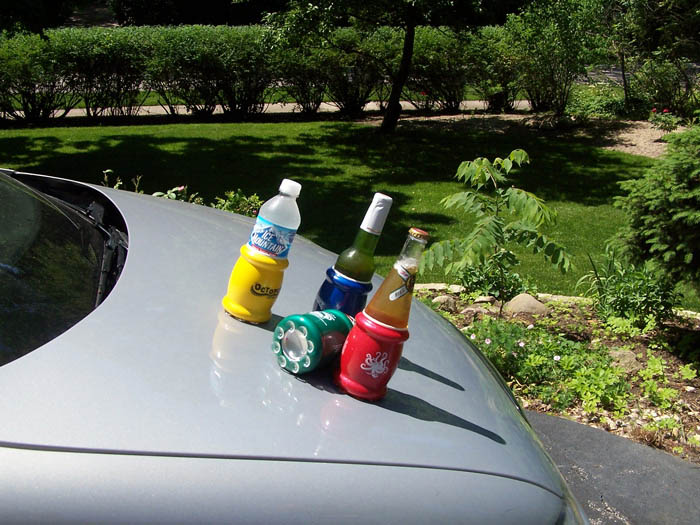
Or maybe a magnetic version that you can just slap right onto the side of your ride:

And then, the perfect solution for the guy who wants to tailgate but doesn't want to pay for parking - the motorized cooler scooter:

But although the American Tailgater Company doesn't carry it, we still believe this is the ultimate tailgating accessory!
Labels: none really
How much deadweight loss did the government's "Cash for Clunkers" program generate in the U.S. economy during the five weeks it ran in 2009?
How about we build a tool and find out!
 We'll begin by taking a closer look at the supply and demand curve for vehicles in the United States. Specifically the one that Jodi Beggs of Economists Do It With Models sketched up to consider what the potential deadweight loss for the Cash for Clunkers program might be.
We next tweaked the diagram to highlight the area representing the deadweight loss to the U.S. economy on Jodi's supply and demand diagram, shading it in yellow.
The rest of our exercise will be to simply identify the values of each of the indicated components, which we'll then use as the input data for the tool that appears below.
 To get that data, we turned to Edmunds.com. They report that the average market price of a new vehicle in the United States before the Cash for Clunkers subsidy went into effect, was $30,998.
They also report that the average price of a vehicle sold in the United States during the five weeks the Cash for Clunkers program ran was $26,915, less an average rebate of $1,667. That then sets the average out-of-pocket cost to the consumer to be $25,248.
The real question though is how many new vehicle sales, above and beyond those that would have happened anyway, took place during those five weeks. Edmunds pegged that figure to be 125,000, substantially less than the 690,000 vehicles for which U.S. taxpayers subsidized their purchase. This amount would need to added to the quantity sold without subsidy to represent the quantity sold when the subsidy is in place.
After all, if 565,000 of the 690,000 vehicles transactions that benefited from the Cash for Clunkers subsidy would have occurred anyway, then the 125,000 additional vehicle transactions that occurred would fully represent all the net gain in economic activity resulting from this particular economic stimulus program.
Dividing that 125,000 vehicles into the $6.9 billion U.S. dollars the program cost U.S. taxpayers then reveals that each one of these additional transactions put roughly an additional $24,000 in the pockets of the auto industry for each vehicle sold, with Japanese automaker Toyota being the number one beneficiary of the U.S. taxpayer financed program. Bankrupt U.S. automaker General Motors was the second biggest beneficiary, despite having none of its models listed in the top ten vehicles purchased in the subsidy program.
Adding that $24,000 per additional vehicle sold to the out-of-pocket cost paid by the consumer with the subsidy then gives us the last piece of data we need to estimate the deadweight loss of the Cash for Clunkers program. We find the total revenue to the producer when the subsidy is in place is $49,248.
The rest is just a matter of finding the area of the triangle representing the deadweight loss on the supply and demand diagram! And that's why we have a tool with the default data for the point coordinates of the triangle already plugged in, ready for you to use below. For the purpose of our analysis, since we're only interested in the change from the equilibrium "no subsidy" levels of supply and demand, we're entering 0 as the quantity sold without subsidy.
We'll have more comments below the tool....
We estimate that the deadweight loss to the U.S. economy and taxpayers resulting from the government's "Cash for Clunkers" program to be $1.5 billion dollars.
The more we look at this "deal", the worse and worse it gets....
On the plus side, our tool above may be adapted to find the area of any triangle, provided you can identify the coordinates of its points. So at least there's something positive that's now come out of the government's Cash for Clunkers program!
Previously on Political Calculations
We asked and answered the question of "How Green Is Cash for Clunkers?", where we took on the program's purported environmental benefits, and also asked "Will Cash for Clunkers Save Gas?", doing the analysis to see if Americans would really use less gas if they had more fuel efficient cars.
Barry Ritholtz asks if a repeat of the 1987 crash is impossible or likely. He looks at the market now and then (Update - see note below the post) before concluding:
The key differences have nothing to do with who was quoted, or the articles authors or their editors. What had changed was the psychology of the moment. And THAT, more than anything, impacts how people perceive the world . . .
Looking at the 1987 Black Monday crash a bit differently, that's exactly correct, although we find fundamental reasons for doing so, both then and now. We think that the current state of the market is such that it's more reminiscent of the 1930s than 1987 - especially since April, when the future expectations of investors appear to have sharply shifted downward, for which we don't yet have the data to confirm if that apparent shift in sentiment is a reaction to a change in the fundamental outlook for the market or is simply the result of noise. Our thinking is that it's more fundamentally driven.
 Here's why. The May 6 plunge is a clear, almost perfect example of a disruptive noise event in the market - a dramatic change in prices that isn't sustained and that is not correlated with changes in the expected growth rate of dividends per share. The combination indicates that the so-called "flash crash" qualifies as being the result of noise in the market.
That the market recovered quickly to the level indicated by where the apparent investor future expectations for dividends would place them, neither going significantly higher or lower, despite the free and clear opportunity provided by the flash crash to do so, would seem to confirm that observation.
Instead, how the market is currently acting suggests that something fundamentally altered the future outlook of investors in a way where they now expect the level of dividends per share in the market to fall significantly from their current levels at some, as yet unknown, point in the future, which is why stocks may be expected to continue trending lower in the near term.
What we know today is that shift in outlook took place in April 2010. What we don't yet know is to what future point in time investors are looking forward. Sadly, our crystal ball can only see ahead to December 2010.
Image Source: The Wall Street Journal, which offers an interactive version of the chart!
Update 18 May 2010, 11:19 AM EDT: We should note that Barry is primarily considering the change in investor psychology as documented in the pages of the Wall Street Journal between 2007 and 2010, with the 1987 crash thrown in to note the parallels between it and the "flash crash". His main thesis is that in 2007, the possibility of something similar to the Black Monday Crash happening again was unthinkable, while today, investor expectations are very different.
Labels: SP 500, stock market
Amtrak, the heavily-subsidized, government-owned passenger rail monopoly in the United States, is trying to go green by switching one of its lines, the Heartland Flyer, to run on a special biodiesel blend that includes beef byproducts.
Really. We're not making this up! Miranda Marquit reports:
In an effort to create a greener train, Amtrak has unveiled the Heartland Flyer, which is designed to run on a special biodiesel blend that includes beef byproducts. The idea is to reduce hydrocarbon and carbon monoxide emissions by 10% each and reduce sulfates by 20%. Amtrak also claims that particulates will be reduced by 15% with the help of this new fuel mix.
However, the train won't be running solely on cow power. Discover reports on how Amtrak will use the fuel:
The Heartland Flyer uses about 100,000 gallons of diesel fuel each year to move 84,000 people. For this one-year test run, Amtrak will replace 20 percent of that fuel with biodiesel, produced from tallow from Texas cows. The fat from the cattle, which is normally used to make animal feed and soap, will now instead help power a train.
While the new biofuel can be used on standard train engines, the Heartland Flyer has been given new parts so that it is possible to determine how much damage the biofuel is inflicting on the train over the course of a year. The Flyer is only expected to run for a year, between Oklahoma City, Oklahoma, and Forth Worth, Texas, and then the engine and the train's performance will be evaluated.
So, let's start racking up the cost to the taxpayer here for this grand plan for the future of rail travel in the U.S. USA Today reports that as of 2008, the average Amtrak passenger already benefits from a government subsidy of $32 per passenger, which makes it possible for the U.S. only national passenger rail service to operate despite continual, chronic losses.
A good portion of that taxpayer subsidized cost of operations goes toward buying fuel. Here, since the Heartland Flyer will be operated using a blend of regular diesel fuel and biodiesel, we'll run our numbers based upon what the Energy Information Agency indicates were the national prices of each in January 2010, which will give us a good idea of what such a scheme might cost if implemented nationwide.
Here, we find the average price of diesel per gallon in January 2010 was $2.87. Meanwhile, the price per gallon of 100% biodiesel fuel was $3.59 per gallon. A blend of 80% diesel and 20% biodiesel, similar to what's being proposed for the Heartland Flyer, cost $2.96 per gallon. The table below presents what we find to be the annual cost to each of Amtrak's 84,000 passengers for the 100,000 gallons of fuel consumed on the trains 206 mile, one-way route:
| Amtrak Heartland Flyer Estimated Annual Fuel Costs | |||
|---|---|---|---|
| Fuel Type | Annual Cost | Difference from Regular Diesel | Additional Government Subsidy per Passenger |
| Diesel | $ 287,000 | $ 0 | $ 0 |
| B20 (20%) Biodiesel | $ 296,000 | $ 9,000 | $ 0.11 |
| B100 (100%) Biodiesel | $ 359,000 | $ 72,000 | $ 0.86 |
At just 11 cents per passenger then, it doesn't seem like a bad idea. But wait - isn't biodiesel subsidized too? Why, yes, it is, or rather, it was, and it very likely will be again, if the current U.S. Congress has its way! To the tune of $1.00 per gallon.
That may not seem like much, but let's re-run our numbers from the previous table to account for the effects of that subsidy:
| Amtrak Heartland Flyer Estimated Annual Fuel Costs, without Biodiesel Fuel Subsidy | |||
|---|---|---|---|
| Fuel Type | Annual Cost | Difference from Regular Diesel | Additional Government Subsidy per Passenger |
| Diesel | $ 287,000 | $ 0 | $ 0 |
| B20 (20%) Biodiesel | $ 309,360 | $ 22,360 | $ 0.27 |
| B100 (100%) Biodiesel | $ 459,000 | $ 172,000 | $ 2.05 |
We find that switching to the B20 biodiesel blend will increase the per-passenger subsidy that taxpayers provide for each Amtrak passenger on the 206 mile one-way Heartland Express route to $32.27, just shy of a 1% increase.
 But that doesn't include the costs of the modifications it will take to make the train run on this special biodiesel blend or any of the expected higher maintenance costs resulting from damage caused by using the biodiesel fuel blend. Nor does it take into account the higher costs for products like soap and animal feed that consumers will see since the cow by-products that might otherwise be used for these products will instead be diverted into biodiesel production.
And since many of the cows that will be producing the by-products are fed with taxpayer subsidized crops, like corn, it doesn't include those costs as well and apparently doesn't provide much benefit for the environment either, the purported reason for the project. We probably shouldn't mention corn prices are themselves higher than they would be otherwise because of government mandates for ethanol production. Also apparently for the purpose of the perceived "benefits" of going green.
If you add it all up, the taxpayer-provided subsidy per Amtrak passenger from implementing this "improvement" is truly, quite generous.
And right now, all for the exclusive benefit of biodiesel producers, a select few cattlemen and optimistically (assuming no repeat passengers) some 84,000 people who don't have to pay as much out of pocket to travel the 206 miles between Oklahoma City and Fort Worth or back again as they might have had to otherwise.
Labels: public transportation
Welcome to the blogosphere's toolchest! Here, unlike other blogs dedicated to analyzing current events, we create easy-to-use, simple tools to do the math related to them so you can get in on the action too! If you would like to learn more about these tools, or if you would like to contribute ideas to develop for this blog, please e-mail us at:
ironman at politicalcalculations
Thanks in advance!
Closing values for previous trading day.
This site is primarily powered by:
CSS Validation

RSS Site Feed
JavaScript
The tools on this site are built using JavaScript. If you would like to learn more, one of the best free resources on the web is available at W3Schools.com.
Other Cool Resources
Blog Roll


