It's Top Gear's Jeremy Clarkson's take on the 2010 Ford Fiesta, in which he reveals the answers to the following questions we've all had about the automobile:
- Will it break down all the time?
- Is it easy to park?
- What if I go to a Shopping Centre and get chased by baddies in a Corvette?
- Is it green?
- Can I afford it?
- What if I'm asked to take part in a beach assault with the Royal Marines?
But before we get to that review, here's a review of the review. Because this is the Internet.
And now, here's the Top Gear's review of the 2010 Ford Fiesta (HT: Gongol):
He seems to have liked it quite a bit better than the Honda Insight....
Labels: none really, review
Sometimes, we're compelled to take the plunge into the world of absolute silliness. Today's featured episode of lunacy is inspired by a newswire photo of U.S. Secretary of State Hillary Clinton, whose image was captured through a Reuters photographer's video viewfinder. Here's the photo and caption as they appeared on Yahoo! News on Tuesday, 28 September 2010:
U.S. Secretary of State Hillary Clinton is pictured through a video viewfinder as she speaks during a news conference in Amman September 16, 2010.
REUTERS/Ali Jarekji (JORDAN)

Now, here's the Internet Movie Database's description of the the storyline for the great John Carpenter classic, They Live:
Nada, a down-on-his-luck construction worker, discovers a pair of special sunglasses. Wearing them, he is able to see the world as it really is: people being bombarded by media and government with messages like "Stay Asleep", "No Imagination", "Submit to Authority". Even scarier is that he is able to see that some usually normal-looking people are in fact ugly aliens in charge of the massive campaign to keep humans subdued.
Is it really any wonder then that the United Nations would appear to be currently seeking to appoint a "space ambassador" for the purpose of acting "as the first point of contact for aliens trying to communicate with Earth.":
Mazlan Othman, a Malaysian astrophysicist, is set to be tasked with co-ordinating humanity's response if and when extraterrestrials make contact.
Aliens who landed on earth and asked: “Take me to your leader” would be directed to Mrs Othman.
She will set out the details of her proposed new role at a Royal Society conference in Buckinghamshire next week.
The 58-year-old is expected to tell delegates that the proposal has been prompted by the recent discovery of hundreds of planets orbiting other starts, which is thought to make the discovery of extraterrestrial life more probable than ever before.
Mrs Othman is currently head of the UN's little known Office for Outer Space Affairs (Unoosa).
Yet before you think that the folks at Unoosa have a screw loosa, a UK-based expert in space law says Mrs Othman is the ideal candidate for the position:
Professor Richard Crowther, an expert in space law at the UK space agency who leads delegations to the UN, said: "Othman is absolutely the nearest thing we have to a 'take me to your leader' person".
The plan to make Unoosa the co-ordinating body for dealing with alien encounters will be debated by UN scientific advisory committees and should eventually reach the body's general assembly.
Opinion is divided about how future extraterrestrial visitors should be greeted. Under the Outer Space Treaty on 1967, which Unoosa oversees, UN members agreed to protect Earth against contamination by alien species by "sterilising" them.
Mrs Othman is understood to support a more tolerant approach.
That more tolerant approach would seem to go against the "kick their alien asses before they kick ours" approach advocated by physicist Stephen Hawking, who worries:
"I imagine they might exist in massive ships, having used up all the resources from their home planet. The outcome for us would be much as when Christopher Columbus first landed in America, which didn't turn out very well for the Native Americans."
Which brings us back to John Carpenter's classic exploration of human-alien contact, They Live, where we find perhaps the ideal model for such a UN space ambassador in the character portrayed by Rowdy Roddy Piper:
Highly recommended. And who knew it was really a documentary about our own time?!
Labels: none really
 How much will the cost of tuition and required fees at a four-year college or university be next year on average? And how about four years from now when today's freshmen may be graduating?
For us, those are really easy questions to answer, because we discovered that the average annual cost of both tuition and required fees at a four-year college or university has come to move in almost perfect lockstep with the total amount of money the U.S. government spends each year.
And because it does, we can take the total federal spending projected by the White House in its most recent fiscal year budget proposal to anticipate what the average annual cost of college will be for each of the years the budget looks into the future.
That information is presented in Table 3.1 of the historical tables presented in the White House's latest budget document, which covers "Outlays by Superfunction and Function". What we're after are the figures for "Total Federal Outlays" for each year from now until 2013, which should cover everyone spanning from this year's seniors through this year's entering freshmen.
Below, we've presented the data we found for the total federal spending levels in the OMB's Fiscal Year 2011 budget for the each year from 2006 through 2013, along with what our tool (on the right) would project for each of those years based on the trend we observe running from 1996 to at least through 2008:
|
|||||||||||||||||||||||||||||||||||||||||
What we find is that if the relationship we found holds over these years, the average cost of tuition and required fees at a four-year higher education institution in the United States will be approximately 25% greater in 2013 than they were in 2008, the last year for which we have recorded data.
We would actually expect that tuition growth will fall below what our tool projects for 2009 through 2011, but will catch up to what it projects for 2012 and 2013. The reason why is because much of the growth in federal spending has been directed toward specific expenditure categories in recent years due to the financial crisis of 2008, so we should expect U.S. higher education institutions to resume pacing their "usual" share of federal spending as the spending associated with the 2008 crisis recedes with the passage of time.
Of course, there's always the chance that the cost of a college education may begin to be driven by factors other than what the total level spending by the federal government will be. But unless and until the current pattern breaks, you can reasonably expect that the average cost of college forecast by our tool will generally follow the pace set by the federal government's projected levels of future spending.
Labels: education, forecasting, tool
Two things have happened since we last offered up our monthly look ahead at where stock prices are going next:
- As of 9 September 2010, we can now see ahead in time all the way through to the end of 2011, at least where dividends are concerned.
- As of 24 September 2010, the acceleration of stock prices has moved out of the range they had been since April 2010.
Both are very big deals, since the first item allows us to anticipate where stock prices are going next using our direct methods, while the second item confirms that the stock market is finally leaving its summer noise-driven doldrums behind.
 The latest update for our stock price and trailing year dividends acceleration chart shows both factors at work. At present, the average of stock prices for the month of September 2010 has risen just above the range of noise we've observed from April into September.
Through Friday, 24 September 2010, the acceleration of stock prices in the S&P 500 would appear to be converging toward the change in the rate of growth of the index' trailing year dividends per share for either the third or fourth quarter of 2011. We've indicated approximately where the the acceleration of stock prices would be given their closing value from last Friday's trading with the green circle.
Given that there's almost no difference between the acceleration levels expected for S&P 500 dividends for these two distant quarters, it really doesn't matter which one investors have focused upon in setting their future expectations at this time. If we had to pick one, we would choose 2011-Q4 as being the current focal point in time for forward-looking investors.
Doing the math to identify what stock prices correspond to that level of expected dividends with more typical levels of noise in the market would place stock prices in a range from 1150 to 1170. This range of values for the S&P 500 will apply in the very near term.
Prior to 9 September 2011, we had been limited by the dividend futures data only extending through the second quarter of 2011. The absence of data covering the third and fourth quarters of 2011, combined with the noise-driven deviation we observed in stock prices since April, led us to invent the indirect method we've been using over the last several months to anticipate how stock prices would change.
For our part, we couldn't be happier things would appear to be in the process of becoming less noisy! Although we demonstrated that we could largely track where stock prices would go next during this extended episode of noise-driven market activity, the indirect method we developed to deal with the situation was, as we would expect, more prone to larger errors than our direct method.
We'll be following up our observations of dividend futures and what they mean for stock prices during the first full week of October.
We'll also be updating our quarterly prediction track record in the latter half of October. Will we keep or improve our plus-minus score of +23? Or will our disastrous prediction that stock prices would fall in September 2010 cause our overall prediction accuracy rating to sink below the 65.3% mark we had recorded last July?
Stay tuned during October 2010 to find out more!...
Update 4 October 2010: Taking a closer look at the expected future dividend data, it's occurred to us that much of the noise we've seen since April 2010 may in fact be the result of investors "pricing in" higher taxes on dividends.
It could well be that the acceleration level where prices have been since April 2010 were perhaps marking what the real expectations for 2011 are, while the level of acceleration for trailing year dividends for 2011 are perhaps being inflated by an unusually high payout in the first quarter of 2011 as investors seek to "beat the clock." In a weird sense, the noise in the market is perhaps in the dividend data rather than in the price data!
We'll be following this up soon!
Labels: chaos, forecasting, SP 500
 Welcome to the Friday, September 24, 2010 edition of On the Moneyed Midways, where each week, we round up best posts we find in each of the best of the week's money and business blog carnivals for your weekend reading entertainment!
We're doing something we've never done before in this edition of OMM - we're not recognizing any of this week's posts as being The Best Post of the Week, Anywhere! That's not to say there wasn't one, but we're marking the end of an era.
As for what era that is, just scroll down for the details. In the meantime, the best posts we found in the week that was are ready for your review!
| On the Moneyed Midways for September 24, 2010 | |||
|---|---|---|---|
| Carnival | Post | Blog | Comments |
| Best of Money | How to Make Money as an Online Writer | Money Help for Christians | Craig Ford explains how he went from just writing a blog to becoming an online freelance writer! |
| Carnival of Personal Finance | The "Lost Decade" You Should Really Be Afraid Of | Pop Economics | Pop extracts depressing new for today's first-time job seekers from some prominent academic studies. |
| Carnival of Trust | Carnival of Trust | Blawg Review | It's the final edition of the Carnival of Trust as we've known it - hands down, the best of the business or money-related carnival we review regularly and the source of many of the posts we declared to be The Best Post of the Week, Anywhere! We're going to break from form and simply recommend you visit the carnival and click through to all the contributed posts. It is, as it has always been, a rewarding experience! |
| Cavalcade of Risk | Do You Really Need an Emergency Fund? | Faithful With a Few | Khaleef Crumbley explains the difference between a cushion in your checking account and an emergency fund in Absolutely essential reading! |
| Carnival of Money Stories | I'm Gold at Starbucks | Bucksome Boomer | Kay Lynn Akers has been elevated from Green to Gold status in the Starbucks Rewards customer loyalty program and here, describes the perks she's looking forward to enjoying! |
OMM's Running Index for 2010
Presented in reverse chronological order....
- On the Moneyed Midways - September 24, 2010
- On the Moneyed Midways - September 17, 2010
- On the Moneyed Midways - September 10, 2010
- On the Moneyed Midways - September 3, 2010
- On the Moneyed Midways - August 27, 2010
- On the Moneyed Midways - August 20, 2010
- On the Moneyed Midways - August 13, 2010
- On the Moneyed Midways - August 6, 2010
- On the Moneyed Midways - July 30, 2010
- On the Moneyed Midways - July 23, 2010
- On the Moneyed Midways - July 16, 2010
- On the Moneyed Midways - July 9, 2010
- On the Moneyed Midways - July 3, 2010
- On the Moneyed Midways - June 25, 2010
- On the Moneyed Midways - June 18, 2010
- On the Moneyed Midways - June 11, 2010
- On the Moneyed Midways - June 4, 2010
- On the Moneyed Midways - May 28, 2010
- On the Moneyed Midways - May 21, 2010
- On the Moneyed Midways - May 14, 2010
- On the Moneyed Midways - May 7, 2010
- On the Moneyed Midways - April 30, 2010
- On the Moneyed Midways - April 23, 2010
- On the Moneyed Midways - April 16, 2010
- On the Moneyed Midways - April 9, 2010
- On the Moneyed Midways - April 2, 2010
- On the Moneyed Midways - March 26, 2010
- On the Moneyed Midways - March 19, 2010
- On the Moneyed Midways - March 12, 2010
- On the Moneyed Midways - March 5, 2010
- On the Moneyed Midways - February 26, 2010
- On the Moneyed Midways - February 19, 2010
- On the Moneyed Midways - February 13, 2010
- On the Moneyed Midways - February 5, 2010
- On the Moneyed Midways - January 29, 2010
- On the Moneyed Midways - January 23, 2010
- On the Moneyed Midways - January 15, 2010
Older Editions
- OMM: The Best Posts of 2009 and our full index for the year!
- OMM's Running Index for 2008
- OMM's Running Index for 2007
- The Best Blogs Found in 2006 (and our full 2006 index)!
Labels: carnival
When we discovered that the average cost of tuition at four-year higher education institutions was largely pacing the growth of total federal government spending in the United States, that was a very surprising result. The reason why that's surprising is because of how most universities are funded.
 According to Table 5 of the Digest of Education Statistics 2009, as of the 2007-08 school year, there were 2,675 Title IV degree-granting institutions (aka "colleges and universities") in the U.S. Of these, 653 were public institutions (mainly state universities) and the remaining 2,022 were private institutions.
But it is the size of the institutions that matters, not their numbers. In the U.S., 92 of the top 100 universities by enrollment are public, state-supported universities and 77% of all college students attend state-supported institutions. As a result, we would then expect the average tuition figures for four-year public institutions to closely follow state-level government spending and not the federal government's total level spending from year-to-year.
And since many states have been cutting back expenditures supporting their post-secondary education institutions, a process that has been ongoing for some time, we would expect tuition to fall, or at least hold level as the institutions adapt by cutting low demand, high cost programs and other expenses.
But the average tuition at a four-year institution is neither falling back nor holding level. It's directly tracking total federal spending, with small deviations that are likely attributable to natural variation.
That much is made clear in our next chart, where we've shown the relationship between the average tuition at a four-year post-secondary education institution against the total level of federal spending for each year from 1976 through 2008.
Here we find that for the years from 1976 to 1992, the change in total federal spending has a correlation coefficient of 0.984. Or to describe what that means in simpler terms, the change in total federal spending "explains" some 98.4% of the change in the average cost of tuition at a four-year institution.
We next see a transition period running from 1992 to 1996, after which, changes in total federal spending would appear to "explain" some 99.4% of the recorded changes in the average cost of college tuition, all the way up through the 2008-09 academic school year.
These high and increasing levels of correlation between total federal spending and the average cost of college tuition strongly indicates that the federal government is directly responsible for the escalating cost of attending college for the vast majority of students.
So much for the cost explosion of college educations in recent years being unexplainable.
And you do realize that with this kind of relationship, a tool you can use to predict what the average cost of college will be several years into the future can't be far behind....
Update 24 September 2010: Welcome Instapundit readers! Picking up on Glenn's point, we're well aware that correlation is not causation, which is why the words "explain" and "explains" appear in quotes above. Still, we appear to have something that we might be able to use to project what the average U.S. college tuition cost will be in the future, provided we have a good idea of how much money the federal government might be likely to spend.
And since "the boss" pointed you here, if you'd like to see the biggest political issue of 2010 presented in one chart, here it is!
Labels: education
We didn't set out to go looking for it, but we couldn't help but notice what would appear to be a really unique correlation between the average annual tuition at a four-year higher education institution in the United States and the total amount of money the U.S. federal government spends every year.
To better see that correlation, we mashed up our charts indicating the presence of an unsustainable bubble in U.S. higher education with our chart showing the level of federal government spending, covering the period from 1976 through 2008, which includes all the tuition cost data we have.
We then multiplied the annual tuition cost data by a scale factor of 243, which indexes the data to the year 2000, and show the data plotted against household median income for these years.
What we find is that changes in the average cost of college tuition closely pace the growth of total U.S. federal spending, and has done so almost perfectly since 1998.
This correlation suggests that the U.S. federal government is directly behind the bubble we observe to exist in the cost of U.S. higher education, with federal spending during years of recession effectively insulating U.S. colleges and universities from the nation's economic circumstances by subsidizing their operations.
 These subsidies, delivered at times of recession, free U.S. higher education institutions to set the price of their tuition independently of their students' ability to pay based upon their or their family's current household income.
The only limiting factor for U.S. higher education institutions then would be the actual growth of U.S. federal spending. This would be why the average cost of college tuition in the United States would appear to have come to track the total level of federal government spending so closely.
As a result, the cost of college tuition has skyrocketed with respect to the typical family's household income. Consequently, when a student attends college today, they must increasingly rely upon subsidies from the federal government that fill the gap between what their institutions charge and what they must pay for out of their own pockets.
And if that spending cannot be be sustained, then what we have is a very large bubble in both U.S. higher education and U.S. federal spending.
Coming Tomorrow
We'll take a more traditional look at how strong the connection is between U.S. federal government spending and tuition....
Labels: data visualization, education
If you were asked to produce a single chart illustrating the biggest single political issue in America today, what would it look like?
We're taking on that challenge today. Here's what we came up with:

In this chart, where we've graphed the trajectory of the total spending of the federal government with respect to the median household income in the U.S. for the years from 1967 through 2009, we see that the U.S. federal government's spending today has decoupled from the primary source of income that is required to sustain it.
Worse, it has literally "gone vertical" during the last two years.
In mathematical terms, that's the sort of thing you see when you divide any number by zero. Applied to the chart above, that means that the relationship between the change in total government spending and the typical income earned by an American household from year-to-year is now "undefined."
In practical terms, that means government spending has become completely disconnected from the ability of the typical American household to support it. And until this skyrocketing spending growth is arrested and reversed, we suspect that government spending has become disconnected from the ability of any American household to support it.
Data Sources
White House, Office of Management and Budget. Historical Tables, Budget of the U.S. Government, Fiscal Year 2011. Table 3.1 - Outlays by Superfunction and Function: 1940-2015.
U.S. Census. Table H-5. Race and Hispanic Origin of Householder -- Households by Median and Mean Income (1967-2009).
Labels: data visualization, income, politics
On 15 September 2010, Greg Mankiw asked "How much would the President raise the top tax rate?" He quotes what he found:
In 2010, the top income tax rate bracket for ordinary income is 35 percent. Besides wages and interest income, this income category includes profits from pass-through business firms—sole proprietorships, partnerships, and S-corporations.
Under the president’s proposal, the top bracket will rise to 39.6 percent. A stealth provision that phases out high-income taxpayers’ itemized deductions will also be reinstated, adding another 1.2 percentage points to the effective tax rate, bringing it to 40.8 percent. Wages and some of the pass-through income will also remain subject to a 2.9 percent Medicare tax. These 40.8 and 43.7 percent tax rates, which will apply in 2011 and 2012, match the 1994 to 2000 rates—the same top bracket, stealth provision, and Medicare tax were in place then.
But the picture changes in 2013. Under the healthcare law adopted in March, the Medicare tax will rise that year, from 2.9 to 3.8 percent. Also, a new 3.8 percent tax, called the Unearned Income Medicare Contribution (UIMC), will be imposed on high-income taxpayers’ interest income and most of their pass-through business income that’s not subject to Medicare tax. So, under the president’s proposal, virtually all of top earners’ ordinary income will be taxed at 44.6 percent, starting in 2013.
On 10 December 2009, here is what we predicted:
If the Obama administration holds to the recent practice of U.S. politicians of keeping near the lower margin, the expected national debt burden for 2011 of 2.9 indicates that the top marginal income tax rate will increase to roughly 44-45%.
Want to test drive our predictive model for yourself to see what the effects of raising the top income tax rate in the U.S. will have on you? It's built into the Independent Institute's MyGovCost calculator!
Labels: forecasting, taxes
Welcome to the Friday, September 17, 2010 edition of On the Moneyed Midways, where we've assembled the best posts we found among the best of the past week's money and business blog carnivals to help kick off your essential weekend reading!
It's been a busy week for us behind the scenes at OMM, so we're more than ready for the weekend ahead. So much so that we'll just go straight to this week's edition, which just happens to feature a strong candidate for the post we'll declare to be The Best Post of the Year, Anywhere! next January.
That post, and the rest of the best posts we found in the week that was, are just a mouse click away....
| On the Moneyed Midways for September 17, 2010 | |||
|---|---|---|---|
| Carnival | Post | Blog | Comments |
| Best of Money | Marriage Tax Penalty Returns in 2011 | My Dollar Plan | Madison DuPaix finds a looming surprise for married couples if what House Speaker Nancy Pelosi described as the "Obama Tax Cuts for the Middle Class" expire as scheduled at the end of 2010. You know what she means: the "Obama Tax Cuts for the Middle Class" that became law back in 2003, during George W. Bush's presidency, some 3 years before Barack Obama was elected to the U.S. Senate, and 5 years before he was elected President.... |
| Carnival of Debt Reduction | Smart Tips for Budgeting Your Money | The Smarter Wallet | The Smarter Budget suggests a trick for making it easier to follow a budget: give yourself a budget for treats! |
| Carnival of HR | Poor Working Moms | Working Girl | "There are two kinds of working moms,* the plodder and the work horse," writes Laura Schroeder in absolutely essential reading, as she examines why working moms earn less than their single counterparts (who turn out to make more than men with similar education and experience!) |
| Carnival of Personal Finance | Spending Under Pressure | Richly Reasonable | The Best Post of the Week, Anywhere! Have you ever been "mariachi-banded?" You'll understand what that means as Lauren considers those situations where you end up paying for crazy things you'd never buy under normal circumstances! |
| Festival of Frugality | We Saved $318 on Auto Insurance! | Out of Debt Again | Mrs. Accountability recently shopped her family's auto insurance and was surprised to score a $318 savings on a 6-month term! |
| Carnival of Money Stories | Save Money by Donating Things You Were Going to Throw Away | Free Money Finance | FMF recently replaced the front door at his home and discovered that he could donate his old front door to charity. The value of the door? $400. The value of the savings on his federal income taxes? $112.... |
OMM's Running Index for 2010
Presented in reverse chronological order....
- On the Moneyed Midways - September 17, 2010
- On the Moneyed Midways - September 10, 2010
- On the Moneyed Midways - September 3, 2010
- On the Moneyed Midways - August 27, 2010
- On the Moneyed Midways - August 20, 2010
- On the Moneyed Midways - August 13, 2010
- On the Moneyed Midways - August 6, 2010
- On the Moneyed Midways - July 30, 2010
- On the Moneyed Midways - July 23, 2010
- On the Moneyed Midways - July 16, 2010
- On the Moneyed Midways - July 9, 2010
- On the Moneyed Midways - July 3, 2010
- On the Moneyed Midways - June 25, 2010
- On the Moneyed Midways - June 18, 2010
- On the Moneyed Midways - June 11, 2010
- On the Moneyed Midways - June 4, 2010
- On the Moneyed Midways - May 28, 2010
- On the Moneyed Midways - May 21, 2010
- On the Moneyed Midways - May 14, 2010
- On the Moneyed Midways - May 7, 2010
- On the Moneyed Midways - April 30, 2010
- On the Moneyed Midways - April 23, 2010
- On the Moneyed Midways - April 16, 2010
- On the Moneyed Midways - April 9, 2010
- On the Moneyed Midways - April 2, 2010
- On the Moneyed Midways - March 26, 2010
- On the Moneyed Midways - March 19, 2010
- On the Moneyed Midways - March 12, 2010
- On the Moneyed Midways - March 5, 2010
- On the Moneyed Midways - February 26, 2010
- On the Moneyed Midways - February 19, 2010
- On the Moneyed Midways - February 13, 2010
- On the Moneyed Midways - February 5, 2010
- On the Moneyed Midways - January 29, 2010
- On the Moneyed Midways - January 23, 2010
- On the Moneyed Midways - January 15, 2010
Older Editions
- OMM: The Best Posts of 2009 and our full index for the year!
- OMM's Running Index for 2008
- OMM's Running Index for 2007
- The Best Blogs Found in 2006 (and our full 2006 index)!
Labels: carnival
What happens when an expert traveler joins forces with professional parachute riggers?
We recently found out through the collaboration of traveler and packing expert Doug Dyment and former military parachute riggers Jim and Perry of Red Oxx who, in addition to developing a new line of carry-on baggage, came up with the following instructions for how to lay out and fold your suitcase's contents to achieve maximum density with minimum wrinkling while occupying minimum space!
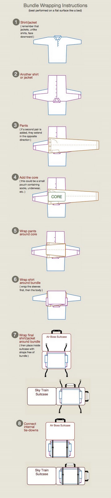
Follow these links for more information about the Air Boss carry-on and the Sky Train backpack/carry-on hybrid that are referenced in the packing instructions.
HT: Core77
Disclosure: Sorry, Philadelphia, we don't have anything to disclose. We don't get paid for this - we just appreciate good design, whether it be physical or informational in nature, and think it's cool!...
Labels: none really
A very natural question to ask in these days of high unemployment in the United States with no end in sight is "why aren't employers hiring?"
If you want the bottom line answer, it's because many firms are unwilling to consider adding to their employee rosters because they don't believe their future prospects are bright enough to support the cost of adding additional people to their payroll.
What is that cost? Well, you're in luck because our latest tool is designed to estimate the minimum amount of money a company would need to justify keeping you on their payroll!
What we've done is to work out the major basic costs your employer has to pay just because you're on their payroll. That includes everything from the pay you receive from working to the pay you might receive for not working, whether that's in the form of vacation, sick leave or other personal time off.
Speaking of personal benefits, let's not forget the amount of cash your employer might contribute to your retirement plan on your behalf, as well as what your employer pays to provide you and/or your family with health insurance.
We've also added in what your employer pays to the federal government because you are working for them. Things like your employer's portion of Social Security and Medicare taxes, not to mention the federal government's share of taxes to fund unemployment insurance benefits.
But wait, that's not all! There's also the taxes that an employer must pay to your state because you're on their payroll. That covers thinks like the state's portion of the unemployment insurance taxes that are intended to pay your benefits if you're laid off from your job and the state's taxes that support workers' compensation programs if you are injured while working.
And don't forget about those pesky administrative costs associated with paying you. Because it actually costs money to pay you money!
As you can imagine, the costs of just keeping you on the job can add up to be pretty substantial. If you're on the outside looking in, you can add in the employer's costs of hiring you and training you.
It's really a wonder that with all these extra costs beyond your paycheck that anyone can get a job in the first place!
Which brings us to today's problem. The costs of keeping people on the payroll and of hiring new people have been rising, which you can confirm by comparing your results for this tool with our previous generation of it!
For instance, if a business might hire significant numbers of teens at the federal minimum wage, the cost of paying just the "visible" portion of such a minimum wage earning employee has gone up by over 40% in the years from 2007 to 2010, as the minimum wage itself was jacked up from $5.15 per hour in 2007 to today's $7.25 per hour.
And if you thought that ObamaCare® might make health care insurance any less expensive, you're sadly mistaken....
So far, we also haven't looked at other potential increases the government still might add this year to a firm's cost of doing business. Not including what might happen through arbitrary regulations.
Never-the-less, our tool does provide a basic indication of the minimum amount of revenue or savings that you must personally generate in support of your employer to justify your place on their payroll. Assuming they can afford to just break even. Indefinitely.
You might have noticed a pattern that nearly every contributing cost that inflates what your employer must pay for your services, above and beyond your "visible" pay, is something that is affected or might be affected by government actions. If you've been paying attention lately, all those costs have been going up.
And that's why employers aren't doing much hiring in meaningful numbers these days. This situation will only reverse when the costs of both doing business and having people on the payroll stop rising, or better yet, start falling instead. Business owner Michael Fleischer writes (HT: King Banaian):
As much as I might want to hire new salespeople, engineers and marketing staff in an effort to grow, I would be increasing my company's vulnerability to government decisions to raise taxes, to policies that make health insurance more expensive, and to the difficulties of this economic environment.
A life in business is filled with uncertainties, but I can be quite sure that every time I hire someone my obligations to the government go up. From where I sit, the government's message is unmistakable: Creating a new job carries a punishing price.
The Obama administration's main response to the situation facing business owners and hiring managers, other than doing things that either increase their costs of doing business (see above) or that steal from the future while playing games today, is to emphasize that they're doing a lot of things to make it cheaper for businesses to borrow money.
It would seem that in their minds, the secret to creating jobs in the private sector is that businesses should take out loans and then pay interest charges on top of their increasing costs, without knowing whether they'll be able to make enough money doing business in the future to justify hiring someone new or to continue employing somebody today.
And these same people wonder why so many people have come to the conclusion that they just don't get it.
Welcome to the blogosphere's toolchest! Here, unlike other blogs dedicated to analyzing current events, we create easy-to-use, simple tools to do the math related to them so you can get in on the action too! If you would like to learn more about these tools, or if you would like to contribute ideas to develop for this blog, please e-mail us at:
ironman at politicalcalculations
Thanks in advance!
Closing values for previous trading day.
This site is primarily powered by:
CSS Validation

RSS Site Feed
JavaScript
The tools on this site are built using JavaScript. If you would like to learn more, one of the best free resources on the web is available at W3Schools.com.
Other Cool Resources
Blog Roll


