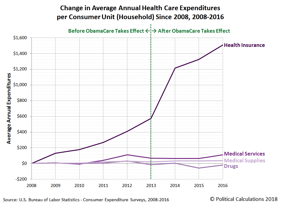
Did the Affordable Care Act (a.k.a. "Obamacare") succeed in making health care more affordable for the average American household?
Data from the Consumer Expenditure Survey says... no!
Update 1 June 2018: The vertical dashed line in the chart indicates a break in the U.S. Census Bureau's methodology for collecting information about health insurance coverage that was implemented after 2013, where data in the periods before and after this change are not strictly comparable to each other. That said, the Consumer Expenditure Survey's data since 2013 confirms that the Affordable Care Act has failed to restrain the growth of average health insurance costs by American households during the period that it has been in effect.
Although the chart above focuses on what happened after it took effect, in reality, the health care cost curve began bending upward almost immediately after the Affordable Care Act was passed in 2010, leaving millions of Americans who had been promised by the ACA's supporters that it would reduce the cost of their health insurance sorely disappointed.
But that disappointment didn't extend to the people who owned stock in the U.S.' major health insurers, such as Centene (NYSE: CNC), United Healthcare (NYSE: UNH), WellCare (NYSE: WCG), Cigna (NYSE: CI), Humana (NYSE: HUM), Aetna (NYSE: AET), Molina (NYSE: MOH) and Anthem (NYSE: ANTM), where the Affordable Care Act has been a government-granted license to print money since it went into effect after 2013....
References
U.S. Bureau of Labor Statistics. Consumer Expenditure Survey. Multiyear Tables. [PDF Documents: 2008-2012, 2013-2016]. Accessed 28 May 2018. [Note: Data for 2017 will become available in September 2018.]
Afterword
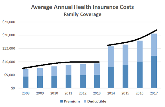
Added 4 June 2018: Here's a neat chart that accompanied a September 2017 Motley Fool article by Keith Speights:
The cost of health insurance, both in premiums and in deductibles, jumped considerably after 2013 when the Affordable Care Act went into effect.
Labels: data visualization, health care, health insurance, personal finance
In our first installment of this series, we approached the question of "how much do you need to save for retirement?" by considering how much money you would need to accumulate in your savings or retirement accounts to effectively replace your annual income after you retire. In this installment, we're going to focus instead on how much you plan to spend each year after you've stopped working to identify your lifetime savings target.
That's an important difference to consider, because if you have developed the kind of frugal and thrifty habits it takes to build a comfortable nest egg where your personal spending is concerned, the odds are that the answer to the question will be much smaller, and much more realistically attainable, than the answer that would belong to someone who lives a less financially disciplined life.
Here, we'll start with the amount of money that you want to spend each year in retirement and figure out how much you would need to save after taking the monthly retirement benefits you might get from Social Security into account (you can find out that number directly from Social Security), which will give us the minimum savings target you will need for your savings and retirement accounts. We'll be applying the simple math that lies behind the Four Percent Rule to find that number, where our tool below will let you set the percentage of money that you would seek to withdraw from your retirement account each year if you would prefer to be more conservative, as some advisers recommend.
We'll also consider something that a lot of retirement advisers haven't yet been taking into account for their clients - what will happen when those benefits are cut as promised under current law by 23-27% after the year 2033 when Social Security's Trust Fund is projected to run out of money, which is just 15 years away at this writing.
The fun starts with our tool below, where you're more than welcome to change any of the default values we've entered to consider whatever retirement spending scenario you would like to consider! [If you're accessing this article on a site that republishes our RSS news feed, please click here to access a working version of the tool.]
In case you're wondering about the default data, $45,786 is the average amount of annual household expenditures for Americans Age 65 or older in 2016, which comes from the U.S. Bureau of Labor Statistics and U.S. Census Bureau's annual Consumer Expenditure Survey. Data for 2017 will become available in September 2018.
To find out if you're on track to hit your personal retirement savings target indicated by our tool, assuming that you've found the results from our tool to be reasonable for your retirement planning scenario, please take advantage of the tool we provided with our first installment.
Perhaps the biggest wild card in our tool's results to consider is what will happen to Social Security after the trust fund that is currently boosting the retirement benefits that it is paying out by about 20-25% runs out of money and it switches back to a pay-out-only-what-it-takes-in type program. It's possible that politicians will strike a deal to keep those payments from being cut, which would more likely than not mean higher payroll taxes.
Alternatively, they could continue doing what they started doing under President Obama and begin cutting Social Security "loopholes" benefits in small installments to more sustainable levels for the government. [Note: We put "loopholes" in quotes because that's how the politicians described cutting the Social Security benefits that earlier politicians had specifically set up to work exactly as they were used by Social Security beneficiaries. Funny how that works!]
Otherwise, big Social Security benefit cuts will arrive all at once, as soon as Social Security's Old Age and Survivors Insurance Trust Fund runs out of cash.
Finally, if you're looking for ways to cut your expenses after retirement that involve little in the way of sacrificing your quality of life, Paul Katzeff of Investor's Business Daily has four suggestions.
Labels: investing, personal finance, tool
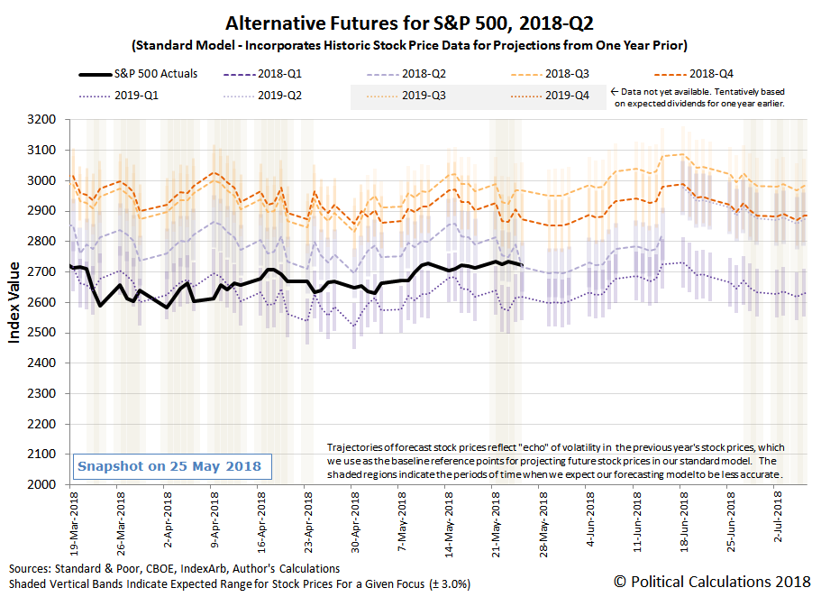
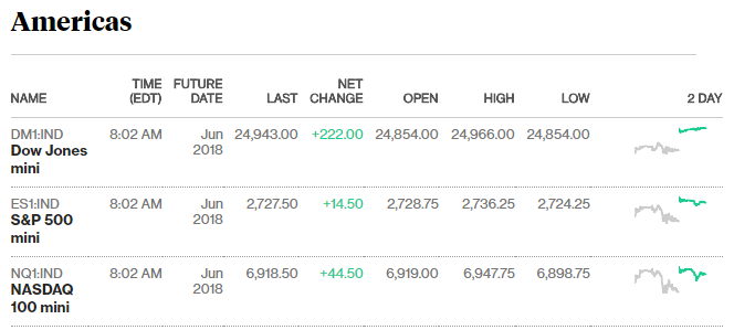
As expected, stock prices gapped up to start the fourth week of May 2018 thanks to a deal between the U.S. and China to not impose new tariffs on each other's goods, but beyond that move, didn't do very much else during the rest of the week.
Update 29 May 2018: We missed a change in 2018-Q2's dividend futures that occurred last Friday. We've corrected the chart above, the original version of the chart may be found here.
Then again, that might have been expected too for a week preceding a long holiday weekend in the U.S., which not uncoincidentally, made for a pretty slow news week.
- Monday, 21 May 2018
- Oil rallies to multi-year highs on Venezuela worries
- Fed's Bostic repeats U.S. close to Fed's inflation, employment goals
- Fed's Harker looking for sustained U.S. inflation near target
- Harker could back 3 more Fed rate hikes in face of U.S. inflation
- Wall St. rises on trade war truce; industrials lead
- Tuesday, 22 May 2018
- Wednesday, 23 May 2018
- Oil falls on shock U.S. stock builds, OPEC supply worries
- Trump calls for new 'structure' for U.S.-China trade deal
- China's Sinopec to boost U.S. crude imports to all-time high: sources
- U.S.-China trade row sows confusion in farmer planting plans
- Trump blasts Mexico, Canada over NAFTA talks
- U.S. new home sales fall in April, housing market treading water
- Wall St. ends up as Fed seen keeping gradual approach to rate hikes
- Thursday, 24 May 2018
- Fed could end tightening cycle in 2019: Harker on CNBC
- Tight supply weighs on U.S. home sales; job market strengthening
- China plans to cut import tariffs on some consumer goods from July 1: Bloomberg
- Wall Street dips after Trump cancels North Korea summit; Netflix gains
- Wall St. ends down slightly on trade, oil price concerns
- Friday, 25 May 2018
Elsewhere, Barry Ritholtz identified the week's positives and negatives for the U.S. economy and markets.
Welcome back from the holiday!
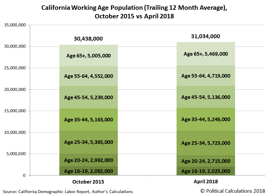
We're about to go into a long holiday weekend, with something of a mystery to consider, in that it would seem that young adults between the ages of 20 and 24 are vanishing from the state of California.
That's according to population data that has been published by the state's Employment Development Department in its monthly Demographic Labor Force Summary Tables, where we find that after reached a peak of 2,992,000 in October 2015, the trailing 12 month average of the state's population of these young adults has been nearly decimated, falling to 2,715,000 in April 2018.
That's not the case for every other age demographic in California's population over the last two and a half years. The following chart shows the overall change the state's population by age group from October 2015 to April 2018.
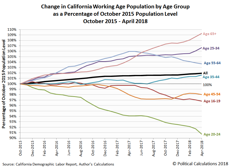
And for the sake of filling in the gaps in between this 31 month span, the following spaghetti chart presents how the population of each of these major age groups has evolved from October 2015 to April 2018 as a percentage of its October 2015 population level, where you can quickly determine which age groups have grown and which have shrunk over that time.
The same phenomenon is showing up in national population data for the U.S. Looking at national data for the Age 20-24 population and rounding to the nearest thousand, we find that there were 22,693,000 young adults in 1 July 2015, which decreased to 22,381,000 by 1 July 2016. Taking advantage of the available cohort population for 2017's Age 20-24 population, we can project that the numbers of this demographic group will continue to decline, with an early estimate of 21,774,000 that would apply for 1 July 2017.
That's a 919,000 decline over two years for the entire U.S., where if we limit California's Age 20-24 population change to an average 24 month period since October 2015, we find that its equivalent population decline over a two year period is 198,000, which would account for 21.5% of the national decline.
Overall, the population of California represents one out of every eight Americans (or 12.5%), so that 21.5% figure seems like a disproportionately large share of a seemingly vanishing population. Fortunately, there's a non-nefarious explanation for why so many Californians between the ages of 20 and 24 are disappearing from the state's population count: the population of this age group within California had been over-represented compared to the rest of the nation in previous years.
In 2015, Californians between 20 and 24 years old made up 13.2% of the nation's total in this age demographic, which has rapidly fallen in the period of time since, where April 2018's population of 2,715,000 young adults in California make up about one out of eight Americans in our early estimate for 2017's population of this group. This portion of the state's population is reverting back to its mean share within the national population.
Meanwhile, the age cohort that produced that over-representated share of Age 20-24 year old Californian among the national population in previous years has aged up into the Age 25-34 group, which is seeing a significant boost in its numbers, and is second only to the state's population of senior citizens (Age 65+).
But perhaps the most amazing thing is how fast the population of Age 20-24 year olds in California has been nearly decimated in such a short period of time. You might normally think of demographic change as something that takes generations to play out, but what's happened in California took place in the amount of time it takes a newborn to grow into a toddler ready to be toilet-trained!
Data Sources
California Employment Development Department. California Demographic Labor Force Summary Tables. [PDF Documents]. October 2015 to April 2018.
U.S. Census Bureau, Population Division. Annual Estimates of the Resident Population by Single Year of Age and Sex for the United States: April 1, 2010 to July 1, 2016. [Online Database]. Release Date: June 2017. Accessed 24 May 2018.
Labels: data visualization, demographics
It didn't last very long. At all. But it was still beautiful when it happened!
In case you missed it, we're referring to what happened to the stock price of General Electric (NYSE: GE) just one day after it had finally converged with the main flock of stocks that is the (Index: SPX) after months of having so sharply deviated from the trajectory of so many other stocks, where our leading paragraph in this article is a play on the final paragraph in our previous entry!
We live to capture "before" and "after" moments like this, and what happened to GE's stock price on Wednesday, 23 May 2018 was truly a thing of chaotic beauty, because after finally catching back up to the S&P 500, investors collectively decided that GE didn't belong anywhere near it. The following chart shows how decisively investors made that call....
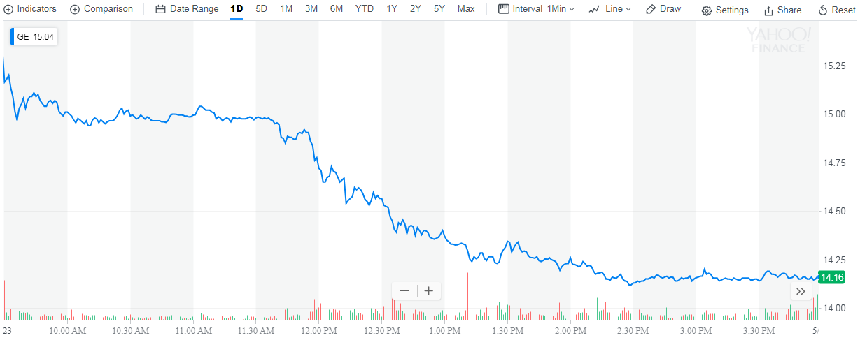
Now, let's talk about why it happened. Something happened on 23 May 2018 to specifically provoke this kind of negative reaction from GE's shareholders and stock market investors, so let's see if we can pinpoint exactly when it happened. The following chart provides a timeline for GE's stock price during 23 May 2018.
Shortly after opening, we see that GE's stock price dropped a little over 2% below its previous day's closing value of $15.29 per share. Not great, but also not greatly out of the ordinary for the kind of volatility that GE's stock price has shown since the end of January 2018.
More importantly, we see that after dropping early in the morning, GE's stock price was fairly stable at that lower level. Until about 11:40 AM EDT, when it suddenly dropped nearly another half a percent.
But that downward move would pale against what happened after 11:55 AM EDT, when GE began steadily dropping over the next two and a half hours, losing another 5% of its value before bottoming for the day. It improved a little after that, but by the end of 23 May 2018, GE's stock price had dropped by nearly 7.3%.
So what happened to cause GE's investors to become so demoralized about the company's future prospects so quickly? We can't put it any better than MarketWatch's Tomi Kilgore:
Shares of General Electric Co. plunged in very active trade Wednesday, putting them on track for the biggest selloff nine years, with losses accelerating after Chief Executive John Flannery started talking at an industry conference.
The industrial conglomerate’s stock GE, slid 7.4% in afternoon trade, enough to pace the Dow Jones Industrial Average’s DJIA losers. Volume ballooned to nearly 110 million shares, well above the full-day average of 61.0 million shares, to make the stock the most actively traded on major U.S. exchanges.
The stock was headed toward the biggest one-day drop since it plummeted 7.2% on Nov. 13, 2017 after Flannery, then newly named CEO, unveiled a transformation plan, including the halving of the company’s dividend. It was down only about 2% at 11:30 a.m. ET Wednesday, which was just before Flannery started speaking at the Electrical Products Group conference in Florida.
Ah yes, we're narrowing in on the problem.... What could John Flannery possibly have said at the conference to send GE's stock price into a tailspin?
The Motley Fool gets straight to the heart of the matter:
Shares of General Electric (NYSE: GE) took a dive today after CEO John Flannery cooled off hopes of a speedy turnaround at the struggling conglomerate. He warned that the industrial giant's power division wouldn't see profit growth until 2020, and also said he couldn't guarantee the company would be able to keep paying a dividend.
As a result, the stock finished down 7.3%.
Oops! That kind of statement is pretty much the last thing that investors are ever looking to hear. Especially for a company with a long history of paying dividends. But what exactly did Flannery say? Reuters has that part of the story:
Asked by an analyst if the 2019 dividend was assured, Flannery said that while payout is important to investors, it depended on multiple factors.
“It’s ultimately a function of the free cash flow of the company and that’s ultimately a function of operating performance and things that we do with the portfolio,” Flannery told analysts at the annual Electrical Products Group conference in Florida.
GE’s decision to merge its transportation business with rail equipment maker Wabtec Corp (WAB.N), announced on Monday, was among the changes that could affect the dividend, he said.
“We have to see how this plays out,” he said.
Reuters also describes what investors heard:
Analysts read this as a sign that GE is likely to reduce its dividend, which is 48 cents a share.
“The primary takeaway is the dividend will be cut as assets are sold,” said Jeff Sprague, an analyst at Vertical Research Partners.
“Proceeds from sales have to go to debt reduction. Cash flow from assets sold is obviously gone making dividend unsustainable.”
In the section above, Reuters is referring to GE's annual dividend payout of 48 cents per share. What that tells us is that the following chart, which we first presented just over a week ago, has suddenly taken on increased relevance.
Assuming that investors would continue to set GE's stock price as they have since 2009 with respect to their anticipated annual dividend payouts (as indicated by the dotted blue line on the chart), for its current market capitalization of $123.2 billion at $14.13 per share, GE's closing stock price on 23 May 2018, investors are effectively speculating that GE will further reduce its quarterly dividend by 25% from its current 12 cents per share (48 cents per share annually) to about 9 cents per share (36 cents per share annually).
Or will investors take the stock price even lower in anticipation of even larger dividend cuts that have been suggested at by GE CEO John Flannery's comments? In the next few weeks, GE will declare its next quarterly dividend, which would be the optimal time for the company to change its current dividend policy if they're going to do so, now that investors are well primed for it. We'll revisit the question after they have.
Labels: dividends, investing, stock prices
We've been tracking the random, yet curiously synchronized movements of the S&P 500 (Index: SPX) and General Electric (NYSE: GE) since the S&P 500 peaked back on 26 January 2018, where the two have diverged and then nearly reconverged before diverging once again during that time.
But as of the close of trading on Tuesday, 22 May 2018, it would appear that GE has returned to the S&P 500 flock, where the trajectories of the two have converged once more. At least as measured by their percentage change since the 26 January 2018 peak for the S&P 500!
That condition may not last very long, but you have to appreciate the beauty of it all when it does!
Labels: data visualization, investing, SP 500, stock prices
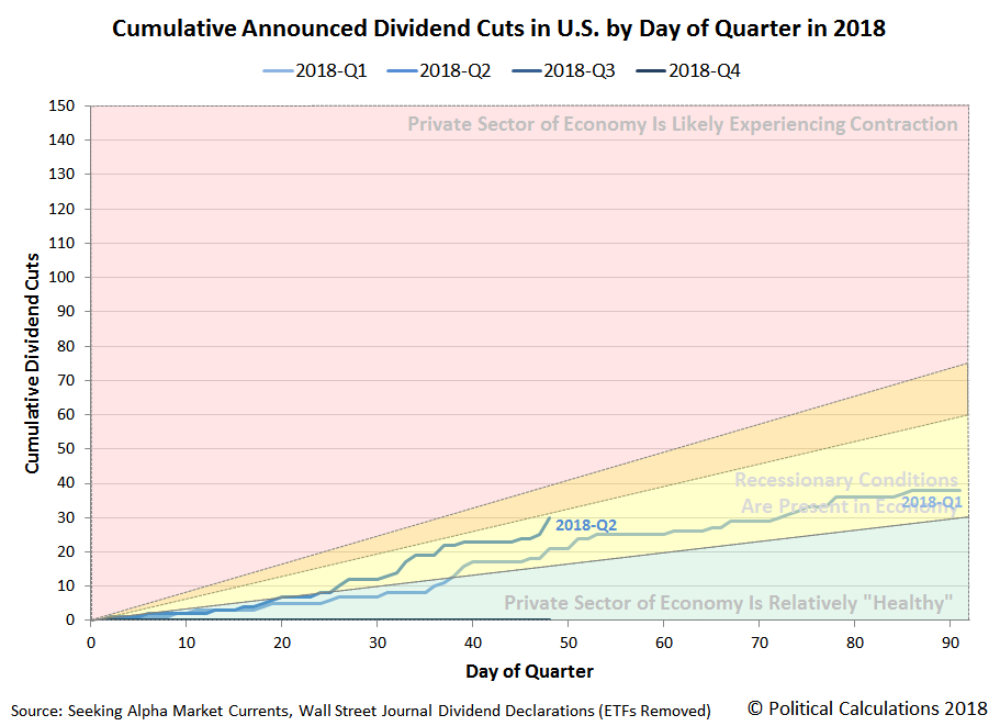
Earnings reporting season for 2018-Q2 is now mostly in the rear view mirror, which makes now a good time to review the state of dividend cuts for the quarter, which are the early warning system of whether any major industrial sectors are experiencing financial distress. Our first chart of two today reveals that compared to the first quarter of 2018, dividend cuts in the second quarter of 2018 have been announced at a faster pace through the current quarter to date.
However, compared to the second quarter of 2017 (2017-Q2), the current quarter of 2018-Q2 is nearly on exactly the same pace.
As for which industrial sectors are being hammered in 2018-Q2, the following sample of firms that have announced dividend cuts in the current quarter offers some insight. The list is presented in chronological order:
- Paradise (OTC: PARF)
- Franklin Street Properties (NYSE: FSP)
- Mesabi Trust (NYSE: MSB)
- Alliant Energy (NYSE: LNT)
- Mesa Royalty Trust (NYSE: MTR)
- Blackstone Group (NYSE: BX)
- Permian Basin Royalty Trust (NYSE: PBT)
- Dynagas LNG Partners LP (NYSE: DLNG)
- SandRidge Mississippian Trust II (NYSE: SDR)
- SunCoke Energy Partners (NYSE: SXCP)
- NuSTAR Energy (NYSE: NS)
- NuSTAR GP (NYSE: NSH)
- Carlyle Group (NASDAQ: CG)
- Och-Ziff Capital Management (NYSE: OZM)
- Aceto (NASDAQ: ACET)
- Apollo Global Management (NYSE: APO)
- AllianceBernstein (NYSE: ABDC)
- Chesapeake Granite Wash Trust (NYSE: CHKR)
- Salient Midstream & MLP Fund (NYSE: SMM)
- ECA Marcellus Trust I (NYSE: ECT)
- TC PipeLines (NYSE: TCP)
- Medley Capital (NYSE: MCC)
- Computer Programs and Systems (NASDAQ: CPSI)
- National Bankshares (NASDAQ: NKSH)
- PermRock Royalty Trust (NYSE: PRT)
- Cross Timbers Royalty Trust (NYSE: CRT)
- San Juan Basin Royalty Trust (NYSE: SJT)
- Enduro Royalty Trust (NYSE: NDRO)
Of the 28 dividend cutting firms in our sample, 16 are in the oil and gas production sector, where we note that 6 of the listings represent firms whose businesses are structured as Master Limited Partnerships (MLP) or Limited Partnerships (LP), which were negatively impacted by a tax rule change that was announced by the U.S. Federal Energy Regulatory Commission in March 2018, which would reduce their earnings and thereby prompt them to cut their dividends. In the oil and gas sector, these are firms that predominantly operate pipelines.
The majority of the remaining 10 dividend cutting oil and gas firms are those that pay monthly distributions of dividends to their shareholders, which fluctuate with their earnings from month-to-month. Here, we suspect that a dip in West Texas Intermediate crude oil prices in the first quarter is showing up as negative noise in the second quarter where these firms dividend announcements are concerned.
The second biggest cutters of dividend payments to their shareholders in 2018-Q2 are to be found in the financial sector, which includes a number of Real Estate Investment Trusts (REIT). Many firms in this sector are sensitive to interest rate hikes, where the Fed has been steadily raising short term rates in the U.S. since December 2016.
The remaining four dividend cutting firms represent the food, healthcare, technology and utility industries respectively.
On the whole, if not for the FERC's tax rule change, we believed that 2018-Q2 would appear stronger than is suggested by our charts above!
Data Sources
Seeking Alpha Market Currents. Filtered for Dividends. [Online Database]. Accessed 18 May 2018.
Wall Street Journal. Dividend Declarations. [Online Database]. Accessed Accessed 18 May 2018.
Labels: dividends
If investors have really been concerned about the threat of a potential trade war between the U.S. and China, the S&P 500 will very likely let us know how concerned they've been about it this week.
That's because investors continually absorb new information about the business prospects for the companies, where changes in the expectations for their future earnings are quickly realized in their stock prices. For trade-dependent industries, those changes in expectations can show up in the form of lowered expectations for future earnings, which would tend to lower the value of their stock, while industries that might materially benefit from the imposition of new or higher tariffs will have raised expectations for their future earnings, which would tend to increase the stock prices of firms in the "protected" industries.
All that is highly relevant going into the fourth week of May 2018 because of news reports that came out over the weekend indicating that a potential breakthrough in trade negotations between the U.S. and China has been made, which would avert the negative impact of tit-for-tat tariffs and other trade sanctions between the world's two largest national trade partners.
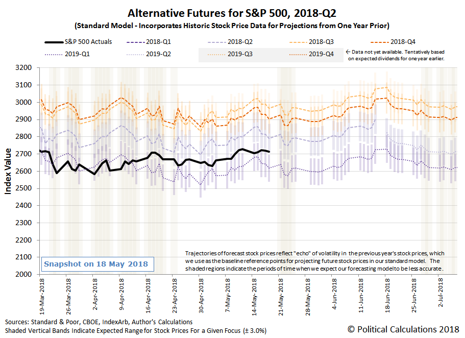
Since the impact of a trade war is generally believed to offer greater negatives than positives across the entire U.S. economy, the diminishment of the risk of trade war should generally boost stock prices, which we would see in the S&P 500. Since the news broke over the weekend, when markets were closed, we would anticipate seeing stock prices (and stock price futures) gap significantly upward as investors provide their initial response to the positive news when markets open for trading on Monday, 21 May 2018. The following spaghetti forecast chart shows where stock prices stood at the close of trading on Friday, 18 May 2018.
The better question to ask is how of that positive change will remain at the close of trading, after investors will be flooded with new information about the potential trade deal and whatever other market moving new information comes out during the day.
At present, our spaghetti forecast chart indicates that the S&P 500 is poised where investors would appear to be roughly equally splitting their forward-looking focus between the current quarter of 2018-Q2 and the more distant future quarter of 2019-Q1. If the news of the potential breakthrough in trade negotiations between the U.S. and China holds, and if the risk of a trade war breaking out between the U.S. and China have been greatly weighing on their expectations for the future, it would be reasonable for investors to shift more of their attention on the current quarter of 2018-Q2 in response to this news and send stock prices upward from their current position, where a single-day increase of 3% or more in response to the news would be relatively easy for the market to achieve.
Such a move would also mark a very rare event for the U.S. stock market. For our daily trading records that extend back to 3 January 1950, covering some 17,207 trading days, we count just 104 where the S&P 500 and its predecessor indices closed higher by 3.0% or more, suggesting historical odds of 1 in 165 for such an event, where we have to go back to 26 August 2015 to find the last such occurrence.
Or, it may not change by such an unusually large amount, which will tell us that investors haven't really been all that concerned about the prospects for an economy-damaging trade war between the U.S. and China, where it has only contributed to the regular daily noise of trading in the U.S. stock market.
The cool thing is that we'll find out the answer, either way, perhaps as early as today from the day's news headlines. Speaking of which, here are the major headlines that we made special note of during the past week....
- Monday, 14 May 2018
- Oil gains while U.S. crude's discount to Brent deepens
- Fed's Bullard says U.S. yield curve might invert by early 2019
- Maybe if he asks nicely? Fed's Kaplan says prefers that U.S. yield curve not invert
- Fed's Kaplan sees U.S. inflation rising but not 'running away'
- China says will work with U.S. for positive outcome in trade talks
- Wall St. ekes out gains as trade optimism pressured by defensive stocks
- Tuesday, 15 May 2018
- NAFTA nations 'very close' to agreeing deal: Canadian prime minister
- At top of Fed, a dispute on policy picks up steam
- Fed's policy language 'served its purpose,' will need revisit: Williams
- Fed's Williams sees no rise in neutral rate from stronger growth
- Bullard says Fed's inflation framework warrants review
- Wall St. drops as Treasury yields surge
- Wednesday, 16 May 2018
- Thursday, 17 May 2018
- Oil steady after retreating from 2014 highs on dollar strength
- Trade Wars not looking so warlike:
- China does not want to see escalation in Sino-U.S. trade tension
- China vice premier says proactively seeking resolutions on trade dispute with U.S.: Xinhua
- White House adviser expects China to bring proposal to trade talks
- China said to offer $200 billion U.S. trade deficit reduction package
- Fed's Kaplan: U.S. economy at or beyond full employment
- U.S. 30-year mortgage rates hit 7-year peak: Freddie Mac
- Tax cut windfall seen lifting U.S. companies' business investments
- Wall St. ends down slightly on trade, oil price concerns
- Friday, 18 May 2018
- Oil prices fall, Brent set for sixth week of gains
- Trade Wars looking like some kind of negotiation:
- Wall Street posts weekly loss as banks, chipmakers weigh
- Over the Weekend
Looking beyond these headlines, Barry Ritholtz listed the positives and negatives for the U.S. economy and markets during the third week of May 2018.
Update 8:15 AM EDT: As expected, pre-market open stock price futures have gapped up, but by 0.6% for the S&P 500.
Update 22 May 2018: By the end of the day, the gain was just a little over 0.5%, with a relatively low level of trading noise throughout the day.
Every three months, we take a snapshot of the expectations for future earnings in the S&P 500 at approximately the midpoint of the current quarter, shortly after most U.S. firms have announced their previous quarter's earnings.
And in the six years that we've been taking these snapshots, we've never seen anything like what has happened to the S&P 500's projected earnings per share during 2018, where those future earnings have been revised dramatically higher in two consecutive quarters.
Last quarter, we could directly attribute the change to the passage of the Tax Cuts and Jobs Act of 2017, where money that had previously been subject to corporate income taxes was immediately reclassified as earnings, which boosted the effective earnings per share of the entire S&P 500.
But in 2018-Q2, the projected future earnings per share of the S&P 500 was significantly revised upward again, apparently as the result of an organic improvement in the future business outlook for the companies of the S&P 500. Standard & Poor's Howard Silverblatt included the following comments in his 16 May 2018 report on the S&P 500's earnings.
Q1 2018 estimate (93% real) up 7.2% from year-end 2017, as EPS setting record; 2018 estimate up 7.7%, 2019 up 8.8%. Operating margin record high at 11.05%, 20-year average is 8.08%, as retail pulls it down. Unsung hero, sales posting strong 9.5% Y/Y gain.
Beyond that, Reuters is reporting that the tax cut is also boosting business investment, which would be a contributing factor to the improvement in future earnings expectations.
U.S. companies could plow more of the money saved from sweeping tax cuts into business investment later this year, perhaps even surpassing a jump in first-quarter capital expenditure that was the highest in almost seven years, strategists and analysts said.
Higher spending on technology, equipment and facilities could ease worries that S&P 500 companies have reached a peak in the profit growth investors are counting on to extend the nine-year bull market in equities.
The increased spending in the first quarter follows significant cuts in corporate taxes approved late last year by the Republican-led Congress. Companies have also been returning the tax cut windfall to shareholders via share buybacks and increased dividends at amounts never seen before, highlighted by Apple’s $23.5 billion repurchase in the first quarter.
With data in from 94 percent of S&P 500 companies, first-quarter capital expenditures total $159 billion, up more than 21 percent from a year ago and on track to be the highest year-over-year growth since the third quarter of 2011, according to S&P Dow Jones Indices data.
The upward revision in projected future earnings stands in stark contrast to the typical pattern we observed in quarter after quarter during the Obama administration, where projected earnings would start with high expectations that would go on to steadily erode over time.
We don't know how long the current situation of rising earnings expectations from quarter to quarter might continue, but it's certainly fun to watch while it's happening!
Data Source
Silverblatt, Howard. Standard & Poor. S&P 500 Earnings and Estimates. [Excel Spreadsheet]. 16 May 2018.
There are several different schools of thought for determining how much money you need to save to be able retire someday. Over the next several weeks, we'll explore what those schools are and what they tell you about how much wealth you need to stash away to be able to afford not ever having to work at a job again!
The first approach we'll check in with is the "income replacement" school, where how much you earn at your job determines how much you will need to save. This kind of approach is often championed by investment firms, like J.P. Morgan Asset Management, who provides the following illustration from their retirement guide to illustrate how much of your annual income you need in order to continue living as if you never stopped working when you retire.
The overall idea is have enough wealth built up by the time that you retire that, after you deduct expenses that you'll never have again, like commuting, work wardrobe, etc., will let you keep being able to spend money as if you never retired in the first place.
But accumulating the amount of money that you need to support the income replacement strategy is easier said than done over the decades of one's working life, where it can be difficult to know if you're on track.
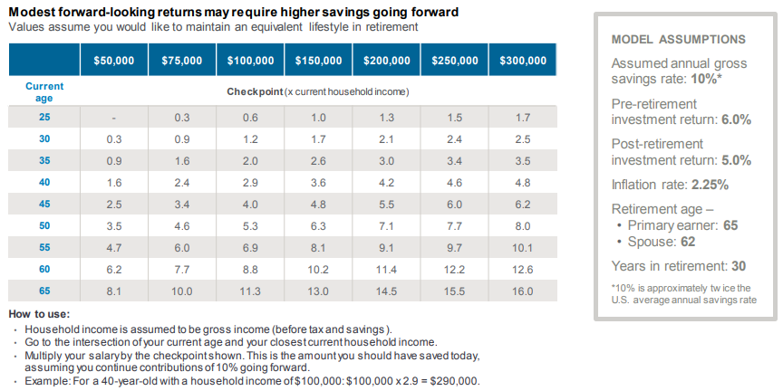
To that end, J.P. Morgan provides the following table to indicate what your accumulated savings needs to be at certain age milestones and income levels to be able to generate the wealth you need to effectively replace your working income in retirement, based on how much they assume you're setting aside and the rates they project for both your investment returns and for inflation.
But we all know that the world doesn't cooperate quite like that, so the savings multiples indicated in the table can tell you how far away you might be if you choose to follow the income replacement strategy for preparing for your future retirement. We've built the following tool to approximate what those actual savings amount are for the age and income you choose to enter to get to that magic number quicker. If you're reading this article on a site that republishes our RSS news feed, please click here to access a working version of this tool at our site.
Our tool works best when covering the range of ages (25 to 65) and annual household incomes ($50,000 to $300,000) indicated on the milestone retirement savings chart. The further outside of those ranges you get, the less reliable the tool's results will be.
The downside of using the income replacement approach to determine how much you need to save up for retirement is that the real world can have very different ideas about how stable your income will be throughout your working life, what actual rates of return might be, and what inflation will be, to name just a few factors. You could easily find yourself in a position where you cannot reasonably attain the income replacement savings targets you might have set, because things change over time. Sometimes dramatically.
There are other approaches to saving for retirement to consider however, which we'll take on in upcoming parts of this series!
Although the media reports that they spend much of their free time killing things, two-thirds of millennials appear to be unable to fully capitalize on their natural killer instincts enough to take on the risks of investing in the stock market to increase their wealth outside of having a job.
Whether that's because their parents failed to teach them to invest or because they find it too "scary and intimidating", it seems strange that so many Americans of the millennial generation haven't grasped that investing can be as easy as buying the products that you want to have and isn't much more expensive than that. In fact, to quote Girl$ On The Money's Mabel Nuñez from her presentation (HT: J. Money) at the LOLA Retreat money event for women that was held in New York City last month, "if you can afford the product, you can afford the stock".
That's really a great way to think about it. If you like a product enough to buy it, odds are that there are a lot of other people like you out there also buying it, which is what keeps the company that makes or sells the product in business. And if you and a lot of others like the company a whole lot, odds are that the company makes a positive net margin (or profit) as it does business.
But, if you're only a customer of what the company sells, you're missing out on the opportunity to make money from the company's success in providing the kinds of products and services that you and lots of other people like you are happy to buy at the prices at which they sell them. One way you can do that is to buy shares in the ownership of the companies whose products that you like to buy, which is what you're really getting when you invest your money in those companies' stocks. The stock market is simply the place where you can publicly buy, sell or trade those shares of ownership.
Let's go shopping, shall we? A great resource to find companies whose products that you like to buy is Dividend.com's listing of stocks by their industrial sector, which is kind of like the mall directory for the stock market. Starting here, you can zero in on the companies whose products you like to buy.
Let's say that you like to buy a particular retailer's apparel products. These kinds of businesses will be grouped in the stock market's Services sector, where you can find them listed under Apparel Stores.
We've gone ahead and pulled the list for the Apparel Stores whose shares of stock are available to be bought in the stock market, where we've focused on those company's who pay a dividend to the owners of the shares of stock that they have issued.
| Company (Ticker) | Dividend Yield | Annual Dividend (per Share) | Stock Price (per Share) |
|---|---|---|---|
| American Eagle Outfitters (NYSE: AEO) | 2.62% | $0.55 | $20.97 |
| Abercrombie & Fitch (NYSE: ANF) | 3.16% | $0.80 | $25.31 |
| Buckle Inc. (NYSE: BKE) | 4.13% | $1.00 | $24.20 |
| Cato Corp (NYSE: CATO) | 8.04% | $1.32 | $16.42 |
| Chico's FAS (NYSE: CHS) | 3.29% | $0.34 | $10.35 |
| Citi Trends, Inc. (NASDAQ: CTRN) | 1.09% | $0.32 | $29.45 |
| DSW Inc. (NYSE: DSW) | 4.07% | $1.00 | $24.56 |
| Finish Line Inc. (NASDAQ: FINL) | 3.39% | $0.46 | $13.55 |
| Foot Locker (NYSE: FL) | 3.18% | $1.38 | $43.44 |
| Guess, Inc. (NYSE: GES) | 3.67% | $0.90 | $24.52 |
| The Gap Inc. (NYSE: GPS) | 3.19% | $0.97 | $30.38 |
| Nordstrom Inc. (NYSE: JWN) | 3.00% | $1.48 | $49.32 |
| L Brands Inc. (NYSE: LB) | 7.22% | $2.40 | $33.23 |
| Children's Place Retail Stores, Inc. (NASDAQ: PLCE) | 1.50% | $2.00 | $133.55 |
| Ross Stores (NYSE: ROST) | 1.09% | $0.90 | $82.66 |
| Shoe Carnival, Inc. (NASDAQ: SCVL) | 1.22% | $0.30 | $24.64 |
| Stage Stores (NYSE: SSI) | 7.46% | $0.20 | $2.68 |
Now, let's put Mabel Nuñez' proposition to the test. Let's say that you happily paid $120 for shoes from Foot Locker (NYSE: FL), where you believe you got a good deal on them.
A single share of stock in Foot Locker cost $43.44 at the close of trading on Monday, 14 May 2018, so there's no doubt that if you could afford to have paid $120 for a pair of shoes, you probably wouldn't have had any trouble in buying a single share of stock in the company. In fact, you could have bought two shares and had change left over, even after paying any commissions or fees to a broker, which is what they call the salespeople of the stock market.
We focused on the dividend paying stocks among the apparel stores for a reason, which is because they provide an opportunity to get a fraction of the profits that the company earns and doesn't reinvest back into the business thanks to your ownership of it. In this example, that would mean that you would get $1.38 every year for every share of Foot Locker stock that you own.
This is where it gets interesting. What if you had the money to buy 100 shares of stock in Foot Locker? While those 100 shares would have cost you $4,344, they would also give you $138 that could pay for the $120 pair of shoes you liked so much in the first place, so not only could you get the shoes, you would have up to $18 left over. And you could potentially do that every year....
Ideally, over time, the management of Foot Locker would work to increase the value of the company, where the value of the shares you own would likewise grow in value. That's the other way that owning stocks can increase your wealth, where say a 10% increase in the price of the stock would increase the total value of the shares you own by the same percentage, which you can collect by selling your shares.
At this point, we should caution that increasing stock prices and dividends over time are not a guaranteed result, where companies that run into financial troubles will sometimes cut their dividends and will see their shares decline in value, which is a risk that comes along with being an owner. It is no different for people who own their own businesses, no matter how big or small that they might be - the value of their business and the income they have left over after paying all their bills and reinvesting in the business is what determines how much they get paid.
That risk can be minimized by diversifying the stocks you own, so that not all your investing eggs are in one basket, and also by periodically selling stocks that are facing such troubles and replacing them with the stocks of companies that have stronger businesses or growth prospects. Companies that are selling the kinds of goods and services that people like you are willing to buy at prices that you believe are a good deal.
Since we're just focusing on individual companies, we'll stop there for now, but there is so much more to investing. On the whole, it's a lot less scary and intimidating than many millennials would appear inclined to believe!
Labels: dividends, investing, stock market
Welcome to the blogosphere's toolchest! Here, unlike other blogs dedicated to analyzing current events, we create easy-to-use, simple tools to do the math related to them so you can get in on the action too! If you would like to learn more about these tools, or if you would like to contribute ideas to develop for this blog, please e-mail us at:
ironman at politicalcalculations
Thanks in advance!
Closing values for previous trading day.
This site is primarily powered by:
CSS Validation
RSS Site Feed
JavaScript
The tools on this site are built using JavaScript. If you would like to learn more, one of the best free resources on the web is available at W3Schools.com.
