We've been looking at how the distribution of income has shifted from 1995 to 2005 by age group, but until today, we haven't put the whole picture together for all U.S. income-earners in those years.
Our first chart is the result of adding up all the individuals in each of our working age groups (individuals aged 15-24, 25-34, 35-44, 45-54, 55-64 and 65-74) that we modeled for each $100 interval from $0 to $95,000 in constant, inflation-adjusted, 2004 U.S. dollars:

This chart reveals that the number of the lowest income earning individuals (those earning anywhere from $0 to $15,300) in the U.S. has decreased in the period from 1995 to 2005. Meanwhile, we see that the number of income earners at all annual incomes above $15,300 increased in raw numbers substantially, except at the very highest levels.
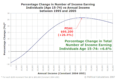
Our next chart shows the magnitude of the shift in the distribution from low to middle and higher incomes, as the percentage change in the number of income-earners at each annual income level:

In addition to confirming the large percentage reductions in the number of the lowest income earners (below $15,300) that was clearly evident in the previous chart, we find that the number of income earners increased substantially at all income levels above $15,300, with the greatest percentage gain from 1995 to 2005 being centered at $66,200.
This is partly due to the relatively low numbers of higher income earners in 1995 - it doesn't take a large numerical gain to create a high percentage gain at the upper end of the income spectrum. (You can extract the numbers directly using our comparison tool!)
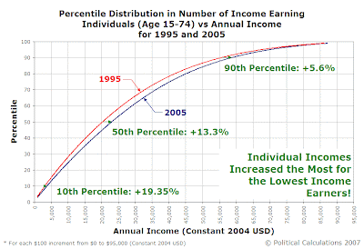
Our final chart represents the changes in the percentile distribution of our Age 15-74 income earners from 1995 to 2005. Here, the 100th percentile consists of everybody within our age groups who earned between $0 and $95,000 in inflation-adjusted 2004 U.S. dollars for both years:

This chart demonstrates that while all the percentile levels in 2005 are ahead of the equivalent 1995 levels, the greatest gains occurred at the lowest end of the income spectrum.
In other words, income inequality among individual working-age income-earners decreased from 1995 to 2005.
Previously on Political Calculations
- Percentage Changes in Income Distribution from 1995 to 2005
- Generations, Part Deux
- Income/Age Percentiles in Pictures
- Comparing the U.S. Distribution of Income by Age Group and Year
- Distributing Income by Age Group in the US: Ten Years Older
- Estimating the U.S. Distribution of Income by Age
- The Shifting Demographics of Age and Income
- Income/Age Demographic Snapshots of 1995 and 2005
- Raking It In: The Baby Boomers from 1995 to 2005
- The Distribution of Income Earners by Age Group for 1995 and 2005
- Changing Apples into Oranges
- 1995 U.S. Individual Income by Age Group Data
- The Distribution of Income by Age in 1995
- Income Distribution Percentages by Age in the U.S. (2005)
- Peak Earning Years for U.S. Individuals (2005)
- The Distribution of Income by Age in the U.S. (2005)
- Generations
Labels: demographics, income, income distribution, income inequality
Welcome to the blogosphere's toolchest! Here, unlike other blogs dedicated to analyzing current events, we create easy-to-use, simple tools to do the math related to them so you can get in on the action too! If you would like to learn more about these tools, or if you would like to contribute ideas to develop for this blog, please e-mail us at:
ironman at politicalcalculations
Thanks in advance!
Closing values for previous trading day.
This site is primarily powered by:
CSS Validation
RSS Site Feed
JavaScript
The tools on this site are built using JavaScript. If you would like to learn more, one of the best free resources on the web is available at W3Schools.com.