How have the number of income earners by age group changed on a percentage basis at all inflation-adjusted income levels from 1995 to 2005? We'll show you in our last look at each of our age brackets!
Age 15-24
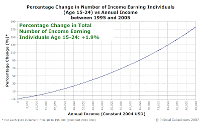
The following chart shows the percentage changes in annual income earned by members of Age 15-24 group from 1995 to 2005:

The percentage growth of high income earners in this chart looks much more impressive than it actually is. Income-earners in this youngest age group are heavily weighted to the low end of the scale, with very few individuals at the highest income levels (this accounts for the outsized gains at this end of the chart - it doesn't take a huge change in the number of individuals to score a high percentage!)
Age 25-34
Let's next look at the percentage changes for the Age 25-34 group - our first post-school years and now full-time income-earning group:

Here, we see the effects of a massive decrease in the number of low income earners. Meanwhile, like the Age 15-24 group, the positive percentage changes at the high end of the income scale are amplified by the relatively low numbers of individuals earning these incomes.
Age 35-44
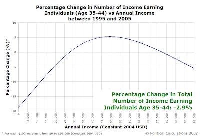
The chart for the Age 34-44 group shows a somewhat different pattern:

In this chart, we not only see decreases in the number of low-end income earners, but also the numbers of high-end income earners as well.
Note: This chart spans a unique transition for the U.S. In 1995, the Age 35-44 group was entirely made up by members of the baby boom generation. More significantly, the distribution of the numbers of individuals within this group were heavily weighted toward the youngest members (the growing surge of the baby boomers.)
As this group was displaced by 2005's Age 35-44 group, the distribution of the number of individuals within this group became heavily weighted toward the oldest members (the tail end of the baby boom generation.)
This chart also reflects the convergence of several major factors driving how income is distributed among income earners within the U.S., which we'll expand upon later....
Age 45-54
The following chart shows massive percentage increases at all levels - driven by the surging numbers of the baby boom generation:

As we've noted before, the ages from 45 through 54 represent the peak income earning years for individuals in the United States, and seeing the raw numbers of the largest generation in the U.S. move fully into these years is something to behold.
Age 55-64
The Age 55-64 group saw a disproportionate number of high income earners join its ranks in the period from 1995 to 2005:

The reason why goes straight back to demographics - this age group includes the leading edge of the baby boom generation!
Age 65-74
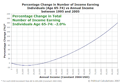
We'll wrap up with the percentage changes in income earners for the retirement ages of 64 through 74:

In a lot of ways, the 65-74 age group is a lot like the Age 15-24 group - it's heavily weighted toward lower incomes. Like the Age 15-24 group, the high percentage increases at higher incomes is largely an artifact of the low numbers of individuals earning these incomes (this group is, after all, largely retired from the U.S. workforce!)
Previously on Political Calculations
- Generations, Part Deux
- Income/Age Percentiles in Pictures
- Comparing the U.S. Distribution of Income by Age Group and Year
- Distributing Income by Age Grop in the US: Ten Years Older
- Estimating the U.S. Distribution of Income by Age
- The Shifting Demographics of Age and Income
- Income/Age Demographic Snapshots of 1995 and 2005
- Raking It In: The Baby Boomers from 1995 to 2005
- The Distribution of Income Earners by Age Group for 1995 and 2005
- Changing Apples into Oranges
- 1995 U.S. Individual Income by Age Group Data
- The Distribution of Income by Age in 1995
- Income Distribution Percentages by Age in the U.S. (2005)
- Peak Earning Years for U.S. Individuals (2005)
- The Distribution of Income by Age in the U.S. (2005)
- Generations
Labels: demographics, income, income distribution
Welcome to the blogosphere's toolchest! Here, unlike other blogs dedicated to analyzing current events, we create easy-to-use, simple tools to do the math related to them so you can get in on the action too! If you would like to learn more about these tools, or if you would like to contribute ideas to develop for this blog, please e-mail us at:
ironman at politicalcalculations
Thanks in advance!
Closing values for previous trading day.
This site is primarily powered by:
CSS Validation
RSS Site Feed
JavaScript
The tools on this site are built using JavaScript. If you would like to learn more, one of the best free resources on the web is available at W3Schools.com.