Why, yes. At least one of these will come to life at our home this evening! Why do you ask?...
Happy Halloween!
Labels: none really
We've had to wait to look at the trends in international trade between the U.S. and China, the world's two largest trading nations, because the release of the Census Bureau's trade data for August 2013, originally scheduled for 3 October 2013, was delayed until 24 October 2013 as a result of the partial government shut down.
It turns out that we really didn't need it to gain any great insight into the trends that have developed in 2013, as August 2013 was pretty much like the five-to-seven months before it.

After adjusting for the exchange rate between the U.S. dollar and Chinese yuan, we see that for the value of goods that China has imported from the U.S., that has meant year-over-year growth rate readings consistent with very sluggish economic growth in that nation. What really stands out in the data for China is that for the last seven months, the year-over-year growth rate of the value of goods that it imports from the U.S. is really more characterized by its strange monthly oscillations into and out of recessionary (negative) territory. Since the growth rate of imports provides a lagging indication of the relative economic health of a nation, we would say that China has essentially been experiencing near-recessionary conditions since the beginning of the year.
Meanwhile, the growth rate in the value of goods that the U.S. imports from China each month suggests that the U.S. economy began growing a bit more strongly in the last five months, picking up a good bit of steam going into August 2013.
That's consistent with what we've observed with our best near-real-time indicator of U.S. economic health, which would put a peak in U.S. economic activity in August 2013. Since then however, that indicator suggests that sluggish growth has returned to the U.S. economy, for which we would expect to see as a confirmation in the trade data over the next few months.
All in all, what we observe indicates that the economies of both the U.S. and China are pretty much well muddling along.
Data Sources
Board of Governors of the Federal Reserve System. China / U.S. Foreign Exchange Rate. G.5 Foreign Exchange Rates. Accessed 29 October 2013.
U.S. Census Bureau. Trade in Goods with China. Accessed 29 October 2013.
Labels: trade

Assuming you actually could buy health insurance coverage on the state and federal government-run Obamacare exchanges, how much would you have to pay before you could actually benefit from having the insurance?
That's an important question to answer, given the high premiums and even higher deductibles that apply for even the most affordable health insurance options being sold through the government-run marketplaces. In addition to paying your monthly premiums, you will also have to burn through your policy's deductible before your health insurance will begin covering a significant portion of your health care expenses.
That creates something that we'll call the "Obamacare Cost Gap", which is the difference between how much of your health care bills that you would have to pay before your insurance coverage begins to kick in, and the amount of the potential additional income tax that you would have to pay if you had no health insurance coverage at all.
How much is your Obamacare cost gap? Well, we've built a new tool where you can find out! But before you use it, we'll ask you to first use our tool that can estimate both your annual subsidy tax credit and also the amount of additional income tax that you will have to pay if you choose not, or cannot buy health insurance in time to avoid a higher tax bill in 2014.
Then, just enter those numbers into our tool below along with the other indicated information. We'll take care of the rest!...
Our default data in the tool above is taken from our default example at our Premium or Penalty Tax tool, and applies to the situation of a single woman working in a part time job in California who is losing her employer-provided health insurance coverage as a result of the changes mandated by the Obamacare law.
What these results make clear is that she can expect to pay quite a lot of money before she might gain any meaningful benefit from having health insurance, even if she opts for the lowest cost, least coverage-providing Bronze plan available to her.
Keep in mind that under Obamacare, one of the big benefits that the law's supporters like to tout is that all health insurance policies will provide one annual checkup per year with no additional out-of-pocket cost. So you know how much that benefit is actually worth, the Department of Health and Human Services reported in 2008 that the average amount paid by Americans for an office visit with their physician was $199.
Meanwhile, the same report indicates that the cost of an outpatient physician visit at a U.S. hospital averaged just $1,275, often in connection with surgery. The average cost of a physician visit in the emergency room was $922.
In an upcoming post, we'll take on the question of just how high your health care expenses have to be to really benefit from having health insurance coverage!
Labels: health care, insurance, personal finance, risk, tool
Thanks to the diminished level of noise in the stock market, stock prices continued to behave exactly as expected in the week ending Friday, 25 October 2013, with the S&P 500 rising by 15.27 points to close at at new all-time record high of 1759.77.
Here's what that looked like on our favorite chart, which tracks the change in the year-over-year growth rates of S&P 500 stock prices and their expected trailing year dividends per share:

In the chart, we see that the change in the year-over-year growth rate of daily stock prices for the S&P 500 is converging toward the level of expectations consistent with the change in the growth rate of dividends per share for 2014-Q1. In the relative absence of noise to affect stock prices, they should consistently be within a narrow range of that level until investors shift their forward-looking attention to a different point of time in the future. They are already very close to a level that would be consistent with "typical" levels of noise in the stock market.
Analyst Notes
If you compare this week's chart to our previous edition, you'll see that the levels for the trailing year dividends that incorporate the data for the recently closed 2013-Q3 have shifted from their previous positions. This is a result of our incorporating S&P's official data for 2013-Q3, which was $8.909 per share as of 30 September 2013, rather than the CBOE dividend future's final recorded figure from 23 September 2013 of $8.814 per share for the quarter. The difference between the two figures is likely attributable to that slight term mismatch and S&P's finalization of the weighting of the index' component dividends according to their market capitalization.
Beyond that, we also had a minor spreadsheet error for the newly added data for 2014-Q3, where we were erroneously measuring the change from 2013-Q2 instead of 2013-Q3 in calculating the expected growth rate of the trailing year dividend per share for the future quarter. That will teach us to just drag the calculation for the previous quarter out to the right in the spreadsheet when setting up the math for a new quarter for which we're first getting data!
With that error corrected, we see that except for the data for 2014-Q1, where investors have fortunately collectively focused their forward-looking attention, the data for all other quarters ending in the future are negative. That's especially true for 2013-Q4, which is a consequence of the Great Dividend Raid of 2012.
What that means is that stock prices would fall rather dramatically if investors were forced to shift their attention to other future quarters. The wild card would be for 2014-Q4, for which we don't expect to have data until around Christmastime.
Labels: chaos, dividends, SP 500
Given the multiple levels of failure of President Obama's Affordable Care Act, which is resulting in millions of Americans losing their current health insurance as they're being prevented from even being able to shop for it on the badly broken Healthcare.gov web site, a lot of Americans are likely asking themselves whether they even need health insurance. If you're among them, we've built a tool to help you answer that question.
First, we've refined our estimates of the probability that an individual might have a health condition serious enough to require admission to a hospital for treatment, which we've illustrated in the following chart.
Although our mathematical model is based upon the rates of hospital admissions for the population of Singapore, we would expect that these values are close to what they would be for the U.S. population.
Just enter your data in our tool below, and we'll estimate the odds that you would need to be admitted to a hospital to treat a significant health condition.
The trick is to use this information to assess whether it might make more sense for you to self-insure, which is what you would really be choosing to do by not acquiring health insurance. If that's you, we can recommend Sean Parnell's blog The Self-Pay Patient and also his list of useful resources. You'll have to decide what's an acceptable amount of risk of expenses for you to carry all on your own if you opt out of getting health insurance coverage in favor of this approach.
The good news, if you can call it that, is that you can always change your mind and pick up coverage in the next enrollment period, or if you qualify for Special Enrollment. Or you might consider a short term medical plan, which Hank Stern has identified as a possible way to get real health insurance coverage outside of the official enrollment periods for Obamacare.
Beyond that, there are certain conditions that should prompt you to acquire regular health insurance coverage outside of what the our tool's results might indicate, which would apply to a generic individual plucked at random from the entire population.
- If you or a member of your household are going to have a baby, or plan to during the next calendar year, your child's delivery will very likely take place in hospital facilities. According to Cigna, a normal delivery can cost over $7,500, so you would likely benefit from having health insurance coverage, which becomes especially true if your child's delivery is more complicated.
- If you have very young children, especially under the age of 2, you will likely benefit from having health insurance coverage.
- If your health or that of a member of your household is impaired, such as might be the case if you're managing a chronic health condition like diabetes, you will likely benefit from having health insurance coverage.
- If you or a member of your household are involved in violent crime or associate with those who do, or are otherwise planning to engage in risky activities with a high likelihood of injury or that might make you sick, you will likely benefit from having health insurance coverage.
Finally, we would hope this would be obvious, but if you or someone for whom you would cover on your health insurance have a high probability of requiring admission to a hospital for the treatment of a serious medical condition, or are over Age 84, which is the official cut off for our tool's accuracy, you will likely benefit from having health insurance coverage.
We'll stop there because we're starting to sound way too much like Jeff Foxworthy....
Labels: health care, insurance, personal finance, risk, tool
Let's look at the S&P 500's stock prices the only way they can really be understood - by showing stock prices versus their underlying dividends per share. Our first chart shows all the major trends that have existed in the stock market from December 1991 through September 2013.

Now, let's zoom in on the current trend, which happens to be a period of relative order in the stock market, which has existed since 4 August 2011 through at least 23 October 2013.
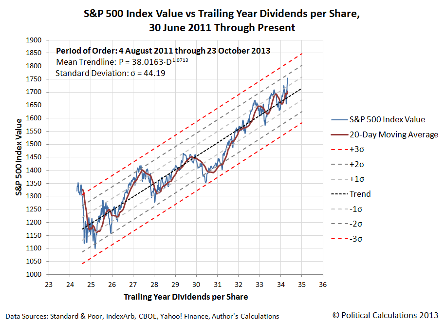
Although 4 August 2011 was a day that saw the ninth-largest point decline ever in the Dow Jones Industrial index, as the Stock Market Noise Event of 2011 was still unwinding as a result of the Federal Reserve's ending of its second quantitative easing program.
The Stock Market Noise Event of 2011 really began after Friday, 22 July 2011, exactly one month after the Fed announced that QE 2.0 would end with the second quarter of the year, concluding the Fed's massive bond-buying program that had begun back in August 2010. Coincidentally, 22 July 2011 was also the day that negotiations between President Obama and the U.S. Congress on raising the U.S. debt ceiling broke down, which happened after U.S. markets had closed for the weekend.
While that was the proximate trigger for the noise event, note that stock prices didn't recover once the 2011 debt ceiling debate was resolved on Tuesday, 2 August 2011 with the passage of the Budget Control Act of 2011, as would be expected if that had been the main driver of stock prices during the noise event. That contrasts to the situation in the U.S. stock market today, as stock prices have risen sharply in response to just the temporary resolution of the U.S. federal government's current debt ceiling crisis.
Instead, stock prices remained volatile through 22 August 2011. What was really happening was that stock prices were stabilizing at a lower level with respect to their dividends per share in the absence of any quantitative easing program operated by the U.S. Federal Reserve. Without the interest-rate lowering effect of QE, stock prices had to fall to reflect a less positive situation for future earnings growth driven by lower than previously expected economic growth, given the relationship between bond yields and stock prices, not to mention the relationship between between QE and GDP.
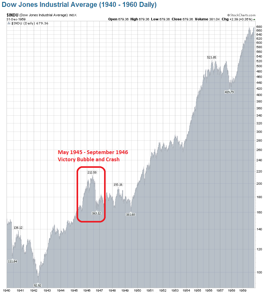
There are two parallels for the Stock Market Noise Event of 2011 in the post-World War 2 era. First, the crash of stock prices from 29 May 1946 through September 1946, which coincided with the maturation of the Victory bonds that Americans bought in the weeks following V-E Day on 8 May 1945, all the way up through V-J Day on 2 September 1945, which promoted a year-long QE-like driven surge in stock prices. Here, the bubble in stock prices lasted exactly one year since that was the minimum holding period required before the war bonds bought during this three-month long window of time could be redeemed.
The second parallel is the 1987 Black Monday stock market crash. Here, there had been a similar surge in bond buying, which set records in January 1987, complete with a coinciding surge in stock prices. Just like in August 2010 and just like in May 1945. Stock prices remained elevated for months on expectations of improved earnings, but ultimately crashed after the Federal Reserve jacked up interest rates as the forward-looking expectations that had initially supported higher stock prices changed. The result was that stock prices reset themselves by shifting down to a lower upward trajectory. Just like in 2011, and also just like in 1946.

Which is what we should expect to happen given the quantum-like properties of stock prices.
The only thing that really makes the 1987 crash stand out is how far stock prices fell in such a short period of time, which perhaps has more to do with the advent of large scale computerized trading, which occurred without the circuit breakers we have today to allow for human intervention when prices change dramatically, as these were only first meaningfully instituted in the aftermath of the 1987 Black Monday crash. By contrast, it took humans two whole days in October 1929 to create a similar magnitude shift in stock prices without the assistance of computerized technology.
Labels: dividends, quality, SP 500, stock market
Although the September 2013 jobs report was delayed for two and half weeks, thanks to the partial federal government shut down, and though it was considered disappointing by many, we did find something curious in it.
Compared to August 2013, the number of teens counted as having jobs increased by 168,000, while the number of adults Age 25 or older fell by that same number! It's as if only the exit of older workers could make room for the entry of an equal number of teens....

We realize that this could very much be just a one-off anomaly in the household employment survey, which will likely disappear when the household data is revised in 2014, but it is interesting to see in the data.
Meanwhile, according to the jobs report, all of the net gain of 133,000 Americans counted as being employed in September 2013 was confined to the Age 20-24 demographic, which is really impressive since this group accounts for just 9.5% of the 144,303,000 Americans counted as having jobs. By contrast, the U.S. teens whose number of employed increased by 168,000 in the month of September 2013 make up just 3.1% of the employed U.S. civilian labor force.
All in all, September 2013 would appear to have been a good month to be among the 12.6% of the U.S. civilian labor force under Age 25 and looking for work. 301,000 more Americans meeting that description were counted as having jobs in September 2013 than had jobs in August. The remaining 87.4% of the U.S. work force was not so lucky.
It will be interesting to see if the pattern reverses itself with the October jobs report. Or really, the November jobs report, because the partial government shut down in October will affect that month's data.
Labels: jobs
Believe it or not, we've figured out how to fix the dysfunctional Healthcare.gov web site. It's by no means an easy solution, and most of the code supporting the site would have to be junked, but as code development experts, we can see how it could be done successfully.

First, all the insurance companies selling health insurance through the state and federal exchanges will need to be required to post their coverage plans' premium, deductible and other data on their own websites and on insurance brokers' or third-party aggregators' health insurance shopping sites that are already designed to do the important part of the job, such as ehealthinsurance.com. What this action will do is allow those who want to buy health insurance through the Obamacare exchanges to actually shop for the plan whose coverage works best for them and then buy it, which is something they cannot do today with any real confidence on the state and federal government-run exchanges.
Next, without leaving those sites, health insurance shoppers will be able to determine how much their costs for health insurance will be after any tax credit subsidies that they might be eligible for based on their income. We already have the code to do that math, so these firms would be able to simply license it from us and then be reimbursed by the federal government for the cost.
Given how the Obama administration has previously valued this kind of work, the amount of reimbursement expenses will total around $47 million, and we would expect to be paid a large percentage of that number for our services in fixing the Obama administration's mistakes. That's a bargain, by the way, because the 'A-team' programmers, 'ninja' coders and 'rockstar' web designers being rushed in the equivalent of a tech surge to clean up Health and Human Services Secretary Kathleen Sebelius' mess will need to be paid even more.
The benefit to the Obama administration is that health insurance consumers will actually be able to buy the health insurance they want, if that's what they want to do. And since the information about the plans (premiums, deductibles, what doctors are in-network, etc.) would be coming directly from the insurers themselves, they could trust it far more than the government-run marketplaces.
The final step for these consumers in this revised process would be to change their federal income tax withholding for 2014 to reduce the amount of their withholding taxes to account for any subsidy they might receive, because they'll be paying the full monthly premiums for the plan they chose. And hey, we have the code for that too!
The advantage to this approach is that it eliminates the need for a big portion of the Healthcare.gov web site that doesn't work. There is just no sense in relying upon the federal government's broken income verification and subsidy eligibility determination systems, whose only real purpose is to pre-pay the subsidy tax credit to the insurance companies on the health insurance buyer's behalf. This is something that just isn't necessary and in the case of income verification, isn't even being done.

Now, notice that we haven't specified just how the Healthcare.gov web site will itself be fixed. Well, all those tech surge troops can redesign the entire site after first throwing out about 5 million lines of useless code, to instead simply present a place where people can click their state and drill down to their county or city to find links to the sites of the government-approved health insurance providers serving their area, and nothing else.
No accounts to set up, no passwords to memorize, no multiple screens of denied access - none of that nonsense.
And they wouldn't even have to change the current launch screen for the Healthcare.gov site!
See! Transforming Healthcare.gov into a web site that actually works just isn't that hard - if the Obama administration is willing to be transparent how much their health insurance will cost and otherwise remove the federal government from the picture altogether.
Perhaps a good question for a mainstream media reporter to ask is why isn't the Obama administration willing to do those things? And a really good question for a skeptical U.S. Congress member to ask is why they should throw even more money to repair the Obamacare web site when our suggested solution is a viable and much more affordable option?
Labels: insurance, technology
As the apparent conclusion of the debt ceiling debate in Washington D.C. on Thursday, 17 October 2013, the largest source of noise negatively affecting stock prices dissipated. Investors, who had been anticipating the conclusion of the noise event since Wednesday, 16 October 2013, rapidly bid up the value of the S&P 500 through the end of the week, reaching an all-time record high of 1744.50 on a gain of 46.44 points in just those three days.
In the absence of that noise, or any new negative noise events that may be brewing out there, we can expect the change in the growth rate of stock prices to once again move to keep pace with the change in the growth rate of dividends expected to be paid in 2014-Q1, which is where investors have largely been maintaining their forward-looking focus in setting their expectations outside of other noise events. The chart below shows where stock prices are and where they're going:

In terms of what that means for stock prices, we would expect to see the S&P 500 generally rise in the near term to converge with the 1800 level, after which the growth pace of stock prices will flatten out on average by comparison. Assuming, of course, no new noise events to distract investors!
Speaking of which, from Friday, 11 October 2013 through Thursday, 17 October 2013, we had the equivalent of a noise event appear in the CBOE's data for 2013-Q4's dividend futures (ticker symbol DVDE), to which we've specifically pointed in this week's edition of our chart. Here, we saw the amount of expected cash dividends to be paid out by the end of December 2013 rise from $9.147 per share to $11.32 per share in a single day.
More remarkably, it held that level, and even spiked up to $11.55 per share on Thursday, 17 October 2013, before dropping back down to more reality-based $9.154 per share on Friday, 18 October 2013!
During that week-long anomaly, there was no news indicating any massive spike in increased dividend announcements or even for any special or extra dividend payments, not that these latter payments should even affect the expected dividends per share number, which is supposed to be based upon regular dividends. And it didn't show up in IndexArb's bottoms-up dividend futures data, which proves to serve as a very useful reality check on the CBOE's more volatile data.
All in all, the magnitude and duration of the anomaly is evidence that the stock market isn't necessarily as efficient as some might like to believe.
Labels: chaos, dividends, SP 500
If only Blake Shelton performed it on "The Voice":
Except that only CeeLo Green would have the guts to do it. Still, that would be interesting, and likely better than many of the battle rounds....
As David Tufte described it:
Odd. A whole song video, sung by Italians, of nonsense words chosen to sound like English.
Made in 1972 by Adriano Celantano, it's a parody of Italian rockers who sang in English even though they didn't speak the language.
The scary thing is that it's not bad at all (if you go in for early 70's bubblegum funk). And you’ve got to love the "harp-syncing".
And who *doesn't* go for "harp-synching" or early '70's bubblegum funk? It's got platinum written all over it!
Labels: none really
What are the odds that you will need serious medical care?
By "serious medical care", most people will automatically think of a situation where they might need to be admitted to a hospital to receive care for an unforeseen condition, so that's the standard we'll use to answer that question.
Beyond that, we'll break the information down by age and sex, simply because we can see these being major factors that might affect how likely a person will need hospital care.
It turns out to be a really difficult question to answer, because the U.S., which is where we first sought to get hospital utilization data, tracks hospital discharges - not admissions. The problem with that is that the number of admissions won't necessarily track with the number of discharges, as patients die or perhaps otherwise leave the hospital before being officially discharged.
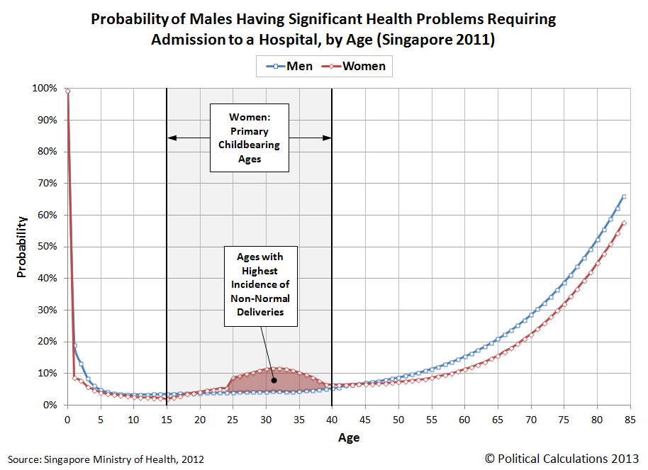
So we turned elsewhere to answer the question, and specifically to the island nation of Singapore, whose Ministry of Health makes the data not only easy to find, but presents it in a way that helps us answer our specific questions. Our first chart below illustrates the 2011 hospital admission rates by age group and sex per each 1,000 members of Singapore's resident population:

One interesting aspect of the data is that we see such high numbers for the 0-4 age group, which drops off dramatically for the 5-9 age group, which really didn't make a whole lot of sense to us at first. Why would a 4-year old have such a dramatically higher probability of being admitted to a hospital over a 5-year old?
We started thinking about it, and realized that the MOH's statisticians gave us a valuable clue - the number of hospital admissions for each 1,000 members of Singapore's resident population doesn't include hospitalizations associated with either normal deliveries for pregnancy or legalized abortions.
While both of these categories would count as foreseeable conditions, we suspect that the reason in the case of normal deliveries was in part to avoid double-counting. Here, where normal deliveries are concerned, we suspect that infants born in Singapore's hospitals are subsequently "admitted" to the hospital after being born, which is how the hospital admissions associated with normal deliveries are tracked.
Beyond that, we can see that the rate of hospital admissions for women of child-bearing age is over twice that of men of the same age, which likely corresponds to pregnancies that involved complicating factors requiring more intensive care, which would not count as a foreseeable condition.
Update 23 October 2013: We've refined our initial analysis to more accurately depict the probability of both males and females needing to be admitted to a hospital by age. Our original analysis appears in the shaded box below the updated analysis.
Let's first look at our more refined analysis of the probability of hospital admission for men from Age 0 through Age 84:
And now for women, again from Age 0 through Age 84:
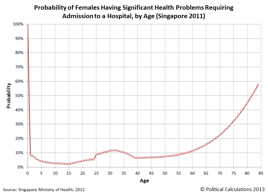
In refining our original analysis, we broke the trend for both men and women up into smaller age ranges, which allowed us to more accurately model the probability of hospital admission for both. As you can see above, for men, the result is a fairly smooth-looking curve from Age 0 through Age 84, while for women, there would appear to be a relatively sharp transition from Age 24 to Age 25, coinciding with the "complicated delivery" baby bump.
This outcome is in part due to how we grafted the mathematical models behind the data together at this point - we would expect that if the Singapore Ministry of Health's data was refined to present hospital admission rates by single years of age, we would see a much smoother transition at this point. As it stands, these refined charts should still closely approximate the actual data.
Looking at the differences in the data between men and women, we see that boys are more likely to be admitted to a hospital before Age 4, after which we see that both boys and girls have similar odds up until child-bearing becomes a factor. At that point, women are much more likely to require hospital admission than men (likely for the reasons we noted earlier), up until their mid-forties, after which, men become much more likely to require hospital admission.
The longer lifespan of women with respect to men likely explains that discrepancy, although we were surprised to see how wide that gap was by Age 84, with women having a 58% probability of being admitted to a hospital and men having almost a 66% probability.
References
Singapore Ministry of Health. Hospital Admission Rates* by Age and Sex 2011. [Online Report]. 10 November 2012. Accessed 8 October 2013.
Original Comments
Update: Original text appears below - superseded by analysis above.
Having worked out why that apparent anomaly exists, we used that knowledge to determine the probability of being admitted to a hospital for both men and women by age, reverse engineering Singapore's age-group based data to approximate the odds by single year of age from Age 0 through Age 84:

Note how nearly 100% of those 0-year olds are admitted to the hospital! Next, let's look at the same data for women from Age 0 to Age 84:
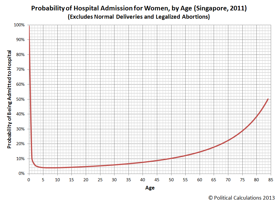
In looking at the differences in the data between men and women, we see that boys are more likely to be admitted to a hospital before Age 4, after which we see that both boys and girls have similar odds up until child-bearing becomes a factor. At that point, women are much more likely to require hospital admission than men (likely for the reasons we noted earlier), up until their mid-forties, after which, men become much more likely to require hospital admission.
The longer lifespan of women with respect to men likely explains that discrepancy, although we were surprised to see how wide that gap was by Age 84, with women having a 50% probability of being admitted to a hospital and men having almost a 90% probability.
Labels: data visualization, health care, risk

Oh no! The government isn't reporting any economic data!
That's something that might stymie a lesser economist, but we're not going to let a lame government shut down stop us!
That's why today, we're going to do the job that the furloughed employees of the Bureau of Economic Analysis won't be doing this month, unless the partial government shutdown ends really soon and they crank out a rush job. We're going to estimate what the United States' Gross Domestic Product will be for the just completed third quarter of 2013.
After all, we've previously found that it takes maybe as many as 2.5 economists in the private sector to do the same job that it takes 16 government economists to do, so just how hard could it be?
Technically, we're going to forecast it, but then, since it takes the BEA three attempts before they finally get close to a good number, forecast values for GDP are probably just as good as an official government estimated one.
Let's do this visually, so you can get a sense of where we came up with our estimate of GDP for 2013-Q3. Our first chart is one based on math that we have been developing to quantify and visualize the impact of changes in government spending, taxes and the Fed's quantitative easing programs upon the U.S. economy, but which we'll now use to project what nominal GDP will be reported to be for the third quarter of 2013:

Using 2012-Q3's GDP as our base point, our forecasting method has come within 0.02% of the actual figure for nominal GDP that was reported in 2012-Q4, 2013-Q1 and 2013-Q2, or rather, the three quarters preceding the third quarter of 2013. We are projecting a nominal GDP of $16,764.5 billion for the U.S. in 2013-Q3, with the following assumptions that apply since the end of 2012-Q3, which marks our base reference point:
- Net Change in total assets held by Federal Reserve (QE): $927.8 billion
- Net Change in government taxes: $168.9 billion
- Net Change in government spending since 2012-Q3: -$21.0 billion
The first two quantities are pretty locked in at this point and won't likely be subject to future adjustment. The wild card in our forecast is the amount of government spending in the U.S., which consists of spending at the federal government level, as well as at the state and local level, for which we won't likely have a good estimate until late December 2013. Assuming that the BEA's data jocks get back on the job before then.
To get around that limitation, we went over data recorded from 1960 through 2012 to determine that average change in spending for both Federal and State & Local governments from the second quarter of each year to the third quarter to determine our estimate for this year. And you want to know the crazy thing about that? Even though the BEA shut down the computer system that reports historic data as part of their effort to completely flummox lesser economists, we didn't need to use their stinking site to get the historic GDP data on government spending at all.
Speaking of which, that value isn't something that would be impacted at all by the partial U.S. federal government shut down, which didn't begin until 1 October 2013, which is part of the fourth quarter of 2013.
Another factor we need to consider from better, private sector sources of information about the relative health of the U.S. economy is the possible return of organic economic growth, following the year-long microrecession experienced by the private sector of the U.S. economy from July 2012 through July 2013, which may have added a positive contribution to the GDP number. Since those conditions would appear to have resumed somewhat in September 2013 however, we think that contribution will be small, with the actual value likely to be reported to be very close to our forecast nominal GDP number.
As for real GDP, our inertial forecasting methods aren't quite as precise as they would seem to be for nominal GDP. Here, outside of periods where the U.S. economy has turned the corner from expansion to contraction, or vice versa, historical back-testing puts us within 2% of the value the BEA reports about 95% of the time, and within 1% of it almost 75% of the time.
Our second chart shows our projected value for real GDP in 2013-Q3:
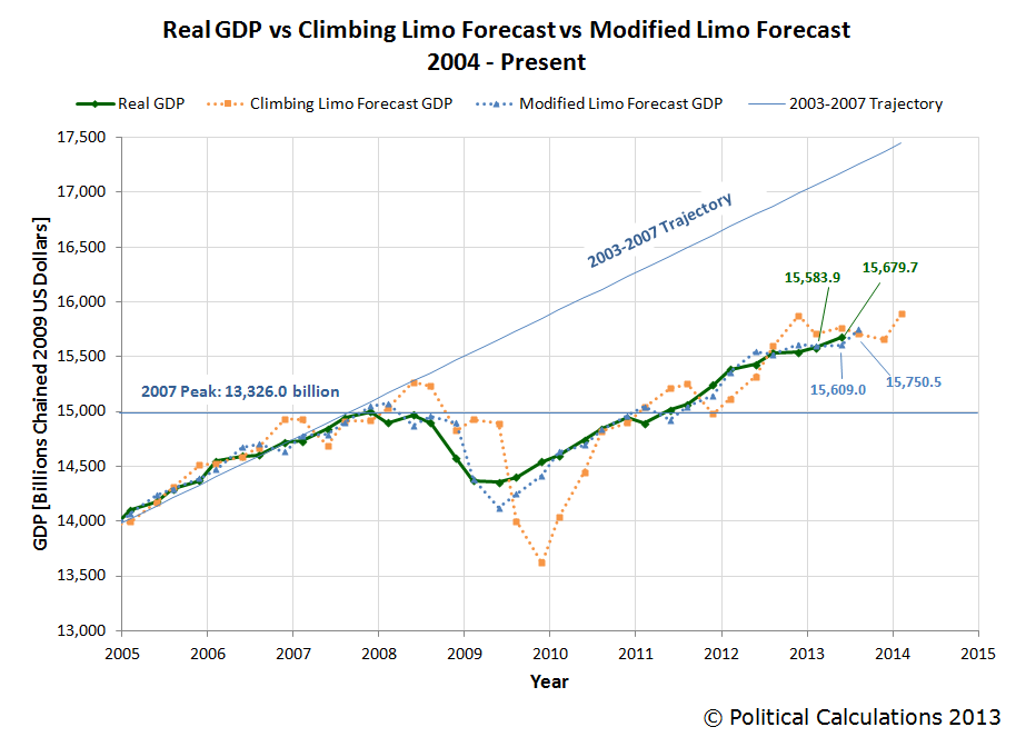
Here we anticipate that real, inflation-adjusted GDP in the U.S. will most likely fall in a range between $15,590.7 and $15,910.4 billion in terms of constant 2009 U.S. dollars, with a 95% probability of falling in a range between $15,430.9 and $16,070.2 billion.
By definition, it has a 50% probability of being above the midpoint of our forecast range, $15,709 billion. We think that given the relative increase in government spending from 2013-Q2 to 2013-Q3, combined with the positive contribution of organic economic growth, that real GDP in the third quarter of 2013 will indeed be reported to be above that level.
And there you have it - a simple blog just replaced the topline work of the Bureau of Economic Analysis for the third quarter of 2013 using just a handful of data points. We'd actually rather they be able to doing the job themselves, since the full extent of the data collection and reporting that they do is something that does have real world value, but we can't help but think that there ought to be a private sector alternative available to fully pick up the slack during times like these.
Labels: gdp, gdp forecast
Now that Eugene Fama, Lars Peter Hansen and Robert Shiller have collectively been awarded the Economics Nobel prize for their insights into how asset prices work, insights that we both routinely apply and have extended in our own work, we'll take this opportunity to open up a new window for how all that applies to the S&P 500.
We'll do that by remaking our favorite chart - the one that shows how changes in the year-over-year growth rate of today's stock prices keep pace with changes in the year-over-year growth rates of the dividends per share that are expected at specific points of time in the future - replacing the dividend futures data we obtain from IndexArb with dividend futures data from the Chicago Board of Exchange, which are really different from one another. The chart below shows all that data for each future quarter's dividends going all the way from 3 January 2013 through 10 October 2013:

Each of the data series that apply for a future quarter's dividends per share represent the expectations that investors have for the amount of dividends they will earn in that quarter. In the absence of large sources of noise, or variance, changes in the growth rate of stock prices will closely track with the trajectories associated with a specific future quarter where investors collectively focus their forward-looking attention.
In the chart above, we see that's the case at the very beginning of 2013, where investors focused their attention on the expected future defined by the second quarter of 2013 in setting stock prices. The focus of investors remained on that quarter, which ended in June 2013, well into April 2013.
At that point, investors began shifting their forward-looking attention to the more distant future defined by the expectations for dividends associated with the first quarter of 2014. We observe this shift in focus in the transition of daily stock prices (the dotted blue line) from the data series for 2013-Q2 to 2014-Q1.
That attention stayed there until 19 July 2013, when stock prices suddenly deviated from where investors were focused in response to what we've called the Bernanke Noise Event. Here, investors reacted to the new information that Fed Chairman Ben Bernanke communicated at a press conference that the Fed was seriously considering tapering off its purchases of government-issued securities once certain economic targets were hit by sending stock prices considerably lower than they would otherwise have been set if only the expectations of future dividends to be paid in 2014-Q1 were driving them.
That reaction was more than the Fed was ready to handle at that time. It took a month of effort, but the Federal Reserve finally succeeded in restoring the expectation that investors previously had that there would be no tapering of its QE programs until 2014, which we observe in stock prices resuming to closely track the expectations for 2014-Q1's dividends. But then, positive economic data combined with statements by lesser Fed officials led investors to believe that the Fed could begin tapering its QE program before the end of the third quarter of 2013.
That set off a larger negative reaction in stock prices. Only here, investors shifted their focus away from the more distant future quarter of 2014-Q1 in setting stock prices to instead fully focus on the critical quarter of 2013-Q3. We observe that shift taking place from the end of the Bernanke Noise Event through the end of August 2013, which marked the high point for the expectation of investors that the Fed would being tapering its QE programs in September 2013.

And then, the real-time economic outlook for the U.S. economy began to take a turn back to the worse, leading investors to increasingly bet that the Fed would not act to cut back its QE programs at the end of 2013-Q3, which led to rising stock prices as investors refocused their attention toward 2014-Q1. The Fed then surprised many, including us, that it would not act in 2013-Q3 to trim its QE bond-buying spree, but in retrospect, the evidence from stock prices and the expectations for future dividends supports that interpretation of events.
Unfortunately, before they could make it back to the level that would be fully consistent with the expectations associated with 2014-Q1, a new negative noise event centered around the potential for a government shut down and partial default on the nation's debt reared its ugly head, causing stock prices to once again deviate away from the level they would otherwise be. And that brings us nearly up to the present.
If all this makes the stock market sound like a chaotic place, that's because it frequently is - but that doesn't mean there isn't a predictable order underlying it all. That's what lies beyond the work of newly-minted Nobel-prize winning economists Fama, Larsen and Shiller, whose work has made what we do possible.
Speaking of which, if you want to find out more about our work, it all begins here. You only have to review several years of worth of what we've worked out live, in real time, without the benefit of any sort of safety net to catch up to us!...
Notes: we've modified the chart in this post from previous versions by eliminating an additional scale factor of 12 that we were applying to both the changes in the growth rates of dividends and the change in the growth rate of stock prices, which was an artifact our annualizing the monthly data we were using when we first discovered the relationship between the two. Since this additional scale factor is applied to both dividends and stock prices, it effectively cancels out of our math describing how changes in the growth rates between the two are related, so we're taking this opportunity to dispense with it altogether.
Beyond that, we've also changed our amplification scale factor, which is the scale factor that matters in our math. This change was driven by our change in data sources, where there can be considerable differences between the dividend futures data reported by IndexArb and that reported by the CBOE. Using IndexArb's data, we had settled on a typical amplification scale factor of 9.0, while the factor we're opting to use for the present with the CBOE's data is 5.0.
Labels: chaos, dividends, SP 500
We've previously discussed our sources for where we obtain the dividend futures data we use to track what investors expect at different points in time of the future, but we haven't shown how they compare with respect to one another, much less to how actual dividends per share play out!
We going to do that today using data for the just-ended third quarter of 2013. Our chart below shows how the data for 2013-Q3's expected cash dividends per share tracked from 3 January 2013 through the end of the calendar quarter on 30 September 2013:
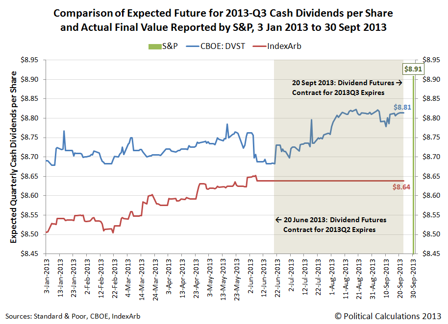
As we noted before, the main difference between our primary sources of dividend futures data is how they determine how much the cash dividends per share will be at the end of the quarter they track. The Chicago Board of Exchange (CBOE) dividend futures contract uses a "top-down" approach, where the price of the contract is set by futures trading activity (if you access their data, the reported value is ten times the expected cash dividends per share for the quarter, so be prepared to shift the decimal point accordingly).
Meanwhile, IndexArb uses a "bottom-up" approach, which takes expected dividend per share data from each of the S&P 500's component companies and weights them according to their market capitalization within the index to create its expected cash dividend per share value. IndexArb also complicates its reporting for future quarters as the information it provides really indicates the total amount of estimated dividends per share for the index that will be paid out between the present (today) and the end of the dividends futures contracts upon which they're based.
That means that to find the expected amount of dividends per share that will be paid out in a given quarter, you have to take the total amount of dividends per share that will be paid out by the end of that quarter and subtract the total amount of dividends per share that will be paid out by the end of the preceding quarter. So, if we want to do find the value for 2013-Q3, we have to subtract the dividends per share that would be paid out by 2013-Q2 from it!
That creates some problems, which you can see in the chart above. Here, the data for 2013-Q3 from IndexArb effectively flatlines at the expiration of the dividend futures contract for 2013-Q2 on the third Friday of June 2013 (21 June 2013), because the futures data for the preceding quarter is no longer available for us to do that subtraction operation.

We can also see differences in how the values start and change over time. Here, the CBOE's dividend futures data starts and a higher value than IndexArb's, but is subject to greater volatility, which you would expect given how its value is set.
The IndexArb data is less volatile, and although it begins at a lower value, we can see that it converges toward the values that the CBOE projects, at least through the end of the preceding quarter's data. Based on the trend we observe in the data before that time, we think that the two would converge very close to each other by the actual expiration of the dividend futures contracts on 20 September 2013.
Meanwhile, both of the expected dividend values for both sources fell short of the actual level of cash dividends per share of $8.909 that S&P reported for 2013-Q3 after the end of the calendar quarter on 30 September 2013.
We think the primary source of the discrepancy between the dividend futures and the actual value for cash dividends per share can be traced to the estimate of each S&P 500 component company's weighting within the index. S&P is the final arbiter of those values, while estimates used by others are just that - estimates. We should also note that there is also a bit of mismatch between the terms of the dividend futures contracts and the dividends that are paid out by the ends of the calendar quarters that S&P reports, which may also account for a good portion of the discrepancy between the futures and the actual data once it is reported.
Given our experience in tracking the data, what we find to be really remarkable that the dividend futures data is typically within a 3% margin of S&P's officially recorded value (that's true even of the three-month earlier cutoff for IndexArb in the absence of a real market-shaking event), and often, is within a much closer margin of error than that.
Speaking of which, since the CBOE data stays "live" longer than the IndexArb data, our next update of our favorite chart will be based solely on the CBOE's data, which we're going to unveil tomorrow. We were going to wait to do that development until our annual end of year hiatus, but it turned out to be a snap to do, and there's some really interesting insights that come out of it!
Image Credit: Schweitz Finance.
Data Sources
EODData. Implied Forward Dividends September (DVST). [Online Database]. Accessed 7 October 2013.
IndexArb. Dividend Analysis. [Online Data Report]. Accessed daily from 3 January 2013 through 21 June 2013.
Standard and Poor. S&P 500 Index Earnings and Estimates. [Excel Spreadsheet]. Accessed 7 October 2013.
First, a right-thinking penguin describes their motive for slapping others:
Hippies, of course, being the among the groups of people who who are just a little too pleased with themselves. Speaking of which, penguins putting the slapdown on others would appear to be something that actually happens in nature:
Cultural evolution in action!
Labels: none really
Since the single topic of the press conference that President Obama staged with his party's media collaborators on Tuesday, 8 October 2013 revolved around the topic of what could happen if the U.S. government chooses to default on its debt obligations, or as will more likely be the case, doesn't default on those obligations and instead doesn't spend as much as U.S. politicians would like it to spend, we thought we would go straight to the bottom line and find out how much the U.S. economy would be affected.
But first, we'll need some numbers, which CNBC tracked down for us:
Treasury Secretary Jack Lew is about to face the very same choices confronted by any financially struggling American household: Which bills to pay and when to pay them.
If Congress fails to raise the debt ceiling by around Oct. 17, Lew, who has been in the job less than a year, will have to sit at his desk and figure out how to make due on roughly one-third less in the way of government funds for the bills he has to pay. Because he can no longer borrow, according to the Bipartisan Policy Center, government spending will fall by about 32 percent, or $108 billion in the first month.
On a side note, to put that situation in context, this is no different from what could very well happen just 20 years from now when Social Security's trust fund has been fully depleted, as expected. At that time, the federal government will reduce all payments to Social Security beneficiaries by roughly 26%, unless it significantly increases the amount it borrows. And that's if everything goes as U.S. politicians have promised without any spending reform - this is one reason why the political fight over the debt ceiling and government spending levels is taking place now, because waiting will make needed reforms so much more painful. Not to mention, more necessary.
Back now to the question at hand: how much would a government spending cut of that magnitude affect GDP?
The good news is that we can answer that question with just back-of-the-envelope math! And we can do it on a "daily" basis.
 That $108 billion reduction in federal government spending works out to be $3.6 billion per day. We know that the GDP multiplier for all government spending in the U.S. is 0.6, which we know from research published by the U.S. Federal Reserve applies when the nation's official unemployment rate is over 7.5%. Which is the case at present, thanks to the furloughing of federal government employees! If it were under 7.5%, we would need to use a GDP multiplier of 0.5 to account for the shock of a sudden change in government spending, as government spending is considered to deliver even less of an impact to GDP when the economy is in a healthier state.
Taking our potential government spending reduction of $3.6 billion per day, and multiplying it by our GDP multiplier for government spending of 0.6, we find that the U.S. economy will lose out the equivalent of $2.16 billion worth of GDP per each day that Uncle Sam doesn't have his credit limit reset to a higher level.
Now, to measure the impact upon GDP, just multiply that number by the number of days the U.S. federal government operates in that situation!
If played out through the remaining 78 days of 2013, assuming we stick with President Obama's planned schedule for putting the U.S. federal government into default, that would reduce the nation's GDP for the fourth quarter of 2013 by $168.48 billion.
To put that number into perspective, the fiscal drag produced by the $56.3 billion by which U.S. federal taxes will be higher in the fourth quarter of 2013 than they were in the fourth quarter of 2012 thanks to President Obama's tax hikes that took effect back in January 2013, GDP in the U.S. will be nearly $168.92 billion smaller in 2013-Q4 than it would otherwise have been given the GDP multiplier for taxes.
Why, that's almost exactly the same amount! Perhaps that explains why President Obama has been so intent on doubling down on his "no negotiation with the duly elected representatives of American citizens" strategy - he'll produce twice the negative fiscal drag on the U.S. economy in 2013-Q4 if only he and his supporters can stick with it!
And yes, numbers like those mean a recession, as the Federal Reserve's quantitative easing programs won't produce enough juice for the economy to offset that kind of fiscal drag, offsetting only somewhere between $250 billion and $290 billion of the hit if the debt ceiling isn't increased by 31 December 2013.
Of course, if the debt ceiling situation is resolved sooner than than, it is very much possible that the U.S. will have positive economic growth in 2013-Q4 - only seeing slower growth than it would have had instead. Which is pretty much the story for every quarter during President Obama's entire tenure in office.
Labels: gdp, math, national debt, politics
Welcome to the blogosphere's toolchest! Here, unlike other blogs dedicated to analyzing current events, we create easy-to-use, simple tools to do the math related to them so you can get in on the action too! If you would like to learn more about these tools, or if you would like to contribute ideas to develop for this blog, please e-mail us at:
ironman at politicalcalculations
Thanks in advance!
Closing values for previous trading day.
This site is primarily powered by:
CSS Validation

RSS Site Feed
JavaScript
The tools on this site are built using JavaScript. If you would like to learn more, one of the best free resources on the web is available at W3Schools.com.
Other Cool Resources
Blog Roll


