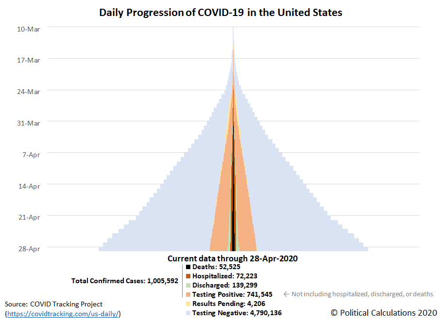
The seventh week of the global coronavirus epidemic in the U.S. has come to an end. Over 1 million Americans have tested positive for the SARS-CoV-2 coronavirus infection, with 52,525 deaths as reported by the COVID Tracking Project through 28 April 2020.
Those are big numbers, yet there are increasing signs the spread of COVID-19 is decelerating, though some states are still seeing growing numbers of cases. Here's what the daily progression of cumulative coronavirus testing, confirmations, hospitalizations, and deaths look like when tracked at the national level in a tower chart over the seven weeks from 10 March 2020 through 21 April 2020.
Starting from 22 April 2020, the volume of testing in the U.S. has kicked up into a higher gear, with anywhere from 190,000 to 314,000 tests results now being recorded per day. In the last week, the overall 'test positivity' rate of daily testing has dropped below 15% for the nation, confirming the expansion of testing beyond those suspected of having been infected by the coronavirus that originated in China.
The following chart shows the number of newly confirmed coronavirus cases and deaths attributed to COVID-19 reported within the U.S. each day during the seven weeks since 10 March 2020 when time series data became available.
A sudden transition from exponential to relatively steady growth appears to have taken place on 4 April 2020, with the number of new cases showing noisy day-to-day volatility in the weeks since, with since of further slowing in the past week. The number of deaths attributed to COVID-19 each day has lagged behind the overall case count, with a peak having been reached on 21 April 2020.
The changes affecting the national pattern are actually taking place at the state and local level, where a more mixed picture continues to be present in the pandemic's seventh week in the U.S. Those changes may be seen in the following skyline tower charts, where you can start to see some of the improvements that have begun to take place. Each of these charts span the same period of time and the width of each corresponds to 2.0% of each state or territory's population, making it very easy to see which states and territories have been most impacted and which have been the least impacted through the first seven weeks of the coronavirus epidemic in the U.S., especially since we've ranked them from the highest percentage of infection within the state's population to the least as you read from left-to-right, top-to-bottom.
This is the first weekly update for which we haven't needed to adjust the horizontal scale of the charts.
If you look at the top row of the chart, you can see the growth in cases in the state of New York continues to slow, though they are still at a level that puts New York at the top of the list for states and territories most impacted by the coronavirus. The other state we highlighted last week, Louisiana, is considerably further along in showing a trend of improvement, which is allowing it to drop down to fifth place in our skyline chart rankings. Both states are now reporting much higher numbers of recovered coronavirus cases among their populations.
The highly ranked states of New Jersey, Massachusetts, Rhode Island and Connecticut however continue to show a widening base of coronavirus cases, though not at the level that the state of New York experienced. We've been updating New York's situation separately on a daily basis, where you can catch up with the latest analysis here. There has been some very disturbing news about Governor Andrew Cuomo and his administration's management of New York's coronavirus epidemic in the news during the past week, which goes a long way to understanding why the state's death count has been so much higher than what other states and many countries have experienced.
Previously on Political Calculations
Here's our series of articles featuring the data visualization we developed to cover the story:
- Introducing Skyline Charts for Tracking Coronavirus Cases in the U.S.
- Visualizing the Progression of COVID-19 in the United States (Updated daily)
- Visualizing The First Four Weeks Of The Coronavirus Epidemic In The U.S.
- Signs Of Slowing COVID-19 Spread Among U.S. States
- A Mixed Picture Emerges For Progression of COVID-19 in U.S.
- COVID-19 In New York (Updated daily)
Meanwhile, if you prefer your data in the form of tables presenting numbers and percentages, we also have you covered!
- COVID-19 Coronavirus Cases in the U.S. (Updated daily)
- Ranking the World for COVID-19 Coronavirus Cases (Updated daily)
Labels: coronavirus, data visualization
Welcome to the blogosphere's toolchest! Here, unlike other blogs dedicated to analyzing current events, we create easy-to-use, simple tools to do the math related to them so you can get in on the action too! If you would like to learn more about these tools, or if you would like to contribute ideas to develop for this blog, please e-mail us at:
ironman at politicalcalculations
Thanks in advance!
Closing values for previous trading day.
This site is primarily powered by:
CSS Validation
RSS Site Feed
JavaScript
The tools on this site are built using JavaScript. If you would like to learn more, one of the best free resources on the web is available at W3Schools.com.


