California's economy struggled in 2017, to the point where it was quite reasonable to ask if the state was experiencing a recession.
In answering that question, we found that economic and employment data from multiple sources were consistent with recessionary conditions being present within the state, which is to say that some sectors of California's economy were indeed experiencing elevated levels of distress during 2017, where one or more sectors would almost certainly have to be going through at least some degree of significant economic contraction.
Further, since much of the negative impact that was clearly evident in the data for the state's employment levels was concentrated in the early months of 2017, that economic distress had to have really taken off in 2016, since changes in employment tend to lag behind changes in economic circumstances for employers.
Around the same time that we did those bits of analysis, we began playing with some new tools for assessing the health of the economy within a given region, which would potentially provide some insight into the nature of the economic distress that was clearly occurring within California using an unconventional metric: the imagery of nighttime lights within the state as documented by NASA's Black Marble project in 2012 and 2016 through the space agency's Worldview application.
So we focused on California's nighttime lights and compared the changes we found between 2012 and 2016. In doing that, we discovered that the most significant changes were taking place in California's Central Valley, where we found numerous lights dim or disappear in that region between 2012 and 2016, which would be consistent with a diminished level of human, and thus economic, activity occurring throughout much of that region between those years. The following animated image shuttles back and forth between the satellite images of California's Central Valley from 2012 and 2016 every three seconds, where the dimming of nighttime lights in the region from 2012 to 2016 becomes clearly evident.

It is almost axiomatic that geography has a profound influence on the composition of a region's economy, so knowing where the lights went out in California's Central Valley between 2012 and 2016 could tell us quite a lot about what sectors of the state's economy were experiencing the greatest amount of distress. So we matched where the lights went out to the communities closest to them, as shown in the following map:

In doing this exercise, we couldn't help but notice that some of the most noticeable changes occurred in the part of the region that is to the west of Bakersfield, California, in the western portion of Kern County, which was something of a red flag because, as Wikipedia describes it, "the city is a significant hub for both agriculture and oil production. Kern County is the most productive oil producing county, and the fourth most productive agricultural county (by value) in the United States."
That's important, because California experienced both a severe multi-year drought that officially ended in April 2017 and also the negative impact of oil prices collapsing in mid-2014, where they didn't hit bottom until February 2016 before going on to stabilize and partially recover.
Of these two industries, the evidence of the dimming nighttime lights between 2012 and 2016 in California's Central Valley prompted us to focus more closely on the state's crude oil production, where we hypothesized that most of what we're seeing is a reduction in natural gas flaring at the state's major oil fields. We then extracted both the state's crude oil field production numbers and its price per barrel from the U.S. Energy Information Administration's databases. In the following chart, we're presenting the trailing twelve month total of its crude oil production along with the state's monthly crude oil prices, mainly for the sake of showing how the rolling annual production level of crude oil in the state changed, where we're capturing data over a 10 year period, from January 2008 through December 2017.

We opted for this presentation because it provides a quick way to compare California's total crude oil production from one year to the next by looking at the values recorded in December each year, while also providing an indication of how the monthly production numbers were changing.
Looking at the period from 2015 through 2017, we see that the California's trailing twelve month total crude oil production was 201 million barrels in December 2015, which declined to 186 million barrels in December 2016 (92.4% of December 2015's value), which then went on to decline more to 174 million barrels in December 2017 (86.3% of December 2015's level).
In very real terms then, we confirm that the California's oil industry contracted by nearly 14% from December 2015 to December 2017. In nominal terms, the picture is much worse. The state's crude oil production sector has shrunk from being an annual output that was consistently worth about $20 billion in the period from 2012 through mid-2014 to an annual output of $8.3 billion at the end of 2017, which works out to be a reduction of 58%.

We confirm that California's economy most certainly experienced recessionary conditions in 2017, with the state's oil industry experiencing a recession that in real terms, was hopefully finally reaching its bottom at the end of that year. It is still very early in 2018, where time will tell if that proves to be the case.
That also makes the experience of California's oil production very different from the experience of other U.S. oil producing states, which have seen their crude oil production rise sharply in 2017 as oil prices have risen off their 2016 bottom, which indicates that factors unique to California are responsible for the continuing recession in the state economy's crude oil production sector.
If it hadn't, California would have turned in a stronger economic performance than it did in 2017. Instead, California finds itself in a schizophrenic situation with two economies, where one is not progressing, to paraphrase one of the many politicians seeking to become the state's next governor. What the data for 2017 makes evident is that California cannot count on the "coastal and thriving" portion of its economy to fully offset continuing economic distress in the state's interior. That kind of worked in 2015 and 2016, but wasn't enough to keep the state's economy from being knocked off its growth trajectory for those years in 2017.
There's a very human cost that comes from the sustained distress in the state's interior, which is showing up in the growing population of homeless Californians, particularly in the Central Valley, where limited resources to support the displaced are being strained, but also in the state's major metropolitan areas, where many of the displaced are going.
It's the kind of distress that the economics equivalent of a climate change denier might try to sweep away or dismiss by deceptively presenting statistics that conceal the widespread economic pain being felt by those who have been negatively impacted in their communities, but which most certainly is there, in a uniquely Californian way, all the same. It is even visible from space.
Update 24 July 2018: And finally, it's also visible in state-level GDP!

Although this GDP category covers Mining, Quarrying and Oil and Gas Extraction in California, the bulk of the data represents oil and gas extraction, where we can confirm that this economic sector has struggled considerably since the fourth quarter of 2014. It doesn't appear to have bottomed until the first quarter of 2017 where since then, the recovery it has experienced may be characterized as fairly stagnant as it appears that California oil and gas industry is still experiencing recessionary conditions.
Since this distress was caused by the decline of global oil prices from July 2014 to February 2016, which have recovered strongly since, what has happened in California stands in stark contrast to the experience of other oil-producing states, such as Texas, whose real GDP from its oil and gas industry has grown strongly with the rise of oil prices.
References
U.S. Energy Information Administration. California Field Production of Crude Oil [Monthly]. [Excel Spreadsheet]. Accessed 28 February 2018.
U.S. Energy Information Administration. California Midway-Sunset First Purchase Price [Monthly]. [Excel Spreadsheet]. Accessed 1 March 2018.
Oil & Gas 360. How Big Is California's Oil and Gas Industry? OilPrice.com. [Online Article]. 11 June 2017.
Labels: data visualization, economics, recession


China's official economic statistics bureau has struggled over the years to accurately capture the state of that nation's economy for years, where it recently was forced to revise its previous estimate of its GDP in 2016 downward. China's statisticians have been working to improve their estimates, but still face challenges.
Beijing is in the process of updating its statistics methods to better represent its vast and quickly changing economy, especially with regards to how provincial figures are calculated by local authorities with vested interests.
Speaking of "vested interests", local authorities in China's provinces have some pretty strong incentives to put out data showing strong GDP growth (emphasis ours):
There are a number of reasons for doubts about the accuracy of China’s GDP. To begin, there are structural political disincentives to reporting accurate GDP figures at the local level. Local officials are promoted almost entirely on the basis of their locality’s growth rates, giving them a huge incentive to report increasing GDP figures, no matter if they are or not. Environmental concerns have also created an incentive for officials to lie: higher growth rates, when paired with the amount of coal burned, give the province an appearance of greater energy efficiency.
There is however a new tool that may soon provide a near-real time picture of how strongly the economies of local regions within China are performing. NASA's WorldView application can be filtered with data showing the amount of light being emitted from the surface of the Earth at night as recorded by NASA's Suomi National Polar-orbiting Partnership (Suomi-NPP) satellite, which was launched in October 2011. The satellite is equipped with the Visible Infrared Imaging Radiometer Suite (VIIRS), which is capable of providing a remarkably clear view of the Earth's surface at night.
That near-real time imagery has been available continuously since 11 November 2016. Before that, we have only the imagery that was produced by NASA's Black Marble project in the years of 2012 and 2016. To show how this data might better communicate the state of the economy on the ground within one of China's provinces, we used the Worldview application to generate the following animated picture comparing the brightness of the lights in China's Shaanxi province in 2012 against how they looked four years later in 2016, when the mining industry in Shaanxi, one of the provinces largest economic sectors, was reported to have gone through a sustained period of relative contraction.

In this animation, you can see many of the lights in Xi'an, and especially in the surrounding settlements, dim in the period from 2012 to 2016.
That dimming effect doesn't appear uniformly all over China. For example, if you look at the coastline of the Leizhou peninsula in the Guangdong province in Southern China (immediately north of the island of Hainan in the South China Sea), you can see the night time lights in that region brightened between 2012 and 2016.
Recent economic research examining data collected over a 20-year period has concluded that there are "high correlations between the area lit from night-time lights on the one hand, and GDP, electricity consumption, and CO2 emissions on the other," which is to say that the number and brightness of night-time lights is a good proxy for economic activity occurring at specific points and regions on the Earth's surface.
For China's National Statistics Bureau, using the near-real time resource provided through NASA's Worldview application might provide a good way of performing a reality check on the economic data provided by local provincial officials in the country, where they could more quickly identify gaps between what they report and the real situation on the ground.
Labels: data visualization, recession
Imagine if it was your job to hang strands of lights on your Christmas tree. Sure, you could have purchased an artificial tree with the lights already installed, but you're old fashioned enough where you want to have the maximum control over where the lights are positioned on the tree.
Now imagine if your control issues extend beyond where the lights are strung up on your tree. Suppose you could control when each individual light on your tree turns on and turns off. What if you could also control their color?
Better still, what if you could turn your Christmas tree into the equivalent of a Fourth of July aerial drone show?
Matt Parker wondered what it would take to pull all that off and did it. Here's the video proof:
Near the end of the 24-minute video, Matt offered to let his viewers code their own Christmas light display on his tree. That followup video featuring him running the viewer submitted, untested code on his Christmas tree became perhaps his most popular video ever, accumulating over 10.7 million views nearly four years later. The 45-minute long video is strangely cathartic, especially since his presentation is very much like that of a professor evaluating student coding projects:
At this writing, Christmas Eve is just two short weeks away. There's plenty of time left to step up your Xmas tree light display game this year!
Labels: math, technology
Imagine being able to slow down time around you, where you would be able to see things move in slow motion. Via Core77, some ingenious Kickstarters have made a picture frame that can do that. Or rather, seem to do just that.
It's not so much a localized time distortion device as it is a sculpture that combines naturally flexible organic material and ambient air currents with strobe light effects to produce the slow motion effect. In the following video, Jeff Lieberman describes his inspiration behind the project.
Core77 explains the method behind the magic.
Slow Dance is made from a sturdy 2" pine wood frame. Two springs hold objects in the frame, lit from recessed LED lighting.
Strobe lights are nothing new—extremely fast strobe lights help us to see fast motions. On a dance-floor, strobe lights turn us into stop motion animations. But Slow Dance puts strobe light to use in a different fashion.By using high speed strobe lights, blinking 80 times a second, your eyes cannot even see that they are blinking—the light looks continuous. By synchronizing the strobes to the high-speed vibration of objects (feathers, branches, flowers, etc), we create the visual illusion of those objects moving in slow motion. This is a phenomenon called persistence of vision, and works similarly to the way a TV works—by flickering frozen images quickly enough that we perceive them as continuous motion.
By varying the timing of the strobe lights, it's possible to make the objects look like they move in impossible ways—moving in slow motion, jumping discretely to new positions instantaneously, and more. The objects can even be touched, and appear to be moving in slow motion despite the user's interaction.
Very cool!
Labels: technology

Measuring economic activity using astronomical and other scientific tools is a relatively recent development that has come into its own during the 21st century.
One of the neater tools are telescopes and cameras mounted on Earth-orbiting satellites that take pictures of the night-darkened surfaces of the world. NASA's Black Marble project uses those images to tracks how the nighttime lights spread across entire regions change in brightness over time, with fully processed imagery now covering the years from 2014 through 2022.
We haven't gotten too far into the data behind the images yet, but what we see in how nighttime lights have changed the years between 2014 and 2022 appears to correspond with how carbon dioxide emissions have changed in those regions. Nighttime lights in Asia, and especially in China and India have become significantly brighter during a period in which those nation's emissions of carbon dioxide have risen. By contrast, regions that have seen falling levels of CO₂ emissions such as the eastern portion of the U.S. and western Europe have seen the brightness of their nighttime lights grow dimmer.
That introduction brings us to the latest measurements of the concentration of carbon dioxide in the Earth's atmosphere, which is measured at the remote Mauna Loa Observatory. The latest data indicates the pace at which carbon dioxide is being emitted into the Earth's atmosphere is continuing to decline, which indicates the world's economic activity is falling.
The following chart reveals how the trailing twelve month average of the year-over-year change in the rate at which the concentration of carbon dioxide in the Earth's air is changing has changed from January 2000 through July 2026.

The rate at which CO₂ is increasing in the atmosphere is nearing levels where it has bottomed during periods of global recessions, or rather, significant regional recessions, in the 21st century.
References
National Oceanographic and Atmospheric Administration. Earth System Research Laboratory. Mauna Loa Observatory CO2 Data. [Online Data]. Updated 5 August 2026.
Image credit: Eastern Hemisphere Map: Total Radiance Change from 2014 through 2022, NASA Earth Observatory images by Michala Garrison, using data from Li, T., et al. (2026). Public Domain.
Labels: environment
The Permian Basin is a booming shale-oil producing region in the United States, which is located in western Texas and southeastern New Mexico. According to a 24 April 2018 article in Bloomberg, the region could very well grow into the largest oil patch on Earth in the next decade.
The Permian shale play is all about setting records. Now, the region may even become the world’s largest oil patch over the next decade.
Output in the basin is forecast to reach 3.18 million barrels a day in May, according to the Energy Information Administration. That’s the highest since the agency began compiling records in 2007. By 2023, the basin may produce 4 million barrels a day, according to the International Energy Agency. The Ghawar field in Saudi Arabia is currently the world’s biggest oil field, with capacity of 5.8 million barrels a day, according to a 2017 EIA report.
This is all thanks to the size of the oil deposits, coupled with increased technology and efficiencies. “The technology is the biggest driver,” said Rob Thummel, managing director at Tortoise, which handles $16 billion in energy-related assets. “The basin in and of itself could end up being the largest oil field in the world, even bigger than Ghawar in Saudi Arabia."
By contrast, top-producing members of OPEC such as Iran and Iraq pump less than 5 million barrels a day. Iran produced about 3.81 million barrels day in March, according to data compiled by Bloomberg.
“If the Permian was part of OPEC, it would be the fourth-largest OPEC member, right behind Saudi Arabia, Iran and Iraq,” Thummel said. “By the end of the year, the Permian probably overtakes Iran.”
We've been playing with NASA's Worldview application, and specifically with the filters that allow access to the nighttime lights imagery that NASA has created for its "Black Marble" projects for 2012 and 2016, and also the real-time imagery captured by NASA's Suomi National Polar-orbiting Partnership (NPP) satellite. In the following animated image, we'll show you how nighttime lights in the Permian Basin has changed from 2012 to 2016 and then on to a snapshot from 26 April 2018, which makes for a nice companion image to go along with Bloomberg's article.

That's what an oil boom looks like from space!
Previously on Political Calculations
Previously, we've focused on regions of the world where real economic output declined, where the nighttime lights dimmed from an earlier point in time to a later one.
Labels: data visualization, economics
Lighting is one of the bigger expenses for modern sports venues, which can cover anything from a recreational baseball field all the way up through the largest of professional football stadiums.
According to Sports Light Supply, a modern LED lighting system for recreational soccer and baseball fields can run from $20,000 to $50,000. The lighting for a modern high school football stadium meanwhile may boost that cost up to $100,000 to $300,000. And then the kind of lighting systems you find in modern professional stadiums can run anywhere from $250,000 to $1 million.
Why such a range? Simply, the size of the venue that needs to be lit with the lighting requirements, which in the case of professional sports stadiums means lighting sufficient to support the televised broadcast of games. Traditionally, that means huge banks of powerful lights mounted on dedicated structures projecting high above the grandstands surrounding the field they are lighting.
But what if instead of all that dedicated structure, you could simply mount powerful lights on drones and fly them above the field where they could light up the action like the sun?
That's the thinking behind Freefly Systems' Flying Sun concept featured in the following 45-second video. Check it out:
As featured in the video, the initial application would be to provide overhead lighting for nighttime roadwork, construction projects, and emergency response applications. But if it proves effective for these uses, drone-based lighting systems for sports venues won't be far behind.
At this writing, Freefly is selling its "Flying Sun" drones for anywhere from $50,000 to $60,000 each.
That represents new product pricing with the potential to fall significantly if the demand for the innovation results in their being produced at higher volumes. They're just being rolled out commercially this month, so whether drone-based outdoor lighting systems becomes an established product category is now up to the marketplace.
Labels: technology

The reason why is pretty straightforward. The state and local governments that generate revenue from issuing traffic tickets for people who violate red lights benefit if they can trap more drivers into entering an intersection after the traffic signal changes from yellow to red. And a very easy way to do that is to set the duration of the yellow caution signal at red-light camera intersections to be shorter than at other intersections, which makes it more difficult for drivers to anticipate how long they will have before the light may turn red.
But how long should a yellow light really be if what we really want is safe intersections? We've taken the math developed by the Institute of Traffic Engineers (ITE) and build the tool below to do it for you. You just need to enter the data that applies for your intersection of interest, and we'll do the rest!
(If you're reading this article on a site that republishes our RSS news feed, click here to access a working version of this tool!
In the tool above, we've entered the median values measured for both the Reaction Time to Brake and the "Safe and Comfortable" Deceleration Rate, which are in close agreement with the values recommended for use by the Institute of Traffic Engineers.
Our tool then provides the minimum duration that a traffic signal should be yellow before switching to be red. If the traffic signal at your intersection of interest has a notably shorter yellow light, that's a pretty good indication that you might be dealing with a red light ticket trap.
Not to mention a potential traffic hazard, put in place by a government bureaucracy that cares more about getting money from traffic tickets than they do about the safety of the public.
Labels: risk, technology, tool
Back in June 2014, we were among the first to observe in near real time that China's economy had cooling to the point where it could be considered to be in recession, which we based on a unique combination of trade and environmental data. The recessionary conditions that we observed persisted from 2014 through mid-2016, when they finally began to reverse. We noted at the time that both trade data and the measurements of carbon dioxide emitted into the atmosphere indicated that the Earth's economy was cooling during that period.
In January 2017, the outgoing Obama administration claimed that the global economy was growing while carbon emissions were flat, an apparent decoupling between the two that directly contradicted our observations.
On 13 November 2017, we got a stunning vindication of our observations from the Global Carbon Project, which released its latest updates and measurements for worldwide carbon emissions, via the Financial Times, which reported the following (emphasis ours):
Stronger Chinese economic growth will push global greenhouse gas emissions to a record high in 2017 after remaining flat for three years, dashing tentative hopes of a turning point in the world’s efforts to curb climate change.
A new report by the Global Carbon Project, an international research consortium, predicts that carbon dioxide emissions from fossil fuels and industry will rise 2 per cent this year. The report was released at the UN climate change meeting in Bonn on Monday....
This year’s rise is especially disappointing as it follows three years of almost no growth in emissions despite a world economy expanding at a steady clip. In 2016, emissions were flat even though the world economy grew 3.2 per cent. One explanation for the uptick is that China’s economic slowdown in the middle part of this decade was more pronounced than official figures suggested.
Earlier this year, the government of China's Liaoning province acknowledged that they had outright fabricated fiscal and economic growth data over a period of several years, coinciding with the tenure of the province's Communist party chief Wang Min, who ran Liaoning from 2009 to 2015. The FT speculates that Liaoning was far from the only province that engaged in that practice, where they identified four other provinces in northern and eastern China that also appear to have been reporting inflated economic figures.
Which brings us to a remarkable bit of evidence that we came across on NASA's Black Marble web site, which recently updated its nighttime map of Earth, providing us with the ability to compare images captured in 2016 with ones captured four years earlier in 2012. We've animated the nighttime map of Southeast Asia, which flips between 2012 and 2016 below.

If you look closely at the map, you'll see the nighttime lights brighten in areas that experienced economic growth between 2012 and 2016, such as along the coast of Viet Nam, and dim in the areas that experienced recessionary conditions between those two years. Pay very close attention to what happened between 2012 and 2016 in northern and eastern China....
The correlation between Night Time Lights (NTL) and economic activity has been found to be a "good proxy" for assessing economic development, particularly in countries that lack high quality economic data reporting.
The evidence is accumulating that the period from 2014 through mid-2016 was not as good as China's official statistics have previously indicated. Given the importance and sheer size of China's economy, it's remarkable that its relative economic health can be both seen from space and measured in the Earth's atmosphere thousands of miles away from its territory.
Labels: environment, recession, trade

We recently took a trip to Home Depot, where we saw something that really took us by surprise: a 60-watt light bulb that costs just under 40 dollars!
Keep in mind that it's no ordinary light bulb, nor is it even a standard incandescent light bulb at all. It's really a highly energy efficient light source that uses a number of LEDs (Light Emitting Diodes) to produce an amount of light that's very comparable to a standard incandescent bulb, which fits in a standard incandescent light fixture.
Designed and manufactured by Philips, maybe the most unique thing about it is the tint of the bulb, which is a very distinct amber color when it's turned off. That color, believe it or not, actually helps transform the light produced by the LEDs inside the bulb so that it looks very similar to the light produced by a standard incandescent bulb when it's turned on.
But when you consider that we can buy a 4-pack of standard 60-watt incandescent light bulbs from Home Depot for $1.27 (or 31.75 cents per bulb) also manufactured by Philips, how can it possibly make sense to buy Philips' 60-watt replacement LED bulb from Home Depot for $39.97? (Update 10 March 2012: The price is now $24.97 at Home Depot!)
So we built a tool to find out.
Here, we've entered our electric utility's average billing rate of 9 cents per kilowatt-hour (kWh) and 8,760 hours as our projected hours of expected use, which is consistent with having the light continuously on for an entire 365 day long year. (You're welcome to substitute the values that would apply to your scenario!)
We next entered the relevant data for each lighting technology: each light's technology type, its listed power consumption rate, the manufacturer's rated lifetime and also the unit price for one light bulb (which we entered as a fraction for our $1.27 package of 4 standard incandescent bulbs.)
Running these default values, we find that Philips' incandescent bulbs just barely edge out Philips' LED bulb, saving only one cent over that year's worth of continuous use.
If we extend the period of expected usage out to Philips' rated lifetime for the LED bulb of 25,000 hours however, we find that the LED's savings over standard incandescent bulbs turns positive, saving $49.83 over the cost of buying and replacing the much shorter-lived and less energy efficient incandescent bulbs.
So yes, it actually makes economic sense to replace a standard 60-watt incandescent bulb manufactured by Philips with their 60-watt replacement LED bulb! From a style aspect however, we would suggest that they might find their greatest use in lighting fixtures where you don't directly see the bulb when it's turned off. While we appreciate the technological solutions behind its seemingly steampunk-inspired kind of design, we do recognize it may not be for those who prefer the aesthetics of standard incandescent bulbs!
How Does That Compare to Compact Fluorescent Lights?
Once again, we returned to the light section at Home Depot to seek out another Philips product, so that we can consider different products made by the same manufacturer and obtainable from the same source, but this time, a compact fluorescent lamp (CFL): the Energy-Saver 14-Watt Natural Light Twister CFL, which costs $5.47 per unit, consumes 14 watts of power and is rated to last 10,000 hours.
We then adapted our tool to consider the finding by utility giant Pacific Gas and Electric (PG&E) that CFLs typically only last two-thirds as long as the lifespan for which they're rated. At present, it appears that LEDs are capable of lasting as long as their lifespan ratings, but never-the-less, if not, Philips offers a minimum 3-year warranty for their LED 60-watt incandescent replacement product, which we note would suggest that they're really capable of at least 26,280 hours of continuous use.
Running those numbers for a direct comparison between Philips CFL and LED products, we found that CFLs would appear to have a clear economic advantage over the LED technology, saving $27.85 over a one-year long period (8,760 hours), which drops to $14.72 over the full-rated lifespan of Philips 60-watt equivalent LED bulb.

But we must also recognize that there is a big difference between these lights - specifically, how much light each produces.
Here, Philips' CFL produces just 650 lumens, which compares to 800 lumens pumped out by Philips LED bulb. Or to put it in non-technical terms, it's about 20% less bright, which you can see in the image to the right (the LED is on the left-hand side, while the CFL is on the right.) By contrast, Philips' standard incandescent bulbs produce 860 lumens, which means that the CFL only puts out 75% of the amount of light in comparison to that, while the LED is within 7% of producing the same physical amount of light.
Beyond the lesser amount of light, CFLs typically grow dimmer over time, take a noticeable amount of time to "warm up" to their full light output, and work less well in cold environments. Another factor to consider is that CFLs are much worse for the environment, because they contain mercury, which requires special disposal procedures that must be followed whenever a CFL is replaced or is broken - the U.S. Environmental Protection Agency's instructions for cleaning up or disposing of CFLs are two pages long.
Experience has taught us to not be fans of CFLs, whose use is just not as brainy as they're often made out to be. When we might switch from incandescent light technology, we would recommend moving to LED lighting technology, especially as their unit prices fall over time.
And hopefully, the producers of LED bulbs are already hard at work at making more classically-inspired designs! As it stands, it would appear that Philips is on track to win the U.S. Department of Energy's L-Prize, which only considers technical performance.
Elsewhere on the Web
Buildaroo offers Yaakov Albietz' review of Philips EnduraLED 60-watt replacement bulb and Daily Home Renovation Tips did a side-by-side comparison of the light-emitting performance of Philips' CFL and LED products. Marc Gunther notes that Philips is currently offering a $10 mail-in cash rebate to entice new buyers! (We'll let you run the numbers associated with getting that rebate on your own, but let's just say that if you're still willing to get by on 150 lumens worth of less light from a CFL to get the savings over the LED product, your money situation is a lot tighter than you likely want to admit.)
Perhaps the definitive guide to the issues associated with CFLs was put together by Paul Wheaton of permaculture.
Also, David Tufte considers the concept of operating leverage as it applies in choosing a specific technology like CFLs over incandescent or LEDs, where the technology chosen is later found to not live up to its promise.
Image Credits
Philips and Daily Home Renovation Tips.
Labels: environment, personal finance, saving energy, tool
 We know it's hard to believe, but canned beer has an image problem. We thought we'd take this opportunity to shed some light on it.
Or perhaps not, because in reality, that's where the real problem begins.
You see, when beer is exposed to ultraviolet light, it will undergo a chemical reaction that produces the dreaded, skunky-flavored 3-methyl crotyl mercaptan molecule, which is all it takes to turn beer bad.
That's why good beer is typically not sold in clear-walled containers - brewers who care about their customer's beer consumption experience will do everything they can to keep their product from any exposure to sources of UV radiation, such as that produced by fluorescent lights or that is found in natural sunlight.
To get around that problem, brewers often use brown-colored glass for their bottled product, which blocks UV light from being able to penetrate to the beer inside. Other colors of glass bottles can work, but less well. Brewers who use these others types of colored glass bottles tend to do so for marketing or branding purposes - to visually distinguish their products on store shelves. But then their products' reputation tends to suffer (just ask any connoisseur of imported green-bottled Eurobeers. The same might be able to be said of the drinkers of Mexico's Corona lager, who have adapted by adding limes to their bottles to compensate for the unaltered taste!...)
Aluminum cans are excellent containers that also avoid this problem, but until very recently, they were only cost-effective to produce for the largest brewers. The brewers for whom mass-market sales represent the majority of their business, whose products are therefore broadly targeted.
And unfortunately as a consequence of targeting mass market appeal, whose products are therefore bland tasting.
That disconnect accounts for much of the image problem that canned beer has.
But now, things are changing because the economics of canning beer has changed. It has finally become much less expensive for smaller brewers to can their product, which is making it possible for more flavorful beers to be produced and brought to market using this technology.
And since craft brewers make their reputation, and their sales, by producing more flavorful beers, they're pushing canning technology as far as they can to make it better. The Core77 industrial design blog recently featured the following works in technological progress as examples of the innovations that might soon redefine the canned beer drinking experience. First up, what the brewers of Sam Adams are doing to amplify the flavor of beer that is consumed straight from the can:
Recently there's been word that a major brewer is introducing a yet another new can this summer. How much more design variance is possible in an aluminum beer can?
Samuel Adams' parent company, Boston Beer Co., hired IDEO to find out. The Sam Adams brand has famously eschewed cans for years; company founder Jim Koch, displaying a Steve-Jobs-like asceticism, felt that cans offered an inferior customer experience and refused to deal in them. But beer sold in cans is some 57% of the U.S. market, and are the only way beer can be served in certain places, like airplanes and stadiums. That translates to millions of dollars' worth. So two years ago, Koch decided he'd consider cans and contracted IDEO to design a better type.
What Sam Adams is looking to introduce this summer is a basic can that has been subtly redesigned to increase the amount of air flow over the beer inside to bring out more of its aroma while being consumed, which turns out to play a big role in how beer tastes. Here, the new can design features a wider top with a reshaped lip (shown on the right below, shown next to a standard can design on the left) - which is somewhat similar to the lip of the pint glass design that Sam Adams introduced several years ago.

Brewer Sly Fox has a similar idea - redesigning the pop-top of their can to expand over the entire top of the can:

Those are quite different from the kind of can innovations being developed by the mass-market brewers. The Belgian-Brazilian conglomerate that bought Anheuser-Busch is focusing on making a bow-tie shaped can to match the bow-tie shaped logo of their flagship product, which we suppose might also make it easier for their target demographic to hold:

Meanwhile, MillerCoors is focusing on making it easier for their consumers to consume their product faster:

We'll note that this design minimizes the amount of time that their consumers would have to deal with the aroma of the products they choose to package in these containers, which probably says quite a lot about the quality of those particular products.
There are some very different strategies at work here - it will be interesting to see if the intended consumer segments to whom these products will be targeted will respond the way the brewers hope.
Image Credits: Corrupted Development, Impulse Sports, and of course, Core77 (follow the various links in the post above!)
Elsewhere on the Web
Economist/brewer Phil Miller has a whole section of his blog dedicated to the intersection of beer and economics!
 When it comes to the employment prospects for U.S. teenagers in the current economy, the effect of increasing the federal minimum wage is rather like throwing a switch. All it would seem to take for the government to throw hundreds of thousands of those Age 16 to 19 out of work is a 70 cent per hour increase in the legislated minimum pay rate!
We've previously looked at how the most recent cycle of increasing unemployment rates has coincided with significant increases in the U.S. federal minimum wage, finding that the minimum wage hikes are disproportionately affecting teenage workers. Teenagers, it would seem, have borne the greatest burden of the increased level of unemployment in the U.S. as they make up such a large share of workers paid at the lowest levels.
Since we previously only considered the situation through the end of 2007, we thought it might be interesting to see what we would find if we ran some back-of-the-envelope numbers using data from the latest Employment Situation report.
Until the job numbers for August 2008 are released, this report provides the earliest look at the impact that the latest increase of the minimum wage would have on the United States' youngest jobholders. Since the minimum wage was just increased on 24 July 2008 to $6.55 per hour from $5.85 per hour, this report would capture the leading immediate reaction of employers to the newest legislated minimum wage increase.
The federal minimum wage was previously increased from $5.15 per hour to $5.85 per hour just a year earlier on 24 July 2007.
Since June 2008, Table A-1 of the report indicates that the number of people in the civilian labor force counted as unemployed has increased from 8,499,000 to 8,784,000 in July 2008. For those Age 16-19, the number of unemployed has increased from 1,253,000 to 1,415,000. As a percentage of those counted as unemployed, the unemployment share of those Age 16-19 spiked upward from 14.7% to 16.1%:

Looking now at the numerical change in the total number of people counted as unemployed between June 2008 and July 2008, we find an increase of 285,000. Meanwhile, for those Age 16-19, we find an increase of 162,000. In percentage terms, 56.8% of the increase in the number of unemployed from June to July 2008 is represented by the increase in the number of unemployed teenagers:

What's amazing is that this report only covers one week of the latest minimum wage hike! One wonders what August will bring for the teen unemployment numbers!...
Labels: minimum wage, unemployment

Christmas will soon be here, you still need to shop for gifts, and your time is running out.
Millions of people face this situation every year. It most often arises because of a classic knowledge problem. You don't know what to get for the people for whom you are shopping. If you did, you would probably already be done with all your shopping at this point of time.
You could perhaps solve this problem a very traditional way, say by giving a classic fruitcake to all the people you have left to shop for on your Christmas shopping list. And depending upon how they feel about receiving a fruitcake, that may help you with the problem of shopping for them next year, especially if they don't like your gift of fruitcake and that leads to them falling out with you.
But odds are that if you're shopping for gifts for them, it's probably because you like them, so why would you even risk that? You need a better solution. So let's turn to statistics.
Or more precisely, let's turn to the results of a poll of Americans run by Statista on what kinds of items are most frequently found on people's wish lists for the gifts they will receive at Christmas. The following interactive chart shows the percentage of Americans whose gift lists included items that fell into the indicated categories.
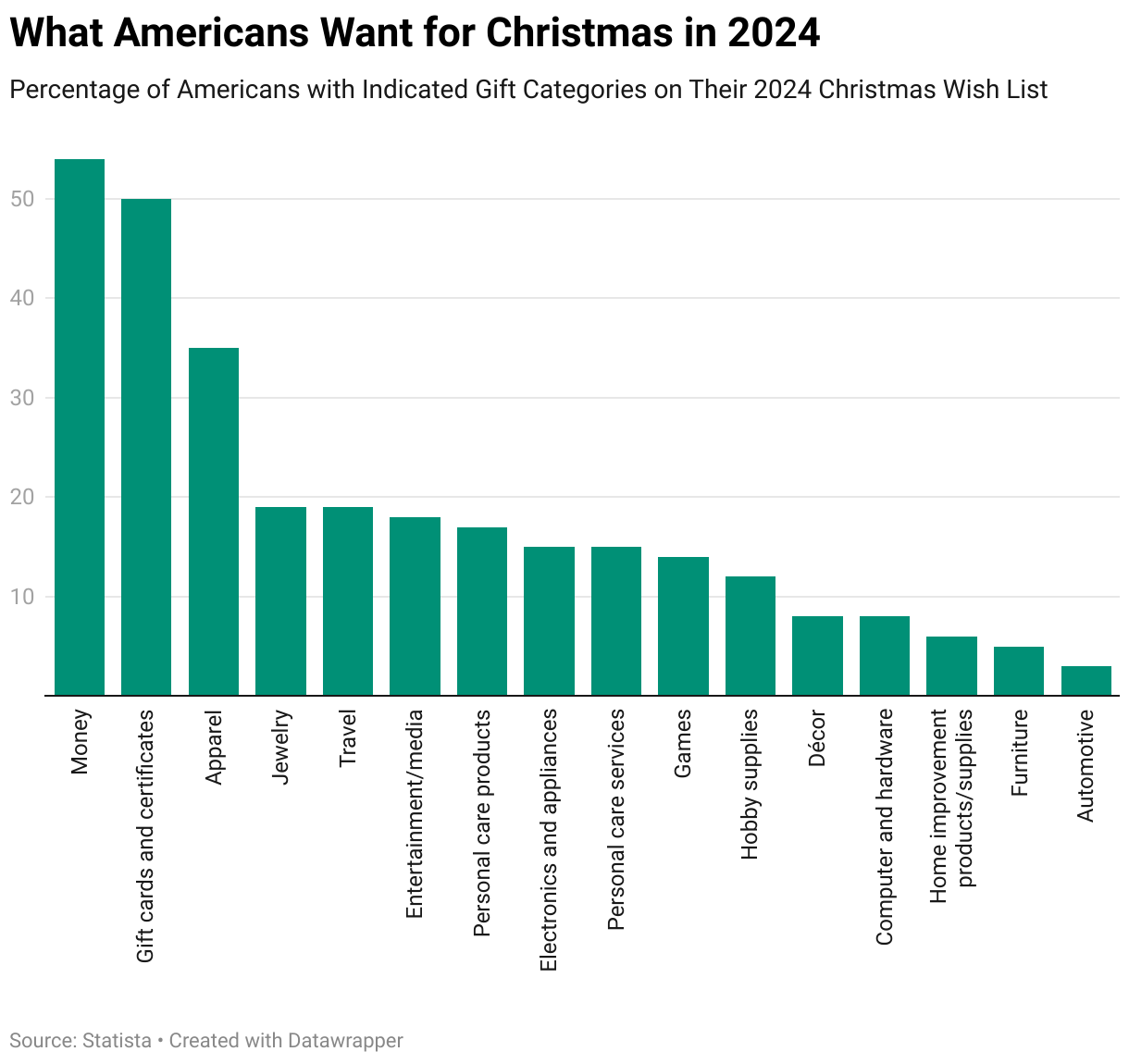
Knowing the probability the people on your Xmas shopping list will want something that falls in the most popular categories can help you finish up your shopping this year now that there's so little time left. And to help get you over the finish line for this year's gift shopping, we've asked the Inventions in Everything team to supply suggestions of gifts that go along with many of these categories.
Last Minute Xmas Gift Ideas
When the IIE team goes shopping, its normally to find out if its even possible to buy a product based on wild or wacky patented invention we've featured. Or, in the case of the "Outside the Box Thinking" category, we review unusual innovations that do exist and that you can buy. The six items on the IIE team's last minute Xmas list for 2024 falls somewhere between these two categories. Here they are.
Bilz Money Puzzle for Cash, Gift Cards and Tickets
Money and gift cards top the list for gifts Americans say they would prefer to receive in 2024 with more than half of those surveyed saying they want to get these things for Christmas. These are really easy things to get, so giving them as gifts is more about how you package them. That's where the Bilz Money Puzzle for Cash, Gift Cards and Tickets comes into play.

Put the cash or gift card into the puzzle box and your gift recipient can enjoy the challenge of extracting your gift from it. Or should we say that your gift recipient can "enjoy" the challenge of extracting your gift from it. We trust that since you know them, you know what you can get away with. As a plus, because the money puzzle can also hold things like movie or concert tickets, you can also tick the box for the Entertainment/media category with this item.
Moipejo LED Flashlight Gloves
Over a third of Americans say they would like to receive some kind of apparel for Christmas this year, so why not light up their faces by giving them gloves with built in LED lights?

It occurs to us this product might also tick the boxes for Jewelry, which nearly one out of five Americans would like to receive at Christmas. It also ticks the box for Electronics and appliances, which 15% of Americans hope to get in 2024.
The Flying Orb Ball Hover Toy
Speaking of electronics and appliances, which 18% of Americans say they'd like to receive, why not get them a flying ball they can play catch with themselves with?
This is a unique product the IIE team covered earlier this year. It's fundamentally a lightweight miniature drone mounted inside a ball-shaped frame that allows air to pass through so the drone's rotors can work, making it possible for the 'ball' to fly on its own.
Combined with a bit of programming magic, it becomes a ball that lets you play catch with yourself. The concept of Flying Orb Ball Hover Toy, a.k.a. "the boomerang ball" is demonstrated in the following short video:
Versions of this technological wonder are available at retailers like Amazon and Walmart. And like many modern tech-based toys, it has a rechargeable battery.
Funboy Winter Fun Inflatable Toboggan
As long as we're talking about products that are fun, we have to include the inflatable toboggan. Unlike the Flying Orb, it's low tech and it checks the box for Games.

For obvious reasons, this gift is best given to those who live in areas that get snow and that ideally also has hills. Otherwise, you may need to pair this item with Travel, which nearly 19% of Americans say they would like to get for Christmas this year. If you don't, there's nothing stopping your gift recipient from blowing it up anyway and using it as a cushion or pillow, which means it might work for them as Décor. Or not.
Original SipCaddy Shower Wine Holder
We think this item falls into the Personal care products category, but really, it's for that person you know who likes to drink adult beverages and who also likes to bathe or shower.

In truth, this gift is for that special someone who likes these activities so much they want to do them both at the same time. Again, you know who you would give this gift. If you didn't, you might be better off giving them that fruitcake.
Pulidicki Car Cleaning Gel
This last minute gift idea is a total stretch on our part. We looked at the remaining categories we hadn't already covered and tried to identify one product that could tick the boxes on as many of those as we could. This miracle product was the winner.

Pulidicki Car Cleaning Gel is a sticky gel that you can use to remove dirt from the nooks and crannies of your car while you detail it, which clearly falls in the Automotive category. You can also use the gel to clean the gunk off the keyboard for your Computer and hardware, and also your electronics and appliances. Or for that matter, around your light switch plates and baseboards of your home, which makes it a Home improvement product. If their hobby is cleaning, it would count as Hobby supplies.
There you have it. Six last minute gift ideas, links to where you can buy them, and just enough time to order them to get them before December 25 arrives. What can possibly go wrong? Happy Xmas!
Image credit: Cake Decorator Displaying Deluxe Fruitcake on Baking Line photo by JmanningCSB on Wikimedia Commons. Creative Commons CC BY-SA 4.0 Attribution Share-Alike 4.0 International Deed.
Labels: data visualization, geek logik, technology
Welcome to the blogosphere's toolchest! Here, unlike other blogs dedicated to analyzing current events, we create easy-to-use, simple tools to do the math related to them so you can get in on the action too! If you would like to learn more about these tools, or if you would like to contribute ideas to develop for this blog, please e-mail us at:
ironman at politicalcalculations
Thanks in advance!
Closing values for previous trading day.
This site is primarily powered by:

CSS Validation

RSS Site Feed

JavaScript
The tools on this site are built using JavaScript. If you would like to learn more, one of the best free resources on the web is available at W3Schools.com.
Other Cool Resources
Blog Roll


