How much more in taxes would you be willing to pay for the sake of reducing the risk of having to recover from the damage done by a natural disaster?
We're asking that question today as Hurricane Sandy has already done most of the damage it is going to do to the northeastern United States, but really, we're going to apply lessons learned back in 2005 from Hurricane Katrina. John Whitehead wrote in considering the cost of a flood-free New Orleans in the aftermath of that natural disaster:
From the NYTimes (New Orleans Floodplan Upgrade Urged):
Federal officials outlined plans yesterday for a significant improvement to the New Orleans flood-protection system by 2011, but said the total cost would be more than double the $7.1 billion that Congress has already appropriated for repairs and upgrades.
I'm wondering ... what is the breakeven willingness to pay that would justify this expense?
By spending an additional $7.6 billion, the Army Corps of Engineers could build higher, tougher floodwalls and gates to seal off waterways like the city’s enormous Inner Harbor Navigation Canal from storm surges, officials said. Permanent pumping stations at the mouths of the city’s drainage canals would block surging water from Lake Pontchartrain and effectively pump water out of the city during storms as well.
The officials said the upgraded system would result in a widespread reduction in water levels should the city be hit by the kind of flood that might have a 1 percent chance of occurring in any year. It would not eliminate flooding, however — rainwater could still accumulate to two or four feet in some sections of the city — and very intense storms could still do major damage.
Suppose the present value of costs (PVC) is $14.7 billion. The present value of benefits in perpetuity is:
- PVB = (P x B x N)/r
where the P is the annual probability of a flood, B is the annual individual level benefit, N is the population and r is the discount rate. According to the article, P = .01. According to my favorite mistake-free source, the greater New Orleans population is 1.2 million (the city population is 273k). The question is, what is the individual level benefit that equates PVB and PVC at various discount rates?
To be worthwhile, the present value of the benefits from such a project must be at least equal to the present value of its costs. Knowing that, there are two unknowns left in the benefits calculation: the value of the individual benefit that a person might enjoy from the project (and be both willing and able to pay each year in taxes in perpetuity to enjoy) and the discount rate.
The discount rate is something that is always changing, but in this case, it might properly be measured by the opportunity cost of loaning out money over a long period of time, which is a fancy way of saying that it should be tied to average long-term interest rates. The Army Corps of Engineers reports that its long-term discount rate in 2008 was 4.88%, however this value has ranged between 2.50% and 8.88% since 1957, with the average discount rate being 5.8%.
Using that 4.88% value, we now have enough information to build a tool to find out how much more each individual benefiting from this kind of project would have to pay in taxes to support it. We've entered the default numbers that would apply to making a flood-free New Orleans in our tool below (just change the values as you might need to consider other situations!):

In the default case, if only the 1,167,785 people of metropolitan New Orleans were responsible for paying for the $14.7 billion project to prevent damage from a natural disaster for which the odds of occurring in any given year is just 1%, each would have to pay an additional $61,429 annually on top of the taxes they pay today for every year going forward.
If we make this a statewide issue, where some 4,574,836 Louisianans would each get a permanently higher tax bill, the cost drops to $15,681 per person per year.
On a national scale, with 311,592,917 Americans sharing in the cost of making a flood-free New Orleans, each would need to pay an additional $230 in taxes each year.
But that would only take care of New Orleans, and specifically only benefit the people who reside within the boundaries of the improved levees. The project wouldn't provide much benefit for all the other Americans who live everywhere else.
Believe it or not, we know how this story has turned out! The funding to improve New Orleans' flood control infrastructure was approved and the U.S. government spent upwards of $14.6 billion to make a flood-free New Orleans. Reuters reports the results following Hurricane Isaac's aftermath in September 2012:
NEW ORLEANS (Reuters) - Thanks to $14.6 billion spent on new flood defenses, roughly $17,400 per resident, Clara Carey and her husband could afford to sit tight in their home when Hurricane Isaac pushed toward New Orleans last week.
"We're senior citizens, and we always said if another Katrina came, we wouldn't come back," said Carey, who lost nearly everything in the flooding that followed the 2005 hurricane and took two years to restore her home in the Gentilly neighborhood.
Isaac would be different, not only because the Category 1 storm was weaker than Katrina, but also because multibillion-dollar work on levees by the U.S. Army Corps of Engineers has given the city stronger protection against hurricanes.
[...]
"The good news is, the post-Katrina system, a $14.6 billion system the federal taxpayer paid for, performed very well," U.S. Senator David Vitter said. But flooding elsewhere "underscores that our work is not done by a long shot," he said.
Doing the math, the federal government's spending of $14.6 billion benefited just over some 839,000 residents of New Orleans, who reside within the boundaries of the city's improved flood control infrastructure. Reuters continues:
But Isaac laid bare an uncomfortable truth about the new and improved New Orleans, a tale of two populations - one of neighborhoods that stayed dry behind a world-class system of levees and flood walls and another of suburban communities that were inundated when their older levees failed.
In the Lower Ninth Ward, where a 20-foot (6-meter) wall of water tore homes off their foundations during Katrina, the federal levees held up under Isaac.
But on the north and west of Lake Pontchartrain in towns like Slidell and LaPlace, and in Plaquemines Parish to the south, residents saw widespread flooding that claimed a few lives, spurred rescues from rooftops and caused a surprising amount of damage.
And so it seems that at least several hundred thousand people who live just outside of New Orleans saw no benefit from the project, although they each are effectively paying an additional $230 per year for it along with all other Americans. Reuters quotes the Cato Institute's Chris Edwards on the cost-benefit mismatch problem:
"It's a huge amount of money spent to benefit people in an area of the country with a particular problem," Edwards said. "The problem is you have different people spending the money than the people who are being taxed to pay for the projects."
Edwards said that decisions by Congress to spend such large amounts in local areas is fundamentally unfair "because the money is allocated by politics" and not based on market demands.
"When you have a levee system in Louisiana that's 80 to 90 percent funded by taxpayers who live in other states, then policy makers have a hard time balancing costs and benefits," Edwards said.
Altogether, some 310,700,000+ Americans, each having to bear the burden of an additional $230 per every year going forward in higher taxes (or really government borrowings) to pay for the project, are finding they aren't sharing the benefits.
With the tab for rebuilding after Hurricane Sandy already being estimated to be more than $20 billion, that's a lot of money that might have been better spent to avoid damage in other places.
All in all, what this lesson from Hurricane Katrina demonstrates is the importance of federalism, which is the mechanism in the United States that best matches where the costs are paid to where the benefits are enjoyed. Upending that arrangement is just playing politics of the worst kind - seizing on tragedy for personal gain.
If you were really evil, how would you furnish your home?
Or should we say your lair? Here at Political Calculations, we occasionally ask questions that most people, aside from a handful of motion picture set designers, ever think about asking. Today, that means considering some of the most unusual furniture designs that caught our attention over the past year.
Let's start with lighting, shall we? Sure, you could opt for pitch blackness, but really, if you're going to be effective at being evil, you still need to see what you're doing.
That doesn't mean you can't do it in style! Especially if you opt to install Kelly Lamb's Skull Chandelier in your dining room (HT: Core77):

Next, let's set the mood with a little music, shall we? To us, aside perhaps for a Lady Gaga soundtrack, nothing creates a sense of discomfort quite like this laptop desk with speakers from French designer Claire Marion, who was inspired to add hair extensions to them:

Why no, that's not creepy at all! Not if you're genuinely evil, that is.
Moving on, let's consider your seating situation. Of course, you'll need a chair that sets you apart from all who enter your home, and for our money, you can't do much better than this $30,000 replica of the seven-foot tall throne of swords inspired by the Game of Thrones television series:

That leaves your guest seating. Might we suggest what Barry Ritholtz might use to furnish his own home office, and point you toward the "Mutation" series of foam-bubble inspired chairs designed by Maarten de Ceulaer:

Admittedly, what you gain in style is a price you'll pay in comfort. But, being evil, you probably won't want to advertise the fact that you have any comfortable chairs about in your home. And that's where Matali Crasset's Decompression Chair comes into play - for those times when you need an emergency comfy armchair deployment in your drawing room:

Meanwhile, you might offer to seat your guests in Kouichi Okamoto's aluminum wire Composition Chairs:

Obviously, that chair is for people you like. You'll need something really disquieting for people you don't like. And that's the space where Sebastian Errazuriz "Chicken Chair" will fit into your decor. Because being poised over poultry is just plain creepy:

Finally, you'll need a special piece of furniture that simply encourages your unwanted guests to leave, or that you can use to unconventionally exit them from your domain. Meet Igor Lobanov's Wormhole chair:

Just suggest to your guests that you have the ability to flush them into another dimension, and your problem with unwanted guests will likely go away!
Happy Halloween!
Previously, on Political Calculations
Labels: none really

Barbara Walters once asked an aging Katharine Hepburn "if you were a tree, what kind would you be?"
The question has often been derided ever since, but we can't help thinking of that situation because it combines the concepts of a person's age and trees. What if we could determine your age the same way we might estimate the age of a live tree?
Here's how that works. There are parts of the human body that grow in size each year, much like the trunk of a tree does, which can then be measured and the person's age estimated from the result. And no, despite what you might think, we're not talking about measuring your waistline....
Instead, we're talking about your ears! Thanks to a 1997 study published by U.S. Veterans Administration researchers, we have the means to estimate how old a person is from a measurement of the circumference of their ears, and vice versa:
It is generally observed that older people have bigger ears and noses. Cartilage is known to alter in structure with age. We conducted a cross sectional study to verify the trend between age and the size of two cartilaginous structures, ear and nose. A total of 100 young individuals were compared to older individuals with respect to their ear and nose sizes. We found that the greatest correlation coefficient of age was with ear circumference, and the linear regression equation being: Ear circumference = 88.1 + (0.51 x subject's age). Except for the ear tragus, which correlated insignificantly with age, anatomical variables of the ear had higher correlation with age than anatomical variables of the nose. This study supports the view that as people age, their ears get larger, particularly the ear circumference, which increases on average 0.51 mm per year. This enlargement is likely associated with aging changes of collagen. The knowledge from this study allows us to calculate the age of an individual based on ear size: Subject's age = 1.96 x (Ear circumference in millimeters - 88.1).
That second equation is the exact math we've built into the tool below! Just enter the value of your or your subject's ear circumference (the distance you measure around the outside edge of the ears) in either inches or millimeters (we'll sort out which is which, although the default value is given in inches) and our tool will do the math for you!
It's a bit like CSI if you think about it! You can almost imagine yourself as the lead detective investigating a murder ("We didn't find any ID, but we estimated the vic was 25 years old from the size of their ears!..." Ed. You're no Caruso....)
Of course, this is really bad news for people who lie about their age, because now they will be less likely to get away with it. ("38? Ha! Let's measure those ears of yours!..." Ed. No means no.)
We suspect that the hardest hit will be Hollywood actresses, who in addition to doing things like growing out their hair to cover their ears and going to all sorts of other extremes in a vain effort to hide their ages, probably haven't realized that those things attached to the sides of their heads are giving them away.
Really, the only remaining question is which aging Hollywood actress do you suppose will be first in line for some otoplasty after they read this post? Quite possibly, the next hot new trend in cosmetic surgery will be the "ear job"!
References
Tan, R., Osman, V. and Tan, G. Ear size as a predictor of chronological age. Archives of Gerontology and Geriatrics. 1997 Sep-Oct; 25(2): 187-91.
As we expected, economic growth in the United States picked up in the third quarter of 2012, increasing from the annualized growth rate of 1.3% recorded in 2012-Q2 to 2.0% in the BEA's initial GDP estimate for 2012-Q3.
We had forecast that real GDP would be recorded at $13,602.8 billion in terms of constant 2005 U.S. dollars, and the BEA's initial estimate came in at $13,616.2 billion - a difference of $13.4 billion, or within 0.01% of the BEA's recorded figure.
The BEA will revise this figure twice more before the end of the year. We anticipate that it will be adjusted upward, as the third quarter of 2012 likely recorded the U.S.' strongest economic performance for the year.

By contrast, our inertia-based forecasting methods point to a slowing economy in the current fourth quarter of 2012. Our chart uses the BEA's initial estimate for 2012-Q3 GDP to project a first look at where we can reasonably expect GDP in 2012-Q4 to be recorded.

Using the BEA's initial estimate of GDP for the third quarter of 2012, we would currently give a 50% probability that GDP will be recorded above our forecast value of $13,671 billion in terms of constant 2005 U.S. dollars. For the statistically illiterate, that means there is also a 50% probability that GDP will be recorded below this value.
We estimate the following odds that real GDP will be recorded within the indicated ranges for 2012-Q4 (all expressed in terms of constant 2005 U.S. dollars):
- A 68.2% chance that real GDP will be recorded somewhere between $13,529.6 and $13,813.8 billion.
- A 95.0% chance that real GDP will be recorded somewhere between $13,387.4 and $13,955.9 billion.
- A 99.7% chance that real GDP will be recorded somewhere between $13,245.3 and $14,098.0 billion.
In considering the overall strength of economic growth in the United States, our one and two quarter temperature gauges both indicate the economy is currently performing in the "cool" zone, indicating sluggish economic growth. Our less volatile two-quarter GDP growth rate temperature gauge indicates that the U.S. economy is actually trudging along at near-recessionary levels.
We anticipate that this condition will continue through the fourth quarter of 2012 and will worsen going into 2013.
Labels: gdp, gdp forecast
How can you tell how old a tree is without chopping it down and counting its rings?

It turns out that there's some really simple math that you can use to estimate the age of a tree. All you need to know is how big around its trunk is and what kind of tree it is!
Here at Political Calculations, we build tools to solve problems like this! And, after a quick Internet search, we discovered that no one else appears to have already built a tool to solve this kind of math, which means that we'll have a monopoly on tree age calculators on the World Wide Web! Can fame and riches be far behind? Or an intensive investigation by the anti-trust division of the Department of Justice?
Bring it on, we say! Now, let's get to business....
In our tool, enter the circumference of the tree you measured and select which kind of tree it is from our list (if it's not in the list, select a tree that you believe would have a similar growth factor). Then click the "Calculate" button, and we'll give you a pretty good estimate of the age of that tree!
Arboriculturist Jim Skiera offers the following insight for interpreting the results of the math:
"The figures in the chart are taken for forest grown trees. In a landscape setting, where trees are being provided additional care, these figures probably would need to be adjusted to get an accurate estimate. Growth has to do with the location of the tree and the type of care it has received. Trees in the landscape tend to grow faster and develop wider growth rings more quickly because the competition from other trees is usually less and the additional water and fertilizer that is provided by the home owner will also increase growth.
In other words, you need to take into account where the tree you've measured is located. If the tree whose age you're trying to estimate is in your yard or in a park, and not in a forest, our tool will overestimate the age of the tree.
Now for the really cool part. What we've just done for estimating the age of trees, we can do with people too! We'll explain more soon....
Labels: environment, tool
Yesterday, we observed that investors have shifted their forward-looking focus in setting today's stock prices backward from the first quarter of 2013 to the fourth quarter of 2012 instead. Today, we'll explore one of the big reasons why: the looming dividend cliff. The WSJ's Jason Zweig explains (emphasis ours):
Enough about the "fiscal cliff." What about the dividend cliff?
At one second after midnight on Jan. 1, 2013, the maximum tax rate on dividends is likely to go from 15% to either 18.8% or 43.4%. The best-case scenario: Congress retains the top dividend-income tax rate of 15%, and the only increase is the scheduled 3.8% surtax on investment income for high earners. The worst case: Congress decides dividends are to be taxed at ordinary-income rates, and the highest rate jumps to 39.6%, plus the same 3.8% surtax.
That looming tax hike for dividends represents a huge incentive for shareholders to push the companies whose stock they own to increase the amount of cash dividends they pay out this year, and perhaps even to pull ahead dividends currently planned to be paid in 2013 by the end of 2012 instead. Zweig continues:
Analysts say many companies are waiting to see what Congress does before they finalize their payment plans. There are no significant tax or financial consequences for companies that speed up a dividend, analysts say.
There is some precedent for doing shareholders a favor by paying out income before it becomes taxable at a higher rate. Two years ago, when Congress also looked likely to jack up taxes on dividends, roughly two dozen companies, including Sara Lee, accelerated their January 2011 payouts into December 2010.
That time, the dividend-tax rate stayed put after a congressional reprieve. This time, a rise to at least 18.8% from 15% is all but inevitable; the odds of a tripling to 43.4% are uncertain.
"I am advising all my wealthy clients [who own private corporations] to pay their dividends this year" before rates rise, says Robert Spielman, a tax accountant at Marcum LLP in Melville, N.Y. "So why shouldn't public companies who care about their shareholders' well-being do the same thing?"
But that's not the real problem with the looming tax hike on dividends. The real problem is that the tax rate for dividends will be greater than that for capital gains.
This difference has the potential to create a massive incentive problem for the nation's stock markets, with repercussions that can impact the entire U.S. economy. And it will all hinge upon how great the difference is between the tax rate for dividends and the tax rate for capital gains. The greater the difference between the two, the greater the incentive will be for investors to buy into stocks that do not pay dividends to shareholders, because investing in these kinds of stocks will increase the after-tax returns on their investments compared to what they might otherwise earn if they had invested in dividend-paying stocks instead.
Over time, the ongoing incremental and increasing effect of millions of investors favoring the tax-advantaged stocks of non-dividend paying companies will create real problems in the stock market, with the potential to create real havoc with the U.S. economy ensured.
That's not speculation on our part. That's *exactly* what happened the last time the tax rate for dividends was significantly greater than the tax rate for capital gains in the United States.
The outcome of that tax policy produced what has become known as the "Dot-Com Bubble", the inflation phase of which began within days, if not hours, of when the U.S. government unexpectedly acted to lower the tax rate on capital gains at the end of April 1997.

In the next several years, non-dividend paying stocks, mainly represented by technology and Internet-related companies, benefited as their shares of stock provided outsize returns to investors compared to dividend-paying stocks. Consequently, their share prices came to be sharply inflated well above what any sound valuation method would place them.
Then, like the vaporware that many of these companies promised to produce, the inflating bubble that generated such exorbitant stock price valuations could not be sustained, and the bubble popped in August 2000. The U.S. economy fell into recession shortly afterward.
The deflation phase of the Dot-Com Bubble lasted for nearly another three years, ending only when the U.S. government acted to equalize the tax rates applying to dividends and capital gains late in May 2003 and returning order to the stock market.
During the deflation phase of the Dot-Com Bubble, millions of investors who had been counting on their investment gains were sorely disappointed, which especially hurt those whose retirement funds were invested in the stock market.
Jason Zweig notes the concerns of at least one fund manager for today's situation,:
Daniel Peris, co-manager of the Federated Strategic Value Dividend mutual fund, is concerned that higher tax rates might provide some companies with an excuse to avoid raising dividends. "It's yet another pretext not to send out a check to company owners," he says.
That lesson is backed by history. Since at least 1980, whenever capital gains have been taxed at a lower rate than dividends, the number of dividend-paying companies decreases.

This result hurts those investors who prefer the regular payments provided by earning cash dividends, such as retirees, who have their investment options limited as companies either limit the growth of their dividend payments or reduce them in response to the incentives created by the government's tax policy.
Today, that matters because high quality companies that consistently pay dividends provide a much higher return on investment and incomes for retirees than many alternatives, such as the yields that might be earned on U.S. Treasuries or interest from bank certificates of deposit, both of which currently pay near-zero rates of return. It's almost like the strategy of some political leaders today is to disadvantage today's sound investments so that those lousy alternatives start seeming attractive by comparison.
History is pretty clear on this matter. And given recent history, the last thing the U.S. economy needs is another government-generated boom-bust cycle sparked by poorly considered investment tax policy.
Correction 5 November 2012: Changed "March 1997" to "April 1997", which marks the last month of the period of relative order in the stock market before the bubble began.
Labels: chaos, dividends, SP 500
It has been several months since we've featured our chart showing the acceleration, or rather, the change in momentum, of stock prices and dividends per share, including expected future dividends per share, for the S&P 500.
A lot has happened in that time. First, the change in the year-over-year growth rate of stock prices appears to have gone through a spike in August 2012. We say "appears" because this effect wasn't a the result of what we would describe as a "noise event", where investors react, or really overreact, to an event in the news by putting the market though a major swing in stock prices, kind of the way a dog on a leash might react to the sudden sight of a squirrel while being walked.

Instead, stock price volatility, as measured by the VIX, hit a low in August, and has been fairly steady at low levels for the last several months, as the S&P 500's stock prices rose from August to September, where they have been fairly steady since (or at least through the close of business on 22 October 2012).
 |  |
The spike in our acceleration chart for August 2012 is really the result of how historical data can affect the results of the math behind how stock prices work. Here, our math measures the change in the rate of growth of average stock prices in reference to the year-over-year change in those prices. In going from July 2011 to August 2011, the S&P 500 dropped nearly 200 points to go below 1150, or roughly 15%, and stayed down at that level through September before beginning to rise in October 2011.

Flashing forward in time, since that low level for the S&P now forms the base of reference from which we measure stock prices, we see the result of that even from August and September 2011 as a spike in our chart, even though there has been no actual spike in stock prices during the last several months!
Since we use the information in this chart to project future stock prices (forecasts we stopped making publicly available after December 2011), you might think that dealing with this kind of data artifact would be a showstopper.
It's not really. All we need to do is to choose a different base reference point from which to measure the change in the growth rate of both stock prices and adjust the rest of the math accordingly. We found in playing with the data that all we have to do for the August 2012 spike is to reset the base reference month to be July 2011 - the spike disappears and we can anticipate what stock prices will be from what investors expect for future dividends!
Now that we've really buried the lede in this post for the sake of answering the question "hey, what's that huge spike in stock prices in August 2012?", let's get to the kind of stock market analysis we provide for free today and answer the question "hey, what is going on in the stock market today?"
It's not good news. It appears that investors have shifted their forward-looking focus to the current quarter in setting stock prices today, where they had previously been focused upon the first quarter of 2013. Since the expected change in the growth rate of dividends per share for this quarter is currently negative, the immediate effect of that change in investor focus is that the upward climb of stock prices of the past several months is now stalling out and beginning to reverse.
That's something that will continue until investors either collectively change their focus to another point in time in the future, or if should they remain focused on the current quarter, if the outlook for dividends in this quarter were to suddenly improve. If you're so inclined, you can use the dividend futures data presented in our accelerations chart above to make your own determinations for the future for the U.S. stock market.

As a general rule of thumb, we'll close by observing that it's almost never a good thing when investors focus in on the very near term after having focused on a more distant point of time in the future. The last time we really saw that kind of near-sightedness was during late 2008 and early 2009 when the most-distressed companies in the stock market were acting to slash their dividends, prompting and preceding similar magnitude cuts in stock prices.
We're not saying that's definitively what is in store for the stock market today, but we are wary that part of the federal government's fiscal cliff set by current law to begin on 1 January 2013 is a dividend cliff for investors. We'll have more thoughts on that soon, here (the link will become active some time on 25 October 2012)!
Update 24 October 2012: We wrote this post on 22 October 2012 - what a difference a day makes!
Labels: dividends, forecasting, SP 500
Six months ago, we used Google's Fusion Tables to create interactive heat maps to visualize the actual price of a gallon of gasoline across the United States. We're updating that exercise today:
Average Price of a Gallon of Gasoline at the Pump
Our first chart visualizes the average price that consumers are paying per gallon of gasoline at the pump when they fill up their vehicle's gas tanks, as of when we sampled it on 21 October 2012 as recorded by GasBuddy:
Average Combined Federal, State and Local Gasoline Taxes
Of course, the price people pay at the pump is jacked up by the combined total of federal, state and local gasoline excise taxes that are imposed by federal state and local governments. Our next chart shows how much gasoline prices are increased by these taxes on average by state, using data recorded by the American Petroleum Institute:
By contrast, oil companies make about 7 cents in profit for each gallon of gasoline they sell. The U.S. federal government by itself collects 18.4 cents for each gallon of gasoline sold in the United States - about two and a half times the take of what the people who actually work to produce and distribute gasoline across the nation earn.
Actual Price of a Gallon of Gasoline by State
By subtracting out these combined taxes, we can find the actual price of a gallon of gasoline in each state:
Looking at the map, gasoline prices have fallen the most per gallon in Illinois (-$0.58), Michigan (-$0.49), Indiana (-$0.46), Ohio (-$0.42), Wisconsin (-$0.42) and Missouri (-$0.41) since March 2012. Meanwhile, 12 states saw price drops between $0.20 and $0.31 per gallon, another 9 states saw price drops between $0.11 and $0.19 per gallon, 10 states saw single digit price per gallon drops and the actual price of gasoline is now higher than it was in March 2012 in 13 states.
The Associated Press notes that much of that price drop in the upper midwest is a very recent development:
The average price at the pump fell 22 cents in Ohio and 16 cents in Wisconsin in the past week. Those are two key battleground states in the presidential election, with 18 and 10 electoral votes, respectively.
Here's the electoral vote count for the states that saw the biggest gasoline price drops:
- Illinois (21 votes)
- Michigan (17 votes)
- Indiana (11 votes)
- Ohio (20 votes)
- Wisconsin (10 votes)
- Missouri (10 votes)
In 2008, Michigan, Ohio, Wisconsin and Missouri were all considered to be battleground states in the presidential election. Three of these states, Michigan, Ohio and Wisconsin are considered to be toss ups for the 2012 election.
Funny how the biggest gasoline price drops by state in 2012 match up so well with that list....
Labels: data visualization
What's wrong with using moving averages to assess trends in economic data? After all, it's a practice that is endorsed by the Federal Reserve.
That question arises today because of the WSJ's Josh Mitchell's analysis from last Friday, which suggests that initial jobless claims are trending down:
The number of Americans applying for unemployment insurance has fallen sharply since summer. The four-week moving average of first-time jobless claims inched up by 750 last week to 365,500. But the figure was below mid-June’s level of more than 387,000 claims. That is a sign that employers are laying off fewer workers and the job market could be healing.
And so it would seem, except there was a huge problem in the data for the week ending 6 October 2012, which might best be described as a California-sized hole in the data:
Last week, California reported a large drop in applications, pushing down the overall figure to the lowest since February 2008.
This week, it reported a significant increase as it processed applications delayed from the previous week. (Read More: Why Jobless Claims May Not Be as Good as Market Thinks.)
A department spokesman says the seasonally adjusted numbers "are being distorted ... by an issue of timing."
Since the Labor Department's four-week moving average for new jobless claims includes this data reporting anomaly, where one week's data was recorded more than 10% below where it might otherwise have been reported (if the California state government's Employment Development Department had properly processed and reported its claims from that week), this measure fails to provide an accurate depiction of the current trends for new jobless claims in the U.S.
In this case, the effect of the data reporting anomaly makes the situation for new jobless claims look better than it really is. Worse, at this writing, that data anomaly will be used to calculate the moving average in new jobless claims for another two weeks yet, which means that the distorted impression it creates will be with us through the Tuesday, 6 November 2012 national election, until it is no longer included in the Labor Department's calculation of the four-week moving average for the new jobless claims report it will issue on Thursday, 8 November 2012!
It is the moving average's inability to recognize data outliers that represents one of its greatest weaknesses. Based on only four data points, the four week moving average just isn't capable of accounting with outliers in a practical manner!
That's where the statistical control chart-style approach we've developed over the last several years can do a much better job. Here's what the recent data looks like from our perspective:

The major trends in the chart above, identified by the letters "I" through "K", are described in greater detail here (along with Trends "A" through "H"!)
The current trend, "K", began after the national average for gasoline prices fell below $3.50 per gallon in early June 2012. As gasoline prices have generally risen since that time, we've observed a generally rising trend in the number of new jobless claims filed each week.
Treating the 6 October 2012 data point as an outlier, we find that through the week ending 13 October 2012, the number of new jobless claims being filed each week, a proxy for the rate of job layoffs in the U.S., is currently rising at an average rate of over 1800 per week - a rate that is faster than at any time since the U.S. last fell into deep recession in mid-2008. This rate of increase also excludes another data point outlier for the week ending 14 July 2012, where the BLS' seasonal adjustments didn't account for a delay in the typical mid-year plant shutdowns in the automotive industry.
That's likely a bit inflated, as the state of California is playing catch up in reporting the large number of claims it failed to process in the week ending 6 October 2012. If we exclude the initially-reported data for last week, we find that the number of new jobless claims in the U.S. is rising at a rate of over 1500 per week. That would still be the fastest rate of increase recorded for new jobless claims in the U.S. since the nation fell into deep recession in mid-2008.
As for whether it ever makes sense for using a moving average to evaluate this kind of data, we'll say that it does, but only for certain unique occasions. Since our statistics based method needs at least 6 to 10 data points to establish whether a trend exists, a moving average might provide a useful picture in the limited period of time following when a break in an established trend occurs until our method can define the new trend.
But once that trend is defined, our method provides a more accurate picture of what's actually going on in the economy. Right now, the real trend for new jobless claims indicates a rising number of layoffs each week in the U.S., which is something the Labor Department's four-week moving average will confirm in the form of a sudden increase after the election.
As the marketing tag says, "Welcome to a Galaxy where Leather Rules"....
The Star Wars Stormtrooper motorcycle armor is available in both Shadow Trooper Black and Stormtrooper White. Unfortunately, there's no word on when Boba Fett-style armor might become available.
Meanwhile, Core77's hipstomp and Rain Noe offer the following invaluable insights:
Folks, I don't doubt that there's some overlap between the motorcycle-riding and Star-Wars-watching subcultures, but isn't this kind of asking for an ass-kicking? Maybe I've been watching too much Sons of Anarchy, but would you not be worried about a gang of thugs pushing each other out of the way in their haste to get to you, eager to win first boasting rights of "I beat the crap out of a Stormtrooper?"
The real rub is that the helmet isn't an actual motorcycle safety helmet. But I can't say what would be more dangerous—riding around with no helmet, or wearing this get-up to Sturgis.
And no, we're not making this up!
Labels: none really, technology
The Mercatus Center has launched a new web app, RegData:
The Mercatus Center at George Mason University is proud to announce the launch of a breakthrough database that provides a dramatically improved measure of the federal regulatory burden.
RegData is the first database to count the actual number of restrictions in the Code of Federal Regulations, as opposed to the former method of simply counting total pages. The interactive tool enables a far more focused view of the regulatory burden by measuring the growth of regulation by industry. While previous methods provided an idea of the growth of overall regulation, they told nothing about how those regulations affected specific sectors in the economy.
Here are the results in looking at the growth in the total number of regulations since 1997:

In 1997, there were 834,949 instances of the words "may not", "must", "prohibited", "required" and "shall" in the Federal Register, which coincide with each single rule implemented by the U.S. federal government.
By 2010, that number had risen to 1,001,153, an increase of 16.6% in 13 years. Or if you prefer, an average rate of increase of 12,808 per year.
For the preceding 208 years, going back to 1789, the average rate of increase of regulations in the U.S. was just 4,013 per year.
The RegData database can also break down the data by industry or by type of regulation - the only real limitation we see is that it only covers data from 1997 onward. All in all, pretty cool!
How many pages does it take to explain the basics of the U.S. Medicare program?
If you answered "a lot more than it used to", you're right! Each year, legal publisher CCH puts out a book simply titled Medicare Explained, which they describe as follows:
A book for Medicare beneficiaries and others who need a relatively thorough explanation of the Medicare program with particular emphasis on services covered in institutional settings and services provided by physicians and suppliers. A detailed explanation is provided regarding eligibility, enrollment, benefits, exclusions and payment rules for Medicare Parts A, B, C and D. This book also explains the process for submitting beneficiary claims and filing an appeal.
As we saw with CCH's Standard Federal Tax Reporter and the U.S. tax code, the growth of the complexity of the laws and regulations affecting Medicare can be measured by the number of pages this particular book requires each year. The summary for the 2012 edition of CCH's Medicare Explained illustrates why that's the case:
Medicare Explained has been prepared for Medicare beneficiaries and others who need a relatively thorough explanation of the Medicare program with particular emphasis on services covered in institutional settings and services provided by physicians and suppliers. Published annually, Medicare Explained includes changes made during 2011 by law and regulation amendments and updates to program manuals issued by the Centers for Medicare and Medicaid Services (CMS).
Our chart below shows how that's changed for each year in which an edition has been published since 1996, which we've now updated through 2012:

Since 2011, the Medicare program has grown in complexity by over 6%, as measured by the addition of some 28 pages to the page count of Medicare Explained for 2012. The previous year saw a 52 page increase, or an increase in complexity of nearly 13%. The large increases in complexity for both years were largely driven by changes related to the Patient Protection and Affordable Care Act (aka "ObamaCare").
We see that over time, more and more pages have been required to "explain Medicare", although the real explosion in the government program appears to have taken place since 2007. That coincides with the arrival of a Democratic party majority in Congress, which lasted through 2010.
At present, the amount of complexity for Medicare is doubling at a rate of once every 10 years, or an annualized growth rate of roughly 7.2%. Prior to 2007, it was doubling at a rate of just once every 20 years, at an annualized growth rate of roughly half its current rate.
Although the Democratic party's majority in the U.S. Congress ended, at least in the House of Representatives if not in the Senate or in the White House, the impact of their policies set during their time of full power in office is still being felt through the ongoing increases in rules and regulations affecting Medicare, as ObamaCare will be adding greater levels of complexity to the Medicare program for years yet to come if not altered.
Labels: data visualization, health care
The signature achievement of President Obama's four years of office was the passage of the Patient Protection and Affordable Care Act, a.k.a. "ObamaCare". Passed into law in 2010, and initially upheld as constitutional by the Supreme Court in 2012, ObamaCare has had an ongoing negative effect upon the employment situation in the United States since it was crammed through the House of Representatives and the Senate solely by members of the Democratic party.
Unfortunately for Americans, the ObamaCare job killing spree will only continue and get worse. The reason why has to do with a penalty tax that will be imposed upon all U.S. employers with 50 or more employees who currently provide their employees with what would be considered to be an "average" health insurance coverage plan today.
The Manhattan Institute's Diana Furchtgott-Roth explains how that works:
... if an employer offers insurance, but an employee qualifies for subsidies under the new health care exchanges because the insurance premium exceeds 9.5 percent of his income, his employer pays a penalty of $3,000 per worker. This combination of penalties gives a business a powerful incentive to downsize, replace full-time employees with part-timers, and contract out work to other firms or individuals.
The new law will make it harder for small businesses with 50 or more employees to compete with those with fewer than 50 employees.
When the employer mandates are phased in 2014, many businesses will be motivated to reduce the number of locations and move workers from full-time to part-time status. This will reduce employment still further and curtail the country’s economic growth.
Let's get a sense of how many people that might affect. Today, over 90 million Americans, or 75% of all working Americans, are employed by firms that have 50 or more employees. With the average annual cost of employer-provided health insurance premiums for Single coverage set at $5,615, employers will only avoid ObamaCare's employer penalty head tax of $3,000 for their employees who earn more than $59,105 per year.
That's well above the $39,372 that represents the median income earned by Americans employed full-time, year round in 2011.

What that means is that MILLIONS of Americans are going to be affected as ObamaCare adds directly to what it costs for their employers to have them on their payrolls.
And since President Obama hasn't done anything for the thousands of businesses that will be stuck with a higher cost of doing business without the additional revenue to pay for it, that means employers are going to have to consider one of the following options:
- Reduce the size of their business to employ fewer than 50 workers to avoid the tax.
- Cut the hours of their full time employees with lower incomes to make them part time employees to avoid the tax.
- Stop providing health insurance coverage for their employees.
- Keep providing health insurance coverage for their employees and take the hit to their bottom line, risking their ability to stay in business.
- Provide employees with "cut-rate" health insurance coverage that is inferior to their current health insurance coverage.
- All or some of the above.
One way or another, ObamaCare will negatively affect your job or your health insurance.
Previously on Political Calculations
Labels: data visualization, health care, insurance
Last April, we were asked to contribute a question to Tim Kane's quarterly survey of economics bloggers for 2012-Q2. After reflecting on the potential causes for the very statistically unlikely number of upward revisions to the number of new jobless claims filed each week over the past year, we submitted the following question:
The Wall Street Journal has reported that the advance number of seasonally-adjusted initial unemployment insurance claims filed each week has been revised upward in 56 of the past 57 weeks. If this were a coin toss, the probability of that occurring would be 2,528,336,632,909,751 to 1, which makes the event extremely statistically unlikely. What is the primary reason behind why the BLS' collection and reporting of the initial data would appear to be so deeply flawed?
- Seasonal adjustments that no longer reflect reality well enough to account for the difference between initial and later revised counts.
- Inadequate counting practices by the 50+ state agencies that report this data weekly to the BLS.
- Deliberate delays in reporting the full scale of the worst case increases in the number of claims recorded each week to create a rosier impression of the data.
Here are the survey results:
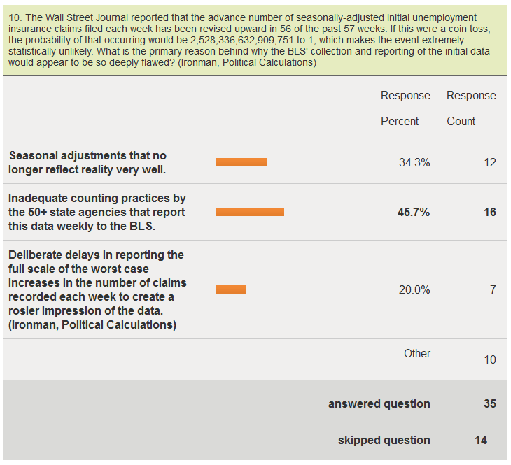
We selected the second explanation in the live voting for the survey, but we were surprised that it didn't win an outright majority. Today however, thanks to a large anomaly in reporting the number of new jobless claims last week, we have an answer to the question that would seem to confirm "Inadequate counting practices by the 50+ state agencies that report this data weekly to the BLS" as the correct answer to the question. James Pethokoukis reports on Strategas' Don Rissmiller's analysis of the reporting anomaly:
One of the driving reasons for the less-than-expected growth was one state, which was expected to report a large increase but instead reported a decline. Unfortunately we will have to wait until next week's release to find out which state it was; the state breakdown is always one week delayed.
And also JPMorgan's Daniel Silver's view, in which he identifies which state had the problem:
We won't know for sure which state caused the large drop in claims during the week ending October 6 until the state-level data become available next week. It was likely a state with a large population and we suspect that it was California based on the occasional massive swings that have occurred in its claims data in the past.
Fox Business' Dunstan Prial and Peter Barnes report on what the BLS has to say about the derelect data counting and reporting practices of the state in question:
Because one state left out a chunk of its weekly reports from last week, the jobless claims numbers will likely be revised upward in the coming week.
The spokesman said the lack of reporting affected the season adjustment for the week, likely by about 30,000 fewer claims.
In addition, the spokesman explained to FOX Business that this large state has a history of reporting "volatile" numbers at the beginning of quarters and that the Labor Department has complained and tried to work with the state to more accurately report its claims but with little success.
"There is no explanation" for the volatility. "We have tried and tried to work with them. It's like playing hardball with them," the spokesman said.
The spokesman said that the unprocessed claims are likely to show up in the numbers in the next week or two. "We should see some sort of catch up."
That apparently was too much truth for one day, as another BLS spokesman tried to walk back the observation, we suspect after getting some rather loud and angry calls from one particular state's employment security department:
Later Thursday, another Labor Department spokesman issued a statement in effort to clarify what the agency described as “confusion” over the data. The latter statement seemed to refute the department's earlier explanation.
"The decline in claims this week was driven by smaller than expected increases in most states and because of drops in claims in a number of states where we were expecting an increase," the statement said. "No single state was responsible for the majority of the decline in initial unemployment insurance claims."
We'll let Pierpont Securities' Stephen Stanley get the final word, as reported by Marketwatch:
Added Stephen Stanley of Pierpont Securities: "The formula for the size of a claimant's benefit check is derived based on an average of their last few quarters of pay (the more you were earning before being laid off, the bigger your unemployment check would be). Thus, in many cases, it pays for a laid-off worker to game the formula by waiting until the beginning of the next calendar quarter to file (if they can wait that long), as they may have been getting paid more in the quarter when they were laid off than in the quarter that rolls out of the equation if they wait."
"As a result, there is an accumulation of claims that are likely submitted over a period of several weeks but not processed until the turn of the quarter. Apparently, the state in question (and it pretty much has to be California to account for anything close to 30,000) forgot to include that stockpile of unprocessed claims in their tally for this week (which is the first week of a new calendar quarter). Since the seasonal factors expected an unadjusted surge of almost 20% in the period to account for the quarterly filing pattern, failure to adhere to that pattern in the raw data (unadjusted claims were only up 8.6%) creates a big drop seasonally adjusted."
So we see that inadequate counting practices by the 50+ state agencies that report this data weekly to the BLS, and for the week ending 6 October 2012, one large state in particular, is responsible for the ongoing issues with the continual undercounting of the initial number of seasonally adjusted initial unemployment insurance claims filed each week.
Welcome to the blogosphere's toolchest! Here, unlike other blogs dedicated to analyzing current events, we create easy-to-use, simple tools to do the math related to them so you can get in on the action too! If you would like to learn more about these tools, or if you would like to contribute ideas to develop for this blog, please e-mail us at:
ironman at politicalcalculations
Thanks in advance!
Closing values for previous trading day.
This site is primarily powered by:
CSS Validation

RSS Site Feed
JavaScript
The tools on this site are built using JavaScript. If you would like to learn more, one of the best free resources on the web is available at W3Schools.com.
Other Cool Resources
Blog Roll


