 Welcome to this regularly scheduled Friday, May 29, 2009 edition of On the Moneyed Midways, the one place you can go each week to find the best of the past week's business and money-related blog carnivals!
If there's a theme among the best posts we found this past week, it's all about changing plans. From deciding to not pay off a mortgage at retirement, as originally planned, to going back to that original plan. From wanting to get an MBA for professional development to not really needing one for the kind of professional development you want. From setting up automatic payment plans to pay your bills so you wouldn't forget, to having to not forget about those automatic payments. Or from being grown up enough to have a credit card to having to have a grown up agree to let you have one.
One way or another, it's all about dealing with change and the desire to keep more of it! Just scroll down to see what we mean by that....
| On the Moneyed Midways for May 29, 2009 | |||
|---|---|---|---|
| Carnival | Post | Blog | Comments |
| Carnival of Debt Reduction | Saying Bye Bye to Our Mortgage | My Wealth Builder | The Super Saver's early retirement had put his family's original plans to pay off their mortgage early on hold, but now those plans are on back on track thanks to what's happened in the stock market. |
| Carnival of HR | How Do You Measure Your Success? | PseudoHR | April Dowling doesn't measure her success by whether she's set up shop in the corner office. Instead, she measures her success as an HR representative by providing for the success of others. |
| Carnival of Personal Finance | Attention Students: You Are Gonna Need Permission to Open that Credit Card | Independent Beginnings | Olivia considers the impact of the new Credit Card Act, which requires those under the age of 21 to have an adult co-signer in order to obtain a credit card. |
| Carnival of Real Estate | I'm P*ssed Off At Some REO (Foreclosure) Agents | Twin Cities Real Estate | Aaron Dickenson unloads on some less than helpful real estate agents dealing with foreclosed properties. We wonder if poor business sense and customer service on the part of these apathetic agents isn't keeping the number of foreclosures on the market much higher than it needs to be. |
| Carnival of the Capitalists | If You Build It, They Won't Come -- Without Marketing | Beelines | Your marketing plan, or lack of one, can make the difference as to whether your small business lives or dies. Gail Kent explains in The Best Post of the Week, Anywhere! |
| Festival of Frugality | Frugal Fixes Around the House - Duct Tape, Foam and a Rubberband | The Happy Rock | The Debt Destroyer, or rather, his wife, fixes stuff around the house the way we do. Or Red Green would. Absolutely essential reading. |
| Festival of Stocks | Penny Stocks Are Not Cheap Stocks | Moolanomy | Pinyo runs though how to interpret a variety of basic financial ratios before concluding that the price of a stock really isn't a solid measure of its value. |
| Money Hacks Carnival | Don't Automate Your Personal Finances and Forget About Them | Simplified Financial Lifestyle | Lots of people set up automatic bill payment so they don't forget to pay their bills. B. Simple says that just because you did, doesn't mean you can afford to forget about paying your bills! |
| Carnival of Money Stories | Why Achieving an MBA Is No Longer My Goal | Cash Money Life | Patrick is putting his goal of getting an MBA on hold mainly because doing so won't provide the same kind of returns it might have a year ago, before he began making more money and became satisfied with his career path. Absolutely essential reading! |
| Carnival of Pecuniary Delights | BVC #11 - Drawing Your Cashflowchart | Bargaineering | Jim Wang stars in a video describing how to create a flowchart for tracking your personal finances and explains why you might want to do so. Absolutely essential viewing! |
Previous Editions
- OMM's Running Index for 2008
- OMM's Running Index for 2007
- The Best Blogs Found in 2006 (and our full 2006 index)!
Labels: carnival
 There's a peculiar kind of greed being unleashed among the top administrators of many of today's top academic institutions, especially the ones that have become financially challenged as a result of gambling too much endowment money on too many poorly considered investments. Rather than cut costs by cutting their academically and financially non-performing departments and staff, who none-the-less have become politically entrenched within their institutions, they're instead going after the departments who have been doing the best job of attracting high quality students to their universities by offering high quality academic programs. Programs whose graduates are highly demanded outside of the universities.
John Palmer touched on this situation back in April in venting his frustration at how the senior administrators at the University of Western Ontario would appear to perceive its economics department, once ranked among the top tier of the world's academic economics departments, and what appears to be driving their decision-making:
Provincial budget cuts, coupled with some poorly managed destructive in-fighting, led to serious deterioration of the department's prestige and ranking in the early 1990s. We struggled, but recently people here have been working to rebuild the department. Nevertheless, a recent ranking has our department at 64th in the world. That is big drop from our glory days [h/t to co-blogger, Gabriel].
And very likely things will get worse.
The financial folks here gambled with our rent money: they invested huge chunks of the university's operating revenues AND endowment funds in equities. They looked like geniuses when stock prices were rising, but who is suffering now? Not them. In fact, they blame the market, not their own injudicious investment strategies.
Instead, the admin types here are reneging even on re-negotiated agreements. As a result, our department is losing a very dynamic and energetic chair and will likely lose other very creative economists.
There is a report that some of the senior admins here think that even having a ranking of 64 is too high for a university whose overall ranking in the world is somewhere between 100 and 150. They think this department is too good and commands too many of the university's resources. They see that top new PhDs in economics draw big salaries at top schools, and so they want us to hire lesser people and fall in the rankings.
But that's only on the cost side of the situation. What about the revenue side? What might the university administrators be considering to make up the shortfalls caused by their "injudicious" investing strategies and overly-ambitious yet poorly-executed expansion plans?
As we're about to reveal, there's some "new thinking" at work in determining how much to make students pay for their education:
Now, more than ever, the price you pay for a college degree is linked with what you choose to study.
Universities are increasingly charging more tuition and fees for certain majors in an effort to cover costs for programs that are more expensive to offer.
The trend is a departure from the one-price tradition that universities have followed for students earning their bachelor's degrees. For years, it made no difference if students majored in literature or engineering, nursing or education. They paid the same amount.
The new thinking among university officials in Arizona and elsewhere is that students who enroll in programs that are more expensive to offer should pick up more of the tab. The extra charges, which are often called "differential tuition" or "program fees," can add several hundred dollars to tuition bills. The higher fees are most common at the graduate level, but they have filtered to the undergraduate level in the past two years.
But which programs' students will be affected you ask? The article identifies the programs that might be impacted with higher charges for tuition or fees at Arizona State University:
Arizona State University already charges hundreds of dollars more for several graduate programs and for juniors and seniors in business and journalism. Next year, officials are proposing an extra charge for juniors and seniors in three colleges: the College of Design, the Ira A. Fulton School of Engineering and the College of Nursing and Healthcare Innovation.
[...]
Nursing students working toward bachelor's degrees will likely pay $750 more a semester, while engineering students may pay $300 more per semester. College of Design students likely will pay $300 more per semester. The charges are on top of a proposed 5 percent increase in base tuition for all current ASU students.
But why these programs? Are they really more costly than other academic programs? And if so, why are they more costly to provide?
Fortunately, the article goes on to explain all:
Several factors can make a major more expensive. Engineering and business colleges must pay higher salaries for faculty often in demand in the corporate world.
Journalism schools use expensive, high-tech digital equipment. Other majors, such as nursing, are governed by state requirements that mandate one faculty member for every 10 students in clinical settings.
So we confirm that in the case of the business and engineering programs, the higher costs would seem to be a direct result of these disciplines higher demand in the world - they have to pay professors in these programs more in order to retain them. Meanwhile, for nursing, we find that a government mandate for a specific teacher-student ratio is behind that department's considerably higher cost differential (combined with an acute nursing shortage in the state, which would suggest that nurses are also in high demand, which would also suggest higher pay is also needed to attract such a large number of qualified instructors.)
And then there's the school's journalism department, which is accused of consuming a great deal of expensive capital equipment. As it would happen though, ASU's J-school just opened a brand new "spaceship" facility in downtown Phoenix far away from its main ASU campus in Tempe, Arizona within the last year as part of the school's plans to greatly expand its presence there. Perhaps there are other expenses the university's administrators are looking to recoup from the venture. Expenses that might have originally been planned to be paid from investment accounts that have since turned south.
By and large however, the common theme we see at both UWO and ASU is one of "milking the cash cow." At these institutions, the senior administrators would rather squeeze as much money as they can out of their most highly-regarded disciplines, as measured by the demand for their graduates outside of the university, to support all their other operations rather than focus on expanding the parts of their operations that are truly doing well and cutting back on their more poorly performing departments.
But are the university administrators aware of any potential unintended consequences to their "revenue-enhancement" plans?
Why, yes:
Nationally, the trend of charging extra for certain majors is on the rise at public universities, said Barmack Nassirian, associate executive director of the American Association of Collegiate Registrars and Admissions Officers. Iowa State, University of Wisconsin-Milwaukee, University of Utah and Southern Illinois University-Carbondale are just a few that charge extra fees for some majors. No data are available, though, on the percentage of schools that have gone this route.
Nassirian said he can see the students' and the schools' sides, adding that there is not one right way to price tuition.
A good argument exists that philosophy majors, who are less expensive to educate, should pay less than engineering students, Nassirian said. But a higher price tag also could steer students away from certain majors if they feel they cannot afford the cost, he said.
"In some ways, that would almost defeat the whole point of (college) access," Nassirian said.
No one ever said that helping provide access to college was the purpose of college administrators.
Labels: education
 As an investor, should you panic that stocks have become overvalued, at least as measured by Robert Shiller's P/E10 ratio?
The P/E10 ratio is similar to the well-known Price-to-Earnings ratio (also known as "the P/E ratio"), but instead of simply using trailing year earnings per share in the denominator, Shiller has popularized Benjamin Graham and David Dodd's method of incorporating the average of trailing year earnings per share for each month over a ten year rolling period of time, after adjusting each month's actual or interpolated trailing year earnings figure for inflation.
And now, aside from being more than a pain to calculate, the P/E10 ratio is apparently indicating that stock prices have reached their long-term average, suggesting that they're now fully valued and that if stock prices continue rising higher, they'll be over-valued. Via King, Jason Zweig writes in the Wall Street Journal:
Stocks have suddenly become more expensive to accumulate. Since March, according to data from Robert Shiller of Yale, the price/earnings ratio of the S&P 500 index has jumped from 13.1 to 15.5. That's the sharpest, fastest rise in almost a quarter-century. (As Graham suggested, Prof. Shiller uses a 10-year average P/E ratio, adjusted for inflation.)
Over the course of 10 weeks, stocks have moved from the edge of the bargain bin to the full-price rack. So, unless you are retired and living off your investments, you shouldn't be celebrating, you should be worrying.
Really? Should you? And what kind of advice is that, anyway? If you're retired and living off your investments, shouldn't you be the most concerned that they're overvalued?
 What if we told you that we know for an absolute certainty that the dreaded P/E10 ratio is going to rise higher than the chart to the left (HT: Doug Short) says it is today. A lot higher. Your stocks will be totally overvalued by this measure, quite possibly for the next ten years! Are you through celebrating yet? Are you ready for the stress of ten whole years worth of worrying?
How do we know? Simple! Being practioners of the dark art perhaps best known to the public as "math," we know that there are two ways that we can make any ratio, which are really just fractions, grow really large:
- Make the numerator really big.
- Make the denominator really small.
While stock prices have risen in recent months, they're pretty much doing exactly what we would expect them to do, so we really can't get all worked up into a rabid lather by being scared by them being "too high." No, we'll instead turn our attention to the denominator and take a closer look at what might be going on there.
 As it happens, what's going on there is that the denominator is getting smaller. In fact, it's going to be getting smaller at a lot faster rate than the numerator is likely to grow larger. Why is that? Well, let's consider the period of time that Shiller's ten-year inflation-adjusted earnings per share is spanning as it has risen and fallen over the past ten years, which includes:
- The back side of the Dot-Com Bubble, during which the S&P 500's inflation-adjusted earnings per share rose from $51.54 in May 1999 to $65.98 in September 2000.
- Falling with the 2000-01 recession to $29.48 in March 2002.
- Rising steadily from that low to $86.98 per share in June 2007.
- Then plummeting to an inflation-adjusted $7.23 per share in April 2009.
From these changes, we see that the new earnings per share values that are replacing the older earnings per share values in the calculation of the E10 average are much, much lower. Consequently, the value of the denominator in the E10 calculation is shrinking. And it will continue shrinking, even though we're now well past the event that resulted in earnings having plummeted so far. What's more, those low values will be holding down the average level of inflation-adjusted earnings per share for ten whole years!
And that shrinking denominator means that the P/E10 ratio won't just rise, it will rise well above it's long term average. Really, the only thing that could keep the P/E10 ratio down at reasonable levels given these circumstances is if stock prices rise fall at least as fast, or faster if we want this ratio to drop to a "safe" and "worry-free" level.
But will they? That's unlikely given that CEOs were throwing everything including the kitchen sink into jacking up their bad earnings numbers for the sake of getting as much bad news out at a time when every other CEO was doing the same thing, providing really nice cover from their shareholders.
Either way though, as a Zweig-style panicky investor, the good news would be that the P/E10 ratio would then be low enough to not have to worry about your portfolio being overvalued!
Update: Modified the last three papagraphs to make more mathematic sense. Must. Get. Coffee....
Labels: earnings, SP 500, stock market
 Previously, we noted a correlation between upticks in the probability of recession and negative events in the U.S. stock market, which would appear to follow in the aftermath of the probability of recession having peaked. We've speculated that these events have been triggered by the unwinding of the actions of bond and hedge fund traders of a year ago, who might have used options contracts as a way of protecting their investments at the time.
Their actions would appear to be a reaction to the narrowing or inversion of the U.S. treasury yield curve, coming as a slowing or reversing of an otherwise widening trend. Our speculation is that the expirations of the year-long options contracts they might have used could be behind some of the large, sudden sell-offs in the stock market that we've seen, which appear to be well-timed with the events of a year earlier.
We suggested that our next step would be to go into the past to see if we could correlate the changes we observe in our calculated recession probability based on the average level of Federal Funds Rate and the average spread between the 10-Year and 3-Month U.S. Treasuries over rolling one-quarter periods of time, but first, we thought we'd look forward to see what might be coming our way. The chart above shows what we found.
We'll see if the dying gasps of the current recession shake the stock market, possibly in as little as less than a month's time from today.
Labels: recession forecast, stock market
Welcome to this Saturday, May 23, 2009 weekend edition of On the Moneyed Midways, the only place you'll find the best of the past week's business and money-related blog carnivals this Memorial Day holiday weekend!
We really weren't going to feature four separate posts from the Festival of Frugality this week, but since Memorial Day weekend is notorious for the beginning of summer sales season, we thought we'd go the extra mile and highlight all the posts we could find that could save a lot of money - or more precisely, all of it, since we noticed a lot of bloggers writing about things that can be obtained for free this week!
You'll thank us on your birthday, when you visit Cold Stone Creamery, or every Friday during the summer when you get your coupon for free chocolate....
Meanwhile, the rest of the best posts of the week that was await you below....
| On the Moneyed Midways for May 23, 2009 | |||
|---|---|---|---|
| Carnival | Post | Blog | Comments |
| Carnival of Debt Reduction | The Minimum Payment Trap | The Paycheck Chronicles | Kate Kashman starts with the average credit card consumer's debt of $5710 and uses Bankrate.com's calculator to work out how long it would take to pay off the balance and ever-accruing interest (over 25 years!!!) |
| Carnival of Personal Finance | Lower Cholesterol, Have Sex, While Unemployed | Insureblog | Don't let anyone ever say that Bob Vineyard doesn't know how to attract readers with a headline. Even more impressive, there's a real story behind it: the maker of Viagra and Lipitor is giving away 70 of its most popular drugs to the recently unemployed. |
| Carnival of Real Estate | Why Mortgage Rates May Plunge3 One Last Time Before Low Rates Are Gone for Good | The Mortgage Reports | Dan Green speculates that with mortgage rates rising, the Fed will intervene one more time in the mortgage market to try to spark another round of home buying and refinancing. |
| Carnival of the Capitalists | 4 Easy Tips to Improve Your Business Meetings | Leadership Type | Ben shuts down off-topic chatter, documents key points, defines what it's all about and gives everyone a break when it goes on too long! |
| Cavalcade of Risk | Why the CDC Ignored Swine Flue Warnings: Type I vs. Type II Errors | Healthcare Economist | Jason Shafrin explains how statistics and the potential for false positives and false negatives likely restrained the U.S. Centers for Disease Control and the World Health Organization from taking faster action in the recent Swine Flu scare. Absolutely essential reading! |
| Festival of Frugality | Freebies for Your Birthday! | Saving Cents in the City | Jen describes the birthday-related promotions that can save you cash when your birthday rolls around each year. |
| Festival of Frugality | Free Mars Candy Bars Each Friday | Cash Money Life | Patrick reveals the details for being able to take advantage of the Mars Candy company's "Chocolate Relief Act" (good through 25 September 2009!) |
| Festival of Frugality | Baby Coupons, Free Samples and Discounts | Cash Money Life | Where can new parents go to get coupons for baby items, and better yet, free samples of the kind of stuff you're going to need when baby arrives? Expectant father Patrick has been scoping things out…. |
| Festival of Frugality | List of Best Free Software for New Computer | I Love Free Software | If you're looking for solid software spanning everything from anti-virus to image-editing, I Love Free Software's list of free resources might be worth a look. |
| Festival of Stocks | Stock Market Rally: First Stage of a Primary Bull Trend? | Jeflin's Investment Blog | Jeflin considers the state of the stock market, which has risen 36% in value since bottoming in March 2009, and believes that with that move now in the past, it's likely to swing through a wide trading range for the next 2-3 months while the bulls and bears duke things out. |
| Money Hacks Carnival | Financial Analysis: Is Costco Worth the Membership? | Ms. Smarty Pants Know It All | With Costco memberships now running at $50 per year, Ms. Smarty Pants runs the numbers to compare Costco to her neighborhood grocery store to see if the savings are worth the cost of being a member. The Best Post of the Week, Anywhere! |
| Carnival of Money Stories | An Auction Experience to Remember | My Dollar Plan | Madison DuPaix went to her first auction, and landed her second rental property. But better than than, she describes the experience and what she learned! Absolutely essential reading! |
Previous Editions
- OMM's Running Index for 2008
- OMM's Running Index for 2007
- The Best Blogs Found in 2006 (and our full 2006 index)!
Labels: carnival
Given the Memorial Day holiday weekend, we'll have a Saturday edition of On the Moneyed Midways this week.
Until tomorrow!...
 Responding to a reader request, Steve LeCompte of the CXO Advisory Group recently investigated whether or not the Reckoning the Odds of Recession tool on our site has any predictive power for determining the future of the value of the S&P 500. Could our recession prediction tool provide a solid sell signal ahead of a recession? Can it indicate when a recovery will come?
In analyzing whether the mathematical model developed by Jonathan Wright that lies behind our recession prediction tool has any value in timing the market, Steve calculated a number of potential correlations between the recession prediction model and future stock returns (the chart to the above right shows the overall correlation between the S&P 500 index and the probability of recession as determined by the recession prediction model. Doing this for forward time horizons of 1, 3, 6, 9 and 12 months, using monthly data. Here, he found that (emphasis ours):
... the correlation between probability of recession and 1-month future S&P 500 index returns is an insignificant 0.03. For horizons of 3 / 6 / 9 / 12 months, the correlations based on monthly data are 0.02 / -0.01 / -0.06 / -0.10. For these longer horizons, there is considerable overlap in stock return calculation intervals, and overlap can distort correlations. Using modeled probability of recession at an annual frequency (each January) the correlation between probability of recession and 12-month future S&P 500 index returns is 0.02. These correlations do not support a belief in any relationship between modeled probability of recession and future stock returns. In other words, scaling allocation of assets to stocks based on the modeled probability of recession is probably not worthwhile.
Next, Steve ran the numbers to see if trading based on when the recession prediction model would anticipate a 50% probability of recession one year in the future could beat a buy and hold trading strategy. Here's what he found (again, emphasis ours):
Since the series begins with the probability of recession over 50%, the timed strategy does not enter stocks until the end of January 1992. It subsequently exits stocks at the end of July 2000, re-enters stocks at the end of November 2001, exits at the end of February 2007 and re-enters at the end of April 2008. The cumulative values of the timed and buy-and-hold strategies are $34,237 and $26,523, respectively. Buy-and-hold leads for the first half of the sample, and the timed strategy leads for the second half. Other entry and exit thresholds produce different results.
This threshold test offers some evidence in support of timing based on the Wright Model Probability of Recession, but the number of trades (five) is so small that the test is not convincing. Extending the test period backward across additional recessions may generate more confident results (but older FFR targets can be squishy).

In summary, very limited evidence suggests that the Wright Model Probability of Recession may have some value for timing the U.S. stock market based on recession probability thresholds but no value based on systematic variation of the modeled probability of recession.

Steve LeCompte's analysis largely agrees with our own view of using Wright's recession prediction model to anticipate the future of the stock market. However, we have found that in the most recent economic downturn that Wright's model can anticipate key dates either initiating large declines in the stock market or one-day plunges a year in advance. The following posts describe what we observed:
- Did We Predict Last Week's Market Turmoil? (22 September 2008)
- Your Ticket to Nervous Nirvana (6 November 2008)
- You Can't Say You Weren't Warned (20 November 2008)
While we don't have a good understanding of the actual mechanism involved, what we think is behind our success at using Wright's Model B recession prediction model in anticipating these key deterioration points in the stock market is the trading strategy put in place by bond and stock investors as they reacted in real time to changes in the U.S. Treasury yield curve. Our best guess at this time is that stocks dropped as significantly as they did on 20 November 2008 and 20 January 2009 in direct response to the expiration of year-long options initiated by stock and bond traders as they hedged their positions as the Treasury yield curve briefly reversed re-establishing a positive spread between the 10-Year and 3-Month U.S. treasuries during late 2007 and early 2008.
It would make for an interesting project to mine through stock market and Wright Modeled Recession Probability history to see if the correlations we observed in 2007 and 2008 might apply to other periods as well.
Labels: forecasting, recession forecast, SP 500
Giffen goods are highly elusive things. Named after Sir Robert Giffen, who first proposed their existence, Giffen goods are unique in that as their prices rise, people respond by demanding more of the good in question.
By contrast, given the way the forces of supply and demand usually work, when the price of a good rises, people respond by demanding lower quantities of the good.
To understand why Giffen goods are different, let's take a closer look at the conditions that makes a Giffen unique (excerpting Wikipedia) in leading their quantity demanded to rise in response to an increase in their price:
There are three necessary preconditions for this situation to arise:
- the good in question must be an inferior good,
- there must be a lack of close substitute goods, and
- the good must constitute a substantial percentage of the buyer's income, but not such a substantial percentage of the buyer's income that none of the associated normal goods are consumed.
If precondition #1 is changed to "The good in question must be so inferior that the income effect is greater than the substitution effect" then this list defines necessary and sufficient conditions. As the last condition is a condition on the buyer rather than the good itself, the phenomenon can also be labeled as "Giffen behavior".
Unfortunately, Giffen goods are rarely found in the real world. Wikipedia explains why:
Giffen goods are difficult to find because a number of conditions must be satisfied for the associated behavior to be observed. One reason for the difficulty in finding Giffen goods is Giffen originally envisioned a specific situation faced by individuals in a state of poverty. Modern consumer behaviour research methods often deal in aggregates that average out income levels and are too blunt an instrument to capture these specific situations. Furthermore, complicating the matter are the requirements for limited availability of substitutes, as well as that the consumers are not so poor that they can only afford the inferior good. It is for this reason that many text books use the term Giffen paradox rather than Giffen good.
It occurs to us that, under certain circumstances, debt might be considered to be a Giffen good. Let's go through each of the three conditions necessary for a Giffen good to exist to see how debt stacks up.
Debt as an Inferior Good
 To qualify as an inferior good, an individual's demand for the good must decrease as their income rises. Keeping that basic definition in mind, we turned to the Federal Reserve's Changes in U.S. Family Finances from 2004 to 2007: Evidence from the Survey of Consumer Finances. The chart to the right presents the leverage ratio for U.S. families according to their income percentile for the years 1998, 2001, 2004 and 2007, which we extracted from Table 12 of the Fed's study.
What we find is that as income rises from the lowest income percentiles, the leverage ratio of U.S. households first increases, then somewhere between the 60th and 80th percentiles (between an annual family income of $59,600 and $98,200 in 2007), the leverage ratio for U.S. households falls.
What this relationship suggests is that debt does indeed qualify as being an inferior good.
A Lack of Substitutes for Debt
Having established that debt qualifies as being an inferior good, we'll next consider what substitutes might exist for it. We'll do that by returning to debt's characteristics as an inferior good, and consider the answers to two pretty simple questions:
- Could higher income households sustain a higher leverage ratio?
- Do they?
The answer to the first question is "Yes." The answer to the second question is "No." That latter question is important because by considering why the answer to it is "no", we can identify the substitutes that exist for debt.
We observe in our chart of leverage ratios with respect to household income, that as households see their incomes rise or as they accumulate assets, they don't take on higher levels of debt. This makes sense since these households might either opt to pay cash for things out of their flow of income, or they might sell assets they already own to cover part or all of the cost of the things they might wish to acquire. In both cases, they have the ability to take on more debt, but choose not to do so, because they prefer these other options to it.
However, households at lower income levels would appear to lack these alternative means of acquiring goods, or at least have much less alternative options to work with compared to households with greater levels of income and assets, which confirms their lack of close substitutes to debt for the lower income households.
Debt Consumes A Significant Portion of Income, But Not Too Much
 This third and final condition is almost redundant at this point, but we can firm that debt consumes a significant portion of income, but not too much, by returning to the Fed's study of consumer finances and looking at the median ratio of debt payments to family income percentile, which we've presented in the chart to the right.
The chart confirms that for lower income families, the median ratio of debt payments to their household income ranges between 16 and 22% up into the range of the 60th and 80th percentiles for household income. Above this level, we see the ratio of debt payments to family income fall, but we confirm that debt does indeed consume a significant portion of income, but not too much.
Empirical Evidence
Having established that debt qualifies as being a candidate for being a Giffen good, let's consider the evidence that consumers respond to an increase in the cost of debt by demanding greater quantities of it. Here, we identify a unique circumstance that does indeed transform debt from simply being an inferior good into a Giffen good: when after a period of falling interest rates, interest rates (or rather, the price of debt) begin to rise!
The following news articles from recent years reveal the increase in debt demanded as the cost of debt increases during these times:
- San Jose, Calif.-Area Home Buyers Race Rising Interest Rates (2004)
- Credit Offers Soar Despite Higher Interest Rates, Utility Bills (2005)
- Mortgage Applications Up Last Week (2006)
- Mortgage applications rose 4.7% last week: MBA (2009)
In each of these cases, the borrowers were seeking to acquire debt as they anticipated having to pay a higher cost for the debt later (in the form of higher interest rates) if they delayed. As a result, the increases in the price of debt drove an increase in the quantity of debt demanded.
Admittedly, the situation we describe is of only limited duration, however it cannot be denied that it does occur and does result in debt becoming a Giffen good. And if so, the most common.
Labels: debt management, economics, personal finance
 Do you remember prime numbers? Those natural numbers that can only be wholly divided by themselves and one?
Once you leave your school days behind, odds are that the only time you ever hear about prime numbers comes on those slow news days when it turns out that some mathematicians at some university have just confirmed that some gigantic number is a prime number, usually using really powerful computers. If you ever dig into the stories, you almost invariably find out that these numbers are what are called Mersenne primes, which are based on the following premise:
If the value given by 2n - 1 is a prime number, then n is a prime number.
What that doesn't tell you though is anything about how prime numbers are distributed. There are lots of prime numbers that are not Mersenne primes, so if you just go by that relationship, the chances are that you've passed over a lot of prime numbers. Here's what Wikipedia has to say on the matter:
Given the fact that there is an infinity of primes, it is natural to seek for patterns or irregularities in the distribution of primes. The problem of modeling the distribution of prime numbers is a popular subject of investigation for number theorists. The occurrence of individual prime numbers among the natural numbers is (so far) unpredictable, even though there are laws (such as the prime number theorem and Bertrand's postulate) that govern their average distribution. Leonhard Euler commented
Mathematicians have tried in vain to this day to discover some order in the sequence of prime numbers, and we have reason to believe that it is a mystery into which the mind will never penetrate.
In a 1975 lecture, Don Zagier commented
There are two facts about the distribution of prime numbers of which I hope to convince you so overwhelmingly that they will be permanently engraved in your hearts. The first is that, despite their simple definition and role as the building blocks of the natural numbers, the prime numbers grow like weeds among the natural numbers, seeming to obey no other law than that of chance, and nobody can predict where the next one will sprout. The second fact is even more astonishing, for it states just the opposite: that the prime numbers exhibit stunning regularity, that there are laws governing their behavior, and that they obey these laws with almost military precision.
 That's why the findings of a new study by Bartolo Luque and Lucas Lacasa are especially interesting. The two Spanish mathematicians discovered that the frequency by which the leading digit of prime numbers would appear to be governed by a generalized version of Benford's Law.
That's important because Benford's Law can describe the frequency by which leading digits appear in sets of data where exponential growth is observed - so much so that deviations from Benford's distribution may be taken as evidence that non-natural forces are at play. A good example of that may be found in accounting, where auditors can use the relationship described by Benford's Law to uncover potential fraud.
PhysOrg describes what Luque and Lacasa found:
Since the late '70s, researchers have known that prime numbers themselves, when taken in very large data sets, are not distributed according to Benford's law. Instead, the first digit distribution of primes seems to be approximately uniform. However, as Luque and Lacasa point out, smaller data sets (intervals) of primes exhibit a clear bias in first digit distribution. The researchers noticed another pattern: the larger the data set of primes they analyzed, the more closely the first digit distribution approached uniformity. In light of this, the researchers wondered if there existed any pattern underlying the trend toward uniformity as the prime interval increases to infinity.
The set of all primes - like the set of all integers - is infinite. From a statistical point of view, one difficulty in this kind of analysis is deciding how to choose at "random" in an infinite data set. So a finite interval must be chosen, even if it is not possible to do so completely randomly in a way that satisfies the laws of probability. To overcome this point, the researchers decided to chose several intervals of the shape [1, 10d]; for example, 1-100,000 for d = 5, etc. In these sets, all first digits are equally probable a priori. So if a pattern emerges in the first digit of primes in a set, it would reveal something about first digit distribution of primes, if only within that set.
By looking at multiple sets as d increases, Luque and Lacasa could investigate how the first digit distribution of primes changes as the data set increases. They found that primes follow a size-dependent Generalized Benford’s law (GBL). A GBL describes the first digit distribution of numbers in series that are generated by power law distributions, such as [1, 10d]. As d increases, the first digit distribution of primes becomes more uniform, following a trend described by GBL.
That's important since knowledge of how prime numbers are distributed could lead to the more rapid discovery of non-Mersenne prime numbers, in much the same way as knowing how gravity affects planets led astronomers to the discovery of the planet Neptune: by reducing the potential number of places in the sky at which telescopes could be pointed to actually see it. Identifying as yet unknown prime numbers would, in turn, lead to improved encryption methods, which underlie the security of modern banking transactions and electronic communication.
Image Credit: The Prime Numbers Poster, available from mathteacherstore.com!
Labels: math
 At present, it appears that we won't hit our average target range of 925 to 945 for the S&P 500 in May 2009, despite having come very close to moving into that range on 8 May 2009. What we find interesting about that is that stock prices, instead of tracking that more recent forecast would instead appear to be pacing an older forecast we had projected for stock prices through the second quarter of 2009.
In fact, if we go back to the base level of stock prices that we used to originally anticipate the level of stock prices in April 2009, then apply the most recent dividend futures data (as of 18 May 2009) with our method of projecting future stock prices, we find that average stock prices would range between 909 and 927.
So what happened? Why would stock prices nearly rise to our newer forecast level, then fall to a level that would be consistent with an earlier projection?
We see two main possibilities:
- Our original forecast for the second quarter of 2009 was correct. This would mean that investors do indeed apply the expected change they foresee in the growth rate for quarterly dividends per share over the course of an entire quarter.
- Investors did indeed shift the base from which they set stock prices, but only did so briefly. This created the surge in stock prices in early May nearly to the level we projected in our newer forecast. As negative news regarding the expected future growth rate of dividends per share was released during the month, investors reacted in part by shifting back to the older base level for setting stock prices that applied throughout April 2009.
It will take a while to see which alternative will more closely agree with how stock prices will change in through the end of the current quarter. If the first option holds, then we might expect stock prices to generally rise on a fairly steady track until investors shift their focus from the future point in time they appear to currently be holding fixed.
If the second option holds, then it's entirely possible that with the absence of further negative news affecting what investors expect for the future level of dividends per share, stock prices could well surge, rising rapidly in a very short period of time, should investors reset the stock price base from which they project future stock prices back to where they would appear to have in early May.
That said, we do not anticipate that stock prices will rise enough by the end of the May 2009 to reach the target level we had specifically forecast for the month, so we're going to score this forecast as a miss (our first for 2009!)
Plus-Minus in 2009
Where does this put us in terms of our Plus-Minus statistic for 2009? Here's our track record through this point of the year (the letters correlate with those in the chart of stock prices at the top of this post!):
| Plus-Minus for S&P 500 Predictions Through 15 May 2009 | ||||
|---|---|---|---|---|
| ID | Date of Prediction | Date Prediction Realized | Post (and Prediction) | +/- Score |
| A | 20 November 2008 | 20 January 2009 | You Can't Say You Weren't Warned | +1 |
| B | 3 March 2009 | 9 March 2009 | Answer: Lower (650-680) | +1 |
| C | 16 March 2009 | 23 March 2009 | A Shift in Focus (815-840) | +1 |
| D | 2 April 2009 | 16 April 2009 | How Stock Prices Work (860-890) | +1 |
| E | 14 April 2009 | 15 April 2009 | Sticking Our Necks Out (Up on 15 April 2009) | +1 |
| F | 20 April 2009 | 21 April 2009 | A Noisy Opportunity? (Up from 832.39) | +1 |
| G | 4 May 2009 | 8 May 2009 | Building from a New Base (935-955, later lowered to 925-945) | -1 |
Our net plus-minus statistic for stock market predictions in 2009 is currently +5 (seven predictions, six correct, one incorrect).
Update 2:43 PM PDT: Okay, make that plus-minus statistic +6. If you go by today's stock market close of 909.71, we just hit the low end of the target range we identified in this post. At the time we posted, the S&P 500 was at 898.80. And if you took our advice from the post we scored as a miss (-1) in the above table, you're probably smiling right about now....
Update 4:25 PM PDT: Added "should investors reset the stock price base from which they project future stock prices back to where they would appear to have in early May" to the eighth paragraph. We accidentally omitted this section from our original post.
Labels: chaos, forecasting, SP 500
Welcome to the Friday, May 15, 2009 edition of On the Moneyed Midways, your sole source for finding the best posts of the past week's business and money-related blog carnivals!
We're remarkably tight on time as we go to post, so we're going to forfeit any observations we might have made, simply welcome the Carnival of Pecuniary Delights to the world of money and business-related blog carnivals and just get straight to it then.
The best posts we found in the week that was await you below....
| On the Moneyed Midways for May 15, 2009 | |||
|---|---|---|---|
| Carnival | Post | Blog | Comments |
| Carnival of Debt Reduction | Managing Debt Wisely: Should You Give Up Credit Cards? | The Smarter Wallet | Are you thinking about cutting up your credit cards? The Silicon Valley Blogger offers some common sense on how to manage your credit card debt that can save you the trouble of having to find scissors! |
| Carnival of HR | HR Metrics: What Do High-Performing Companies Track? | i4CP | Erik Samdahl reports on the results of an i4CP study into how high performing and low performing companies measure their employees, uncovering evidence of something we always suspected but could never really prove. The Best Post of the Week, Anywhere! |
| Carnival of Personal Finance | Before Working Toward Your Goals, Know What They Are | Money Beagle | What's the difference between having a direction and kind-of-going-that-way when it comes to personal finance? The Money Beagle says it's something called success. |
| Carnival of Real Estate | Carnival of Real Estate | Dan Melson | Dan Melson, the host of this week's CoRE, couldn't find a post that qualified as being the best of the week. So he didn't name one. We reviewed each of the contributed posts, and we have a different opinion - this week's Carnival of Real Estate is the best post of this week's Carnival of Real Estate! |
| Carnival of the Capitalists | How We'll Be Forced to Drive the Most Fuel Efficient Cars - Even If We Don't Want To | Super Gas Saver | The Super Gas Saver looks at the Obama administration's plans to put millions of more fuel efficient cars on the road, then looks at the projected percentage of fuel savings compared to today and wonders if the hell that executing the plan will put American consumers and businesses through is really worth it. Absolutely essential reading! |
| Festival of Frugality | How to Lower Your Grocery Bill by Not Following My Example | The Conscious Shopper | Erin considers her grocery shopping habits and recognizes that a lot of people could save a lot of money if they did the opposite of what she does! Absolutely essential reading! |
| Festival of Stocks | Crisis Investing: Company Blunders | Monevator | The Investor finds investing opportunities in bad PR for otherwise well run and well positioned firms! |
| Money Hacks Carnival | Evaluating the Cost of a Gym Membership | Studenomics | The Studenomist considers the amenities and type of physical training offered by different types of gyms in weighing which would best suit his purposes. |
| Carnival of Money Stories | Taking the Buyout Plunge | Do You Dave Ramsey? | Dave Ozment was offered a buyout for his job from his company just days before Christmas last year. Here, he describes how he handled it. Absolutely essential reading! |
| Carnival of Pecuniary Delights | Is Going to the Movies Still Worth It? | The Strump | The Strump went to the new Star Trek movie and hated it. Not because he thought the movie was bad, but because the movie experience at the theatre he went to was bad. Here, he describes what he did after the show and wonders if he'll go back. |
Previous Editions
- OMM's Running Index for 2008
- OMM's Running Index for 2007
- The Best Blogs Found in 2006 (and our full 2006 index)!
Labels: carnival
 How much of your retirement account can you afford to withdraw each year without having to worry too much about whether you'll run out of money before you're dead?
The old rule of thumb that gets tossed around by investment advisors is that you should withdraw roughly 3.0% of the total amount in your retirement fund in any given year, with the downside being that this amount may not provide for the kind of retirement you may have envisioned. Newer research suggests that withdrawing anywhere from 4.0% to 6.0% of your retirement account balance can be safely sustained for a prolonged period of time, but the higher your rate of withdrawal, the less likely your retirement will last as long as you might.
Another factor that greatly affects your effective safe withdrawal rate is how your investments are allocated within your retirement account. As we've seen in the past two years (2007-2009), having a significant portion of your retirement portfolio invested in stocks can greatly affect the total value of your retirement account, as the stock market can gain or lose a substantial amount of value in relatively short periods of time. For instance, an individual retiring in late 2007, when stock valuations were high, would have seen a substantial reduction in the value of their retirement portfolio. Meanwhile, an individual retiring in early 2009, with stocks at much lower valuations, might very well see their retirement portfolio grow as stocks rebound in value.
In both cases, we would expect the relative valuation of stocks to have an effect upon how much either investor should feel comfortable withdrawing from their retirement portfolio. If stocks have relatively high valuations, then a hypothetical retiree might need to significantly lower the amount they might withdraw from their retirement account, since it would be more likely to lose value in the near future. Likewise, at relatively low stock valuations, our retiree could comfortably withdraw a higher percentage of their account, with the reasonable expectation that stock prices would increase in value.
The question then is to determine how highly or lowly stocks are being valued when the retiree withdraws money from their retirement account, and to then work out how that might affect the percentage that the retiree could safely withdraw and still be able to have their retirement funds through their retirement.
 One of the neater concepts we've been intrigued by that addresses the effect of relative stock valuations upon a retiree's safe withdrawal rate is a tool developed by Rob Bennett and John Walter Russell, whose work in predicting future trends in stock returns based upon their relative valuation we've reviewed previously.
The valuation measure used in their Retirement Risk Evaluator tool is the Price-to-Average Inflation-Adjusted 10 Year Earnings Ratio (P/E10), which was originally developed by Robert Shiller, who makes this stock market data available in spreadsheet form on his web site. [Note: This is very much not the same as the Price-to-Earnings (or P/E) Ratio that you can easily find or calculate!]
A retiree looking to determine how much of their retirement account to withdraw would need to enter the most current P/E10 ratio into the tool, then account for how much of their retirement account is represented by the stock market, the rate of return of a Treasury Inflation Protected Security (or TIPS, a risk-free T-bill whose yield is adjusted for inflation), and finally, the percentage of the current value of the retirement account that the retiree would want to ensure is available in 30 years.
The tool's interface is slightly clunky and dated in appearance (the same criticisms we had of the design of the Stock Price Predictor tool), and with four scenarios to enter, we believe a bit overkill, since we would expect most users would mainly consider a side-by-side comparison of just two scenarios.
On the plus side, the tool provides a neat execution and the graph function provides a really nice touch in visualizing the safe (the white bar), mostly safe (green), okay (blue), risky (yellow) and almost certain to fail (red) rates of withdrawal that Russell and Bennett's tool calculates, which is based on their regression analysis of historic stock valuation data.
Going with the default data provided, we see that a retiree's safe withdrawal rate drops significantly at times when stocks have relatively high valuations, and increases significantly at times when valuations are low.
The only caveat we would have with using the tool is that given how fast valuations can change in the stock market, retirees would need to monitor the relative valuation of stock prices frequently to adjust how much they might consider withdrawing if they based their decisions of how much to withdraw purely on the results they obtain using the tool. Alternatively, investors might just simply opt to withdraw a relatively low percentage of their portfolio each year, say around 3.0 to 4.0%, and just tweak that amount occasionally depending upon where stock market valuations go.
Labels: review
Just days ago, Nobel Prize-winning economist Paul Krugman said a very strange thing to a forum in Shanghai, China:
"It looks to me now as if the markets are now pricing in a rapid recovery, that they’re pricing in a V-shaped recession, which I consider extremely unlikely," Krugman, 56, said at a forum in Shanghai today. "The market seems to be looking as if this is going to be an average recession, but it’s not."
What makes this comment so strange is that it has no basis in fact. As it happens, we can show you exactly what investors have been, and are now, expecting for the economy since the stock market recently bottomed on 9 March 2009 before beginning to rally. The chart to the right shows the expected level of trailing year dividends per share for the S&P 500, which we've calculated using historic data from Standard and Poor, dividend futures data from IndexArb, as well as our rough estimate of the current quarter's trailing twelve months dividends per share, which we've held constant from the final projection that IndexArb's dividend futures provided for 2009Q2 before the 2009Q1 dividend futures contract expired.
 Picking up the action two weeks before the market reached bottom, we see that expected dividend levels were plunging rapidly as several major companies were announcing dividend cuts going forward during this period. This declining outlook is the principal reason stock prices were falling during this period of time. We also see that the 2009Q4 forecast dividend data is the lowest on the chart (labeled #4) - this indicates that back on 23 February 2009, investors were expecting the fourth quarter of 2009 to mark the bottom of the current recession.
Meanwhile, we see that the data for 2010Q1, 2010Q2 and 2010Q3 were each progressively higher in value above that for 2009Q4 at this time. What this indicates is that investors were anticipating something like a V-shaped recovery in the economy, expecting that each quarter's dividends would grow progressively higher in value as the economy strengthened after hitting bottom.
That is what investors believed would happen with the economy while stock prices were falling. What happened next, as stocks bottomed and began rising in value, tells a very different story than that now being put forward by Krugman.
In the week that followed the market reaching bottom, the rate of decline in dividend prices suddenly slowed, then slowed further. What happened during this time is that investors shifted their focus from the announcements of large dividend cuts being made during the first quarter of 2009, focusing their attention instead upon where they expected stock dividends would be at the end of the year. The dividend futures that apply to this period are those for 2010Q1, since the dividend futures for 2009Q4 expire on 20 December 2009, before the year ends.
At this point in time, we see that investors now anticipated that 2010Q1 would mark the bottom of the recession. What's more, we see that they expected that growth would be slow in 2010Q2, but would pick up steam in 2010Q3 and 2010Q4, as the forecast level of dividends per share were progressively above the level for 2010Q2.
Tracking forward to today, we see that as time has gone by, the level of future expected dividends per share has declined. What's more, we see that the spread between quarters has narrowed considerably. This combination of changes indicates that investors absolutely do not expect a V-shaped recovery in the economy. What the data indicates is that investors are now expecting that 2010Q2 will mark the bottom of the recession, but that the recovery from that point will be very slow, with little economic growth to power dividend levels much higher in future quarters.
The data reveals that this outlook is little different from what investors have expected throughout the entire stock rally since 9 March 2009. If anything, investors have become more pessimistic on the state of the U.S. economy throughout this period of time.
What's also important to note here is that what has powered stock prices higher in the rally following the market bottom of 9 March 2009 is not their expectation that the economy will have a strong recovery, it is instead that the rate at which the economy is getting worse has been slowing, the result of the acceleration of the expected future rate of growth of dividends per share becoming positive. It is this positive acceleration of the expected future growth rate of dividends per share that is behind the rally in stock prices that we've observed since 9 March 2009.
And that rally will resume, absent any news that would significantly alter what investors currently believe will be the future level of dividends per share in the stock market.
Then again, perhaps Krugman is simply not up to date on what investors expect, perhaps being distracted by having to concede his imputed wager with Mankiw....
| Year-Quarter | Quarterly Dividend per Share | Trailing Year Dividend per Share |
|---|---|---|
| 2009Q2 | 5.492 | 25.652 |
| 2009Q3 | 5.324 | 23.926 |
| 2009Q4 | 5.541 | 22.317 |
| 2010Q1 | 5.613 | 21.970 |
| 2010Q2 | 5.368 | 21.846 |
| 2010Q3 | 5.677 | 22.199 |
| 2010Q4 | 5.699 | 22.357 |
While the trailing year dividend per share data suggests an overall bottom in 2010Q2, the quarterly data indicates a recovery in corporate earnings starting from a bottom in 2009Q3 and going through both 2009Q4 and 2010Q1.
Though followed by a one-quarter dip in 2010Q2, if one takes two consecutive quarters of growth as an indication signalling the end of a recession, it might be pretty likely that the NBER will identify a month in 2009Q3 as representing the end of the current recession.
What this analysis doesn't change is that investors would still appear to be anticipating a very lackluster period of very low growth after the economy bottoms.
Labels: dividends, forecasting, investing, recession forecast, SP 500, stock market
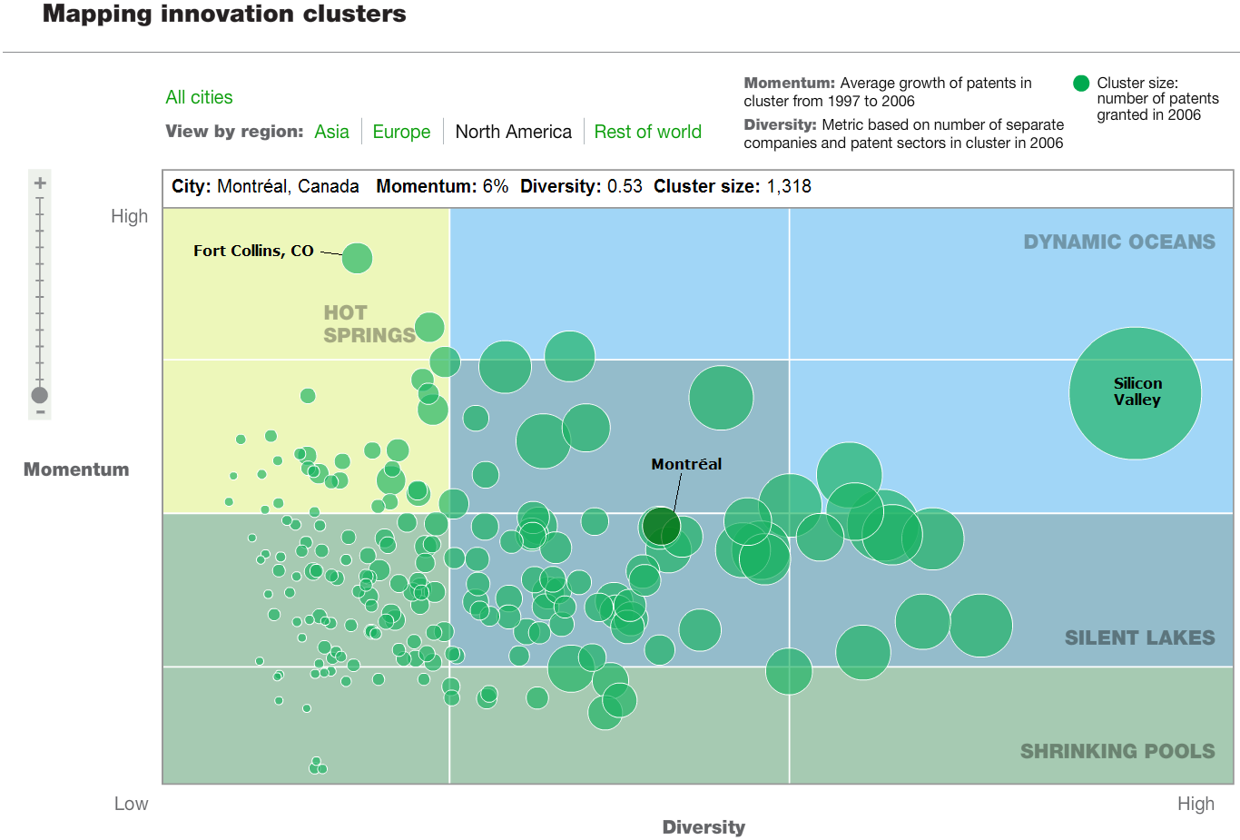
McKinsey Digital has created a really neat flash application that maps out the results of their study into where in the world innovation happens, ranking them according to the diversity of the innovations (as measured by the number of companies or industrial sectors filing patents for a given city or region), as well as the momentum of innovation as measured by the number of patents filed between 1997 through 2006 (HT: Core77):
McKinsey Digital has released a new innovation study of the world's leading cities, grouping them into one of four different categories -- "hot springs," "dynamic oceans," "silent lakes," and "shrinking pools."
The most innovative cities are "dynamic oceans," while the "hot springs" are the types of cities with a lot of economic momentum, but in need of a little Creative Class infusion to make them even more vibrant and diverse. In the chart above, Silicon Valley stands alone as the dominant innovation cluster in the world.

We thought it might be fun to go continent by continent through the world's innovation centers. Our first stop is North America:
Next up, Asia!:

Now, Europe:

And the rest (our sincere apologies for putting the Ballad of Gilligan's Island in your heads....):

Labels: none really
Welcome to the blogosphere's toolchest! Here, unlike other blogs dedicated to analyzing current events, we create easy-to-use, simple tools to do the math related to them so you can get in on the action too! If you would like to learn more about these tools, or if you would like to contribute ideas to develop for this blog, please e-mail us at:
ironman at politicalcalculations
Thanks in advance!
Closing values for previous trading day.
This site is primarily powered by:
CSS Validation

RSS Site Feed
JavaScript
The tools on this site are built using JavaScript. If you would like to learn more, one of the best free resources on the web is available at W3Schools.com.
Other Cool Resources
Blog Roll


