By now, you may be getting very tired of the Christmas carol equivalent of "The Wheels on the Bus Go Round and Round".
We're talking of course about "The Twelve Days of Christmas" song. You know, the one with "five goooooolden rings" and "a partridge in a pear tree".

You see, they treat the math as if only one gift is being given out on each of the 12 days, whether it be a single set of 10 lords-a-leaping on Day 10 or 3 French hens on Day 3. But here's the thing - if you pay close attention to the lyrics, many of the gifts are repeated on each subsequent day after being given out.
So instead of just one partridge in a pear tree, the recipient of all this true love would actually have 12 - one partridge in a pear tree for each day the song goes on. The "goooooolden rings" would be pretty cool to get, because you'd be getting 40 of them, which you could then equally divide among the 40 milking maids who would start arriving in batches of eight on Day 8.
Needless to say, this is a lot of stuff to keep track of, which is why we've created today's tool, which you can use to keep track of how many total items have been transferred as gifts through each day of Christmas. Just enter the day, and we'll tell you just how many items we're talking about....
And there you have it. Going back to the title of our post "Why Christmas Only Has 12 Days", we find that after 12 days, the gift recipient in the song has accumulated 364 items - enough for every other day of the year (except for leap years, but don't tell the 10 lords.)
You can get a visual sense of all the gifts given during these twelve days in the following image, which was the inspiration for today's post!

This is our final post for 2012 - we'll see you again in the new year. In the meantime, we'll leave you with the only tolerable version of "The Twelve Days of Christmas" that we could find:
Have a Merry Christmas!
Labels: none really, tool

In the wake of the Newtown school massacre, we've noted a strong uptick in our site traffic by people wanting to find out how different the U.S. might be if the nation adopted Canada's much more restrictive firearms laws. This post gathers all our analysis on that topic from 2011 in one place.
- Who Kills Who
We examine the FBI's data on the race of victims and their killers. We find that the vast majority of offenders prefer to kill their own kind (that evidence is borne out elsewhere, where criminals also seem to prefer killing other criminals!)
- U.S. vs Canada: Comparing Oranges and Apples
We want to compare the U.S. and Canada's murder statistics, but find we can't do a direct comparison because Canada is significantly lacking in two things the U.S. has in much greater quantities: blacks and Hispanics!
- U.S. vs Canada: Comparing Apples to Apples
We work out how to get around Canada's demographic deficiencies in reporting its homicides to be able to directly compare the populations of both nations.
- U.S. vs Canada: Homicide Edition
We determine the real difference in the number of homicides per 100,000 people between Canada and the most demographically-similar-to-Canada portion of the U.S. population.
- U.S. vs Canada: Homicide Modi Operandi
This is the one post that has drawn the most attention since the shootings in Connecticut. We break down the number of homicides per 100,000 by method for Canada and the most demographically-similar-to-Canada portion of the U.S. population, finding that Canada's much more strict laws regulating firearms "saves" about one life for every 100,000 people, although Canadian homicide offenders have adapted to the lack of firearms available to them by making murder more brutal.
- U.S. vs Canada: Assault Edition
We find that there's an additional price to be paid for saving that one life for every 100,000 people with strict gun control laws. It turns out that after adjusting for the major demographic differences between the two nations, Canada is a much more violent place than is the U.S. (Ed. At least Canadians are polite, eh? Just don't cross them....)
- U.S. vs Canada: Suicide Edition
Do Canada's stricter gun-control laws reduce the number of suicides per 100,000 people compared to the U.S.? We find the answer is not at all....
Update: Doc Palmer picks up on a report that indicates the U.S. is also much less violent than the U.K., Sweden, Belgium and Holland - all places that also feature much more restrictive gun laws than does the U.S....
Labels: crime
We now have dividend futures data through the fourth quarter of 2013. Our chart below shows how the expected future for dividends looks:
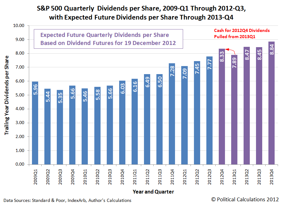
Given all the dividend-related activity following the 6 November 2012 election in the United States, where companies have acted to pull dividends from 2013 into 2012 instead to beat a now guaranteed dividend tax increase, we anticipate that there may be quite a bit of error in the actual dividends that will be paid in 2012-Q4 and for 2013-Q1. We believe the value that will actually be recorded for 2012-Q4 will be about $0.42 per share higher than what we've shown on the chart above based on how much money appears to have been transferred from 2013-Q1.
Looking at the history of the expected future for that quarter, 2013-Q1's expected cash dividend of $7.88 per share is down considerably from the high value of $8.30 per share that was expected to be paid in that quarter back on 17 October 2012. Almost all of the decline in the level of expected dividends for 2013-Q1 has taken place since 15 November 2012.
Looking forward now in time, the expected level of cash dividends for the S&P 500 looks as if the first three quarters for the U.S. economy in 2013 will be lackluster. The fourth quarter looks as if it will be better by comparison, but even here we've already seen some erosion in investor expectations for that future quarter.
Here, the expected dividends for that quarter first debuted on 13 December 2012 at $8.90 per share. That has fallen to $8.84 through the futures for 19 December 2012.
We hope you've enjoyed 2012. As we've long forecast, 2013 will be a very different story....
Today's data visualization exercise features the Bureau of Labor Statistics' data reporting the number of U.S. teens working either full or part-time, which goes back to January 1968. Our first chart improves on the BLS' data, by showing how both full and part-time working 16 to 19 year olds make up the complete teen employment scene:

Looking at the chart, we see that full-time jobs for teens peaked in 1979, while we see that part-time jobs for teens peaked in 1999. Overall, the number of part-time jobs for teens has been more stable than the number of full-time jobs, which have been declining since 1980.
The decline in full-time jobs for teens is especially visible in our second chart, which shows how the relative share of full-time jobs for teens has declined in stages over time:

As a short primer to the reasons why the decline in the relative share of full-time jobs for U.S. teens looks the way it does, we'll point you to one document, which reveals the history of both the U.S. federal and California's minimum wages. Note the timing of when major shifts occur in our two charts with the dates listed....
Labels: data visualization, jobs
Following on the heels of our finding that the increase in the share of single person households over time is the primary factor in the observed increase in U.S. income inequality for households over the last six decades, we thought it might be interesting to share what we found in the U.S. Census' data from 1940 onward regarding the growth trend of Americans living alone.
Our chart below reveals the general trend for how single person households grew from 7.7% of all U.S. households in 1940 to an estimated 27.5% in 2011.

Here, we find that the percentage share of single person households in the U.S. doubled in the 28 years from 1940 to 1968. It then took another 20 years for the percentage share of single person households to more than triple its 1940 level, reaching that mark in 1988. Since that time, the growth rate of householders living alone has sharply decelerated. The percentage share of single person households has only increased by 3.5% in the last 23 years.
In essence, the number of single-person households in the U.S. grew exponentially from 1940 into the mid-1960s, then steadily from then until about the early 1980s and at a decelerating pace in the years since.
Data Sources
U.S. Census Bureau. Households by Size: 1960 to Present. [Excel spreadsheet]. Accessed 16 December 2012.
U.S. Census Bureau. Historical Census of Housing Tables: Living Alone. Accessed 16 December 2012.
Labels: data visualization, demographics
There we were, surfing the web for ideas of what to get a certain 9-year old boy for Christmas, when we stumbled into something that made us suddenly sit up and say "That is so cool!"
That something is the Air Swimmer Remote Control Inflatable Flying Shark. Here's a Youtube video of it in action:
We like it because it combines a boy's love of flying R/C vehicles with nature's perfect predator! And as an added bonus, it echoes some of the more fun scenes from the 2010 Doctor Who Christmas special, many of which were excerpted and remixed with appropriate music in the following video preview:
The real preview for the 2010 Doctor Who Christmas special is available here. The episode is simply brilliant, with one of the best twists ever in retelling Charles Dickens' classic Christmas Carol story. Very highly recommended!
And at the very least, we've also answered Mark Cuban's problem of what to get his fellow multi-millionaire venture investors on Shark Tank for Christmas this year!
Labels: none really, technology
How do we know that the Fed pays attention to the things we write? Previously, commenting on the apparent lack of effect that the Fed's latest round of quantitative easing has had on stock prices, we observed:
- The Fed is doing it wrong. In the two previous rounds of QE, the Fed purchased large quantities of U.S. Treasuries. So far in this round, the Fed is only purchasing Mortgage Backed Securities. The stock market just doesn't get the same bang for the buck as when the Fed buys up Treasuries, which acts to reduce long-term interest rates across a wider swath of the economy, which is really what helped boost stock prices in earlier rounds.
- QE, as an effective policy, is running out of gas. The interest rates that the Fed might hope to lower in its QE programs started off at a much lower level, and a lot closer to their minimum zero level, than in its previous incarnations. With less room to maneuver, the Fed's actions just don't have the same oomph they once did.
And now, the Fed has announced that they've gotten the message and are going to start "doing it right" and also buy Treasury securities, which will give this latest generation of QE more "oomph". Interestingly, they've also announced the economic targets that must be satisfied before they will discontinue the plan. All together, that suggests to us that they're thinking the future for the economy in much of 2013 will be somewhat worse than other official sources are letting on....
It looks like that as far as the pace of layoffs in the U.S. is concerned, the impact of Hurricane Sandy lasted for just three weeks.
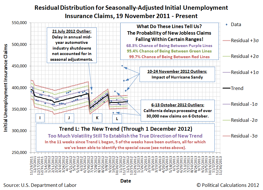
Assuming that the volatility we've previously noted dies down, we should have enough data to begin projecting the new trend in initial unemployment benefit claim filings within a few weeks.
Suppose we converted a house to run entirely off the grid on green, renewable energy sources like solar or wind, so that we would never again have to pay an electric bill or generate any carbon emissions for the power it consumes, as President Obama would seem to desire all Americans do. What possible environmental harm would we cause by lighting it with the soon-to-be-banned 100-watt incandescent bulbs, which we might note are far more friendly for the environment and are much less costly than their CFL replacements? And if the answer is "none", why must we have the government progressively ban all incandescent light bulbs from production?
On a development note, we can't help but notice that if we combined the site traffic our tools for determining individual, family and household income distribution percentile rankings, they would collectively represent the most popular tool ever on Political Calculations. So guess what will be coming soon!...
And speaking of coming soon, here's our Christmas countdown clock!
Labels: random thoughts
We're going to look at the change in the U.S. employment situation since the total level of employment in the U.S. peaked five years ago in November 2007, but first, let's look at the change since October 2012.
Through November 2012, the U.S. employment situation for young adults Age 20-24 was good, for all older adults it was bad, and for teens, it was "meh".
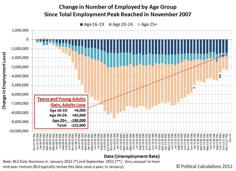
Overall, some 6,000 more teens and 62,000 young adults than in October 2012 gained jobs, while some 190,000 fewer individuals Age 25 and older were counted as being employed. Doing the math, the net change in the number of jobs in the month from October 2012 to November 2012 came in for a loss of 122,000.
The total number of employed Americans fell by that number to 143,262,000 in November 2012, which is 3,333,000 less than the so-far all-time peak number of of 146,595,000 Americans who were counted as having jobs in November 2007.
The number of employed teens in the U.S. has declined from 5,927,000 in that month to 4,479,000 some five years later. Over this period of time, the number of young adults Age 20-24 with jobs has fallen by 405,000 from 14,001,000 to 13,596,000 and the number of older adults has fallen by 1,480,000 from 126,667,000 to 125,187,000.
Looking at the total decline in the number of employed Americans through November 2012, jobs lost by U.S. teens account for 43.4%, young adults for 12.2% and adults Age 25 and older account for 44.4% of all jobs that have disappeared from the U.S. economy over the last five years.
In November 2007, teens represented 4.0% of the entire U.S. workforce. In November 2012, teens account for just 3.1% of the reduced U.S. workforce. At this point, jobs that were most likely to have been held by teens are 14 times more likely to have been negatively affected by the employment situation over the past five years than their numbers among the entire U.S. workforce would suggest.
In retrospect, it seems that the U.S. Congress' action to boost the minimum wage by nearly 41% in three stages from 2007 through 2009 without doing anything to boost the revenues of teen employers by an appropriate percentage to compensate them for their higher costs of doing business during this period of time wasn't such a hot idea.
Labels: jobs
According to S&P's latest Monthly Dividend Action Report [Excel spreadsheet], the month of November 2012 was a record month that saw some 3,327 U.S. companies make some kind of declaration involving their dividends (that's not the record!) Here are the astounding numbers:
197 companies acted to increase their cash dividend in the 8th best month on record (since January 2004), and the most in any November on record. The all-time record for regular dividend increases announced in a single month is 246, which was set in February 2007.
228 companies acted to make a special cash dividend payment to their investors, the most ever. To put that number in context, the most announcements that companies would pay an extra dividend in an entire year was 233 in 2007. For the period of time for which we have data, the average number of extra dividends announced per month from January 1994 through October 2012 is 33. The previous record of 97 in one month was set in December 2010.
But this drive to pay out dividends in 2012 before the tax rates on them goes up in 2013 masks the deteriorating situation for many companies in the U.S. The number of companies announcing they would cut their cash dividend payments in the month of November 2012 rose to 27, up one from the previous month.

To put that increase in perspective, the average number of companies that act to decrease their cash dividends in a non-recession month is 4. The 54 dividend cuts that have been announced in just the last two months alone is more than would be expected in an entire average non-recession year.
In the chart above, it takes at least 10 companies announcing dividend cuts in a given month for the U.S. economy to be considered to be in recessionary territory. Through November, U.S. companies have announced 151 dividend cuts in 2012.
Labels: dividends, recession forecast
In Part 1, we pointed out that companies waited a little over a week after the re-election of Barack Obama on 6 November 2012 to begin responding to the guarantee of higher taxes on dividends that would take effect on 1 January 2013. In today's post, we're simply going to point out how much money they've have pulling into 2012 to avoid those higher taxes waiting in 2013 and from where:

As of the dividend futures data available for 10 December 2012, companies such as Walmart and numerous others have collectively pulled about 4.3% of the total amount of dividends that had been projected to be paid out in the first quarter of 2013 into the fourth quarter of 2012 instead.
While some companies like Oracle have simply pulled ahead the dividends that they had originally intended to pay out in the first, second and third quarters of 2013, at least 123 other companies at this writing have announced they will pay a special dividend before the end of 2012. One of those companies, Costco, has actually taken out a loan to pay a special dividend to its investors before the higher dividend tax rates of 2013 take effect.
These companies are rushing to take these actions because many of their largest shareholders fall into the income range that will be most negatively impacted by the higher taxes on dividends. We estimate that over two-thirds of all dividends go to these individuals, who are often the primary owners or founders of the companies that pay out dividends.
Labels: dividends, SP 500, taxes
The planet Neptune has never been seen by anyone looking at the night sky through just their own eyes. So distant is it from the sun that the light it reflects toward the Earth is so faint that the planet is effectively invisible in the darkness of night. And yet, the outermost large planet of our solar system was discovered by astronomers who knew exactly where to look....
Following William Herschel's discovery of Uranus in 1781, the world's astronomers went to work to observe and describe the seventh planet of the solar system, taking detailed measurements of its trajectory in space.
Forty years later, French astronomer Alexis Bouvard published detailed tables describing Uranus' orbit about the sun. More than that however, his tables incorporated the lessons learned about planetary orbits from Johannes Kepler and Sir Isaac Newton to chart the path Uranus would follow into the future.
But then, something strange happened. Significant discrepancies between Bouvard's projected path for Uranus and its actual orbit began to be observed - irregularities that were not observed in the tables he had created to describe the orbital paths of the planets Jupiter and Saturn using the same methods. Soon, observations and detailed measurements confirmed that Uranus was moving along a path that was not described by Bouvard's careful calculations.
These irregularities led Bouvard to hypothesize that an as yet unseen eighth planet in the solar system might be responsible for what he and other astronomers were observing.
Over twenty years later, astronomer Urbain Le Verrier was working on the problem, taking a unique approach to resolving it.
What made Le Verrier's work unique is that he applied the math developed by Sir Isaac Newton to describe the gravitational attraction between two bodies to solve the problem. Here, he used Newton's theory to anticipate where an as yet unknown, but more distant planet also orbiting the sun would have to be to create the effects observed upon the position of the planet Uranus in its orbit.
Le Verrier completed his calculations regarding the position of the hypothetical eighth planet on 1 June 1846. A little over three months later, on 23 September 1846, the planet Neptune was observed for the first time at almost exactly the position in space where Le Verrier predicted it would be, confirming Newton's gravitational theory in the process.


We're going to do something similar today to explain why household income inequality in the United States has increased over time, even though there has been no change in individual income inequality.
From Darkness to Discovery
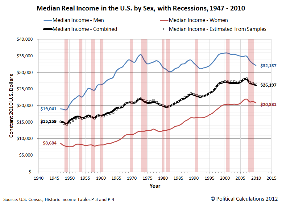
Our first chart below is based on data taken from the U.S. Census' data [Excel spreadsheet] on the inflation-adjusted median and mean income for all Americans from 1947 through 2010, which we've presented in terms of constant 2010 U.S. dollars. For reference, we've also indicated the NBER's official periods of recession in the U.S. during this period with the shaded red vertical bands on the chart:

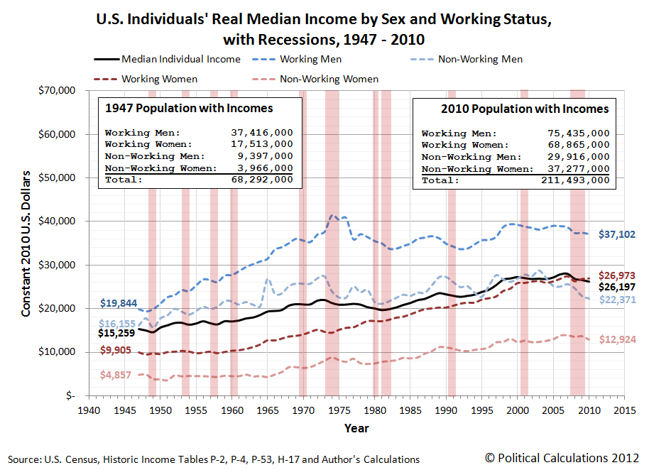
Next, we took the U.S. Census' breakdown of inflation-adjusted median income for both men and women for each of these years [Excel spreadsheet] and used the math that applies to log-normal distributions to construct the combined median income that applies to individuals. Our results are shown in the chart below, along with the actual median incomes reported by the U.S. Census so we can compare our calculated results with them:
As you can see, our calculated results in creating a weighted median from the subsets of median income data for men and women are very close to the actual real median income numbers for all individuals. Here, because per capita income has been demonstrated to follow a log-normal distribution, we are able to use this math to either combine or extract subsets of data that have never been officially presented.
As an aside, we achieved the results above by treating the reported median income data the way we might calculate a weighted average. The beauty of the log-normal distribution math is that we can do this with medians, which we ordinarily could not do otherwise.
In the chart above, you can see the effect of the changing composition of the U.S. workforce, as the relative share of women earning incomes in the United States has increased since 1947. In 1947, the median income for individuals is much closer to the median income for men than it is for women. By 2010 however, we see that the median income for individuals is about halfway in between the median incomes for men and for women, reflecting that nearly equal share that both sexes now have among all individual income earners in the U.S.
Extracting The Unseen
The U.S. Census Bureau provides the median income data for individuals (or persons), men and women. It also reports median income data for both male and female wage or salary earners [Excel spreadsheet], whom we'll simply describe as Working Men and Working Women.
Using the math we demonstrated above with this data, we can extract the median incomes for two categories of people for whom the U.S. Census has never reported median incomes: men and women with incomes who do not earn wages or salaries, or as we'll describe them from now on, Non-Working Men and Non-Working Women! Today, we're putting what we found for all U.S. individual income earners together for the first time:
Constructing Households
Now, let's combine our median income earners into two-person households, pairing working men and women, working men and non-working women, non-working men and working women and finally non-working men and non-working women. We've shown our results below, along with the U.S. Census' official median income for U.S. households:

Well, look at that! The households formed by our single-wage and salary income earning couples from 1947 through 2010 closely parallels the actual real median income for U.S. households with a working man and non-working woman over that time (except for the years 1974 through 1977, where there seems to be an anomaly in the Census' data for working men - and here, the actual median splits the difference!) Also keeping in mind that the actual median household income might include the income contributions of additional people (say individuals between the ages of 16 and 24 who might be working part time at minimum wage jobs while also attending school and living at home with their parents), which likely accounts for the difference between the two, we've pretty much just demonstrated that we can successfully model basic U.S. households using just the data that applies for U.S. individuals.
But wait! What about single person households? Our next chart throws them into the mix as well!

Using the figures for 2010, we approximated the income percentiles for each of our single and two-person median income earning households. The table below reveals our results (our model should put each approximated percentile within 0.2 of the actual percentile!):
| Household Type | 2010 Median Income | Approximate Income Percentile |
|---|---|---|
| Working Men and Working Women | $64,075 | 61.4 |
| Working Men and Non-Working Women | $50,026 | 50.7 |
| Working Women and Non-Working Men | $49,344 | 50.1 |
| Non-Working Men and Women | $35,295 | 36.7 |
| Working Men Only | $37,102 | 38.6 |
| Working Women Only | $26,973 | 27.7 |
| Non-Working Men Only | $22,371 | 22.4 |
| Non-Working Women Only | $12,924 | 11.5 |
It occurs to us that all we would need to increase the income inequality among households in the United States is to increase the nation's percentage of single person households among all households. That would work by increasing the number of households at the lower end of the income spectrum, even though it would have absolutely no effect upon the measured income inequality for individuals. The U.S. Census Bureau shows the change in the number of single person households since 1960:

Here's the U.S. Census Bureau's Gini index measure of the amount of income equality among U.S. households for the years from 1947 through 2010:

And here is the Gini index measure of the amount of income equality among U.S. individuals for the years from 1947 through 2005 (the data since 2005 is presented here - it's similar to all that recorded since 1960 in the chart below):

The relevant data in the chart above is the Gini measure indicated with the hollow circles, which is based on the "fine", or more detailed, income bins reported by the U.S. Census in its annual Current Population Survey. The other data in the chart, indicated by solid diamonds, represents income distribution data reported by the U.S. Census in larger, or more "coarse" income bins, which are less detailed and are therefore a much less accurate measure of the nation's level of income inequality in any given year.
Intersections and Connections
Looking at where all the data in these three charts intersect and overlap, What we find is that since 1960, the level of income inequality for U.S. individuals as measured by the "fine" Gini index is nearly constant, but has increased significantly for U.S. households. What has changed over that time is the composition of U.S. households, with a steady increase in the percentage of single person households.
Without a corresponding increase in the measured income inequality for U.S. individuals, the increase in the measured income inequality for U.S. households has been almost entirely driven by the increase in the number of single person households over time.
So income inequality among U.S. households isn't increasing because the rich are getting richer. That means that policies intended to right this situation by going after the rich in the name of "fairness" are guaranteed to fail, because the real cause of the increase in income inequality among U.S. households over time is something that cannot be fixed by such actions.
If only the people pushing such policies could see that....
And that concludes our eighth anniversary post. Thank you for joining us today - we greatly appreciate your choice to spend so much time with us (we really do try to draft shorter posts!)
Celebrating Political Calculations' Anniversary
Our anniversary posts typically represent the biggest ideas and celebration of the original work we develop here each year. Here are our landmark posts from previous years:
- A Year's Worth of Tools (2005) - we celebrated our first anniversary by listing all the tools we created in our first year. There were just 48 back then. Today, there are nearly 300....
- The S&P 500 At Your Fingertips (2006) - the most popular tool we've ever created, allowing users to calculate the rate of return for investments in the S&P 500, both with and without the effects of inflation, and with and without the reinvestment of dividends, between any two months since January 1871.
- The Sun, In the Center (2007) - we identify the primary driver of stock prices and describe a whole new way to visualize where they're going (especially in periods of order!)
- Acceleration, Amplification and Shifting Time (2008) - we apply elements of chaos theory to describe and predict how stock prices will change, even in periods of disorder.
- The Trigger Point for Taxes (2009) - we work out both when, and by how much, U.S. politicians are likely to change the top U.S. income tax rate. Sadly, events in recent years have proven us right.
- The Zero Deficit Line (2010) - a whole new way to find out how much federal government spending Americans can really afford and how much Americans cannot really afford!
- Can Increasing the Minimum Wage Boost GDP? (2011) - using data for teens and young adults spanning 1994 and 2010, not only do we demonstrate that increasing the minimum wage fails to increase GDP, we demonstrate that it reduces employment and increases income inequality as well!
- The Discovery of the Unseen (2012) - we go where so-called experts on income inequality fear to tread and reveal that U.S. household income inequality has increased over time mostly because more Americans live alone!
References
Kitov, Ivan. "Modeling the evolution of Gini coefficient for personal incomes in the USA between 1947 and 2005," MPRA Paper 2798, University Library of Munich, Germany. 2007.
Lopez, J Humberto and Servén, Luis. "A Normal Relationship? Poverty, Growth and Inequality". World Bank Policy Research Working Paper 3814, 2006.
Pinkovskiy, Maxim and Sala-i-Martin, Xavier. "Parametric Estimations of the World Distribution of Income". NBER Working Paper No. 15433. October 2009.
Political Calculations. The Distribution of Income for 2010: Households. 14 September 2011.
U.S. Census Bureau. Changing American Households. [PDF document]. C-SPAN. 4 November 2011. p. 6.
U.S. Census Bureau. Table P-2. Race and Hispanic Origin of People by Median Income and Sex: 1947 to 2010. [Excel spreadsheet]. September 2011.
U.S. Census Bureau. Table P-4. Race and Hispanic Origin of People (Both Sexes Combined) by Median and Mean Income: 1947 to 2010. [Excel spreadsheet]. September 2011.
U.S. Census Bureau. Table P-53. Wage or Salary Workers (All) by Median Wage and Salary Income and Sex: 1947 to 2010. [Excel spreadsheet]. September 2011.
Wendt, Phil. Income Disparity by the Numbers. Phil Wendt's Studio. 26 December 2011.
Labels: data visualization, demographics, economics, income, income distribution, income inequality, math, poverty, wages
Earlier this year, we posed the following challenge for our readers:
Why does the following chart, which spans 50 years of data for the United States in the post World War 2 era, look the way it does?
In this chart, we observe that the ratio of the U.S. National Average Wage Index starts off at a level 127.3% of the U.S.' GDP per Capita in 1951, slowly rises to peak at 137.8% of GDP per Capita ten years later in 1961, then falls steadily for the next three decades until 1994 when it flattened out at around 88.3% of the U.S.' GDP per Capita.
Since then, it has been as high as 91.3% of GDP per Capita in 2001, and as low as 86.2% of GDP per Capita in 2006. In 2010, the ratio of the U.S. National Average Wage Index to GDP per Capita is 88.6%.
What we can't explain is why these patterns exist. How can the average wage earned by individuals in the U.S. go from being as much as 37.8% higher than the U.S.' GDP per Capita over forty years ago to being steadily 11.4% below that quantity three decades later. What factors caused this ratio to first rise, then fall, then stabilize?

Several of our readers responded, offering the following possibilities:
- Why the ratio was rising from 1950 to 1961:
- Casualties in World War 2 reducing the pool of able-bodied men available to work, which boosted wages.
- Why the ratio fell so dramatically from 1961 to 1994:
- Technology replacing human capital in the workforce.
- An increasing share of women entering the workforce at lower wages.
- Baby boomers entering the U.S. workforce at lower wages.
- Declining union membership in the private sector.
- A declining portion of GDP going to wages.
- Why the ratio leveled off after 1994:
- Baby boomers no longer entering the U.S. workforce.
It took time to run down all these possibilities, but we now know the basic answer, at least for the period since 1961: the declining portion of GDP going to wages!
We were able to eliminate the other possibilities largely because the timing of factors affecting each of them failed to correlate with the trends we observed in the chart. For example, the number of women entering the U.S. workforce has been rising steadily for all years since 1951, and so have their wages - there have been no surges in female employment that might have sharply reduced wages with respect to GDP after 1961 as we might expect to see if women were responsible for what we've observed.
The entry of Baby Boomers into the U.S. workforce at first seemed like a better fit in explaining the decline, with the oldest Baby Boomers turning the working age of 16 in 1962, but here, only a portion of this population would have done so, with a majority waiting to graduate from high school two years later before entering the workforce, and another very large percentage postponing that event for up to another four years following their graduation from college.
If Baby Boomers were responsible for what we observe, we would see the ratio continue rising but top out in the early-to-mid 1960s. Instead, that clearly happened in the late 1950s and very early 1960s, years before the leading edge of the Baby Boomers reached Age 16.
Similar logic applies for the stabilization of the ratio following 1994. Here, the youngest Baby Boomers, born in 1964, would have reached the working age of 16 in 1980. Adding in two more years of high school and four years of college would have nearly all of the last Baby Boomers entering the U.S. workforce no later than 1986. The stabilization in the ratio didn't begin for another eight years.
Likewise, the role of technology, such as the wide scale introduction of the transistor in the 1950s and 1960s, following by the rapid development of computing technology in the late 1980s and 1990s doesn't well correlate with what we observe. Here, if technology were the culprit, we would expect to see a second decline in the ratio following the widespread adoption of computing technology in the late 1990s and early 2000s. That we don't see such a second decline indicates that technology doesn't explain what we observe.
Like the timing of Baby Boomers entering the U.S. workforce, the timing of the decline of union membership fails to explain what we observe in the chart. Here, union membership in the U.S. peaked in the early 1950s, then entered a period of slow and steady decline until 1974, after which union membership entered into more of a free fall thanks to the loss of automotive industry jobs as a result of the Arab oil embargo, when U.S. consumer demand shifted strongly in favor of more fuel efficient vehicles made by foreign car makers (a situation repeated again in 2008). The slow decline of union membership in the 1950s and 1960s is not consistent with the timing of the decline we observe in the ratio after 1961 and the lack of a similar decline following 2008's event rules out this possibility.
And that leaves just a declining portion of GDP going to wages. Interestingly though, when we went into the Bureau of Economic Analysis' data on the composition of GDP by sources of income, we found that total labor compensation as a percentage of GDP has been rock steady since 1951, averaging 88.6% of GDP and ranging between 86.8% and 90.7% of GDP in the 60 years from 1951 through 2011.
But the composition of that labor compensation has changed! Here, the percentage of labor compensation represented by wages and salaries has fallen from 95% in 1951 to just over 80% in 2011. Meanwhile, the portion of labor compensation represented by employer contributions to Social Security and Medicare (or employer FICA contributions), as well as for regular pensions and health insurance has risen considerably, taking a larger and larger share of total labor compensation for U.S. workers. Our new chart below shows how and when these other forms of compensation cut into U.S. wages and salaries:

Moreover, the timing of when those changes in the composition of labor compensation in the U.S. took place correlate very well with what we observe in the chart. Here, we observe increases in the employer portion of FICA taxes in 1954, 1957, 1959, 1960, 1962, 1963, 1966 (when the Medicare tax was introduced), 1967, 1969, 1971, 1973, 1978, 1979, 1981, 1982, 1984, 1985, 1986, 1988 and 1990. The FICA tax rate has then increased from 1.5% of income in 1951 to 7.65% in 1990, where it has held steady through 2011.
We likewise observe double-digit increases over the previous year for labor compensation in the form of pensions and employer-provided health insurance taking place from 1955 through 1957, 1959, and in each year from 1964 through 1981.
Together, these forms of employee compensation have displaced wage and salary income in the measure of GDP, which largely explains why the ratio of the National Average Wage Index first topped out with respect to GDP per capita in the U.S. in the late 1950s, then dropped after 1961 exactly as we've observed.
That also includes the stabilization in the ratio after 1994, as the year-over-year growth rate for employer-provided pension and health insurance slowed significantly after that year as U.S. employers adopted more effective cost control strategies for their pension and health insurance-related employee compensation expenses. These measures have included shifting away from unsustainable defined benefit pension plans in favor of defined contribution plans, such as 401(k) and 403(b) type retirement saving plans, as well as increasing the amount of the co-payments and annual deductibles paid by employees for their employer-provided health insurance.
And that's it! Our thanks to our readers for their suggestions in helping us finally explain that chart!
References
The data for the changing composition of labor compensation over time is taken from the BEA's interactive data showing GDP and Personal Income data, specifically Table 1.12, which shows the U.S.' national income by type of income.
Labels: data visualization, economics
Harvard economist Greg Mankiw offered a unique observation following the release of the findings of a CBO study on the effective marginal tax rates that many Americans really pay on their incomes, after taking into account any government assistance they might receive and the income levels at which their welfare benefits phase out:
The Congressional Budget Office has a new study of effective federal marginal tax rates for low and moderate income workers (those below 450 percent of the poverty line). The study looks at the effects of income taxes, payroll taxes, and SNAP (the program formerly known as Food Stamps). The bottom line is that the average household now faces an effective marginal tax rate of 30 percent. In 2014, after various temporary tax provisions have expired and the newly passed health insurance subsidies go into effect, the average effective marginal tax rate will rise to 35 percent.
Here's a chart from the CBO's report illustrating Mankiw's observation for the effective marginal tax rates that applied in 2012:

In 2012, the federal government's poverty guidelines would put the federal poverty level (FPL) at $11,170 for a single person household, at $15,130 for a two-person household, $19,090 for a three person household and at $23,050 for a four-person household. These values would correspond to 100% of the federal poverty level indicated in the CBO's chart above.
But what can we do with Mankiw's observation? Mankiw offered the following idea:
What struck me is how close these marginal tax rates are to the marginal tax rates at the top of the income distribution. This means that we could repeal all these taxes and transfer programs, replace them with a flat tax along with a universal lump-sum grant, and achieve approximately the same overall degree of progressivity.
So what if we did just that? How might you fare under that kind of tax code? And how much money would the U.S. government collect if we adopted a flat income tax like the one that would seem to be in effect in practice, if not in law?
Let's find out! In our tool below, enter the flat tax income tax rate that you might like to see as well as the amount of a universal lump sum grant that might apply per person. Then enter the unique data that might apply for your household and we'll do the rest, calculating what the data you input would mean for you and for the U.S. Treasury's coffers, outputting the data in the tables below!...
For estimating how much money the U.S. federal government would collect in income taxes, we based our calculations upon the distribution of income for U.S. households in 2010. As such, the amount of tax collections estimated in our tool represents how much income taxes that the federal government might collect following a deep recession in the United States.
Our default data of a 30% flat income tax rate and a universal lump sum grant (or tax credit) of $4,300 per person works out to nearly match the U.S. federal government's actual total tax collections in 2010, which represented about 6.2% of the nation's Gross Domestic Product (GDP) for that year.
To achieve the same results as 2010 with a 35% flat income tax rate, the amount of the individual tax credit must be increased to $5,500.
Putting those results into statistical context, since the end of World War 2, the federal government's tax collections from personal income taxes has steadily averaged 8.0% of GDP, with a standard deviation of 0.8% of GDP. Personal income tax collections of just 6.2% of GDP as were collected in 2010 fall more than two standard deviations below the federal government's average level of income tax collections, which is something we would only expect to have happened in just under 2 of the 65+ years since 1945.
What that means is that the the U.S. federal government's current income tax rates are more than capable of collecting higher amounts of taxes in a healthier economy. That many in the federal government are so actively pursuing higher effective marginal income tax rates today is really an indication that they don't believe the economy is going to be getting healthier any time soon!
References
Congressional Budget Office. Effective Marginal Tax Rates for Low- and Moderate-Income Workers. [PDF document]. November 2012.
Labels: taxes

Assuming that President Obama continues his policy of not negotiating in good faith with U.S. congressional leaders on federal budget matters, what might your paycheck look like in 2013 after President Bush's 2003 income tax rate cuts expire?
That matters to you because if you earn either wages or a salary from a job, your income taxes will increase. And with that increase, so will the amount of taxes that you have withheld from each of your paychecks also go up.
We wondered what the potential impact of that might be on a working American's paycheck, so we adapted our paycheck withholding tool for 2012 by incorporating the withholding tax rates that would apply under 2003's original rules, updating the income thresholds to account for inflation.
That tool is below - just enter the indicated data for all the typical items that might affect the amount of federal income taxes that will be withheld from your paycheck and we'll work out how much federal income taxes will be withheld from your paycheck beginning in January 2013, as well as the percentage change from the amount that would be withheld from a paycheck you would receive in 2012.
In doing this exercise, we've taken the IRS' withholding tax income thresholds for both 2001 and 2012 and updated them to account for inflation, which we estimated based on the increase in Social Security's maximum taxable earnings from those years to 2013. We've also taken into account the reduced maximum amount of any health care flexible spending account contributions you might make in 2013, which will occur independently of other changes the nation's tax law thanks to ObamaCare.
As a result, the amount of federal income tax withholding from your paycheck that is estimated in this tool should be very close to the right ballpark for what you might actually see in your paychecks beginning in January 2013.
Welcome to the blogosphere's toolchest! Here, unlike other blogs dedicated to analyzing current events, we create easy-to-use, simple tools to do the math related to them so you can get in on the action too! If you would like to learn more about these tools, or if you would like to contribute ideas to develop for this blog, please e-mail us at:
ironman at politicalcalculations
Thanks in advance!
Closing values for previous trading day.
This site is primarily powered by:
CSS Validation

RSS Site Feed
JavaScript
The tools on this site are built using JavaScript. If you would like to learn more, one of the best free resources on the web is available at W3Schools.com.
Other Cool Resources
Blog Roll


