
We haven't yet seen the iteration of the CSI: Crime Scene Investigation television franchise that rips this story from the headlines, but in 2007, turkey DNA was instrumental in proving the guilt of a criminal.
We had high hopes when we first saw the headline Utah State University Helps Solve Iowa Turkey Crime. Could it be that the crime being investigated involved a frozen turkey leg used as a murder weapon that was subsequently cooked in an effort to destroy evidence by serving it to the police who were investigating it? But no, it was nothing so dramatic. The crime in question involved poaching, where the murder victims were themselves wild turkeys.
Here's the key to how the Utah State University researchers cracked the case:
When game wardens served a search warrant on Iowa hunter Justin Jones, they found five packages of turkey meat. They suspected Jones used a 12-gauge shotgun to poach wild turkeys.
He beat a similar rap once before because no one could prove the meat came from wild turkeys instead the grocery store. This time authorities shipped meat samples to Utah State where they have the only nationwide wild turkey DNA database.
Who knew we needed one? But in this case it was invaluable. Samples from Justin Jones' private stash of turkey meat matched the DNA of wild turkey. "It was pretty convincing that they were, in fact, poached, that they were not domestic turkeys," genetics lab manager Carol Rowe said.
There was more to it than just comparing DNA matches to samples in USU's database. Here's how the Utah State researchers described how they got their man.
Roberg contacted Mock, who agreed to help with the investigation – but she needed help. Mock required DNA samples from known wild turkeys in the same geographic region as the suspected poached birds.
“If you’re showing a particular bird came from a particular population, you have to figure out the probability that this genotype came from your target population rather than from some other population,” says Mock, assistant professor in USU’s Department of Wildland Resources.
With help from Iowa conservation officers and state DNR personnel 78 samples were collected and shipped to USU’s lab. Mock and her team went to work and discovered that the samples seized from the suspect’s freezer showed a high probability of coming from the Iowa wild turkey population.
In the end, they had the suspect dead to rights, leading to perhaps the most boring legal outcome possible:
In October, Jones entered a guilty plea in court and was ordered to pay fines and court costs plus $1,000 toward the cost of USU’s efforts.
This 15-year old case is surprising in many ways. But perhaps the most surprising is how low the cost of doing DNA analysis had become. Consider the following:
- There is an exclusive database with the DNA samples of both wild and domesticated turkeys.
- It is worthwhile for conservation officers to call up the equivalent of CSI: Wild Turkeys for assistance in resolving criminal cases.
DNA analysis has become even cheaper since. Offenders committing turkey-related crimes should beware!
Image Credit: Stable Diffusion DreamStudio Beta - "A cooked turkey in a laboratory, beside a microscope, scientists".
Labels: crime, technology, thanksgiving



What are the best tools investors can use to detect potential accounting fraud at the firms in which they might invest?
That's not an easy question to answer. That's because accounting fraud is almost invariably an inside job, where most investors are on the outside looking in. Most investors simply don't have the access to information about the transactions that constitute the bulk of accounting fraud where it exists.
But for publicly-traded firms, investors can access their financial statements. If the scope and scale of potential accounting fraud at a firm is big enough, the signs of it can show up in them. Accounting professionals have developed tools to help them identify known signs of fraud within financial statements.
That brings us back to the beginning. What are the best tools investors can use to find the signs of potential accounting fraud in financial statements?
A 2021 paper by Messod Beneish and Patrick Vorst, who evaluated seven fraud prediction models. They sought to identify the tools that could successfully identify firms where real accounting fraud may be occurring, without triggering too many costly false positives in the process. Here's the list of tools they evaluated, which are identified by their creator(s) and the year the tool was introduced:
- Beneish (1999) M-Score
- Cecchini et al. (2020)
- Dechow et al. (2011) F-Score
- Amiram et al. (2015) FSD Score
- Alawadhi et al. (2020)
- Bao et al. (2020)
- Chakrabarty et al. (2020) ABF Score
The M-Score was developed by Messod Beneish, so as the analysis goes, we should recognize that he has skin in the game for the evaluation.
Let's cut to the chase and go straight to the conclusion to find out which tools the authors evaluated came out on top in their analysis and why they did:
We compare seven fraud prediction models that have been proposed in prior research. We find that the higher true positive rates in recent models come at the cost of higher false positive rates and that even the best models trade off false to true positives at rates exceeding 100:1. Indeed, the high number of false positives makes all seven models considered too costly for auditors to implement, even when we consider extreme subsamples where a priori firms’ management has higher incentives and/or ability to misreport. We believe this could explain audit practitioners’ apparent reluctance to use these models, despite the fact that models have nearly doubled their success at identifying fraud when compared to the initial models in Beneish (1997, 1999).
For investors, M-Score and the F-Score when used at higher cut-offs are the only models providing a net benefit when applied to the sample as a whole. We conjecture this occurs because the M-Score and the F-Score exploit fundamental signals that have been shown to predict future earnings and returns, and the main component of investors’ false positive costs is the profit foregone (or the loss avoided) by not investing in a falsely flagged firm. In addition, we find that most models are economically viable if applied to top or bottom quintiles of characteristics of firms in which managers a priori have greater incentives and/or ability to misreport.
At this point, we'll point out that we also have skin in the game, which is why the conclusion of this paper attracted our attention. Political Calculations has tool based on the F-Score fraud detection model: Using the F-Score to Detect Accounting Fraud. Meanwhile, a tool based on Beneish's M-Score model is also freely available in both spreadsheet and online tool formats.
Aside from having built a tool based on one of these potential accounting fraud prediction models, we'll recommend using either or both. It's hard enough as an investor to do proper due diligence to choose which companies you might invest in. If the potential for fraud is a concern, it's worth the time and effort to use the most effective tools to either rule it in or out of your portfolio.
References
Messod D. Beneish and Patrick Vorst. The Cost of Fraud Prediction Errors. The Accounting Review. DOI: 10.2308/TAR-2020-0068. [SSRN Preprint]. 30 December 2021.
Image Credit: Stable Diffusion DreamStudio beta "A lonely accountant uses advanced internet based analytical models to detect fraud at a publicly-traded firm."
Labels: crime, investing, personal finance, review, tool
Earlier this year, the U.S. Sentencing Commission released its study on the recidivism of violent offenders released from federal prisons in 2010. The study tracked some 13,883 individuals to find out how many might go on to be arrested for new crimes within nine years after they completed serving their original sentences. How many of these violent offenders would you predict returned to crime after their release from federal prisons?
We won't keep you in suspense. Within nine years of their release, 63.8% of this sample cohort of violent offenders were subsequently arrested for committing new crimes. No fewer than 26% of this criminal cohort were arrested for new crimes within the first year after they were released, while over half had done so within four years.
The following chart visualizes the Sentencing Commission's data for the number of violent offenders who were arrested for newly committed crimes within one to nine years after they were released from prison in 2010.
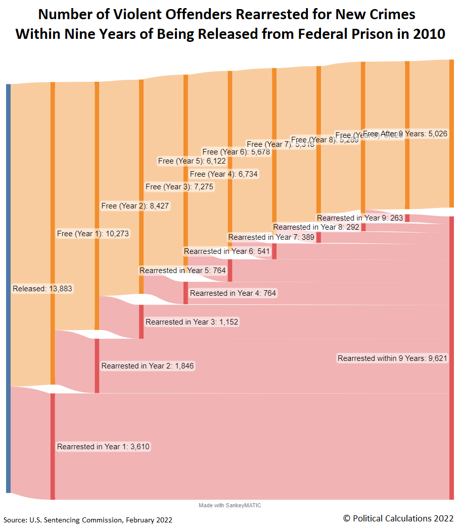
We opted to present this data using a Sankey diagram to illustrate both the relative share of total offenders that went on to be arrested for committing new crimes and how many were added to that total within each year following their release from prison. 76.4% of these individuals had been sentenced for their original crimes after 12 January 2005, when the Supreme Court issued a ruling that affected U.S. federal sentencing guidelines, so the vast majority of these former prisoners had served fewer than five years in federal prisons before their release in 2010.
Reference
U.S. Sentencing Commission. Recidivism of Federal Violent Offenders Released in 2010. [PDF Document]. February 2022.
Labels: crime
Today marks the anniversary of the most pivotal moment in New York Governor Cuomo's COVID nursing home deaths scandals. Because one year ago today, Governor Cuomo and senior members of his administration reached the point of panic as they struggled to address the greatest challenge of his tenure in office.
We originally presented that story on 12 May 2020. Today, we're re-running that original article, in which we recreated critical information that influenced the most consequential decision Governor Cuomo made on that day. The deadly repercussions of what resulted from that day of panic are still rippling through New York and making national news a year later. Let's get started....

We're fascinated with how politicians use data and models in setting the policies they pursue, where knowing both what they knew and when they knew it can explain a lot about why they made the choices they did at the time they made them.
To that end, we've been paying attention to how Governor Andrew Cuomo has been managing the difficult task of coping with the coronavirus epidemic in New York, and in New York City in particular, which has been the focal point for both the number of cases and the spread of the SARS-CoV-2 coronavirus across the United States. We've assembled a timeline of Governor Cuomo discussing the predictive models for how fast the coronavirus infection would spread within New York, which provides insight into how that information affected his decisions for how to allocate the limited health care resources over which he had influence during the worst part of the epidemic in his state.
We're going to pick up the action shortly after 7 March 2020, the date Governor Cuomo declared a state of emergency because of the coronavirus epidemic in New York, when the number of coronavirus cases within the state had 'soared' to 89. The following article is the earliest in which we find a reference to coronavirus modeling projections for New York City, which had been put together by New York City Mayor Bill de Blasio's staff:
9 March 2020: Coronavirus Cases in New York State Rise to 105:
Mayor Bill de Blasio said Sunday that the city had 13 confirmed cases, including a new case of a man in the Bronx. Based on modeling, his team estimated there could be 100 cases in the next two or three weeks, but for most people, the illness would result in very mild symptoms.
Three days later, New York City had nearly reached that total and was set to blast through it, prompting Governor Cuomo to ban all public events with more than 500 people in attendance and to require gatherings with fewer than 500 people to cut capacity by 50%. The faster than previously projected growth in the number of COVID-19 infections drove a change in public policy.
Four days after that, Governor Cuomo had clearly been presented with projections that showed the exponential growth in the number of cases that had gotten underway in New York.
16 March 2020 - Audio & Rush Transcript: Governor Cuomo is a Guest on CNN's Cuomo Prime Time:
"I see a wave and the wave is going to break on the health care system ... You take any numerical projections on any of the models and our health care system has no capacity to deal with it."...
"Yeah. I think you look at that trajectory, just go dot, dot, dot, dot, connect the dots with a pencil. You look at that arc, we're up to about 900 cases in New York. It's doubling on a weekly basis. You draw that arc, you understand we only have 53,000 hospital beds total, 3,000 ICU beds, we go over the top very soon."
At this point, Governor Cuomo was beginning to appreciate that the thousands of hospital beds across the state of New York were really a scarce resource. He expanded on that realization the next day after an overnight surge in the number of reported cases:
"There is a curve, everyone's talked about the curve, everyone's talked about the height and the speed of the curve and flattening the curve. I've said that curve is going to turn into a wave and the wave is going to crash on the hospital system.
I've said that from day one because that's what the numbers would dictate and this is about numbers and this is about facts. This is not about prophecies or science fiction movies. We have months and moths of data as to how this virus operates. You can go back to China. That's now five, six months of experience. So just project from what you know. You don't have to guess.
We have 53,000 hospital beds in the State of New York. We have 3,000 ICU beds. Right now the hospitalization rate is running between 15 and 19 percent from our sample of the tests we take. We have 19.5 million people in the State of New York. We have spent much time with many experts projecting what the virus could actually do, going back, getting the China numbers, the South Korea numbers, the Italy numbers, looking at our rate of spread because we're trying to determine what is the apex of that curve, what is the consequence so we can match it to the capacity of the health care system. Match it to the capacity of the health care system. That is the entire exercise.
The, quote on quote, experts, and by the way there are no phenomenal experts in this area. They're all using the same data that the virus has shown over the past few months in other countries, but there are extrapolating from that data.
The expected peak is around 45 days. That can be plus or minus depending on what we do. They are expecting as many as 55,000 to 110,000 hospital beds will be needed at that point. That my friends is the problem that we have been talking about since we began this exercise. You take the 55,000 to 110,000 hospital beds and compare it to a capacity of 53,000 beds and you understand the challenge."
Faced with the potential shortage of needing 110,000 beds and only having 53,000 to provide care to coronavirus patients in New York, Governor Cuomo lobbied President Trump for support, which resulted in President Trump ordering the U.S. Navy's hospital ship USNS Comfort to sail to New York City the next day, and also lobbied for the U.S. Army's Corps of Engineers to begin identifying public facilities in New York City to be converted for use as temporary hospitals to handle the projected overflow of coronavirus patients from regular hospitals.
USNS Comfort would arrive in New York City on 30 March 2020, and the Army Corps of Engineers would have 1,000 beds ready at New York City's Javits Center ready on 27 March 2020, and were working to expand it to a 2,500 bed temporary hospital facility by 1 April 2020. But during the time in between, the updated projections of the coronavirus models led Governor Cuomo to panic.
24 March 2020: Andrew Cuomo: Apex of coronavirus outbreak in NY two or three weeks away:
Cuomo, speaking at his daily COVD-19 briefing in Manhattan, said the state's projection models now suggest the apex of the coronavirus crisis could hit New York within 14 to 21 days, rather than the 45 days the state projected late last week.
He likened it to a "bullet train" headed for New York, urging the federal government to deploy as many ventilators and as much protective medical gear it can to the state as quickly as possible.
"Where are they?" Cuomo said. "Where are the ventilators? Where are the masks? Where are the gowns? Where are they?”
At this point, we should show what one of the more influential coronavirus models that Governor Cuomo was using looked like. The following chart is taken from the Institute for Health Metrics and Evaluation (IHME)'s 25 March 2020 projections showing its estimates of the minimum, likely, and maximum number of additional hospital beds that would be needed in the state of New York to care for the model's expected surge of coronavirus patients.

This is just one of several coronavirus models whose projections were being combined and presented to Governor Cuomo by consultants from McKinsey & Co., where the IHME's coronavirus model's projections for New York are consistent with the figures and timing of a peak cited by Governor Cuomo in the days preceding his panic.
Faced with what appeared to be an imminent shortage of hospital beds and other medical resources, the Cuomo administration appears to have adopted an emergency triage strategy, one that would have devastatingly deadly consequences. Here, to free up as many beds as possible in New York's near-capacity hospitals, the Cuomo administration would try to move as many patients infected with the SARS-CoV-2 coronavirus as they could out of these facilities into others, even though they could still be contagious and present the risk of spreading infections within the facilities to which they would be transferred.
25 March 2020: The facilities in which they chose to place them were predominantly privately run nursing homes, where a directive issued by the state's Department of Health on 25 March 2020 mandated they must admit them into their facilities, where refusals could mean the loss of their New York state-issued licenses to operate.

Flashing forward to the end of March 2020, the coronavirus epidemic forecast models Governor Cuomo was using in making his decisions were pointing to the peak still being ahead:
Cuomo said various predictive models being used by New York indicate the apex of the surge for hospitals will come anywhere from 7 to 21 days from now.
“The virus is more powerful, more dangerous than we expected,” Cuomo said. “We’re still going up the mountain. The main battle is on top of the mountain.”
Four days later, the coronavirus models were predicting the peak was almost upon New York:
While giving an update Saturday on the frantic work to ready New York hospitals for the most intense period of the coronavirus (COVID-19) crisis, Gov. Andrew Cuomo said that the state’s models put the so-called apex about four-to-eight days out.
“By the numbers, we’re not yet at the apex. We’re getting closer,” he said at his daily press briefing. “Depending on whose model you look at, they’ll say four, five, six, seven, days, some people go out 14 days. But our reading of the projections is that we’re somewhere in the seven-day range. Four, five, six, seven, eight-day range.”
“Part of me would like to be at the apex, and just, let’s do it,” Cuomo continued. “But there’s part of me that says it’s good that we’re not at the apex because we’re not yet ready for the apex, either. We’re not yet ready for the high point...the more time we have to improve the capacity, the better.”
But on 6 April 2020, the IHME model revised its estimates for New York and the U.S. downward, indicating the peak Governor Cuomo feared would overwhelm New York's hospitals was not going to come anywhere close to what it had previously projected. On 8 April 2020, it indicated New York had already passed its peak in number of daily new cases.
Ordinarily, that would be a good thing. Except, Governor Cuomo had taken an action by which he intended to avoid the spectacle of having pictures of sick New Yorkers not able to get medical treatment in the media, but instead ensured the state's death toll from its coronavirus epidemic would no longer be small. That part of the story has its own special timeline, which we've moved here from the bottom of the article where we had previously been piecing together this part of the story of COVID-19 in New York....
Image credit: Martin Sanchez
The explosion of Cuomo scandal news has prompted us to launch a new blog to host the timeline we had been updating regularly in this space! We officially launched the new site a week ago. If you haven't yet seen it, may we introduce A Timeline of New York Governor Andrew Cuomo's Nursing Home Scandals.

Now serving all your Cuomo nursing home scandal news needs!
Labels: coronavirus, crime, ethics, health, management, politics, risk
On 25 May 2020, video of the tragic death of George Floyd in police custody in Minneapolis, Minnesota exploded across social media, quickly leading to mass public protests in many cities across the United States. Coming as many states were lifting their initial lockdowns aimed at limiting the spread of COVID-19, many public health officials worried the protests would cause a resurgence of new coronavirus infections.
In the months since, little evidence has emerged to indicate that the anti-police protests contributed to a surge of new SARS-CoV-2 coronavirus infections. A NBER working paper considered data collected in 315 U.S. cities and counties that experienced protests in the five weeks following George Floyd's death, demonstrating "the protests had little effect on the spread of COVID-19 for the entire population of the counties with protests" for all but one:
However, with the exception for Maricopa County, Arizona, we find essentially no evidence that protests contributed to significant or substantial increases in COVID-19 during the period following protest onset, consistent with our main difference-in-differences findings....
We've been following Arizona's experience during the coronavirus pandemic since we identified the state had become a national hotspot for infections in the early summer of 2020. We've continued following Arizona's experience because the state's Department of Health Services makes high quality, detailed time series data available. This data makes it possible to use back calculation techniques to identify the timing of events that changed the rate of incidence for coronavirus exposures, which in turn, changed the trend for COVID-19 infections within the state.
With that being the case, we are uniquely situated to quantify the impact of 2020's anti-police protests on the spread of COVID-19 in the one state where these two factors intersected with deadly effect. In the following sections, we'll estimate the number of excess COVID-19 cases that resulted from the mass protests that took place within Arizona, along with the number of excess hospital admissions and the number of excess deaths that were attributed to COVID-19 following the protests.
Excess COVID-19 Cases Resulting from Anti-Police Protests
Arizona tracks its confirmed COVID-19 cases by their sample collection dates. Since the onset of COVID-19 symptoms is a significant driver of testing activity, occurring a median of five days after initial exposure with 95% of tests occurring within ten days following this initial viral exposure, we can use the date for positive test results to predict when a turning point will be seen following an event that significantly changed the incidence of viral exposures within a population. These figures apply when sufficient test kits and testing capacity are available to process COVID-19 tests without delays.
In Arizona, 28 May 2020 marked the first day of mass anti-police protests, which were concentrated in Maricopa County and specifically within the city of Phoenix. Adding 10 days to this date suggests that any turning point related to anti-police protests would start after 7 June 2020.
That's exactly what we observe in the following chart, showing the number of confirmed COVID-19 cases in Arizona by their sample collection date.

The protests had high participation through 7 June 2020, before the crowds dwindled and finally petered out on 15 June 2020.
That noted, we can use the counterfactual of the trend that existed prior to the protests to estimate the number of excess COVID-19 cases that were recorded after 7 June 2020. We estimate Arizona experienced at least 29,061 more COVID-19 cases as a consequence of the anti-police protests, which is indicated by the shaded red area on the chart.
Excess Hospital Admissions Due to Anti-Police Protests
Arizona's Department of Health Services provides its data for the daily number of new COVID-19 hospital admissions. Here, we note that COVID-19 hospitalizations typically follow some 11 to 13 days following the initial viral exposure, where we would expect to see a surge of new admissions with respect to a counterfactual based on the pre-existing trend on or shortly after 8 June 2020.
Once again, that's what we observe in the data. The next chart shows the number of daily COVID-19 new hospital admissions in Arizona during the nine months from 3 March 2020 through 4 December 2020.

Here, we estimate Arizona experienced at least 2,608 more COVID-19 hospitalizations than it would otherwise have because of the anti-police protests, which is indicated by the shaded red area on the chart.
Excess Deaths Due to Anti-Police Protests
Arizona reports data for the number of actual deaths attributed to COVID-19 per day. Typically, deaths from COVID-19 follow some 17 to 21 days after the date of initial exposure to the SARS-CoV-2 coronavirus. With 28 May 2020 as the starting point, this lag would put the expecting timing of an increase in coronavirus-related deaths in Arizona resulting from the social mixing that occurred as part of the anti-police protests on or shortly after 14 June 2020.
Or would, if not for the demographics associated with the anti-police protests. By and large, individuals below the age of 45 were the main participants in the protests, where fewer than six percent of all deaths attributed to COVID-19 in Arizona have occurred within this age group.
However, that doesn't mean the anti-police protests didn't result in a surge of COVID-19 deaths in the state. We think that after large scale protests in Arizona ended on 7 June 2020, participants carrying coronavirus infections went home, so to speak, where their subsequent social interactions would result in the infection of older Arizonans. Using 7 June 2020 as the starting point for those post-protest interactions, that would put the expected timing of a change in trend for COVID-19 deaths between 25 June 2020 and 28 June 2020.
This scenario fits what we observe in the following chart showing the number of deaths attributed to COVID-19 each day in Arizona from 3 March 2020 through 4 December 2020.

We estimate Arizona experienced at least 594 more coronavirus-related deaths than it would otherwise have due to the anti-police protests, which is indicated by the shaded red area on the chart.
Personal Injuries and Wrongful Deaths
What if the organizers of Arizona's anti-police protests were held accountable for the excess COVID-19 hospitalizations and deaths that occurred as a consequence of their actions?
That's a real question because there were activists in Arizona who recognized the risk of spreading COVID-19 infections, who chose to not engage in mass protests. BLM activist Lola Rainey explains her thinking for why she didn't organize mass street protests in Tucson, Arizona:
"When you talk about taking to the streets an organized movement like that, you have to be aware that you're putting other people's lives at risk. One, because we are in a pandemic, and there are a lot of things you cannot control when people are out in the streets like that,” said Rainey.
Alas, that kind of responsible thinking wasn't anywhere to be found in Phoenix, Arizona, where disputes among protest organizers all but ensured an uncontrolled situation that would promote the spread of coronavirus infections, with participants engaging in behaviors that ran counter to the guidance of public health officials.
In that regard, the various organizers and promoters of the anti-police protests could be held legally liable for the excess COVID-19 hospitalizations and deaths that resulted from their collective actions and negligence, if any enterprising trial attorneys were looking to score some easy personal injury and wrongful death settlements.
Using data from California, the median personal injury settlement is $114,305, so Arizona's protest-related 2,608 excess COVID-19 hospitalizations could represent a $332 million payday for the injured and their lawyers. Meanwhile, with a median wrongful death award of $2.2 million, the corresponding payout for wrongful death claims could total over $1.3 billion. With numbers like that, how long do you suppose it might be before class action lawsuits start being filed by hungry attorneys representing damaged clients?
Why Is the Deadly Intersection of Anti-Police Protests and COVID-19 in Arizona?
The previous section explains "why Phoenix?", but a larger question is "why Arizona?"
We suspect the answer lies in a unique confluence of events. For one, Arizona is unique in its climate. Unlike nearly all other places where mass anti-police protests occurred at this time, the city of Phoenix was already registering daily high temperatures between 100 and 110 degrees Fahrenheit at the end of May 2020 and in early June 2020. Those kinds of temperatures mean that groups of protesters would periodically break away from protesting to cool off in air-conditioned environments. Such environments have been found to be conducive for spreading respiratory viruses like SARS-CoV-2, providing an additional factor for increasing the incidence of infections beyond that from direct participation in the protests.
We think the timing of Arizona's initial lockdown period also played a significant role. Arizona lifted its statewide lockdown on 15 May 2020, which led to a steady but managable growth in the number of infections in the following weeks. At the time of the protests, that increase had provided a critical mass of infected individuals that would fuel a surge of new infections under the conditions of a large, uncontrolled event like mass political protests where social distancing would not be effectively practiced.
Though Arizona's leaders could not have possibly forecast such an event would occur when it did, we can compare the state's experience with that of Nevada, where Las Vegas is the only other major city in the U.S. with a climate similar to Phoenix to test this factor. Here, we find that Nevada delayed lifting its lockdown for nearly two weeks after Arizona, which meant it had a much smaller pool of infected individuals at the start of its protests. Those lower numbers would have greatly reduced its risk of experiencing a surge in cases at the time of the protests, which potentially explains "why Arizona and why not Nevada?", even though both share similar hot, arid climates.
If it wasn't already clear, the role of protest organizers and those supporting or promoting them in contributing to the conditions that promoted the spread of COVID-19 in Arizona cannot be overstated.
There may be additional, lesser factors to consider, but these are the big three that could very well explain most of why the intersection of anti-police protests and COVID-19 proved to be so deadly in Arizona and not elsewhere in the United States.
A Resurgence of Cases
Finally, we should recognize the surge in coronavirus cases that Arizona is currently experiencing. We've previously traced the origin of the current surge to 2020 political campaign events occurring two and a half weeks before the 3 November 2020 election, which stand out because they involved many more people than the anti-police protests did. On 3 December 2020, Arizona Governor Doug Ducey initiated new restrictions on large events and businesses in the state. We should first start seeing any effects from the new restrictions in the state's data for cases and hospital admissions reported after 14 December 2020.
Celebrating Political Calculations' Anniversary
Our anniversary posts typically represent the biggest ideas and celebration of the original work we develop here each year. Here are our landmark posts from previous years:
- A Year's Worth of Tools (2005) - we celebrated our first anniversary by listing all the tools we created in our first year. There were just 48 back then. Today, there are over 300....
- The S&P 500 At Your Fingertips (2006) - the most popular tool we've ever created, allowing users to calculate the rate of return for investments in the S&P 500, both with and without the effects of inflation, and with and without the reinvestment of dividends, between any two months since January 1871.
- The Sun, In the Center (2007) - we identify the primary driver of stock prices and describe a whole new way to visualize where they're going (especially in periods of order!)
- Acceleration, Amplification and Shifting Time (2008) - we apply elements of chaos theory to describe and predict how stock prices will change, even in periods of disorder.
- The Trigger Point for Taxes (2009) - we work out both when, and by how much, U.S. politicians are likely to change the top U.S. income tax rate. Sadly, events in recent years have proven us right.
- The Zero Deficit Line (2010) - a whole new way to find out how much federal government spending Americans can really afford and how much Americans cannot really afford!
- Can Increasing the Minimum Wage Boost GDP? (2011) - using data for teens and young adults spanning 1994 and 2010, not only do we demonstrate that increasing the minimum wage fails to increase GDP, we demonstrate that it reduces employment and increases income inequality as well!
- The Discovery of the Unseen (2012) - we go where so-called experts on income inequality fear to tread and reveal that U.S. household income inequality has increased over time mostly because more Americans live alone!
We marked our 2013 anniversary in three parts, since we were telling a story too big to be told in a single blog post! Here they are:
- The Major Trends in U.S. Income Inequality Since 1947 (2013, Part 1) - we revisit the U.S. Census Bureau's income inequality data for American individuals, families and households to see what it really tells us.
- The Widows Peak (2013, Part 2) - we identify when the dramatic increase in the number of Americans living alone really occurred and identify which Americans found themselves in that situation.
- The Men Who Weren't There (2013, Part 3) - our final anniversary post installment explores the lasting impact of the men who died in the service of their country in World War 2 and the hole in society that they left behind, which was felt decades later as the dramatic increase in income inequality for U.S. families and households.
Resuming our list of anniversary posts....
- The Toolmaker's Tool (2014) - we make the code we use for creating online tools available to all!
- Replacing GDP with the National Dividend (2015) - we explore our development of an alternative measure of economic welfare that can replace GDP.
- The Gamblers Who Invented Modern Encryption (2016) - we discover that a group of gamblers seeking to break the law in Missouri back in 1905 put together many of the elements that underlie secure electronic communications and financial transactions in 2016!
- The Isolation of El Niño (2017) - in which we advanced the development of a global economic indicator for Earth!
- Telescoping Median Household Income Back in Time (2018) - we find a way to nearly double the available supply of monthly median household income estimates with reasonable accuracy.
- Cashing Out of the S&P 500 (2019) - we develop a tool to answer the question of whether you can survive being retired if you're counting on cashing out your investment in the S&P 500!
- The Deadly Intersection of Anti-Police Protests and COVID-19 (2020) - it was the year of the coronavirus and political protests, so we combined the two in a way that only we could!
Previously on Political Calculations
Here's our previous Arizona coronavirus coverage presented in reverse chronological order, with a sampling of some of our other COVID analysis!
- 2020 Campaign Events Drive Surge in Arizona COVID Cases
- Arizona Arrives at Critical Junction for Coronavirus Cases
- Arizona To Soon Reach A Critical Junction For COVID-19
- Getting More Than Care from Arizona's COVID ICU Beds
- Arizona's Decentralized Approach to Beating COVID
- Going Back to School with COVID-19
- Arizona Turns Second Corner Toward Crushing Coronavirus
- Arizona's Coronavirus Crest in Rear View Mirror
- The Coronavirus Turns a Corner in Arizona
- A Delayed First Wave Crests in the U.S. and a Second COVID-19 Wave Arrives
- The Coronavirus in Arizona
- A Closer Look at COVID-19 Deaths in Arizona
- The New Epicenter of COVID-19 in the U.S.
- How Long Does a Serious COVID Infection Typically Last?
- How Deadly is the COVID-19 Coronavirus?
- Governor Cuomo and the Coronavirus Models
- How Do False Test Outcomes Affect Estimates of the True Incidence of Coronavirus Infections?
- How Fast Could China's Coronavirus Spread?
References
Arizona Department of Health Services. COVID-19 Data Dashboard. [Online Application/Database].
Maricopa County Coronavirus Disease (COVID-19). COVID-19 Data Archive. Maricopa County Daily Data Reports. [PDF Document Directory, Daily Dashboard].
Stephen A. Lauer, Kyra H. Grantz, Qifang Bi, Forrest K. Jones, Qulu Zheng, Hannah R. Meredith, Andrew S. Azman, Nicholas G. Reich, Justin Lessler. The Incubation Period of Coronavirus Disease 2019 (COVID-19) From Publicly Reported Confirmed Cases: Estimation and Application. Annals of Internal Medicine, 5 May 2020. https://doi.org/10.7326/M20-0504.
U.S. Centers for Disease Control and Prevention. COVID-19 Pandemic Planning Scenarios. [PDF Document]. Updated 10 September 2020.
COVID Tracking Project. Most Recent Data. [Online Database]. Accessed 10 November 2020.
More or Less: Behind the Stats. Ethnic minority deaths, climate change and lockdown. Interview with Kit Yates discussing back calculation. BBC Radio 4. [Podcast: 8:18 to 14:07]. 29 April 2020.
Labels: coronavirus, crime, data visualization, demographics, risk
We're fascinated with how politicians use data and models in setting the policies they pursue, where knowing both what they knew and when they knew it can explain a lot about why they made the choices they did at the time they made them.
To that end, we've been paying attention to how Governor Andrew Cuomo has been managing the difficult task of coping with the coronavirus epidemic in New York, and in New York City in particular, which has been the focal point for both the number of cases and the spread of the SARS-CoV-2 coronavirus across the United States. We've assembled a timeline of Governor Cuomo discussing the predictive models for how fast the coronavirus infection would spread within New York, which provides insight into how that information affected his decisions for how to allocate the limited health care resources over which he had influence during the worst part of the epidemic in his state.
We're going to pick up the action shortly after 7 March 2020, the date Governor Cuomo declared a state of emergency because of the coronavirus epidemic in New York, when the number of coronavirus cases within the state had 'soared' to 89. The following article is the earliest in which we find a reference to coronavirus modeling projections for New York City, which had been put together by New York City Mayor Bill de Blasio's staff:
9 March 2020: Coronavirus Cases in New York State Rise to 105:
Mayor Bill de Blasio said Sunday that the city had 13 confirmed cases, including a new case of a man in the Bronx. Based on modeling, his team estimated there could be 100 cases in the next two or three weeks, but for most people, the illness would result in very mild symptoms.
Three days later, New York City had nearly reached that total and was set to blast through it, prompting Governor Cuomo to ban all public events with more than 500 people in attendance and to require gatherings with fewer than 500 people to cut capacity by 50%. The faster than previously projected growth in the number of COVID-19 infections drove a change in public policy.
Four days after that, Governor Cuomo had clearly been presented with projections that showed the exponential growth in the number of cases that had gotten underway in New York.
16 March 2020 - Audio & Rush Transcript: Governor Cuomo is a Guest on CNN's Cuomo Prime Time:
"I see a wave and the wave is going to break on the health care system ... You take any numerical projections on any of the models and our health care system has no capacity to deal with it."...
"Yeah. I think you look at that trajectory, just go dot, dot, dot, dot, connect the dots with a pencil. You look at that arc, we're up to about 900 cases in New York. It's doubling on a weekly basis. You draw that arc, you understand we only have 53,000 hospital beds total, 3,000 ICU beds, we go over the top very soon."
At this point, Governor Cuomo was beginning to appreciate that the thousands of hospital beds across the state of New York were really a scarce resource. He expanded on that realization the next day after an overnight surge in the number of reported cases:
"There is a curve, everyone's talked about the curve, everyone's talked about the height and the speed of the curve and flattening the curve. I've said that curve is going to turn into a wave and the wave is going to crash on the hospital system.
I've said that from day one because that's what the numbers would dictate and this is about numbers and this is about facts. This is not about prophecies or science fiction movies. We have months and moths of data as to how this virus operates. You can go back to China. That's now five, six months of experience. So just project from what you know. You don't have to guess.
We have 53,000 hospital beds in the State of New York. We have 3,000 ICU beds. Right now the hospitalization rate is running between 15 and 19 percent from our sample of the tests we take. We have 19.5 million people in the State of New York. We have spent much time with many experts projecting what the virus could actually do, going back, getting the China numbers, the South Korea numbers, the Italy numbers, looking at our rate of spread because we're trying to determine what is the apex of that curve, what is the consequence so we can match it to the capacity of the health care system. Match it to the capacity of the health care system. That is the entire exercise.
The, quote on quote, experts, and by the way there are no phenomenal experts in this area. They're all using the same data that the virus has shown over the past few months in other countries, but there are extrapolating from that data.
The expected peak is around 45 days. That can be plus or minus depending on what we do. They are expecting as many as 55,000 to 110,000 hospital beds will be needed at that point. That my friends is the problem that we have been talking about since we began this exercise. You take the 55,000 to 110,000 hospital beds and compare it to a capacity of 53,000 beds and you understand the challenge."
Faced with the potential shortage of needing 110,000 beds and only having 53,000 to provide care to coronavirus patients in New York, Governor Cuomo lobbied President Trump for support, which resulted in President Trump ordering the U.S. Navy's hospital ship USNS Comfort to sail to New York City the next day, and also lobbied for the U.S. Army's Corps of Engineers to begin identifying public facilities in New York City to be converted for use as temporary hospitals to handle the projected overflow of coronavirus patients from regular hospitals.
USNS Comfort would arrive in New York City on 30 March 2020, and the Army Corps of Engineers would have 1,000 beds ready at New York City's Javits Center ready on 27 March 2020, and were working to expand it to a 2,500 bed temporary hospital facility by 1 April 2020. But during the time in between, the updated projections of the coronavirus models led Governor Cuomo to panic.
24 March 2020: Andrew Cuomo: Apex of coronavirus outbreak in NY two or three weeks away:
Cuomo, speaking at his daily COVD-19 briefing in Manhattan, said the state's projection models now suggest the apex of the coronavirus crisis could hit New York within 14 to 21 days, rather than the 45 days the state projected late last week.
He likened it to a "bullet train" headed for New York, urging the federal government to deploy as many ventilators and as much protective medical gear it can to the state as quickly as possible.
"Where are they?" Cuomo said. "Where are the ventilators? Where are the masks? Where are the gowns? Where are they?”
At this point, we should show what one of the more influential coronavirus models that Governor Cuomo was using looked like. The following chart is taken from the Institute for Health Metrics and Evaluation (IHME)'s 25 March 2020 projections showing its estimates of the minimum, likely, and maximum number of additional hospital beds that would be needed in the state of New York to care for the model's expected surge of coronavirus patients.
This is just one of several coronavirus models whose projections were being combined and presented to Governor Cuomo by consultants from McKinsey & Co., where the IHME's coronavirus model's projections for New York are consistent with the figures and timing of a peak cited by Governor Cuomo in the days preceding his panic.
Faced with what appeared to be an imminent shortage of hospital beds and other medical resources, the Cuomo administration appears to have adopted an emergency triage strategy, one that would have devastatingly deadly consequences. Here, to free up as many beds as possible in New York's near-capacity hospitals, the Cuomo administration would try to move as many patients infected with the SARS-CoV-2 coronavirus as they could out of these facilities into others, even though they could still be contagious and present the risk of spreading infections within the facilities to which they would be transferred.
25 March 2020: The facilities in which they chose to place them were predominantly privately run nursing homes, where a directive issued by the state's Department of Health on 25 March 2020 mandated they must admit them into their facilities, where refusals could mean the loss of their New York state-issued licenses to operate.
Flashing forward to the end of March 2020, the coronavirus epidemic forecast models Governor Cuomo was using in making his decisions were pointing to the peak still being ahead:
Cuomo said various predictive models being used by New York indicate the apex of the surge for hospitals will come anywhere from 7 to 21 days from now.
“The virus is more powerful, more dangerous than we expected,” Cuomo said. “We’re still going up the mountain. The main battle is on top of the mountain.”
Four days later, the coronavirus models were predicting the peak was almost upon New York:
While giving an update Saturday on the frantic work to ready New York hospitals for the most intense period of the coronavirus (COVID-19) crisis, Gov. Andrew Cuomo said that the state’s models put the so-called apex about four-to-eight days out.
“By the numbers, we’re not yet at the apex. We’re getting closer,” he said at his daily press briefing. “Depending on whose model you look at, they’ll say four, five, six, seven, days, some people go out 14 days. But our reading of the projections is that we’re somewhere in the seven-day range. Four, five, six, seven, eight-day range.”
“Part of me would like to be at the apex, and just, let’s do it,” Cuomo continued. “But there’s part of me that says it’s good that we’re not at the apex because we’re not yet ready for the apex, either. We’re not yet ready for the high point...the more time we have to improve the capacity, the better.”
But on 6 April 2020, the IHME model revised its estimates for New York and the U.S. downward, indicating the peak Governor Cuomo feared would overwhelm New York's hospitals was not going to come anywhere close to what it had previously projected. On 8 April 2020, it indicated New York had already passed its peak in number of daily new cases.
Ordinarily, that would be a good thing. Except, Governor Cuomo had taken an action by which he intended to avoid the spectacle of having pictures of sick New Yorkers not able to get medical treatment in the media, but instead ensured the state's death toll from its coronavirus epidemic would no longer be small. That part of the story has its own special timeline, which we've moved here from the bottom of the article where we had previously been piecing together this part of the story of COVID-19 in New York....
Image credit: Martin Sanchez
Update 23 March 2021: The explosion of Cuomo scandal news has prompted us to launch a new blog to host the timeline we had been updating regularly in this space! We officially launched the new site nearly a week ago. If you haven't yet seen it, may we introduce A Timeline of New York Governor Andrew Cuomo's Nursing Home Scandals.
Now serving all your Cuomo nursing home scandal news needs!
Labels: coronavirus, crime, data visualization, math
Welcome to the blogosphere's toolchest! Here, unlike other blogs dedicated to analyzing current events, we create easy-to-use, simple tools to do the math related to them so you can get in on the action too! If you would like to learn more about these tools, or if you would like to contribute ideas to develop for this blog, please e-mail us at:
ironman at politicalcalculations
Thanks in advance!
Closing values for previous trading day.
This site is primarily powered by:

CSS Validation

RSS Site Feed

JavaScript
The tools on this site are built using JavaScript. If you would like to learn more, one of the best free resources on the web is available at W3Schools.com.
Other Cool Resources
Blog Roll


