Last week, news that China's economy is slowing down contributed to investor fears in world stock markets, sending equity prices lower. Not trusting Chinese GDP statistics, which have long been considered to be off target, we turned to the data that the U.S. Census Bureau reports on the value of trade between the U.S. and China to get a clearer picture of what's going on within China's economy.
Our chart below shows the exchange rate adjusted value of the year-over-year growth rate of trade between the two nations from January 1986 through November 2013, the most recent month for which that data is available at this writing:
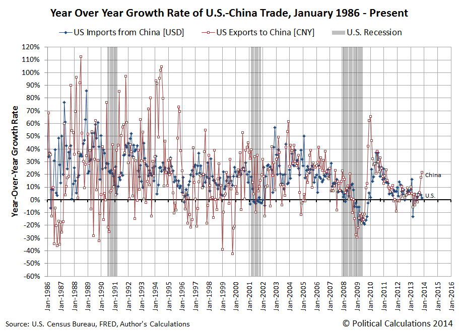
At first glance, it would appear that China's economy is actually accelerating strongly, with China pulling in a dramatic increase of goods produced in the United States.
That first glance may be somewhat deceiving however, because the U.S. goods that China is pulling in such dramatically higher quantities are predominantly soybeans, where U.S. farmers recently harvested a record bumper crop. The unexpectedly large harvest boosted U.S. GDP in the third quarter of 2013 through its impact on U.S. inventories, and may continue to boost U.S. GDP again in the fourth quarter of 2013 in the form of increased exports.
And it would appear, predominantly to China, which is the top foreign market for U.S. soybeans. Through 5 December 2013, China had increased its year-over-year purchases of U.S. soy by 33%. The U.S. is second behind Brazil as an exporter of soybeans to China, and China is the world's largest importer of soybeans.
Digging deeper into the trade data however, we found that the value of U.S. exports to China in November 2013 could have been even larger if not for a $396 billion decline in transportation equipment, primarily aircraft, exported by the U.S. to China during the month. In 2013, U.S.-based Boeing delivered over one-fifth of its annual production of 648 commercial aircraft to China-based air carriers, so November represented somewhat of an off month for this trade category.
What that indicates then is that China's economic consumption is growing more rapidly than its official GDP statistics would suggest, as it would appear that the Chinese government's efforts to promote more domestic consumption are producing the desired results. China's reported GDP is lower because the nation's domestic investment spending has declined while Chinese consumption of imported goods has increased. Both factors would be negative contributors to China's reported GDP, which are being offset by increased consumption spending.
That increase in China's imports may be due in part to the Chinese government's 26 July 2013 edict to 1,400 domestic producers in 19 of the nation's industries to curb their "excess" production capacity by the end of September 2013. If Chinese demand for the affected products did not similarly decline, that would account a good portion of the nation's increase in its imports since mid-summer 2013.
For our analytical method for measuring the relative health of the U.S. and Chinese economies, the upshot of all this is that our method will likely overstate the strength of China's economic growth until the rebalancing of the Chinese economy has stabilized.
References
Board of Governors of the Federal Reserve System. China / U.S. Foreign Exchange Rate. G.5 Foreign Exchange Rates. Accessed 26 January 2014.
U.S. Census Bureau. Trade in Goods with China. Accessed 26 January 2014.
Labels: trade

Stock prices are primarily driven by the expectations that investors have for the amount of money they can reasonably expect to earn through the shares of businesses that they own. Specifically, businesses that have raised money in the past to fund their growth by selling off portions of the ownership of the business to investors in return for a share of the profits that they expect to sustain in the future.
The sustainable portion of a business' profits that investors can reasonably expect to earn through their ownership of the share of the business are called dividends, where the business' primary owners periodically divide up a portion of the profits earned by the business and pay them to out to investors in direct proportion to their share of ownership in the business.
Consequently, what investors expect to earn through dividends at the specific times in the future at which they will be paid can have a profound effect on stock prices. If investors believe that they can earn a growing amount of dividends in the future by owning shares of these equity-financed businesses, they will bid up the price of the shares of ownership to buy them from their current owners, who might wish to pursue other opportunities with the funds they gain from selling their shares. And vice-versa for the opposite scenario, where the current owners might greatly wish to pursue other opportunities and need to entice other investors to buy the shares they want to sell by lowering their price.
Now that we've laid this basic groundwork for the fundamentals of what drives stock prices, let's get to the revolutionary.
The change in the growth rate of stock prices is directly proportional to the change in the growth rate of the dividends per share expected at specific points of time in the future - or as we've observed, at a specific point of time in the future to which investors have fixed their forward-looking focus for setting their expectations of it while making their investing decisions today.
That means that there are two fundamental ways in which stock prices can change. The first is pretty obvious: They can change as the amount of dividends expected to be paid in the future changes.
The second is not so obvious: Stock prices can change when investors shift their forward-looking focus from one point in the future to another, because different points of time can have very different expectations for the dividends that will be paid within them. When such a shift happens, stock prices would appear to behave similarly to how electrons within a hydrogen atom change their quantum energy levels or orbitals.
We're bringing this up today because that's exactly what has happened in the past week with the U.S. stock market. Our chart below, updated from the version we just posted on Monday, 27 January 2014, shows that investors have completed shifting their forward-looking focus from the fourth quarter of 2014 to instead focus on the second quarter (which we see as the shift from the medium blue data line for 2014-Q4 to the olive-green data line for 2014-Q2):
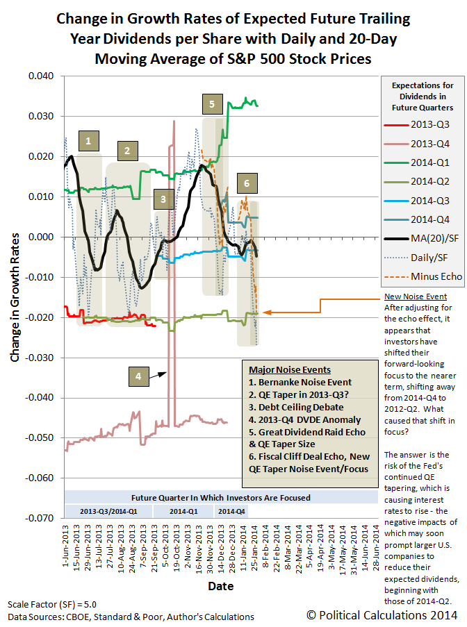
The driving factor behind this change is the Federal Reserve's tapering of its quantitative easing programs. While the Fed's action has long been expected in and of itself, what has changed for investor expectations is the news of the effect of the Fed's QE tapering, the first results of which began being reported after 22 January 2014.
Here, while the Fed had announced its intentions on 17 December 2013, it didn't actually implement the first reduction in its economy-stimulating quantitative easing bond-buying programs until January 2014.
After 22 January 2014, what wasn't previously known and became news is that very interest-rate sensitive businesses, especially in more heavily debt-financed developing nations, are being very negatively impacted by the Fed's tapering, which has put upward pressure on interest rates. Rising interest rates negatively impact debt-financed businesses because they increase their costs of doing business, which then puts negative pressure on their earnings.
For investors, the question then became one of where they should focus their forward-looking attention in making their investment decisions. If a considerable number of businesses might soon be seeing reduced earnings, with corresponding reductions in their expected dividend payments to their shareholders, it would make sense to focus more in the nearer term than a more distant future.
Since the earnings season for the first quarter of 2014 is nearly two-thirds over, it doesn't make much sense for investors to shift their focus to the current quarter, because the dividends that will be paid during it are largely locked in at this point.
But it would make sense to focus on the dividends that are expected to be paid in the second quarter, because that's where any impact to investors from falling earnings will first be indicated by businesses. Since 22 January 2014, it would appear that investors have been progressively shifting their focus to 2014-Q2.
Although it was unlikely going into 29 January 2014, there was still a small chance that the Fed might back off its QE tapering plans. That door slammed shut shortly after 2:00 PM Eastern Standard Time, and stock prices completed their quantum shift in future expectations to fully reflect the expectations associated with 2014-Q2 by the end of the trading day.
We're now going to push the limits of what we can do as analysts of the stock market. The following chart shows what investors can rationally expect for stock prices over the next month in the absence of any additional news that might shift their focus to a different point of time in the future or that might change the level of dividends expected for 2014-Q2, the quarter where they would now appear to have shifted their focus in making investment decisions (provided they keep their forward-looking focus on this quarter):

A third possibility going forward is that investors could react to some other news event, deviating stock prices from this basic trajectory - however, so long as investors remain focused on 2014-Q2, in the absence of bigger news to drive a shift in focus, stock prices should return to fall within our expected range, as all noise events end - it's only ever a question of when.
Finally, for the sake of covering all the bases, there's a fourth possibility: Instead of a shift in focus, what just happened with stock prices is really just its own noise event, which will itself end soon enough.
No matter what, there's some interesting and wonderfully chaotic forces at work in the markets - we couldn't be happier!
In his 2013 State of the Union address, President Obama had the following to say about the "success" achieved during his tenure in office in reining in the federal government's spending:
Over the last few years, both parties have worked together to reduce the deficit by more than $2.5 trillion – mostly through spending cuts, but also by raising tax rates on the wealthiest 1 percent of Americans. As a result, we are more than halfway towards the goal of $4 trillion in deficit reduction that economists say we need to stabilize our finances.
Reducing the federal government's budget deficit by $2.5 trillion sounds pretty impressive, doesn't it? But what might not sound so impressive is that even with those minor spending cuts and large tax increases, the federal government will still run very large budget deficits throughout the rest of President Obama's term in office. On top of the massive trillion dollar plus budget deficits in each of his first four years in office - before the President's budget deficit reduction achievement. Deficits that will pile on top of a national debt whose size continues to swell.
Update 30 January 2014: It looks like we accidentally left a bit of this post on the editing room floor. Here's the deleted scene!...
Let's flash forward to 2014. Here's what President Obama had to say about that budget deficit reduction achievement in his 2014 State of the Union Address:
Here are the results of your efforts: The lowest unemployment rate in over five years. A rebounding housing market. A manufacturing sector that’s adding jobs for the first time since the 1990s. More oil produced at home than we buy from the rest of the world – the first time that’s happened in nearly twenty years. Our deficits – cut by more than half. And for the first time in over a decade, business leaders around the world have declared that China is no longer the world’s number one place to invest; America is.
We see that reducing the government's budget deficit is something the President associates with good things - but the U.S. government is still running in the red by billions of dollars - all of which are inflating the national debt, which totals over $17 trillion now - larger than the nation's entire annual GDP.
So what's the real impact of that achievement in terms that can be related to typical American households? And how does that compare to other U.S. Presidents in the modern age of chronic federal government budget deficits?
The answer is displayed graphically below for each President beginning with Richard Nixon....

To arrive at these results, we divided the total public debt outstanding for the U.S. federal government by the number of U.S. households counted by the U.S. Census Bureau for each year since 1967, when the U.S. Census Bureau first started tallying this data, and adjusted each of these values to account for the effect of inflation over time, expressing each in terms of constant 2013 U.S. dollars.
We then subtracted the national debt burden per U.S. household of the last year of the preceding U.S. President's term from the equivalent value recorded in their final year in office, dividing that difference by the number of years that each was in office (which is five years and counting for President Obama). The results of all that math work out to be exactly what we've presented in the chart above.
We should note that the value for President Obama incorporates our projection that were 123,700,000 households in the U.S. in 2013 - the U.S. Census Bureau won't report its official tally until September 2013, so until that time, the figure representing President Obama first five years in office really represents a preliminary estimate - one that should be relatively close to what the final figure will work out to be.
The bad news is that there is a clear winner for the President with the worst record on budget deficits, which is perhaps why those economists are saying that we need even more deficit reduction to stabilize our finances. That's the consequence of having spending get out of control.
If only we had effective leadership in Washington D.C.
Labels: national debt
January 2014 is not shaping up to be a good month for the reality-challenged belief system of the Incredibly Incurious Journalist Jonathan Chait.
Still smarting from his defeat in the debate on whether Obamacare is beyond rescue, the findings of newly published academic research into the nature of why income inequality among U.S. households and families has risen over time couldn't have come at a worst time for the leftist journalist.
The abstract of the paper gets straight to the issue at hand:
Has there been an increase in positive assortative mating? Does assortative mating contribute to household income inequality? Data from the United States Census Bureau suggests there has been a rise in assortative mating. Additionally, assortative mating affects household income inequality. In particular, if matching in 2005 between husbands and wives had been random, instead of the pattern observed in the data, then the Gini coefficient would have fallen from the observed 0.43 to 0.34, so that income inequality would be smaller. Thus, assortative mating is important for income inequality. The high level of married female labor-force participation in 2005 is important for this result.
"Assortative mating" is a term borrowed from genetics, which refers to when the members of a species select mates based on their observable characteristics, seeking mates whose characteristics are either similar to their own or that they find desirable.
Where economics and income inequality come into play is when one of the main characteristics that people use to form families and households is the income-earning potential of their prospective spouse. Our own groundbreaking analysis shows how simply combining working or non-working men and working or non-working women into various one or two-person households can create considerable disparity in the amount of income earned by each resulting household:
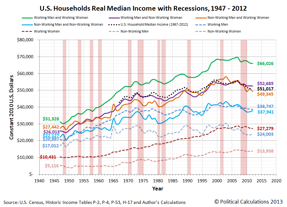
The data in this chart is solely based on the median income earned by each type of household member, so every individual income upon which it is based is represented by a person whose income places them in the exact middle of the income distribution for their category in the year indicated.
Now, consider the following changes in the composition of households might change as a result of this assortative mating. What would happen to the measured amount of income inequality over time if:
- Men and women who both have high income earning potential increasingly form households together, with both delivering on that potential.
- Men and women who both have low income earning potential increasingly form households together, with both delivering on that potential.
Why, that's a recipe for increasing income inequality over time, isn't it? Especially when you consider these changes would coincide with a reduction in the number of households and families that are composed of one individual with high income-earning potential and one individual with low-income earning potential.
And that doesn't even consider the situation for when a household or family either fails or if one of the income-earning members of the household passes away, leaving behind just a single income-earning household.
All of which combines to produce the following picture for the major trends in income inequality since 1947:

In this chart, we see that the measured income inequality among individual Americans hasn't meaningfully changed since 1960, while the income inequality measured in American households and families has increased. That is the telltale indication that social factors, rather than economic ones, are behind the increase in the income inequality observed for U.S. households and families.
This is the kind of real world evidence that income inequality theorists like Chait and his precious few sources in academia who share his cloistered world view disregard. Because if they accepted it, they would have to abandon the policy prescriptions that derive from their debunked claims.
But then, we're talking about someone who actually believes that Obamacare can be rescued. Even though the evidence today says that it cannot, especially considering that the whole political rationale for the program was sold on lies. Lies fully bought into by people like today's income inequality theorists.
And for the record, Jonathan Chait has still never contacted us regarding any of the original analysis we've generated here on the topic of the income distribution of Americans over the years. As journalists go, he's certainly an incredibly, unbelievably, stupendously, incurious member of the profession.
What else can we say? Vindication tastes sweet! Our long-time readers know what comes next....
Previously on Political Calculations
- How to Detect Junk Science
- Debunking Income Inequality Theory
- The Incredibly Incurious Journalism of Jonathan Chait
- The Continuing Adventures of an Incredibly Incurious Journalist
- The Major Trends in U.S. Income Inequality Since 1947
- The Discovery of the Unseen
- The Real Story Behind "Rising" U.S. Income Inequality
- Low End Income Inequality in the U.S.
Labels: income inequality
Finally, the market did something interesting last week!
If you couldn't tell from the tone of our last several posts observing the S&P 500, we've been pretty bored with the market over the last several weeks, seeing as the market was pretty much behaving as expected all through that time.
But then, beginning on Thursday, 23 January 2014, we saw the arrival of a new negative noise event, where the volume really cranked up on Friday, 24 January 2014, with the S&P 500 losing over 2% for the day, which for the record, is how much stock prices have to change in a single day before we become greatly interested in what the stock market is doing. Our chart tracking the change in the growth rate of stock prices against the backdrop of the expectations that investors have for the change in the growth rate of trailing year dividends per share captures the carnage.
While much of the focus in the news highlighted lackluster 2013-Q4 earnings reports and on increasing economic concerns in developing markets, the real story once again is uncertainty related to the Fed's QE policies. The weakness in emerging markets reflect this, because of their sensitivity to those policies. The editors of Bloomberg explain how the Fed's tapering of its purchases of U.S. Treasuries and Mortgage-Backed Securities are negatively impacting these very interest-rate sensitive markets:
The problem is that two things are amplifying the adjustment of capital flows: first, the dependence of global capital markets on the dollar, and hence on the policies of the U.S. Federal Reserve; and second, policy mistakes in some of the most-watched developing economies. In the short term, there’s little to be done about the dollar’s destabilizing pre-eminence. But economic reform in some of the main emerging-market economies, desirable in its own right, would help calm nerves.
Paradoxically, the U.S. market crash of 2007 and 2008 entrenched the dollar’s global dominance. Investors sought safety, and U.S. government debt remains the world’s safest asset. Despite tremendous federal borrowing, U.S. debt was soon in short supply. The Fed’s quantitative easing took trillions out of the market, and emerging-market governments bought dollars as a cushion against bad news and to hold their currencies (and export prices) down.
As a result, the emerging markets are unduly sensitive to fluctuations -- real or imagined -- in U.S. monetary policy. The Fed has recently begun to pivot away from quantitative easing, signaling that the era of extraordinarily loose U.S. monetary policy will come to an end. This is making investors think twice about putting their money in developing countries.
We've previously observed that a similar phenomenon is occurring within the U.S. economy, were the most interest-rate sensitive Real Estate Investment Trusts (REITS) have likewise been negatively impacted by the Fed's tapering decisions.
The main issue with the Fed's QE policy now is not whether it is going to taper its economy-stimulating bond buying, but at what pace? Or rather, how much and how often?
As we saw in the previous QE taper-related noise events, investors shifted their forward-looking focus to the nearer-term as the probability of the Fed's tapering rose and fell, causing stock prices to fall and rise with their assessment of that risk for when and how the Fed will execute its tapering strategy, which won't likely be known until the conclusion of their meeting on 28-29 January 2014.
So the noise event will likely last for at least several days, with statements by Fed officials about their QE tapering intentions and willingness to ensure liquidity in the markets having a notable effect on stock prices.
And then it will be over, because all noise events end, and investors will go on to set stock prices according to their expectations. The Fed's challenge, if it desires market stability, will be to set those expectations back to the level they were before the new noise event broke out.
And if they don't desire market stability, then they'll have some serious damage control to do. Welcome to your new job, Janet!

How at risk are you of having your job taken over by a robot or some other kind of automation technology?
One of the dangers that people who work in low wage-earning jobs face from politicians promising minimum wage or benefit increases is that they might get priced out of their jobs.
Here, as a result of government action, these workers might suddenly find themselves at extreme risk of either losing their jobs, or really, having the job itself disappear, if the cost of employing them rises above the cost of buying automation technology that can do the job more productively than can be done by people.
Mark Perry points to an example where that situation is increasingly playing out in America's wine country, starting with a video of the automation technology increasingly being used there to sort grapes in action:
The video above shows the Bucher Delta Vistalys R2 optical grape sorting system in operation. Modern Farmer featured the futuristic farming technology on its website this week in the article "How a Robot Can Sort 2 Tons of Grapes in 12 Minutes."
Head winemaker Steve Leveque is now using a $150,000 optical grape sorter at Hall Winery in Napa Valley, and he says "Most wineries can sort about two tons of grapes per hour, using 15 human sorters. We now processes the same amount of grapes in only twelve minutes, with zero human sorters."
We thought this example might make a great case study of the economics involved. First, let's look at the nature of the work itself. Wine Spectator describes the job of sorting grapes:
As freshly picked grapes enter the winery, they have to be sorted for quality, a process commonly known as triage in French. Traditionally, the bunches were dumped on a sorting table, where sorters would look over the clusters and separate the good from the inferior, removing unripe, diseased or damaged grapes, along with any leaves that snuck in. Today, the grapes usually travel down a conveyor belt past a line of sorters making the selections. The belt often vibrates to shake out bad grapes that might sneak in under cover of the good ones.
Technology is taking the place of human grape sorters, however. Optical laser sorters are now in place at many top Bordeaux estates. As the grapes move down a conveyor belt, an optic sensor recognizes anything that doesn't have the desired size, shape and color and blows it onto another conveyor belt with a blast from an air cannon.
Meanwhile, Wine Business describes the business aspects of the task, along with the potential labor savings a winemaker has for adopting the automation technology (free, registration required):
According to Lance Vande Hoef and Mea Leeman, sales reps for Pellenc and KLR respectively, these machines can process up to 2,000 berries a second, equaling about 10 to 12 tons per hour. They require three people to operate the optical berry sorting line and one or two forklift drivers to move the fruit. (Most of the wineries I visited were running about 6 to 8 tons per hour.)
Doing this job by hand would take eight to 12 people who could process 1½ to 2½ tons of fruit per hour. A vibrating sorting table can process up to four tons of fruit per hour using six to eight people. So not only does the optical eye sorting technology process the grapes faster and with less people, but most of the folks I talked to agreed that the end result was at least as good as anything they have done in the past, if not better.
In addition, one additional person is required to clean the automation equipment after a typical 8-hour shift for sorting grapes and perhaps also to transport it to a different location, so the automated technology in this example really requires 4-6 people, half of the 8-12 people required for performing this task manually.
Let's assume that they all earn the current federal minimum wage of $7.25 per hour. If we go to the upper end of the staffing requirement for the automated equipment, we're talking about 6 people, who would earn $3,770 each during the three month long period for a typical grape harvest in the United States, or $22,060 total.
Because we're going to compare this cost to the purchase of automation equipment, which we assume will involve monthly payments, we'll divide this figure by 12 to get the average monthly cost for labor over an entire year: $1,885. We'll next multiply this figure by 107.45%, to account for the employer's portion of federal FICA payroll taxes, so the employer's minimum monthly cost for employing the people in this example is actually $2,025.43. This is the value we'll enter into our tool below.
Next, because there's a cost for money to buy the automation equipment, which which we'll assume is represented by the interest rate that applies for a government-backed small business loan with a 10-year term. (Sure, the business might already have the money sitting in an account somewhere and not have to borrow the money, but there's an opportunity cost involved, since they wouldn't be able to invest it in other things once they choose to buy the automation equipment. The interest rate that a business would have to pay on an SBA-backed loan is a reasonable estimate of the opportunity cost in that case.)
Finally, because we're looking at the cost over an extended period of time, we'll need to take inflation into account. Here, our default data is the long-term average of inflation in the United States over the last 100 years.
The rest is just simple math....
What we find is that at the current federal minimum wage of $7.25 per hour, it's less costly to hire workers at that pay than it is to buy the automation equipment.
But what happens if we increase the minimum wage to $10.10 per hour, as President Obama and the members of his political party desire?
See what happens for yourself. At $10.10 per hour, six workers at this wage would earn $5,252 each during the three month long period for a typical grape harvest in the United States, or $31,512 total. Their basic average monthly income $2,656 and the minimum cost the business would have for employing them would be $2,853.87 per month, figuring in the employer's portion of federal FICA taxes once again. The $2,853.87 amount is the figure you should enter in the tool above to consider this scenario.
Once the cost of marginal labor rises too high, it makes more sense to replace minimum wage jobs with robots or other automated technology. And since the cost of marginal labor, in the form of the minimum wage, has been set arbitrarily, without any real concern for the people who lack the skills, experience or education needed to do more valuable kinds of work, those are the people who are going to find themselves on the outside of prosperity looking in.
Which is exactly where the people who propose minimum wage hikes would appear to want them to be. People whose incomes fall within the range that might be affected by a minimum wage increase would be very much at risk of having the jobs they do taken over by technology.
References
Lippman, Ken. New Technology for Sorting Grapes Used in High-end Wine. Wine Business Monthly, February 2011. [Online Article - Free, Registration Required].
O'Donnell, Ben and Taylor, Robert. Harvest 101: The Basics of Crush Season. Wine Spectator. [Online Article]. 31 August 2011.
Income inequality theory is a lot like ancient astronaut theory, in that in order to believe in it, you have to disregard a lot of evidence to the contrary.
Let's start with the most basic premise of income inequality theory: that when the rich become richer, the poor become worse off.
Do they really?
Today, we're going to revisit a time in recent American history that income inequality theorists claim represents a peak in the degree of economic inequality in the nation, where income became highly concentrated in the hands of just a lucky few, leaving millions of the poorest Americans at the lowest end of the income spectrum worse off.
And we're going to do that by comparing the top to the bottom, during the days of the Dot-Com Bubble.

Perhaps no other episode in modern American history so clearly separated the people at the top of the income earning spectrum, who raked in millions upon millions from the capital gains associated with a booming stock market that rose to spectacular new heights, and the people at the bottom, whom we'll represent by the people with the least education, least skills and least work experience in the U.S. economy: Americans between the ages of 16 and 24!
The Highest of the High
Although we normally date the beginning of the Dot-Com Stock Market Bubble to the month of April 1997 [1], in reality, that bubble really began to inflate on Wednesday, 7 May 1997.
The action that caused the prices of stocks to suddenly start rising rapidly was the announcement that day that the Tax Relief Act of 1997 would incorporate a major reduction in the tax rate for capital gains, which would be retroactive to 7 May 1997 after the act was signed into law.
Because the tax rate for dividends wasn't similarly reduced, the disparity that was introduced in potential after-tax returns for investors sparked off the inflation phase of the Dot Com Bubble. Investors quickly bid up stock prices, and especially the stock prices of companies that didn't pay stock-price reducing dividends, as they could realize greater after-tax returns that way.
An adverse feedback cycle soon developed, amplifying the inflation of the bubble, which continued boosting stock prices up to its unsustainable August 2000 peak. After which, the Dot Com Bubble entered its deflation phase, which lasted until the tax rates for dividends and capital gains were set to be equal to each other by the Jobs and Growth Tax Relief Reconciliation Act of 2003, which was signed into law on 28 May 2003, marking the end of the Dot Com Bubble.
The best way to see how out-of-the-ordinary the Dot Com Bubble was is to track its growth with respect to the dividends per share that the stock market generated during that period of time, and to compare it to the trends that came before and after. We've done that for the annual averages for the S&P 500 in the chart below, which we've also adjusted for inflation to be in terms of constant year 2000 U.S. dollars, since that year marks the peak for the Dot Com Bubble.

In the years in between 1997 and 2003, the investors who sold the stocks they owned during that time became the people whose growing income from those tax-cut fueled capital gains quickly put them in the stratosphere of the U.S. income distribution, as more income became concentrated [2] among these topmost income earners than in the several decades preceding the bubble's peak.
These individuals then represent the highest of the high. The very people into whose hands the most income was concentrated during the years of the Dot Com Bubble.
The Lowest of the Low
Meanwhile, the people at the bottom of the U.S. income spectrum would be earning the minimum wage. Since approximately half of the people who populate the lowest end of the income spectrum in the U.S. are between the ages of 16 and 24, we can use this portion of the population to demonstrate how they fared during this period of time.
To do that, we'll return to our recently updated minimum wage demand curve for this portion of the U.S. income earning population, updating it to also be in the inflation-adjusted terms of constant year 2000 U.S. dollars.

Notice that during the years of the Dot-Com Bubble that the number of Age 16-24 Americans with incomes swelled far above where our minimum wage demand curve says should have happened. At its peak in the year 2000, we estimate that over 1.6 million U.S. teens and young adults were earning incomes than would have been possible without the Dot Com Bubble's effect on the U.S. economy.
But that's not the most remarkable observation that we are now able to make.
Debunking Income Inequality Theory
What would happen if we overlayed these two charts? Remember, the first chart showing the trajectory of stock prices during the Dot Com Bubble directly indicates the outsized income gains that the people at the highest end of the U.S. income spectrum accumulated during the years that saw the greatest increase in income inequality in American history up to that point.
The second chart shows what happened for the people at the very bottom of the U.S. distribution income during those same years. We've already observed that far more people in this group would appear to have earned income during this time than would have been predicted by the data outside the period of the Dot Com Bubble, but how much worse off did they fare?

This is the chart that completely debunks the main premise of income inequality theory - that the rich get richer at the expense of the poor, who income inequality theorists claim get poorer.
What we've revealed is that the gains of the people at the bottom were directly proportional, or nearly so, to the gains of the people at the top during the Dot Com Bubble.
The people at the top saw those gains in the form of income acquired through investments in the U.S. stock market. The people at the bottom saw those gains in the forms of jobs that allowed millions more to earn incomes through wages and salaries, many at jobs that paid at or near the minimum wage, than they could if the economic activity generated during the years of the Dot Com Bubble did not occur.

The effect on the income inequality math is pretty straightforward - the Dot Com Bubble both put a lot of money into the hands of the people at the top of the income spectrum, while at the same time, it supported a very large influx of people at the bottom - people who wouldn't have been included in the calculation of income inequality if they had no income at all.
But they did - with these millions of these additional people in the U.S. workforce earning billions of dollars.
The only way this effect wouldn't play out is if the minimum wage were raised so high, it would effectively block employers from being able to hire marginally educated and experienced Americans because these individuals would not be able to generate enough revenue to cover the costs of employing them. As we can see in the charts above, the Dot Com Bubble generated enough additional economic activity to more than offset the negative effect of the minimum wage increases during that time. Alas, economic bubbles are not sustainable.
The alternative for these most economically marginal of Americans is to not participate in the U.S. job market at all and to earn zero income as a result.
During the Dot Com Bubble that was a choice. Perhaps such people who chose not to earn incomes instead chose to attend school and obtain masters and doctorate degrees in fields that just don't provide much of an economic return on their investment, so they saw no gains from the bubble-driven economy of the late 1990s or early 2000s. We strongly suspect that these particular individuals, along with their academic mentors who likewise were on the economic sidelines, are today's leading income inequality theorists.
It occurs to us that the main difference between income inequality theorists and ancient astronaut theorists is that the ancient astronaut theorists have more credibility.
Footnotes
[1] We follow the same practice for dating the beginning and end of stock market events that the National Bureau of Economic Research follows in determining when recessions begin and end. Here, the NBER doesn't select the month in which the economy actually begins to contract as the starting point for a recession, but rather the month in which the previous period of economic expansion peaked.
Following the same logic with monthly stock price data, we've identified April 1997 as the starting month for the Dot Com Bubble since stock prices began to deviate sharply from their previously established trajectory in May 1997. April 1997 then may be thought of as the starting month, or rather, Month 0 of the Dot-Com Bubble.
[2] The concentration of income at the top end of the U.S. income spectrum during the Dot-Com Bubble is clearly evident in Figure 2 of the material introduced here by Victor Yakovenko. There's a second period of income concentration later with the U.S. housing bubble, but as we've previously shown in a three part series (Part 1, Part 2, Part 3), that was just the result of a capital flow from one market to the other....
Image Credits: Michael Wu.
Previously on Political Calculations
We celebrated our 2013 anniversary in three parts, since we were telling a story too big to be told in a single blog post! Here they are:
- The Major Trends in U.S. Income Inequality Since 1947 (2013, Part 1) - we revisit the U.S. Census Bureau's income inequality data for American individuals, families and households to see what it really tells us.
- The Widows Peak (2013, Part 2) - we identify when the dramatic increase in the number of Americans living alone really occurred and identify which Americans found themselves in that situation.
- The Men Who Weren't There (2013, Part 3) - our final anniversary post installment explores the lasting impact of the men who died in the service of their country in World War 2 and the hole in society that they left behind, which was felt decades later as the dramatic increase in income inequality for U.S. families and households.
Meanwhile, there were the things that led up to those findings:
- Can Increasing the Minimum Wage Boost GDP? (2011) - using data for teens and young adults spanning 1994 and 2010, not only do we demonstrate that increasing the minimum wage fails to increase GDP, we demonstrate that it reduces employment and increases income inequality as well!
- The Discovery of the Unseen (2012) - we go where so-called experts on income inequality fear to tread and reveal that U.S. household income inequality has increased over time mostly because more Americans live alone!
- The Major Trends in U.S. Income Inequality Since 1947 - want to know why you cannot blindly rely on the data that income inequality theorists use to make their case?
- The Real Story of "Rising" U.S. Income Inequality - we find that social factors, rather than economic ones, account for virtually all of the claimed increase in income inequality over time.
- Twenty Years of the U.S. Minimum Wage - we introduce our updated minimum wage demand curve, complete with a tool you can use to anticipate how the income-earning prospects for Americans between the ages of 16 and 24 will change as a result of a change in the U.S. minimum wage.
- The Income Distribution of U.S. Wage and Salary Earners in 2012 - the most recent snapshot we have of how income is distributed in the U.S. among those who earn wages or salaries!
Labels: economics, income distribution, income inequality, minimum wage, SP 500
Last Friday, 17 January 2014, President Obama secretly contacted us for information about the number of Americans who might be impacted by a significant increase in the U.S. federal minimum wage.
Really. Our friends at the NSA tipped us off to the visit and here's the screen shot of our site traffic log of the President's inquiry:

Specifically, President Obama was interested in our work where we estimated the income distribution of U.S. hourly workers using data originally published by the Congressional Budget Office in 2006.
So he got numbers, but numbers that applied before the last series of increases in the U.S. federal minimum wage. Numbers we later used to show that lots of jobs within the range of incomes affected by the minimum wage increase of 2007 disappeared from the economy. Before the last recession.
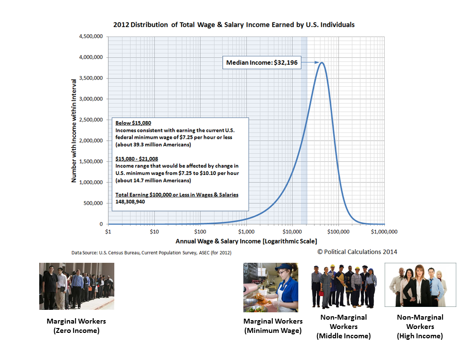
Alas, they are also old numbers. And as a source of vital information more trusted by the Executive Office of the President than say the New York Times or government bureaucrats, we thought we'd take this opportunity to update them somewhat. Our chart below shows what we found when we tapped the U.S. Census Bureau's most current data available on the distribution of wage and salary income earned by Americans in 2012 (as the data for 2013 won't be collected until this upcoming March, nor will it be available to the public until September.)

There are two key thresholds shown in this chart. The first is at $15,080, which corresponds to the annual income that an individual who earned the U.S. federal minimum wage might earn if they worked full-time, 40 hours per week, all year long. Americans who fall below this level today are predominantly those who work fewer than 40 hours per week or who work fewer than 52 weeks per year. That's approximately 39.3 million Americans.
The next threshold is at $21,008, which corresponds to the annual income that an individual who earns an hourly wage equal to $10.10 per hour might earn if they worked 40 hours per week, 52 weeks per year. In 2012, there were approximately 14.7 million Americans who earned wages or salaries with an equivalent full-time hourly wage of greater that $7.25 per hour, but less than or equal to $10.10 per hour.
As we indicated yesterday, approximately half of these individuals are between the ages of 16 and 24. Which is a shame, because it sure would be nice if they could earn just a little bit of money through a job so they don't have to rack up quite so much student loan debt.
But then, that's a very profitable racket for Uncle Sam, which is one reason why President Obama may have chosen to sign off on this particular nudge. They'll just need that college education to be considered for the new higher minimum wage jobs that don't even really require a college degree.
References
U.S. Census Bureau. Current Population Survey. Annual Social and Economic (ASEC) Supplement.Table PINC-10. Wage and Salary Workers--People 15 Years Old and Over, by Total Wage and Salary Income in 2012, Work Experience in 2012, Race, Hispanic Origin, and Sex. Both Sexes. [Excel Spreadsheet]. 17 September 2013. Accessed 21 January 2014.
Labels: data visualization, income distribution, minimum wage
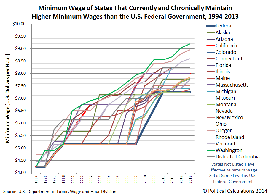
We thought it might be fun to update some of our previous analysis of the U.S. minimum wage, now that we have both minimum wage and inflation data through 2013. First, we should note that there is more than one minimum wage in the United States, with the federal minimum wage often setting the effective floor for those states that don't set their minimum wage at a higher level. Here's what the last 20 years looks like for the federal minimum wage and those states that do set their minimum wage at significantly higher levels:
While kind of cool to look at, with so many different minimum wages, we think that most people would rather refer to a single number that represents what we'll call the national average minimum wage. So we calculated what that single number is for each year from 1994 through 2013, weighting each state's minimum wage by its percentage of the U.S. population. Our next chart shows the results of our calculating the nominal (non-inflation-adjusted) minimum wage for each year of the last two decades:

But wait! What about inflation? Well, we redid the math we did above to calculate the national average minimum wage to adjust it for inflation as well, showing the last 20 years in terms of constant 2013 U.S. dollars!

Now for a real challenge! How would changing the national average minimum wage affect the people most likely to earn the minimum wage?
For that, we'll need to create a demand curve, pairing the inflation-adjusted national average minimum wage with the number of Americans between the ages of 16 and 24 who earn incomes. Or rather, the U.S. teens and young adults who collectively have represented approximately half of all Americans who earn incomes that are consistent with the minimum wage over the past decade (and probably much longer than that, since the BLS only provides data on the characteristics of minimum wage earners back to 2002).
Our U.S. minimum wage demand curve chart is below. The data for the number of teens and young adults with income is taken from the U.S. Census' Annual Social and Economic Supplements going back to 1994 (the first year the Census began publishing this data in digital-friendly format). The data for state minimum wages is from the Bureau of Labor Statistics, where we adjusted the data to account for inflation, according to data also published by the BLS. All we did was to connect the dots, or at least those that weren't skewed by the impact of the 1997-2003 Dot-Com Bubble, and run a simple linear regression....

Going by the regression, for every $1 increase in the inflation-adjusted national average minimum wage (expressed in terms of constant 2013 U.S. dollars), some 1,265,000 fewer teens and young adults can expect to have incomes.
So what would increasing the U.S. minimum wage to $10.10 per hour, as desired by a number of politicians in Washington D.C., affect the teens and young adults who make up half of all minimum wage earners? Especially if the politicians have no plan or even a clue for how to increase the revenues earned by the businesses that pay U.S teens and young adults to cover the higher cost of keeping these least experienced, least educated and least skilled Americans on their payrolls?
To answer that question, we built a tool you can use to answer that question for yourself, or perhaps for some other hypothetical minimum wage that you would like to consider. Enjoy!
To put that result in context, we estimate that about 26.6 million teens and young adults earned incomes in 2013 (we won't have a firm number until September 2014, as the data won't be collected until this upcoming March.) That means that about 1 in 8 Americans between the ages of 16 and 24 could reasonably expect to no longer be able to earn incomes after this particular minimum wage increase would go into effect. Unless there's a "lot" of inflation!...
As for those pushing the minimum wage increase, we would recommend that if they really think its a good idea, they should commit to doing everything possible to have the increase take effect in April 2014.
Labels: data visualization, economics, minimum wage, tool
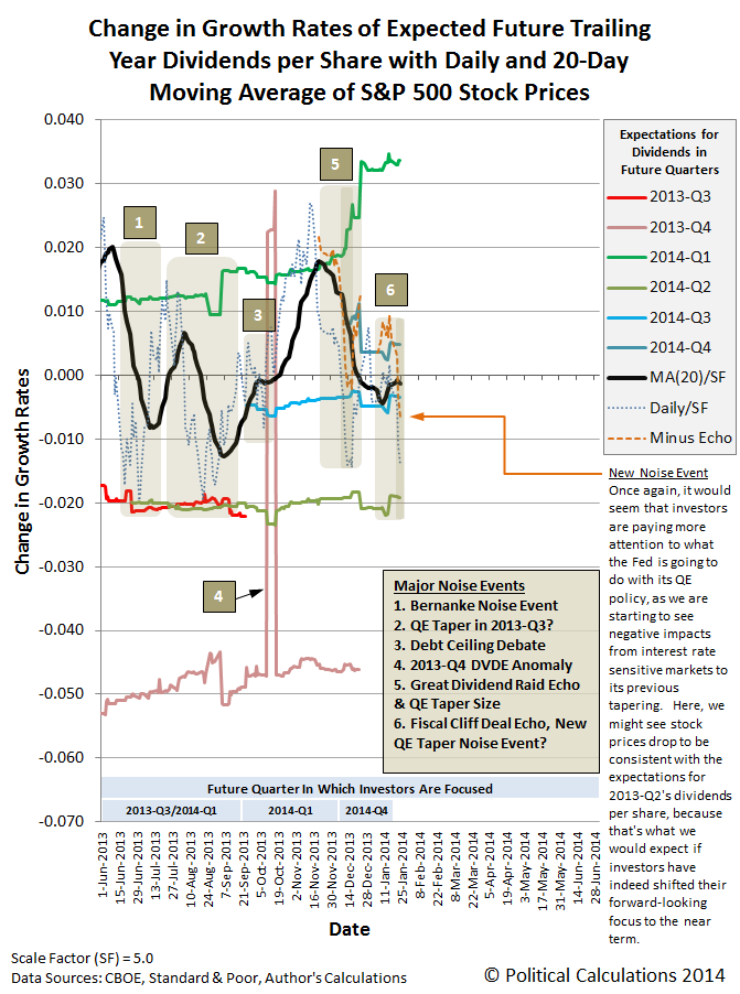
The S&P 500 continued to behave as expected last week, especially after the selling/buying opportunity of Monday, 13 January 2014 that we did our best to communicate to our informed readers well before the fact.
Following that short-term opportunity, there was a surge in expected future dividends that coincided with, you guessed it, an increase in stock prices:

So, all in all, stock prices behaved pretty much exactly as we would rationally expect they would last week.
Analyst Notes
And especially after accounting for the echo effect from the Fiscal Cliff Deal Rally of 2013, which we now have just enough data for the anniversary period coinciding with the rally to quantify.
What is the echo effect? It's something that affects the math we use to anticipate where stock prices should be based upon the primary fundamental driving factor of their underlying dividends per share, and specifically our calculation of the growth rate of stock prices.
Here, when there is an anomalous event in the historical data, such as a sustained rally as occurred late in 2012 (the Great Dividend Raid Rally, which ran from 15 November 2012 through 21 December 2012) and in 2013 (the Fiscal Cliff Deal Rally, which ran from 3 January 2013 up to 21 April 2013), the effect upon our math is such that it makes our calculation of the change in the year-over-year growth rate of stock prices appear as if they are depressed (in the case of the anniversary of a rally) or bubblicious (in the case of the anniversary of a negative noise event or crash).
You can actually see the echo of these events in our chart above - the dotted blue line indicating the change in the growth rate of daily stock prices has not been adjusted to account for the echo effect, while the dashed orange line has.
What we find after filtering for the echo effect is that changes in the growth rate of stock prices are closely following the preceding changes in the growth rate of dividends per share associated with the expectations for the future quarter of 2014-Q4. Which is exactly what we should expect to be happening, up until investors either shift their focus to another discrete point of time in the future or until the onset of a new current day noise event.
Which means, of course, that stock prices today, as indicated by the value of the S&P 500, are right about on target.
Suppose politicians were free to spend money in ever increasing amounts, and that the only rule they had to follow is that each additional expenditure they make would have to be exactly one dollar more than their previous highest expenditure. So, if they started off with a $1 expenditure, they would spend $2 for their next line item in their budget, then $3 for the next item, and so on, until they've spent an infinite amount of money.
Now, what would we have to show for all that spending if we added it all up?
Well, to do that, we'd first have to sum up all that spending. Believe it or not, after doing the math, we would have less than nothing, which is to say that we are all worse off than we were before all that spending was allowed to happen. And that is just another way to say that all that spending wasn't anything other than an infinite waste of money. Here's the math that proves it:
Jason Kottke comments:
This is, by a wide margin, the most noodle-bending counterintuitive thing I have ever seen. Mathematician Leonard Euler actually proved this result in 1735, but the result was only made rigorous later and now physicists have been seeing this result actually show up in nature. Amazing.
The physicists in question would be those working with string theory. Which, if you need a basic primer, here you go:
Looking back at government spending, while the results so far are only preliminary, it does appear that today's politicians are on track to achieve that ultimate result.
The December 2013 Employment Situation Report included the BLS' annual revision of the estimated number of employed Americans by age group, which affected the monthly data going back to January 2009. Our chart below
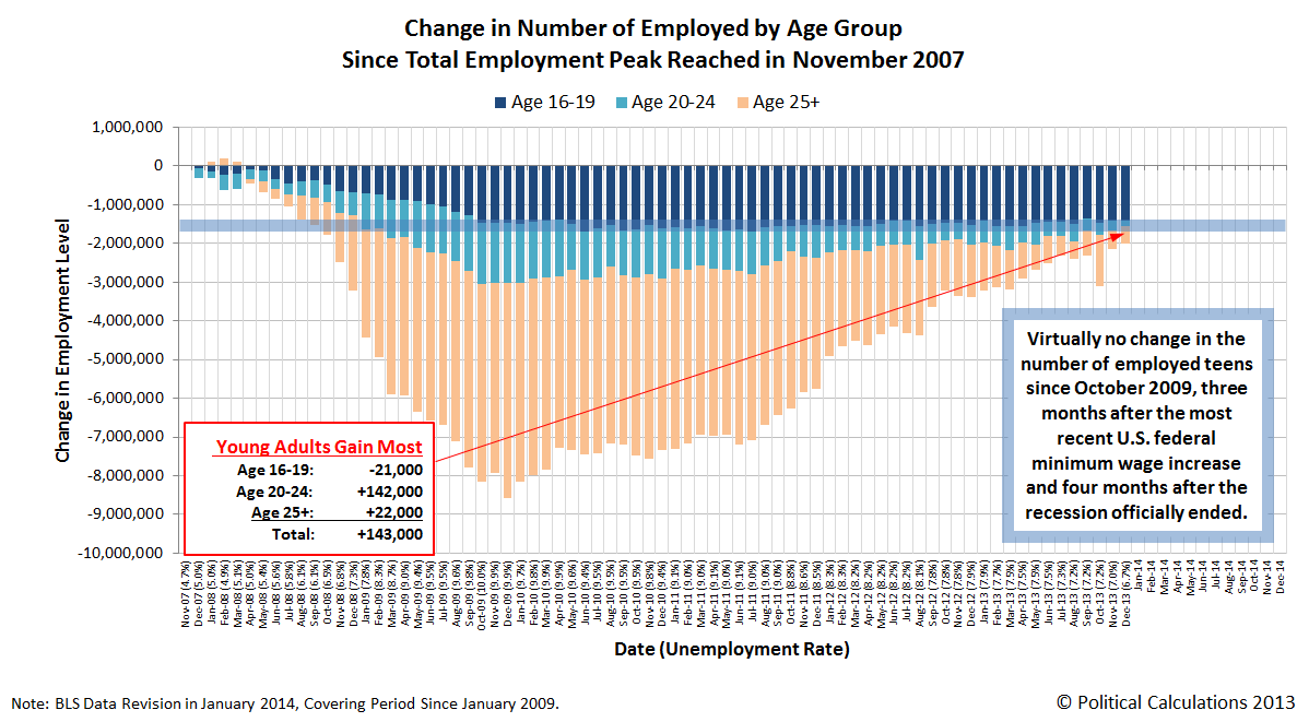
After the revision, it's clear that both young adults (Age 20-24) and adults (Age 25+) were the biggest winners in the U.S. job market in 2013. Here, the number of employed young adults rose by 439,000 from 13,436,000 in January 2013 to 13,875,000 in December 2013, while the number of adult Americans rose by 771,000, from 125,438,000 to 126,209,000.
Since Americans between the ages of 20 and 24 account for 9.6% of all Americans with jobs, their 439,000 increase from January through December 2013 makes them the biggest winners for jobs during the year.
Meanwhile, the number of U.S. teens with jobs actually fell by 8,000 from January 2013 to December 2013, declining from 4,510,000 to 4,502,000.
Meanwhile, Matt Yglesias reports that the number of employed women in the U.S. workforce has recovered to its pre-recession levels. This is largely because men were the most economically displaced workers during the recession, particularly because the most negatively affected industries, construction and automobile manufacturing, were those that had employed disproportionately large numbers of men. To a lesser extent, it is also because the Obama administration's desire to impose "gender equality" upon the workforce led it to deliberately adopt policies that failed to address the real needs of the majority of American workers who were the most negatively impacted during the recession.
Looking back at the economically displaced by age group, we see for young adults, 2014 could be the year where their numbers in the workforce climb back above the level they were when the total employment level in the U.S. peaked in November 2007, just before the Great Recession began. The December 2012 data puts them within 126,000 of that total.
We would also anticipate that American adults will climb back over their previous employment peak level in 2014 as well. There's no reason however to expect much improvement for the employment situation for U.S. teens, since the reason for their displacement from the American work force has a great deal to do with the level to which the minimum wages that apply across the nation have been set.
Labels: jobs
Welcome to the blogosphere's toolchest! Here, unlike other blogs dedicated to analyzing current events, we create easy-to-use, simple tools to do the math related to them so you can get in on the action too! If you would like to learn more about these tools, or if you would like to contribute ideas to develop for this blog, please e-mail us at:
ironman at politicalcalculations
Thanks in advance!
Closing values for previous trading day.
This site is primarily powered by:
CSS Validation

RSS Site Feed
JavaScript
The tools on this site are built using JavaScript. If you would like to learn more, one of the best free resources on the web is available at W3Schools.com.
Other Cool Resources
Blog Roll


