Since being sworn in as President of the United States, Donald Trump has devoted considerable energy to reversing many of his predecessor in office Barack Obama's actions.
But perhaps the most surprising reversal might come from undoing a January 2013 action by President Obama to reject a popular petition for the U.S. to build a working Death Star. For an administration seeking to expand the military capabilities of the United States, where the President has proposed creating a "space force", the Trump White House might soon revisit what would be the nation's largest ever defense infrastructure construction project.
Advances in production technology and fabrication methods for space-based structures stand to make the project much more feasible and cost effective than in President Obama's day, as the following video demonstrating how a Death Star could be practically manufactured demonstrates (HT: Core77):
It's really not that much different from assembling an International Space Station. And it would certainly be a lot easier to see from the ground. For a nation whose private sector can launch a Tesla into space, how hard can it be for the government to do?
Yes, the second video is real!
Labels: movies, satire, technology


Last Thanksgiving, we presented a chart featuring a spurious correlation between the average live weight of U.S. farm raised turkeys and the MSCI World Stock Market Index, in which we showed how U.S. turkeys predict global stock market crashes. Here's what we wrote at the time....
As you can see in our carefully calibrated chart above, whenever the value of the MSCI World index has exceeded the equivalent live weight of an average farm-raised turkey in the U.S., the index went on to either stagnate or crash. And in 2014, the value of the the MSCI World Stock Market Index has once again exceeded that key threshold, which can only mean one thing.... The climate for investors has changed, and it's time to sell!
And if they try to tell you that doesn't make any real sense, you should hold firm and tell them that the correlation is really strong (the R² is 0.9616), which means that the science is settled and that they really shouldn't want to be some kind of climate change science denier.
Speaking of which, the rising live weight of U.S. farm-raised turkeys also is strongly correlated with global warming. Believe it or not, the correlation between atmospheric carbon dioxide and global temperatures is not very strong at all (other factors do a much more coherent job in explaining actual temperature observations).
Say what you will about the science, but you cannot deny that by using tips like this, you can make the conversation around your Thanksgiving dinner table a lot more lively this year!
The correlation between the live weight of U.S. farm-raised turkeys and global stock prices is still spurious, and yet amazingly, our prediction based upon it has largely come true in the past year, as the worlds' stock markets did indeed go on to either stagnate or crash.
And with those stock prices still above the live weight of U.S. turkeys, we can't as yet say that global markets are finished stagnating or crashing as yet.
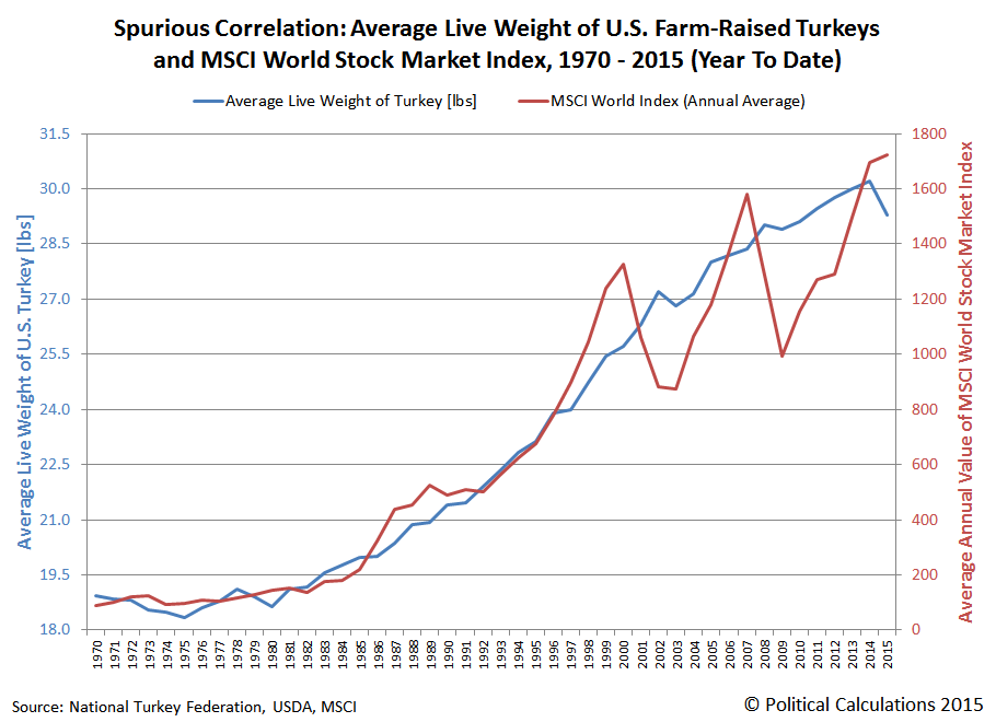
If it seems irrational to link the weight of U.S. turkeys and global stock prices, just remember the old saying: the market can remain irrational longer than you can remain solvent. Do you really feel lucky enough to bet against the birds?

Data Sources
MSCI. MSCI - World Stock Market Index. (End of Day Index Data Search). [Online Database. ]. Accessed 23 November 2015.
National Turkey Federation. Sourcebook. [PDF Document]. October 2013.
U.S. Department of Agriculture. Turkeys Raised. [PDF Document]. 30 September 2015.
Labels: satire, stock market, thanksgiving
Not long ago, in an e-mail exchange with an individual who accused us of being "likely in the the top 5-10%" (which we are, definitely, wink, wink, nudge, nudge, say no more!), and therefore of being "clearly unable to understand the lives or plight of the lower 50%", into which group they placed themselves (hey - they're the ones who self-identified!) They also accused us of being "someone from the conservative side of the political spectrum".
Today, we're going to clear up exactly where we fall on the political spectrum. Via John Whitehead, we've taken "The World's Smallest Political Quiz". Here is a screen shot of our first-time-ever results:

We played around with the quiz, tweaking some of our answers slightly to account for some of the inherent vagueness in how to interpret the various options for each of the questions asked, but only managed to move the dot marking our location in the political spectrum one square to the left or one square up from our natural positions on the issues presented, when we managed to move it at all.
(Meanwhile, John Whitehead, tie-dye wearing hippie - at least, as compared to us - reports that one can achieve a 100% libertarian status in the quiz by agreeing with each proposition.)
Still, we appreciate that many of our readers might think that we fall much further to the right in the political spectrum. We suspect that impression has a great deal to do with our approach to the positions we take on the topics we cover, where we have two overriding principles:
- Data wins. We don't take any political position unless we have real world data and objective analysis that clearly supports it.
- Competence matters in performance. We have little to no tolerance for displayed incompetence.
This combination of principles largely accounts for our negative assessment of President Obama's tenure in office and his preferred policies, which many of the President's most ardent and not uncoincidentally unthinking supporters perceive as meaning that we're very much on the right of the political spectrum. Instead, the truth is that we're right in the center, the only place where people can be truly fair and objective.
We suspect that is perhaps what really upsets such mindlessly hate-filled and jealous people so greatly, because that combination of principles gives us the super power of being able to accurately see the world as it is, which makes it possible for us to be right so much more often than such negatively-affected extremists can ever hope to be.
But then, maybe that's just our perspective from actually being in the center of the political spectrum. We just don't see the point of spending any part of life in such an inadequacy-driven rage, because the data says that's no way to live.
Of all the things we never expected to find ourselves doing, providing policy guidance to the Federal Reserve is probably at the top of the list.
That's all the more unexpected because we've never had any contact with any official at any level of any branch of the U.S.' central banking institution.

And yet, if you listen to the things that a number of the Fed's most influential officials have been saying, you'll find our fingerprints all over them.
It all begins with some key observations and insights we've offered over the years. On that count, our having quantified how the action of investors collectively shifting their forward looking focus from one discrete point of time in the future to another point of time in the future can influence otherwise inexplicable changes in stock prices is likely our major contribution, followed by our observation that the Fed was using stock prices to assess the effectiveness of its monetary policies.
Those two things together allowed us to identify and quantify mistakes made by top Fed officials as they attempted to provide forward guidance to markets. And that, in turn, allowed us to describe how they could repair the damage and more effectively use forward guidance as a monetary policy tool by emphasizing the timing of when the Fed will implement changes using its more traditional arsenal of tools.
The Fed was listening. Now they're applying the lessons they've gleaned from our observations and suggestions.
Over the last several weeks, we've been observing, with increasing frequency, the statements of highly influential Fed officials who have gone out of their way to set the expectation that the Fed will begin hiking short term interest rates above its current 0-to-0.25% level by the end of the second quarter of 2015.
And we know that forward guidance has been effective because of the trajectory that U.S. stock prices has taken during these last several weeks, which becomes even more clear after our simple adjustments to account for the past volatility of U.S. stock prices, which we use as the base reference points from which we can otherwise project future stock prices within a relatively narrow range of noise.
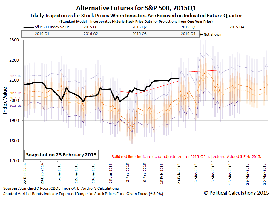
Provided, of course, that we know just how far investors are peering into the future when they make their investment decisions today, which is why we show each of the likely trajectories for investors focused on any of the next four quarters ending in the future. And that's where the Fed's forward guidance efforts come into play, because the Fed's outsized ability to affect interest rates can affect how far forward in time investors look from the present, which then tells us which future trajectory to follow. At least while investors aren't distracted by the alternative futures.

The way that works is that when the Fed says it is going to do something by the end of a certain time period, investors will adapt their investments to be consistent with the expectations for the investment returns that associated with that period of time in the future. We can then tell from the actual trajectory that stock prices follow how tightly investors have set their forward looking focus on the quarter that coincides with the anticipate action on the part of the Fed.
That's the way in which the Fed's forward guidance has been shaped and made more effective, even at the so-called lower zero bound, by our insights and what the Fed has absorbed from our guidance of how to better employ this tool. As long as the Fed's action is considered to be credible given the current state of economic affairs, the Fed can use the model we've developed of how stock prices work as a means of assessing the degree to which markets have bought in to the Fed's preferred policies.
Here, the greater the deviation from the projected trajectory associated with the future point of time to which the Fed has directed investors, the more statements or actions using the other tools the Fed has available to it will be needed to bolster the credibility of its preferred policy. If the gap can't be closed after all that, that provides the indication the Fed needs that it should pursue a different, and more credible, policy.
The best part? It doesn't matter if you've never heard of us or even believe any of what we've just described is possible. It is the way the world works, whether you like it, understand it, or not.
As for what good this does, if you happen to be an investor or just someone who needed more economic stability before you could justify proceeding with plans to expand your business or investments in today's world, you've benefited from the Fed's more effective implementation of its forward guidance policy. As for us and our role in providing guidance to the Fed in implementing those forward guidance policies since mid-2013, you're welcome.
Labels: chaos, economics, satire, SP 500

Now that we've established what the relative purchasing power of a dollar is in each of the United States, we're going to apply that information today to solve one of the great problems of our time: how to set the minimum wage in each state in order to achieve purchasing power equality.
After all, it goes against the ultimate liberal ideals of fairness and equality of outcomes if, thanks to nothing other than the relative cost of living in each state, that a minimum wage earner in Mississippi is able to buy more things with their earnings than can a person earning the identical wage in a high cost of living state like New York.
Clearly, in the interest of fairness and of achieving purchasing power equality, the minimum wage in each state needs to be adjusted in such a way that a person who earns the minimum wage in each state can buy no more and no less than the same amount of real goods and services. That's the great problem for society that we'll be solving today.
Let's start by examining the applicable minimum wage that applies to each state in 2012, the year for which we have the relative purchasing power data, which is the greater of either the state's own minimum wage or the federal minimum wage of $7.25 per hour. That data is directly encoded in the interactive map below:
Next, let's calculate what each state's minimum wage would have to be so that the individual's who earn it will have an equal amount of purchasing power, regardless of the state in which they might live. Here, we've used the federal minimum wage of $7.25 per hour as the benchmark for calculating the minimum wage levels in each state that would achieve purchasing power equality across the entire nation.
Finally, we calculated how much each state would need to adjust their minimum wage levels in order to realize the very achievable dream of purchasing power equality for minimum wage earners throughout the United States.
What this exercise demonstrates is that if one really cares about achieving equality, it makes absolutely no sense to impose a national minimum wage, which we observe produces the situation where the minimum wage earners in some states are considerably worse off than individuals earning the same wage in lower cost of living states - the very essence of income inequality and unfairness.
Labels: data visualization, economics, income inequality, minimum wage, satire
We think that Pinch Sulzberger is an idiot.
There. We said it. Now, let's discuss why we think that....
It all starts with a story that was floated to and repeated by the New Yorker's Ken Auletta regarding the reasons why Sulzberger sacked Jill Abramson, the woman who has worked for several years as the Executive Editor of the New York Times as that company worked to shrink its way toward profitability under her leadership. The emphasis in the following section is ours:
Several weeks ago, I’m told, Abramson discovered that her pay and her pension benefits as both executive editor and, before that, as managing editor were considerably less than the pay and pension benefits of Bill Keller, the male editor whom she replaced in both jobs. “She confronted the top brass,” one close associate said, and this may have fed into the management’s narrative that she was “pushy,” a characterization that, for many, has an inescapably gendered aspect. Sulzberger is known to believe that the Times, as a financially beleaguered newspaper, needed to retreat on some of its generous pay and pension benefits; Abramson, who spent much of her career at the Wall Street Journal, had been at the Times for far fewer years than Keller, which accounted for some of the pension disparity. Eileen Murphy, a spokeswoman for the Times, said that Jill Abramson’s total compensation as executive editor “was directly comparable to Bill Keller’s”—though it was not actually the same. I was also told by another friend of Abramson’s that the pay gap with Keller was only closed after she complained. But, to women at an institution that was once sued by its female employees for discriminatory practices, the question brings up ugly memories. [Update: On Thursday, Sulzberger gave his staff a memo on what he said was “misinformation” on the pay question. “It is simply not true that Jill’s compensation was significantly less than her predecessors,” he wrote. “Her pay is comparable to that of earlier executive editors.”] Whether Abramson was right or wrong, both sides were left unhappy. A third associate told me, “She found out that a former deputy managing editor”—a man—“made more money than she did” while she was managing editor. [Update: The man in question, John Geddes, was in fact the managing editor of news operations.] “She had a lawyer make polite inquiries about the pay and pension disparities, which set them off.”
The reason we believe that Sulzberger is an idiot is because his solution to the problem of unequal pay at the New York Times was to significantly boost the pay of his top-ranking female employee. If he were more serious about running a successful and more profitable business, he should have replaced all the overpaid men on the New York Times' staff with women willing to do the same jobs at lower levels of compensation.

To demonstrate why, we'll adapt the math on wage gaps that was recently developed by economist Steve Landsburg to the particular situation that applies at the New York Times and media organizations in general. To do that, we'll use data provided by Pew Research and the New York Times' 2013 annual report.
The results of the math in our tool below will tell us how much more profitable the New York Times could have been, if only Pinch Sulzberger were not so determined to maintain just under two men for every one woman on the New York Times' payroll at their average 20% higher pay.
That additional 10.4% profit may not seem like much, but the financially-troubled New York Times Company would not have had to shrink so much in recent years if Sulzberger had implemented such a lower wage-paying strategy. Sexism is costing Sulzberger's New York Times' money.
And that's why we think that Pinch Sulzberger is an idiot. As it happens, others have other reasons for thinking the same thing.
Image Credit: Christopher Coons.
Labels: business, math, satire, tool
We're going to use as few words as possible to discuss what's happened and what's about to happen with the S&P 500 this week.
First, looking backwards, we'll observe that stock prices are largely behaving as expected. Mind the notes in the margin of the chart below:

Second, looking forwards, because they are behaving so much as expected, our alternative futures chart suggests something wickedly interesting is coming this way.


We don't think it will be as quite as interesting as what this second chart suggests, but let's have this week play out and see how things develop. Hopefully, it won't be boring.
Update 30 April 2014: What you're about to read is our April Fool's Day post for 2014. Our analysis of the events in question is based on the theory we've been developing for how stock prices work, which is why you might find our description of how and why the S&P 500 changed as it did on 26 March 2014 compelling and believable, however we had absolutely no role in either masterminding or controlling those actions!
Yesterday, we indicated that we have been very busy behind the scenes here at Political Calculations during the past week.
That's a bit of an understatement....
That's because last Wednesday, 26 March 2014, we ran a little experiment with the S&P 500. If you were paying attention to the market that day, particularly around mid-day, you might have noticed:

Certainly, a number of traders and CNBC did, as they apparently got "spooked":
After a positive start to Wednesday's session, the stock market took a serious intraday slide that saw it lose more than half a percent in half an hour, and took the S&P from positive to negative on the day.
While an especially strong five-year Treasury note auction is another likely culprit in the intraday decline, many traders blamed the turnaround on a massive bearish options trade on the S&P 500 that was effectively a multibillion-dollar short bet on the market.
Let's take a step back here. Our regular readers are well aware that we have developed a hypothesis that goes a long way toward explaining the behavior of stock prices. Our basic theory is that investors focus their attention on a specific time in the future when making decisions about their investments today. The price of stocks then follows the expectations associated with what investors can reasonably expect to earn through owning stocks at that future point in time.
What they can reasonably expect to earn through owning stocks can be determined by the market's dividend futures. That is important because we have found that the change in the expected growth rate of future dividends per share is often directly proportional to the change in the growth rate of stock prices today, which means that if we know how far ahead investors are looking in making their investment decisions, we can reasonably anticipate how today's stock prices will change - so much so that we can generally place stock prices within a relatively limited range.
What makes this relevant now is because if our theory of how stock prices behave really holds, it would be possible to drive stock prices simply by getting investors to shift their forward-looking focus of a sufficient number of investors from one point in the future to another - one with a different set of expectations - as the mechanism by which we can influence stock prices.
That is all well and good, but there is only so much that we can do to demonstrate whether the theory we've developed holds by simply observing the behavior of stock prices. If we really want to test out our hypothesis, we need to run a controlled experiment - one designed to influence a significant number of investors into changing their forward-looking focus to a different point in the future with very different expectations from the future point in time where they have been focused.
So that's what we did.
Starting at 11:57 a.m. ET, a major player started buying May 1,995-strike put options on the S&P 500 for $133 per contract. The trade was not executed in a single block, but over many smaller trades between 11:57 and 1:12 p.m. (and the prices of the contract varied, getting as low as $131.70). On the whole, 15,450 contracts were purchased. And since each contract controls 100 shares, this trade cost about $200 million.
Since a put gives its buyer the right, but not the obligation, to sell the underlying security at that given strike price, this implies a bearish bet on the market that will make money if the S&P 500 is below 1,862 (1,995 minus $133) at May expiration.
However, since this trade was deeply "in the money," the trader does not appear to be making a speculative options bet, but rather to be expressing a significant bearish view on the market as a whole. Indeed, this trade is effectively a $2.8 billion short bet on the S&P.
We have to laugh at the "major player" description, but the summary above describes the basic execution of the experiment.
Here, we had been waiting for the volatility associated with the quadruple witching day the Friday beforehand to settle down, because that had depressed stock prices somewhat below that level that would be consistent with investors maintaining a tight and clear focus on 2014-Q3 in setting stock prices and we needed them to return near that level so the outcome of what we would be doing would not be greatly affected by that source of noise.
That base reference level of a future defined by the expectations of 2014-Q3 was effectively set for us by Janet Yellen's comments during her first press conference as Federal Reserve Chair, which had motivated large numbers of investors to collectively focus on that future quarter in setting stock prices.
The waiting ended early on 26 March 2014, as the S&P 500 had gapped upward by 13 points from the previous day's closing value to open and held steady at that level throughout most of the morning. To upset that apparent stability, we needed to shift the attention of a significant number of investors away from focusing on that quarter to instead focus on either the nearer term future defined by 2014-Q2's expectations or the more distant future represented by 2014-Q4, both of which would suit our purposes.
Ultimately, we opted for the nearer term future defined by 2014-Q2. The reason why we selected this quarter is because we believed it would be easier to achieve a statistically significant result.
Here, since the expectations for dividends for 2014-Q2 are more negative than they are for 2014-Q3, successfully shifting the forward-looking focus of investors to this quarter would drive stock prices lower, as stocks would be less desirable to hold.

Resetting the forward-looking focus of investors to a more negative point of time in the future was also important because the money that would be involved in making the transactions that would result was already available in the market. If we had instead chosen to focus investors on the much more positive expectations associated with 2014-Q4, in addition to requiring more effort on our part, it would also risk not having a significant enough response because of the transactional frictions involved (where getting a sufficient response might require investors to liquidate other investments - this a big reason why stock prices are often quick to fall and slower to rise.)
We wish we could claim credit for the idea of using the strike put options to achieve the desired shift in focus to 2014-Q2, but that really belongs to others. And while it would have made a much bigger splash if it had all been done in one trade, for our purposes, it was more important to have the trade broken out into smaller pieces, which would serve as a means of getting a larger number of traders to focus their attention in on the more negative future associated with 2014-Q2.
As for the amounts involved for the trades, well, let's just say that it was sufficient to "reverse" the open, as the market closed down the same number of points from the previous day's trade that it had originally gapped up to open the day. It also kept the day's closing value for the S&P 500 within the expected range that would be still be consistent with a majority of investors maintaining their focus on 2014-Q3.
That's also important because we weren't looking to make a lasting impact, as the overall trade was designed to be neutral, if a bit asymmetric in how the news of the trades were communicated to market participants:
As traders started to notice the options trade, word got around that the buyer of the puts also bought the S&P futures at the same time. That would make this a very different sort of trade, which a firm would put on not to express a bearish thesis, but more likely to square an options trading book that was heavily short options.
If a firm is short more options than it is long, that leads it to collect less premium than it could otherwise, due to the cut of premium that clearing firms take.
"From what I'm being told, this trade was neutral, so there is not going to be an impact from the standpoint of a large amount of futures for sale," said David Seaburg, head of equity sales trading at Cowen & Co.
Beyond demonstrating our basic hypothesis, we also learned from our experiment that you can most certainly have a lot of fun with 200 million dollars. And that you can have even more fun with that kind of money when it's not yours and nobody can prove you did. If you design an experiment properly, it's a small price to pay to learn quite a lot about how to drive stock prices where you want them to go.
But then, that's also impossible isn't it?
Finally, if there's anyone out there who might be upset by all this or are still "spooked", just remember Dr. Clayton Forrester's most memorable quote: "It's supposed to hurt. It's science!"
Correlation doesn't prove causation, but make of the following charts what you will. Our first chart shows how much U.S. businesses have paid in both payroll employment taxes and the corporate income tax as a percentage share of GDP in each year from 1960 through 2012 (now corrected to show through 2012 - the original version through 2010 is here):
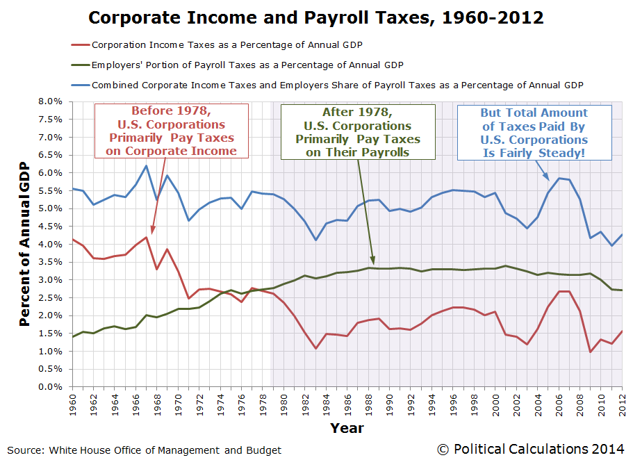
This chart shows that the total amount of taxes paid by businesses to the U.S. federal government has remained fairly steady as a percentage share of GDP from 1960 through 2012, but the composition of the taxes they pay has changed over time. Before 1978, U.S. businesses paid more in corporate income taxes than in payroll taxes, but since 1978, they have consistently paid considerably more in the form of payroll taxes.
The reason why that changed after 1978 was a series of increases in the employer's portion of Social Security payroll taxes, which were offset by reductions in corporate income taxes. During that time, employers went from having their payrolls taxed at a rate of less than 5% before 1978 to be increased in steps every several years to reach a much higher rate of 6.2% beginning in 1990, where it has held level since. Social Security's tax rates were increased during these years to ensure that the program would remain solvent.
What kind of effect do you think those tax hikes would have had on U.S. businesses, where suddenly, it became a much larger penalty to have lots of people on their payrolls in the United States? And what about those businesses where it really doesn't matter that the jobs be done inside the U.S., like manufacturing?
Think about those questions when you consider our next graph:
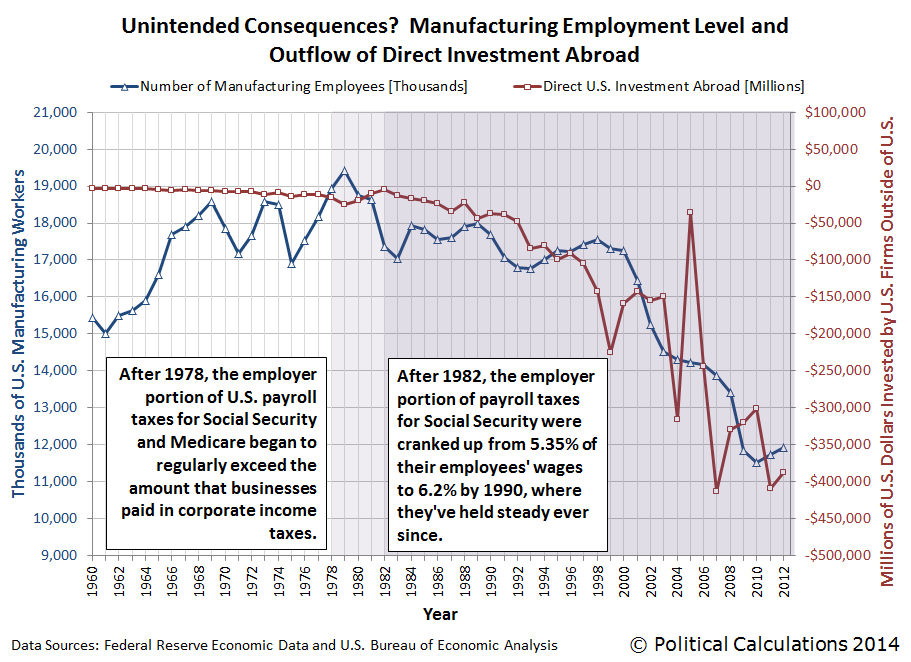
What we see in this chart is that increases in the amount of money being directly invested by U.S. firms abroad (shown as a negative value on the right hand scale, since it is an outflow for the U.S. economy), largely coincides with and is generally proportional to the change in the number of Americans employed in manufacturing. It's as if U.S. manufacturing firms, in seeking to avoid having to pay higher taxes that would put them at a disadvantage with their competitors by reducing the number of people on their payrolls, shifted their production to be outside of the U.S. as they invested in new production facilities elsewhere in the world.
As a result, the U.S. federal government, in hiking its payroll taxes on U.S. businesses so much, actually drove jobs out of the U.S. instead because it overly penalized employing workers within the U.S. In the process, it lost the tax collections that would have come from those relatively high paying jobs, not to mention potentially lowering the nation's GDP below what it might have been otherwise.
But as they say around the White House these days, since those Americans are no longer trapped in their high-paying manufacturing jobs as they were given the opportunity to pursue their dreams, they're much better off now.
Data Sources
White House Office of Management and Budget. Budget of the U.S. Government, Fiscal Year 2014, Historical Tables. Table 1.2 and 2.1. [PDF Document]. 10 April 2013.
Federal Reserve Bank of St. Louis. Federal Reserve Economic Data. All Employees: Manufacturing (MANEMP), Thousands, Monthly, Seasonally Adjusted. [Online Database]. Accessed 15 February 2014.
Bureau of Economic Analysis. U.S. International Transactions Accounts Data. Table 1. U.S. International Transactions [Millions of dollars], Line 51. Excel Spreadsheet]. Accessed 15 February 2014.
Labels: jobs, satire, social security, taxes
Suppose politicians were free to spend money in ever increasing amounts, and that the only rule they had to follow is that each additional expenditure they make would have to be exactly one dollar more than their previous highest expenditure. So, if they started off with a $1 expenditure, they would spend $2 for their next line item in their budget, then $3 for the next item, and so on, until they've spent an infinite amount of money.
Now, what would we have to show for all that spending if we added it all up?
Well, to do that, we'd first have to sum up all that spending. Believe it or not, after doing the math, we would have less than nothing, which is to say that we are all worse off than we were before all that spending was allowed to happen. And that is just another way to say that all that spending wasn't anything other than an infinite waste of money. Here's the math that proves it:
Jason Kottke comments:
This is, by a wide margin, the most noodle-bending counterintuitive thing I have ever seen. Mathematician Leonard Euler actually proved this result in 1735, but the result was only made rigorous later and now physicists have been seeing this result actually show up in nature. Amazing.
The physicists in question would be those working with string theory. Which, if you need a basic primer, here you go:
Looking back at government spending, while the results so far are only preliminary, it does appear that today's politicians are on track to achieve that ultimate result.
We're afraid that we're going to have to rewrite the lyrics to The Mamas and The Papas classic song, "California Dreamin'":
The governor is Brown and the sky is gray.
I've been out of work on a winter's day.
I'd be safe and warm if I could get pay;
California schemin' on such a winter's day.
The reason for the rewrite of the song this season is the ongoing problems that the state of California is having in processing new applications for insurance benefits. Californians who have recently been forced into the marketplace for those benefits are being prevented from receiving them thanks to a large number of technical glitches that are plaguing the state Economic Development Department's brand new computer and telephone application system that was specifically built to handle them.
Oh, before we go on, we should clarify that we're not talking about California's Obamacare enrollment system, which is experiencing similar issues. Instead, we're talking about the state's unemployment insurance system, which is preventing Californians who have recently lost their jobs from being able to obtain the unemployment insurance benefits for which they and their former employers have already paid the premiums.
It would seem that finally, after weeks of silence in which they hoped that all the technical problems would be fixed so newly jobless Californians could enjoy their benefits and begin really boosting the state's economy, the state's elected lawmakers are finally becoming outraged at the state's bureaucrats' ongoing incompetence in fixing its broken system:
California lawmakers blasted state officials for their oversight of a computer problem that delayed jobless benefits for nearly 150,000 Californians, while front-line employees testified Wednesday that problems persist.
"This whole situation put a big black eye on how our constituents see the state of California," Assemblywoman Lorena Gonzalez, D-San Diego, told Employment Development Department officials at an Assembly Insurance Committee oversight hearing, the first on the troubled project.
A miscalculation converting old unemployment claims into a new processing system over the Labor Day weekend resulted in a massive backlog of unemployment claims. The problem became so severe it skewed reporting of initial jobless claims by the U.S. Department of Labor, and it provided another example of the state's information-technology shortcomings.
That, of course, is how we first learned of the situation, months before California's lawmakers were willing to pay attention to it. In the chart below, we see that aside from Hurricane Sandy, which was an actual natural disaster that severely disrupted the economies of states in the northeastern United States, virtually all of the extreme volatility in the data is originating in California.

Meanwhile, California's lawmakers would appear to believe that their state's problems in processing new jobless benefit claims is creating something an image problem for the competence of the state's government, if the comments of California Assemblyman Ken Cooley, D-Rancho Cordova, are any indication:
"I think the fundamental issue for the state is we are the home of Silicon Valley, we are seen as the most technologically adept state in the nation. To have this sort of thing happening is a colossal problem."
No, really? Well, at least someone with a "D" behind their name thinks so!
After the problems first developed, the state's Economic Development Department (EDD) launched something of a technical surge to deal with backlog of claims created by the department's incompetence. Here's how things stand after nearly three months of that sustained effort:
While EDD administrators said backlog claims have largely been resolved, Irene Livingston, an employment program representative for EDD in San Jose, testified that it remains "nearly impossible" for unemployed California to reach front-line employees. She said the system is overwhelmed with telephone calls and an email system that remains backlogged.
"There's literally hundreds of thousands of messages that have yet to receive a response," she said.
Sound familiar? Now, how about this as we compare the rollout of California's new unemployment insurance application system with the train wreck rollout of Obamacare:
EDD administrators lamented staffing shortages at the department, but EDD Chief Deputy Director Sharon Hilliard told the committee that staffing levels were not responsible for the computer problem. The department greatly underestimated how many claimants would be affected by a glitch in data conversion done over the Labor Day weekend, as well as how long it would take employees to address the problem.
"For this, we are very sorry," Hilliard said.
Oh, but wait - there's more!
Hilliard and a representative of Deloitte Consulting, the contractor on the project, both said the department should have done a more thorough test on the amount of time required to address "stop pay" flags associated with a portion of claims being converted.
Ba-bam! California Governor Jerry Brown's EDD isn't just following the same playbook as U.S. President Obama's HHS in implementing Obamacare. They're writing it!
Ready for another bizarre parallel with the Obamacare fiasco? Let's check in with the people with the greatest incentive to sign up for benefits. Here are the comments of Nicholas Lee, a 33-year old husband and father who lost his job back in September, who hasn't received any unemployment benefits or assistance from EDD officials, much less an unemployment benefits check, who has become very distressed that he hasn't been able to obtain any help despite his frequent calls and visits to the state's unemployment offices:
"I have two autistic kids, I have a wife, I have a house, and I am barely making it right now. And this system is not working.... I don't understand what they're doing, what's wrong, but maybe they should go back to the old system, because the old system was working."
Clearly, Mr. Lee is unaware that the old system was substandard, which is why that computer system needed to be replaced with a $35 million upgrade, because the state decided it really needed to enhance access to its unemployment insurance services.
And California is sparing no expense to deliver that $35 million upgrade for enhanced access to its unemployment insurance services, the bill for which now tops $188 million.
We should point out at this juncture that California Governor Jerry Brown's first response to this problem when it first hit critical mass back in September 2013 was to order the state's Economic Development Department to pay out unemployment insurance benefits to all applicants, without checking to confirm if they are even eligible to receive them. Which is something that is useful for fraudsters, if not actual people with legitimate claims like Nicholas Lee who are being left out in the cold.
Why, the parallels with Obamacare just keep stacking up like cordwood!...
But what we find fascinating are the parallels between the claims of improved performance after having the system break down, which are almost carbon copies of things that the Secretary of Health and Human Services, Kathleen Sebelius has been saying as the still-under-heavy-construction Healthcare.gov site continues to crash and burn. Here is EDD Chief Deputy Director Sharon Hilliard speaking before a state legislature committee:
"The system is working, and a majority of our customers are receiving benefits without interruption."
Except perhaps for those few, those unlucky few, that unfortunate band of brothers for whom California has failed to process even a single jobless benefit claim for week upon week. And since it only takes 50% plus 1 to make a majority, how few indeed are they? And why should any state government employee be concerned enough to set things right if that's where their administrators set the bar for their work?
Speaking of which, were any state government employees ever concerned that the implementation of the new unemployment benefits processing system was going to be such a total train wreck?
According to the Sacramento Bee, state government employee unions have begun circling their wagons and are suggesting that the department's managers dismissed the concerns of state employees about the project. Because why should unionized state government employees have to worry about serving the needs of distressed Californians who are laid off from their private sector jobs? Plus, it's not like they have any special connections to higher level state officials who might be able to address their concerns if they were really voiced before they became real problems now, is it?
We wonder with all this California schemin' if any two-bit lying politician has promised that if Californians like their unemployment insurance, they can keep their unemployment insurance?
Because if they did, that's another promise with an expiration date. And on such a winter's day!
Labels: satire
If you take time to think about it, the Sun is perhaps best understood as being an uncontrolled nuclear fusion-powered ball of fiery plasma in the sky. As you can imagine, it's relationship with the Earth is complex, especially as scientists have only just determined that our planet is only just within the Sun's "habitable" zone, which is a fancy way of saying that we are only just far enough away from it to avoid it both boiling away the oceans and being burned into carbon-based cinders.
Which is completely cool, if you take some more time to think about it. The problems begin however if you don't think about it, as the architects of London's "Walkie-Talkie" Skyscraper apparently did not do as they designed and built what has turned out to be a multi-story solar energy concentrator with the capability of distorting and damaging the parts of cars parked on the streets below it. Via Core77:
Of course, there are people who try to harness the power of the sun in a positive way, but who are also hopelessly inept at it. Unsurprisingly, most of those people are being heavily subsidized by the government.
And then, there are those who do get it, who aren't subsidized by the government at all, who can do genuinely incredible things with the power of the sun, on purpose. Here's Grant Thompson, who has properly harnessed the intense power of the sun using the screen from an old big-screen projection television set (via Core77, who described the device that Thompson created as "an absurdly powerful, eco-friendly death ray capable of heating things to 2000 degrees Farenheit"):
Small wonder then that "ever since the beginning of time, man has yearned to destroy the sun." Those French candle makers were certainly on the right track years ago with their petition to the government against its destructive power.
Flashing forward to today, the real-life satire is that today's hopelessly inept candle makers now get government subsidies.
Labels: satire, technology
 Have you ever heard of the "long tail"?
The long tail is a concept that was introduced back in 2004 by Chris Anderson, who argued that the future of entertainment, and by extension, all business, lies in developing millions of niche markets rather than just a handful of mega-markets. By focusing on capturing the revenues that might otherwise be lost in these millions of niche markets, businesses - and especially Internet-based businesses - can realize larger profits than they could by focusing on selling just a handful of products - the same products sold in large numbers by their competition.
We're going to really put that concept to the test today, because as part of a major shift away from markets and politics and toward really obscure and unexplored topics, as we're going out on the long tail after the consumers of bird perches! 
It just so happens that there's a math equation that can help bird owners determine the right size of a perch for their pet birds, which can help them avoid foot-related health issues and their costs:
Larry Nemetz, DVM, an avian-only vet in Southern California, once assumed that all birds within the same species would naturally have the same-sized feet — until he noticed another pattern emerging. "I started seeing a lot of soreness and arthritis in my patients, and wondered what was going on."
Two months of data collection later, he compared results on a spreadsheet and saw the truth — every patient he saw, even ones of the same bird species, had different-sized feet. That meant they all had specific perching needs. Were they on the wrong-sized perch?
That got him thinking further. "How could we come up with a guideline for perch sizes if species alone couldn't tell us anything?" Nemetz, it turns out, was in agreement with other avian experts: A bird's foot should wrap 75 percent around a perch for optimal comfort.
"We're looking for the best, long-term perching figure for pet birds. This may differ from how wild parrots roost, but for our purposes a 65- to 75-percent wraparound figure is ideal." This factors in elements such as secure gripping and foot stress.
So here's the potential long tail opportunity for us. Bird owners who care about their birds will be out seeking to improve their comfort and health by obtaining the right-sized perch for their pets. They might come across the same Bird Channel article in their internet searches as we did in seeking out a wildly obscure topic to take on.
That same search then should turn up the tool we're featuring in this post, which makes it easy to find out what size perches they should buy for their birds. All they would need to do is to enter the indicated information below, and our tool will return the results they need:
We'll next point to Amazon's section on bird perches so the more serious shopping for a particular-sized perch can get underway.
So will our long tail marketing strategy really work? The only way to find out if it really does is for bird owners to buy correctly sized bird perches for their birds through the links on our site! Go for it bird people!...
Image Credit: Avianweb
Previously on Political Calculations
Labels: none really, satire, tool
Let's start today's post about where stock prices are headed by retelling an old Indian fable:
Three wise men were blindfolded and led one at a time into a room where an elephant stood. Each was asked to discern what was in the room without removing his blindfold. The first, upon touching the elephant's trunk, concluded a "snake" was in the room. The second, upon contacting a leg, concluded a "tree" was in the room. The third, upon grasping the tail, concluded a "rope" was in the room. All were surprised to discover the elephant once their blindfolds were removed.
We thought it might be fun to illustrate just what the modern equivalent of those three wise men "see" as they attempt to describe what's going on in the stock market with the charts that we've developed over the last several years to analyze stock prices, as described in a recent article from the Reuters news agency.
It would seem that Bruce Zaro is a blindfolded wise man who feels the market's potential for mean reversion, such as might happen if volatility in stock prices could be described by statistically normal distribution that might be observed in something that looks like a control chart:Odds of a pullback are increasing, with the market in slightly overbought territory, said Bruce Zaro, chief technical strategist at Delta Global Asset Management in Boston.
"I do suspect the closing of the earnings season will lead to at least a pause and possibly a pullback," Zaro said. The S&P 500 could shave 3 to 5 percent between now and early April, he said.

Here, having the most recent data be below the mean trend would suggest a rising market as stocks would be "underbought", while being above the mean trend would suggest that stock prices are "overbought" and are increasingly likely to either stall out or fall in the future.
In this chart, which picks up the major trend that has existed in the U.S. stock market since the QE 2.0 bubble popped in late July 2011, we see that stock prices are in what Bruce Zaro describes as "slightly overbought territory". The 3-5% "shave" he predicts by the end of March would represent a little over a one-standard deviation decline in stock prices, which would be a move from the central black trend line to the light-gray dashed line immediately below it.
Next, let's see what another blindfolded wise man discerns as he examines the stock market:
At the same time, other analysts say, the market has not shown significant signs of slowing, including a break below 15- and 30-day moving averages.
Such moves would be needed to show that momentum is slowing or that the market is at risk of a correction, said Todd Salamone, director of research for Schaeffer's Investment Research in Cincinnati, Ohio. The S&P 500's 14-day moving average is at 1,511 while the 30-day is at 1,494. The index closed Friday at 1,519.
Todd Salamone is what we would describe as a "momentum" guy. Unlike a practitioner of momentum trading, which is really a kind of crowd-following/crowd-anticipating investment strategy, Salamone believes in the physical force of inertia, which is a way of saying that once stock prices get onto a particular trajectory, they'll stay on it!
All you have to do to see that prediction on our chart above is to draw an imaginary line from a point at the bottom of the most recent short-term trend up through the most recent data point for stock prices. And then on out as far as you dare dream. Kind of like Chuck Prince's dance party investment strategy, because what can possibly go wrong so long as you don't see stock prices suddenly dip below the moving line average shown on the chart?...
Let's get one last take on the current state of the stock market from the Reuters article:
The S&P 500 has been trading near five-year highs, and it notched its highest level since November 2007 this week. But the gains have pushed the benchmark index almost as far as it is likely to go in the near term, with strong resistance hovering around 1,525 and 1,540, one analyst said.
As a result, the index is set to move sideways, said Dave Chojnacki, market technician at Street One Financial in Huntington Valley, Pennsylvania. "We just don't have the volume or the catalyst right now" to go above those levels, he said.
Dave Chojnacki is described as a market technician, which means he is a practitioner of technical analysis. Here's how Investopedia explains that black art:
Technical analysts believe that the historical performance of stocks and markets are indications of future performance.
In a shopping mall, a fundamental analyst would go to each store, study the product that was being sold, and then decide whether to buy it or not. By contrast, a technical analyst would sit on a bench in the mall and watch people go into the stores. Disregarding the intrinsic value of the products in the store, the technical analyst's decision would be based on the patterns or activity of people going into each store.
In essence, what he is saying as he senses the stock market today is that because investors have never gone shopping for stocks much above the 1,525 and 1,540 level for the S&P 500 before, they're resistant to go shop for them above that level now.
But then, he goes on to say something actually interesting - he loosely perceives that some sort of physics might be involved, as he doesn't find any forces that might drive stock prices higher as he surveys the market's current environment.
The two comments together would seem to describe how stock prices might behave given the lack of upward room to move that is indicated by the current changes in the growth rates of stock prices and dividends per share driving them as the gap between them narrows in our chart below, if only the analyst knew of the relationship between the two!:

The only perspective that's missing from the Reuters article is the consideration of a steep decline for stock prices once we get past the near term. We guess they couldn't find a fourth wise man to blindfold before going to press....
Labels: dividends, forecasting, satire, SP 500
What effect might President Obama's 2013 State of the Union address proposal to increase the U.S. federal minimum wage from $7.25 per hour to $9.00 per hour have upon teens and young adults?
That question is especially relevant because teens and young adults between Age 15 and 24 represent approximately half of all minimum wage earners in the United States, not to mention making up a disproportionate share of individuals who earn wages just above that level.
To find out, we tapped the U.S. Census Bureau's detailed income data for the Age 15-24 population that it collected in 1995, when the U.S. federal minimum wage was $4.25 per hour, so we can see what effect raising the minimum wage to today's $7.25 per hour had on this age group through the data the Census Bureau collected in 2012 [1].
Our first chart adds up all the income earned by individuals between the ages of 15 and 24 in the United States in both 1994 and 2011 [2], both in originally reported values and in terms of constant 2011 U.S. dollars:

This result is pretty remarkable. In nominal terms, the aggregate income earned by all 15-24 year olds in 1994 adds up to more than $236.8 billion, while the aggregate income of those Age 15-24 in 2011 adds up to over $358.8 billion. But when we adjust for the effect of inflation, we see that the total amount of money paid out to 15-24 year olds in each year is almost identical!
In a sense, it is almost as if the employers of U.S. teens only have a fixed amount of revenue that they can use to pay them.
Next, we determined what the minimum wage for 1994, 2011 and the President Obama's proposed minimum wage in 2013 would be in terms of constant 2011 U.S. dollars:

Here, we find that although the U.S. federal minimum wage has grown by 70.6% from 1994's $4.25 per hour to 2011's $7.25 per hour, in inflation-adjusted dollars, it has really only increased by 12.4%, from $6.45 constant 2011 U.S. dollars in 1994 to $7.25 per hour today.
Meanwhile, President Obama's proposed increase to $9.00 per hour would represent a raw increase of 24.1%, which works out to be a 21.7% increase (to $8.82 in constant 2011 U.S. dollars) after we adjust for inflation.
In our next chart, we answer a hypothetical question by dividing the aggregate income of all 15-24 year olds in the U.S. by dividing it by the minimum wage for each year: how many equivalent hours of work would it take to earn all the aggregate income earned by all individuals Age 15-24 in each year if it was all earned at the federal minimum wage that applied in each year?

This is where that remarkable result we illustrated earlier comes into play. Because the employers of 15 to 24 year old Americans don't have any more money available in real terms to pay their workers than they did in 1994, an increase in the minimum wage forces a reduction in the number of hours in which those Age 15-24 can be employed below their 1994 level.
In the chart above, we see that the 12.4% real increase in the minimum wage from 1994 to 2011 results in an 11.2% reduction in the number of hours that U.S. employers had available for teens and young adults to work. If President Obama's 21.7% real increase in the minimum wage were to go into effect today, the fixed amount of money that the employers of teens and young adults have available would reduce the number of equivalent minimum wage hours by 17.8% below the 2011 figure.
We should also note that the number of hours shown for each year in our chart above would represent the hypothetical maximum number of hours that U.S. employers would have available for all teens and young adults to work. Teens and young adults who earn more than the minimum wage would reduce the amount of money and hours available for those who earn less than they do, forcing many out of the job market altogether. The more who make more than the minimum wage, the more who will be locked out from even being able to be employed.
So how did that 12.4% real increase in the federal minimum wage play out in real life for 15-24 year olds in the United States? Our final chart shows the changes in the number of teens and young adults both with and without income in 1994 and 2011:

Here, we should first note that the population of 15-24 year olds in the United States increased by 6,823,000, from 36,294,000 in 1994 to 43,117,000 in 2011.
With that noted, we find that there are some 1,012,000 fewer teens and young adults with incomes in 2011 than there were in 1994, as the number of income earning teens and young adults fell from 27,026,000 to 26,014,000. Meanwhile, the number of teens and young adults without incomes skyrocketed by 7,835,000, rising from 9,268,000 in 1994 to 17,103,000 in 2011.
That 84.5% increase in the number of teens and young adults without any kind of measurable income in 2011 should not be surprising, given that over 89% of teens and young adults who do have incomes earned more than the federal minimum wage in this year - that high figure means that most of the impact will be felt by teens who are blocked by the minimum wage from entering the job market. In this case, that includes the entire increase in the teen population from 1994 to 2011. Remember our point about the "more who make more" than the minimum wage above!
In the absence of real economic growth boosting the revenues for the employers of teens and young adults, which would be what is needed to effectively counteract this effect, we can expect the same scenario to play out if President Obama's proposed minimum wage ever goes into effect.
In an upcoming post, we'll take on how much of a deadweight loss that would be imposed on the economy for just Age 15-24 year olds by implementing President Obama's poorly considered proposal. In the meantime, see the comments here for more insight on the outcomes that this proposal would really achieve.
Notes
[1] We selected 1995 because the U.S. Census Bureau only makes detailed income data for that year easily available in a digital-friendly format). We selected 2012 because it is the most recent year.
[2] The U.S. Census Bureau collects in March of each year, so its reported income figures really apply for the previous year, which is why we've indicated 1994 and 2011 in our charts.
[3] We've deliberately introduced a flaw in our analysis above (not the math, mind you!), so it conforms with how President Obama and many of his supporters see the world - we think that they should really have to explain why they are out to hurt teens and young adults so much if what they believe about income inequality is really true.
References
U.S. Census Bureau. Current Population Reports. Consumer Income. Series P60-189. Table: PINC-01. Selected Characteristics of Persons 15 Years and Over,By Total Money Income in 1994, Work Experience in 1994 and Sex (Numbers in thousands). September 1995.
U.S. Census Bureau. Current Population Survey. 2012 Annual Social and Economic Supplement. Table: PINC-01.Selected Characteristics of People 15 Years Old and Over, by Total Money Income in 2011, Work Experience in 2011, Race, Hispanic Origin, and Sex, Total Work Experience, Both Sexes, All Races. [Excel Spreadsheet]. September 2012.
Sahr, Robert. Inflation Conversion Factors for Years 1774 to Estimated 2022. [PDF Document].
Labels: economics, jobs, minimum wage, satire
Welcome to the blogosphere's toolchest! Here, unlike other blogs dedicated to analyzing current events, we create easy-to-use, simple tools to do the math related to them so you can get in on the action too! If you would like to learn more about these tools, or if you would like to contribute ideas to develop for this blog, please e-mail us at:
ironman at politicalcalculations
Thanks in advance!
Closing values for previous trading day.
This site is primarily powered by:

CSS Validation

RSS Site Feed

JavaScript
The tools on this site are built using JavaScript. If you would like to learn more, one of the best free resources on the web is available at W3Schools.com.
Other Cool Resources
Blog Roll


