 Welcome to the June 29, 2007 edition of On the Moneyed Midways, the blogosphere's only review of the best posts from the week's best major business and money-related blog carnivals!
Every week, we scan through hundreds of blog posts contributed to dozens of money and business-related blog carnivals, seeking out the very best posts in each carnival. The best post we find wins the title of being The Best Post of the Week, Anywhere!(TM) Post that rank very highly are awarded the title of being Absolutely essential reading!(TM)
Big news this week - the bar for The Best Post of the Year, Anywhere!(TM) has been reset. You'll find it and the best posts of the week that was from the world of the business blogosphere below....
| On the Moneyed Midways for June 29, 2007 | |||
|---|---|---|---|
| Carnival | Post | Blog | Comments |
| Personal Growth Carnival | Using Your Business to Serve the Community | Small Business Buzz | How can the jobs your business provides be used to better serve your community? Chris Brunner demonstrates why even a McJob can make a huge improvement to the social fabric of society. Absolutely essential reading! |
| Carnival of the Capitalists | What Big Oil Can Stand to Learn from Google | New Venture Outsourcing | Chris Harris observes that "Google continues to raise its prices faster than the rate of oil and gasoline, yet Big Oil is being hauled up in front of congress to defend themselves against price gouging, while Google is still seen by most as living up to their motto, 'do no evil,' with near perfection" and finds that the reason why this is the case might be found in the "ultimatum" game. |
| Carnival of Fraud | Fraud and SOX Failure | SOX First | Leon Gettler reports on Oversight Systems' annual report on corporate fraud, which uncovered that Sarbanes-Oxley regulation has failed as 75% of certified fraud examiners report increases in the number of incidents involving fraudulent activity within corporate America since the law was enacted. |
| Small Business Issues | Phone Etiquette in the Workplace | The Freestyle Entrepreneur | Linda Talley plays "Miss Manners" in a Q&A that highlights the do's and don'ts for what makes for proper phone use in today's business environment. |
| Festival of Stocks | On Running a Concentrated Two-Book Portfoiio | Vale Tudo Investing | Eddie Bravo looks at the investment potential of books on investing and discusses the strategies an "investor" in these books might take to score big! |
| Real Estate Investing | The Real Risk in Real Estate Flipping | BloodhoundBlog | Michael Cook provides a solid overview of the nature of the risks an individual considering becoming a real estate investor takes on when chasing the returns from buying and selling houses. |
| Carnival of Debt Reduction | Emptying Out a 401(k) to pay Off Credit Card Debt | The Simple Dollar | Trent Hamm tackles a reader's question on whether she should cash out her 401(k)'s to pay down her high level of credit card debt. He says she should, but many of his commenters say otherwise. |
| Carnival of Real Estate | Real Estate Licensing Laws Are a Criminal Conspiracy Against the Consumer Created By and For the Benefit of a Cartel | BloodhoundBlog | Gregg Swann. The Best Post of the Week, Anywhere! And now also the leading contender for being "The Best Post of the Year, Anywhere!" |
Previous Editions
- OMM's Running Index for 2007
- The Best Blogs Found in 2006 (and our full 2006 index)!
Labels: carnival
Or rather, the cover of the May 2007 issue of Fermilab/SLAC's Symmetry:

Sadly, the format only goes as far as the cover! Although we wonder why the comic book format isn't used more, particularly in educational materials. Frankly, one of the most useful "textbooks" to which we frequently refer is Larry Gonick's Cartoon Guide to Statistics.
Labels: none really
Six months has passed since we last checked in on how well the concept of weighting the component stocks according to fundamental business metrics is working in practice.
Today, we'll compare the performance of the fundamental-weighted Powershares RAFI 1000 Exchange Traded Fund (Ticker: PRF) at this point against the S&P 500, the iShares Russell 1000 Value Index (Ticker: IWD), and the Russell 1000 (Ticker: RUI). The relative performance of all four funds are plotted over the term of PRF's existence below (click the image for a larger version):
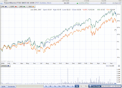
At the 18 month mark, the fundamental-weighted PRF is performing considerably better than the S&P 500 and the Russell 1000. Meanwhile, it has largely kept pace with the Russell 1000 Value Index. The following chart reveals the annualized rates of return over the 18-month period beginning from the launch of the PRF exchange traded fund on December 20, 2005:

As of the close of trading on June 20, 2007, fundamental indexing has provided a slight-to-good advantage over the other established indices.
Other Fundamental-Weighted Index News
Back in April, Charles Schwab announced that it would offer three new open-end mutual funds in the U.S. based upon the fundamental-weighted indexing concept developed by Rob Arnott, with Schwab calling it a "better mousetrap."
That "better mousetrap" is being disputed by some of the investing world's heaviest hitters, and is now being examined more closely. (Follow the links for more details!)
And for a quick who's who of who's involved in the debate (aside from Charles Schwab, Rob Arnott and, well, us....), on the institutional side, a number of firms such as Vanguard and Barclays have offered criticism, index fund pioneer Jack Bogle, and a number of academics have also weighed in, or will be soon, including Princeton's Burton Malkiel, Harvard's Andre Perold, Wharton's Jeremy Siegel, and Nobel prize winner Henry Markowitz (of modern portfolio theory fame.)
Previously on Political Calculations
- Fundamental Indexing: Market Wrap for Year 1
When PRF turned one year old, we marked the occassion by comparing against the market capitalization-weighted funds that would seem to be the most similar.
- Are Fundamental ETFs Worth Their Premium?
The fees being charged by brokerage houses are higher than those of regular index funds. Here, we examined whether the improved returns are justifying the higher expenses for investors. (The answer as of this writing still appears to be "Yes.")
- Where Are the Fundamental ETFs?
We first checked in on the performance of the PRF fundamental-weighted ETF against the major stock indices at the ETF's 6-month old mark.
- Indexing Fundamentals
We first explored the fundamental-weighted index fund concept in this post. Essential reading for the basic background!
Labels: investing
What wisdom can we learn from the past titans of industry? Better yet, what could we learn from the not-so-great among the CEOs of the past? To find out, we've drawn a random sampling of almost-great business knowledge from Simpson's quotations*. Why you ask? We don't know - it just seemed like a good idea at the time.
Market research can establish beyond the shadow of a doubt that the egg is a sad and sorry product and that it obviously will not continue to sell. Because after all, eggs won’t stand up by themselves, they roll too easily, are too easily broken, require special packaging, look alike, are difficult to open, won’t stack on the shelf.
- Robert Pliskin
Vice President, Benton & Bowles
In fact, the only good thing about eggs is that the producers work for chicken feed....
It is our job to make women unhappy with what they have.
- B. Earl Puckett
President, Allied Stores
Because, as men already know, they're not unhappy enough with what they have already.
We hope this car will be less labor intensive, less material intensive, less everything intensive than anything we have done before.
- Roger B. Smith
Chairman, General Motors, on GM's new Saturn in 1985
As it happened, GM's Saturn proved to also be less sales intensive and less profit intensive than just about anything GM did before, so it appears to have wildly surpassed Roger Smith's grandest ambitions....
Smell that! That’s gasoline you smell in there. You can’t buy any perfume in the world that smells as sweet.
- William K. Whiteford
Chairman, Gulf Corporation
And at today's price of roughly $3.00 per U.S. gallon, it's a bargain compared to other perfumes! Let's get Earl Puckett working on this one right away!
People want economy and they will pay any price to get it.
- Lee Iacocca
Ford VP and future CEO of Chrysler, in 1974
Now, if only they could buy it from a U.S. automaker....
* That's James B. Simpson's Contemporary Quotations. Homer J. Simpson's contemporary quotations are quite, quite different....
Labels: random thoughts
 We have incorporated some minor revisions that Standard & Poor had made to its dividend and earnings data for the S&P 500 index (going back to September 2004) into our signature tool for providing historical S&P 500 returns: The S&P 500 at Your Fingertips!
But, that's not the big news! In making these revisions, we realized we could make some pretty accurate short term projections of these values, which means that we're no longer held for S&P to update their data each quarter! That means that we can now update our tool with the most recent month's market data when the Bureau of Labor Statistics releases their inflation data on the third week of each month.
That means that you can go use our tool to find historic market returns for any month from January 1871 through May 2007, right now! For those who hate clicking through, here's the quick summary:
January 1871 through May 2007: For those with really long term investment horizons, the S&P 500 returned 2.28% before reinvesting dividends and after adjusting for an inflation rate of 2.09%. Reinvesting dividends increases the inflation-adjusted really, really, really long term annualized rate of return to 7.11%!
May 2006 through May 2007: For those who like year over year returns, an investment in the S&P 500 in May 2006 returned an inflation-adjusted 16.37% with full reinvestment of dividends in the one year period. Inflation clocked in at 2.69% over this period.
January 2007 through May 2007: Finally, for those who like their data as Year-To-Date, an inflation-adjusted, full dividend reinvested investment in the S&P 500 in January has produced an annualized rate of return of 12.56%. The annualized rate of inflation is something to behold however, as it registered a level of 8.42% for the period from January through May 2007.
 Welcome to this Saturday, June 23, 2007 edition of On the Moneyed Midways, the blogosphere's only review of the best posts from the week's best major business and money-related blog carnivals!
Every week, we scan through hundreds of blog posts contributed to dozens of money and business-related blog carnivals, seeking out the very best posts in each carnival. The best post we find wins the title of being The Best Post of the Week, Anywhere!(TM) Post that rank very highly are awarded the title of being Absolutely essential reading!(TM)
Except this week, that is! This week we're offering a double issue, as we missed posting an edition for last week. That means that we've picked out two posts as being "The Best Post of the Week, Anywhere!.
Sadly though, that doesn't mean that we're offering twice as many posts, as far too many carnival hosts these past two weeks were apparently on summer autopilot. How can we tell? The Blog Carnival-generated boilerplate format that goes as follows:
BLOGGER NAME presents POST TITLE posted at BLOG NAME [OPTIONAL], saying "BLAH BLAH BLAH". [/OPTIONAL]
You get the idea. They might be the best posts in the world, but we'll never know as the carnival host has provided no compelling reason to read them (and probably hasn't themselves!)
Meanwhile, you'll find the most compelling posts we found in the past two weeks that were awaiting you below....
| On the Moneyed Midways for June 23, 2007 | |||
|---|---|---|---|
| Carnival | Post | Blog | Comments |
| Carnival of Debt Reduction | Finding the Joy in Frugality | David on Finance | How do you change from a childhood and adolescence where money equals gratification to become an adult who can live "without being overshadowed by debt?" David tells his story.... |
| Carnival of Debt Reduction | Advice from a Billionaire | Stewart Hsu | What advice do you think you might get from a billionaire? Stewart Hsu shares his notes of what he found out in a recent encounter. |
| Carnival of Fraud | How Marketing Can Destroy Sales Trust | Trusted Advisor | Charles H. Green shows how the marketing directive to "sell on message" is widening the trust gap between people and the politicians, public relation departments and pharmaceutical companies held under the marketer's sway. |
| Carnival of Real Estate | Bay Area Price Reductions Heat Map | Altos Research Real Estate Insights | Michael Simonsen of Altos Research graphically shows how much and where the housing market in and around San Francisco has cooled the most. Very cool! |
| Carnival of Real Estate | The Transparent Broker | Comitini.com | Peter Comitini tackles the reasons why real estate brokers should blog, in the first Best Post of the Week, Anywhere! |
| Carnival of the Capitalists | Irrelevant, but Frustrating | InsureBlog | Hank Stern tells the story of how a GE product perfectly solved a problem he had, and then how GE scotched the goodwill they had created through the company's poor customer service. |
| Carnival of the Capitalists | Why the Poor Are Crazy to Save Money | SavingAdvice | Did you know the government provides powerful incentives for the poor to NOT save? Jeffrey Strain uncovers the sad truth! Absolutely essential reading! |
| Cavalcade of Risk | WSJ: Consumers Having a Tough Time with HSAs | Cato @ Liberty | Michael Cannon observes the problems with Health Savings Accounts noted by the WSJ and identifies how they might be repaired. |
| Cavalcade of Risk | Wall Street Jounral Sends Shockwaves Through the Health Insurance Markets with the Headline "Health Savings Plans Start to Falter" | Health Care Policy and Marketplace Review | Robert Laszewski reviews the WSJ article that found low satisfaction with Health Savings Plans, arguing that "they were a silly idea in the first place." |
| Festival of Stocks | Unintended Consequences of the Ethanol Boom | SelfInvestors | What could be wrong with having the government increase the subsidies for producing ethanol? Tate Dwinnell discusses how the invisible hand of supply and demand is reacting against the heavy hand of federal handouts to Big Corn in the other Best Post of the Week, Anywhere! |
| Festival of Stocks | Net/Nets Any Good? And Where Are They All? | Vale Tudo Investing | Can you get hedge fund returns without owning hedge funds? Bryan Moore reports on a study of a portfolio that using mutual funds that follow hedge fund style investing strategies. |
| Personal Growth Carnival | Success Begins With You | The Air | "What are you willing to do for success?" "Are you willing to fail for success?" Nik Agarwall leads a post that's Absolutely essential reading with these questions (and more!) |
| Real Estate Investing | Is Flipping Houses Investing Or Speculating? | The Dough Roller | The Dough Roller defines the difference between what is speculation and what is investing when it comes to the real estate market. |
| Real Estate Investing | This Could Save You Thousands of Dollars When Buying or Selling a House - The C.L.U.E. Report | Debt Free | If you're buying an existing house, you might want to get a C.L.U.E.! Why? So you can get all the information about any insurance claims made for the property! |
| Small Business Issues | Why You Would Be VERY Wise To Start a Business While you Still Have Your Day Job | Starting a Small Home Business | Stacey Derbenshire argues that starting a business while you are still working at your day job is a very important part of your retirement strategy. |
Previous Editions
- OMM's Running Index for 2007
- The Best Blogs Found in 2006 (and our full 2006 index)!
Labels: carnival

Did we mention that this celebration is almost always scheduled on a day the employees would normally be off-work?
So there has to be a powerful motivating factor for so many employees to attend the company picnic every year. We don't really have any evidence to support this, but we personally believe that powerful motivating factor is "free beer."
But that leads to an ethical dilemma. Since you as an employee are going to be observed in this activity by both your bosses and your co-workers, it might not be a good idea to have as much beer as you can drink, even if it is "free." After all, you might end up saying or doing things that will come back to haunt you in more ways than we can count.
So how many beers should you have at the company picnic?
The good news is that Geek Logik author Garth Sundem has already balanced the important factors that can affect your decision of when to say when in a mathematical equation. Our tool below puts it all together for you and finds where you should draw the line.
Garth Sundem explains the dynamics of the math behind this tool:
The most important factor is how many drinks the boss has - if he is doing tequila shooters, this releases many of the constraints you might otherwise feel. Additionally, if you don't have to be alert tomorrow or if you don't like the job much anyway, you might consider tying one on.
The complex variable in this equation is your current standing in the company - to exceed your recommended daily drink allowance, you need either very strong standing (because your reputation can handle it) or very low standing (because at that point, who cares?), with those in the middle of the spectrum maintaining sobriety.
Keep in mind, the number you get from this equation is only a suggested maximum, and, like the speed limit, you are not compelled to actually meet this maximum. And speaking of driving - this equation assumes that someone sober is driving you home.
Labels: food, geek logik, tool
 Tim Haab of Environmental Economics had too much time on his hands recently, so he worked out the math for determining just how much hypermilers value their lives.
At least, those hypermilers who attempt to increase the gas mileage of their cars by driving really, really closely behind large trucks to cut down on the mileage-robbing wind resistance of highway speed driving - a practice known in racing circles as drafting.
Fans of the Discovery Channel's MythBusters series will recognize drafting as the myth taken on by the show's build team, who provided the empirical data for the increases in gas mileage that come from trailing a semi-truck at distances from a slightly too close 100 feet to an entirely too close 10 feet. [Not to mention to an insanely too close 2 feet separation!]
In any case, we've combined our model of the MythBusters' data with a slightly tweaked version of Tim's math in the tool below, in which we find out what statistical value hypermilers are placing on their lives when they go extreme tailgating at 55 miles per hour.
We ran our default numbers above for a 100 foot trailing distance and a 10 foot trailing distance. Trailing 100 feet behind a semi at 55 miles per hour, the hypermiler is effectively valuing the remaining years of their life at $263,500.38. Trailing at 10 feet, the hypermiler is indicating that they place of their life at $176,226.92, more than $87,000 less.
Conclusion: the stupider the things you do, the less valuable you are!
Editor's Note: We shouldn't have to say this, but if you're drafting behind big rigs at highway speeds, you are, in Tim's immortal words, "an a$$h@!& driver."
What will be the effect of the retirement of income earners in the baby boom generation upon the distribution of income in the U.S.?
Today, we're going to do a back-of-the-envelope analysis as part of a thought experiment to take a stab at foreseeing the future!
We'll start with the number of registered births for each of our birth decades, and find the percentage of income earners making between $0 and $95,000 in 2005 with respect to that number. The table below shows our initial results:
| Percentage of Income Earners by Age Group for 2005 | ||||
|---|---|---|---|---|
| Birth Decade | 2005 Age Group | Registered Births | Number of Income Earners | Ratio of Income Earners to Registered Births (%) |
| 1930-1939 | Age 65 to 74 | 24,374,000 | 17,958,307 | 73.7% |
| 1940-1949 | Age 55 to 64 | 31,666,000 | 25,410,246 | 80.2% |
| 1950-1959 | Age 45 to 54 | 40,530,000 | 35,723,625 | 88.1% |
| 1960-1969 | Age 35 to 44 | 38,808,409 | 36,606,962 | 94.3% |
| 1970-1979 | Age 25 to 34 | 33,308,985 | 33,986,844 | 102.0% |
| 1980-1989 | Age 15 to 24 | 37,507,107 | 27,243,902 | 72.6% |
| 1930-1989 | Age 15 to 74 | 206,194,501 | 176,929,886 | 85.8% |
For this analysis, we'll assume that these percentages representing the ratio of income earners to registered births will stay constant over the next 10 years for each of the age groups:
| Projecting the Number of Income Earners for 2015 | ||||
|---|---|---|---|---|
| Birth Decade | 2015 Age Group | Registered Births | 2005 Ratio of Income Earners | 2015 Number of Income Earners |
| 1940-1949 | Age 65 to 74 | 31,666,000 | 73.7% | 23,330,916 |
| 1950-1959 | Age 55 to 64 | 40,530,000 | 80.2% | 32,523,125 |
| 1960-1969 | Age 45 to 54 | 38,808,409 | 88.1% | 34,206,194 |
| 1970-1979 | Age 35 to 44 | 33,308,985 | 94.3% | 31,419,498 |
| 1980-1989 | Age 25 to 34 | 37,507,107 | 102.0% | 38,270,400 |
| 1990-1999 | Age 15 to 24 | 39,860,087 | 72.6% | 28,953,028 |
| 1940-1999 | Age 15 to 74 | 221,680,588 | 85.8% | 188,703,161 |
So, we have projected the number of income earners increasing by 6.7% from 176,929,886 in 2005 to 188,703,162 in 2015.
Now, the next table shows the percentage changes in the number of income earners for each of our age groups from 2005 to our projected numbers in 2015:
| Percentage Change from 2005 to 2015 for Number of Income Earners in Age Range | ||
|---|---|---|
| Birth Decade | 2015 Age Range | Percentage Change from 2005 |
| 1940-1949 | Age 65-74 | +29.9% |
| 1950-1959 | Age 55-64 | +28.0% |
| 1960-1969 | Age 45-54 | -4.2% |
| 1970-1979 | Age 35-44 | -14.2% |
| 1980-1989 | Age 25-34 | +12.6% |
| 1990-1999 | Age 15-24 | +6.3% |
| 1940-1999 | Age 15-74 | +6.7% |
In the table above, we see massive increases for the age ranges associated with the transition from working life and incomes to retirement incomes. Since this represents the upcoming retirement of the baby boom generation, let's consider what this will mean for the distribution of income in the United States.
In this next part of our analysis, we'll assume that the number of individuals in each age group for every $100 increment from $0 to $95,000 in 2004 U.S. dollars changes by the percentage given in the table above, and that there is no other shift in the distribution of income for each age range (no upward shifting of income for increased education level, etc.). In other words, the percentile distribution of income will not be changed.
The following chart reflects what happens when we add up the number of individuals at each income interval and age range:

This chart demonstrates that the number of low end income earners can be expected to go up substantially over the next 10 years, compared to the number of high end income earners. The following chart shows the projected percentage changes for our back-of-the-envelope analysis:
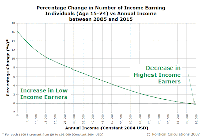
Even though the number of income earners at nearly all levels increased, the greatest increase occurred at the lowest end of the income spectrum. Once again, this effect is purely due to the age distribution of the income earners we're examining, as we have not altered the percentile distribution of income from 2005's level at all.
All this previous analysis holds true only if the same percentage of income earners to registered births holds constant from 2005 to 2015. But, if the ratio of income-earners to registered births for each age range were to change from 2005's level, this may well have a profound effect upon the percentile distribution of income, even if all other factors (such as level of education) remain unchanged.
For example, if we have a larger percentage of baby boomers opting to work longer, thereby delaying their transition to retirement income levels, the effect will be to shift the overall distribution of income in the U.S. toward higher income levels.
Likewise, if a higher percentage of baby boomers retire by 2015 compared to 2005's retirees, reducing the percentage of income-earners to registered births, the overall distribution of income in the U.S. will shift toward lower levels.
Certainly food for thought!
Previously on Political Calculations
- A Confluence of Factors in U.S. Income Distribution - Our wrap-up of our series on the distribution of income!
- The Big Picture: Shifting Incomes from 1995 to 2005 - We found that income inequality actually DECREASED from 1995 to 2005!
- Percentage Changes in Income Distribution from 1995 to 2005 - Where the biggest changes in the distribution of income happened (by age group!)
- Generations, Part Deux - Why did we choose 1995 and 2005 as the years we examined?
- Income/Age Percentiles in Pictures - How income shifted on a percentile basis between 1995 and 2005 for each age group.
- Comparing the U.S. Distribution of Income by Age Group and Year - Our tool that let's you do our math for comparing between our years of interest!
- Distributing Income by Age Group in the US: Ten Years Older - Each of our age groups cover a 10 year span. That means we can look at how a younger group's income distribution in 1995 became the next 10-year older group's income distribution in 2005!
- Estimating the U.S. Distribution of Income by Age - Our first tool which only extracts samples from our data model.
- The Shifting Demographics of Age and Income - our first comparison between 1995 and 2005 that showed dramatic shifts in how the distribution of income changed between those two years.
- Income/Age Demographic Snapshots of 1995 and 2005 - a bar chart comparison of the median incomes per age group of the two years.
- Raking It In: The Baby Boomers from 1995 to 2005 - here, we showed that the baby boom generation moved into the peak earning years for U.S. individuals.
- The Distribution of Income Earners by Age Group for 1995 and 2005 - in this post, we presented our foundational results of the income distributions we determined for each of our age groups.
- Changing Apples into Oranges - A discussion of how we developed the math behind our income distribution models (plus, a blind alley we started to go down!)
- 1995 U.S. Individual Income by Age Group Data
- The Distribution of Income by Age in 1995
- Income Distribution Percentages by Age in the U.S. (2005)
- Peak Earning Years for U.S. Individuals (2005)
- The Distribution of Income by Age in the U.S. (2005)
- Generations - Our series started with a pretty straightforward look at the number of people born into each generation in the U.S.
Update (21 June 2007): Given the heavy interest from this post's being featured on The Consumerist, we added links to the rest of our series on how the distribution of income has shifted in the U.S. from 1995 to 2005!
Labels: demographics, income, income distribution
The bad news: We won't have an edition of On the Moneyed Midways this week.
The good news: We'll have a double issue next week!
In the meantime: Why not catch up with the best posts of the business end of the blogosphere?. See if you can guess who's currently on track to win The Best Post of the Year, Anywhere!(TM)
Labels: carnival
A major shift is underway in shaping how income is distributed among the members of the U.S. workforce. In our previous analysis, we've shown that in the ten years from 1995 to 2005, the ranks of the lowest income earners have dwindled while the ranks of the middle and high income earners have increased.
Why?
In the time from 1995 to 2005, several major factors have influenced the distribution of income within the United States, each of which may have contributed to the shift for income-earners away from the low end of the income spectrum to the middle and high end. The likely suspects include:
- Low Unemployment
- Increased Immigration
- Increasing Level of Education
- Generational Changes in Workforce Composition
We'll briefly explore each of these factors.
Low Unemployment
The period from 1995 to 2005 marks a period in which the rate of unemployment has trended downward for our snapshot years of 1995 and 2005. The chart below shows the monthly level of the U.S. civilian unemployment rate from January 1948 through May 2007, as well as its average level of 5.6% over this time. The standard deviation of the unemployment rate is 1.5%, which is represented by the red dashed lines on the chart.

We've added information to the chart showing the rate of inflation at the beginning and end of both 1994 and 2004 [1], which covers the period captured by the Current Population Surveys from which we drew our income data. We find that the rate of unemployment decreased substantially over the course of both years, with 1994 seeing unemployment decrease from 6.6% at the beginning of the year to 5.5% in December and 2004 seeing unemployment decrease from 5.7% in January to 5.4% at the end of that year.
We find that the average rate of unemployment for each year to be 6.1% in 1994 and 5.5% in 2004.
While 2004's lower average rate of unemployment may help account in part for the latter year's higher overall number of income-earners, there's little within these figures that would account for the large shift we observed in the distribution of individual income in the U.S. If anything, we would anticipate higher number of income earners at all levels, rather than a decrease in the numbers of the lowest income earners and an increase in the number of higher income earners.
Low rates of unemployment do not explain the observed shift in income distribution.
Increased Immigration
We added increased immigration to our list of possible explanations for the shift in individual incomes after discovering that the number of income-earners within the Age 25-34 group for 2005 (or in other words, those born in the years from 1970 to 1979) exceeded the number of registered births in the U.S. for those years.
The only way that can happen is if significant numbers of immigrants are added to the U.S. income-earner pool, so we chose to look at the impact of the foreign-born upon the distribution of income in the U.S.
The problem though is that immigrants to the U.S. in this period earn substantially less that their native-born income-earning counterparts. So much so, that an increase in the number of immigrants would disproportionately increase the numbers of the lowest income earners, opposite to what we have seen.
As a result, we can rule out increased numbers of immigrants as a reason for the shift we've observed in the distribution of annual incomes earned from $0 to $95,000 (in 2004 U.S. dollars) in the U.S.
Increasing Level of Education
Education can play a big role in determining an individual's potential to earn high incomes. The chart we've included above is taken from the July 2002 U.S. Census report The Big Payoff: Educational Attainment and Synthetic Estimates of Work-Life Earnings, which demonstrates how increased levels of education correspond with higher incomes throughout an individual's income-earning years.
But are more Americans becoming more educated? According to economists Gary Becker and Kevin Murphy, the answer is yes. In the years from 1994 to 2004, the percentage of individuals in each year aged 20-25 with at least some college increased, as did the premium in income one could expect from having more education.
In terms of how income is distributed among the U.S. working population, an increase in the number of individuals with more education should produce the two-pronged effect of decreasing the number of low income earners while increasing the number of higher income earners over time.
This kind of shift in income distribution is, in fact, the pattern we observe in our data for U.S. income earners Aged 15-74 as a whole, as well as for the Age 15-24, 25-34, 35-44 and 45-54 groups over the period from 1995 to 2005, as the younger, relatively more educated group displaced the older, slightly less well educated group.
This effect appears to have the greatest effect at the low end of the income spectrum, but has little effect at the highest end, especially as those who would otherwise occupy the lowest income levels would appear to gain the most from their investment in additional education. We note with interest the breadth of age-ranges across which this effect occurs, which coincides with significant increases in the number of older, non-traditional students pursuing post-secondary education (who now make up roughly three-quarters of higher education students.)
Generational Changes in Workforce Composition
The number of individuals available to be income-earners in any year within a nation is largely determined by the number of people of working age who are born in that nation combined with the number of working age immigrants, and deducting any emigrants from that total. As the U.S. has not experienced any significant emigration in its population in the years from 1995 to 2005, we may discount this factor. Having already discounted the immigration portion of the puzzle in producing the effect we have observed, significant changes in the number of native-born income earners may have a very large effect upon the distribution of income.
We observed this effect in how the distribution of income changes as those born in a given decade grew 10 years older from 1995 to 2005. As each younger age group in 1995 became the next older age group in 2005, significant shifts in income distribution coincided as individuals leave school for full-time work, gain experience, retire from working, or otherwise enter, leave or change their position within the workforce.
What matters here is the size of the native-born age group. The table below provides the number of registered births in the U.S. for each decade, as well as the age group for those born within a given decade for 1994 and 2004:
| Number of U.S. Registered Births by Decade | ||||
|---|---|---|---|---|
| Birth Decade | Age Group in 1994 | Age Group in 2004 | Registered Births | Percentage Change from Previous Birth Decade |
| 1920-1929 | Age 65 to 74 | Age 75 to 84 | 28,582,000 | N/A |
| 1930-1939 | Age 55 to 64 | Age 65 to 74 | 24,374,000 | -14.7% |
| 1940-1949 | Age 45 to 54 | Age 55 to 64 | 31,666,000 | +29.9% |
| 1950-1959 | Age 35 to 44 | Age 45 to 54 | 40,530,000 | +28.0% |
| 1960-1969 | Age 25 to 34 | Age 35 to 44 | 38,808,409 | -4.2% |
| 1970-1979 | Age 15 to 24 | Age 25 to 34 | 33,308,985 | -14.2% |
| 1980-1989 | Age 5 to 14 | Age 15 to 24 | 37,507,107 | +12.6% |
| 1990-1999 | Age -5 to 4 | Age 5 to 14 | 39,860,087 | +6.3% |
In going from 1995 to 2005, we found that the size of each birth decade cohort has a significant effect upon the number of income earners at every income level. This effect is most easily seen in the percentage changes from 1995 to 2005 in the number of income earners coinciding with the baby boom generation.
The Effects of Generational Change
Here, we see both leading and trailing effects as income earners born in the midst of the post World War II baby boom displace the smaller numbers of income earners of previous years (1995's Age 35-44 becoming 2005's Age 45-54) and in turn are displaced by smaller numbers of income earners in following years (1995's Age 25-34 becoming 2005's Age 35-44, shown below.)
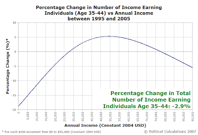
This chart spans a unique transition for the U.S. In 1995, the Age 35-44 group was entirely made up by members of the baby boom generation. More significantly, the distribution of the numbers of individuals within this group were heavily weighted toward the youngest members (the growing surge of the baby boomers.)
As this group was displaced by 2005's Age 35-44 group, the distribution of the number of individuals within this group became heavily weighted toward the oldest members (the tail end of the baby boom generation.)
A Confluence of Factors
More significantly, this chart shows the confluence of the two major factors affecting the distribution of income in the U.S. In looking at the percentage changes from 1995 to 2005 in the distribution of income for the income earners born in the 1950s, we see that these individuals have a symmetric distribution across our income spectrum.
However, in the chart above, we do not see such symmetric changes in the distribution of income. Instead, we find that the distribution is skewed so that there are fewer low income earners and more middle and high end income earners than might be expected.
We believe this is the effect of having the income earners born in the 1950s being displaced in this age range by the slightly more educated income earners born in the 1960s.
The Future
We'll conclude our series with a look at what these changes mean for the future next week!
Previously on Political Calculations
- The Big Picture: Shifting Incomes from 1995 to 2005
- Percentage Changes in Income Distribution from 1995 to 2005
- Generations, Part Deux
- Income/Age Percentiles in Pictures
- Comparing the U.S. Distribution of Income by Age Group and Year
- Distributing Income by Age Group in the US: Ten Years Older
- Estimating the U.S. Distribution of Income by Age
- The Shifting Demographics of Age and Income
- Income/Age Demographic Snapshots of 1995 and 2005
- Raking It In: The Baby Boomers from 1995 to 2005
- The Distribution of Income Earners by Age Group for 1995 and 2005
- Changing Apples into Oranges
- 1995 U.S. Individual Income by Age Group Data
- The Distribution of Income by Age in 1995
- Income Distribution Percentages by Age in the U.S. (2005)
- Peak Earning Years for U.S. Individuals (2005)
- The Distribution of Income by Age in the U.S. (2005)
- Generations
Notes
1. The data we've used in our analysis is drawn from the Current Population Surveys published in March 1995 and March 2005. Since these surveys capture data collected during the previous year, we're really looking at income earners in 1994 and 2004 respectively, although we have consistently referred to the year in which the survey was released throughout our analysis. This is also why we have adjusted all our figures for inflation to be in constant 2004 U.S. dollars, which allows for a direct comparison of the distribution of income in both years.
Labels: demographics, income, income distribution, unemployment
We've been looking at how the distribution of income has shifted from 1995 to 2005 by age group, but until today, we haven't put the whole picture together for all U.S. income-earners in those years.
Our first chart is the result of adding up all the individuals in each of our working age groups (individuals aged 15-24, 25-34, 35-44, 45-54, 55-64 and 65-74) that we modeled for each $100 interval from $0 to $95,000 in constant, inflation-adjusted, 2004 U.S. dollars:

This chart reveals that the number of the lowest income earning individuals (those earning anywhere from $0 to $15,300) in the U.S. has decreased in the period from 1995 to 2005. Meanwhile, we see that the number of income earners at all annual incomes above $15,300 increased in raw numbers substantially, except at the very highest levels.
Our next chart shows the magnitude of the shift in the distribution from low to middle and higher incomes, as the percentage change in the number of income-earners at each annual income level:
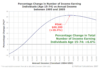
In addition to confirming the large percentage reductions in the number of the lowest income earners (below $15,300) that was clearly evident in the previous chart, we find that the number of income earners increased substantially at all income levels above $15,300, with the greatest percentage gain from 1995 to 2005 being centered at $66,200.
This is partly due to the relatively low numbers of higher income earners in 1995 - it doesn't take a large numerical gain to create a high percentage gain at the upper end of the income spectrum. (You can extract the numbers directly using our comparison tool!)
Our final chart represents the changes in the percentile distribution of our Age 15-74 income earners from 1995 to 2005. Here, the 100th percentile consists of everybody within our age groups who earned between $0 and $95,000 in inflation-adjusted 2004 U.S. dollars for both years:
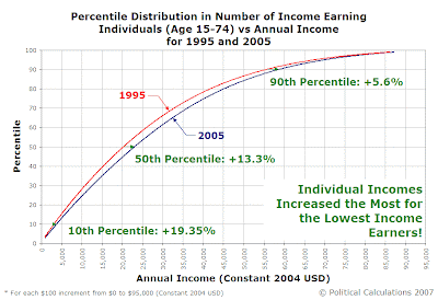
This chart demonstrates that while all the percentile levels in 2005 are ahead of the equivalent 1995 levels, the greatest gains occurred at the lowest end of the income spectrum.
In other words, income inequality among individual working-age income-earners decreased from 1995 to 2005.
Previously on Political Calculations
- Percentage Changes in Income Distribution from 1995 to 2005
- Generations, Part Deux
- Income/Age Percentiles in Pictures
- Comparing the U.S. Distribution of Income by Age Group and Year
- Distributing Income by Age Group in the US: Ten Years Older
- Estimating the U.S. Distribution of Income by Age
- The Shifting Demographics of Age and Income
- Income/Age Demographic Snapshots of 1995 and 2005
- Raking It In: The Baby Boomers from 1995 to 2005
- The Distribution of Income Earners by Age Group for 1995 and 2005
- Changing Apples into Oranges
- 1995 U.S. Individual Income by Age Group Data
- The Distribution of Income by Age in 1995
- Income Distribution Percentages by Age in the U.S. (2005)
- Peak Earning Years for U.S. Individuals (2005)
- The Distribution of Income by Age in the U.S. (2005)
- Generations
Labels: demographics, income, income distribution, income inequality
How have the number of income earners by age group changed on a percentage basis at all inflation-adjusted income levels from 1995 to 2005? We'll show you in our last look at each of our age brackets!
Age 15-24
The following chart shows the percentage changes in annual income earned by members of Age 15-24 group from 1995 to 2005:
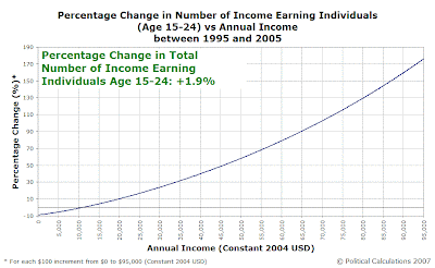
The percentage growth of high income earners in this chart looks much more impressive than it actually is. Income-earners in this youngest age group are heavily weighted to the low end of the scale, with very few individuals at the highest income levels (this accounts for the outsized gains at this end of the chart - it doesn't take a huge change in the number of individuals to score a high percentage!)
Age 25-34
Let's next look at the percentage changes for the Age 25-34 group - our first post-school years and now full-time income-earning group:

Here, we see the effects of a massive decrease in the number of low income earners. Meanwhile, like the Age 15-24 group, the positive percentage changes at the high end of the income scale are amplified by the relatively low numbers of individuals earning these incomes.
Age 35-44
The chart for the Age 34-44 group shows a somewhat different pattern:

In this chart, we not only see decreases in the number of low-end income earners, but also the numbers of high-end income earners as well.
Note: This chart spans a unique transition for the U.S. In 1995, the Age 35-44 group was entirely made up by members of the baby boom generation. More significantly, the distribution of the numbers of individuals within this group were heavily weighted toward the youngest members (the growing surge of the baby boomers.)
As this group was displaced by 2005's Age 35-44 group, the distribution of the number of individuals within this group became heavily weighted toward the oldest members (the tail end of the baby boom generation.)
This chart also reflects the convergence of several major factors driving how income is distributed among income earners within the U.S., which we'll expand upon later....
Age 45-54
The following chart shows massive percentage increases at all levels - driven by the surging numbers of the baby boom generation:

As we've noted before, the ages from 45 through 54 represent the peak income earning years for individuals in the United States, and seeing the raw numbers of the largest generation in the U.S. move fully into these years is something to behold.
Age 55-64
The Age 55-64 group saw a disproportionate number of high income earners join its ranks in the period from 1995 to 2005:

The reason why goes straight back to demographics - this age group includes the leading edge of the baby boom generation!
Age 65-74
We'll wrap up with the percentage changes in income earners for the retirement ages of 64 through 74:
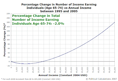
In a lot of ways, the 65-74 age group is a lot like the Age 15-24 group - it's heavily weighted toward lower incomes. Like the Age 15-24 group, the high percentage increases at higher incomes is largely an artifact of the low numbers of individuals earning these incomes (this group is, after all, largely retired from the U.S. workforce!)
Previously on Political Calculations
- Generations, Part Deux
- Income/Age Percentiles in Pictures
- Comparing the U.S. Distribution of Income by Age Group and Year
- Distributing Income by Age Grop in the US: Ten Years Older
- Estimating the U.S. Distribution of Income by Age
- The Shifting Demographics of Age and Income
- Income/Age Demographic Snapshots of 1995 and 2005
- Raking It In: The Baby Boomers from 1995 to 2005
- The Distribution of Income Earners by Age Group for 1995 and 2005
- Changing Apples into Oranges
- 1995 U.S. Individual Income by Age Group Data
- The Distribution of Income by Age in 1995
- Income Distribution Percentages by Age in the U.S. (2005)
- Peak Earning Years for U.S. Individuals (2005)
- The Distribution of Income by Age in the U.S. (2005)
- Generations
Labels: demographics, income, income distribution
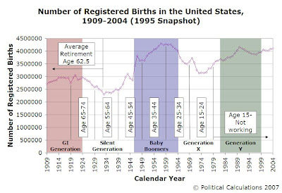
We're going to wrap up our look at how the distribution of inflation-adjusted income has changed by age group from 1995 to 2005 this week, so we thought we'd start the grand finale by looking again at the generational demographics of our income earners in both years.
We'll first look at where our age groups fall among the United States' generational divisions, going by registered births, first for 1995:
And 10 years later:

So, right off the bat you can see that there's a strong generational component behind the number of potential income-earners in each age group as they advance through time, which is in good part reflected by the number of registered births within our age ranges. The following table adds up the birth numbers, and lists the number of income earners between $0 and $95,000 (in 2004 US dollars) for both 1995 and 2005:
| Age Groups and Income Earners for 1995 and 2005 | |||||
|---|---|---|---|---|---|
| Birth Year Range | Age Group in 1994 | Age Group in 2004 | Registered Births | 1994 Income Earners | 2004 Income Earners |
| 1920-1929 | Age 65-74 | Over Age 75 | 28,582,000 | 18,320,102 | N/A |
| 1930-1939 | Age 55-64 | Age 65-74 | 24,374,000 | 18,468,644 | 17,958,307 |
| 1940-1949 | Age 45-54 | Age 55-64 | 31,666,000 | 26,741,030 | 25,410,246 |
| 1950-1959 | Age 35-44 | Age 45-54 | 40,530,000 | 37,690,015 | 35,723,625 |
| 1960-1969 | Age 25-34 | Age 35-44 | 38,808,409 | 37,991,817 | 36,606,962 |
| 1970-1979 | Age 15-24 | Age 25-34 | 33,308,985 | 26,725,555 | 33,986,844 |
| 1980-1989 | Under Age 15 | Age 15-24 | 37,507,107 | N/A | 27,243,902 |
Note: We highlighted the number of income earners for birth years between 1970 and 1979 (specifically, 2005's Age 25-34), since this figure is actually larger than the number of registered births for those years. That's very likely a lot of immigration inflating the numbers of the domestic U.S. workforce!
In addition to the provided data, the table above also indicates why we selected the years of 1995 and 2005 for our income distribution analysis. Since the Current Population Surveys released in March of these years really reflect data captured for 1994 and 2004, and given how the CPS provides its age group breakdowns beginning with Age 15-24 (and so on), these years made a nice natural fit with the decades for when people within each age group were born!
And you thought we were going completely at random!...
Previously on Political Calculations
- Income/Age Percentiles in Pictures
- Comparing the U.S. Distribution of Income by Age Group and Year
- Distributing Income by Age Grop in the US: Ten Years Older
- Estimating the U.S. Distribution of Income by Age
- The Shifting Demographics of Age and Income
- Income/Age Demographic Snapshots of 1995 and 2005
- Raking It In: The Baby Boomers from 1995 to 2005
- The Distribution of Income Earners by Age Group for 1995 and 2005
- Changing Apples into Oranges
- 1995 U.S. Individual Income by Age Group Data
- The Distribution of Income by Age in 1995
- Income Distribution Percentages by Age in the U.S. (2005)
- Peak Earning Years for U.S. Individuals (2005)
- The Distribution of Income by Age in the U.S. (2005)
- Generations
Labels: demographics
Welcome to the blogosphere's toolchest! Here, unlike other blogs dedicated to analyzing current events, we create easy-to-use, simple tools to do the math related to them so you can get in on the action too! If you would like to learn more about these tools, or if you would like to contribute ideas to develop for this blog, please e-mail us at:
ironman at politicalcalculations
Thanks in advance!
Closing values for previous trading day.
This site is primarily powered by:
CSS Validation
RSS Site Feed
JavaScript
The tools on this site are built using JavaScript. If you would like to learn more, one of the best free resources on the web is available at W3Schools.com.