Hugo Gernsback was a certified, bonafide, totally legitimate inventor with 21 patents to his credit issued between the years 1920 and 1955. He's also the man who, as a publisher, established science fiction as an independent literary form - today's annual Hugo awards for science fiction literature are named after him.
But it is his conceptual creation of "The Isolator", an invention he doesn't appear to have ever sought to patent, but which he wrote about in the July 1925 edition of Science and Invention magazine, that has caught the Invention in Everything team's fancy today because of its potential to solve a very different problem than the one for which it was conceived.
The problem it could solve today is of how workers can go back on the job without having to worry about exposure to the coronavirus from other potentially infected workers. But as you can see in the following illustration, it would also solve the problem of helping workers focus on their work without distraction, which is the problem the invention was originally intended to address.
The modern day equivalent of Gernsback's Isolator is the Powered Air Purifying Respirator (PAPR), a technology that featured prominently in a recent edition of IIE.
In fact, if you want to make a modern day Isolator, start with a PAPR, attach a cover with eye holes to the face mask to narrow the field of view to be similar to Gernsback's original Isolator concept, and there's no reason for today's workers cannot both go back to work and be more productive with the technology we have on hand today!
Like many inventive geniuses, Gernsback's vision was far, far ahead of his time. Perhaps that time has finally arrived.
Inventions in Everything: The 2020 Archive
If you're just catching up with Inventions in Everything, follow the links below to our features in 2020, the first of which will also take you to links to our older stories of ingenuity and invention.
- Inventions in Everything: Space Age Baby Delivery
- Inventions in Everything: Mechanical Trees
- Inventions in Everything: Coffee Cups for Astronauts
- Inventions in Everything: PAPR Machines Made With Truck Parts
- Inventions in Everything: Opening Doors in a Virus Filled World
- Inventions in Everything: Has the Time of the Isolator Finally Arrived?
Labels: coronavirus, technology
Here's what we know today, or rather, here's what the U.S. Centers for Disease Control and Prevention (CDC) knows today about how deadly the COVID-19 coronavirus infections are:
These figures are the CDC's best estimates as of 20 May 2020, which specifically apply for those who have developed COVID-19 symptoms, which according to the CDC as of 13 May 2020, can include the following:
- Fever or chills
- Cough
- Shortness of breath or difficulty breathing
- Fatigue
- Muscle or body aches
- Headache
- New loss of taste or smell
- Sore throat
- Congestion or running nose
- Nausea or vomiting
- Diarrhea
After being exposed to a sufficient amount of the SARS-CoV-2 coronavirus to become infected, early studies have indicated COVID-19 symptoms can take anywhere from 4.5 to 5.8 days to develop, with a median incubation period of 5.1 days. According to the CDC, about 35% of those who become infected may never develop any of the listed symptoms associated with COVID-19. The coronavirus infection does not appear to be deadly for those who do not develop symptoms.
After the onset of symptoms, another early study found the typical period before death might occur could range between 15 and 22 days, with a median period of 18.5 days. Combined, that gives an estimated period from infectious exposure to death of anywhere from 20 to 28 days, with a median period of about 25 days. The incidence of death from COVID-19 increases with age, though most who have succumbed to it have also had underlying medical conditions, which may be more strongly correlated with an increased risk of death than age alone.
If the indicated percentages in the chart seem lower than what you may have expected, that is because the analyses on which the CDC is relying to produce these estimates is considering its spread among the whole population. Many of the deaths that have driven news headlines have occurred within especially vulnerable subsets of the population, such as among elderly Americans who reside in nursing homes or other long term care facilities, for whom coronavirus infections combined with the health conditions that led them to live in such facilities in the first place greatly increases their risk of death far above what would apply for the general population.
Compared to seasonal influenza, such as experienced during the 2018-2019 flu season, COVID-19 is about four times as deadly overall. While it is not anywhere as apparently deadly as previously thought, the available evidence indicates the SARS-CoV-2 coronavirus is still more deadly than a typical flu virus.
Updates
28 May 2020: All this assumes the CDC's figures are valid, but there are unanswered questions about how the CDC's analysts have determined them. Follow this space for developments in that story.
29 May 2020: Could the CDC's "best estimates" have come from mixing the results of viral and antibody tests in their assessments of how deadly the SARS-CoV-2 coronavirus is?
“You’ve got to be kidding me,” Ashish Jha, the K. T. Li Professor of Global Health at Harvard and the director of the Harvard Global Health Institute, told us when we described what the CDC was doing. “How could the CDC make that mistake? This is a mess.”
Viral tests, taken by nose swab or saliva sample, look for direct evidence of a coronavirus infection. They are considered the gold standard for diagnosing someone with COVID-19, the disease caused by the virus: State governments consider a positive viral test to be the only way to confirm a case of COVID-19. Antibody tests, by contrast, use blood samples to look for biological signals that a person has been exposed to the virus in the past.
A negative test result means something different for each test. If somebody tests negative on a viral test, a doctor can be relatively confident that they are not sick right now; if somebody tests negative on an antibody test, they have probably never been infected with or exposed to the coronavirus. (Or they may have been given a false result—antibody tests are notoriously less accurate on an individual level than viral tests.) The problem is that the CDC is clumping negative results from both tests together in its public reporting.
Mixing the two tests makes it much harder to understand the meaning of positive tests, and it clouds important information about the U.S. response to the pandemic, Jha said. “The viral testing is to understand how many people are getting infected, while antibody testing is like looking in the rearview mirror. The two tests are totally different signals,” he told us. By combining the two types of results, the CDC has made them both “uninterpretable,” he said.
Suddenly, we're having to go from covering apparently very good news to instead covering a new potential scandal for the CDC, on top of their previous self-inflicted black eye in failing to develop effective viral tests in the first place.
29 May 2020: According to this report, the current best estimate outside of the CDC for the Symptomatic Case Fatality Ratio of COVID-19 falls somewhere between 0.5% and 1.0%.
22 June 2020: More than a month after it set its "best estimate" of COVID-19's symptomatic fatality ratio at 0.4% for the general population, the CDC hasn't updated it. Originally, the CDC had estimated a value of 0.25% for this figure on 31 March 2020, which the agency increased to 0.5% on 14 April 2020, before revising it again to the present level of 0.4% on 20 May 2020.
23 June 2020: The American Council on Science and Health has posted the latest available COVID-19 death totals by age group from the CDC, and also provides additional estimates for the infection fatality ratio for COVID-19. The CDC's best estimate above falls within the ranges for the other estimates, though at their lower end.
28 July 2020: We're late in addressing it here, but the CDC has revised its estimate of the SARS-CoV-2 coronavirus' Infection Fatality Rate. On 10 July 2020, they indicated the rate was 0.6%, which would correspond to a Symptomatic Case Fatality Rate of just under 1.1%. You can find more of our previous coverage on this revision here.
Previously on Political Calculations
Labels: coronavirus, health, risk
The coronavirus epidemic in the U.S. is again trending downward in its eleventh week. As the volume of testing has continued to expand, averaging 386,000 tests per day during the last week, the rate at which Americans are testing positive for coronavirus infections is reaching new lows. Meanwhile, the incidence of both newly confirmed cases and deaths across the nation has continued to fall since peaking on 10 April 2020 and 21 April 2020 respectively as the spread of infections slows at the national level.
You can see these trends in the latest update to the United States' full tower chart through 26 May 2020, along with the nation's daily test positivity rate (the percentage of positive test results among all tests reported), and also the nation's rolling 7-day average of newly confirmed cases and deaths per day. Click on the image below to access a much larger version of the three charts together:
Most states and territories within the U.S. have seen improving trends during the past week, with two big exceptions. The following skyline tower chart illustrates the progression of COVID-19 cases for U.S. states and territories from 10 March 2020 through 26 May 2020, where we can see the slowing rate of growth of confirmed cases in the individual state or territory tower charts, and for the states and territories that report the number of recovered patients, in the transition from orange to lighter green shading in their tower charts.
Each of these charts span the same period of time and the width of each corresponds to 2.0% of each state or territory's population, making it very easy to see which states and territories have been most impacted and which have been the least impacted through the first eleven weeks of the coronavirus epidemic in the U.S., especially since we've ranked them from the highest percentage of infection within the state's population to the least as you read from left-to-right, top-to-bottom.
This is the fifth week in a row we haven't needed to adjust the horizontal scale of the charts to accommodate larger percentages of confirmed cases within the populations of the most affected states and territories, which is another very positive indication.
Two Big Exceptions at the State Level
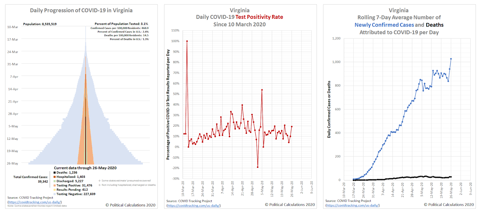
While most states and territories are reporting falling levels of newly confirmed coronavirus cases, there are two big exceptions: Virginia, which we spotlighted last week as part of a regional hotspot in the U.S., and California.
Let's look at Virginia's data, where you would never know from looking at the trends in its data that the state has been on a lockdown ordered by its governor, a medical doctor, since 30 March 2020.
One contributing factor may be recent example set by the state's governor, who just mandated Virginia residents wear face masks indoors while in public venues, after ignoring his own recommendations for the public while going to the beach over the weekend.
The other problem state is the most populous: California. Here are the charts showing its trends:
California was the first state to impose a statewide lockdown order, with its governor acting to do so back on 19 March 2020, with the action extending those of local governments who locked down their jurisdictions following the detection of one of the nation's earliest known outbreaks of SARS-CoV-2 coronavirus infections.
That early action contrasts with the very delayed response of New York's governor, whose actions through March 2020 all but ensured the exponential spread of the virus in the northeastern United States, which is reflected in the states that rank at the top of the skyline tower chart.
That's also what makes California's now rising trend of newly confirmed coronavirus cases somewhat surprising in the epidemic's eleventh week. California's neighboring states are each seeing falling numbers of new infections, while California's continues to rise. A recent report attributes the rising trend of new cases in Orange County to the virus' penetration into state-run or regulated institutions, such as jails and nursing homes, which are characterized by people living in close proximity to one another, making infections more likely to spread among the resident populations once they are established. California's early actions may have slowed that penetration, but now that the virus is establishing itself in these places, it is spreading rapidly.
But it's not just Orange County seeing an increasing trend within California. Los Angeles County is experiencing a far larger increase, but with less explanation for why that might be. It's an area that certainly bears watching.
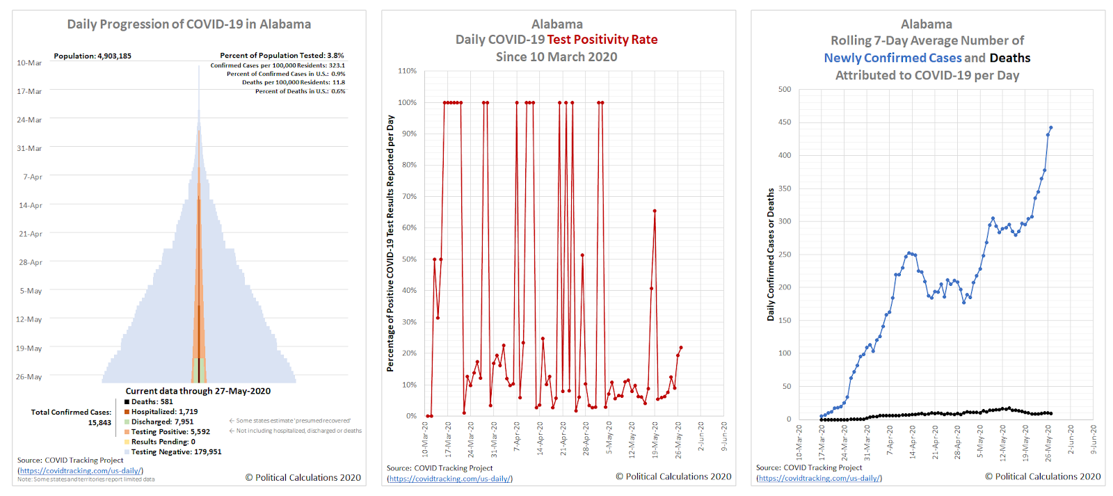
Update 27 May 2020: Let's add Alabama to the list of states now seeing a surge in cases:
Compared to California and Virginia, its overall numbers are much lower, but that's still an adverse trend.
Previously on Political Calculations
Here's our series of articles featuring the data visualization we've developed to track the spread and severity of the coronavirus epidemic at the state level, which we've listed in reverse chronological order:
- U.S. Sees Widespread Improvements in Coronavirus Epidemic But Develops a New Regional Hotspot
- A Shifting Geography for Coronavirus Cases in the U.S.
- Most States Show Slowing Progression of Coronavirus in Week 8 of Epidemic
- Seven Weeks and One Million Coronavirus Cases Later...
- A Mixed Picture Emerges For Progression of COVID-19 in U.S.
- Signs Of Slowing COVID-19 Spread Among U.S. States
- Visualizing The First Four Weeks Of The Coronavirus Epidemic In The U.S.
- Visualizing the Progression of COVID-19 in the United States
- Introducing Skyline Charts for Tracking Coronavirus Cases in the U.S.
We're also covering the worst-in-the-U.S. situation in the state of New York and why it has been so bad in that state:
- Governor Cuomo and the Coronavirus Models - Recently updated
- COVID-19 In New York - Recently updated
Meanwhile, if you prefer your data in the form of tables presenting numbers and percentages, we also have you covered!
- COVID-19 Coronavirus Cases in the U.S. - Recently updated
- Ranking the World for COVID-19 Coronavirus Cases - Recently updated
Labels: coronavirus, data visualization
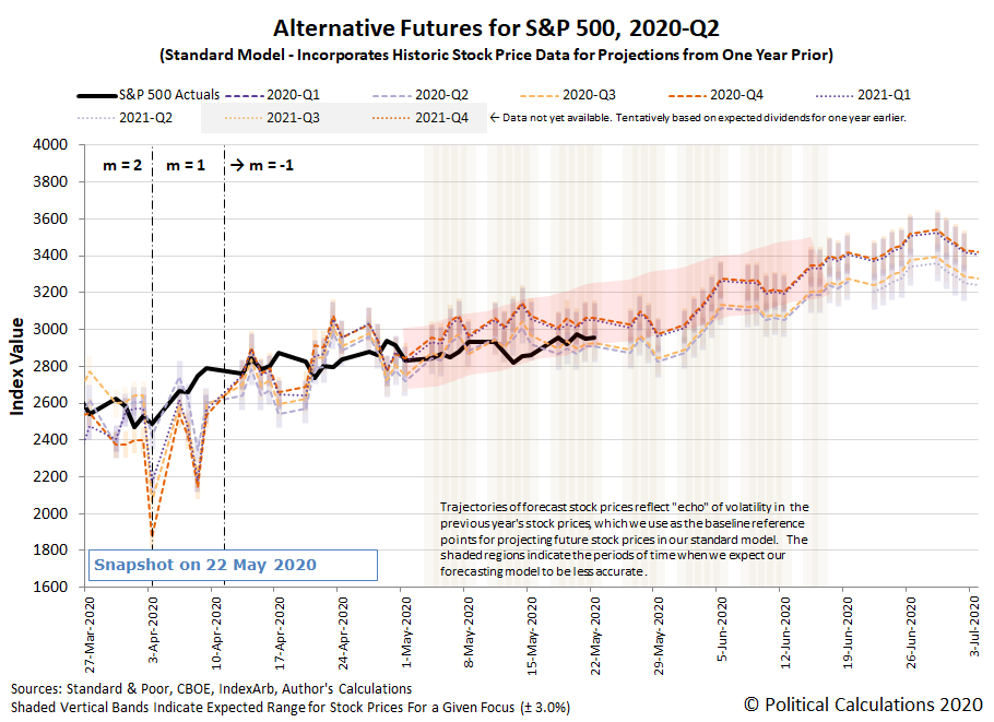
The S&P 500 (Index: SPX) is tracking along the lower end of the redzone forecast range of the alternative futures chart, which assumes investors are looking forward toward 2020-Q4 in setting today's stock prices, and which we suspect also indicates that investors are somewhat backing off the expectation the Fed may institute negative interest rates by that time.
Since the increased potential for negative rates may account for the unprecedented "upside-down" character of how stock prices have been behaving over the last several weeks, we checked in with the CME Group's FedWatch tool to see what it was indicating, where it is currently projecting the Federal Funds Rate will be held at the zero bound range (between 0% and 0.25%) for the indefinate future.
That doesn't mean investors have taken their consideration of negative interest rates in the U.S. off the table. Instead, it means that the CME Group's analysts haven't yet worked out how to adapt its FedWatch Tool to incorporate the possibility of negative rates in its projected probabilities for the future projected level of the Federal Funds Rate. With that limitation, it may be more accurate to read the 100% probabilities the FedWatch Tool is currently indicating as saying that investors are giving 100% odds the Federal Funds Rate being set at the zero bound range or less in the indefinite future.
Now, what if that limitation didn't exist and the FedWatch Tool is capturing that U.S. interest rates will be held at or just above the 0% level? How might that different expectation affect the projections for the S&P 500 provided by the dividend futures-based model?
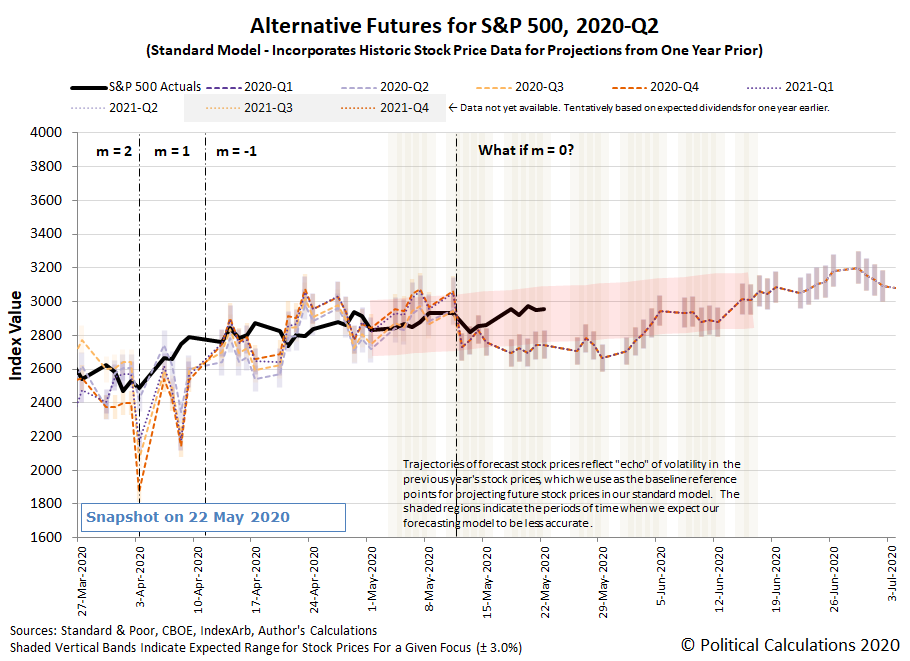
Assuming that outcome would correspond with the model's amplification factor being set so that m = 0, the following alternative futures chart shows the model's projection of the future for the S&P 500 in that scenario:
In this chart, we assume the shift of the amplification factor, m, to be zero to align with the increased expectation of zero bound interest rates in the U.S. took place beginning on 12 May 2020. We see that shift corresponds with the projected trajectory of the redzone forecast range shifting downward after that point, which corresponds to a less robust path forward for the S&P 500 than under the scenario where investors were factoring in a strong likelihood of negative interest rates prior to that point in time.
It also shifts the redzone forecast in a way that centers it closer to the actual trajectory of the S&P 500 in the period since 12 May 2020 where we've applied these assumptions, though we could also say that the value of the amplification factor m is currently falling somewhere between 0 and -1.
The stream of news from the week ending 22 May 2020 confirms that the prospects for negative interest rates continued to be very much on the mind of investors, though they are mixed in with other market-moving headlines from the week that was.
- Monday, 18 May 2020
- Daily signs and portents for the U.S. economy:
- Oil jumps to two-month high on easing lockdowns, positive vaccine results
- What did eight weeks and $3 trillion buy the U.S. in the fight against coronavirus?
- Fed's Powell: CARES Act 'critical' to support for economy
- Bigger stimulus developing in China:
- Bigger stimulus finally develops in the Eurozone:
- France, Germany propose 500 billion euro EU Recovery Fund
- Germany to shoulder 27% of Recovery Fund money: Merkel
- ECB's Lagarde cheers Franco-German EU recovery fund plan
- S&P 500 closes at 10-week high on vaccine hopes, stimulus pledge
- Tuesday, 19 May 2020
- Daily signs and portents for the U.S. economy:
- Mnuchin says seeing large second quarter unemployment, negative economic data
- U.S. crude strengthens as certain stimulus measures to continue
- Coronavirus hammers U.S. homebuilding; permits tumble
- Bigger stimulus finally coming out in Eurozone:
- Fed minions make predictions but admit they are 'flying blind':
- Fed's Rosengren says central bank would consider lowering minimum loan amount on Main Street facility
- Fed's Rosengren says U.S. unemployment rate could remain at double-digit levels by end of year
- Fed's Barkin says officials still 'riding blind' in assessing reopening: interview
- U.S. stimulus taking an old tact, and a new one:
- Mnuchin defends U.S. fiscal response to pandemic, seeks payroll loan extension
- Trump signs order directing agencies to cut federal regulations
- S&P stumbles as Moderna sinks on report questioning trial results
- Wednesday, 20 May 2020
- Daily signs and portents for the U.S. economy:
- Oil rises on lower U.S. stocks, firmer demand
- U.S. borrowers in hardship jumped in April: study
- Fed debates longer-term crisis-fighting plan, minutes show
- Bigger trouble developing in Eurozone, Canada:
- Euro zone April inflation revised down to nearly four-year low
- Outlook for European corporate profits worsens further
- Canada's annual inflation rate goes negative for first time since 2009
- Bigger stimulus under negotiation in U.S., corporate bailouts developing in Japan and Eurozone:
- U.S. Senator Rubio sees consensus for extending paycheck loan program
- Japan's LDP advocates stimulus, with funding for firms to survive COVID-19 recession
- European companies told to come clean on coronavirus pain
- Negative interest rates becoming relevant where they've never been seen before:
- Britain borrows at negative interest rate for first time
- Explainer: How do negative interest rates work?
- Wall Street climbs on stimulus hopes, as S&P, Nasdaq hit multi-month highs
- Thursday, 21 May 2020
- Daily signs and portents for the U.S. economy:
- Brent at highest since March on U.S. stock draw, recovering demand
- While U.S. economy slides, heartland auto dealers cry out for more trucks
- U.S. leveraged loan defaults at six-year high as coronavirus hits businesses
- U.S. existing home sales post largest decline in nearly 10 years
- Mnuchin sees U.S. economic bottom in second quarter, 'gigantic increase' fourth quarter
- Bigger trouble developing in Japan, United Kingdom. Plus now there are locusts:
- Japan exports fall most since 2009 as pandemic wipes out global demand
- UK factories report biggest output drop in over 40 years
- World Bank approves record $500 million to battle locust swarms
- Bailouts for businesses developing in the EU, insurers in the U.S.:
- EU mulling solvency aid for firms, commissioner tells Handelsblatt
- U.S. insurers propose taxpayer-funded business-loss coverage for future pandemics
- Fed minions try ruling out negative rates, considering a return financial repression instead:
- NY Fed's Williams says negative rates are not a tool needed now
- Yield curve control a 'natural complement' to some possible Fed tools, Clarida says
- Fed's Bostic: Banks should be preserving as much capital as possible - CNBC
- China buying American ethanol, but Americans won't be buying Chinese stocks....
- China to receive rare U.S. ethanol shipment on Friday: sources
- Senate passes bill that could block Chinese firms from U.S. securities exchanges
- Stocks slip on U.S.-China tensions; oil rises to 2-1/2-month high
- Friday, 22 May 2020
- Daily signs and portents for the U.S. economy:
- Oil falls on China-U.S. tensions, energy demand doubts
- All 50 U.S. states shed jobs in April: Labor Department
- Bigger trouble developing in Africa, China, Germany:
- S&P forecasts South Africa's economy to shrink 4.5% in 2020
- China drops mention of GDP goal as parliament opens, virus slams economy
- German tax revenues fall 25.3% due to coronavirus pandemic
- Method of bigger stimulus debated in in Eurozone, Japan fears deflation:
- ECB minutes hint at more policy easing in June
- EU 'frugals' formally oppose Merkel-Macron plan for coronavirus grants
- Japan launches its version of Fed's 'Main Street' scheme as deflation returns
- ECB minion concerned about inflation being too low in Eurozone:
- Wall Street ends mixed as China-U.S. tensions weight
The Big Picture's Barry Ritholtz has a short list of the positives and negatives that he found lurking in the week's markets and economy news.
Highly influential mathematician John Conway passed away recently from complications related to COVID-19 at age 82. Conway had significant achievements across many fields of math, from the discovery of "monstrous moonshine" in number theory, to developing the notation used by mathematicians working to understand knots, extremely large numbers, and geometric polyhedrons, among others.
John Conway was also a lover and inventor of games, using them to explore mathematical relationships. One of the games he invented became especially popular, coming at the dawn of computer gaming: the Game of Life. Although he developed it on paper, the rules proved to be relatively easy to code, which made it very popular among programmers. In 2014, he described the thinking that underlies the game in the following 11 minute Numberphile video:
The game is interesting because there are certain initial patterns that you can set that will mutate into other patterns, eventually stagnating, or perhaps oscillating between two different states, or eventually disappearing and dying off. Some however will live up to the name of the game and replicate themselves!
If you want to play, we've adapted code developed by Rob Tomlin so you can explore the complexity that might emerge from a simple pattern you click into existence within the following grid of squares, before starting the reproduction cycle. If you're accessing this article on a site that republishes our RSS news feed, please click through to our site to play the game on your device.
Click on table cells to toggle the cells as alive or dead.
Click the Start Reproducing button to Start and Stop
Because Conway's achievements go far beyond just the Game of Life, we'll close with him discussing Life, Death and the Monster from the same interview about his career as a mathematician and what he hoped to see in his remaining years:
It would be very cool to see any of those things happen in our lifetimes!
Labels: math
New York has been, far and away, the worst state to be in for the coronavirus epidemic in the United States. Especially for elderly Americans with illnesses that require they live in nursing homes or long term care facilities, where one single poorly-considered policy implemented after the state's governor and public health officials began to panic when the going got tough has needlessly cost thousands of lives.
New Jersey has been the second most-impacted state or territory in the U.S. thanks to its proximity to New York City, which has been the nation's epicenter for the coronavirus epidemic. In fact, you can tell which counties of New Jersey can be considered to be part of New York City's greater metropolitan area just from a map indicating the number of confirmed COVID-19 cases have been recorded in each.
That close proximity to New York means that New Jersey has shared a very similar experience in dealing with the SARS-CoV-2 coronavirus. The following charts show the daily progression of the epidemic in New Jersey, the amount and results of medical testing in the state, and also the rolling 7-day totals for newly confirmed cases and deaths, all of which have generally tracked along with New York, although in the third, rightmost chart, you can see New Jersey was more successful in flattening its curve compared with how the spread of the coronavirus played out in New York.
While New Jersey's situation has improved significantly from what it was just three weeks ago, it too has seen an outsized number of deaths occurring in the state's nursing homes and long term care facilities, with numbers similar to New York. Unfortunately, the reason that is the case is the same: New Jersey Governor Phil Murphy and the state's public health officials copied what Governor Cuomo did in New York in mandating the state's nursing homes and long term care facilities admit patients known to be infected with the SARS-CoV-2 coronavirus, which ran rampant through the nursing homes, needlessly contributing to the premature deaths of thousands of New Jersey's most vulnerable residents. The following chart shows the results of that policy has been since it was adopted on 31 March 2020:
The question is why did New Jersey Governor Phil Murphy copy such a misguided policy? When the state of New York's Department of Health issued its infamous directive on 25 March 2020, the policy was slammed in the pages of the Wall Street Journal the next day. Less noticed however was a press release issued by the Committee to Reduce Infection Deaths on the same day, in which the anti-hospital infection public interest advocacy group also slammed New York's policy, but which cited an example from New Jersey for how the state should work to prevent the spread of coronavirus infections within the state's nursing homes.
Dear RID Friends and Healthcare Providers:
The State of New York is adopting a dangerous new policy requiring nursing homes to blindly admit patients infected with Covid-19, according to a new report in The Wall Street Journal.
Cuomo's edict, if reported correctly, dooms thousands of elderly to illness and likely death. Basic infection control says to identify and contain. Cuomo's edict does the opposite: conceal and spread. It spreads the infections to nursing homes and forcing homes to operate in the blind, not even knowing which incoming patients are coronavirus carriers.
A model of what should be done is how CareOne, an exemplary facility in New Jersey, knowingly emptied one of its locations to protect other uninfected residents and then welcomed coronavirus patients from St. Josephs to that facility.
You can find out more about the model New Jersey was setting here. Clearly, something dramatic changed, because just six days later, the Murphy administration issued a directive with the following instruction mandating that nursing homes and long term care facilities in New Jersey to admit patients with contagious coronavirus infections (the underlining is contained in the original document):
No patient/resident shall be denied re-admission or admission to the post-acute care setting solely based on a confirmed diagnosis of COVID-19 … Post-acute care facilities are prohibited from requiring a hospitalized patient/resident who is determined medically stable to be tested for COVID-19 prior to admission or readmission.
What changed? We've pieced together the story as best we can from contemporary reports, where the first indication that Governor Murphy would soon follow Governor Cuomo's bad example came on 28 March 2020, as a number of hospitals in northern New Jersey began to divert, or to not accept, new patients for 4-hour blocks of time because they were either at or near their full capacity.
The timing of these events coincides with the worst case projections the influential Institute for Health Metrics and Evaluation (IHME) has issued for New Jersey, which as in New York, was used by state policymakers to make decisions. In this case, we think those early diversions prompted New Jersey's leaders into thinking they were facing a worst-case scenario. The following chart shows what the IHME's projection for the number of hospital beds above New Jersey's available capacity looked like on 30 March 2020, just before Governor Murphy's administration implemented its policy that would allow hospitals to move as many asymptomatic or partially recovered coronavirus patients as they could to other medical facilities, which in the case of elderly patients, would mean moving them to nursing homes and long term care facilities throughout the state.
So the motive for Governor Murphy's administration to adopt the same policy that Governor Cuomo had less than a week earlier is the same. For Governor Murphy however, the lack of condemnation or criticism for Governor Cuomo's disastrous move other than in the Wall Street Journal cleared a path to act with impunity, where he could safely assume his own deadly action would not be challenged by the nation's media.
To understand what happened, let's take a moment to review the chart showing the 7-day rolling total for new coronavirus cases in New Jersey. On 31 March 2020, the number of confirmed cases was rocketing upward, which would go on to peak at 25,437 new cases per week on 7 April 2020. After that point, the state's curve flattened out under that level for the next three weeks, before the incidence of newly confirmed cases began to fall rapidly after that point.
Within that period, the number of COVID-19 hospitalizations peaked on 14 April 2020, just within the state's available capacity to accommodate these patients at its hospitals, thanks in large part to efforts they had made to expand their capacity in the preceding weeks. In the following chart, we've pieced together the number of New Jersey's long term care facilities that reported housing coronavirus patients at various points throughout the state's coronavirus epidemic from various reports, along with the figures the state's Department of Health began reporting for these facilities on 20 April 2020.
Before Governor Murphy's directive forcing nursing homes to admit infected coronavirus patients on 31 May 2020, 73 long term care facilities in the state reported having infected patients. On 8 April 2020, that figure had risen to 123. Twelve days later, with the number of new coronavirus infections throughout the state reaching and holding near its peak, the state's Department of Health began reporting the number of cases within the state's nursing homes, where that number had skyrocketed to 425 facilities.
That figure has continued to grow, where though 20 May 2020, the New Jersey Department of Health reports a cumulative 529 of the state's nursing homes long term care facilities have housed coronavirus-infected patients.
That outcome did not happen by accident. Nursing homes and long term care facilities are geographically dispersed, where they can be thought of as relatively isolated islands, where an outbreak of infections at one would not travel to others on its own. It took a deliberate policy by the governor and the state's public health officials to make that happen. And once it did, with recently transferred contagious patients exposing nursing home staff members to the infection, who in turn spread it to previously uninfected, but especially vulnerable nursing home residents with fatal effect.
The spread of coronavirus infections within New Jersey nursing homes and long term care facilities resulting from the Murphy administration's policy can be seen in the following chart, where we find from the available data that the number of infections at these facilities begins to take off after 31 March 2020, where by 20 May 2020, New Jersey's nursing homes account for 19% of all confirmed coronavirus cases in the state:
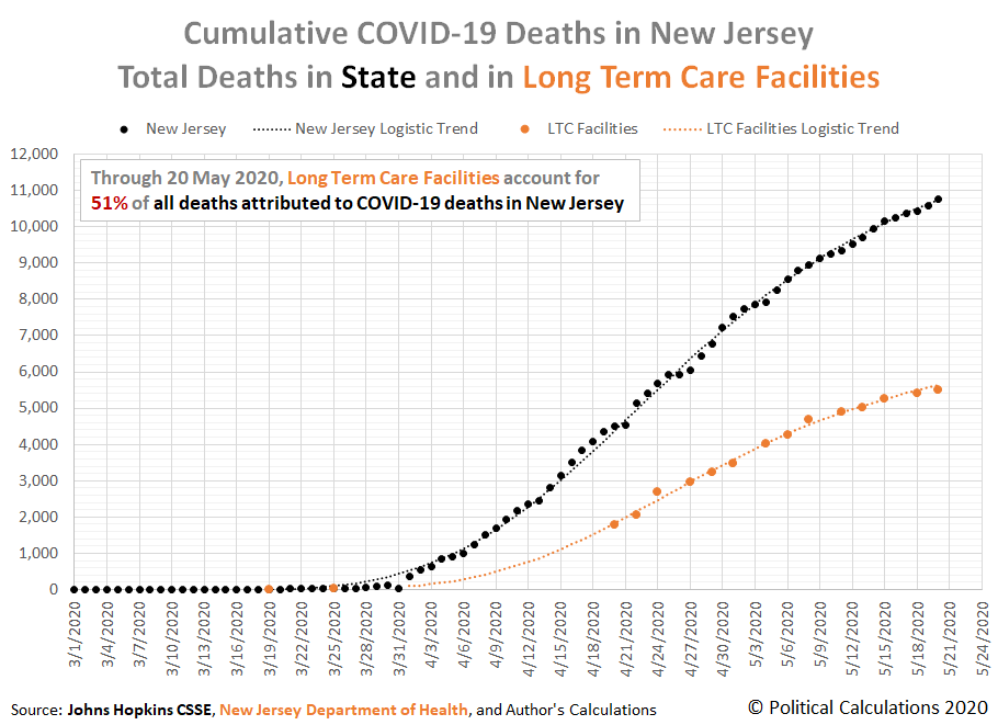
The deadly impact of the Murphy administration's policy can be seen in the next chart, where we find that New Jersey's nursing home residents account for over 51% of the deaths attributed to the COVID-19 coronavirus in New Jersey.
Were any of these nursing home deaths inevitable? It would be fair to assume that whatever portion of coronavirus infections that had made it into the 73 nursing homes that had them before Governor Murphy's policy went into effect on 31 March 2020 would be deadly, but only within those facilities. The Murphy administration's policy expanded the viral risk to hundreds of more facilities, where these COVID-19 attributed deaths could wholly have been avoided. If only Governor Murphy hadn't been a copycat of Governor Cuomo.
References
2019 Novel Coronavirus COVID-19 (2019-nCoV) Data Repository by Johns Hopkins CSSE. CSSE COVID-19 Time Series Data: Confirmed U.S. [CSV File]. Last updated 20 May 2020. Accessed 20 May 2020.
2019 Novel Coronavirus COVID-19 (2019-nCoV) Data Repository by Johns Hopkins CSSE. CSSE COVID-19 Time Series Data: Deaths U.S. [CSV File]. Last updated 20 May 2020. Accessed 20 May 2020.
New Jersey Department of Health. NJ Long Term Care Facilities with COVID-19 Outbreaks. [PDF Document]. Posted: 20-Apr-2020, 22-Apr-2020, 24-Apr-2020, 27-Apr-2020, 29-Apr-2020, 1-May-2020, 4-May-2020, 6-May-2020, 8-May-2020, 11-May-2020, 13-May-2020, 15-May-2020, 18-May-2020, 20-May-2020.
Arco, Matt. Number of coronavirus patients at N.J. hospitals drops to 3-week low with 5th straight day of declines. NJ.com. [Online Article]. 26 April 2020.
Associated Press. New Jersey reports 9 coronavirus deaths; elections postponed. Dayton 24/7 Now. [Online Article]. 19 March 2020.
Associated Press. NJ COVID-19 deaths climb by 17 to 44 in biggest jump yet. APNews.com. [Online Article]. 24 March 2020.
Associated Press. Coronavirus in 43 NJ nursing homes — death toll now at 81. New Jersey 101.5. [Online Article]. 27 March 2020.
Associated Press. 8 nursing home residents die of COVID-19, N.J. mayor says. Philadelphia Tribune. [Online Article]. 30 March 2020.
Broadt, Lisa. 3 deaths, 10 coronavirus cases ID’d at Mount Laurel nursing home. Burlington County Times. [Online Article]. 25 March 2020.
Institute for Health Metrics and Evaluation (IHME). COVID-19 Estimate Downloads. IHME. [Zip File]. 30 March 2020.
Washburn, Lindy. An unseen crisis: Coronavirus deaths mount at NJ nursing homes as virus spreads, staff dwindles. NorthJersey.com. [Online Article]. 8 April 2020.
Labels: coronavirus, health care, politics
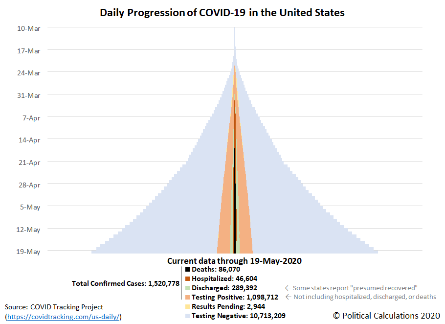
The progression of the coronavirus epidemic in the United States continues to slow, with most states having successfully 'flattened the curve' for the spread of the potentially deadly infection in the last several weeks, with the number of both hospitalizations and deaths attributed to the coronavirus stabilizing. At the same time, testing for the SARS-CoV-2 coronavirus has been growing exponentially.
All of these trends can be seen in the following tower chart, where the expanding light-blue pyramid for negative test results confirms the expansionary growth in the amount of testing since 22 April 2020, the light-orange tower within the light-blue pyramid indicates a slowing rate of growth for positive test results, the growing light-green zone within the light-orange tower indicating the growing number of Americans 'recovering' from the infection, and the dark-orange and black towers at the center of the tower indicating much slower growth in the rate of new hospitalizations and deaths from the viral infection.
That's quite a lot of information to unpack, so let's dig down into the underlying state and territory level data. The following skyline tower chart illustrates the progression of COVID-19 cases for U.S. states and territories from 10 March 2020 through 19 May 2020, where we can see the slowing rate of growth of confirmed cases in the individual state or territory tower charts, and for the states and territories that report the number of recovered patients, in the transition from orange to lighter green shading in their tower charts.
Each of these charts span the same period of time and the width of each corresponds to 2.0% of each state or territory's population, making it very easy to see which states and territories have been most impacted and which have been the least impacted through the first ten weeks of the coronavirus epidemic in the U.S., especially since we've ranked them from the highest percentage of infection within the state's population to the least as you read from left-to-right, top-to-bottom.
Another sign of improvement is that for the fourth week in a row, we haven't needed to adjust the horizontal scale of the charts to accommodate larger percentages of confirmed cases within the populations of the most affected states and territories.
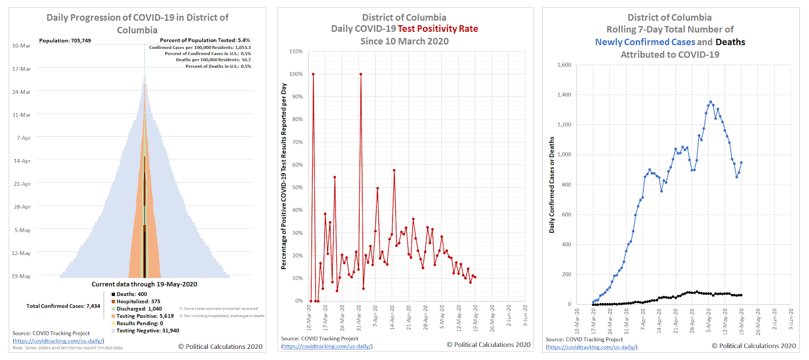
As promised last week, we'll take a closer look at the new regional hotspot for COVID-19 infection that has developed around the nation's capital. Let's start with the District of Columbia, where we'll show its full tower chart, its daily test positivity rate (the percentage of positive tests among all its newly reported test results, and its 7-day rolling total of newly confirmed cases and deaths. Each chart covers the period from 10 March 2020 through 19 May 2020.
Starting with the rightmost chart, the number of newly confirmed cases appears to have peaked in the District of Columbia on 6 May 2020, at 1,355 cases per week. That has since declined to range between 850 and 950 new cases per week during the last several days. The district's test postivity rate has likewise been trending downward in the last two weeks, partly because fewer new cases are being confirmed but also because the amount of coronavirus testing has been increasing, as confirmed in the district's tower chart.
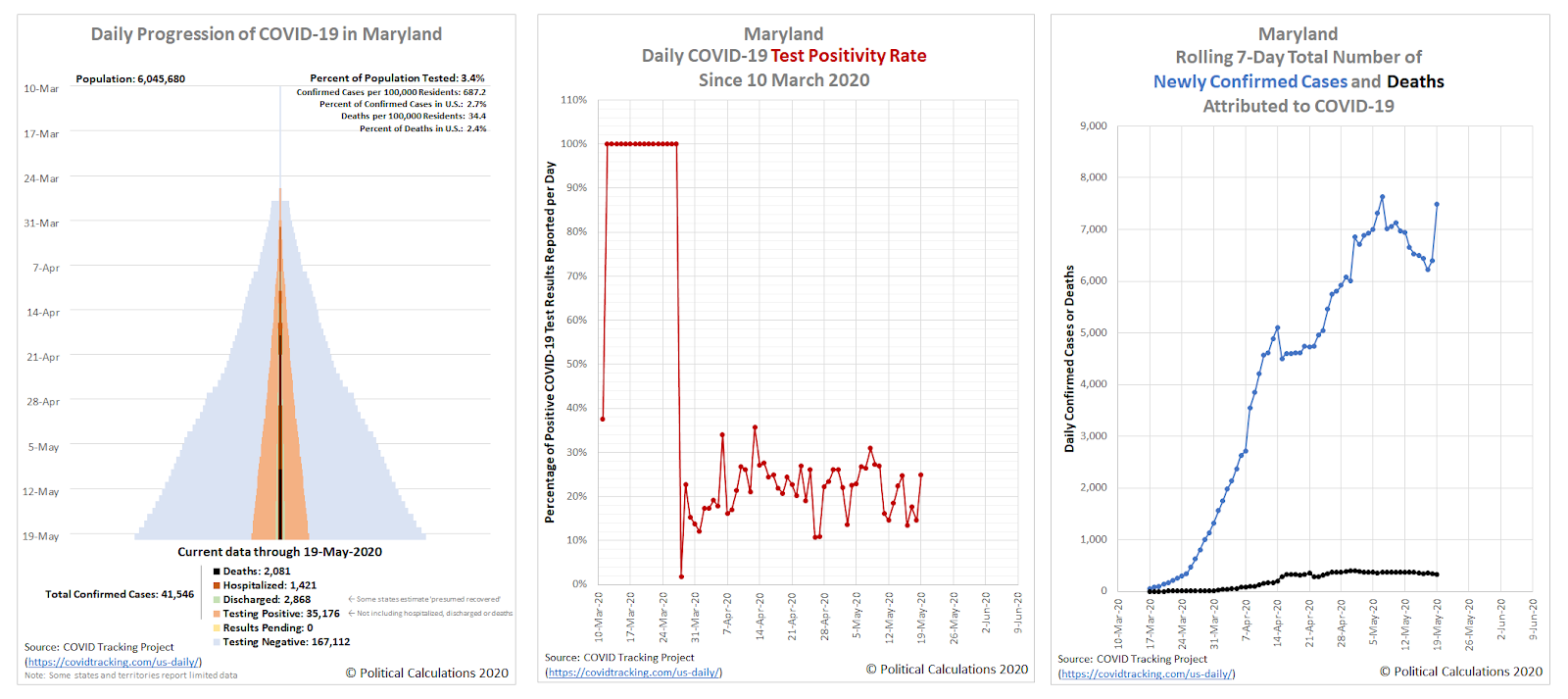
Let's next look at the data for the state of Maryland:
Here, starting again with the rightmost chart, we find a state that is experiencing an increasing rate of coronavirus infections, recording 7,485 per week as of 19 May 2020. The middle chart shows an elevated test positivity rate, ranging between 10% and 31% during the past two weeks, which is the result of two factors: spreading infection and insufficient testing.
Both factors are evident on the tower chart which, though not scaled to population as in the skyline tower charts, is relatively 'skinnier' than the District of Columbia's tower chart.
But as we're about to see, Virginia isn't far behind in becoming a coronavirus hotspot:
Virginia shares all the problems and adverse trends that we described for Maryland, confirming the greater Washington D.C. area as a regional hotspot for coronavirus infections within the U.S.
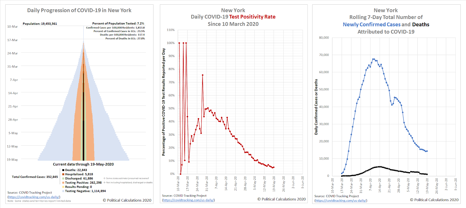
As for the original regional hotspot of New York, here's what its data looks like:
The state appears to be past its peak for both coronavirus infections and deaths attributed to them, but note the vertical scale on its chart for the 7-day rolling totals - it is still recording nearly the same number of new cases as the region of the District of Columbia, Maryland, and Virginia is combined. We've been covering New York's situation separately, where you can find links to our ongoing analysis below.
Previously on Political Calculations
Here's our series of articles featuring the data visualization we've developed to track the spread and severity of the coronavirus epidemic at the state level, which we've listed in reverse chronological order:
- A Shifting Geography for Coronavirus Cases in the U.S.
- Most States Show Slowing Progression of Coronavirus in Week 8 of Epidemic
- Seven Weeks and One Million Coronavirus Cases Later...
- A Mixed Picture Emerges For Progression of COVID-19 in U.S.
- Signs Of Slowing COVID-19 Spread Among U.S. States
- Visualizing The First Four Weeks Of The Coronavirus Epidemic In The U.S.
- Visualizing the Progression of COVID-19 in the United States
- Introducing Skyline Charts for Tracking Coronavirus Cases in the U.S.
We're also covering the worst-in-the-U.S. situation in the state of New York and why it has been so bad in that state:
- Governor Cuomo and the Coronavirus Models - Recently updated
- COVID-19 In New York - Recently updated
Meanwhile, if you prefer your data in the form of tables presenting numbers and percentages, we also have you covered!
- COVID-19 Coronavirus Cases in the U.S. - Recently updated
- Ranking the World for COVID-19 Coronavirus Cases - Recently updated
Labels: coronavirus, data visualization
Welcome to the blogosphere's toolchest! Here, unlike other blogs dedicated to analyzing current events, we create easy-to-use, simple tools to do the math related to them so you can get in on the action too! If you would like to learn more about these tools, or if you would like to contribute ideas to develop for this blog, please e-mail us at:
ironman at politicalcalculations
Thanks in advance!
Closing values for previous trading day.
This site is primarily powered by:
CSS Validation
RSS Site Feed
JavaScript
The tools on this site are built using JavaScript. If you would like to learn more, one of the best free resources on the web is available at W3Schools.com.


