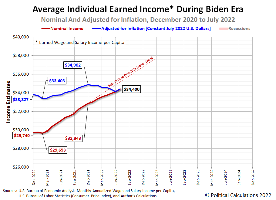
Americans saw both their average nominal and inflation-adjusted income per capita rise for the first time since February in July 2022.
Political Calculations' initial estimate of the average per capita income of Americans in July 2022 is $34,400, a $330 (or nearly 1%) increase from June 2022's estimate of $34,030. The following chart tracking the average individual earned income during the Biden era shows the increase in both nominal and inflation-adjusted terms.
In terms of constant July 2022 U.S. dollars, July 2022's average per capita income of $34,400 falls $502 below December 2021's peak of $34,902. By contrast, nominal average per capita income increased by $1,557 since the end of 2021. That difference means that all of the nominal gain in the average wage and salary income earned by Americans was entirely eroded by inflation during 2022.
We'll be looking at the latest update to the trends for median household income through July 2022 tomorrow.
References
U.S. Bureau of Economic Analysis. Table 2.6. Personal Income and Its Disposition, Monthly, Personal Income and Outlays, Not Seasonally Adjusted, Monthly, Middle of Month. Population. [Online Database (via Federal Reserve Economic Data)]. Last Updated: 26 August 2022. Accessed: 26 August 2022.
U.S. Bureau of Economic Analysis. Table 2.6. Personal Income and Its Disposition, Monthly, Personal Income and Outlays, Not Seasonally Adjusted, Monthly, Middle of Month. Compensation of Employees, Received: Wage and Salary Disbursements. [Online Database (via Federal Reserve Economic Data)]. Last Updated: 26 August 2022. Accessed: 26 August 2022.
U.S. Department of Labor Bureau of Labor Statistics. Consumer Price Index, All Urban Consumers - (CPI-U), U.S. City Average, All Items, 1982-84=100. [Online Database (via Federal Reserve Economic Data)]. Last Updated: 10 August 2022. Accessed: 10 August 2022.
Labels: data visualization, income
How much of the total U.S. stock market owned by Americans and how much is owned by foreign interests?
We found 70 years worth of Federal Reserve data on the U.S. and foreign ownership of corporate equities answering that question, spanning the entire modern era for the U.S. stock market. Our first chart shows the value of those investments on a linear scale from 1 January 1952 through 1 January 2022.
Meanwhile, if you're a fan of logarithmic scale data, follow this link....
One thing that log-scale data cannot do well is visually communicate the relative share of foreign versus U.S. ownership. Our next chart focuses just on the share of ownership to reveal the share of the U.S. stock market owned by foreigners has increased from 1.7% in 1952 to 16.5% in 2022.
The foreign-owned share of U.S. corporate equities peaked at 16.6% on 1 October 2021.
References
Board of Governors of the Federal Reserve System. Rest of the World; U.S. Corporate Equities; Asset, Level. [Online Database]. Last Updated 9 June 2022.
Board of Governors of the Federal Reserve System. All Sectors; U.S. Corporate Equities; Asset, Market Value Levels. [Online Database]. Last Updated 9 June 2022.
Labels: data visualization, market cap, stock market
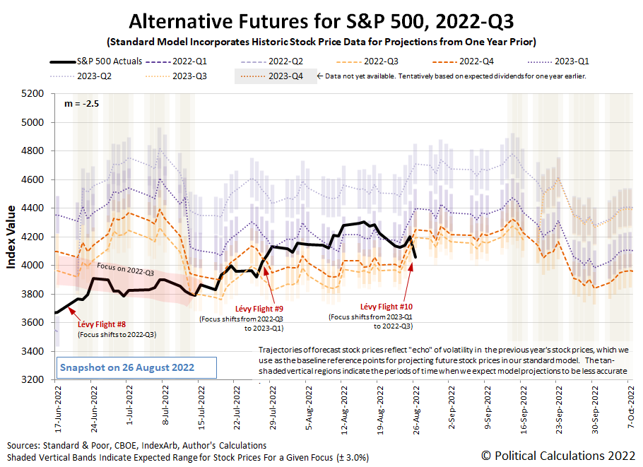
Fed Chair Jerome Powell spoke from the Federal Reserve's annual retreat Jackson Hole on Friday, 26 August 2022. In doing that, he succeeded in sending the S&P 500 (Index: SPX) on its tenth confirmed Lévy flight event of 2022, sending the index down 3.37% to close the week at 4,057.66.
Since it's the tenth Lévy flight event of the year, investors are getting a lot of exposure these high volalilty episodes. For readers who are new to the concept, here's what it means:
- Lévy flights involve large changes in stock prices that occur more often than statistical analysis based on a normal distribution predicts.
- These events coincide with investors shifting their forward-looking focus from one point of time in the future to another.
- How much stock prices change during these events is tied to what the expectations are for dividend growth between these future points in time.
All of which are tied together in the dividend futures-based model we invented to forecast the future for the S&P 500. The alternative futures chart tracks the actual trajectory of the index against the levels it projects it would be for when investors focus their attention upon specific future quarters.
Going into the last trading week, the chart shows investors had been focused on the future quarter of 2023-Q1 in setting current day stock prices. Fed Chair Powell's Jackson Hole speech on Friday, 26 August 2022 however refocused their attention on 2022-Q3 by increasing the uncertainty they have for how much the Fed will change interest rates at its upcoming September meetings.
Our summary of the market-moving headlines of the trading week that was documents how that shift in the forward looking focus developed during the trading week.
- Monday, 22 August 2022
- Fed minions Jackson Hole conference becomes center of investor focus:
- Forecast for Powell's mountain resort trip: High inflation, limited visibility
- Fed to slow to 50 bps hike in September; recession worries grow: Reuters poll
- Inflation hitting hard in Mexico, United Kingdom:
- Mexico's inflation expected to hit 8.51% in first half of August: Reuters poll
- UK inflation to top 18% in early 2023, Citi warns
- Bigger trouble developing in the Eurozone:
- Bigger stimulus developing in China:
- China set to lower lending benchmarks Monday to revive wobbly economy
- Major Chinese banks urged to maintain stable loan growth, central bank says
- China steps up easing, cuts lending benchmarks to revive faltering economy
- BOJ minions see Japan's economy getting worse:
- BOJ seen cutting growth forecasts on soft spending, says ex-central bank executive
- As Japanese manufacturing fades, a factory town fights to stay alive
- Wall Street ends sharply lower on fears of aggressive Fed
- Tuesday, 23 August 2022
- Signs and portents for the U.S. economy:
- U.S. private sector activity contracts again in August, survey shows
- U.S. new home sales tumble to 6-1/2-year low; prices still high
- Fed minions putting bigger rate hikes on the table:
- Two Fed bank boards wanted 100-basis-point discount rate rise in July
- Fed's Kashkari says his biggest fear is inflation will be more persistent
- Bigger trouble developing in the Eurozone, United Kingdom:
- Euro zone business activity contracted again in Aug, outlook bleak
- UK factory output falls for first time since Feb 2021 - CBI
- ECB minions rethinking plan to hike rates:
- Wall Street ends down as investors eye slowing economy
- Wednesday, 24 August 2022
- Signs and portents for the U.S. economy:
- Brent oil climbs above $100 a barrel on potential OPEC cuts
- U.S. new vehicle prices to hit record high despite rising interest rates
- Fed minions get ready to party the only way central bankers can!
- Central bankers head to U.S. mountains with a bad case of inflation reflux
- Investors see no Fed pivot, brace for hawkish Powell message in Jackson Hole
- Bigger trouble, stimulus developing in China:
- China's jobless turn to car boot sales as COVID-hit economy stalls
- China to take more steps to support economy -state media cites cabinet
- Wall Street ends higher, with all eyes on Jackson Hole
- Thursday, 25 August 2022
- Signs and portents for the U.S. economy:
- Revision shows mild U.S. economic contraction in second quarter
- U.S. consumers borrow at record levels as car prices surge - Experian
- Fed minions described as having been wearing kid gloves, trying to shift focus to 2022-Q3:
- Fed officials: no call yet on 50 vs 75 bps rate hike next month
- Fed's Powell leaves kid gloves behind as he saddles up for Jackson Hole
- Fed's Bostic says he's split between 50 bps and 75 bps Sept rise - WSJ
- Fed's George: Too soon to predict size of Sept hike
- Fed's Bullard: Inflation likely to be more persistent than expected
- Fed's Harker: Would like to get rates above 3.4% and 'sit for a while'
- Fed's George: Too soon to predict size of Sept hike
- Bigger trouble developing in Eurozone:
- BOJ minions determined to keep unending stimulus alive:
- ECB minions thinking they may need to think more about inflation:
- Wall Street ends sharply up, fueled by Nvidia and Amazon
- Friday, 26 August 2022
- Signs and portents for the U.S. economy:
- Chief Fed minion Powell predicts pain in fight against inflation, other minions fall in line and promise shallow recession:
- Powell sees pain ahead as Fed sticks to the fast lane to beat inflation
- Fed's Bostic: leaning toward 50 bps hike in Sept -- CNBC
- Fed's Mester sees rates above 4%, says Powell speech 'strong' - BBG TV
- Fed's Harker: Any U.S. recession would be shallow
- Bigger stimulus developing in China:
- Bigger trouble developing in Japan:
- ECB minions thinking more about bigger rate hikes:
- Wall Street ends in a hole after Powell's Wyoming speech
After Fed Chair Jerome Powell got done speaking on Friday, 26 August 2022, the CME Group's FedWatch Tool's projections of the Fed's future interest rate hikes registered big changes in investor expectations, confirming the Lévy flight event resulting from investors resetting their time horizon. Instead of a half point rate hike in September (2022-Q3), the probability of a three-quarter point hike rose over 50% as investors expectations changed for this quarter. Looking further forward in time, that hike would be followed by a half point rate hike in November (2022-Q4), after which, investors think the Fed will hold off on more rate hikes until February 2023 when they anticipate a quarter point rate hike. That will put the Fed's target for the Federal Funds Rate in the 3.75-4.00% range, which is where investors are now expecting the Fed's series of rate hikes will top out.
Meanwhile, the Atlanta Fed's GDPNow tool's forecast for real GDP growth in 2022-Q3 held steady at 1.6%, so we can rule out changes in the outlook for the U.S. economy as a significant contributing factor to what happened with stock prices during the week. What happened was caused by investors drawing in their focus from 2023-Q1 to 2022-Q3 in reaction to Powell's Jackson Hole remarks.
Think about your first apartment. Chances are the first thing you think about your first apartment is that it's small. Really small. Really, really small.
Wouldn't it be nice if you could make it more livable by making seem bigger than it is?
Solving that problem has challenged both inventors and interior designers throughout history. They've tried everything. From folding furniture, to furniture that can be stored or stowed away, to multitasking furniture, it's been tried. And yet, nothing really has worked. Each of these items still have bulk that consumes scarce floor space, even when fully compacted, and requires both effort and coordination to set up, use, and break down again.
That's the situation that inventor William Calderwood confronted in 1989. His innovative solution: furniture that would levitate itself out of the way whenever it wasn't in use! The U.S. Patent Office agreed that his solution was novel, awarding him with U.S. Patent 4,888,836 for his insight. Here's Figure 1 from the patent, showing a lighter-than-air bed in its "not-in-use" position:
Calderwood explains how his invention would be used in the detailed description of the patent:
A person who whishes to use article 10 in a conventional furniture-like manner grasps tether 28 and pulls article 10 downward, toward floor 18. By utilizing article 10 to support the person (see body 12 in FIG. 4), the person in combination with article 10 together exhibit a density greater than the density of air, and the buoyancy effect is then reversed. Consequently, article 10 sinks in the atmosphere until it rests on floor 18. When article 10 is in its sunk position, illustrated by FIG. 4, tether 28 no longer hangs downward but resides substantially horizontal so that it too rests on floor 18. Consequently, article 10 remains stably positioned on floor 18. When body 12 moves away from article 10, article 10 then rises to its levitated position without any effort on the part of its user.
Figure 4 shows Calderwood's lighter-than-air bed in its "in-use" state:
Alas, while we can find examples of all the other kinds of space-saving furniture available for sale, we are unable to find any lighter-than-air furniture products on the market. The closest we could find was inflatable furniture, which is really another type of stow-away furniture product. Sure, you could fill these products with helium (or go full Hindenburg and use hydrogen gas), but since these products weren't designed to be lighter-than-air products, it's unlikely they'll perform as you might desire.
There's also the ceiling factor to consider. To be usable for Calderwood's invention, the space on your ceiling needs to be clear of fixtures that might either pop or impact your floating furniture product. That first interaction with a ceiling fan, for example, could spell the end for your investment in levitating furniture.
In short, while innovative, lighter-than-air furniture has been an unsuccessful product to date. The IIE team hopes its time will come!
From the Inventions in Everything Archives
While you might not yet be able to successfully float your furniture in the air, you can conceivably float your houseplants, be sheltered by a hovering umbrella, or buy furniture that will move itself!
- Houseplants from Avatar
- Inventions in Everything: The Hoverbrella
- Inventions in Everything: The Future of Furniture
You're already living in the IIE world!
Labels: technology
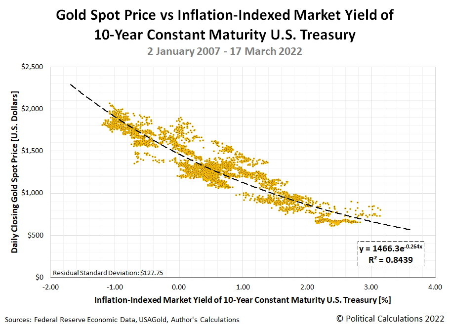
On 16 March 2022, after a nearly a year of letting building inflation in the U.S. go unaddressed, the U.S. Federal Reserve finally decided to do something about it. The Fed announced it would begin hiking interest rates, raising them above the near-zero level it had been maintaining. Coincidentally, a week later, we featured a snapshot of the inverse relationship between the price of gold and the inflation-adjusted yield of the 10-Year Constant Maturity Treasury Bond from 2 January 2007 through 17 March 2022. Here's the chart we featured:
It would be reasonable to expect that as the Fed has continued to hike interest rates, the inflation-adjusted yield of a 10-year U.S. Treasury would rise as well. And sure enough, that is what has happened in the five months since. It would also be reasonable for the price of gold to retrace its path along the curve shown in this chart, falling as real interest rates rise. We can confirm that's happened too. But as we're about to reveal in the next chart, by nowhere near as much as the relationship established in the previous 15 years implies:
The red line added to the chart tracks the daily spot price of gold with respect to the real yield of the 10-Year Constatn Maturity U.S. Treasury from 16 March 2022 through 19 August 2022. During this period, the price of gold has averaged being $439 higher than the level indicated by the black-dashed curve modelling the inverse relationship between these variables.
That outcome suggests the Fed's current strategy for combatting inflation may be failing to achieve the full effect Fed officials are counting upon. That's also despite their policies' seeming success in boosting the value of the U.S. dollar, which should also contribute to reducing the price of gold:
The dollar is soaring against the world's major currencies, heading for its biggest calendar year rise in almost 40 years and third biggest since President Richard Nixon took the dollar off the gold standard over half a century ago.
Will the Fed be worried? Not one bit.
Quite the opposite. All else equal, the dollar's strength will help cool price pressures by reducing import costs, and tighten financial conditions, both desired goals for Jerome Powell and colleagues as they try to bring 40-year high inflation back towards their 2% target.
15 August 2022 marked the 51st anniversary of Nixon's closure of the gold window, when an ounce of gold cost $43. If the price of gold had grown at an average of 2% per year and compounded monthly, that ounce would cost $119.25 today. On 15 August 2022, the price of an ounce of gold was $1,778.57.
Speaking of the rise in the value of the U.S. dollar:
The dollar is hovering around a 20-year peak against a basket of major currencies. It is up 13.5% so far this year - on course for its biggest calendar year rise since 1984, and third largest since the dollar's convertibility to gold ended in 1971.
There's that gold-based reference point again! Why does Reuters columnist Jamie McGeever keep going back to it unless it's somehow meaningful for measuring the Fed's performance? Let's assume it is, which raises some questions.
If the Fed was succeeding in reducing inflation it believes is transitory, shouldn't that calendar year rise in the relative value of the U.S. dollar be much higher? Shouldn't the price of gold have fallen much more than it has? Or has the inflation the Federal Reserve's and President Biden's policies wrought permanently ratcheted up its value?
Or is it all just a matter of time before the value of the U.S. dollar spikes upward even higher and the price of gold collapses? How long does the Federal Reserve think that might take?
Labels: data visualization, economics
The market capitalization of new homes in the U.S. is the product of two factors: average new home sale prices and the number of sales. Multiply these two numbers together and you have a direct measure of the relative health of the U.S. homebuilding industry.
After recent reports of plunging sales and falling prices for new homes in the U.S., we were fully braced to see the nation's new homes market cap follow suit. But once we got our hands on the latest data, we were in for a surprise. New home sales fell, but the average price of a new home sold in the U.S. spiked much higher.
Political Calculations initial estimate of the market cap for new homes in the U.S. in July 2022 is $31.40 billion, down 0.25% from our initial estimate of $31.48 billion for June 2022. Our revised estimate for June 2022 is $31.22 billion, a 0.8% reduction from our initial estimate, but against which, July 2022's estimated market cap represents an increase. The latest update of our chart shows the developing trend for the U.S.' new home market cap's shifted trailing twelve month average, which shows the market cap of new homes in the U.S. has hit a new post-housing bubble high:
The next two charts show the underlying shifted twelve month averages of sales and price data for the new home market cap:
In the latter two charts, we're also showing the raw monthly data for new home sales and their average monthly sale price. Reuters reports "new home sales tumbled 12.6% to a seasonally adjusted annual rate of 511,000 units last month, the lowest level since January 2016". The news service also reported the "median house price up 8.2% to $439,400 from year ago".
But in focusing on the median, Reuters missed what happened to the average. In July 2022, the average new home sale price was initially estimated to be $546,800. That's up by 19.6% from the previous month's revised estimate of $457,300 and is up +18.3% from a year ago. For reference, the average sale price of a new home in July 2022 is over 40% higher than their level at the bottom of the Coronavirus Pandemic Recession in April 2020.
This large difference between median and average indicates the bottom fell out of the bottom end of the new home market in July 2022 compared to the previous month. New home sales were dominated by high dollar value homes being bought in July 2022. That's why the initial estimate of the market cap for new homes in July 2022 rose to its highest level when compared with the revised data for recent months.
We think this current trend is not sustainable and the situation does not bode well for the U.S. economy in the second half of 2022. New home sales contribute anywhere from 3% to 5% of the nation's GDP, so a falling market cap for new homes will represent a headwind for the U.S. economy.
We'll look at the trend for the relative affordability of new homes in the U.S. during the first week of September 2022.
References
U.S. Census Bureau. New Residential Sales Historical Data. Houses Sold. [Excel Spreadsheet]. Accessed 23 August 2022.
U.S. Census Bureau. New Residential Sales Historical Data. Median and Average Sale Price of Houses Sold. [Excel Spreadsheet]. Accessed 23 August 2022.
Labels: market cap, real estate
Morningstar's Amy Arnott wrote a column exploring whether dividend stocks provide shelter from a recession. It's a good article, and after reading it, we had a question. How would the S&P 500 (Index: SPX) compare with the three categories of dividend funds she discussed?
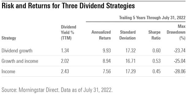
Those dividend stock fund categories include growth, growth and income, and income. In the following table, she gives some useful metrics for comparing how each type has performed during the past five years.
The table presents the trailing twelve month dividend yield for each type of dividend stock fund, and also the five-year performance of each category for their Annualized Return, Standard Deviation (a measure of volatility), Sharpe Ratio (a risk-adjusted measure of investment return), and their Maximum Drawdown (the largest downward trend experienced from peak to trough).
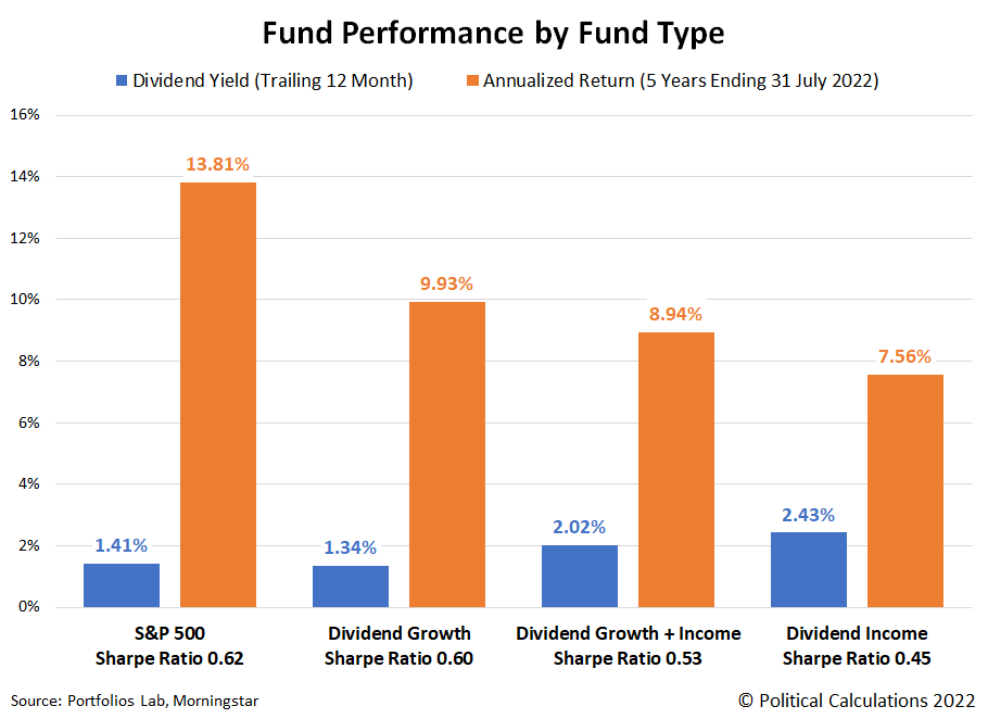
We tracked down the same measures for the S&P 500. In the following chart, we've visually compared the index's dividend yield and 5-year annualized return with that of each of the dividend fund categories. We've also indicated the Sharpe Ratio for each in the column headings.
Although they have the lowest dividend yields, the S&P 500 and Dividend Growth fund categories provided the best total returns. That's also true after considering their Sharpe Ratio values, for which Arnott had indicated for the Dividend Growth category "posted the best combination of risk and return", beating the other two types of dividend funds. Speaking of which, Arnott recognizes that the dividend stock funds might have recorded better returns if not for having higher fees. She found that low-cost funds outperformed high-cost funds for overall returns.
The next chart compares the S&P 500's and the three dividend stock fund categories' standard deviation (volatility) and their worst recorded downward trend over the past five years.
The standard deviation data for the S&P 500, Dividend Growth, and Dividend Income funds were all similar, with the Dividend Growth and Income fund recording the lowest volatility. Meanwhile, the S&P 500 clearly outperformed the other fund types by recording the smallest drawdown during the past five years, with Dividend Growth funds ranking second lowest. Dividend Income funds recorded the most adverse drawdown in the five year period ending on 31 July 2022.
Altogether, the data indicates the S&P 500 had the best overall performance, followed by Dividend Growth funds, then Dividend Growth and Income funds, and finally, Dividend Income funds.
References
Arnott, Amy. Do Dividend Stocks Provide Shelter From Recession? Morningstar. [Online Article]. 8 August 2022.
Morningstar. S&P 500 PR Risk Data. [Online Application]. Accessed 14 August 2022.
PortfoliosLab. S&P 500 Portfolio Trailing Twelve Month Dividend Yield [Online Application]. Accessed 14 August 2022.
Labels: dividends, investing, recession, SP 500
The S&P 500 (Index: SPX) mostly drifted sideways during the third week of August 2022, before dipping on Friday, 19 August 2022 to close the week at 4,228.48.
Here's how that change looks on the latest update to the dividend futures-based model's alterative futures forecast chart:
The week held little in the way of market moving news, with the next big event that might move the market's coming when the members of the Federal Reserve meet at their annual retreat in Jackson Hole, Wyoming. The dividend futures-based model indicates investors' main quarter of interest continues to be 2023-Q1. However, we can't help but note that whatever news comes out of Jackson Hole in the upcoming week will present investors with an opportunity to shift their focus to the much nearer term time horizon without greatly affecting the level of stock prices.
As for the week that was, the small dip in the index' level was associated with "recession jitters" in the week's market-moving headlines from Friday, 19 August 2022:
- Monday, 15 August 2022
- Signs and portents for the U.S. economy:
- U.S. home builder sentiment, New York state factory activity drop
- Oil settles lower on weak economic Chinese economic data
- Bigger trouble developing in China:
- Marketmind: Fasten your seat belts
- China new bank loans tumble more than expected amid property jitters
- China new home prices in July unchanged from June, down 0.9% y/y
- China unexpectedly cuts 2 key rates, withdraws cash from banking system
- China to lift Aug fuel exports but 2022 shipments to drop to 7-year lows
- Chinese developers in 'survival mode' slash property investment
- Bigger stimulus developing in China:
- Bank of England expected to deliver more rate hikes:
- Wall Street climbs, adding to recent gains as megacaps rise
- Tuesday, 16 August 2022
- Signs and portents for the U.S. economy:
- U.S. housing starts tumble in July; building permits fall
- Oil falls to 6-mth low on economic data, awaits news of Iran nuclear deal
- U.S. manufacturing production accelerates in July
- Bigger trouble developing in China:
- Bigger stimulus developing in China:
- China will step up policy support for economy, premier tells state media
- China supports several private developers with bond guarantee -sources
- Dow, S&P 500 climb as upbeat results from Walmart, others boost optimism
- Wednesday, 17 August 2022
- Signs and portents for the U.S. economy:
- U.S. retail sales flat on gasoline price drop; consumer spending resilient
- Oil edges off low as strong export demand drains U.S. crude stocks
- Pricey pencils, paper: U.S. teachers get schooled in inflation
- Fed minions see inflation, think they're about to start losing money, say more women will go to work:
- Fed minutes show more rate hikes in the pipeline, but pace could slow
- Fed staff sees bond portfolio income turning negative in coming months
- Fed's Bowman sees strong U.S. labor market bringing more women back to work
- Bigger trouble, stimulus developing in China:
- China's fiscal revenue growth slows slightly amid sluggish economic recovery
- Chinese vice premier urges greater effort to boost consumption
- Bigger trouble developing in the U.K.:
- More central banks ramping up more rate hikes:
- ECB minions focusing on regulating cryptocurrency:
- Wall Street ends down, but indexes briefly cut losses after Fed minutes
- Thursday, 18 August 2022
- Signs and portents for the U.S. economy:
- Oil up 3% on robust U.S. fuel consumption, tight supply outlook
- U.S. labor market resilient despite rate hikes; housing market wilting
- Fed minions on a mission to hike rates, only question is by how much:
- Fed united on need for higher rates, divided over how high
- Fed must get inflation down urgently, Kashkari says
- Fed's George says pace, endpoint of rate hikes still matter of debate
- Fed's Powell to speak on Aug. 26 at Jackson Hole conference
- Bigger trouble developing in China:
- China central bank, under pressure to ease, is hemmed-in by inflation, Fed jitters
- Exclusive-China regulator launches new probe into banks' property loan exposure - sources
- Bigger trouble developing in the Eurozone:
- ECB minions notice Eurozone inflation hasn't improved:
- Wall St ends higher, Cisco Systems jumps after forecast
- Friday, 19 August 2022
- Signs and portents for the U.S. economy:
- Fed minions trying to play coy about plan for more rate hikes:
- Bigger trouble developing in Japan:
- Bigger trouble developing in the Eurozone:
- German dependence on China growing 'at tremendous pace', research shows
- Record jump in German producer prices adds to gloomy outlook
- Bigger stimulus developing in China:
- China set to lower lending benchmarks to revive wobbly economy
- China to boost targeted policy support for economy -state media citing cabinet
- ECB minions starting to think they'll need to keep hiking rates:
- Wall Street ends down as yields rise; indexes post weekly losses
There was little change in the CME Group's FedWatch Tool's projections of the Fed's future interest rate hikes to follow last week’s action. Investors still expect half point rate hikes in September 2022 (2022-Q3) and November (2022-Q4), followed by a quarter point rate hike in December (2022-Q4), with rates topping out in a target range of 3.50-3.75%. The probability of a rate cut is elevated from June 2023 onward but is below 50%.
The Atlanta Fed's GDPNow tool's forecast for real GDP growth in 2022-Q3 dropped to 1.6%, down from last week's projection of 2.5% growth.
Did you wake up on the right side of the bed this morning?
By that, we're really asking whether you got up early enough after having enough sleep before you go off to accomplish all the stuff you intend to today. Getting up on the "right side" of the bed means you did, while getting up on the "wrong side" of the bed means you did not.
We're asking that question today because British mathematician Dr. Anne-Marie Imafidon has constructed a mathematical relationship to determine which of those sides of the bed you woke up on. You can imagine our palpable excitement when we discovered the following video in which she discusses her formula:
After watching the video to decipher her math, we have to agree with Ralphie from Christmas Story:
And yet, we wondered if she might be onto something. So we built a tool to do her math. If you're accessing this article on a site that republishes our RSS news feed, please click through to our site to access a working version of the tool.
The default data in the tool was provided by WFXB's Carolina AM's Greg and Audra, where the tool's results differs from Audra's because she went off into the weeds in doing her calculations.
Then again, that might be expected for someone who woke up on the wrong side of the bed! (For the record, we find she woke up on the right side!) Regardless, change the values as you need to represent your own personal scenario, and the tool will determine which side of the bed you got up on!
Labels: geek logik, tool
The outlook for future dividends per share of the S&P 500 (Index: SPX) improved since our previous mid-season snapshot at the midpoint of 2022-Q2. The following chart shows those expectations as of Thursday, 11 August 2022:
Update: We discovered a glitch with the chart, where the indicated dividends were off by one quarter. The chart and following analysis has been updated to reflect the correct dividends for each period.
Here's how investor expectations for the S&P 500's future dividends per share changed for each of the upcoming quarters shown in the first chart since our last snapshot three months ago:
- 2022-Q2: Up $0.07 per share
- 2022-Q3: Up $0.35 per share
- 2022-Q4: Up $0.55 per share
These increases across most future quarters point to an improved outlook for the S&P 500's dividends over the past three months, with the exception of 2023-Q3, where dividend futures point to a sharp reduction. But there's an important factor to consider about this latter development.
These figures are based on dividend futures data that tends to be the most stable for the nearest term future quarter and the most volatile for the most distant future quarters. As it is, we're pushing the limits in showing the expected future for 2023-Q3, the expectations for which are the least well established at this writing. That will settle down as time passes, but right now, it's very early days for dividend futures data for this quarter!
Analyst's Notes
Six weeks ago, we started tracking what the S&P 500's quarterly dividend futures look like about a week after the end of each dividend futures contract expiration date to capture changes in expectations that investors update during these busy options trading periods. Our next update on dividend futures will be in late September 2022 and will present how they've changed from 27 June 2022 through 26 September 2022.
More About Dividend Futures
Dividend futures indicate the amount of dividends per share to be paid out over the period covered by each quarters dividend futures contracts, which start on the day after the preceding quarter's dividend futures contracts expire and end on the third Friday of the month ending the indicated quarter. So for example, as determined by dividend futures contracts, the "current" quarter of 2022-Q3 began on Saturday, 17 June 2022 and will end on Friday, 16 September 2022.
That makes these figures different from the quarterly dividends per share figures reported by Standard and Poor, who reports the amount of dividends per share paid out during regular calendar quarters after the end of each quarter. This term mismatch accounts for the differences in dividends reported by both sources, with the biggest differences between the two typically seen in the first and fourth quarters of each year.
Reference
The past and projected data shown in this chart was taken from the CME Group's S&P 500 quarterly dividend index futures on the indicated dates. The past data reflects the values reported by CME Group on the date the associated dividend futures contract expired, while the projected data reflects the values reported on 11 August 2022.
Labels: dividends, forecasting, SP 500
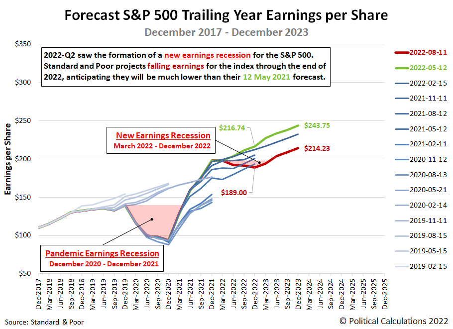
Every three months, we take a snapshot of the expectations for future earnings in the S&P 500 (Index: SPX) at approximately the midpoint of the current quarter, shortly after most U.S. firms have announced their previous quarter's earnings.
The outlook for S&P 500 earnings has deteriorated since since our last update three months ago. Standard and Poor now projects a new earnings recession, lasting through December 2022. The following chart illustrates how the latest earnings outlook has changed with respect to previous snapshots:
Unlike the semantic games played by pedantic douchebags over the accepted definition of a recession for the U.S. economy, an earnings recession has a simple definition:
“Earnings recession” is usually interpreted as two consecutive quarters of decline. In the case of the market, that would mean that corporate earnings dropped for two quarters in a row.
There is a minor dispute over whether that means consecutive quarter-on-quarter declines or if it means consecutive declines over two quarters with respect to the same quarters a year earlier. However, that dispute is moot in this case. The updated outlook for the S&P 500's reported earnings qualifies as an earnings recession under both these interpretations.
In the chart, we've identified the period in which the quarter-on-quarter decline in earnings interpretation was met by both the Pandemic Earnings Recession (December 2020-December 2021) and the projected new earnings recession (March 2022-December 2022). The regions of the chart we've shaded in light red indicate the periods where the year-over-year interpretation of an earnings recession is met.
Whether the S&P 500's earnings per share actually experiences an earnings recession through the rest of 2022 now depends entirely on the earnings reports of the index' 505 component firms over the months ahead. Our next snapshot of the index' expected future earnings will be in three months.
Reference
Silverblatt, Howard. Standard & Poor. S&P 500 Earnings and Estimates. [Excel Spreadsheet]. 11 August 2022. Accessed 12 August 2022.
Labels: earnings, recession forecast, SP 500
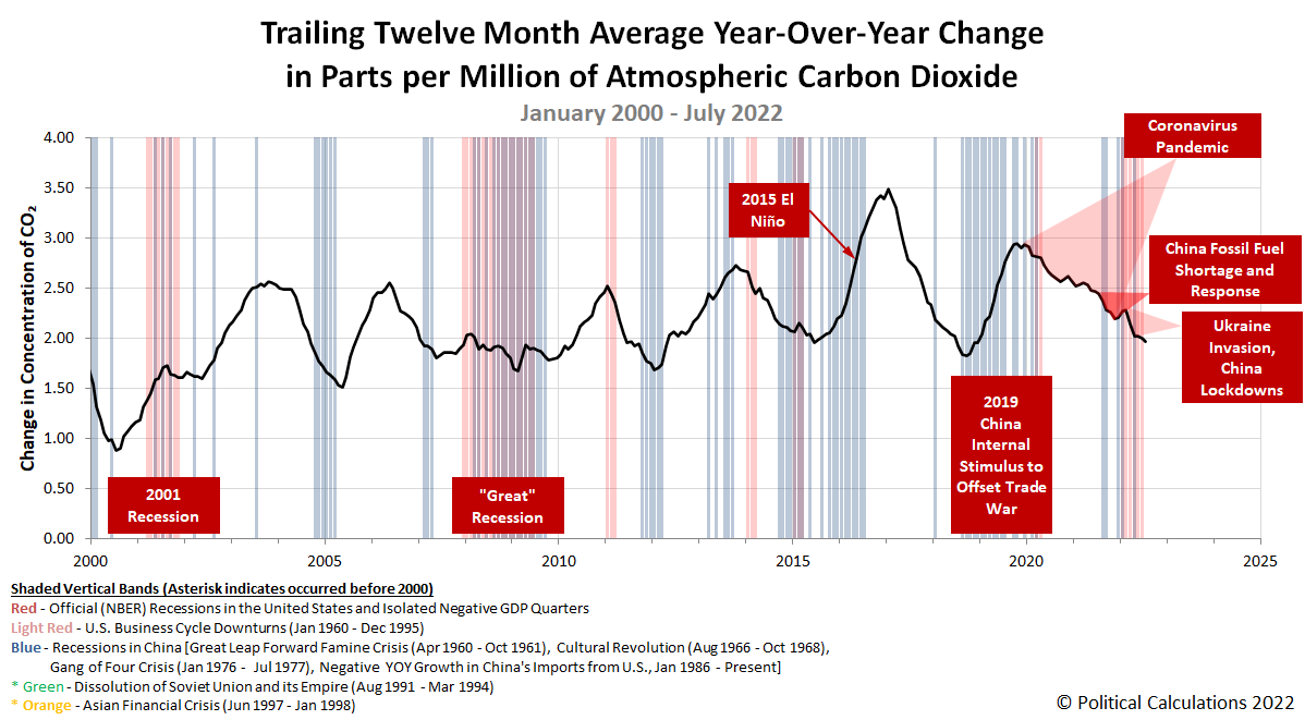
According to atmospheric carbon dioxide concentration data collected at the remote Mauna Loa Observatory, Earth's economy continued to cool in July 2022.
That outcome can be seen in the latest update to Political Calculations' chart tracking the pace at which CO₂ accumulates in the Earth's air.
A falling rate of carbon dioxide accumulation in the atmosphere corresponds to falling levels of economic output. It also occurs as China's economy strengthened following the lifting of its government's zero-COVID lockdowns in several regions and as the U.S. economy likely continued shrinking or stagnating in real terms. The falling rate of CO₂ accumulation points to the established negative trend in the U.S. economy more than offsetting China's economic rebound.
All in all, it's pretty amazing what you can see about the global economy from the side of a remote volcano!
References
National Oceanographic and Atmospheric Administration. Earth System Research Laboratory. Mauna Loa Observatory CO2 Data. [Text File]. Updated 5 August 2022. Accessed 5 August 2022.
Labels: economics, environment
Welcome to the blogosphere's toolchest! Here, unlike other blogs dedicated to analyzing current events, we create easy-to-use, simple tools to do the math related to them so you can get in on the action too! If you would like to learn more about these tools, or if you would like to contribute ideas to develop for this blog, please e-mail us at:
ironman at politicalcalculations
Thanks in advance!
Closing values for previous trading day.
This site is primarily powered by:
CSS Validation
RSS Site Feed
JavaScript
The tools on this site are built using JavaScript. If you would like to learn more, one of the best free resources on the web is available at W3Schools.com.
