How much does winning the Academy Award for Best Picture matter for DVD sales?
If you think about it, the annual televised Oscars ceremony is really little more than a four-hour-or-more-long commercial for the DVD of the movie that "wins" the "Best Picture" category. But we wondered how much that really matters for the movies' DVD sales.
To find out, we need to compare the DVD sales of a "Best Picture" winner with the DVD sales of a "Best Picture" nominee during the first several weeks after they go on sale to the public - ideally with the Oscars telecast occurring within just a few weeks of their DVD release. And really ideally, Best Picture contenders that have nearly identical sales during those first weeks of their release, except perhaps for the weeks immediately following the Oscars telecast.
We found two great examples from the 85th Academy Awards, which were televised on 24 February 2013: the movies Flight, whose DVD sales began two weeks before the 24 February 2013 Academy Awards telecast, and Argo, whose DVD sales began just one week before the Oscars telecast. Check out what we found in the chart below, in which we've also showed the DVD sales for a popular movie directed by Seth MacFarlane, who hosted the 85th Academy Awards telecast, just for comparison purposes:

In this chart, we see that the weekly DVD sales for both Flight and Argo are virtually identical for every week of their release except for one - the second week of DVD sales for Argo were double those of Flight, corresponding to the week immediately after it won the Academy Award for Best Picture of 2012.
For Argo, that meant that winning the Best Picture Oscar equated to an extra 142,665 more sales than it would have had that week if it hadn't won the Oscar. And at an average sales price of $14.97 that week, Argo's DVD sales grossed an additional $2,135,546 more than it likely would have for the movie's makers and distributors.
Notice also that there's almost no difference between Flight's and Argo's weekly DVD sales for all the other weeks of their DVD sales - their numbers are only meaningfully different for the week following when Argo won for Best Picture.
That makes the Academy Awards a four-hour-or-more-long commercial whose advertising impact on DVD sales only lasts for about a week. And it's only effective for the winner of the Best Picture Oscar, because Best Picture nominee Flight didn't see any meaningful bump in its corresponding third week DVD sales, which came right after the Oscars telecast.
But if nothing else, we hope our chart explains why Hollywood is now busy making Ted 2. Without good movies featuring talking bears like the original Ted, they just wouldn't be able to afford to make as nearly as many critical "successes" otherwise!
Previously on Political Calculations
- The Value of Winning the Oscar for Best Picture Versus Not Winning
- The Difference Between Being Pro-American and Anti-American at the U.S. Box Office
- Copyright Math and the U.S. Entertainment Industry
- The "Hit" Equation for Box Office Gold?
- Can Billy Crystal Sell Movie Tickets?
- Identity of Political Calculations' "Ironman" Revealed
- Anti-US Fervor in Hollywood
- The Anti-War on Hollywood's Box Office
- Reflections on the Oscars and the Most Manipulative Man in Hollywood
- How Men Are Like Bad Movies, and Why Bad Movies Keep Getting Made
- Do Academy Awards Boost Box Office?
- Does Best Picture Equal Big Box Office?
Labels: academy awards, business
Last December, the IRS released the latest update to their annual tax return statistics to now cover the 2011 tax year. We thought it would be interesting to look at the threshold income that a typical American taxpayer would need to have earned to be included among the Top 50%, the Top 1% and the stratospheric Top 0.1% according to the IRS over the preceding 10 years [1]:

In the chart, we've shown the threshold incomes on a logarithmic scale (be sure to read Jim Hamilton's invaluable explanation for why we would choose to do this!)
Two things really stand out in what we observe in the data from 2001 through 2011:
- The higher the income percentile, the more likely incomes generally rose over time to be in a given percentile.
- The higher the income percentile, the greater is the volatility of income from year to year to be in a given percentile.
Our next chart underscores our second observation - we simply calculated the percent change from the previous years threshold income to be in the Top 50%, the Top 1% or the Top 0.1%:

Now, ask yourself a question: Could you afford to go through a year where your income might drop by 20% or more from the previous year?
The answer likely depends on how much you might have been counting on having the same kind of income you did in the previous year. For the individuals who actually earned incomes that put them in the Top 0.1% [2], the answer is probably not too bad, because if they stayed in the Top 0.1%, they were still earning a significant amount of income.
But that kind of income volatility from year to year is potentially catastrophic for their two biggest financial dependents: the federal government and potentially their state government, where the reliance upon extremely progressive income tax rates imposed upon high income earners for their revenue would virtually ensure that they will face a major fiscal crisis if the millionaires and billionaires included in these top ranks have a really bad year.
Notes
[1] The IRS first started reporting data for the Top 0.1% in 2001.
[2] While there's certainly some overlap from year to year, the actual people whose earned income puts them in the Top 1% and especially the Top 0.1% is not consistent from year to year - there's a lot of turnover at these income levels.
Reference
Pomerleau, Kyle. Tax Foundation. Summary of Latest Federal Income Tax Data (2011). Table 7. Dollar Cut-Off, 1980-2011 (Minimum AGI for tax return to fall into various percentiles; thresholds not adjusted for inflation). 18 December 2013.
Labels: income, income distribution, risk, taxes
Correlation doesn't prove causation, but make of the following charts what you will. Our first chart shows how much U.S. businesses have paid in both payroll employment taxes and the corporate income tax as a percentage share of GDP in each year from 1960 through 2012 (now corrected to show through 2012 - the original version through 2010 is here):
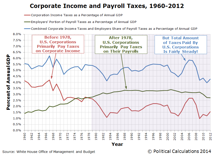
This chart shows that the total amount of taxes paid by businesses to the U.S. federal government has remained fairly steady as a percentage share of GDP from 1960 through 2012, but the composition of the taxes they pay has changed over time. Before 1978, U.S. businesses paid more in corporate income taxes than in payroll taxes, but since 1978, they have consistently paid considerably more in the form of payroll taxes.
The reason why that changed after 1978 was a series of increases in the employer's portion of Social Security payroll taxes, which were offset by reductions in corporate income taxes. During that time, employers went from having their payrolls taxed at a rate of less than 5% before 1978 to be increased in steps every several years to reach a much higher rate of 6.2% beginning in 1990, where it has held level since. Social Security's tax rates were increased during these years to ensure that the program would remain solvent.
What kind of effect do you think those tax hikes would have had on U.S. businesses, where suddenly, it became a much larger penalty to have lots of people on their payrolls in the United States? And what about those businesses where it really doesn't matter that the jobs be done inside the U.S., like manufacturing?
Think about those questions when you consider our next graph:
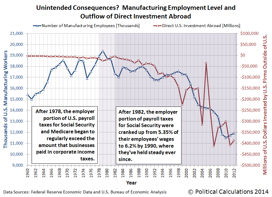
What we see in this chart is that increases in the amount of money being directly invested by U.S. firms abroad (shown as a negative value on the right hand scale, since it is an outflow for the U.S. economy), largely coincides with and is generally proportional to the change in the number of Americans employed in manufacturing. It's as if U.S. manufacturing firms, in seeking to avoid having to pay higher taxes that would put them at a disadvantage with their competitors by reducing the number of people on their payrolls, shifted their production to be outside of the U.S. as they invested in new production facilities elsewhere in the world.
As a result, the U.S. federal government, in hiking its payroll taxes on U.S. businesses so much, actually drove jobs out of the U.S. instead because it overly penalized employing workers within the U.S. In the process, it lost the tax collections that would have come from those relatively high paying jobs, not to mention potentially lowering the nation's GDP below what it might have been otherwise.
But as they say around the White House these days, since those Americans are no longer trapped in their high-paying manufacturing jobs as they were given the opportunity to pursue their dreams, they're much better off now.
Data Sources
White House Office of Management and Budget. Budget of the U.S. Government, Fiscal Year 2014, Historical Tables. Table 1.2 and 2.1. [PDF Document]. 10 April 2013.
Federal Reserve Bank of St. Louis. Federal Reserve Economic Data. All Employees: Manufacturing (MANEMP), Thousands, Monthly, Seasonally Adjusted. [Online Database]. Accessed 15 February 2014.
Bureau of Economic Analysis. U.S. International Transactions Accounts Data. Table 1. U.S. International Transactions [Millions of dollars], Line 51. Excel Spreadsheet]. Accessed 15 February 2014.
Labels: jobs, satire, social security, taxes
It's time once again to take a snapshot of the major trends in S&P 500 stock prices against their trailing year dividends per share over time! Our first chart shows each of the major trends that have existed in the U.S. stock market since December 1991, all the way through to 21 February 2014:

Our next chart zooms in on the current trend, which has been in place since 4 August 2011, and has extended through 21 February 2014 (the chart picks up the action from the end of 2011-Q1 on 30 June 2011):

The difference between the regression equations representing the main trajectory of stock prices with respect to deviations in both charts is attributable to the differences in the data presented in each. The first chart shows the average of the S&P 500's daily closing prices during each calendar month, while the second chart shows the S&P 500's daily closing prices.
Since 4 August 2011, the S&P has behaved in what we would describe as an orderly manner, where the residual variation in stock prices about their central trajectory would appear to be adhering to a normal distribution, where stock prices would be likely to fall between the indicated +/- one standard deviation curves some 68.4% of the time, between the +/- two standard deviation curves some 95% of the time, and between the +/- three standard deviation curves some 99.7% of the time.
While this is a characteristic of periods of relative order in the market, our readers should note that over the long term, stock prices are not normal. Since the statistical hypothesis that stock prices are behaving normally during relative periods of order in the market cannot be ruled however, we can use the tools of standard statistical analysis to gain more insight into their behavior during these periods.
One interesting and new observation we can offer is that the size of the standard deviation for the residual variation of stock prices about the main trend with respect to their dividends per share would appear to coincide with differences between the change of the year-over-year growth rates of dividends per share expected in different future quarters.
Which is something that should perhaps be expected if investors do indeed periodically shift their forward-looking focus from one future quarter to another in setting today's stock prices, since it would account for a good portion of the variation we observe in stock prices during relative periods of order in the market.
Labels: data visualization, SP 500
There were no surprises for stock prices last week, as the S&P 500 largely behaved as we expected it would. Unfortunately, because it did, the S&P 500 will open this week in a pretty precarious position. Mind the notes in margin of our first chart, and we'll have a little more commentary on that situation in this week's Analyst Notes:

Analyst Notes
During the past week, investors fully shifted their forward-looking attention from 2013-Q3 to the more distant future quarter of 2014-Q4 in setting today's stock prices, reaching that level on Thursday, 20 February 2014 on positive speculation for Verizon (NYSE: VZ), Exxon Mobil (NYSE: XOM), Chevron (CVX) and 3M (NYSE: MMM). That shift in focus largely accounts for why stock prices were able to basically continue moving sideways during the week, even though each of the alternate futures for dividends turned south after Wednesday, 19 February 2014.
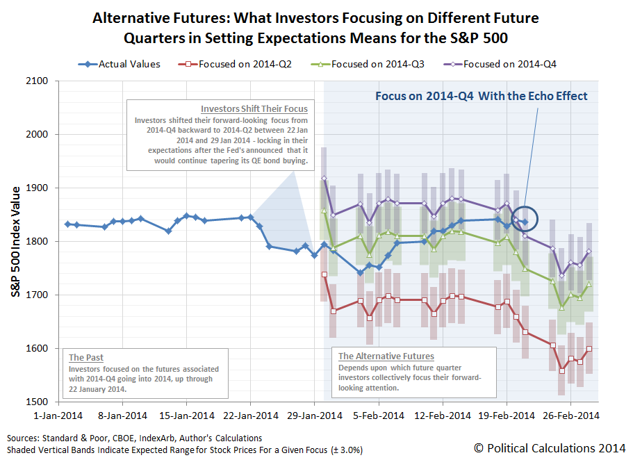
Going back to our first chart, stock prices were able to do that because they were still below the level that investor expectations would set them if investors were tightly focused on the future quarter of 2014-Q4.
But now the situation has changed, because Friday, 21 February 2014 saw stock prices close at a level that's suspended above that level. Not greatly so, as the value is still within the range that we would expect given typical levels of noise in the market, but that position will become increasingly more tenuous as time moves forward, making any continued sideways movement highly unlikely - especially so in the absence of an increased volume of positive noise in the market to offset the fundamental pull of expectations for the future quarters that investors are mostly likely to focus upon at this point in time.
At some point in the very near future, something that very much looks like the rules of gravity in Wile E Coyote's universe may very well come into play, as the rules of deterministic chaos for stock prices with the strange attractor of change in the expected growth rates for dividends per share at specific points of time in the future would have them react:
With the future for 2014-Q1 effectively locked in at this point, the best scenario for investors would be if they sustained their forward-looking focus on the expectations associated with 2014-Q4. Anything that would shift their focus to the less distant future quarters of 2014-Q3, or worse, 2014-Q2, would have a significantly more negative effect upon stock prices.
And now, you cannot say that you were not told! We're definitely looking forward to interesting things happening in the market this week!
Alert Doc Palmer! This may be even better than calendars featuring the nude women of curling!
Okay, it's not, but it might be close. World-renown naturalist Sir David Attenborough narrates curling, as if he were featuring it in one of his many nature documentaries, and also as if the sport were being played by ice squirrels (HT: io9).
Y'all didn't think we were going to let the Olympics pass by without notice, did you?
Labels: sports
How many of the 250,000 Chevy Volts that President Obama promised would have been sold by this point in time have you seen driving around on the nation's roads?
It's time to update the picture for Chevy Volt sales in the United States from our previous snapshot last August! The chart below shows the monthly sales for GM's flagship product through the third anniversary of its arrival on the U.S. market:

Ouch! With monthly sales numbers like those, it's a pretty safe bet that GM has fallen far short of President Obama's sales target for his preferred electric vehicle. Our next chart shows just how far off President Obama's marks those sales have fallen:

As we noted in our previous installment, there's about an 80% gap between what President Obama promised and what he actually delivered. Or if you prefer, President Obama can only apparently deliver one-fifth of what he promises.
Which is something that at least one other historian has noticed.
References
U.S. Department of Energy. One Million Electric Vehicles by 2015, February 2011 Status Report. February 2011.
InsideEVs. Monthly Plug-In Sales Scorecard. Accessed 15 February 2014.
Previously on Political Calculations
- Is the Government Subsidizing the Chevy Volt Enough? - we find that the $7,500 tax credit that the U.S. government was giving every buyer of GM's Chevrolet Volt was more than adequate to cover the relatively higher cost to the consumer for the Volt's electricity-driven engine.
- Comparing MPGs for Alternative Fuel Vehicles - GM claimed the Chevy Volt will go 230 miles for every gallon of gasoline that it consumes. We built a tool to determine just what kind of mileage that consumers could really expect to get out of the electric car with the backup gasoline-powered engine.
- Barack Obama: Crony Capitalist in Chief? Part 2 - after setting the stage in Part 1, we tell the sad story of a failing car company and how its electric car concept was used as the bait to commit a willing politician looking to grease the wheels of crony capitalism in America for political advantage into providing a massive taxpayer-funded bailout of the company.
- Is GM Headed Back to Bankruptcy? - despite the President Obama's bailout of the company, we find that GM's financial situation is such that it is still in the danger zone for going through bankruptcy again.
- The Twenty Percent President - using the sales of the Chevy Volt as an example, we note that President Obama's promises tend to fall about 80% short of what he actually delivers.
Labels: business
Roughly every three months, we take a snapshot of Standard & Poor's earnings forecast for the S&P 500's earnings per share. The chart below shows what's changed since our last snapshot of earnings forecasts in November 2013:
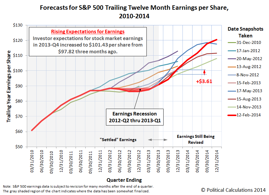
Looking just at the fourth quarter of 2013, there isn't much change, as the S&P 500's expected trailing year earnings per share clocked in at $101.43, up $3.61 per share from the figure reported on 14 November 2013.
But check out what happened with forecast earnings going throughout 2014! It would appear that S&P's forecast for earnings through 2014 dramatically shifted upward in each quarter. Looking ahead at the new expectation for earnings at the end of 2014, we see that the amount of trailing year earnings per share increased to $120.60 from $108.11 per share, a jump of $12.49, or nearly 12% from what was expected just three months ago.
Beyond 2014, S&P's Howard Silverblatt, has begun projecting the S&P 500's earnings per share through the end of 2015, but at present, he is still populating the data behind the forecasts (he anticipates the double-digit gains he shows through the end of 2014 will carry through 2015 from the data he has populated already.) We're going to hold out showing that forecast until our next snapshot, when we'll expand our chart to extend through the end of 2015.
Data Source
Silverblatt, Howard. S&P Indices Market Attribute Series. S&P 500 Monthly Performance Data. S&P 500 Earnings and Estimate Report. [Excel Spreadsheet]. Last Updated 12 February 2014. Accessed 15 February 2014.
We were wrong. Although it would make our math simpler to do, the data said that we're not going to be able to dispense with accounting for the echo effect in stock prices anytime soon.
We know that's the case because the market gave us an opportunity to calibrate the results of our math last week. Those results indicate that continuing to account for the echo effect will continue to provide a clearer picture of why stock prices are behaving as they are.
For our methods, large and sudden changes in stock prices provide the opportunity to calibrate our math. Since these kinds of changes in stock prices are not randomly-driven, but rather are the result of investors collectively shifting their forward-looking focus from one point of time in the future to another, which occur without significant changes in the expected income that investors might earn from dividends at those different points of time in the future, these events allow us to dial in the scale factor we use in our math.
In this case, it validated the scale factor we've been using since we switched to use the CBOE's dividend futures data in our calculations in October 2013. Let's go to the latest update of our favorite chart....

The calibration event was the conclusion of Janet Yellen's first congressional testimony as the chair of the Federal Reserve. In her testimony, she made clear that the Fed would continue its policy of tapering off its purchases of U.S. government-issued securities at the measured pace it has established.
Investors, who had previously shifted their attention to 2014-Q2 in advance of the Fed's last Federal Open Market Committee (FOMC) meeting where its Quantitative Easing (QE) policy is set, breathed a sigh of relief and began to shift their forward-looking focus in making investment decisions today to a more distant future: 2014-Q3.
It took a while for us to figure out why that future quarter would be the immediate focus for forward-looking investors in setting today's stock prices following Yellen's testimony. If we project ahead the Fed's FOMC meeting schedule with the established pace at which the Fed is tapering its QE bond buys, the Fed would be likely to announce its plans for how it will finally terminate its net purchases of U.S. Treasuries and Mortgage-Backed Securities at its September 2014 meeting, which coincides with the end of the third quarter of 2014.
In the chart above, the change in the growth rate of stock prices, minus the echo effect, immediately shifted to the future trajectory indicated by the expected change in the year-over-year growth rate of dividends per share for the future quarter of 2014-Q3.
We would not however be surprised if the focus of investors shifted to follow the trajectory defined by the expectations for 2014-Q4. Since investors had been focused on that more distant future quarter before 23 January 2014, and because that's the quarter in which the Fed's QE bond buying would actually end, it would make sense for investors to shift at least a portion of their forward-looking focus to it.
Speaking of trajectories, let's see how stock prices in February 2014 are keeping pace with the different levels that the respective focus on the dividends that would be earned in different future quarters would place them, as the future appeared on 29 January 2014.

One quick note - the projected decline in stock prices for each of the anticipated trajectories after 19 February 2014 isn't as severe as it appears. Since our method incorporates the stock prices from a year ago as the base reference point from which we have projected where stock prices are likely to fall, what you're seeing here in part reflects the dip in stock prices of a year ago.
If we account for that particular short-lived echo, the decline is still there, but not as great. We're going to test out treating this particular echo like an error, where we would expect that the error bars we've shown around the midpoint trajectory for each alternate future will adequately capture how stock prices are likely to behave during this time. Given the particular echo, we would expect that the actual trajectory will fall in the upper end of the trajectories indicated for a focus on the future quarters of 2014-Q3 and 2014-Q4.
Provided, of course, no new noise events or shifts in investor forward-looking focus in the mean time!

The Affordable Care Act (aka "Obamacare") is unraveling on many levels, but perhaps most so on the personal finance level for the consumers of both health care and health insurance.
That's particularly true for healthy, young Americans, who the Obama administration and its health insurer crony capitalist partners were counting upon to enroll in much, much greater numbers than they are. Because these individuals represent up to 40% of all Americans who might buy health insurance through the Affordable Care Act's state and federal government-run health insurance "marketplaces", if significantly fewer than this percentage sign up for Obamacare, many health insurers will be forced to jack up the cost of health insurance within the next few years to cover their losses.
That will be true, even with Obamacare's built-in multi-billion dollar bailout for health insurers participating in the ACA exchanges. A bailout that at least one politically-connected health insurer has planned to exploit all along as part of its business strategy.
But if too few young, healthy Americans buying health insurance to cover the health insurers' costs of paying for the health care bills of older, sicker, insured Americans, they risk setting up the dynamic where each time they increase their premiums to compensate, they'll lose more of their healthier customers who will balk at paying higher bills, sending their business into a death spiral. That dynamic is the result of what insurers call "adverse selection", which is the situation where not enough healthy people sign up for health insurance to cover the cost of paying for the health care needs of the sick people who did.
That's why President Obama's political supporters are scrambling to put out a marketing campaign aimed at getting young Americans to enroll in ACA coverage on 15 February 2014, even though the Healthcare.gov web site will not be functioning on that day.
To understand how the dynamic of an adverse selection death spiral has already gotten underway with Obamacare, let's start by reviewing the various levels of health insurance coverage being marketed on the federal and state governments' health insurance exchanges. Our first table below ranks these from most comprehensive coverage to the least, showing the average annual deductibles and typical premiums for each that would apply to a 27-year old American. In the right-most column, we have also adjusted the annual premiums to account for the average tax credit subsidy [1] that would be collected by the vast majority of individuals enrolling through the Obamacare exchanges.
| Affordable Care Act Coverage Levels and Average Unsubsidized Health Insurance Costs for Age 27 Individual in 2014 | ||||
|---|---|---|---|---|
| "Metal" Plan | Percentage of Health Care Costs Paid by Insurance After Consumer Pays Deductible | Annual Deductible | Annual Premium (Without Subsidies) | Annual Premium (With Average $1,175 Subsidy) |
| Platinum | 90% | $347 | $5,079 | $3,904 |
| Gold | 80% | $1,277 | $4,145 | $2,970 |
| Silver | 70% | $2,907 | $3,286 | $2,111 |
| Bronze | 60% | $5,081 | $2,752 | $1,577 |
| Catastrophic | 50% | $6,350 | $2,206 | $1,031 |
The annual premiums, either with or without the federal government's subsidy depending upon the health insurance consumer's eligibilty, represents their absolute minimum cost of health insurance and health care. These values represent what an insured individual consumer will pay for health care, even if they never see a doctor.
In our next table, we show the maximum amount that a 27-year old consumer would have to pay out of pocket for health care before their health insurance would provide any meaningful benefit for each level of coverage they might select. These values are determined by adding the annual premiums to annual deductibles listed in our first table for each level of health insurance coverage.
| How Much A 27-Year Old Would Need to Pay in Premiums and Deductibles Before Gaining Any Benefit for Having Health Insurance Coverage in 2014 | ||
|---|---|---|
| "Metal" Plan | Maximum Out of Pocket Cost (Without Subsidies) | Maximum Out of Pocket Cost (With Average $1,175 Subsidy) |
| Platinum | $5,426 | $4,251 |
| Gold | $5,422 | $4,247 |
| Silver | $6,193 | $5,018 |
| Bronze | $7,833 | $6,658 |
| Catastrophic | $8,556 | $7,381 |
In our next table, we'll consider the situation where our 27-year old might have $7,500 worth of health care expenses. This value is consistent with the cost of an uncomplicated natural delivery of a baby in the U.S. [2], which would be the kind of significant health care expense that a 27-year old might reasonably anticipate in their near future.
| What If That 27-Year Old Had $7,500 in Actual Health Care Costs? | |||
|---|---|---|---|
| "Metal" Plan | Health Care Expenses Not Paid by Insurance | Combined Health Insurance and Health Care Expenses (Without Subsidies) | Combined Health Insurance and Health Care Expenses (With Average $1,175 Subsidy) |
| Platinum | $1,062 | $6,141 | $4,966 |
| Gold | $2,522 | $6,667 | $5,492 |
| Silver | $4,285 | $7,571 | $6,396 |
| Bronze | $6,049 | $8,801 | $7,626 |
| Catastrophic | $6,925 | $9,131 | $7,956 |
In this table, we've highlighted the combined cost of health insurance and health care that are greater than what it would be to simply pay the $7,500 health care bill directly out of pocket.
What this table reveals is that the benefits of having health insurance coverage are mainly conveyed to people who select the plans with the most costly premiums - the Platinum and Gold level plans. The Silver plan would actually be more of a toss-up - it wouldn't take much more in additional health care costs (say for pre- and post-natal care in our baby delivery example) to make it a reasonable option.
In practical terms, what that means is that if an individual can reasonably anticipate having large health care bills in the near future, such as would be the case if they expect to have a baby, they would benefit most by selecting the plan with the most comprehensive coverage, where their premiums would effectively be pre-paying for the health care services they will consume at what would appear to be a discount to them (remember, the insurer and perhaps the federal government is paying the balance of their bill).
Worse, we see that for the plans with the most affordable premiums, the Catastrophic and Bronze level plans, it would actually be much less costly for a 27-year old to not carry any health insurance coverage at all, subsidized or not. In terms of their personal finances, it would make more sense for young and healthy individuals to not bother buying these health insurance plans and to instead pay for these kinds of expenses directly out of pocket, which would allow them to save the money that might otherwise go to waste on health insurance premiums.

The Affordable Care Act attempts to deal with that situation by imposing an additional income tax upon Americans who rationally choose to not buy health insurance. In 2014, that tax is the larger of $95 or 1% of their annual modified adjusted gross income.
Doing the math for the Bronze-level plans in our example above, we estimate that an individual would have to have an income above $285,200 before paying for a Bronze plan would more economical than paying the additional income tax. In 2016, when the additional Obamacare income tax will increase to be a maximum of 2.5% of an individual's income, buying a Bronze-level health insurance plan with the costs we've listed above would only begin to make sense if their income was greater than $120,000.
So, unless a health insurance consumer has a reasonable expectation that they will have very high health care bills in the near future, it doesn't make sense from a personal finance perspective for them to buy health insurance. And since the law mandates that they cannot be denied coverage if they do develop a costly medical condition, they can simply hold out until the next enrollment period when their situation might change, or take advantage of the alternatives that many people are using to avoid Obamacare and its taxes altogether.
And that explains why Obamacare is developing such an adverse selection problem - one that can send the program into a full death spiral. The people who benefit the most from buying health insurance through the Affordable Care Act exchanges are the ones who have the greatest expectation that they'll have large health care expenses in the near future. Meanwhile, the people who benefit the least, the healthiest Americans, have powerful personal financial incentives to steer clear of Obamacare altogether. It's the relative health of the people who enroll for health insurance that matters most in this situation.
Going back to the personal finance incentives for plan selection, individuals who fall in the middle, where they reasonably believe they may have large health care expenses in the near future but aren't absolutely sure they will (say if they are considering having a baby in the next year but aren't pregnant yet), would benefit by choosing a health insurance plan in the middle of the Obamacare tiers of coverage, such as the Silver level plan.
We're watching those personal finance incentives play out in real life, as health insurers like Humana are reporting the kinds of plans their consumers are selecting:
Humana management told the UBS managed care analyst team, in a follow up call, that this was a concern for the insurer. Humana is seeing more people enrolling in platinum plans (21%) than it expected. These are most likely higher cost members who are paying the higher premiums to buy down their anticipated co-pays and deductibles. In other words, they plan to tap their health coverage for medical claims. The company also reported that bronze plans account for 9% of applications, gold for 10%, and catastrophic plans for 2%.
The remaining 58% of Obamacare enrollees are selecting Silver-level plans, which as we observed, is consistent with individuals who have a much higher, but not fully certain, likelihood of accumulating large health care expenses during the next year. Nearly everyone else is either sicker and enrolling in more comprehensive coverage, or are healthy enough where it makes more financial sense to avoid buying any health insurance through the dysfunctional Affordable Care Act exchanges altogether.
It all boils down to one inescapable factor: if you're shopping for health insurance, rather than being influenced by slick marketing campaigns aimed at trying to keep politically connected health insurers afloat, you should let your health decide if and when you really need it.
Notes
[1] We obtained our estimate of an average individual tax credit subsidy by dividing the CBO's estimate of $4,700 per household in 2014 by 4. The actual size of the tax credit subsidy that an individual might receive varies according to income and the cost of the second-lowest "Silver"-level health insurance plan that is available in their region.
[2] We took the value most recently reported by the U.S. government's Agency for Healthcare Research and Quality of $6,789 for an uncomplicated, vaginal delivery in 2009 and adjusted it for inflation, which would put the cost associated with this single procedure at approximately $7,500 in 2014.
Previously on Political Calculations
We've been covering the Obamacare beat for some time now - the links below will take you to some of our best personal consumer finance analysis of how the Affordable Care Act will affect you.
- Obamacare: Should You Pay the Premium or the Tax?
We ask the question and provide a tool where you can do the math to answer the question for yourself!
- Obamacare: Will Making a Little More Income Cost You Thousands?
We show how crossing certain critical income thresholds can cost you the subsidies that make your Obamacare health insurance coverage affordable - welcome to the welfare trap, middle-class Americans!
- The Odds of Going to the Hospital
We begin the analysis of finding out just how likely it is that a random individual plucked from society might need serious medical treatment.
- Do You Even Need Health Insurance?
We help you answer the question that supporters of Obamacare hope you won't ask!
- The Obamacare Cost Gap
Depending upon what plan you find affordable, there may be very little difference for you in how much you'll actually pay for health care expenses between having health insurance and not having health insurance. We built a tool to help you find out how big the gap in your health care costs can get before you get any real benefit from having health insurance.
- Obamacare: Does Buying Health Insurance Make Sense for You?
We consider the situation where buying health insurance through the Obamacare exchanges might make sense for you.
- How to Get Real and Affordable Health Insurance Without Obamacare
There are affordable alternatives to Obamacare's health insurance coverage - we discuss a number of options that you might consider!
Labels: health care, insurance, personal finance
In order to sustain dividend payments to their shareholders, companies generally need to have a couple of things going for them:
- They need to be profitable.
- They need to generate sufficient cash flow to make the dividend payments.
If either one of these things falls short on a sustained basis, the company may need to reduce their dividends. And that, of course, is almost universally bad for share prices, given the basic fundamentals for how stock prices work.
That in turn is bad for the company's primary owners and managers, who in addition to taking a financial hit on the shares of stock they might own in the company, also have to deal with a large number of very angry shareholders who weren't part of the decision, whose anger might force changes in the company's business practices and executive ranks.
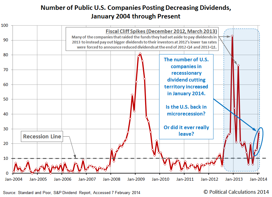
So whenever a company acts to cuts its dividends, it's a pretty good indication that the company is experiencing some kind of real economic distress, because the outcome of that action is something that the company's primary owners and managers would seek to avoid if it were at all possible because of the pain associated with it for them. Yesterday, we showed that the number of U.S. companies acting to cut their dividends is once again consistent with recessionary conditions being present in the U.S. economy:
So is there a connection between companies cutting dividends and the employment situation in the United States?
We've taken the chart we normally use to track the change in the number of employed Americans by age since the total employment level in the U.S. peaked in November 2007, just before economic expansion peaked and the nation officially entered recession a month later, and have indicated with light red shaded lines the periods coinciding with an elevated number of companies cutting their dividends:

What we find is that whenever there are steadily more than 10 companies acting to cut their dividends in any given month, the trend in the number of employed Americans either falls, as when the economy is experiencing a full-fledged recession, or goes flat, as is the case at present, when an improving trend for employment stalls out.
What we observe with the employment situation at present is consistent with our previous observation that the U.S. economy is experiencing a microrecession.
Labels: dividends, jobs, SP 500
Picking up on the theme we introduced in our previous installment, we can't help but notice that the number of U.S. companies announcing that they are cutting their dividends increased to 28 in January 2014.
That's significant in that it only takes 10 companies to announce dividend cuts in a given month to indicate that recessionary conditions are present within the U.S. economy.
So it would seem then that the U.S. economy is back in what we would describe as a microrecession, which might be best thought of as when recessionary conditions are present, but are perhaps not of sufficient magnitude, scope or duration for the National Bureau of Economic Research to officially declare that the economy is in recession.
But really, if you look at what dividends have been communicating since mid-2012, it's not so much a question of whether the U.S. economy is once again experiencing the kind of economic conditions that are consistent being in a microrecession, but rather whether it ever really left.
That situation is something that has an effect on the nation's employment situation, which is something that we'll take on in our next post....
Data Source
Standard & Poor. Monthly Dividend Action Report. [Excel Spreadsheet]. Accessed 8 February 2014.
In January 2014, a new all-time record for the number of publicly-traded U.S. companies that announced increases in their dividends was set.

In January 2014, some 2,750 U.S. companies issued some sort of declaration about their dividends. 368 announced they would be increasing their dividends going forward, breaking the previous record of 298 recorded in February 2013 by a margin of 70.
We think that what we're seeing is the tail end of the restructuring of corporate compensation following the 2013 tax hikes. Since January 2013, U.S. companies have been shifting funds away from paying wages and salaries to their owners and managers, who are now drawing a larger share of their compensation in form of dividend payments. These actions are a direct response to the large tax hikes that took effect early in 2013, which work to minimize the negative impact of increased taxes on their personal compensation.
We have a strong suspicion that a lot of the firms taking this action now are the ones where the owners and executives were either not savvy enough to realize how much their personal tax bills would go up in the 2013 tax year, or were, but for one reason or another, couldn't shift more of their compensation from salaries to dividends.
Unlike 2013, there hasn't been a corresponding rally in stock prices for the S&P 500 in 2014. The reason for the absence of a rally is pretty straightforward - the companies that make up the S&P 500 largely acted to restructure their executive compensation during 2013. The companies acting to boost their dividends in January 2014 are largely outside of the S&P 500, which means that they're considerably smaller in size and market capitalization.
The lack of impact on major stock market indices doesn't mean that these companies' dividend policies are insignificant however, since we can get a good indication on the relative health of the U.S. economy by tracking how many act to cut their dividends each month. As we show in the chart above, there is an increased cause for concern, which we'll soon address.
Data Source
Standard & Poor. Monthly Dividend Action Report. [Excel Spreadsheet]. Accessed 8 February 2014.
Labels: dividends
Depending upon how we account for the echo effect from the Fiscal Cliff Deal Rally of a year ago on our growth rate calculations, investors have either split their forward-looking focus between two future quarters or are largely focused on 2014-Q2 in setting stock prices today. Mind the notes in the margin of the chart below, and we'll discuss this seemingly confusing state of affairs in the Analyst Notes section below....

Analyst Notes
We're not joking when we indicate that we're do cutting edge analysis here at Political Calculations! Today's a good example, as we're working out, almost live, the methods we're developing to analyze the behavior of stock prices.
Having predicted and successfully accounted for the existence of the echo effect, where the noise generated by the "echo" of anomalies in the historic data we use as our base reference points in calculating the year over year growth rates of stock prices could otherwise obscure our ability to determine the future quarter to which investors have fixed their forward looking attention in making their investment decisions today, we now have a new dilemma: when do we really need to account for that factor?
It would make sense to account for it whenever we know that there is something anomalous in the historic data, which was the case with the one-year anniversary of the Great Dividend Raid Rally in late 2013, where if we didn't account for the effect, it would have instead appeared that stock prices would have entered a new, negative noise event, rather than have been largely focused upon the future defined by the expectations for future earnings in 2014-Q1.
But there isn't a similar historical shock in the historical data that corresponds to the Fiscal Cliff Deal Rally, whose anniversary period will continue into mid-April 2014. So are we getting any better insight into which future investors have focused by continuing to take the echo effect into account?
It's not so much a factor where anticipating stock prices is concerned. With the echo effect, it appears that stock prices are following a trajectory in-between the various alternate futures investors can select in setting their forward-looking focus.

As long as the "split" between the focus upon future quarters is relatively stable, we could pretty easily anticipate how stock prices will behave. The math we do gets easier though if we can dispense with accounting for the echo effect.

Without accounting for the echo effect, we could argue that investors have maintained their focus on 2014-Q2 in setting stock prices since shifting it from 2014-Q4 after 22 January 2014, with stock prices behaving consistently with that observation since.
Right now, we're leaning in favor of dispensing with accounting for the echo effect, except for when we know there's a major anomaly in the historic data that would skew how it appears stock prices are behaving by considerably more than the typical level of noise we observe in the data. Ultimately, we'll let the data decide what the best practice going forward might be.
For now, that means that we'll continue tracking both scenarios until we've developed a better understanding of the dynamics involved.
Thank goodness that what we do is only complex, which believe it or not, makes it simpler to understand. If what we do was complex and difficult, we probably wouldn't be at this point.
If you're a Lego fan, or know one, hang on to your seat!
HT: Core77, who had this to say about the latest in simulated toys:
Most of us who like building things loved Legos as a kid. There were just a few gripes: Inevitably you'd build something and run out of a particularly-sized piece, or you wished for different colors, or two pieces would become stuck together so badly that scientists at CERN couldn't separate them.
Well folks, the future is here. Google has teamed up with Lego to release Build with Chrome, a free, browser-based version of Lego! (Works in Firefox and Chrome, I've not tried Safari.) You select whatever sized-piece you want and drop it into your construction with mouseclicks. It's 3D, so you can rotate the build platform by dragging. You can change colors at will. And in the tutorials at least, the supply of pieces is unlimited.
The next trick will be to take things one step further, and have Lego take your model and make your custom kit for you so you can re-create it in the real world. Or perhaps, take things two steps further and upload the virtual models you create with a license from Lego to a 3D printer and make your own.
The actual future of manufacturing is probably nothing like you've ever thought it will be.
Labels: technology
What would cause the Federal Reserve to back off its plan to progressively reduce its purchases of U.S. Treasuries and Mortgage Backed Securities that make up its current Quantitative Easing (QE) economic stimulus efforts?
At the simplest level, it should be if the U.S. economy's growth performance falls too far below the level that the Fed forecasts, which ideally should match its targets for economic growth. That would be the clearest indication that the Fed's established policies are not sufficiently facilitating the nation's economic growth by its own standards.
While the Fed should use nominal GDP growth targets in doing this, which would allow it more easily meet its dual mandate of promoting price stability and full employment in the United States, we know that the Fed has instead been targeting the inflation component of nominal GDP growth separately.
The problem is that in focusing primarily upon inflation, the Fed risks having nominal economic growth fall too low as its monetary policies may not provide enough stimulative impact to promote real economic growth.
We can see that play out as we compare forecasts of real economic growth, as provided by our Modified Limo forecasting technique, with real GDP growth in recent years. The chart below does that, also showing when the Fed initiated its various Quantitative Easing programs.

The figure indicated for real GDP in 2013-Q4 is based upon the Bureau of Economic Analysis' first estimate for this value. The BEA will revise this figure at least twice more - once in February and again in March 2014.
Examining the chart, we see that since 2007, whenever real GDP has fallen below the Modified Limo forecast value, the Fed has had to initiate new or increased levels of QE.
Which is really cool to see, because that perhaps gives us a new tool for anticipating how the Fed will manage its QE efforts going forward! If we see real GDP fall significantly below the forecast level, it might be a good predictor that the Fed might soon suspend or perhaps even reverse its QE tapering plans.
Labels: gdp forecast, tool
U.S. housing prices resumed inflating through the end of 2013, however, they don't appear to have anywhere near the head of steam they did from July 2012 through July 2013.
Let's first update our look at the long term trends for U.S. median new home sale prices with respect to median household income from 1967 through the end of 2013. Here, by tracking the trends of median new home sale prices with respect to median household income, we can more easily identify how relatively affordability of the prices of new homes in the middle of the U.S. sales distribution are changing with respect to the household incomes of people who are in the middle of the U.S. income distribution. This is what allows us to identify when bubbles might be present in the U.S. real estate market:

Here, we see that the first U.S. housing bubble really began to inflate after November 2001, peaking in March 2007, then basically deflating until January 2010. Median new home sale prices then grew slowly and steadily with household incomes until July 2012, which is when we mark the beginning of the second U.S. housing bubble.
Let's next zoom in on the box in the upper right hand corner of our first chart, which shows the detail from 1999 onward:

This chart shows how median new home sale prices stalled out from July through September 2013, coinciding with the period where mortgage rates rose in anticipation of the Federal Reserve beginning to taper off its purchases of U.S. Treasuries and Mortgage-Backed Securities in its Quantitative Easing (QE) programs. Following the Fed's decision to delay any taper in its QE programs until later, the inflation of median new home sale prices reignited in October as mortgage rates fell in response.
Mortgage rates began rising again in December 2013, once again in anticipation that the Fed would follow through on its QE taper plans, which would initially appear to be causing the inflation of the second U.S. housing bubble to slow. Our final chart compares the current data for median new home sale prices from July 2012 to July 2013 against how they have changed since September 2013:
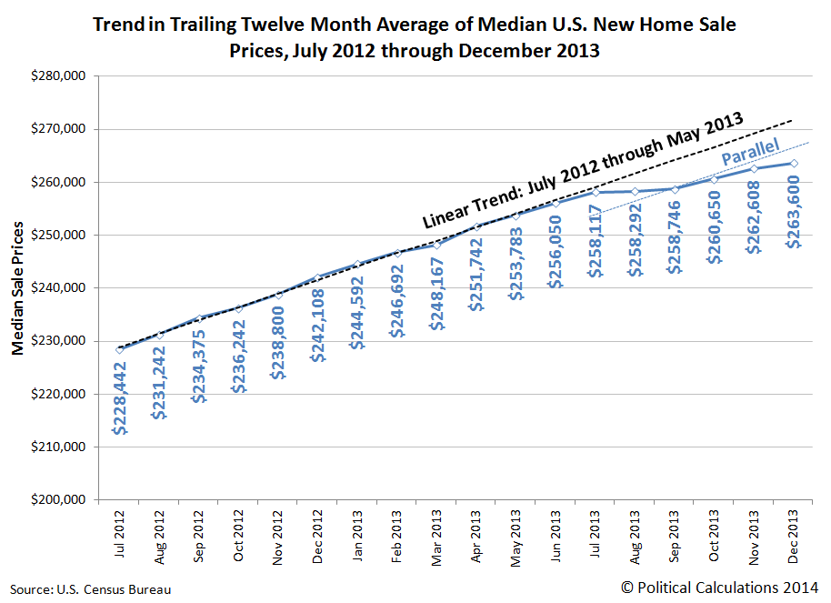
This chart is where we observe that the pace of inflation of median new home sale prices would appear to be slowing. We should caution however that this data is subject to revision as more complete sale data become available, with the greatest revisions occurring in for the most recently published data. Even so, we can see in the older data that the reignited inflation has less "oomph" behind it.
Since December 2013, the Fed has acted to implement its QE taper plans, but mortgage rates are approximately still at the level to which they rose in anticipation of the Fed's action. It will be interesting to see if a new, more stable trajectory for housing prices begins to take hold in the U.S.' real estate markets.
References
Sentier Research. Household Income Trends: December 2013. [PDF Document]. Accessed 23 January 2014. [Note: We have converted all the older inflation-adjusted values presented in this source to be in terms of their original, nominal values (a.k.a. "current U.S. dollars") for use in our charts, which means that we have a true apples-to-apples basis for pairing this data with the median new home sale price data reported by the U.S. Census Bureau.]
U.S. Census Bureau. Median and Average Sales Prices of New Homes Sold in the United States. [Excel Spreadsheet]. Accessed 30 January 2014.
Previously on Political Calculations
We were among the first to declare that a second housing bubble was forming in the U.S. economy, and we were the first to back it up with an objective framework of analysis and data. Our ongoing analysis is chronicled below....
- The U.S. Housing Bubble Is Back - we apply our groundbreaking analytical methods to determine that a new housing bubble has begun to inflate in the U.S. economy.
- Fuel, Oxidizer and a Spark - Part 1 - we revisit the origins of the first U.S. housing bubble and identify the factors that ignited it.
- Fuel, Oxidizer and a Spark - Part 2 - we explain why housing prices rose so much more in just four states than they did elsewhere, and point our finger at the Fed's below-market interest rate policy as the primary source of fuel for the bubble.
- Fuel, Oxidizer and a Spark - Part 3 - we examine the factors that kept the first U.S. housing bubble going, even after the Fed finally acted to stop throwing so much fuel on the fire.
- Confirming the Second U.S. Housing Bubble - using revised data, we confirm that there is no apparent new-year slowdown in the inflation phase of the new U.S. housing bubble.
- As the Housing Bubble Inflates: Month 9 - we use hard data to refute the housing bubble deniers!
- As the Housing Bubble Inflates: Month 10 - we note the fourth consecutive record for median new home sale prices and discuss the spark that set off the second U.S. housing bubble.
- Setting the Baseline for a Better Housing Affordability Index - how affordable is your home when compared with every other American homeowner? We create a new index to answer that question for any household income level.
- As the Second U.S. Housing Bubble Inflates: Rapidly Escalating Prices - each revision of median new home sale prices indicates the second U.S. housing bubble is growing even faster than the first!
- The Sales Mix of the New Housing Bubble - we find that just like in the first U.S. housing bubble, the sales mix of new homes in the second U.S. housing bubble is being distorted in a very similar way.
- The First Anniversary of the Second U.S. Housing Bubble - we mark the first birthday of the second U.S. housing bubble.
- Is the Second U.S. Housing Bubble Beginning to Peak? - We note a deceleration in the upward trajectory of median new home sale prices and identify the primary cause. Along the way, we find that bubbles can only exist if the Fed wants them to exist!
- U.S. New Home Sale Prices Stalling Out
- Breathing New Life Into the Second U.S. Housing Bubble - After stalling out through September 2013, we find that U.S. housing prices began to rise again with lower mortgage rates following the Fed's decision to delay tapering its purchases of U.S. Treasuries and Mortgage-Backed Securities in September 2013.
- Slowing Inflation for the Second U.S. Housing Bubble - looking at the data through December 2013, we find that while the second housing bubble has resumed inflating, it would also seem to be inflating at a decelerating rate.
Labels: real estate
Welcome to the blogosphere's toolchest! Here, unlike other blogs dedicated to analyzing current events, we create easy-to-use, simple tools to do the math related to them so you can get in on the action too! If you would like to learn more about these tools, or if you would like to contribute ideas to develop for this blog, please e-mail us at:
ironman at politicalcalculations
Thanks in advance!
Closing values for previous trading day.
This site is primarily powered by:
CSS Validation

RSS Site Feed
JavaScript
The tools on this site are built using JavaScript. If you would like to learn more, one of the best free resources on the web is available at W3Schools.com.
Other Cool Resources
Blog Roll


