Let's shake things up a bit and start this week's review of last week's action in the S&P 500 by considering the major market moving headlines of the week preceding the Memorial Day holiday weekend in the U.S.
- Monday, 23 May 2016
-
- Fed's Rosengren sees U.S. on verge of meeting test for rate rise - FT
- Fed's Bullard: rates too low for too long could be risky - in which influential St. Louis Fed President James Bullard is quoted as saying that stronger market expectations for a rate rise are "probably good".
- Fed's Williams sees U.S. rate hikes despite Brexit risk, more in 2017
- Wall Street dips with focus on Fed
- Tuesday, 23 May 2016
- Wednesday, 23 May 2016
-
- Fed's Kaplan says sees two U.S. rate hikes this year - Kaplan also says that he "wants rate hike in near future"
- S&P 500 ascends 2 percent in two days - the S&P is nearing its ceiling once again - it won't go much higher in the absence of either a positive noise event (a.k.a. "speculative bubble") or unless the prospects for future dividends get a boost.
- Thursday, 23 May 2016
- Friday, 23 May 2016
-
- Yellen says Fed rate hike likely appropriate in coming months
- Wall Street puts finishing touch on best week since March - the original headline for this article was "Wall Street rises; sees bright side of higher rates"
- Fed's Bullard says global markets seem well-prepared for summer rate hike - Bonus headline from Sunday, 29 May 2016!
So why does St. Louis Fed President Jim Bullard think that? Here's a hint from his reported remarks:
St. Louis Federal Reserve President James Bullard said on Monday global markets appear to be "well-prepared" for a summer interest rate hike from the Fed, although he did not specify a date for the policy move.
"My sense is that markets are well-prepared for a possible rate increase globally, and that this is not too surprising given our liftoff from December and the policy of the committee which has been to try to normalize rates slowly and gradually over time," Bullard told a news conference after speaking at an academic conference in Seoul.
"So my ideal is that if all goes well this will come off very smoothly."
Our alternative futures chart below, which is based on our dividend futures-based model of how stock prices work, reveals that the spread of potential volatility for the S&P 500 has narrowed to less than 75 points, regardless of whichever future quarter investors might focus their forward looking attention upon.

That means that no matter what the Fed might do, the value of the S&P 500 is unlikely to move more than 3-6% in value in the near term future, and the only reason we think it might move as much as 6% is because we believe that the S&P 500 is presently running slightly to the hot side. So where the stock market is concerned, the Fed now has optimal conditions for hiking short term interest rates.
Following up an observation we made in our review of Week 3 of May 2016, it appears that what we had thought might be a short-term pricing anomaly for the CBOE's implied forward dividends contract for S&P 500 in the second quarter of 2016 (CBOE: DVJN) represents a real change in the expected amount of dividends that will be paid out before the end of the quarter, as it has been sustained for more than a week.
Update: 12:07 PM EDT: It turns out that we were right the first time - the CBOE's implied forward dividends contract for S&P 500 in the second quarter of 2016 (CBOE: DVJN) has dropped by 3.50 this morning, from 116.70 to 113.20, reverting back to just above the level it was before the pricing anomaly appeared.
Not long ago, we had the opportunity to buy Manchester United.
That's right. The soccer team. The one that Forbes estimates to be worth over 3.3 billion dollars, or if you prefer, the football team that Forbes estimates is worth over 2.2 billion pounds.
And we saw that we could buy it because it was on sale.

Specifically, we were looking to buy it in the first several months of this year, after we recognized that we could acquire the world's most successful and valuable sports franchise for a significant discount.

So we put a bid in to buy Manchester United (NYSE: MANU) for $13.25 per share, which we projected would be pretty close to the bottom that the stock price would hit before beginning to recover.
As you can see in the chart above, we were almost right on target. MANU dropped to a low value of $13.30 during trading on 22 March 2016, and that was as close as we got to buying the world's most popular sports team. As of the close of trading two months later, on Friday, 20 May 2016, it had bounced back to $16.80 per share - an increase of $3.50 per share, or a raw percentage gain of 26.3%.
But truth be told, we weren't being fully rational in making our investment decisions. Our main motivating factor in even considering the purchase was irrationally psychological in nature.
Specifically, we were looking to buy the Red Devils as a psychological hedge for the disappointment that we realized we would be likely facing by the end of the 2015-2016 season as our preferred team in the English Premier League struggled to find its footing.
And though Manchester United was struggling too at the time we began considering buying it, which is why its stock was on sale in the first place, we recognized that the team's deeper organizational strengths would likely carry it through. And that meant that we could offset at least a portion of the amount of any psychological loss we might have by the end of the season with real financial gains.
In the end, that strategy didn't work because we were a nickel below where Manchester United would find its bottom before turning around. It was however fun to think about, which we now describe as that time we almost bought Manchester United. As for our psychological accounts, we are happy to say that we have since been handsomely rewarded by developments in the battle for Lord Stanley's Cup.
Labels: business, investing, sports
Following up our discussion of the priorities of the TSA (a.k.a. the Transportation Security Administration), we thought it might be worth looking at the priorities of the U.S. Department of Homeland Security (DHS) as measured by how it directed the money it was authorized to spend over the past 10 years.
The chart below visualizes what we found in the DHS' own Budget in Brief documents for each year from the U.S. government's 2007 fiscal year (beginning on 1 October 2007) through the projected end of the current 2016 fiscal year (ending 30 September 2016). We've ranked the spending by major organization within the DHS from lowest to highest as of FY2016. The values in the chart are given in thousands of U.S. dollars.

Since Fiscal Year 2007, the annual budgets of two organizations within the U.S. Department of Homeland Security have more than tripled: the Federal Emergency Management Agency (FEMA) and the National Protection and Programs Directorate (also called the Office of Infrastructure Protection).
Meanwhile, five have budgets that are over 148% larger in FY2016 than they were in FY2007: Management and Operations (177%), Customs and Border Protection (171%), Office of Inspector General (164%), Citizenship and Immigration Services (163%) and the Secret Service (148%).
Meanwhile, the remaining seven major organizations have budgets in FY2016 that are all within 31% of what they were in FY2007 - some higher and some lower: Immigration and Customs Enforcement (131%), Coast Guard (128%), Transportation Security Administration (118%), Federal Law Enforcement Training Center (97%), Analysis and Operations (88%), Science and Technology Directorate (81%) and the Chemical, Biological, Nuclear and Explosives Office (72%).
This analysis omits the DHS' Office of Health Analysis, for which the Obama administration appears to have not requested funding in FY2017, and also the FEMA grants to U.S. states and local governments that are managed through the DHS, but which really represent spending by state and local governments that is funded by the federal government.
The TSA's budget peaked at $7.84 billion in FY2012, but was cut by 8.3% in FY2013. Since then, it has slowly risen back to be 94.9% of its peak budget value, which at $7.44 billion in FY2016, is also 118% of what the TSA spent to perform its mission in FY2007.
In FY2007, the TSA spent $6.33 billion. Adjusted for inflation, that $6.33 billion in 2007 U.S. dollars is the equivalent of $7.33 billion in 2016 U.S. dollars. Since the TSA will spend $7.44 billion in 2016, its spending has kept ahead of inflation.
What that means is that the TSA has all the money it would take to provide a similar level of service in 2016 as it did in 2007, if only it spent money the same way. Because it is spending its money differently, the problems the TSA is now having in causing significant delays for travelers at U.S. airports may be entirely attributed to the decisions of the DHS and its own management for how its available funds have actually been spent.
That's why the TSA's security chief, Kelley Hoggan, has been put on administrative leave, pending a new assignment (no, he hasn't has his federal government employment terminated as erroneously reported by several mainstream news outlets - that would take a system of real accountability for managerial job performance that the civilian branches of the U.S. federal government haven't had since 2008 - Hoggan is still receiving his full paycheck.)
Where does the buck stop again?
Data Sources
U.S. Department of Homeland Security. Budget in Brief: Fiscal Year 2017. [PDF Document].
Accessed 25 May 2016.
U.S. Department of Homeland Security. Budget in Brief: Fiscal Year 2008 through Fiscal Year 2014. [Links to PDF Documents]. Accessed 25 May 2016.
Labels: business, data visualization, quality
Not long ago, we came across a data source that provided over 150 years worth of nominal price data for wheat crops grown in the U.S., which we recently visualized.
But more than that, it also provided some very remarkable data on the production of wheat over the 15 decades from 1866 through 2015. Data that captures the story of great advances that have been made in U.S. agriculture over the last 60 years, which is what we'll explore and visualize today!
First up, let's consider the amount of wheat that is harvested annually. The following chart counts up the thousands of bushels of wheat that were harvested from 1866 through 2015 in just one state, which has gone from nearly 1,292,000 bushels in 1866 to figures that have consistently ranged between 200 and 388 times that figure over the last 40 years.
![Wheat Production [Thousands of Bushels], 1866-2015](https://blogger.googleusercontent.com/img/b/R29vZ2xl/AVvXsEg-Qh9zSUqpHv5GSym3qzc1lxgOADHLwHXxyTvdUvxjzxE0uMSMoBCNz7-8G4NCpEB-vzo53HmzjShvJg1k3eWzHnZpQWibu341D_q3m8KRnpAYcEkUZbF5qSF2XlkTEU5axJogsQ/s1600/ks-wheat-production-1866-2015.png "Wheat Production [Thousands of Bushels], 1866-2015")
At the same time, over the period since 1909 when data for the number of acres planted is available, we see that the gap between potential and actual wheat production has narrowed. The next chart shows what we'll call the harvest efficiency of the acreage of wheat planted each year, which we calculate as the percentage of acres harvested to acres planted.
![Efficiency of Wheat Crop [Acres Harvested per Acre Planted], 1909-2015](https://blogger.googleusercontent.com/img/b/R29vZ2xl/AVvXsEg36cOIyShfxKWFwY3IDE6pSn7GRRQDldtzPAnYCLt9MOD7oCWoPX_YLcODfWuiDLhxxD27QGlMR_gZ6V_nXzWaKoGhsw6NBGrebdvHzx9KpQRmWMBQ6z9gfxifLxjcqwZkC1Z-BA/s1600/ks-harvest-efficiency-wheat-crop-1909-2015.png "Efficiency of Wheat Crop [Acres Harvested per Acre Planted], 1909-2015")
In this chart, we see that U.S. farmers have become better over time in avoiding major crop losses, often as a consequence of severe droughts, where the trend is clearly one of great improvement. At the same time, the most recent years show that the amount of volatility in annual harvest efficiency has become greatly reduced during just the past 20 years, which is especially remarkable given that 2012 saw the most severe drought conditions across much of the wheat producing section of the United States since the 1950s.
But here's the real story that's hidden in this data: the rapid rise of the yield of wheat per acre. From 1866 through the mid-1950s, the typical yield for harvested wheat ranged between 9 and 20 bushels per acre. After 1955 however, it has risen to where it now ranges between 24 and 48 bushels per acre.
![Yield of Wheat Crop [Bushels per Acre Harvested], 1866-2015](https://blogger.googleusercontent.com/img/b/R29vZ2xl/AVvXsEjVETW56HOGBdTdvMdHu_SGU_HC2yM5sdUMLPPiqJnUOuq92Jj1K0paqdiUMLbnHctJKIySV1N4Z0xVFQS0gBxArYSRdctrgKkliAQaoPi87bW7XzLmthV3N12JoWIKNQXcw2pmzg/s1600/ks-yield-wheat-crop-1866-2015.png "Yield of Wheat Crop [Bushels per Acre Harvested], 1866-2015")
There is one big factor behind this change, and a lot of other factors that have combined to produce this result. The big factor is the development of infrastructure for irrigating crops, which are estimated to have increased the yield of wheat by 18 bushels per acre in the years since 1955. By minimizing losses to periodic drought conditions, the expansion of irrigation technology to improve wheat crop yields largely accounts for the reduction of volatility in annual harvest efficiency.
At the same time, an ongoing series of incremental improvements in other agricultural technologies, including seed genetics, seed treatments, fertilization methods and improving harvesting methods, have all combined to incrementally increase the yields of wheat harvested over time.
Those rising yields have also produced another benefit. Increasing yields and efficiencies has made it possible for wheat farmers to reduce the amount of acreage they plant.
![Wheat Production [Thousands of Acres Planted], 1909-2015](https://blogger.googleusercontent.com/img/b/R29vZ2xl/AVvXsEg3ePBP5uo7GXsDFhHNnezc5MotFD1RBbj5F9ngbmvatUcuPIJrYd3FFvkF2RGTSYn_dWBEH0Utcdy7Rkf057uiHuZBtUeHctXXlqmzBzYUbmyqV37sjPA82o3wjnYNrHKGOqHtkg/s1600/ks-wheat-crop-acres-planted-1909-2015.png "Wheat Production [Thousands of Acres Planted], 1909-2015")
In 2015, farmers planted 9,200,000 acres of wheat, just slightly more than the 9,112,000 acres of wheat that were planted over a century earlier in 1914. In 1914, wheat farmers harvested 172,750,000 bushels of wheat, which for that year, represented a record bumper crop. In 2015 however, wheat farmers harvested 321,900,000 bushels of wheat - over 1.8 times as much - in a year where the amount of wheat harvested was well below the average of the last 40 years.
That increase in productivity has allowed land that had been tied up in farming wheat to be used to grow other crops or to be used for entirely different purposes.
And it's not just wheat. Many other crops have seen even greater improvements in their yields and harvest efficiency.
These changes have also all happened as dramatically fewer Americans are employed in agriculture. In 1900, an estimated 41% of the entire American workforce were employed on farms. A century later, that figure had fallen below 2%. As of December 2015, some 1.5% of all working Americans are employed in agriculture.
Data Source
U.S. Department of Agriculture. National Agricultural Statistics Service. Northern Plains Regional Field Office. Kansas Wheat History. [PDF Document]. Last Updated: October 2015. Accessed 7 May 2016.
Labels: business, data visualization, food, technology
On Monday, 16 May 2016, the U.S. Treasury updated its accounting of the national origins of the major foreign holders of debt issued by the U.S. government through the end of March 2016, the halfway point of the federal government's fiscal year. With that new information, we can update our visualization of all the money that the U.S. federal government has borrowed and currently owes through the end of March 2016.

In the chart above, we've grouped Belgium and Ireland together, next to the pairing of Mainland China and Hong Kong, because major banks in these nations have been increasingly acting as intermediaries for China's total holdings of U.S. government-issued debt securities. Along with a number of banks in the United Kingdom, which have served a similar role in recent years, we believe that a good portion of China's ownership of U.S. Treasuries is being incorrectly attributed to these nations.
Meanwhile, Brazil's holdings have fallen over the past year, as falling oil prices and falling exports to China have taken a toll on the South American nation's economy. Back in 2011, we had noted the rise of Brazil's holdings of U.S. Treasuries were an indication that it was a rising world power. Those holdings peaked in 2014 and since then, Brazil's status has faded along with its economic and now political challenges.
But perhaps the biggest news in the U.S. Treasury's updated data is that discontinued its previous grouping of "oil exporters" as a single category, instead presenting the U.S. Treasury holdings of Saudi Arabia, United Arab Emirates, Kuwait, and others individually for the first time since it began reporting the data in 1974. Of these nations, Saudi Arabia had the largest holdings at $117 billion, accounting for 0.6% of the total public debt outstanding for the U.S. government.
Much of those holdings were accumulated in the time from when oil prices began surging in 2004 until global oil prices began falling dramatically in mid-2014.
Like China however, many of Saudi Arabia's actual holdings of U.S. government-issued debt securities are likely being attributed to other nations. Since Saudi Arabia recently threatened to sell off $750 billion worth of U.S. Treasuries and other assets, which suggests the nation maintains most of these assets in non-direct accounts based in other nations.
Data Sources
Federal Reserve Statistical Release. H.4.1. Factors Affecting Reserve Balances. Release Date: 2 April 2015. [Online Document]. Accessed 15 May 2015.
U.S. Treasury. Major Foreign Holders of Treasury Securities. Accessed 15 May 2015.
U.S. Treasury. Monthly Treasury Statement of Receipts and Outlays of the United States Government for Fiscal Year 2015 Through March 30, 2015. [PDF Document].
Labels: national debt
Quite a lot has happened since we last commented on the S&P 500 and the news events that influenced it during the first part of the third week of May 2016. In short, the following major events happened:
- More officials at the U.S. Federal Reserve indicated that they were likely to hike interest rates at their upcoming June 2016 meeting.
- The minutes of the Fed's April meeting released during the week confirmed that the Fed is actively considering that move.
- The Fed appears to have quietly launched a new round of quantitative easing (QE).
Following what happened over the preceding several days, U.S. investors appear to have focused on 2016-Q3 in setting the level of the S&P 500. Our alternative futures chart shows how the rest of Week 3 of May 2016 played out for the S&P 500.

Here are the more significant headlines from the rest of Week 3 of May 2016 that caught our attention:
- Wednesday, 18 May 2016
-
- Oil advances on U.S. refined fuel drawdown; Brent near $50 per barrel
- U.S. dollar up on hawkish Fed; bank stocks rally
- Fed signals interst rate hike firmly on the table for June
- Wall Street turns negative as Fed signlas June rate hike possible
- Dollar jumps after Fed minutes signal possible June hike
- Hawkish Fed sends U.S. dollar soaring; bank stocks rally
- Thursday, 19 May 2016
-
- Wall Street opens lower as Fed rate hike looms, oil falls
- Dudley joins chorus of Fed officials seeing rate hikes soon
- Wall St. falls on Fed rate hike worry
- U.S. Fed buys $7.5 billion of mortgage bonds, sells none - In the absence of an offsetting move, this is nothing less than the return of QE (let's call it QE 4.0), which is similar to how QE 3.0 was first implemented, although on a smaller scale. More remarkably, the Fed may actually be following part of our policy advice from August 2015, when if was first considering hiking interest rates after years of adhering to its previous Zero Interest Rate Policy (ZIRP).
- Friday, 12 May 2016
The Fed's net increase in its holdings of Mortgage Backed Securities (MBS) is reminiscent of the actions it took in 2012, when it became clear that the U.S. economy was beginning to slide toward recession during the summer of 2012, where the Fed's first action in QE 3.0 was to begin making large MBS purchases to further stimulate the nation's real estate market.
The Fed's intervention at that time succeeded in preventing the U.S. economy from falling into recession before the November 2012 elections, but following the elections, the Fed was forced to expand its QE efforts to offset the negative impact from the U.S. government's fiscal policies, where large tax increases desired by President Obama on all working Americans were set to take effect on 1 January 2013.
As we saw in 2012, the Fed's new MBS purchases should have little effect, if any, on U.S. stock prices. They are really a way to partially offset the full impact of its next planned interest rate hike, which they will now likely announce on 15 June 2016, but which will be implemented in 2016-Q3, which is why investors are focusing on this future quarter.
On a final note, we think that there is a pricing anomaly in the CBOE's implied forward dividends contract for S&P 500 in the second quarter of 2016 (CBOE: DVJN), which suddenly jumped in value from 113.00 to 116.40 on Wednesday, 18 May 2016, which has been sustained over the last several trading days. (You can estimate the amount of ordinary dividends that will be paid out for the S&P 500 during 2016-Q2 by dividing the value of these contracts by 10).
Since that large increase hasn't also shown up in the implied forward dividends for 2016-Q3 (CBOE: DVST), 2016-Q4 (CBOE: DVDE) and 2017-Q1 (CBOE: DVMR), which would confirm that the change is the result of a sustained improvement in the expectations for future dividend payments, it instead suggests that something unusual is going with the DVJN contract.
That is something that is possible because these contracts are periodically very thinly traded, which allows such pricing anomalies to occasionally develop. It will be interesting to see how long that situation might persist.
Every three months, we take a snapshot of the expectations for future earnings in the S&P 500 at approximately the midpoint of the current quarter, right about the time that earnings season has ended for the U.S. stock market.
Today, we'll confirm for the sixth time in a row that the earnings recession that began in the fourth quarter of 2014 has continued to deepen.
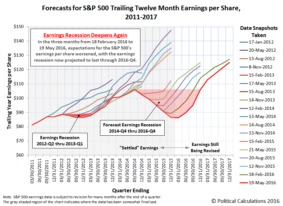
In the chart above, we confirm that the trailing twelve month earnings per share for the S&P 500 has continued to fall from the levels that Standard and Poor had projected they would be back in February 2016. And November 2015. And for that matter, what they had forecast they would be back in August 2015, May 2015, February 2015 and in November 2014.
According to S&P's projections, the S&P 500's trailing year earnings per share will not return to the level they were in August 2014 until the fourth quarter of 2016, which is to say that S&P is anticipating an extraordinarily robust earnings recovery.
While that's not impossible, some back of the envelope math suggests that the most likely path that would enable such a recovery to occur for the S&P 500's earnings situation would involve the rapid escalation of oil prices back above the $100 per barrel mark, which would enable the earnings recovery of the U.S.' distressed oil production industry. That would mean that oil prices would have to more than double from the level they are at this writing.
Alternatively, that result could also be obtained if the relative value of the U.S. dollar were to plunge by 50% or more.
Both scenarios however are very unlikely. Which is a good thing because if either thing happened, it would be very bad news for the U.S. economy.
Data Source
Silverblatt, Howard. S&P Indices Market Attribute Series. S&P 500 Monthly Performance Data. S&P 500 Earnings and Estimate Report. [Excel Spreadsheet]. Updated 12 May 2016. Accessed 19 May 2016.
Labels: earnings, forecasting, SP 500
Last year, on 20 August 2015, a four year long period of order in the U.S. stock market came to a crashing end.

What has happened since then?
After the initial shock, which ended on 26 August 2015, order briefly returned to the S&P 500, but only through the end of 2015.
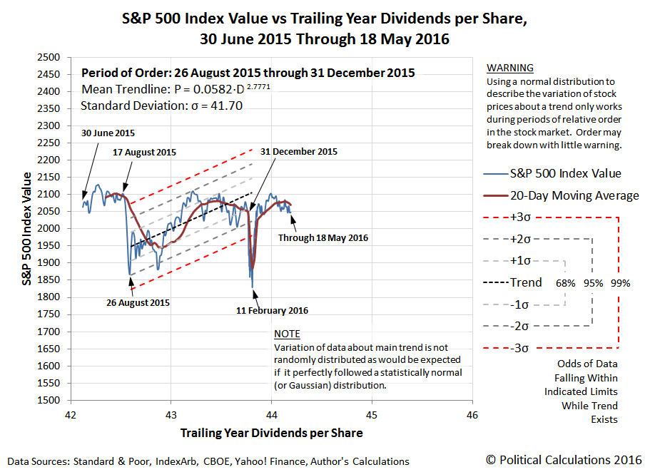
As yet, not enough time has passed to determine whether order has returned to the U.S. stock market following the disruptive noise event of January-February 2016. But if you're the type who needs something to worry about, compare the path that stock prices followed in the period from 30 June 2015 through 17 August 2015 to the path that stock prices have taken from 31 December 2015 through 18 May 2016.
So what do you think comes next?
Although the poorly laid plans of the TSA interfered with our usual posting schedule this week, we're fortunate in that recent developments in the market are giving us something far more interesting to write about today that what we might otherwise have discussed this past Monday.
Picking up on the market's action from last Friday, 13 May 2016 through Tuesday, 17 May 2016, it would appear that investors are shifting their focus away from the more distant future represented by 2016-Q4 toward the nearer term future of 2016-Q3. You can see the small magnitude shift take place in the following chart over the last several days.

With the relatively tight compression of the alternative futures that stock prices might take dependent upon how far forward investors are collectively looking into the future, this particular Lévy flight in the trajectory of the S&P 500 is almost indistinguishable from noise.
But we might get a bigger, more volatile response if certain Fed officials get their way and if the U.S. economy is able to show additional signs of strength, which the Fed would take as a green light for hiking short term interest rates sooner rather than later as investors had previously believed. You can see the news that moved investors to shift their forward looking focus to the nearer term in the headlines of note that we recorded over the past seven trading days, spanning all of Week 2 of May 2016 and the first part of Week 3....
- 9 May 2016
- Fed's Kashkari says current U.S. interest rates 'about right' - not a voting member of the FOMC, but a vote for the status quo. Coinciding, of course, with investors keeping their focus on 2016-Q4, where it has been for much of the current quarter of 2016-Q2.
- Wall St. little changed as health offsets commodities - also not surprising.
- 10 May 2016
- U.S. economy seen expanding 2.2 percent in second quarter: Atlanta Fed - the first taste of better than expected news for the U.S. economy
- Stocks, oil surge as yen falls back again - which provided a very short-term boost for U.S. stock prices, before investors started considering what better than expected news would mean for the Fed's rate hiking plans.
- 11 May 2016
- Oil jumps on first U.S. drawdown since March; Brent up 4 percent
- U.S. dollar falls for first time after six-day rally
- Wall Street slumps as Disney and Macy's slam consumer shares - the S&P 500 ended down from the previous day, but up from the day before that, as the market basically continued moving sideways as it has through much of 2016-Q2.
- 12 May 2016 - This is the day when hawkish Fed officials really began to get to work in attempting to direct the attention of investors to the nearer term future, which they did by indicating that they want a rate hike much sooner than investors have been expecting.
- U.S. economic uncertainty should not 'paralyze' Fed: Mester
- Fed will need to hike if second-quarter data points to stronger economy: Fed's Rosengren
- Fed's George says interest rates are too low
- Fed's Yellen says won't completely rule out negative rates
- Wall Street mixed as Apple tumbles to two year low
- DoubleLine's Gundlach sees 'some rebellion' from Fed hawks
- 13 May 2016 - And the hits just kept on coming!
- Fed's Williams sees good outlook, 2-3 rate hikes this year
- Wall Street drops at end of tough week for retailers
- S&P seen failing in reach for year-old record
- 16 May 2016
- Fed's Lacker says June hike should be on the agenda - Lacker would be the fifth Fed official calling for a sooner rate hike.
- Oil hits six-month highs on supply outages, Goldman forecast
- Apple, energy shares shine as Wall Street rallies
- 17 May 2016
- Wall Street lower as strong data raises chances of rate hike
- Fed's Kaplan's sees U.S. rate hike in 'not too distant future'
- Fed officials say 2-3 U.S. Rate hikes possible this year - the "Fed officials" in the story are Atlanta Fed President Dennis Lockhart and San Francisco Fed President John Williams. Lockhart would be the seventh Fed official in the last week calling for a short term interest rate hike to happen sooner.
Why, it's as if the Fed's minions are working overtime to set investor expectations! At least until they might get mugged by a different reality....
IF the Fed's June 2016 meeting becomes a "live" meeting for implementing a rate hike, U.S. stock prices can be expected to converge with the trajectory our dividend futures-based model is projecting for 2016-Q2, which would mean the S&P 500 would fall from its present level. Potentially by as much as 200-240 points by the time the meeting concludes given the current expectations for future dividends.
But if the Fed is prompted to back off its rate hike plans, the S&P 500 would only be likely to move sideways from where it is now, plus or minus three percent. At least, in the absence of a noise event that might prompt stock prices to deviate from our futures-based model's projected trajectories.
Visually confirmed by a traveler at Chicago's Midway Airport (MDW), five days ago, but repeated many times in many places in the days since:
Here is what the hapless head of the U.S. Department of Homeland Security, Jeh Johnson, has to say about what he plans to do to fix the U.S. Transportation Security Administration's geographically expanding problems with has been described as "inevitable" recurring delays at security check lines, and what he believes that U.S. travelers should have to do:
The U.S. Department of Homeland Security will immediately increase the use of overtime and work to quickly bring in more screening officers to help alleviate long lines at airport security checkpoints, Homeland Security Secretary Jeh Johnson said Friday.
But Johnson warned that wait times are inevitable during the busy summer travel season.
“We encourage people to have the appropriate expectations when they arrive at airports,” Johnson said at a press conference at Reagan National Airport outside Washington. “Contemplate increased wait times as you travel.”
Wow. Who could possibly have foreseen that the busy summer travel season would be busy, year after year after year after year? Especially following the records for passengers traveling by air that were just set during the busiest spring travel season ever.
Why, that might take some kind of communication with the shrinking number of airlines that sell tickets to people doing that kind of travel often well in advance of their actual travel, wouldn't it?
But then, the people who would need to use that information to competently plan staffing levels for the TSA's air travel screening programs at the nation's airports would appear to have other priorities than paying attention to the needs of U.S. travelers.

Some would say that the chart above represents real world evidence that the senior management at both the TSA and the Department of Homeland Security are apparently incapable of planning their way out of a wet paper bag.
If only they had had more money to spend this year. Oh wait, they do....

The problem isn't money. It's priorities.
We'll soon return to our travel delayed regular programming....
Labels: management
On 18 March 2016, Arturo Vittori and the team behind Warka Water won the 2016 World Design Impact Prize from the International Council of Societies of Industrial Design for their unique concept of supplying potable water to remote regions in Ethiopia without access to safe drinking water.
But what makes their achievement especially noteworthy is that they did it without diverting water from elsewhere or by digging wells. Instead, they developed a device to capture the area's limited rainfalls and to also harvest water from both fog and dew. In the 17-minute TEDx video below from 25 August 2015, Arturo Vittori describes the problems that led to the invention and development of the Warka Water tower.
The image below illustrates how the Warka project's nature and tradition-inspired water gathering towers, which can be built with common materials available where they are built without special tools, are able to effectively extract water directly from the atmosphere.

Unlike a lot of what passes for "development", which usually consists of "experts" flying in and just applying technical solutions that were developed elsewhere to "solve" the problems of indigenous peoples that almost inevitably fail because they don't really meet their needs, Vittori's invention has a real shot of becoming successful because in addition to being technically capable of delivering on its promise, it also respects the established traditions and the hard-won knowledge of the people who might benefit from it without thoroughly disrupting their lives. Even better, it provides a starting point that can be adapted and refined by its users and builders to better meet their own needs as they change.
HT: Core77.
Previously on Political Calculations
Some of our favorite essays on the topics of technology and innovation....
- Technology's End
- Making Wind Energy Better for the Environment
- Old Inventions, Finding New Life
- Telephones, Steam Engines and Zeer Pots
- What Can Africans Do that Europeans, Asians and Americans Can't?
- An Ancient Clockwork Bronze
- Rediscovering Nature
- Power from Space
- Linear Cities
- Things That Last and Where to Buy Them
- Creating Civilization from Nothing
- Does Technology Have to Replace Low Income Jobs?
Labels: technology
How much money does the U.S. federal government owe to China?
Answering that question is a bit harder than it sounds, because in addition to its own financial institutions and those of Hong Kong, China loans money to the U.S. indirectly through a number of foreign intermediaries - most notably in the international banking centers in the United Kingdom, Belgium and in recent years, Ireland.
Using historic data trends to estimate the portion of each nation's reported holdings of the U.S. national debt likely belong to each nation, we then assigned any surplus in those holdings to China. The chart below reveals what we found for the ten year period from January 2006 through January 2016.
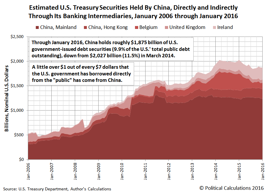
In the 10 years from January 2006 through January 2016, we estimate that China nearly quadrupled its holdings of U.S. Treasuries, from roughly $500 billion to almost $2 trillion. China therefore accounts for approximately $1 out of every $7 that the U.S. federal government has borrowed from the public in order to sustain its spending at levels that are considerably elevated over the revenue it collects through taxes and also the payments it receives for federal direct student loans.
Meanwhile, through January 2016, China holds roughly $1,875 billion of U.S. government-issued debt securities (9.9% of the U.S.' total public debt outstanding at that time), which is down from $2,027 billion, or 11.5%, in March 2014, as China has liquidated a significant portion of its holdings through its Belgium-based intermediaries.
Data Sources
U.S. Treasury Department. Securities (B): Portfolio Holdings of U.S. and Foreign Securities. Statistics.
Online Document]. Accessed 3 January 2016.
U.S. Treasury Department. Major Foreign Holders of Treasury Securities. MFH Historical Data. [Online Document]. Accessed 3 January 2016.
Labels: data visualization, national debt
Every now and again, we run into historic price data that we weren't expecting to find. When we do, we visualize it!
Today, we're exploring 150 years worth of the price of a bushel of wheat in the United States, first in a normal linear scale....

What do you know - it looks like a hockey stick!
Now, let's see what it looks like on a logarithmic scale, which takes exponential growth and makes it look like a straight line....

In this latter chart, we see that inflation we see that the price of a bushel of wheat generally ranged between $0.50 and $1.50 per bushel during the first 80 years for which we have data, from 1866 through 1945, with some notable exceptions, such as inflationary highs of $2.10-$2.14 during and immediately after World War I (1917-1919) and the low of $0.33 per bushel in 1931, marking the bottom for wheat prices during the Great Depression.
But after World War II ended in 1945, we see that wheat prices quickly rose to $2.00 per bushel, only dropping significantly below that threshold during the years from 1963 through 1972. After which wheat prices have stepped up in two main increments, the first in the years from 1973 to 2005 where wheat prices ranged between $2.25 and $4.59 per bushel, then again after 2005, when wheat prices have consistently ranged between $5.00 and $7.48 per bushel.
For 2015, we've estimated the average price of wheat to be approximately $5.28 per bushel, although this is based on the average prices of a bushel of wheat during each month of 2015. Since it doesn't reflect a weighted average however, as the USDA reports and which would better reflect the prices that people actually paid farmers for the wheat they grew in that year, it should be considered to be a preliminary estimate.
Data Source
U.S. Department of Agriculture. National Agricultural Statistics Service. Northern Plains Regional Field Office. Kansas Wheat History. [PDF Document Internet Archive PDF Document]. Last Updated: October 2015. Accessed 7 May 2016.
Update 10 June 2020: We've noticed this post is getting quite a lot of traffic, where we've just found the link to the source for the data we've visualized is no longer working. Since the USDA has broken the link, here is a link to where you can find the Kansas Wheat History document we originally referenced at the Internet Archive: [PDF Document].
If you want to find potentially newer editions of the data, here's a filepath you might be able to use to track where the latest edition of the report might now be located.
- Start with the National Agriculture Statistics Service's Statistics by State page.
- Select your state of interest (for this example, it's Kansas)
- Under the Publications section, select Cooperative Projects
- The latest Kansas Wheat History report should be among the available publications in this section.
The final link we've pointed to here will take you to the October 2019 edition of the report, which is the latest available at the time of this update, at least until the USDA's data jocks might restructure all their datapaths again!...
Labels: data visualization, food, inflation
How is the pace of dividend cuts in the U.S. stock market during 2016-Q2 coming along compared to the previous quarter? And how does that compare to the pace of dividend cuts that was recorded in the year ago quarter of 2015-Q2?
We're answering both questions today with two charts. In the first chart, we'll compare 2016-Q2 announced dividend cuts with 2016-Q1, which itself was the worst quarter for announced dividend cuts since 2009.

Through 9 May 2016, we see that the pace of dividend cuts in 2016-Q2 is greater than what was recorded through similar point of time in 2016-Q1.
That comparison however is somewhat misleading, which will become clear when we compare 2016-Q2 with the year ago quarter of 2015-Q2.

Here, we confirm that the pace of dividend cuts in 2016-Q2 is almost right on track with what we saw back in 2015-Q2.
A year earlier, this was approximately the point in time at which the level of distress in the U.S. economy that had built up in the preceding two quarters began to ease up. We saw this happen in near real time as a reduced number of U.S. firms announced new dividend cuts through the remaining part of the quarter, corresponding with an improving situation for the U.S. economy.
The thing to pay attention to in the next several weeks will be how the pace of dividend cuts now compares to that year ago quarter. If we see a significant uptick in the comparative number of dividends cuts in the remainder of 2016-Q2, we'll know things are worse. If the pace of dividend cuts decelerates to be slower than what was recorded a year ago, we'll know things are improving more rapidly than they did at that time.
That latter case would also hold if the pace of announced dividend cuts in 2016-Q2 follows the same trajectory it did a year ago. The reason why that would be true has to do with the fact that 2016-Q1 was worse than 2015-Q1. By comparison, a similar performance in 2016-Q2 would have to considered to be a better performance than what was observed in 2015-Q2 given that it occurred when coming off the momentum of a worse quarter.
Data Sources
Seeking Alpha Market Currents Dividend News. [Online Database]. Accessed 9 May 2016.
Wall Street Journal. Dividend Declarations. [Online Database]. Accessed 9 May 2016.
Labels: data visualization, dividends
If it seems like not much happened in the U.S. stock market in the first week of May 2016, that's because not much happened. The S&P 500 pretty much continued to follow the trajectory it has been following, tracking along with the path associated with investors being mostly focused on 2016-Q4.
")
Now, for the sake of documenting the news that barely moved the market, at least as measured by its daily closing values, here are the headlines of note from Week 1 oof May 2016.
- 2 May 2016:
- Fed may need more powers to support securities firms during crises: Dudley - This news actually came out on Sunday, 1 May 2016. Dudley's proposal would, in the case that liquidity in the markets were to unexpectedly dry up, provide a method of bailing out financial firms who would be at risk, and whose balance sheets would put other firms at risk. What Dudley perhaps does not very well appreciate is that once the Fed opens Pandora's box like this, it will need to keep it open. Just ask any central bank that has taken the path of ZIRP, NIRP and QE, which have all contributed to the increased dangers of such limited liquidity.
- Wall St. rebounds; Nasdaq breaks seven-day losing run
- 3 May 2016:
- Futures lower after weak Chinese economic data
- Fed's Lockhart: Two rate hikes this year 'certainly possible', flags Brexit risk - In just over a month's time, Lockhart has officially reduced his projection of three rate hikes in 2016 to two! Meanwhile, he's concerned about potential repercussions if Britain opts to leave the E.U., which he cites as a factor that might affect his new version of the Fed's plans to hike rates twice in 2016.
- Wall St. loses ground on growth fears, oil slide
- 4 May 2016:
- Wall St. lower as tepid data adds to growth worries
- Stocks retreat a second day on growth worries, copper slips - recurring headlines like this will eventually prompt the Fed's Lockhart to trim back his rate hike projects to just one!
- 5 May 2016:
- U.S., Europe shares rise with oil prices; dollar gains
- Fed's Bullard says global headwinds appear to have waned - Bullard's comments are mainly remarkable because it is the first time a senior Fed official has said that they don't expect any significant negative repercussions should the U.K. vote to exit the European Union - pretty much contradicting what the Fed's Lockhart was going on about earlier in the week....
- Wall Street ends little changed ahead of jobs report
- 6 May 2016:
- Wall Street rebounds to close higher after jobs report - ZeroHedge has a funny take on the market's recent reactions to the monthly jobs reports.
- Dollar edges higher as Fed's Dudley offsets weak U.S. jobs data - the Fed's jawboning at its finest, overshadowing his other comments suggesting that it would be "reasonable" to expect two rate hikes in 2016. To give you an idea of how much Dudley's thoughts are really worth, we think it would be reasonable for Fred Willard to play the Fed's Dennis Lockhart in the upcoming over-the-top dramatization of Money for Nothing: Inside the Federal Reserve.
All good inventions solve real problems. But what makes a great invention is how what it makes possible redefines what people consider to be real problems.
Take window blinds for example. As an invention, most people appreciate the real problem they solve by making it easy to regulate the amount of light over the entire surface of the window, allowing a more general diffusion of light to pass through than is possible to achieve by manipulating curtains, shutters or shades.
At the same time, most people will identify the problem of cleaning window blinds as something crying out for a new invention to solve. It's just not easy to remove the dust that accumulates on them.
But what most people won't do is identify the tilting of the blinds to allow more or less light to pass through as a problem demanding a new invention. The wands that many blinds are equipped with are pretty capable of doing that job.
And yet, via Core77, we've learned of a Kickstarter campaign for an invention that solves the problem of how to automate the tilting of blinds with an elegantly designed device that can be retrofitted to many existing window blinds.
Better still, it solves a problem that many people might not have fully appreciated because of being distracted by all the dust building up on their blinds - that adjusting the tilt of the window blinds is something of a hassle, especially as outdoor light conditions change throughout the day, meaning that it has to be done several times a day.
The FlipFic is an automated solution to the problem of window blind adjustment, which only becomes clear because the invention reveals it to be a problem that has been in great need of a solution.
But perhaps the real genius of the invention is something that the inventors themselves may not fully recognize. By eliminating the need to manually manipulate the window blinds, the FlipFic reduces the likelihood that the dust that inevitably accumulates on the blinds will be disturbed by being touched by human hands, leaving unsightly clean spots on an otherwise smooth coating of dust on the blinds, which is what really makes it necessary to clean them. So in a roundabout way, they may also have solved the biggest problem that the owners of window blinds believe they have with them!
If you're interested, the Kickstarter campaign will run through 11 May 2016. At this writing, it has surpassed its funding goals, so it will be a real thing that you can invest in for your home to improve your quality of life.
Labels: technology
If you were paying attention to the news yesterday, you probably heard that the United States' trade deficit with the rest of the world hit was the smallest it has been in several years. Which is being presented as a positive for the U.S. economy. Here is an excerpt of some key numbers from the news:
The U.S. trade deficit fell more than expected in March as imports of goods tumbled to their lowest level since 2010, a potential boost to first-quarter economic growth estimates that also hints at sluggish domestic demand.
[...]
In March, imports were held down by industrial supplies and materials imports which hit their lowest level since April 2004. Petroleum imports were the lowest since September 2002, even as oil prices rose to an average $27.68 per barrel.
Imports from China fell to their lowest level in three years. With exports rising, the politically sensitive U.S.-China trade deficit declined 25.7 percent to $20.9 billion in March.
But there is more to that story, and actually where the relative health of the U.S. economy is concerned, some, well, cause for concern. The following chart shows what we find when we calculate the year-over-year change in the growth rate of the exchange rate adjusted value of goods between the U.S. and China, which is important because it gives an indication of the relative health of the two largest economies in the world.

We see that for March 2016, the year over year growth rate for the goods that China imports from the U.S. and also the goods that the U.S. imports from China are in negative territory, which is an indication that things are not well with both economies.
While China's economy has been in this territory for some time, which coincides with that economy's struggles, what's more remarkable is the deep plunge that the U.S. economy would appear to have taken from the values recorded a year ago.
That's somewhat misleading, because a year ago, the amount of goods coming into the U.S. from China was elevated due to the end of a work slowdown by organized labor at the U.S.' west coast ports, which had created a significant backlog that took time to clear after it ended in February 2015. Last month, that work slowdown meant an elevated year over year growth rate, but in March 2016, that means a dramatic plunge in the year over year growth rate.
So how can we get a sense of the relative health of the U.S. economy from the most recently reported trade data when that dynamic is at work?
It occurred to us that we can take advantage of the cyclical nature of China's exports to the United States, which typically peak in either September or October of each year, and bottom in either February or March. We've shown that for the value of goods that the U.S. imports from China in the chart below for the period from January 2000 through March 2016, where we're showing the value of the goods in terms of both U.S. dollars (which is how Americans see the value of what it imports from China) and Chinese yuan (which is how the Chinese see the value of what it exports to the U.S.)

What if we calculated the percentage change from one year's bottom in the value of the goods that the U.S. imports from China to the next? Doing that should give us a pretty good idea of whether the value of trade is up, indicating positive economic growth since a growing economy will draw in more goods from elsewhere in the world to meet its growing demand, or if its down, indicating recessionary conditions are present in the U.S. economy. The following chart reveals what we found:

We see that negative values are consistent with recessionary conditions being present in the U.S. economy, coinciding with the 2001 recession, the 2008-2009 recession, and the 2012-2013 microrecession.
We also see that 2016 shows a negative value. Which is really remarkable because that's in comparison to the lowest month for U.S. imports from China in 2015, which was made lower in part because of the labor union orchestrated work slowdown at west coast ports that year.
Which then confirms that the relative health of the U.S. economy in March 2016 has deteriorated from what it was a year ago, and is also worse than what was observed during the 2012-2013 microrecession.
Data Sources
Board of Governors of the Federal Reserve System. China / U.S. Foreign Exchange Rate. G.5 Foreign Exchange Rates. Accessed 4 May 2016.
U.S. Census Bureau. Trade in Goods with China. Accessed 4 May 2016.
Labels: trade
Welcome to the blogosphere's toolchest! Here, unlike other blogs dedicated to analyzing current events, we create easy-to-use, simple tools to do the math related to them so you can get in on the action too! If you would like to learn more about these tools, or if you would like to contribute ideas to develop for this blog, please e-mail us at:
ironman at politicalcalculations
Thanks in advance!
Closing values for previous trading day.
This site is primarily powered by:
CSS Validation

RSS Site Feed
JavaScript
The tools on this site are built using JavaScript. If you would like to learn more, one of the best free resources on the web is available at W3Schools.com.
Other Cool Resources
Blog Roll


