We were really amused to read Ed Morrissey's lead in his take on the BEA's release of its second estimate for how much the U.S. economy grew in the third quarter of 2012:
When I wrote about the advance estimate from the Commerce Department on Q3 GDP hitting 2.0%, some commenters warned that the report — which came out just before the election — would be sharply revised after it. They were right, although the revision went in the opposite direction they suspected. The revised Q3 GDP number jumped upward to 2.7%, the best quarter of the year, although still substantially a stagnation number, especially when one sees the source of the growth
While Ed then goes on to note the role of government spending and particularly defense spending in boosting the GDP growth rate for the quarter, we really can't help wonder who the commenters who picked the wrong direction for the revision are.
Because clearly, they aren't us! Here's what we wrote nearly one month ago:
As we expected, economic growth in the United States picked up in the third quarter of 2012, increasing from the annualized growth rate of 1.3% recorded in 2012-Q2 to 2.0% in the BEA's initial GDP estimate for 2012-Q3.
We had forecast that real GDP would be recorded at $13,602.8 billion in terms of constant 2005 U.S. dollars, and the BEA's initial estimate came in at $13,616.2 billion - a difference of $13.4 billion, or within 0.01% of the BEA's recorded figure.
The BEA will revise this figure twice more before the end of the year. We anticipate that it will be adjusted upward, as the third quarter of 2012 likely recorded the U.S.' strongest economic performance for the year.
And here's what we wrote nearly a month before that:
Although we're coming off a quarter where the U.S. economy could reasonably be described as being in a "microrecession", as we had long expected, we anticipate that the GDP growth rate will be stronger in the third quarter of 2012 by comparison. Going by the dividend futures data we've had available since November 2011, the third quarter of 2012 has always looked as if it would be the strongest in 2012. Much like how the second quarter of 2008 was the strongest quarter in that year, even though the U.S. economy had already peaked and had begun falling into recession earlier in December 2007.
We'll give the next-to-final word to the Emperor:
But alas, when it came to serious analysis of data in real time, the Emperor was no Moradmin Bast. Geek out on that if you will....
Labels: gdp
James Pethokoukis notes the skyrocketing ratio of student loan debt to household income, the currently spiking default rate on student loans, and wonders if a new federal government bailout is in the works:
See where this is heading? When you take into account America’s burgeoning bailout culture and the rising political power of younger voters, it’s no surprise that Citigroup thinks taxpayers might end up riding to the rescue:
Taxpayers already (or will) indirectly subsidize both the housing and healthcare sectors by covering GSE losses and paying for a healthcare system that pays out more than it receives in revenues. If the continued misalignment of educational resources ultimately leads to government “forgiveness” of student loan debt, it will simply be one more example of fiscal subsidies for a narrow demographic.
Citigroup estimates that writing off defaulted student loans would cost $74 billion, though such a move might nudge other borrowers to strategically default in hopes of a bailout of their own.
We have a very easy solution for this scenario, which enterprising politicians might use to both ride to the rescue of distressed student loan borrowers while avoiding the moral hazard issue of encouraging other borrowers to strategically default on their student loans: restore the ability of distressed borrowers to have their student loan debt discharged in bankruptcy!
In one fell swoop, it would be possible to both relieve the genuine distress of the excessive debt held by these individuals in such a way that would stop other less-distressed but really opportunistic people from considering strategic defaults on their student loans, thanks to the restrictions and higher costs of future borrowing activity that would be placed upon them in bankruptcy proceedings.Plus, this reform would have the unique benefit of forcing the undoing of one of the biggest political power grabs of recent years: the federal government's takeover of the student loan industry.
Here, the unspoken goal of President Obama's policy has been to fully exploit the restriction of borrowers from being able to discharge their student loan debts in bankruptcy court as a backdoor means by which he could increase the amount of money that the federal government collects from low and middle income earners. All, we might add, without having to go through the hassle of fighting the political battle that would come from attempting to directly increase their income tax rates.
Just in case you wondered why President Obama has always been so keen to push "cheap" student loans....
That's also why President Obama has been so focused on increasing the tax rates of just those with high incomes, while pushing to keep the Bush-era tax cuts in place for low and middle income earners, even though such a strategy will do very little to reduce the federal government's annual budget deficits or the national debt. Since most income in the United States is actually generated by people who earn much less than $200,000 (or $250,000 per household), the President is simply using the old deceptive magician's trick of distraction in an attempt to keep low and middle class earners from recognizing how much of their income they're really paying in total to the federal government.
It doesn't matter that it's called "debt". If you cannot discharge it in bankruptcy and you owe it to the federal government, which sets the size of your payments according to the amount of your annual income, then the money that you're paying to the government should more properly be called "taxes".
At the very least, the federal government should require student loan borrowers to write that number somewhere in the "taxes you paid" section of their tax returns....
Image Source: ZeroHedge.
Labels: bankruptcy, education, national debt
Payscale.com analyzed the data in its online salary database and has revealed the college degrees that go along with the jobs that have the lowest median pay for their respective career professionals in its 2012-13 College Salary Report. Note - these figures represent the typical annual combination of pay, bonuses, commissions and profit sharing earned by people who have been successful in working in these fields for at least 10 years and were willing to participate in Payscale.com's survey, which means the reported median incomes will likely be inflated above each field's actual median incomes....
| College Degree | Median Annual Salary |
|---|---|
| Child and Family Studies | $37,700 |
| Social Work | $45,300 |
| Elementary Education | $46,000 |
| Human Development | $47,800 |
| Special Education | $48,900 |
| Culinary Arts | $49,700 |
| Athletic Training | $49,800 |
So what possesses people to take out big student loans to go into professions like these that offer such little compensation? Payscale.com offers the following insight:
"According to our research, people in these majors typically believe their work makes the world a better place," says PayScale’s lead analyst Katie Bardaro.
To translate, the people in these majors are perhaps so disconnected from reality that they do not recognize that the reason their trades provide so little return on their educational investment is because they really do not require unique ability, which is why society does not reward them with greater compensation.
These people are then exploited by the higher education establishment, which really does know better, but can't help noticing that these same people are willing to pay nearly the same amount of money for their college degrees as do people in careers that society values a lot more.
And let's not forget the role of the U.S. federal government in guaranteeing and issuing student loans, which has its own ulterior motives for pushing higher education that offers little real benefit to society.
Elsewhere on the Web
Say what you will about the careers that go with the degrees above, but at least many of the people who pursue these degrees might actually get jobs in their fields of study, if only low paying ones. Kiplinger's Caitlin Dewey takes things several steps further and identifies the college degrees in Payscale.com's database that combine low pay with high rates of unemployment for their graduates!
Also, this isn't just an American phenomenon. Don't miss this perspective by a recent PhD graduate in Britain who complains that the "real world" doesn't understand or appreciate their skills.
Image Source: Global Elites.
In a article, we indicated that the U.S. Census' data on the value of U.S.-China international trade was overstating the growth in the value of that trade because of the falling value of the U.S. dollar with respect to China's currency, the renminbi (or as its often referred to in foreign exchange, the yuan):
Here, we see that the growth of China's exports to the United States is continuing its trend of slow growth, while following its typical seasonal pattern. Typically, China's exports to the U.S. peak each year in the period from August to October, in advance of the U.S.' holiday shopping season.
In reality, because the value of the U.S. dollar has been falling with respect to the value of China's currency since early 2010, the value of trade shown in the chart above represents a lower quantity of actual goods and services traded today than what similar values in 2010 would indicate.
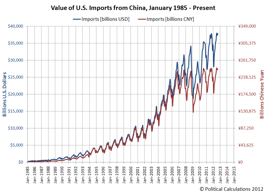
Today we're going to show that's exactly the case. In our first chart, we're showing the value of goods and services imported by the United States from China priced in both U.S. dollars, as reported by the U.S. Census, and priced in Chinese yuan, going by the official exchange rate recorded by the U.S. Federal Reserve.
In the chart, we've tweaked the vertical scale for the Chinese yuan so that it corresponds to that currency's minimum value with respect to the U.S. dollar from January 1994, when the value of the yuan was set to be worth just 11.46 cents (or 0.1146 U.S. dollars). As of October 2012, the relative value of the dollar has fallen so that one yuan is now worth 15.96 cents (or 0.1596 U.S. dollars).
With that visual adjustment made, we discover that from the Chinese perspective, there has been almost no increase in the value of China's exports to the United States since 2010, and very little growth since 2007.
Our second chart shows how U.S. exports to China have fared in terms of both U.S. dollars and Chinese yuan:
Measured in terms of China's currency, we find that the value of U.S. exports to China has actually been declining since they peaked in January 2010, which coincides with the peak of that nation's economic stimulus spending, which it had earlier specified on 6 March 2009. (The announcement of how the Chinese government would implement its massive stimulus program is the economic event that finally arrested and reversed the steep decline of the U.S. stock market at the time following the U.S. fiscal crisis of 2008.)
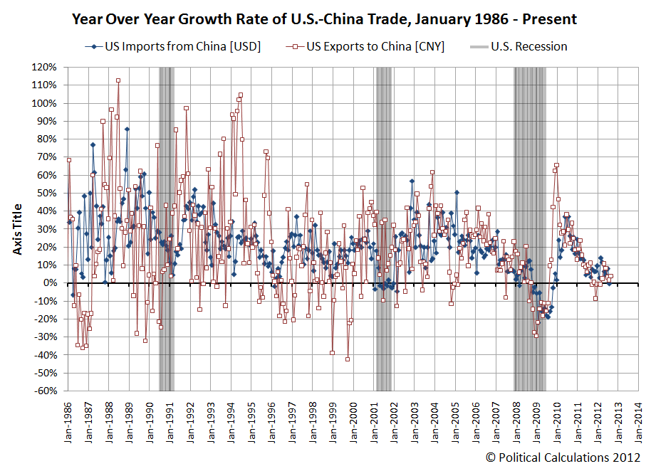
Our final chart shows the year-over-year growth rates for the U.S. imports from China calculated in terms of the U.S. dollar-based data and for U.S. exports to China calculated in terms of Chinese yuan-based figures, since these units are how each nation's economy would actually see the value of trade imported from the other nation:
Through September 2012, we find the year-over-year growth rate of trade between the two nations is at near-zero levels of growth, indicating near recessionary conditions if we take this measure as an indication of the relative health of the economies of both nations. But perhaps the real news is what factoring in the falling dollar does for our impression of the health of China's economy.
Previously, using just the U.S. dollar-based growth rate of U.S. exports to China, we found that China's economy had entered into recession in December 2011.
But after factoring in the falling value of the dollar over time, which results in the growth rate of trade between the two nations being overstated on the Chinese side of the trade balance, we find that China's economy really slipped into recession some two months earlier, in October 2011. This month coincides with the beginning of a period of contraction for China's manufacturing industries.
Going forward, we'll be using this improved version of our trade growth rate chart in our analysis of the relative economic health of both the United States and China.
Labels: trade
On the first day of 2013, the amount of taxes that top U.S. stock market investors will have to pay on the dividends they earn will increase. The only question at this point is by how much. Will taxes on dividends rise from 15% to 18.8% because of the ObamaCare tax on investment income that will take effect on that date or will dividend taxes rise from 15% to 43.4% thanks to the additional tax increase related to the 2003 Bush-era tax cuts that are currently set to expire after the last day of 2012?
That question matters today because, as expected, influential investors are pushing companies to boost their dividend payouts in December 2012 to beat the clock on the dividend tax increases that will take place in 2013.
Here, because about two-thirds of all the ordinary and qualified dividends that will be subject to the higher dividend taxes are earned by people with household incomes over $250,000, at least if you go by the IRS' tax return statistics for 2009 [Excel spreadsheet], the most recent year for which data is available at this writing, and because these same people who will be most subject to the higher taxes are the ones who have the ability to affect the amount and timing of corporate dividend payments, all investors will be affected by their response to the tax increase. [We should note that this point will likely be lost on the more clueless commenters of Seeking Alpha.]
That brings up an interesting question. Where will the companies that act to boost their dividends in 2012 get the money to pay them?
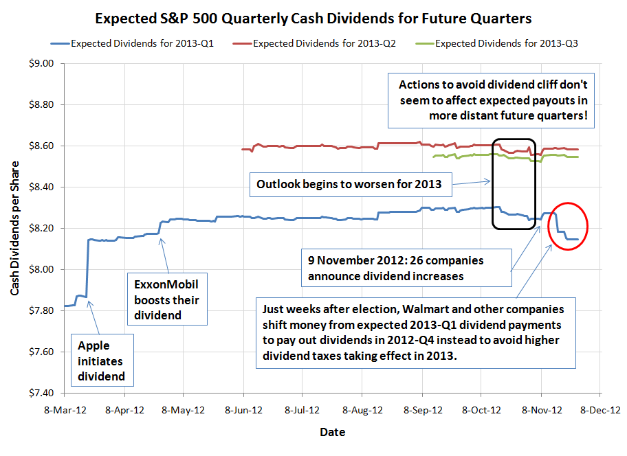
Today, we can reveal that the companies acting to beat the clock on higher dividend taxes for their shareholders are pulling the money to pay them from the funds that they might otherwise have used to pay dividends in the first quarter of 2013:
In our chart, we observe that the expected dividends expected to be paid out in the first quarter of 2013 has declined sharply in the weeks following the 6 November 2012 re-election of President Barack Obama, which ensured that these dividend tax increases would take place. Meanwhile, we see that the level of dividends expected to be paid out in later quarters of 2013 are very little changed - it would seem that only the amount of dividends expected to be paid in 2013-Q1 have been affected in the weeks since higher dividend taxes in the U.S. became a sure thing.
The reason why has to do with the way companies actually accumulate the funds to pay their dividends, where they set aside money well in advance of the dates the payments will be recorded, or transferred to their shareholders. Here, the actual funds to pay out dividends in 2012 are being pulled from the funds that are already being reserved to pay dividends in the first quarter of 2013.
So it's not personal and it's not something that reflects a worsening outlook for the U.S.' economic performance in the first quarter of 2013. It's simply a transfer of income from the future to the present for the purpose of avoiding tomorrow's higher taxes. Exactly the sort of rational actions that we should expect such influential investors to pursue in this situation.
As we close, we should note that these actions related to higher dividend taxes in 2013 are far from over. While the incentives are such that the immediate focus will be for companies to make either higher or special dividend payments in these last weeks of 2012, the ongoing incentives for dividend taxes are such that dividends cuts will be favored in federal tax law. And right now, there's no imperative for companies to rush to announce those kinds of negative changes in their dividend policies until after the end of the year.
Consider this thought experiment. We've shown that companies today are raiding the funds they've set aside to pay dividends to their shareholders in the first quarter of 2013 for the sake of racing to beat the clock on the dividend cliff. Where might they then get the funds to cover the amount of dividends that they are expected to pay out in 2013-Q1 without negatively affecting either the investors or the economy? Will they raid the funds being set aside to pay out dividends in the second quarter of 2013 or might they cut back on their other business expenses? Will they do it all over again when it comes time to pay out dividends in the second quarter of 2013? And what about the third quarter? How long can raiding the future for sustaining the expected benefits of the present continue?
At a certain point, things that cannot continue will stop. In this scenario, cutting dividends to shareholders will be the easiest way for the endless raids on the future to stop. When that happens, a lot of not-so-influential investors who rely on dividend income for things like their retirement or pension income can expect to find themselves worse off as a result of the federal government's actions to increase its taxes on dividends for the highest income earners.
And that's how those with incomes of less than $250,000 per year will share in the price of paying higher dividend taxes. Just because they don't write big checks to the I.R.S. doesn't mean they won't feel the pinch in their pocketbooks....
Major Dividend Event Timeline
- 19 March 2012: CNN Money: Apple announces dividend and stock buyback
- 25 April 2012: Bloomberg: Exxon Becomes World's Largest Dividend Payer with 21% Increase
- 24 October 2012: Investors Become Nearsighted
- 25 October 2012: Political Calculations: The Dividend Cliff
- 7 November 2012: Political Calculations: Eroding Dividends and Failing QE
- 9 November 2012: InvestorPlace: 26 Companies Increasing Dividends
- 19 November 2012: NY Times: Early Dividend for Wal-Mart Is Latest Move in Tax Tactics
- 19 November 2012: Bloomberg Businessweek: Special Dividends Surge Fourfold as U.S. Tax Increase Looms
- 20 November 2012: Fox Business: December's Dividend Bonanza
Labels: dividends, SP 500, taxes
You know, it's bad enough that we see Christmas decorations start going up in some stores before the Fourth of July, but now, some big retailers just can't wait for dessert after Thanksgiving before trying to rack up more sales:
Retailers this year will open for Black Friday sales early enough to make shoppers choose between hot deals and hot apple pie after Thanksgiving dinner.
From Toys R Us to Target to Walmart, retailers are opening as early as 8 p.m. on Thanksgiving night.
Toys R Us announced Monday that its Black Friday will begin on Nov. 22 when doors open at 8 p.m, an hour earlier than last year.
To entice shoppers to line up even earlier, the toy retailer will give the first 200 customers at each location a free "Great Big Goody Bag" full of stocking-stuffers up to $30 in value.
"You can have your dinner, then come to our store. We all know that everybody gets burned out on turkey and football," says Troy Rice, chief of store operations, who expects stores to have lines from 500 to more than 1,000 people by the time doors open.
We think this is just a classic case of shifting consumer behavior, much like how sales tax holidays actually work. Here, instead of racking up more sales, as they might hope, U.S. retailers joining in this scheme are basically trading the timing of when their sales occur. It's not like consumers will have any more money to spend on an extra four hours of shopping....
Taking the Toys R Us promotion as an example, lining up to join in a bizarre shopping frenzy for $30 worth of "stocking-stuffers" (at Toys R Us' inflated "regular" prices - we suspect their actual cost for the items is around $10) some four hours earlier than retail tradition would dictate doesn't seem like that great a gain for the American consumer.
In the modern world, for those who just can't wait for the Black Friday shopping experience, there's no need to wait until 8:00 PM to get in on those Black Friday deals.... Or even to leave home....
The best part is that if enough consumers take advantage of the online alternatives, the other retailers looking to bust out of Black Friday will have to offer much, much better deals to consumers to try to draw them into their stores. And if doing that keeps their bottom line from going the way they might hope, they might be forced to stop the Black Friday bleedout because their sales don't justify the higher costs of having to be open longer.
And wouldn't that be a nice Thanksgiving treat!
Labels: business, thanksgiving
... from a movie that wasn't as popular at the box office as perhaps it ought to have been:
Happy Thanksgiving!
Labels: thanksgiving
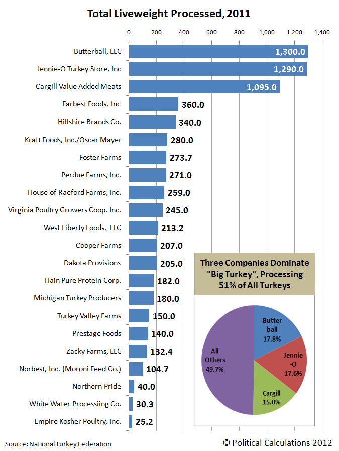
Big Turkey is our cute name for the U.S.' largest turkey producers. Our chart below ranks who they are by the total live weight of turkeys they processed in 2011:
The top three companies in our rankings, Butterball, Jennie-O Turkey Store and Cargill, account for over half of all turkeys processed in the United States.
As we noted yesterday, "Big Turkey" really isn't very profitable. With an average net profit margin of 2.9%, turkey producers, which would be grouped in the "Meat Products" sector of U.S. industries, would rank 171 out of some 215 industrial sectors.
But that's better than it appears - each of the publicly-traded companies that make up the list of companies in the Meat Products industry sector process more kinds of meat than just turkey, which do more to contribute to their profit margins. If not for the turkey segment of their businesses, the sector would have a higher net profit margin.
It is very hard to make money in the turkey business.
In fact, low profit margins are the main reason that Smithfield Foods (NYSE: SFD) sold off its 49% stake in Butterball, the top producer of turkeys in the United States, for $175 million back in September 2010.
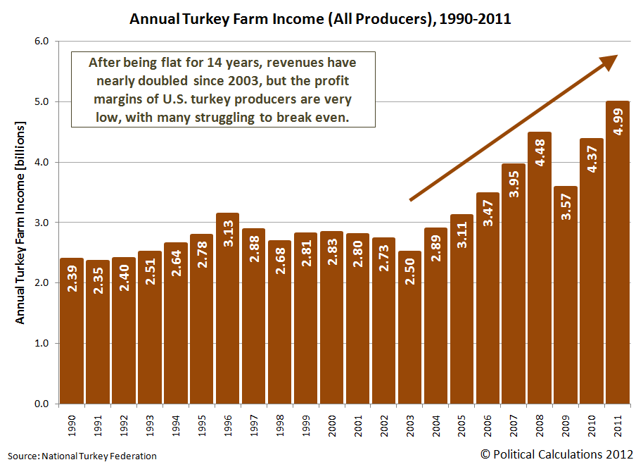
But U.S. turkey producers would appear have been on a tear since 2003, collecting more and more revenue in almost each year and now having more than doubled after having had mostly flat incomes in the 14 preceding years.
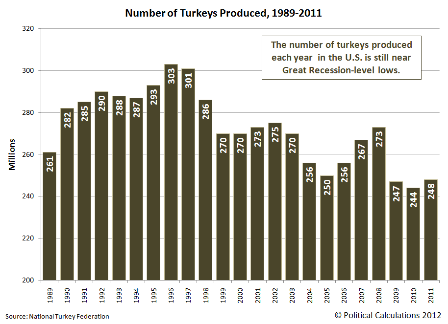
That increase in revenue becomes even more exaggerated when we consider the falling volume of turkeys produced over that time:
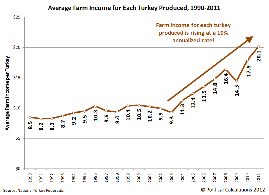
Calculating the average income collected by turkey producers for each turkey they produce, we find that the average revenue collected per turkey has been rising at double-digit growth rates since 2003.
And yet, "Big Turkey" is struggling to profit.
The only way this situation can exist is if the cost of producing turkeys in the United States to be rising at similar rates. Or more specifically, if U.S. turkey producers are directly passing on their higher costs of production to U.S. consumers on an almost dollar-for-dollar basis, which we can safely assume is the case given what we observe and the razor-thin profit margins for U.S. turkey producers.
So our question is what changed after 2003 that resulted in driving up the cost of producing turkeys in the United States in nearly every year since?
To find out, we began by looking at the main factors that can affect the cost of producing turkeys for market.
According to the University of Missouri's agriculture department, the cost of turkey feed can represent 70% of the cost of turkey production. With such a large share, we focused solely on this particular factor for our analysis.
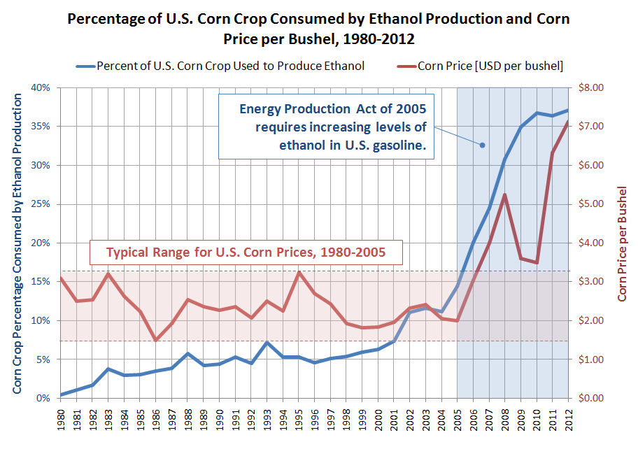
Turkey feed typically consists of two main ingredients: soybeans and corn. Here, we observe that soybean prices suddenly spiked in 2003, then fell back to their pre-spike level in 2004 before beginning to increase in 2006. Meanwhile, the price of corn mostly held level until 2005, when it began to skyrocket in response to the U.S. federal government's increased ethanol fuel mandates - dipping only with the Great Recession in 2010.
The combination of the 2003 soybean price spike (which would be fed to turkeys in 2004) and the sharply increasing price of corn after 2005 would appear to account for nearly all of the increase in the cost of turkey production after 2003. Of the two, corn prices would appear to be the more significant driver, in that a larger and larger share of U.S. corn production has been required to be consumed to produce ethanol for use in motor vehicle fuel by the U.S. government over the years since 2005.
We should also note the role of the federal government's ethanol mandate in displacing other crop production, reducing supplies of those other crops while simultaneously increasing their costs at market.
And thus we discover the reality behind the illusion of prosperity for U.S. turkey producers. They've never generated more revenue, but they've never struggled so much to profit so little either.
That's the big reason why the industry isn't growing. The University of Missouri reflects on the role the industry's production cost increases have had on the state of the turkey business:
While such increases have boosted production costs of white meat and giblets, retail price pressure isn’t letting producers pass much to the consumer. Turkey eaters have reacted to price increases of almost eight percent over 2009 by eating more holiday ham and Thanksgiving pizza.
According to the US Department of Agriculture, turkey output dropped from 5,663 billion pounds in 2009 to 5,587 billion pounds last year, about a one percent reduction. Stocks of frozen whole birds also fell. Between September and October of last year, six percent fewer turkeys found themselves in freezers.
Grocers have tried to keep turkey prices low, even selling the birds below cost to attract holiday customers who load shopping cars with other goodies. With little opportunity to increase prices, producers have to eat higher costs to remain competitive.
In response, the turkey food industry now processes more meat into TV dinners, turkey ham and breasts, but this is only keeping pace with the decrease in holiday whole bird consumption. Annual consumption per capita has remained flat-lined for 30 years – about 16 pounds in some form, including Spam Turkey.
It is very hard to make money in the turkey business.
Labels: business, economics, food, thanksgiving
It's Thanksgiving week once again here at Political Calculations, where our tradition calls for us to put aside everything else we're working on and celebrate the most American of all national holidays for an entire week.
We're kicking off this week's holiday festivities by considering just what "Big Turkey", the conglomeration of the biggest turkey producers in the U.S., are seeking to put in the center of every American dining table on this holiday: a big turkey!
But first, let's see just how many turkeys we're talking about. Drawing upon statistics collected and published by the National Turkey Federation, we put together the following chart showing how many turkeys made it from farm to table in each year from 1989 through 2011:
Here, we see after peaking at 303 million birds in 1996, which coincided with the height of the low-fat diet craze, the number of turkeys produced each year fell off to range between 250 million and 275 million through 2008.
However, the aftermath of the Great Recession took a big bite out of U.S. turkey production beginning in 2009, sending annual turkey production below the 250 million mark.
You would think then that America's turkey farmers are producing less turkey today than at any time since 1989, the first year for which we have annual turkey production figures.
You would, of course, be wrong. In reality, 2011 marked the fourth-highest year on record for total amount of turkeys to go to the market, as measured by their live weight:
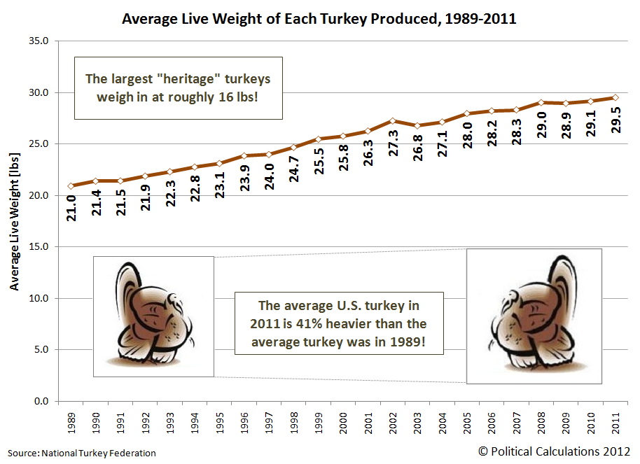
The only way that mathematically works is for the size of turkeys produced in the U.S. to increase pretty dramatically. Doing the math, we find that's exactly what has happened!
On average, we find that the average live weight of a turkey produced in the United States has risen from 21 pounds per bird in 1989 to reach 29.5 pounds today.
That's a 41% increase in the weight of a live turkey produced for market in the U.S. in the last twenty-three years. To help put that increase in perspective, the largest "heritage" or wild turkeys will weigh in at just 16 pounds per bird.
So that's what "Big Turkey" has been up to over much of the last twenty three years (and longer!) In our next installment, we'll see just how much money "Big Turkey" makes on each one of those birds!
References
National Turkey Federation. Turkey Statistics. Accessed 12 November 2012.
Labels: food, thanksgiving
The United States would appear to have entered a new trend for new jobless claims, one characterized by outliers and volatility. Our chart below showing the residual distribution of the number of new jobless claims filed each week shows just how far off from normal things have become since 22 September 2012, which we're marking as the end of the previous trend:
In fact, the data is so volatile right now that we're not able to accurately determine what the real trend in new jobless claims might be. For that, we'll need anywhere from six to ten non-outlier data points, where at present, we only have five (or four, if we discount the first data point marking the shift from the previous trend).
The newest and most extreme outlier is an outcome of the economic disruption caused by Hurricane Sandy. Here, we note that it may be some time before the data settles down enough to reveal its current trend. At present, we're showing a flat trend for the data points that aren't attributable to special causes, but this is a temporary choice on our part to provide a reference from which we can determine the magnitude of the outliers in the data.
What's particularly upsetting is that the two of the outlying points are man-made, the result of the state of California's Employment Development Department's failure to process tens of thousands of new claims filed in the first week of October 2012. That failure then produced an outlier in the opposite direction in the following week, as the state played catch up.
No disciplinary action related to the mishandling of these unemployment insurance claims in California's Employment Development Department has yet been taken.
Those problems are deep and ongoing. The California State Auditor, Elaine M. Howle, issued a report on 13 November 2012 finding that the California Employment Development Department's management of the state's unemployment program still does not meet acceptable performance levels related to core benefits measures, such as the timely processing of unemployment insurance claims.
In addition, California's state auditor found that the agency has failed to implement a number of reforms it specified following a 2010 audit of the agency, but interestingly, noted that the agency made a unique effort to achieve one of them - the one that allowed it to receive $839 million in economic stimulus funds in return for establishing an "alternate base period" for determining benefit eligibility for jobless claim filers, which it put on the fast track and received in July 2011.
So apparently, if you want to get California's Employment Development Department to achieve a goal, such as the timely processing and reporting of initial unemployment insurance claims, one needs to dangle a check with a lot of zeroes on it in front of the state agency's management to provide a sufficient incentive for them to do so.
Will Starbucks (NYSE: SBUX) kill its own business with its Verismo single serving home brewer?
Think about it. Why would you go to Starbucks if you could get almost exactly the same product at home? Consider the following excerpt from the online Starbucks Store:
Your favorite Starbucks® beverages. All at home, all from one machine.
The machine that makes both espresso and brewed coffee. Now you can use the Starbucks recipes that we use in our coffeehouses to create the drinks you love - Caffè Latte, espresso, and a freshly brewed cup of Starbucks® coffee - at home. Our sweet creamy Caffè Latte, the original loved in our coffeehouses. Our caramelly rich true espresso, perfectly unchanged since our first handcrafted latte.
Let's say it is that good. Did Starbucks just slit its own throat?
To find out, we're going to compare the basic cost of brewing up one of Starbucks' Caffè Lattes at home compared to ordering one out while shopping, to see which makes more sense to the customer. Here are the costs we're considering:
- Starbucks Verismo™ 580 Brewer, which costs $199.00 (and is available in silver, piano black and champagne).
- Verismo™ Caffè Latte Pods, which includes 8 coffee pods and 8 milk pods at a cost of $12.95 for 8 total servings, or $1.62 per serving.
By contrast, a Caffè Latte at our local Starbucks would cost us about $4.00.
So the question boils down to this: should we pay $199 to make our own Caffè Lattes at home for $1.62 each, or should we keep going to Starbucks to get them for $4.00 each?
To answer that question, we've adapted our Rent vs Buy tool to apply to this specific situation. Here, we've entered the costs we discussed above, and have also included other factors that might influence their value, such as the inflation rate for the Verismo pods or for Caffè Lattes purchased at your local Starbucks. We'll also consider the cost of money, which we're measuring as a typical interest rate that might apply for a low-rate credit card.
In the tool above, we entered 260 for the number of your Caffè Lattes consumed per year, which works out to be about one per business day. We also set the inflation rate for the Verismo pods and cups at Starbucks to be the same, although it's likely that the inflation rate for one will be higher than that for the other.
Doing this math then, we find that it makes much more sense from a money standpoint to stop buying Caffè Lattes at our local Starbucks than it does to equip our home with a Verismo brewer, which would make it a desirable investment.
So to answer our original question, yes, the Verismo brewer has the capability of negatively impacting traffic at Starbucks store locations.
Keeping all the numbers the same except for the number of lattes consumed per year, we find that 10 Caffè Lattes per year would seem to be the division line between it making sense to buy a Verismo brewer versus buying your lattes at Starbucks. Assuming, of course, that the produced Caffè Latte you make at home is equivalent in quality to the store-purchased cup and that the brewers are available in the places where you want to consume your Caffè Lattes.
If not, that premium of $2.38 per latte is the extra price you'll pay for convenience.
In any case, our tool above will work for just about any of the single-server coffee brewers that have become popular in recent years - just plug in the numbers that apply for the situation you're considering, and we'll let you know if it ever comes close to making sense!
Having now run the numbers, we think that the introduction of the Verismo brewer is an interesting step for Starbucks, since it would clearly offer its strongest customers a more economically viable way of consuming Starbucks' products. All without the overhead of operating so many physical locations and the associated cost of maintaining staff at them and very likely generating a higher profit margin.
That would also free up a lot of prime commercial real estate if its customers reduce their store purchases, which we suspect might become an important source of revenue for the company as it adapts its business model.
Labels: business, food, personal finance
October 2012 marked a significant event for the S&P 500 - the first time since 1999 that there were more than 400 dividend paying companies in the index!
But what affects the number of companies that pay dividends?
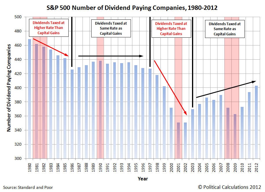
To answer that question, we turned to Standard and Poor's Dividends and Payers report [Excel spreadsheet], which provides the data for the number of dividend paying companies in the S&P for each year since 1980. We've taken that data, combined it with some significant milestones and presented it in the chart below (which is updated from our 2009 post on the topic.)
We find that while recessions tend to lower the number of companies paying dividends while they're ongoing, which we would expect, we find that the bigger driver of what affects the number of companies paying dividends to individual shareholders, retirement and pension plans, et cetera would appear to be the relative tax rate of dividends with respect to capital gains.
For example, in 1978, before we have data showing the percentage of S&P 500 dividend payers, the capital gains tax rate was reduced from a maximum tax rate of 39.9% (that's on paper - the real maximum capital gains tax rate was 49.9% as a result of an interaction with the maximum regular income tax rate) to 28%, which was then lowered to 20% in 1981.
By contrast, the tax rate for dividends was the same as for personal income taxes, with a maximum tax rate of 50% beginning in 1982. Prior to 1982, the maximum personal income tax rate was 70%.
That changed with the U.S. Tax Reform Act of 1986, which equalized the maximum tax rates for both dividends and capital gains at 28%.
In the period before 1986, the number of S&P 500 companies that paid dividends to their shareholders declined from 469 in 1980 (or 93.8% of all companies making up the index) to 426 companies in 1986 (or 85.2%). After 1986, the number of dividend paying companies in the S&P 500 was largely stable, ranging between 426 and 438 for the next decade.
That stability ended with the Taxpayer Relief Act of 1997. Here, the capital gains tax rate was reduced from 28% to 20%, while the tax rate of dividends was held at the 28% level. As we can see in the chart above, this change in tax law coincided with a dramatic drop in the number of companies within the S&P 500 that paid dividends, which plummeted from 427 in 1997 to 351 in both 2001 and 2002.
That decline wasn't reversed until 2003, with the passage of the Jobs and Growth Tax Relief Reconciliation Act, which once again equalized the tax rates of both capital gains and dividends, but this time at 15%.
Since then, the number of dividend paying companies in the S&P 500 has rising from 351 in 2002 to 403 in 2012, despite a recession-driven dip to 363 companies in 2009.
But all that is about to end. On 1 January 2013, the tax rate for dividends will rise above that for capital gains - it's only a question of how much.
Thanks to a special tax on dividends and investment income imposed by the Patient Protection and Affordable Care Act of 2010 (aka "ObamaCare"), the tax rate on dividends will at least rise from 15% to 18.6%, while the capital gains tax rate will remain the same. We say "at least" because we don't yet know the resolution for the so-called "fiscal cliff", in which all the tax cuts implemented in the 2003 Jobs and Growth Tax Relief Reconciliation Act are scheduled to expire. If that comes to pass as currently mandated by law, the maximum tax rate upon dividends will rise to 43.8%.
In the best case scenario, without Congress acting to equalize these tax rates, given on what we see in the correlation of the tax rates for both dividends and capital gains, it's very likely that companies paying dividends will begin becoming more scarce in 2013.
In the worst case scenario, the imbalance between dividend and capital gains taxes will lead to significant distortions in the stock market and economy, similar to those that were created by the Taxpayer Relief Act of 1997, which caused the "Dot-Com" stock market bubble, whose inflation and deflation cycles were only ended with the passage of the 2003 tax cuts equalizing those tax rates.
As a policy recommendation, the only outcome that can avoid that kind of economic distortion is for the tax rates for dividends and for capital gains tax rate to be set equal to one another. We don't have much hope for that happening given how much Silicon Valley money backed President Obama in the election. Since they were the primary beneficiaries of the last imbalance between dividend and capital gains tax rates, they may be hoping for a repeat of their economic boom days.
If you think about it, Silicon Valley's digital aristocracy would seem to have a lot in common with a South Pacific cargo cult on this count....
Data Reference
Standard and Poor. S&P 500 Dividends and Payers. [Excel Spreadsheet]. Accessed 11 November 2012.
Labels: dividends, SP 500, taxes
Some time ago, we discovered that we could diagnose the relative health of national economies by measuring the growth rate of trade between nations. Now that the data is available through September 2012, we're updating our analysis of the relative health of the economies of both China and the United States.
Our first chart shows where things stand with respect to the year over year growth rate of what each nation exports to the other:
What this chart tells us is that the value of trade between the two nations are continuing at near-zero levels of growth. For the U.S., that indicates a near-recessionary condition, while for China, this result indicates that nation is continuing in recession, now nearing its one year mark.
Next, let's look at our doubling rate charts, which illustrate the amount of time it has taken for the goods and services traded between the two nations to sustainably double in value. Our first doubling rate chart considers the value of the goods and services that the U.S. imports from China:
Here, we see that the growth of China's exports to the United States is continuing its trend of slow growth, while following its typical seasonal pattern. Typically, China's exports to the U.S. peak each year in the period from August to October, in advance of the U.S.' holiday shopping season.
In reality, because the value of the U.S. dollar has been falling with respect to the value of China's currency since early 2010, the value of trade shown in the chart above represents a lower quantity of actual goods and services traded today than what similar values in 2010 would indicate.
Next, we confirm that China's economy isn't growing very fast, as the value of goods and services exported by U.S. companies continues to be in the same narrow range it has been since December 2010.
Here, the falling value of the U.S. dollar with respect to China's currency means that this chart is also overstating the value of U.S. goods and services imported by China since 2010.
Comparing the two nations, the U.S. economy is currently performing better than the Chinese economy. However, that's not saying much considering the flatlining growth trend of trade between the two nations.
Labels: trade
Earlier this year, we began taking snapshots of S&P's forecast trailing twelve month earnings per share for the S&P 500 at roughly three month intervals. Our chart below shows how the expected future for earnings has changed over time:
Since our last snapshot in August 2012, the outlook for the expected amount of S&P 500 company earnings has continued to decline, although not as much as the decline from May to August.
Looking at the overlap of historic data and old forecasts, we see that the future vision of investors in December 2010 looking forward to the end of 2012 appears to closely match how things have actually played out over time.
We find that interesting because we would have expected more recent snapshots of the forecast earnings for the S&P 500 to more closely match the actual results than that much older forecast.
The continuing moral of the story: future earnings projections are not necessarily very good indications of actual future earnings. It's simply a good thing that changes in earnings expectations have so little effect upon stock prices or they would be way more volatile!
Previously on Political Calculations
The previous snapshots we've taken of the way the future looked to investors for the S&P 500 at different points of time are presented in reverse chronological order below:
- Fall 2012 Snapshot of Expected Future S&P 500 Earnings
- Summer 2012 Snapshot of Expected Future S&P 500 Earnings
- The Spring 2012 Snapshot of Expected S&P 500 Earnings
- The Changing Futures for S&P 500 Earnings
- How Good Are Earnings Forecasts?
References
Silverblatt, Howard. S&P 500 Earnings and Estimates Report. [Excel Spreadsheet]. Standard and Poor's Market Attributes. Accessed 8 November 2012.
Labels: earnings, forecasting, SP 500
As promised, we're updating our chart showing the number of publicly-traded companies that have acted to decrease their dividends through the end of October 2012 - providing what might perhaps be the simplest and best near-real time picture of the state of the health of the U.S. economy (our thanks to S&P for the updated data - that was quick service!):
In October 2012, S&P recorded that some 2,471 publicly-traded companies making declarations regarding their dividends, with 165 announcing dividend increases and 26 announcing they would cut their dividends.
To put that level of dividend cuts for the month of October 2012 into context, we calculated the average number of U.S. companies that have announced dividend cuts outside when the 2007 recession started until after the level of dividend cuts returned to their pre-recession levels for all of S&P's available data from January 2004 through December 2011. We excluded data after December 2011 in our calculation of the average because we wanted a clear sample of data to set a non-recession period benchmark that wouldn't be affected by what has been developing in the economy through much of this year.
Here's what we found. On average, a non-recessionary month will have only four announced dividend cuts during these periods of economic expansion. The most dividend cuts that were ever announced in any of these months that fall outside an official period of recession in the U.S. is nine.
If we then set the value of ten companies per month that act to cut their dividends as the threshold at which a recession in the U.S. is likely to exist, we find that the U.S. economy first dipped into recessionary territory in May 2012, exited briefly in July 2012, and re-entered more deeply into that recessionary territory again in August, going deeper in each month since.
So no matter what you might hear in the mainstream media or from the White House, this isn't a situation that developed overnight because of the aftermath of Hurricane Sandy or the so-called "fiscal cliff". Recessionary forces have been at work in the U.S. economy for many months now....
Previously on Political Calculations
Our previous posts on the rising likelihood of recession based on the number of U.S. companies acting to cut their dividends, presented in reverse chronological order:
Labels: dividends, recession forecast
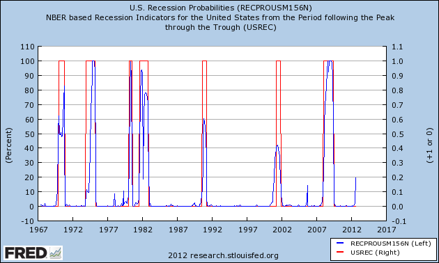
On 30 October 2012, a recession forecasting model developed by Marcelle Chauvet and Jeremy Piger reached what appears to be a critical threshold for anticipating a recession in the U.S. in the very near future:
The Reformed Broker's Joshua Brown comments (HT: Abnormal Returns):
Do you see the percentages on the left side of the chart? 20% is the line in the sand. We've never hit that level and NOT had a recession. In 2006 we got close (18%?) but that particular Great Recession would be a year and half in the making. Note that we're back at that 20% line again. And I can't think of anything that keeps the leading indicators from going through it to the upside - the Fiscal Cliff stuff could only speed its ascent.
One thing we should note is that the data in the chart only covers the period through August 2012 - this is a delayed reaction to a developing situation. The probability of recession in the U.S. suddenly surged to the 20% level from the 2% level recorded a month earlier pending future revisions.
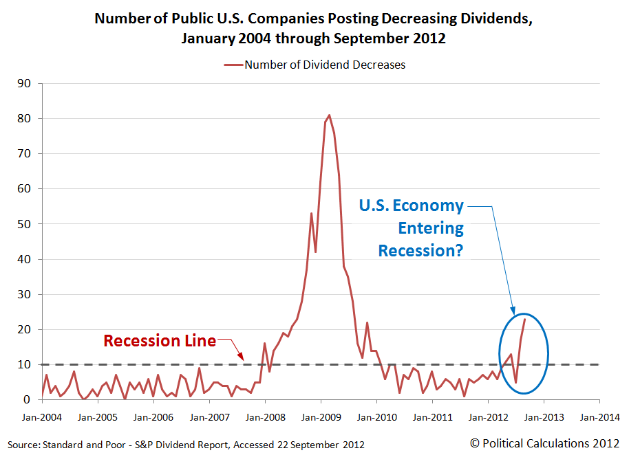
As it happens, we have another indicator which gave a slightly earlier signal that the U.S. economy is trending toward recession: the number of publicly-traded companies that have acted to cut their dividends. Here is what that data showed through the end of September:
We'd like to be able to update the chart through October 2012, however the aftermath of Hurricane Sandy has impacted Standard and Poor's operations, which has delayed the update of S&P's dividend action report [Excel spreadsheet].
As soon as that report has been updated, we'll post an updated version of our chart. In the meantime, we should note that this trend toward recession would seem to be occurring independently of whatever noise is going on in Washington D.C. with respect to the so-called fiscal cliff, which is confirmed by the Chauvet-Piger recession forecasting model, which does not consider that scenario.
We'll close by noting that what we're seeing in dividends now is not a result of the reactions to what we've described as the "dividend cliff". Here, there's really no hurry for companies to announce dividend cuts this year. Instead, the incentives are such that companies would more likely be announcing special dividend payments to beat the clock on the higher taxes for dividend income scheduled to begin in 2013, delaying the announcement of any plans they might be developing to cut dividends until the new year.
Previously on Political Calculations
Our previous posts on the rising likelihood of recession based on the number of U.S. companies acting to cut their dividends, presented in reverse chronological order:
- Dividends: U.S. Continuing Descent Toward Recession
- The Present According to Dividends: U.S. Entering Recession
- Declining Dividends Hinting at Recession
References
Chauvet, M. and J. Piger, "A Comparison of the Real-Time Performance of Business Cycle Dating Methods," Journal of Business and Economic Statistics, 2008, 26, 42-49.
Standard and Poor. Monthly Dividend Action Report. [Excel spreadsheet]. As last updated 28 September 2012.
Update 10 November 2012: Added "pending future revisions" as shown in boldface text above.
Labels: dividends, recession forecast
The future has begun to change for the U.S. stock market. After mostly flatlining since the end of 2012-Q1's earning season, expectations for the amount of dividends expected to be paid in the future began to decline in mid-October 2012 as the outlook for dividends has worsened.
Meanwhile, when it comes to stock prices, investors appear to be focused on the very near term, with the change in the expected growth rate of trailing year dividends per share for the fourth quarter of 2012 setting the pace for the change in the year-over-year growth rate of stock prices for both October and November.
Until mid-October 2012, investors had appeared to be setting stock prices largely in tune with the change in the expected growth rate of dividends for the first quarter of 2013, the outlook for which is mildly positive. By contrast, the outlook for 2012-Q4 is moderately negative as it indicates that the growth rate of dividends is decelerating.
It also appears that the Fed's latest exercise in quantitative easing is failing to produce the same equity lifting effect it had in its previous two incarnations. Previously, we had observed that while the Fed was running its QE programs, the change in the growth rate of stock prices was well elevated above the expected change in the growth rate of future dividends per share.
This time however, we see that the changes in the growth rates of both stock prices and future dividends are not deviating from each other as they did in the Fed's earlier rounds of quantitative easing. That suggests the following possibilities:
- The Fed is doing it wrong. In the two previous rounds of QE, the Fed purchased large quantities of U.S. Treasuries. So far in this round, the Fed is only purchasing Mortgage Backed Securities. The stock market just doesn't get the same bang for the buck as when the Fed buys up Treasuries, which acts to reduce long-term interest rates across a wider swath of the economy, which is really what helped boost stock prices in earlier rounds.
- QE, as an effective policy, is running out of gas. The interest rates that the Fed might hope to lower in its QE programs started off at a much lower level, and a lot closer to their minimum zero level, than in its previous incarnations. With less room to maneuver, the Fed's actions just don't have the same oomph they once did.
Charles Hugh Smith offers more thoughts on the factors that might restrain the success for QE.
Labels: dividends
Welcome to the blogosphere's toolchest! Here, unlike other blogs dedicated to analyzing current events, we create easy-to-use, simple tools to do the math related to them so you can get in on the action too! If you would like to learn more about these tools, or if you would like to contribute ideas to develop for this blog, please e-mail us at:
ironman at politicalcalculations
Thanks in advance!
Closing values for previous trading day.
This site is primarily powered by:
CSS Validation
RSS Site Feed
JavaScript
The tools on this site are built using JavaScript. If you would like to learn more, one of the best free resources on the web is available at W3Schools.com.


