Before we get into our summary of the week that was for the S&P 500, in our previous edition, we featured a quiz where we challenged our readers to interpret our chart showing the actual trajectory of stock prices against the backdrop of the alternative trajectories of the future path it could take.
As part of that quiz, we asked one question that we had to phrase very specifically, which we'll highlight in the following quote (we'll also add the answer to the "previous question" in parentheses):
If investors were to maintain their forward-looking focus on the period of time you identified as your answer to the previous question (2016-Q4), and assuming that the projected future doesn't change and that there is no sudden onset of a noise event, would you expect the S&P 500 to rise or to fall with respect to its value on 19 February 2016 at the end of the first quarter of 2016?
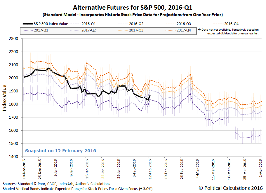
Why did we have to phrase that question so specifically? As you'll see in the following chart, which we've animated to help visualize the changes that have taken place over the last week, the future itself has changed. The easiest way to see it is to simply look at the alternative trajectories on the right hand side of the chart (corresponding to the future date of 1 April 2016):

The answer to the question is still the same (lower). However, we couldn't pass up a good opportunity to demonstrate the extent to which the recent evolution of stock prices can influence the likely future trajectories of stock prices.
But as you can see in the animated chart, there was one rather spectacular change in the previous week that had absolutely no impact on the actual trajectory stock prices when it happened, because investors were focusing on a much more distant future (2016-Q4) when it did.
That change is seen in the likely trajectory of stock prices associated with investors focusing on the current quarter of 2016-Q1, the end of which is still in the future. What happened is that on Tuesday, 23 February 2016, the dividend futures for the S&P 500 2016-Q1 (WCB: DVMR) suddenly increased from $11.62 to $11.95 per share. Meanwhile, there was no similar change in any of the other dividend futures for 2016-Q2 (WCB: DVJN), 2016-Q3 (WCB: DVST) and 2016-Q4 (WCB: DVDE).
That's an important thing to note, because as you can also see in the animated chart above, the actual trajectory of stock prices tracked closely along with the future defined by the expectations for dividends in 2016-Q4 from the previous week through Thursday, 25 February 2016, before breaking toward the nearer term future of 2016-Q3 on Friday, 26 February 2016.
Even though it didn't affect the actual trajectory of stock prices in the fourth week of February 2016, the change in expectations for dividends in the current quarter of 2016-Q1 has produced two positive benefits. The first benefit is that the risk of a large downward move in the S&P has been greatly reduced. The second benefit is that the market should be considerably less volatile than it was in the first half of 2016-Q1 - investors shifting their forward-looking focus from one point of time in the future to another won't have the same impact that it did earlier in the quarter.
That doesn't mean that stock prices will continue to be as apparently steady as they've been. As for what to reasonably expect in the week ahead, we'll let the chart do the talking, although we'll caution that the week ahead has the potential to be noisier than normal.
Speaking of which, here are the main market driving news events of the fourth week of February 2016.
- 22 February 2016: Although a number of analysts worried that the that the U.S. inflation rate was firming up, increasing the potential for the Fed to hike rates again sooner than 2016-Q4, stock prices discounted the news and instead rallied on the day as investors remained focused on 2016-Q4, although closing above the middle point of the range we would expect them to fall.
- 23 February 2016: Although the S&P 500 was initially "lifted by muscular oil rally" in the morning, oil prices fell later in the day and stock prices followed. If you look at the chart above however, you'll see that in actuality, they simply dropped down to the mid-point of the range that our model had projected they would fall for when investors are focused on 2016-Q4.
- 24 February 2016: Following along with the 2016-Q4 trajectory, stock prices initially slipped in the day, but rebounded when Dallas Fed president Robert Kaplan indicated that he expected to downgrade his expected path of rate hikes at the FOMC's March meeting, which served to closely focus investors on 2016-Q4, and the market closed up accordingly.
- 25 February 2016: Investors remained focused on 2016-Q4 as Richmond Fed president Jeffrey Lacker proclaimed that it was "still logical to expect rate hikes this year", but the bigger news keeping investors looking at 2016-Q4 came as St. Louis Fed president James Bullard acknowledged that the Fed's January rate hike "may have spurred market turmoil". The S&P 500 closed up on the day.
- 26 February 2016: Although Wall Street initially responded to better-than-expected GDP data by going higher, as investors absorbed additional news indicated that inflation really did kick up toward the Fed's 2% target level in the fourth quarter of 2015, stock prices would ultimately close down as investors began shifting their attention to the nearer term future, as that higher inflation would likely drive the Fed to hike interest rates sooner. We see that change in our chart above, where investors would appear to have shifted their focus to 2016-Q3.
On a comical note, Friday, 26 February 2016 was also the day when San Francisco Fed president John Williams intentionally made the following statements:
"Although it’s understandable to want to communicate a comprehensive view of monetary policy with all of its incumbent uncertainties, the public has only so much bandwidth dedicated to central bank messaging," Williams said in remarks prepared for delivery Friday. "So, like a sledgehammer, strongly worded forward guidance can be a powerful tool when it’s needed."
Williams stopped short of advocating forward guidance in all instances, adding that "like a sledgehammer, care needs to be taken when and where it is used."
Combine those thoughts with James Bullard's comments earlier in the week acknowledging the Fed's role in sparking market turmoil and also with the knowledge that we actually use the Fed's forward guidance to check the calibration of our futures-based model for projecting the alternative future trajectories of stock prices, and hopefully you'll understand why we found the "sledgehammer" comment to be so funny, coming as it did from one of the Fed's own minions.
For more insight into the nature of forward guidance, we can recommend James Hamilton's well-versed and timely discussion of recent research on the topic at Econbrowser.
It's time for the Academy Awards once again, which our longtime readers know fills us with an overwhelming sense of imminent doom.
What would it take to make watching the annual awards ceremony into a more tolerable experience?
We're serious. What would it take? Because the producers and writers for the awards show certainly don't have any good ideas, and try as we might, there just is not enough beer in the world to make it better....
But then, we suddenly and unexpectedly found reason for hope, when the answer became apparent thanks to Ryan Reynolds' last minute Oscars campaign to get Deadpool nominated for Best Picture.

Although technically ineligible for consideration by the temporally-constrained members of the Academy of Motion Picture Arts and Sciences, who limited the nominees to just those films shown in U.S. theaters in 2015, it's exactly what the Academy needs to really shake things up. Otherwise, we'd be stuck with a bunch of not-so-popular films of questionable watchability that were nominated purely on the basis of their artistic merit.
If you're like us, your gag reflex was triggered when you read the last two words of that previous sentence.
That's because you, like us, know that Hollywood only really cares about two things: money and status. Hollywood people absolutely obsess over both things, where success is defined as either making lots of bucks at the box office or by achieving status through the recognition of their artistic achievements by their peers.
They use Oscars to measure their status as "artists", where the biggest winner gets the Oscar for Best Picture. In making that determination, voting members of the Academy will go off to a dark room, whip out their complimentary viewing copies of the nominated films, and then compare them to each other over and over again until they've ranked one above all others. The winner is then awarded with the peer recognition of their artistic status in the form of a 13.5-inch tall gold-plated phallic trophy.
Really. It's just like that.
That's why upsetting all the Academy's apple carts by getting a more popular movie like Deadpool into consideration for Best Picture of 2015 is such an attractive idea, and all the more so because Deadpool so clearly captures the vital essence of what drives Hollywood itself.
And by the other measure of success in Hollywood, money, Deadpool has already beaten all the contenders for Best Picture of 2015. At least, through its first full week of release:

And that's without taking into account the fact that the eight Best Picture nominees were being shown in nearly three times as many theaters as Deadpool. If we were to do that math, the cumulative box office performance of the 8 Best Picture nominees would, shall we say, come up somewhat short.
Which is why Hollywood is talking about Deadpool 2 and not The Revenant 2. Unless perhaps the producers of that other sequel fix the main deficiency of the first one.
Labels: academy awards
In the United States, there are more than 30 minimum wages. The chart below shows the evolution of state level minimum wages that have risen above the level set by the U.S. federal government in the years from 1994 through 2016.

By and large, the minimum wage is higher in states where it costs more to live, which is why the minimum wage should only ever be adjusted at the state level. Otherwise, if there were only one statutory minimum wage greater than zero that applied everywhere, you would risk creating too much real inequality between people earning the minimum wage in different states, where minimum wage earners in low cost of living states would be much richer and wealthier than minimum wage earners in high cost of living states.
Labels: data visualization, minimum wage
Every three months, we take a snapshot of the expectations for future earnings in the S&P 500 at approximately the midpoint of the current quarter. Today, we'll confirm for the fifth time that the earnings recession that began in the fourth quarter of 2014 has continued to deepen.

In the chart above, we confirm that the trailing twelve month earnings per share for the S&P 500 throughout 2015 has continued to fall from the levels that Standard and Poor had projected they would be back in November 2015. And for that matter, what they had forecast they would be back in August 2015, May 2015, February 2015 and in November 2014.
There is some good news. Although the latest projection confirms that the earnings recession is continuing to deepen, the current estimate indicates that the fourth quarter of 2015 is the first time that the rate at which the earnings recession is deepening has begun to decelerate. As we have seen in previous quarters however, that is no guarantee that we've yet seen the bottom.
Standard & Poor's Howard Silverblatt described what he's seeing in 2015-Q4's earning reports (via S&P's Index Earnings Report Excel spreadsheet), which will only present the following comments for a very limited time (most likely, they'll be superseded in less than a week)....
With almost 90% of the Q4 2015 earnings reported, 67.6% of the issues are beating estimates (the historical rate is two-thirds), but only 36.8% beat As Reported GAAP rule based earnings estimates and less than half, 46.8%, beat sales estimates.
Explained 'responsibility' for any short fall on the cost side includes currency costs and a growing list of special one-time items (never to be repeated, of course).
On the income side, helping earnings, are the 'difficult decisions made' by companies under the heading of cost-cutting (as layoffs and location changes appear to be on the rise).
Speaking of layoffs, here's a list of those making the news on just the two days of 22 February 2015 through 23 February 2015, where the sample of just those in the U.S. indicate a wide geographic dispersion as well as a widening list of affected industries.
Data Source
Silverblatt, Howard. S&P Indices Market Attribute Series. S&P 500 Monthly Performance Data. S&P 500 Earnings and Estimate Report. [Excel Spreadsheet]. Updated 18 February 2016. Accessed 19 February 2016.
Labels: earnings, recession, SP 500
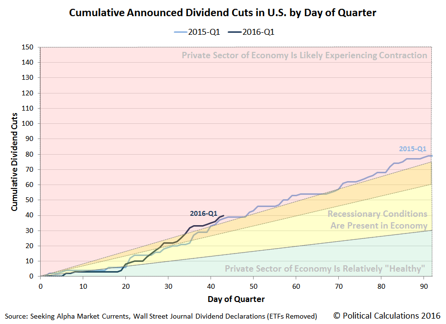
Did you know that there has been at least one dividend cut announcement on each and every single trading day in February 2016?
It's true! The only weekday that didn't have one was Monday, 15 February 2016, which didn't have one because U.S. markets were closed for trading for the Presidents Day holiday.
That said, the number of dividend cuts announced in this first quarter of 2016 is now greater at this point of time than the number that were announced in the first quarter of a year ago. The accompanying chart is the visual proof....

Of course, another way to describe what the chart shows is that the number of dividend cuts in 2016-Q1 is running a week ahead of the pace set in 2015-Q1, which is also to say that its worse than in 2015-Q1.
Right now, our unofficial count of dividend cuts for February 2016, as of 22 February 2016, is 30. Of these 30 firms, half are in the oil and gas producing sector of the U.S. economy, 4 are in the financial industry, 3 are in high tech, 2 are in the chemical industry (or really the agriculture industry since both firms make nitrogen-based fertilizer products), and there is one each for the industrial sectors of biotech, manufacturing, services, shipping, mining and real estate.
But you don't have to take our word for it. Here's the list-to-date for the month: PDL BioPharma (NASDAQ: PDLI), Twin Disc (NASDAQ: TWIN), Rent-A-Center (NYSE: RCII), Apollo Global Management (NYSE: APO), ECA Marcellus Trust I (NYSE: ECT), Northern Tier Energy (NYSE: NTI), ConocoPhillips (NYSE: COP), Chesapeake Granite Wash Trust (NYSE: CHKR), Symantec (NASDAQ: SYMC), Sabine Royalty Trust (NYSE: SBR), Ardmore Shipping Corporation (NYSE: ASC), Bristow (NYSE: BRS), Anadarko Petroleum (NYSE: APC), Alon USA Partners (NYSE: ALDW), Precision Drilling (NYSE: PDS), Carlyle Group (NYSE: CG), Energen (NYSE: EGN), KKR (NYSE: KKR), Devon Energy (NYSE: DVN), Ingram Micro (NYSE: IM), Rentech Nitrogen Partners (NYSE: RNF), CVR Partners (NYSE: UAN), Yamana Gold (NYSE: AUY), GAMCO Investors CL A (NYSE: GBL), Cross Timbers Royalty Trust (NYSE: CRT), Enduro Royalty Trust (NYSE: NDRO), Magic Software (NASDAQ: MGIC), Enerplus Corp (NYSE: ERF), First Potomac Realty Trust (NYSE: FPO), and Mesa Royalty Trust (NYSE: MTR).
That's a big change from January 2016, when all but one of the 22 firms whose dividend cuts we sampled were in some way tied to the U.S. oil and gas industry. The distress in the U.S. economy is becoming more diversified.
And there are just 5 more trading days left to go in February 2016!
Data Sources
Seeking Alpha Market Currents. Filtered for Dividends. [Online Database]. Accessed 22 February 2016.
Wall Street Journal. Dividend Declarations. [Online Database]. Accessed 22 February 2016.
Labels: dividends
Before we get into explaining the major market driving events of the week that ended on Friday, 19 February 2016, we're going to test your ability to interpret what our alternative futures chart is communicating. Here's the chart showing all the action that has taken place in the S&P 500 since 18 December 2015, where we've drawn a red box around the most recently completed week.

Here are your test questions:
- Approximately how far forward in time were investors looking at the close of trading on Friday, 12 February 2016?
- How did their forward-looking focus change on each of the four days of the Presidents Day holiday-shortened trading week?
- How far forward in time were they looking at the close of trading on Friday, 19 February 2016?
- If investors were to maintain their forward-looking focus on the period of time you identified as your answer to the previous question, and assuming that the projected future doesn't change and that there is no sudden onset of a noise event, would you expect the S&P 500 to rise or to fall with respect to its value on 19 February 2016 at the end of the first quarter of 2016?
- What events prompted the changes you observe in the actual trajectory of the S&P 500 during the third week of February 2016?
The first four questions are pretty easy, or should be really easy if you're one of our regular readers!
The last question is definitely the hardest, and we don't expect that you would know the answers off the top of your head without doing some research. Fortunately, we kept track of the main market driving events that we saw during the past week, so all you need to scan through the following discussion of what we found to be the major market driving events of the third week of February 2016 (or if you prefer, the seventh week of 2016), where nearly all of the above questions will be answered!
- 16 February 2016: After finishing the previous week by splitting their forward-looking focus between 2016-Q1 and 2016-Q2, investors shift their attention more toward 2016-Q2, with stock prices rising as a result. That rise is in part attributable to the prospect of a deal between Saudi Arabia and Russia to freeze their present oil production levels, which boosts the oil and energy sector of the market.
- 17 February 2016: Stock prices open considerably higher, as energy and materials stocks lead the way again, as the speculation that the U.S. Federal Reserve will adopt a more dovish policy with respect to short term interest rates takes hold. The release of the minutes of the Federal Open Market Committee reinforce that sentiment, as investors push back the time they expect the Fed to next hike short term rates to the fourth quarter of 2016. Well after the market's close, comments by St. Louis Fed president James Bullard work to cement that expectation through the rest of the week.
- 18 February 2016: The S&P 500 closes down little changed on a day with little market moving news, as investors appear to significantly discount the reported better than expected drop in new jobless claims that might otherwise have prompted them to shift a portion of their forward looking focus back toward the less distant future.
- 19 February 2016: The S&P 500 closes essentially flat, but ever so slightly down, from the previous day's close, as investors discount the news that U.S. inflation apparently spiked in January 2016, thanks primarily to government policy-influenced increases in rent, in-patient hospital care, and health insurance costs.
So, all in all, things went just about exactly as our alternature futures model led us to suggest last week:
The good news though is that stock prices are likely to be less volatile over the next two weeks than they were in either January 2016 or in the first two weeks of February, at least in the absence of market driving news that might cause investors to suddenly shift their attention with little warning to more distant points of time in the future, which would be a good thing in the short term if that were to happen.
And so it was in Week 3 of February 2016. We'll know next week if that continued to hold in Week 4, after which, what we called the "short term" will be just about over....

We've been following the health of China's economy, as viewed through the goods and services it imports from the United States, for a very long time. As a result of our ongoing analysis, we were among the very first to confirm that China's economy was encountering severe headwinds in its centrally planned attempt to transition from a manufactured good-export oriented economy to a services-based one.
Yesterday, we showed that exchange rate-adjusted year-over-year growth rate of the value of the goods that China imports from the U.S. had fallen to the lowest level they've been since July 2009, falling well below the level where this measure of economic growth last bottomed in February 2015.
At the time, China's political leaders were so concerned that they significantly ramped up their efforts to stimulate the nation's economy.
And they succeeded, which we confirmed as the growth rate of China's imports from the U.S. rebounded in the spring and through summer of 2015, albeit with some month-to-month volatility.
That changed for the worse in October 2015, which is when the year over year growth rate of China's imports from the U.S. plunged from +4.8% in the previous month to -7.0%, a negative swing of 11.8%. In the two months since for which we have data from the U.S. Census Bureau, it has only continued to fall.
Here's where things get interesting. In 2015, we began developing a new economic indicator that can provide insight into the near-real time health of the global economy. Using the measurements of the concentration of carbon dioxide in the Earth's atmosphere taken in the remote Pacific Ocean at the Mauna Loa Observatory, we were able to correlate changes in the rate at which atmospheric CO2 is changing with recessions or other major business cycle downturns in the global economy.
The latest version of the chart we produced to visualize that correlation is presented below, which includes the most recent data reported by the Mauna Loa Observatory on 5 February 2016.
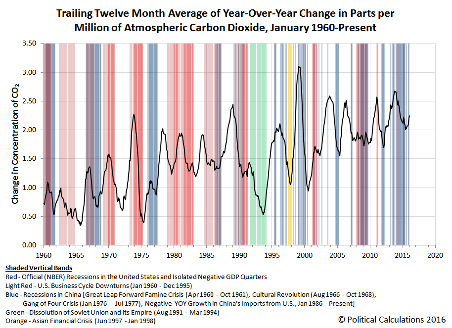
In this chart, we observe that the rate at which carbon dioxide is being added to the Earth's atmosphere bottomed in June 2015 and has increased in each of the months since, which directly contradicts what China's U.S. import trade data is communicating.
While we expect there to be a time lag between when there is a change in economic activity and when the resulting change in a national economy's carbon dioxide emissions might be detected in the middle of the Pacific Ocean, the upswing we see in the atmospheric CO2 levels is both larger than we would have anticipated and has extended longer than we would have anticipated as well.
We think that this sustained acceleration may very well be a direct consequence of the emergency stimulus measures that China's leadership undertook began in March 2015.

In this hypothesis, we suspect that China's leadership acted to accelerate the early completion of a number of construction projects that were already in progress - and particularly, new coal-fired power plants, which typically take 3 to 4 years to build and put into service.
By getting these plants into service more quickly, China's leaders may have hoped that the additional electricity that they would generate would be capable of sustaining additional economic activity, which would justify the acceleration of these projects.
Unfortunately, the trade data suggests that plan is not working out as well as China's leaders may have hoped. China, the world's largest producer of carbon dioxide emissions by a very wide margin, is burning more coal and is exporting an increased amount of CO2 into the Earth's atmosphere as it brings these new plants online sooner than previously planned. But the demand for what might be done with the additional electricity generated by these newly chartered power plants is not sufficiently developed enough to take advantage of the increased capacity to sustain new economic activity, which we can confirm by China's plunging level of imports.
That's the kind of dynamic that can produce the national economy equivalent of a dead cat bounce, where the efforts of national leaders to stimulate an economy to reverse its contraction lead to short term gains that ultimately prove to be unsustainable because of the imbalances they create.
In the worst case, they would make their nation's economic situation worse because they've added capacity that would take decades to fill, which in the mean time, virtually ensures the negative economic outcome they had sought to avoid. In this scenario, the increased supply without increased demand causes prices to plunge, starving firms of the revenue they need to cover their costs of staying in business (particularly the cost of any debt they may have taken on), which leads to defaults and business failures, which become greatly amplified if they prompt failures in banks and other institutions.
If that happens, we'll definitely see it in both the trade data and in the air.
Image Credit: National Science Foundation
Labels: economics, environment, recession, trade
Three days ago, China released its trade data numbers for January 2016, and they weren't good. In addition to not being particularly reliable, even the strongest proponents of that data had to be sorely disappointed, because they indicated that China's exports plummeted by 11.2%, indicating a global recession, while China's imports fell by 18.8%, suggesting China's own economy experienced some pain.
Using more reliable data reported by the U.S. Census Bureau on the value of goods and services exchanged between the U.S. and China, we can show that both nations' economies were feeling pain in December 2015, the most recent month for which this data is available at this writing (data for January 2016 won't be available until 4 March 2016).

After adjusting for the exchange rate between the U.S. dollar and the Chinese yuan, we find that the year-over-year growth rate of China's exports to the U.S. dropped to -6.2%, suggesting that December 2015 was the worst month of the fourth quarter of 2015 in the U.S. At the same time, we find that the value of the year-over-year growth rate of the goods and services that China imports from the U.S. dove to -13.7%, the lowest figure on record since July 2009.
We can confirm that the decline in China's consumption of U.S. goods (primarily the agricultural product of soybeans during the months of October through December) occurred in both nominal and real terms. Tapping the U.S. Census Bureau's International Trade Statistics database for China, we found that China imported the following value of soybeans from the U.S. during these months in both 2014 and 2015.
| Value of Soybeans Exported by the U.S. to China | |||
|---|---|---|---|
| Month | 2014 | 2015 | Year Over Year Change |
| October | $3,009,223,000 | $2,799,077,000 | -$210,146,000 |
| November | $3,473,028,000 | $2,411,731,000 | -$1,061,297,000 |
| December | $2,402,104,000 | $1,465,150,000 | -$936,954,000 |
| Total | $8,884,355,000 | $6,675,958,000 | -$2,208,397,000 |
Update 19 February 2016: Highlighted values in the bottom row of the chart above have been corrected!
For the fourth quarter of 2015, that value falls some $1.2 billion below the total value of all the soybeans that China imported from the U.S. in the same quarter a year earlier.
That confirms the decline in nominal terms, but we also recognize that the price of soybeans in 2015 was much lower than in 2014. That means that China could simply have been paying less for U.S. soybeans, but buying more. So, using the average price of soybeans that we calculated for the 12 months preceding October, November and December in both 2014 and 2015, we estimated the equivalent quantity of U.S. soybeans that China acquired in each year. Our results are summarized in the table below.
| Estimated Quantity of Soybeans (Bushels) Exported by the U.S. to China | |||
|---|---|---|---|
| Month | 2014 | 2015 | Year Over Year Change |
| October | 229,274,133 | 282,362,716 | 53,088,583 |
| November | 268,931,638 | 247,441,621 | -21,490,017 |
| December | 189,055,211 | 152,302,495 | -36,752,716 |
| Total | 687,260,982 | 682,106,832 | -5,154,150 |
Here, we see that in October 2015, China far exceeded its import quantity of soybeans from the U.S. as compared to the previous year. But for November and December 2015, we find that the quantity of China's soybean imports from the U.S. fell below the previous year's total. On net, China's cumulative imports in 2015 exceeded its previous year's total through November 2015, but turned fully negative once December 2015's tally was included.
This outcome in part explains what we observed yesterday, where we found that layoffs in U.S. farm states began to notably rise in the months of November and December 2015. More interestingly, two of the states that we had identified as lesser finance industry states, Illinois and Minnesota, are also significant producers of soybeans, so the increase in new jobless claims in these states could be a considered to be in part a direct consequence of China's reduced appetite for U.S. soybeans.
On a final note, in previous months, we've also used changes in global atmospheric carbon dioxide levels as an independent indicator of China's economic health, since that nation is the world's largest producer of carbon dioxide emissions. Those levels continued to increase in December 2015 above the pace they did in previous months, indicating a increasing level of economic activity, which contradicts what the trade data is telling us.
We have an interesting hypothesis for why that might be, which we'll explore in the very near future. If you want to try to get there before us, the links to the relevant data are listed below.
Data Sources
Board of Governors of the Federal Reserve System. China / U.S. Foreign Exchange Rate. G.5 Foreign Exchange Rates. Accessed 5 February 2015.
U.S. Census Bureau. Trade in Goods with China. Accessed 5 February 2015.
National Oceanographic and Atmospheric Administration. Earth System Research Laboratory. Mauna Loa Observatory CO2 Data. [File Transfer Protocol Text File]. Accessed 5 February 2015.

As promised, we've dug deeper in the U.S. Department of Labor's state level data on the number of seasonally-adjusted new jobless claims being filed each week to identify the states that have experienced a trend-breaking increase in the number of job layoffs.
Let's get straight to what we found: the job layoffs that began rising in the final week of October 2015 have been concentrated in states where either farming or the finance industry contributes an outsized portion of their economies, at least as compared to most other states.
The chart below shows the clear break in the previous statistical trend that occurred in the farm industry heavy states of South Dakota, Nebraska, Kansas, Iowa and Idaho, as well as the finance industry-domininated states of New York, New Jersey, Connecticut, Massachusetts, New Hampshire, Maryland, and to a lesser degree, Illinois, Minnesota and Colorado.

Some quick observations before we discuss what else we looked at before concentrating on these states....
- The number of layoffs in the finance states are much greater than those in the farming states.
- Layoffs in the farming states appear to have somewhat abated since the end of December 2015, but it is as yet too early to confirm if that will be sustained.
- The break in the established statistical trend occurred in the week ending 28 November 2015, with the number of new jobless claims rising well above the range that would be expected purely by chance.
- We see a similar break in the week ending 26 December 2015.
- Quick thinking readers will recognize that those are the weeks including the major holidays of Thanksgiving and Christmas. However, if you look at the equivalent weeks in 2014, the number of seasonally-adjusted layoffs in each week is lower, which means that when these weeks are compared to 2015, there is really a higher level of new jobless claims being filed in the more recent period - and certainly much higher with respect to the mean trend.
- The data in the period since 28 November 2016 is also extremely volatile, which itself is an indication that the established trend for new jobless claims being filed each week broke down in this period.
Previously, we had looked at the oil-patch states and found that the number of job layoffs in these states was largely flat, which has remained true up at least through 23 January 2016, the most recent week for which we have state level data for initial unemployment insurance claim filings at this writing. What is happening in the farm and finance industry states represents an expansion of economic distress in the U.S.
We had also looked at California, the most populous U.S. state. Here, we found a break in the statistical trend that applied in that state beginning in January 2016, but which did not exist before that time, which happens to coincide with the latest increase in the state's minimum wage. Although California has a major agricultural industry, it contributes a much smaller share to the state's GDP than does the farming industries of the states we identified, not to mention the very different nature of agriculture in California as compared to the more farm industry heavy states. For example, California's farmers actually enjoyed a record year in 2015, despite the state's extreme drought, thanks mostly to the industry's front-of-the-line status for irrigated water delivery.
Having established an increased minimum wage as a potential explanation for the increase in layoffs beginning in January 2016, we looked at all the other U.S. states that implemented minimum wage hikes that were greater than the rate of inflation to find out if they experienced a similar pattern. We found no similar January surge in these other states.
We tentatively think that may have a lot to do with the composition of the recently added workers in California's economy, where we discovered from data published by California's Economic Development Department in its monthly Labor Market Review that teens were hired in 2015 at over five times the rate of their actual numbers in the state's overall workforce. That is to say then that much of California's net job growth in 2015 was very likely fueled by an explosion of minimum wage jobs. That's a topic we'll explore more in the near future, but for now, we'll note that we are not aware of any other state where teens, who represent the demographic group within the U.S. work force with the least amount of education, skills and job experience, outperformed adults in gaining employment to such an extreme extent as they appear to have in California in 2015.
We also looked at states whose economies are dominated by the retail or manufacturing industries. We observed no break in established trends for new jobless claims in these states, which covers all the major industrial sectors where contemporary news coverage from November 2015 to the present has indicated some degree of distress.
Data Sources
U.S. Department of Labor. Unemployment Insurance Weekly Claims Data. [Online Database]. Accessed 16 February 2016.
U.S. Department of Labor. Unemployment Insurance Weekly Claims News Releases. [Online Database]. Accessed 16 February 2016.
References
Political Calculations. A Closer Look at New Jobless Claims. [Online Article]. 12 May 2011.
Political Calculations. U.S. Layoffs Begin Hitting Outside of the Oil Patch. [Online Article]. 5 February 2016.
Political Calculations. Gasoline Prices, Minimum Wage Hikes Define Trends for California's New Jobless Claims. [Online Article]. 10 February 2016.
Labels: jobs
Just two weeks ago, we reported that the number of dividend cuts being announced in this first quarter of 2016 was escalating quickly. In that same post, we also updated our chart showing the ongoing monthly count of the number of dividend cuts as reported by Standard & Poor that have taken place in the U.S. since January 2004, which confirmed that the pace of dividend cuts had once again crossed the threshold that indicates some degree of outright contraction is occurring in the U.S. economy.
That same chart also showed that the last time that the number of dividend cuts were below the level that would indicate some form of recessionary conditions being present in the U.S. economy was October 2013.
Keeping in mind that all of this information is, thanks to our regular reporting on the topic, really old news, we had to laugh as none other than the New York Times finally realized that an elevated number of dividends cut announcements do, in fact, indicate some degree of distress occurring in the nation's economy. Just 11 days after we scooped them on the basic story. Again.
Speaking of which, the pace of dividend cuts in the first quarter of 2016 has continued to escalate. Through Friday, 12 February 2016, the number of dividend cuts has risen into the "red zone" of our cumulative count of dividend cuts by day of quarter chart.
We observe that while the pace of dividend cuts in 2016-Q1 got off to a slower start than they did in same quarter a year earlier, they have escalated to their current level at a much faster pace than they did in 2015-Q1. At present, they are just slightly higher than they were at this same point of time last year.
Both quarters were in the contractionary red zone of our chart. In 2015-Q1, that corresponded to a quarter in which the real GDP growth rate is presently reported to be a cold 0.6%.
Of course, the last time the pace of cumulative dividend cuts announced in a quarter was even close to the pace seen in 2015-Q1 was 2015-Q4. Falling just short of 2015-Q1 in terms of badness, the first estimate of real GDP growth in the fourth quarter of 2015 was reported to be a similarly cold 0.7%.
Leaving behind now what the simplest and perhaps one of the strongest near real-time indicators of real economic distress is telling us about the recent history of the U.S. economy, let's jump straight into the latest twists and turns in the quantum random walk of U.S. stock prices.
Here were the major market driving news events of the sixth week of 2016, or if you prefer, the second week of February 2016!
- 8 February 2016: With investors appearing to be focused on 2016-Q2 in our chart above (actually splitting their attention between the current quarter of 2016-Q1 and that more distant future quarter), stock prices moved downward as dimmer prospects for future growth gave investors little positive to go upon in a week where all eyes would be on Fed Chair Janet Yellen's scheduled Congressional testimony on Wednesday and Thursday.
- 9 February 2016: A classic day with little news and stock prices not really going anywhere as a result.
- 10 February 2016: Janet Yellen speaks softly, hinting that the Fed might slow its plans to hike short term U.S. interest rates further and prompting a rally, but alas, she kept speaking, and the market found she said some offsetting hawkish things in her first day of testifying before Congress, killing off what rally there was. The S&P 500 finished the day just below the level where it started.
- 11 February 2016: Bad news from global banks sends the U.S. dollar up and oil prices down, getting the day off to a bad start. They reach their low for the year, 1810.35, during the day at 2:38 PM Eastern Standard Time, when a rumor that OPEC will cut its oil production sent oil prices higher, boosting oil stocks. At the same time, the market digests the news that Yellen indicated that global market conditions might move the Fed to back off its planned interest rate hikes.
- 12 February 2016: That latter understanding took greater hold on Friday, as both oil stocks and financial stocks continued to rise on that belief. And then, New York Fed president Bill Dudley put the kibosh on that positive outlook, suggesting that he saw no reason for the Fed to not continue hiking rates, causing the rally to stall out at a level much lower than it might otherwise have gone. Still, the market held onto enough momentum to close up for the first time in four days, setting the stage for an opening bell gap up on Tuesday, 16 February 2016 following the U.S. Presidents Day holiday.
According to our model, which is giving us a truer read on the market now that we're beyond the short-term echo of past volatility that dogged us going into the last week, stock prices ended the sixth week of 2016 almost just as they began, with investors splitting their forward-looking attention between 2016-Q1 and 2016-Q2.
The good news though is that stock prices are likely to be less volatile over the next two weeks than they were in either January 2016 or in the first two weeks of February, at least in the absence of market driving news that might cause investors to suddenly shift their attention with little warning to more distant points of time in the future, which would be a good thing in the short term if that were to happen.
The bad news is that for that to happen, it would take some pretty bad news....
Labels: chaos, dividends, SP 500
Have you ever bought something that you thought would last, then had to replace it far sooner than you believe you ever should have had to?
Sure, maybe you deliberately bought something that was cheap just because it was cheap, and because you figured you would replace it with a higher quality, more durable version once you became a grown up and could afford to pay more to get something better. But what if you had to deal with that better item falling apart or wearing out long before it ought to have?
Core77's Rain Noe vents his frustration before finding a solution:
I am so sick of the fact that we must constantly buy things, throw them out and buy new ones. I can't stand the appliance that breaks, the cheaply-made tool that fails, the object that's suddenly rendered entirely useless because one small plastic irreplaceable hinge has failed.
Tara Button is sick of it, too, and resolved to do something about it. Button ditched her career in advertising to start Buy Me Once, an online retailer that searches far and wide to find manufacturers who actually build things that were made to last.
In the following video, Button explains what the site is about:
We think it's a cool idea, and also long overdue. And we have to say that we didn't think that we would ever have seen socks with a lifetime guarantee!
Labels: personal finance, technology

Last week, we offered a challenge for our readers at Seeking Alpha: "How Would You Exploit the Future for the S&P 500 If You Knew It?"
In that challenge, we presented a scenario for investors that actually took place in the last week of January 2016, which were based on the series of "If-Then" statements we had outlined a week earlier. After discussing those statements, we laid down the challenge.
Getting back to what we really want to get at, do you see how all these changes in the value of the S&P 500 were specifically covered in our If-Then conditions representing how stock prices would be most likely to behave during the fourth week of 2016?
And since they were, the question of how you as an investor could have taken advantage of the foreknowledge of how stock prices would behave under the circumstances we described, but not the knowledge of the exact timing of when the changes in stock prices we described would take place, is a very open question. One where the strategies you might have used in the fourth week of January 2016 would be very similar to what you might do in future weeks when similar circumstances come back into play.
So what would you have done with your investments to maximize your returns given these circumstances (and the benefit of 20-20 hindsight)? If you're reading this article on Seeking Alpha, we'll monitor the responses addressing that question in the comments over the next week and will share the more interesting strategies that are put forward through that venue in our next discussion of our alternative futures model for the S&P 500.
It's been just over a week since our challenge appeared at Seeking Alpha, and we were very pleasantly surprised by the quality of the comments that were provided.
In particular, ghiblinewt picked up on the degree of difficulty in the challenge from a conventional investing perspective:
As I understand it, knowing the market reaction to a set of events which may or may not eventuate is near meaningless, unless you also happen to know that will occur. Perhaps I'm missing the real question being posed here, but the If-Then proposal gives you no real advantage unless you know that the antecedent will occur.
If you know that one of two (n) possible outcomes will definitely occur however then you could decompose the index space into a bi- (n)-nomial tree and then weighted sum over the multiple paths to arrive at some more probable paths.
But I would suggest that attempting to guess market reaction to specific events is very much a losing game- since the market is already continuously integrating these weightings into its prices- I just don't see that as exploitable in any way. the single most significant piece of information you have about the market is where its just been, of course this means that its not IID, but that's pretty well established.
According to conventional finance theory (think Bachelier, Samuelson, Fama, Ross, Tobin and Shiller), ghiblinewt is absolutely correct. However, our futures-based model extracts more information about the likely future for stock prices than any of these market hypothesists were able to consider in their day, opening up the possibility of being able to exploit the additional information to gain greater returns than would otherwise be possible. Here's how we fleshed out that greater potential and re-expressed the challenge (emphasis and links added, spelling errors corrected):
There's an important bit of information to consider with the If-Then conditions as well - where stock prices are currently, with respect to where our futures-based model indicates they would be based upon how far ahead in the future investors are looking.
For example, there are times when we absolutely know that investors are going to shift their attention to a different point of time in the future, which most often happens when investors are focused on the current quarter (the end of which is still in the future), but the clock for which is ticking down, because there is only so much of the current quarter left to play out before investors *have* to shift their focus to a more distant point of time in the future. The classic example from recent years is 2012-Q4 thanks to what we call the "Great Dividend Raid" ahead of the Fiscal Cliff crisis.
Then, there are most other times where investors have to make some kind of determination of how likely an event is (such as the future timing of Fed rate hikes). You're right in assessing that the market is continually doing that, but here, we're seeing in our model that Fed meetings often coincide with investors focusing on a specific future point in time (the time at which the Fed has indicated it plans to next change interest rates), which provides a basis for setting up an investment strategy based on the likelihood of alternative outcomes.
We'll interject here to note that we have come to use Fed meetings and announcements where investors are clearly and nearly universally focused on one particular point of time in the future as calibration events - to check out well our model is providing feedback on the future outlook of investors. It's something we have to do because the scale factor in the basic math behind our model has to be determined empirically.
Resuming our response:
In a sense, it's like the Monty Hall problem from statistics, where you're given three doors to choose from on a game show, behind one of which is the grand prize. The game show host shows you the prize that is behind one of the doors you didn't pick, then gives you the opportunity to choose again from the two unopened doors, so you now have the choice of sticking with your previous choice or switching it.
Statistics says it is very much to your advantage to switch from your original choice.
For our futures based model, the prizes behind the doors you get to choose are the alternative trajectories for stock prices - and unlike the Monty Hall problem, you get to see what the prize is behind each. The model plays the role of Monty Hall and shows you at certain points of time what the prize is behind a particular door is, or rather, the current level of stock prices tells you exactly how far ahead into the future investors are looking.
Unlike the Monty Hall problem, you have the option of sticking with the door through which you can see the prize. Or you can switch to one of the others based on your assessment of how likely it is investors will focus their attention toward the alternative points of time in the future they represent.
There is a probability that attaches to each, so really the question is one of how you can maximize your returns with that knowlege. Or perhaps a better way to ask the question is if you were to make a larger bet on one of those alternatives becoming the focus of investors, how would you hedge your risk if one of the other alternatives turned into the actual outcome?
Armed with that additional information, ghiblinewt proposed the following strategy:
If we take the reductive case that there are just 2 extremal trajectories for the index - say one broadly net up and the other net down over the period of interest. And then we get a peek at the prize - here do you mean that the "prize" is the expected target level for the index +n days into the future? Is it just the current futures level?
Interjecting to answer these questions, from a practical perspective, since the timing of the changes would be unknown, it would the +n days into the future, which may or may not align with the current futures level. Now back to ghiblinewt's proposed strategy:
Then in that case if and only if we had some ex ante probability for those two extremal paths e.g say that they were 70/30 rather than 50/50 probability of eventuating, then we could definitely exploit that difference. Options for example are priced on the "naïve" equal probability distribution at each point in time - so you would be able to exploit any information advantage you had vis vis the standard pricing models. But as I see it when all is said and done you'd still need to gain your advantage via the ex ante probabilities, and whenever these diverge from those priced by the spot and/or futures level then you can exploit that divergence.
So, difficult, but possible.
Meanwhile, Geoffrey Caveney tackled the problem from more of a hands-on, "How could I do this?", perspective:
Well, if you knew the next big move of the S&P 500 will be downward, but you didn't know the exact timing of the move, a safe way to make a big profit would be to sell lots of out of the money call options on SPY. All the premiums you collect would be free money, if you knew that the S&P 500 wouldn't rise enough to make the call options in the money. In real life I would always recommend selling call *spreads* to protect yourself from unlimited losses in the case of an unexpected huge rally.
We would assume that the opposite strategy, buying "in-the-money" put options, would apply in the situation where we expected a decline in prices. Which is coincidentally what Mark Cuban did with his long position in Netflix (NASDAQ: NFLX) back on 5 February 2016.
Altogether, these are what we would consider to be pretty sophisticated strategies. We'll have to tackle the question of what strategy a typical investor might be able to execute in a regular trading account without having to open an options trading account in a future post.
But if you have good ideas, by all means, please share them in the comments to our How Would You Exploit the Future for the S&P 500 If You Knew It? challenge at Seeking Alpha - if you beat us to a workable strategy before we get around to posting our thoughts, we'll give you full credit for devising it!
Labels: investing, SP 500, stock market
Last week, we used a well established method of statistical analysis to demonstrate that layoffs were beginning to spread to the states outside of the eight oil-patch states where they had previously been concentrated.
Today, we're digging into that discovery to see if we can identify the factors that are driving the statistical break in what had been a steady trend of improvement that had become established in July 2014.
Our first step is to look at the state with the biggest population of the states: California. The chart below shows the state's residual distribution of the major trends in new jobless claims filed each week from 31 May 2014 through 23 January 2016, adjusted for seasonality using the BLS' national-level seasonal adjustment factors. (Since California represents the home of one out of every eight Americans, we will assume reasonably approximates the seasonal adjustment factors that would more accurately apply to that single state's economy.)

In the chart above, we identify four main trends for new jobless claims in the state of California during the period of time since 31 May 2014.
- Trend MCA: Coincides with the national trend that began on 23 February 2013, which extended through 28 June 2014. Nationally, the trend was defined by a general improving trend of declining layoffs and new jobless claims, which fell at an average rate of 460 per week. In California however, the trend of new jobless claims was characterized by a volatile but steady increase of 130 per week.
- Trend NCA: Oil prices, which began falling in late June 2014, prompt a reversal in California's fortunes with respect to new jobless claims. From 5 July 2014 through 3 January 2015, California's new jobless claims would fall at an average pace of 486 per week. We should note that California also increased its minimum wage by $1.00 per hour, effective 1 July 2014, to $8.00 per hour right at the beginning of this change in trend.
- Trend OCA: After months of falling oil and gasoline prices, they bottom in January 2015 and begin to rebound - peaking in July 2015. New jobless claims in California also rebound in this period, rising at an average rate of 64 per week. This flat-to-upward trend for new jobless claims extends past the end of rising oil and gasoline prices, coming to an end by 5 September 2015.
- Trend PCA: Weeks after oil and gasoline prices begin falling again, new jobless claims in California begin falling at a steep rate, with the average pace of initial unemployment insurance claims filed each week plummeting by 984 per week - more than double the rate seen when oil and gasoline prices fell by a similar amount back during Trend NCA. The trend however appears to have come to a sudden end in January 2016.
Why such a difference between Trend PCA and Trend NCA? Unlike July 2014, we observe that California didn't increase its minimum wage in this period of falling oil and gasoline prices, which meant that businesses in the state, particularly those related to the fuel price-sensitive food, accommodation, travel and recreation industries, benefited from the increase in the disposable income of Californians without having their costs of doing business arbitrarily increased - allowing them to both put and keep more employees on their payroll to keep up with the improved economic situation.
That changed however on 1 January 2016, as California increased its minimum wage once again by $1.00 per hour, to its current level of $9.00 per hour.
We've previously observed that new jobless claims lag some 2 to 3 weeks behind the events that drive changes in the hiring and employee retention decisions of U.S. businesses, which corresponds to the typical weekly and biweekly payroll period that predominates throughout the U.S.
In the chart above, the sudden appearance of extreme statistical outliers on and after 16 January 2016 indicates that something changed to affect the outlook of California businesses between 26 December 2015 and 2 January 2016. Since oil and gasoline prices, a factor we've already identified to be significant where trends in new jobless claims are concerned, were still falling at that time and also in the weeks since, the factor that most likely caused the break in the established statistical trend was California's minimum wage hike.
Speaking of oil and gasoline prices, we'll close with a chart showing the average retail price of all grades and all formulations of gasoline in the period from May 2014 through January 2016.

Perhaps the most remarkable thing illustrated in the charts above is that during periods of time when oil and gasoline prices fell, the first period which had a larger decline in fuel prices combined with the immediate impact of a minimum wage hike saw half the rate of improvement in new jobless claims than the period that saw oil and gasoline prices falling by a lesser amount, but no minimum wage hike.
It's just a shame that trend had to come to an end so early after the minimum wage in California was hiked on 1 January 2016.
Labels: data visualization, jobs, minimum wage
Welcome to the blogosphere's toolchest! Here, unlike other blogs dedicated to analyzing current events, we create easy-to-use, simple tools to do the math related to them so you can get in on the action too! If you would like to learn more about these tools, or if you would like to contribute ideas to develop for this blog, please e-mail us at:
ironman at politicalcalculations
Thanks in advance!
Closing values for previous trading day.
This site is primarily powered by:
CSS Validation

RSS Site Feed
JavaScript
The tools on this site are built using JavaScript. If you would like to learn more, one of the best free resources on the web is available at W3Schools.com.
Other Cool Resources
Blog Roll


