 It's Friday, we did the nation's taxes yesterday, so we're getting a jump start on the weekend. Today's list comes from the BeerFathers, who were kind enough to list the top 10 imported beer brands for 2010:
- Corona Extra
- Heineken
- Modelo Especial
- Corona Light
- Tecate
- Labatt Blue
- Labatt Blue Light
- Dos Equis XX Lager Especial
- Stella Artois Lager
- Heineken Premium Light Lager
And their comments:
TheBeerFathers Notes on Top Imported Beer Brands:
- Newcastle fell off the list from last year at #10, and they were #7 in 2007. That explains their ramp up in advertising lately – their Newcastle commercials are actually quite great. It’s tough to see them drop off because they were by far the highest rated beer from RateBeer.com on the list with an overall 47 out of 100. Hopefully they can make a strong comeback.
- It’s still surprising to me that Guinness Draught is not on the list. They fell off last year after a #8 ranking in 2007. Shock!
- Heineken. Still a case study in marketing.
- Dos Equis continues to hold strong at #8, riding the strength of their still brilliant commercials featuring The Most Interesting Man in the World.
- The highest rated beer on this list at RateBeer.com is Stella Artois, with an 18 overall. It is a 92 by style though (
Euro Trash LagerPale Lager).
None of the import brands crack the top 10 beer brands by U.S. market share, where Bud Light appears to dominate, claiming 28.5% of the total U.S. market. (Just in case you were wondering what's most likely to be on draft at a local neighborhood bar in the U.S.!)
Labels: food
 What if you were in charge of reforming the U.S. individual income tax? Would you consider ditching today's excessively complex tax code in favor of something much, much simpler? Something like a flat income tax, perhaps?
If so, you've come to the right place! Our latest tool puts you in the driver's seat for determining how the nation's, and your own, fortunes would fare under such a system!
In the tool below, all you need to do is enter the percentage income tax rate that would apply to all Americans, from Warren Buffett on down to his pool of non-amused secretaries, along with the value of a single tax credit, which would be provided to each individual American, again regardless of who they are.
After that, if you want to see how your or your family's income taxes might change as a result of your dramatic proposal, enter your household's total money income (whether you earned a salary, wages, capital gains, and/or dividends) and the number of individuals who would be covered by it (sorry, pets and other livestock need not apply!)
About the Tool
We used our model of the 2010 aggregate distribution of household total money income for the U.S. in generating the "how would the federal government do with your flat tax?" portion of the tool, along with the U.S. GDP for 2010, and the IRS' count of the number of exemptions reported on tax forms for 2009 (the most recent year this data is available.)
The rest was just simple math! (Trust us - you should see how the IRS does quadratic equations!)
Final Thoughts
In 2011, it took 72,536 pages to document the ins and outs of the U.S. tax code. We whipped our tool up yesterday afternoon. If you're into simple, this is about as simple as it gets.
Do you think anyone in Washington, D.C. wants that?
Data Sources
White House Office of Management and Budget. Budget of the United States Government: Historical Tables Fiscal Year 2012. Table 2.1 - Receipts by Source: 1934-2016. [Excel Spreadsheet]. 14 February 2011. Accessed 28 September 2011.
Bureau of Economic Analysis. Gross Domestic Product: Second Quarter 2011 (Second Estimate). 26 August 2011. Accessed 28 September 2011.
Internal Revenue Service. Selected Income and Tax Items for Selected Years (in Current and Constant Dollars). Individual Complete Report (Publication 1304), Table A, 1990-2009. [Excel Spreadsheet]. Accessed 28 September 2011.
Image Credit: Real Clear Markets (thanks guys!)
According to Snopes, Willie Sutton was famous for two things, one of which wasn't true:
Sutton is famous for two things: His fascinating career as an illegal withdrawals specialist (bank robber, that is) and for a pithy rejoinder supposedly uttered in response to an inverviewer's query about why he robbed banks. While lore would have it that the band robber replied "Because that's where the money is" to that common question, Sutton denied ever having said it. "The credit belongs to some enterprising reporter who apparently felt a need to fill out his copy," wrote Sutton in his autobiography. "I can't even remember where I first read it. It just seemed to appear one day, and then it was everywhere."
So, if you were a modern day illegal withdrawals specialist, seeking to go "where the money is" with respect to the incomes of those who earned it in 2010, where would you go?
To find out, we estimated the number of households within each $1,000 increment of total money income from $0 to $10,000,000 in the United States, using U.S. Census data. We then calculated the aggregate amount of income within each $1,000 income increment by multiplying our estimated number of households by the value of the midpoint of the income increment.
Our first chart shows what we found:
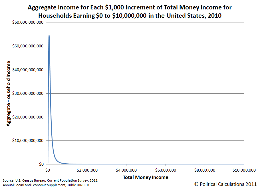
This chart shows that the aggregate distribution of income in the United States is heavily weighted toward the lower end of the chart, however the horizontal scale makes it difficult to see which incomes correspond to the greatest amount of aggregate income.
To make those values easier to read, we switched the horizontal axis to be in a logarithmic scale. Our second chart shows the results:
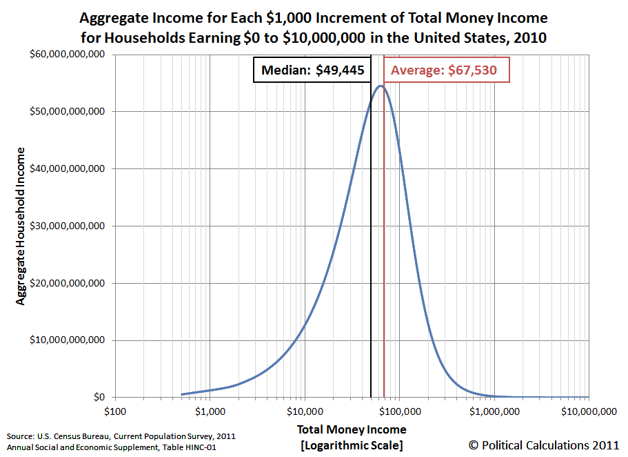
Here, we clearly see that most of the aggregate income earned by U.S. households in 2010 is to be found between the median household income figure of $49,455 and the mean household income figure of $67,530, which would put you in the neighborhood where Americans households collectively earn well over 50 billion dollars per year.
If you'd like to widen your target rant to include those households that collectively rake in more than 20 billion dollars per year, you'll find those households between an annual income of $16,000 and $161,000.
Or, if you just care about the income range where Americans collectively make more than 10 billion dollars per year, you'll find that money earned by households with annual incomes between $8,500 and $221,500.
And now you know where the money really is!
Data Source
U.S. Census. Current Population Survey. Annual Social and Economic (ASEC) Supplement. HINC-01. Selected Characteristics of Households by Total Money Income in 2010. Accessed 13 September 2011.
Labels: income distribution

We've got good news, bad news and really bad news for you this morning, White House Staffer! The good news is that for the first time in months, the average national price of gasoline in the United States has fallen below $3.55 per gallon, so we've finally taken down the "Good Morning, White House Staffer" feature that we've been running since mid-April. Just as promised!
The bad news? The reason gasoline prices have fallen is because the outlook for the economy has gotten much worse. Much like the last time it happened, just after U.S. gasoline prices peaked at $3.96 per gallon in early May 2011. When we took matters into our own hands and pushed gasoline prices lower at that time by accelerating the change in outlook.
Because that outlook has gotten much worse, and also because of what that means for jobs, the really bad news we have for you is that basically, you're hosed. Please review the following chart to understand why:
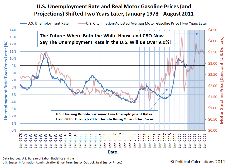
Given the current strength of the housing market in D.C., we recommend acting sooner rather than later in putting your house up for sale, then renting for the rest of your tenure in our nation's capitol. Plus, this is also a very good time to update your résumé.
But then, if you've been paying attention, you probably have already done that, haven't you?
Data Source
U.S. Energy Information Administration. Short-Term Energy Outlook - Real Energy Prices. [Excel spreadsheet - monthly real U.S. City Average Motor Gasoline Prices]. Accessed 14 September 2011.
Previously on Political Calculations
- Surprising Impotence
- Who's Behind the Drop in Gas Prices?
- Changing the Outlook for Oil Prices
- Holy Gas Prices Batman! It's the New Batmobile!...
- Using Gas Prices to Forecast the Unemployment Trend
- Correlating the Price of Gas and the Unemployment Rate
- Why Are Americans Driving Less?
- How Much Does Your Commute Cost You?
- Should You Move Closer to Work to Save Commuting Costs?
- How to Save Money on Gas, Without Driving Less
- How Much Are Higher Gas Prices Really Hurting You?
- Should You Trade in Your Gas Guzzler?
- Is It Worth the Drive?
- Do Hybrids Really Save Money?
- How Much Do You Pay in Gas Taxes?
Labels: none really
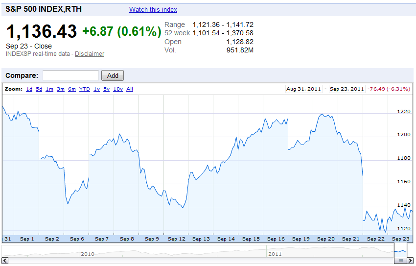
You may have noticed that stock prices have been flailing around quite a lot lately:
What we can tell you is that investors have been reacting to quite a lot of noise in the market, specifically related to what actions the Federal Reserve might take with respect to a new round of quantitative easing.
We know that noise is behind the change in stock prices, because the fundamental driver of stock prices, the cash dividends per share that are expected to be paid in the future, have been rising sharply since 12 September 2011:

We know that the change in expectations for what the Federal Reserve will be doing with respect to a new round of quantitative easing because of the timing for when stock prices underwent their most significant change biggest dip for the month on 22 September 2011. Here, when it became apparent that the Federal Reserve would not follow through on the expectation that it would launch QE 3.0 any time soon, stock prices reacted in response.
In this case, stock prices fell because investors had to suddenly factor in the increased potential for deflationary or near-deflationary conditions to re-emerge.
But even with all that noise, the main driver of today's stock prices continues to be the change in the expected rate of growth of dividends per share, specifically those that apply for the second quarter of 2012:
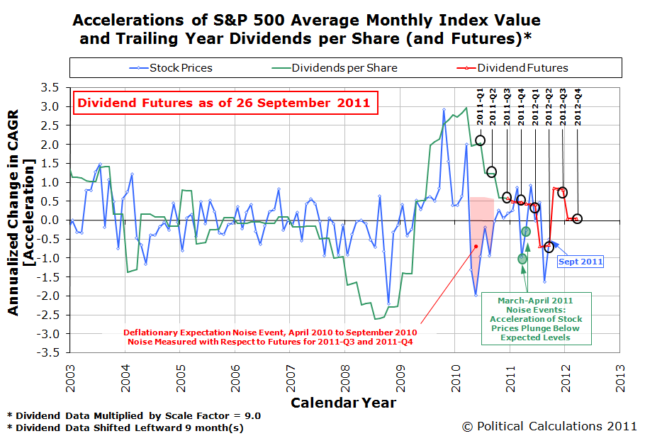
If we had to pick a quarter that would be mostly likely to see recession in the future, it would be the second quarter of 2012. Since a recession would most likely be accompanied by falling prices, there's your most likely source for today's expectations of future deflationary conditions.
As for what that might mean for stock prices going forward while such expectations exist, consider the following chart:
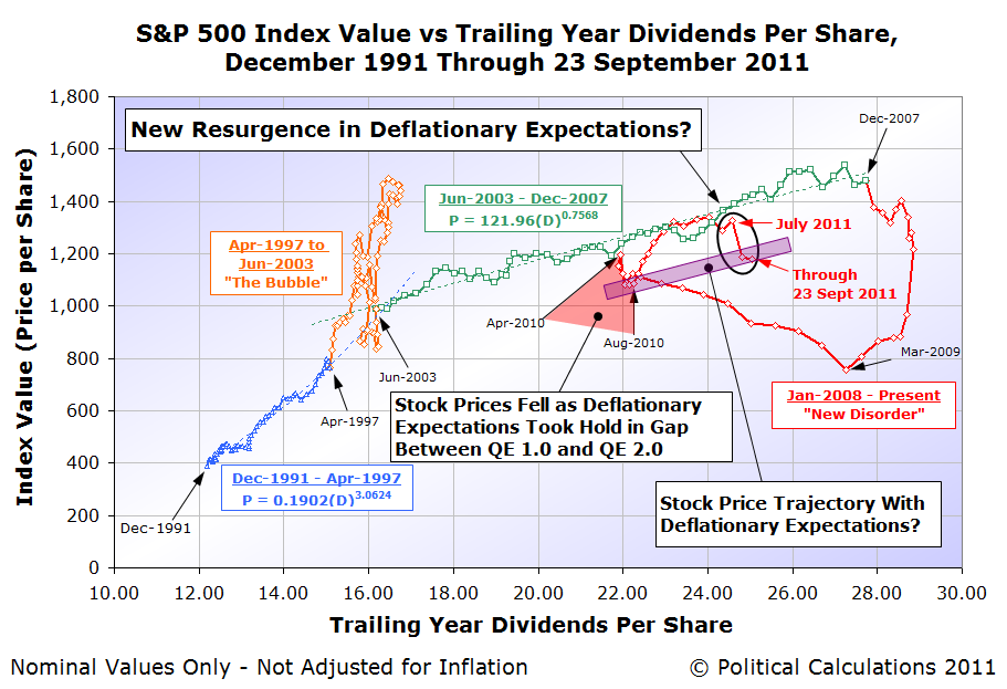
The trajectory we're showing for stock prices with deflationary expectations runs largely parallel to the trend that existed from June 2003 through December 2007, which was characterized by the expectation of a steady level of future inflation.
Without that expectation of a steady and positive level of future inflation, but rather a steady, but much lower, or near-deflationary level of inflation, we would expect stock prices to follow a parallel trajectory with respect to their dividends per share, provided investors continue to expect rising levels of dividends with passing time.
The wild card then would be changes in the expected level of dividends per share in the future, which could then send stock prices reeling, much like what happened following December 2007.
We'd really like to be able to nail down a real forecast, however we don't yet have the data we would need to be able to quantify the effect of changing expectations of future inflation on stock prices. In that sense, today's market volatility is especially interesting, because it's generating the data we would need to do that.
But then, we're pretty sure that most investors would really rather not be part of our science experiment....
Labels: chaos, SP 500, stock market
Are you dieting and/or exercising to lose weight right now? And how much weight do you expect to be able to lose and keep off by following your weight loss plan?
You've probably heard that rule of thumb that says you can lose one pound by either eating 3,500 fewer Calories over time or by burning 3,500 more Calories through exercise. And you might very well have heard it from some seemingly reputable sources, like NBC's Today show or from the winning contestants on that network's show The Biggest Loser.
The only problem with that kind of math is that it doesn't work in real life. Here's what we learned on that topic last year, when we looked at what might happen to our weight if we started eating one extra chocolate chip cookie (or 210 extra Calories) every day:
What happens in real life is that your body's metabolism will adjust over time to compensate for the additional calories you're consuming, in such a way that the amount of weight you might gain will be much smaller than what that 3,500 calories = 1 pound relationship would predict.
One way to look at that situation is that the weight you would gain would also cause you to burn more calories, which limits how much additional weight you would actually gain in that situation.
The body's process of metabolic compensation then works in reverse if you're trying to lose weight. Here, many people will recognize that force at work if they ever had the experience of succeeding in losing some weight, but reaching that certain point where it became really tough to lose any more.
Kevin Hall is a biologist at the U.S. National Institute of Health whose research into the body's metabolism has led him and his colleagues to publish a new paper in the Lancet medical journal, which quantifies how a person's metabolism adjusts when they change their calorie intake or physical output.
Better still, they developed a web-based application where you can apply the mathematical model they've built based upon their research for yourself!
We took their tool for a test drive and were pretty impressed. In our first screen shot of what the Human Body Weight Simulator can do, we entered the data for a 35 year old woman who is 5 feet, 8 inches tall and weighs 170 pounds, whose daily physical activity is very light.
We then had the tool calculate what it would take, just in reduced food intake, for our heroine to lose 10 pounds in 30 days.

Here, we find that our heroine can lose the 10 pounds in 30 days by cutting her typical daily intake of 2,123 Calories down to 1,205 Calories.
After that, assuming she ups her food intake up to 2,057 Calories per day, her weight will rise back up to 162.8 pounds, where it will then hold steady at that level indefinitely (provided her Calorie intake and physical activity levels also remain steady!)
For our next screen shot, we specified a lifestyle change for our hypothetical woman, where we started her making just one change on the first day of her new diet plan: we put her on a 2,000 Calorie per day diet, just 123 Calories per day less than her estimated baseline diet value.

Here, after one year, her weight had dropped to 162.1 pounds. Adjusting the number of days to span two years (730 days), her weight had dropped to 158.4 pounds.
Three years later, her weight had dropped to 156.7 pounds. After four years, she hit 155.9 pounds, as her weight loss flattened out and her weight began holding steady. Ten years later, our simuluated heroine was maintaining a steady 155.1 pounds, about 15 pounds below her starting weight of 170.
By contrast, if every 3,500 Calories not consumed really leads to one pound of weight loss, after reducing her diet by 123 Calories per day over 10 years, our hypothetical woman would have lost 128 pounds, putting her weight at 42 pounds.
Overall, we found the NIH's Human Body Weight Simulator provides highly informative results, which are based on solid science.
On the user interface side of things however, we have some issues, as we found it to be somewhat of a mixed bag. Although the tool provides slider controls for the graphed portion of its output, it would be really nice to have a similar control for the time period displayed.
Likewise, we'd love to be able to have a control that would allow us to read the data points at various points along the graph, rather than directly entering the number of days.
All in all, the NIH's Human Body Weight Simulator meets our Silver Standard for online applications. Based on its strong information quality, we highly recommend it.
How much does the top income tax rate affect how much money the government collects each year?
That question is relevant today because of the President's latest idea: the "Buffet Rule", which would impose higher income taxes on people who earn over one million dollars a year.
But would the government actually collect more money? Let's find out by doing some math that the President doesn't seem to have done!
The chart below plots the ratio of total government Revenue Per Household (RPH) to the Median Household Income (MHI) for the U.S. for each year from 1967 through 2010. The chart also plots the maximum income tax rate that the topmost income earners in the United States have had to pay for each year from 1967 through 2010.
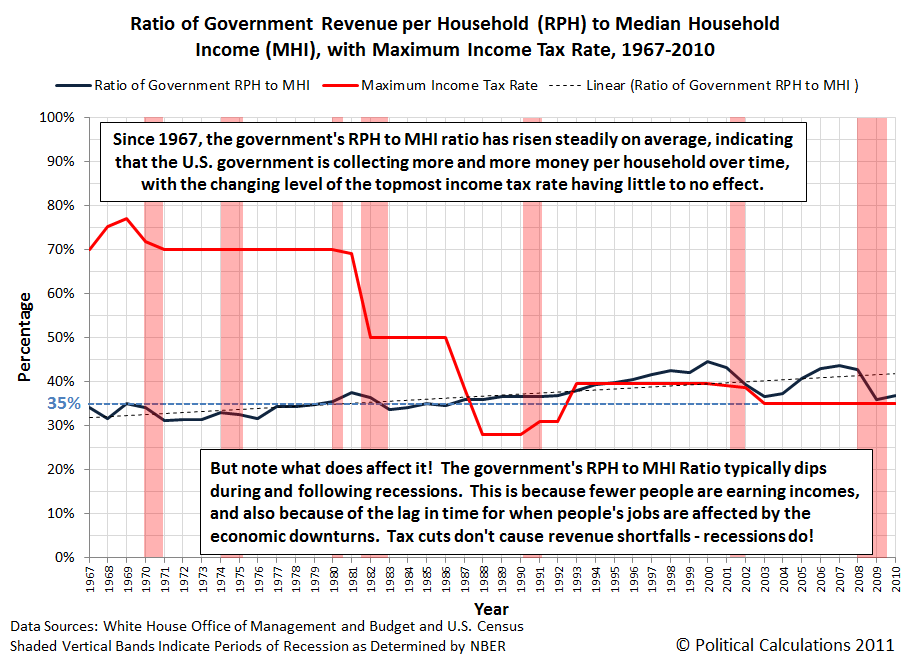
The nice thing about the government RPH to MHI ratio is that if the high income earners who are affected by changes in the maximum income tax rate, we'll see it in how the percentage of revenue collected the government per household changes with respect to the median household income changes over time.
Here, if a tax cut really slashes the amount of money that the government collects from these taxpayers, we'll see it show up as a decrease in this ratio following the timing of when a tax cut is implemented. We will likewise see the reverse pattern following a tax hike.
What we do see indicates that the maximum tax rate has little to no bearing on how much money the federal government collects per household in any given year. Since 1967, the government's RPH to MHI ratio has risen steadily on average, indicating that the U.S. government is collecting more and more money per household over time, with the changing level of the topmost income tax rate having little to no effect on the rate of that change.
With that being the case, there is no legitimate reason to set higher income tax rates today, as they are now demonstrated to have little to no effect on how much money the government collects in any given year. Increasing the top income tax rate in the U.S. is simply not an effective strategy for closing the gap between the government's spending per U.S. household and how much it collects in taxes per U.S. household, making any ongoing effort to do so an utter waste of time that could be put to much better use.
As for what does affect the government's RPH to MHI ratio, we would identify two main factors. First, the real progressivity of the U.S. tax system has increased from 1967 through the present (the Tax Foundation shows a snippet of this happening from 2000 to 2005). In other words, those with higher incomes have been paying a increasing share of taxes in the U.S., which is the main factor skewing the overall trajectory of this ratio upward over all this time.
Second, recessions appear to be bad for both billionaires and the government's tax collections. But perhaps that's to be expected when you progressively come to rely too much upon a too small a number of people for your revenue.
So spending a lot of time then to try to make the government become even more dependent upon the random year to year fluctuations of the incomes of a much too small number of people to try to get more money from them would be just plain stupid.
Labels: taxes
What's the biggest single factor that determines how much money the U.S. federal government will collect in any given year?
For our money, it's Median Household Income. The chart below, which shows the relationship between median household income and the total receipts of the U.S. government for each year since 1967, the earliest year for which we have median household income data, shows why we think that:

Here, we found that a simple power law relationship exists between the amount of median household income in the United States and the total amount of money that the federal government collects each year, which is why we've opted to show both the horizontal and vertical axes on a logarithmic scale: a power law relationship becomes a straight line when graphed on such a chart.
All in all, given the variation we observe from year to year, the formula we presented on the chart will be accurate to within 12% of the actual amount of money collected by the U.S. government in any given year if you only know the median household income, and often much less than that amount. That's pretty remarkable considering how much, and how often, U.S. income tax rates have changed since 1967.
But then, you don't have to take our word for it. You can use the tool below to do the relevant math for yourself:
And now, you would just need to compare your results with the OMB's historical tables for "Total Receipts".
Speaking of variation, most of what we observe in the data may be linked to the economic situation of the U.S. Here, we see the government really raking in high dollar amounts during the inflation phase of economic bubbles (say 1998-2000 and 2005-2007 for example), while recession years see the government raking in much lower amounts, especially during the deflation phase of economic bubbles (2001-2003 and 2008 to the present.)
Data Sources
U.S. Census. Income Data, Historical Tables. Table H-5. Race and Hispanic Origin of Householder -- Households by Median and Mean Income: 1967 to 2010 [Excel Spreadsheet]. 13 September 2011. Accessed 20 September 2011.
White House Office of Management and Budget. Budget of the United States Government: Historical Tables Fiscal Year 2012. Table 1.1 - Summary of Receipts, Outlays, and Surpluses or Deficits (-): 1789-2016 [Excel Spreadsheet]. 14 February 2011. Accessed 20 September 2011.
What tax deductions do the rich and famous, as well as all other Americans who earn more than $200,000 per year, claim on their U.S. tax returns, and how much do they claim for each?
Using the most recently available tax return data for 2009, we found out and visualized the results into the following chart:

In 2009, people with incomes over $200,000 claimed $67.8 billion in itemized tax deductions on their tax returns for that year. Of that amount, the largest share of $22.8 billion, or roughly 34% of the total, was claimed through the mortgage interest tax deduction.
The second largest category was the tax deduction for paying state and local income, sales and personal property taxes, which absorbed $20.1 billion, or about 30% of the total.
We should note that people filing income taxes have been able to claim both deductions on their federal income tax returns since the income tax went into effect in 1913. The only difference is that Americans used to be able to claim all the interest paid on their debts, rather than just their mortgage interest, which was changed by the Tax Reform Act of 1986.
Meanwhile, charitable contributions accounted for $19.1 billion of the total deductions claimed by those earning $200,000 or more in 2009, or 28% overall.
Combined, these three categories of itemized tax deductions represent over 91% of all the itemized tax deductions claimed by people who earned $200,000 or more in 2009.
All other tax deductions, covering things like real estate taxes, medical deductions, child care, etc. amounted to less than 9% of the total $67.8 billion claimed by these high-earning taxpayers
Data Source
Joint Committee on Taxation. Estimates of Federal Tax Expenditures for Fiscal Years 2010-2014. 21 December 2010.
Labels: taxes
How much can typical Americans actually afford for the U.S. federal government to spend? And how does that compare with the amount of money that President Obama would really like to spend?
Now that we have the median household income data for 2010, we can update our chart showing the relationship between the amount of federal spending per household against the U.S. median household income to answer those two questions! The results are illustrated below:

In the chart above, in addition to tracking the historical amount of U.S. government spending per U.S. household and U.S. median household income since 1967, we've also indicated the amount of federal expenditures per household that President Obama has indicated he wants to spend in future.
President Obama has described that future spending in the Mid-Session Review of the Budget of the U.S. Government for Fiscal Year 2012, which runs from 1 October 2011 through 30 September 2012.
We've also indicated the additional amount of federal government spending per U.S. household that the President is currently demanding that the U.S. Congress act to support his jobs bill (aka "The American Jobs Act"), which he hopes will duplicate the "success" of his 2009 economic stimulus package. For that measure, the President would like to spend an additional $447 billion in 2010, which works out to be about an additional $3,800 per U.S. household.
Finally, we've also shown just how much money that typical Americans can afford for the U.S. government to spend per household through the Zero Deficit Line (ZDL). The ZDL represents the amount of money that the government can collect through taxes for a given level of median household income for the nation.
Data Sources
U.S. Census. Income, Poverty, and Health Insurance in the United States: 2010 - Historical Income Tables. Table H-5. Race and Hispanic Origin of Householder -- Households by Median and Mean Income [Excel Spreadsheet]. 13 September 2011. Accessed 18 September 2011.
White House. American Jobs Act. 12 September 2011. Accessed 18 September 2011.
White House Office of Management and Budget. Budget of the U.S. Government, Fiscal Year 2012, Historical Tables. 14 February 2011. Accessed 18 September 2011.
White House Office of Management and Budget. Budget of the U.S. Government, Fiscal Year 2012, Mid-Session Review. 1 September 2011. Accessed 18 September 2011.
Labels: national debt
Here's the situation: you have two gas stations to choose between for your fuel needs. One station is closer to you than the other, but the one that's further way is selling gas at a cheaper price than the closer station. Which station should you choose to fill up at?
Yes, these are the kinds of questions we seek to answer here at Political Calculations, or rather, the kinds of questions that we make tools for you to answer for your own needs! Enter the indicated data into the input fields of the tool below, click the "Calculate" button, and we'll do the math to figure out which station you should go to!
Of course, it's entirely possible that you're one of those people for whom time doesn't matter. If that's not you, perhaps Mark Perry's point applies:

"And if you drive a typical car more than a mile out of your way for each penny you save on the per-gallon price, it doesn't matter how worthless your time is to you - the gas to get there and back costs more than you save." Source.
The real question to ask then is "how much is your time really worth?"
Labels: gas consumption, personal finance, tool
On Valentine's Day 2011, we explored the correlation that appears to exist between what motor gasoline prices are today and what the unemployment rate will be two years from now. At the time, we found that:
While the correlation is far from a perfect match, what we do see suggests that Americans can indeed use the real price of gas at the pump to reasonably anticipate how the unemployment rate will change two years down the road.
We then went on to create a tool where anybody can plug in the average price of gasoline today to forecast the U.S. unemployment rate two years later (we later simplified the tool, which is currently featured at the top of our website in our "Good Morning, White House Staffer" feature.)
At the time, we offered a vision of two possible scenarios based on the U.S. Energy Information Administration's projections of average U.S. motor gasoline prices that would play out through the end of 2012 (emphasis ours):
For example, using the default data for our tool, which takes the average retail price of motor gasoline in the United States from 21 February 2011 and pairs it with the Consumer Price Index for All Urban Consumers (CPI-U) from January 2011, our tool projects that the unemployment rate will be about 8.3%, which is lower that the 9.0% unemployment rate reported in January 2011, suggesting a mild improvement from now until then.
However, if average gasoline prices rise quickly to exceed $3.50 per gallon across the nation, as they already have in California, our tool would project that no significant improvement in the U.S. unemployment rate will take place over the next two years.
This year, we've watched the second scenario take hold. What's more, those higher gasoline prices have forced the White House to alter its view of how the U.S. economy will perform through the end of 2012 (emphasis ours, again):
President Obama's mid-session budget review confirms what most private and government projections have recently concluded -- that the economy is considerably weaker than earlier forecasts held, and won't fully recover from the Great Recession for years.
Most troubling, both for the country and for Obama politically, is that near-term unemployment is expected to remain significantly higher than expected, averaging 9 percent in fiscal year 2012.
Obama's budget office initially calculated its economic forecast based upon data available through June. Even that data presaged an 8.8 percent average unemployment rate in 2011 and an 8.3 percent average rate next year. But the mid-session review got delayed, and when the Office of Management and Budget revised it to incorporate the data through the end of August, the picture became much gloomier. Unemployment will average 9.1 percent this year, and 9.0 percent next year, OMB concluded, and won't dip below 7 percent until 2015 at the earliest.
Don't those numbers look familiar! Our site's "Good Morning, White House Staffer" feature would appear to be attracting its target audience!
But they would really rather you not think the much higher-than-they-expected unemployment rate they now expect through the end of 2012 has anything to do with the average retail price of gasoline in the United States:
The revised figures "reflect the substantial amount of economic turbulence over the past two months," OMB says, triggered by the European debt crisis, the earthquake in Japan, congressional brinkmanship over the debt ceiling among others. They also take into account the fact that GDP growth in the first half of fiscal year 2011 turned out to be significantly lower than originally thought.
Because that would mean having to admit that the higher-than-expected gasoline prices that we've seen this year are not so much an accident, but rather, a signature achievement of an administration that has consistently sought to increase gasoline prices in the U.S.:
Odd that the Obama administration wouldn't want to trumpet or draw attention to the successful achievement of another one of the President's major domestic policy objectives.
Instead, the President is becoming increasingly desperate as he tries to force the U.S. Congress to pass another massive stimulus package to try to "create or save" more jobs that even his party's leaders in the Senate are hesitant to take up.
Because maybe, just maybe, those White House staffers have finally worked up their own chart showing the correlation of average U.S. gasoline prices and the U.S. unemployment rate two years later, and realized that it looks like this:
Going by the elevated motor gasoline prices that have come to characterize Barack Obama's years as U.S. President, it appears that the U.S. unemployment rate will skyrocket up to 11% early in 2013 if the correlation between gasoline prices and the unemployment rate two years later continues to hold.
Regardless, whoever wins the Presidential election in November 2012 is going to have their work cut out for them in cleaning up what looks to be one big man-caused disaster.
Data Sources
U.S. Energy Information Administration. Short-Term Energy Outlook - Real Energy Prices. [Excel spreadsheet - monthly real U.S. City Average Motor Gasoline Prices]. Accessed 14 September 2011.
U.S. Bureau of Labor Statistics. Labor Force Statistics from the Current Population Survey, LNS14000000, Seasonally-Adjusted Unemployment Rate. Accessed 14 September 2011.
Previously on Political Calculations
- Surprising Impotence
- Who's Behind the Drop in Gas Prices?
- Changing the Outlook for Oil Prices
- Holy Gas Prices Batman! It's the New Batmobile!...
- Using Gas Prices to Forecast the Unemployment Trend
- Correlating the Price of Gas and the Unemployment Rate
- Why Are Americans Driving Less?
- How Much Does Your Commute Cost You?
- Should You Move Closer to Work to Save Commuting Costs?
- How to Save Money on Gas, Without Driving Less
- How Much Are Higher Gas Prices Really Hurting You?
- Should You Trade in Your Gas Guzzler?
- Is It Worth the Drive?
- Do Hybrids Really Save Money?
- How Much Do You Pay in Gas Taxes?
Labels: forecasting, gas consumption, unemployment
In 2010, the median household income in the United States was $49,445, which was down from the $49,777 that had been recorded in 2009.
Meanwhile, average household income in the U.S. was $67,530 for 2010, which was likewise down from 2009's figure of $67,976.
Both figures for 2010, along with the rest of the cumulative distribution of household income in the United States for 2010, are presented in the following chart, which shows the U.S. household income distribution in terms of percentiles:
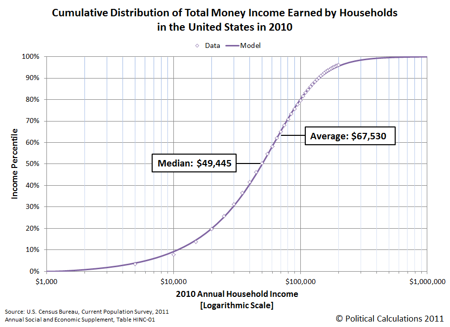
As we did with the individual distribution of income for 2010, we've built a tool you can use to see where you might fall in percentile terms among all U.S. households where your household income is concerned.
Accounting for 2010's average 1.6% rate of inflation, which would boost household median income in 2009 up to $50,599 in 2010 U.S. dollars, real median household income fell by 2.3%, from $50,599 to $49,445.
Overall, the U.S. Census counted 118,682,000 households in 2010, marking an increase of 1,144,000 households in the U.S. from 2009. With 211,254,000 people counted as having earned income in 2010, that puts the average number of income earners per U.S. household at 1.782. The average number of income earners per U.S. household was 1.797 in 2009 and 1.808 in 2008, when this ratio last peaked in value.
On a side note, in 2010, the U.S. federal government spent $3.456 trillion dollars, which represents spending in excess of $29,121 per U.S. household, which is slightly down from the $29,968 it spent per U.S. household in 2009.
For a median household income of $49,455, the typical American household can only afford for the U.S. government to spend, at most, $20,794 per household. To be able to afford a federal government that spends $29,121 per U.S. household, the median household income of the United States would have to rise to just over $68,250.
Finally, here is our chart showing the cumulative distribution of income among all U.S. households with the number of households.
Update 15 September 2011: We've retitled the chart and relabeled the vertical axis to better clarify what data is being shown in the chart below - the original version is still available by clicking here:

Data Sources
U.S. Census. Current Population Survey. Annual Social and Economic (ASEC) Supplement. HINC-01. Selected Characteristics of Households by Total Money Income in 2010. Accessed 13 September 2011.
U.S. Census. Current Population Survey. Annual Social and Economic (ASEC) Supplement. HINC-01. Selected Characteristics of Households by Total Money Income in 2009. Accessed 13 September 2011.
Labels: income distribution, tool
According to data just released by the U.S. Census this morning, in 2010, the median income earned by an individual American was $26,197, or rather, 50% of Americans earned more than that amount and 50% earned less than that amount. The average (or mean) income was $38,337.
Update 20 September 2013: Before going any further, please note that we've posted a newer version of this tool based on the most recently available data! Go here to find out more!
We've presented the cumulative distribution of the total money income earned by individuals in the United States in the chart below:
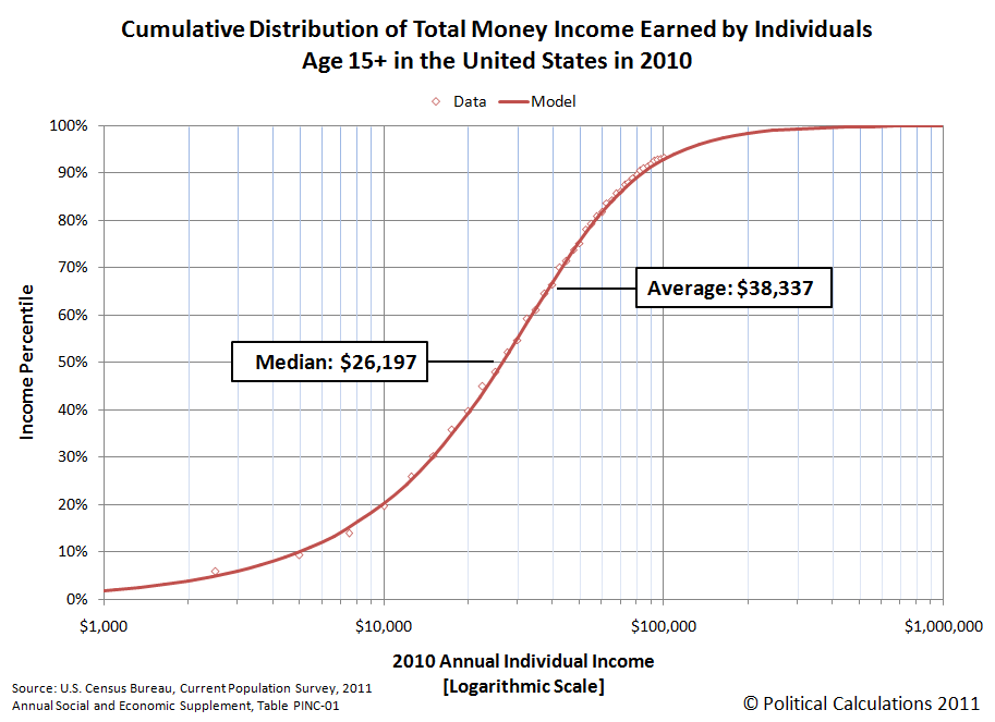
So what percentile does your income place you on that chart?
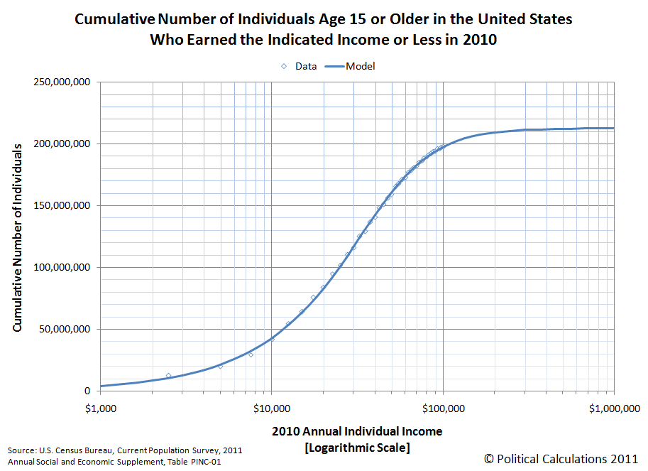
Well, wonder no more! Our latest tool will tell you exactly where you rank among all Americans, or rather, the 211,492,000 Americans over the age of 15 who earned money in 2010, based upon the U.S. Census' data for 2010, for which we modeled the distribution using ZunZun's invaluable 2D Function Finder.
Just enter your annual income into the tool below, and we'll give you a good idea of where you rank among all income earning individuals in the United States, at least for 2010! One last quick note before you start plugging away - our mathematical model tops out with the highest 0.13% of U.S. income earners and bottoms out with the lowest incomes, so entering either very high or very low annual incomes will produce static results.
Not an American?
If you don't work in the United States, you can still find out where you might rank by income in the U.S., but you'll need to convert your income into equivalent U.S. dollars. We recommend using XE's Universal Currency Converter to do that math before you enter your equivalent income in U.S. dollars in our tool above.
How Does That Compare to 2009?
You can find out with our "What's Your U.S. Income Ranking?" tool, which is set up with 2009's income data! Here's a companion chart to go along with the percentile chart we showed above, which shows the cumulative number of thousands of working age Americans who earned the indicated incomes shown on the horizontal axis or less in 2010. (Update 18 September 2011: We retitled the chart below to better describe the information it presents. The original version of the chart is still available here.): Labels: income distribution, tool
Another Cool Graph

On Wednesday, 8 September 2011, the fog obscuring our view of the future suddenly lifted and we could finally see what lies in store for the U.S. economy all the way to the end of 2012.
Or, to put it less mysteriously, our primary source for tracking the S&P 500's dividend futures from day to day expanded their projections to include the third and fourth quarters of 2012!
We took that as our cue to also update the historic stock market data that we maintain in our signature tool, The S&P 500 at Your Fingertips with the most up-to-date earnings and dividend data available from S&P's Market Attributes series - specifically the S&P 500 Earnings and Estimates data, which is posted under the S&P 500 Monthly Performance Data section.
We then combined the dividend portion of that recorded data with our calculation of what dividends are currently expected to be paid out by the companies that make up the S&P 500 in future quarters through the fourth quarter of 2012. The chart below shows what that looks like for the dividend futures in place for 12 September 2011:

Taking the S&P 500's dividend futures data as a proxy for how investors expect the private sector portion of the U.S. economy will perform going forward from this point in time, the data suggests that the economy will pick up the pace of growth through the end of 2011.
That situation is unlikely to continue very far into 2012 however, as the quarterly dividends per share currently expected to be paid out declines for both the second and fourth quarters of 2012.
Of these two declines, the projected dip in the quarterly dividends of the fourth quarter of 2012 is of greater concern, because typically, the fourth quarter of a year sees the highest amount of dividends being paid out for that year. (The chart above shows an aberration in that typical pattern, as it picks up with the economic meltdown that was in already in progress during the first quarter of 2009, which then played out with the stock market's dividends through the rest of that year.)
With that being the case, what the dividend futures are now signalling is that the U.S. economy will begin slowing again in the first half of 2012 and will be facing recessionary or near-recessionary conditions in the latter half of 2012.
We've also updated our chart tracking the changes in the rate of growth of both stock prices and dividends per share for the S&P 500:
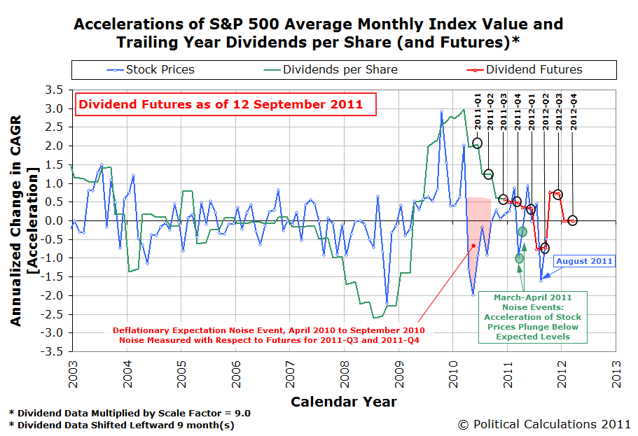
Here, with the adjustments we've made to the historic dividend data combined with the new projections for the futures data, we observe that investors are currently focused on the second quarter of 2012. This observation is consistent with today's stock prices being driven more by changes in fundamental expectations at present than by noise.
Image Credit: The Telegraph.
Labels: chaos, forecasting, SP 500
Welcome to the blogosphere's toolchest! Here, unlike other blogs dedicated to analyzing current events, we create easy-to-use, simple tools to do the math related to them so you can get in on the action too! If you would like to learn more about these tools, or if you would like to contribute ideas to develop for this blog, please e-mail us at:
ironman at politicalcalculations
Thanks in advance!
Closing values for previous trading day.
This site is primarily powered by:
CSS Validation

RSS Site Feed
JavaScript
The tools on this site are built using JavaScript. If you would like to learn more, one of the best free resources on the web is available at W3Schools.com.
Other Cool Resources
Blog Roll


