What effect did the Federal Reserve's quantitative easing programs have on U.S. stock prices in the three years from November 2008, when it was first suggested, and today?
To find out, we'll do an event analysis - we'll match up the level of stock prices as measured by the S&P 500 with the timing of the Federal Reserve's announcements and implementation of its two rounds of quantitative easing (aka "QE1" and "QE2").
The Federal Reserve Bank of St. Louis maintains a timeline of the events and policy actions that have been taken with respect to the financial crises since 2007. Here are the key milestones with respect to the Fed's quantitative easing programs, along with some other notable events. Our chart below shows the overall timeline over the past three years:
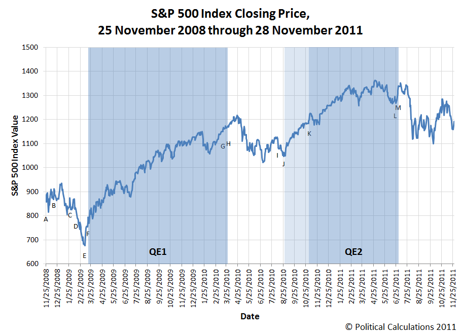
Beginning the timeline:
- A. 25 November 2008
The Federal Reserve Board announces a new program to purchase direct obligations of housing related government-sponsored enterprises (GSEs)—Fannie Mae, Freddie Mac and Federal Home Loan Banks—and MBS backed by the GSEs. Purchases of up to $100 billion in GSE direct obligations will be conducted as auctions among Federal Reserve primary dealers. Purchases of up to $500 billion in MBS will be conducted by asset managers.
- B. 16 December 2008
The focus of the Committee's policy going forward will be to support the functioning of financial markets and stimulate the economy through open market operations and other measures that sustain the size of the Federal Reserve's balance sheet at a high level. As previously announced, over the next few quarters the Federal Reserve will purchase large quantities of agency debt and mortgage-backed securities to provide support to the mortgage and housing markets, and it stands ready to expand its purchases of agency debt and mortgage-backed securities as conditions warrant. The Committee is also evaluating the potential benefits of purchasing longer-term Treasury securities.
- C. 28 January 2009
The Federal Reserve continues to purchase large quantities of agency debt and mortgage-backed securities to provide support to the mortgage and housing markets, and it stands ready to expand the quantity of such purchases and the duration of the purchase program as conditions warrant. The Committee also is prepared to purchase longer-term Treasury securities if evolving circumstances indicate that such transactions would be particularly effective in improving conditions in private credit markets.
- D. 13 February 2009
U.S. Congress approves President Barack Obama's "Stimulus Package". The measure will inject an estimated $787 billion (the CBO estimates that $821 billion was actually spent) into the U.S. economy through a variety of tax credits, transfers to support state government programs and "shovel ready" infrastructure projects. The measure is signed into law on 17 February 2009.
- E. 9 March 2009
The stock market bottoms. After this point, stock prices begin rising as the rate at which business conditions are worsening begins to decelerate.
- F. 18 March 2009
The FOMC votes to maintain the target range for the effective federal funds at 0 to 0.25 percent. In addition, the FOMC decides to increase the size of the Federal Reserve's balance sheet by purchasing up to an additional $750 billion of agency mortgage-backed securities, bringing its total purchases of these securities to up to $1.25 trillion this year, and to increase its purchases of agency debt this year by up to $100 billion to a total of up to $200 billion. The FOMC also decides to purchase up to $300 billion of longer-term Treasury securities over the next six months to help improve conditions in private credit markets. Finally, the FOMC announces that it anticipates expanding the range of eligible collateral for the TALF (Term Asset-Backed Securities Loan Facility).
The Federal Reserve Bank of New York releases more information on the Federal Reserve's plan to purchase Treasury securities. The Desk will concentrate its purchases in nominal maturities ranging from 2 to 10 years. The purchases will be conducted with the Federal Reserve's primary dealers through a series of competitive auctions and will occur two to three times a week. The Desk plans to hold the first purchase operation late next week.
- G. 16 March 2010
The FOMC announces that "The Committee will maintain the target range for the federal funds rate at 0 to 1/4 percent and continues to anticipate that economic conditions, including low rates of resource utilization, subdued inflation trends, and stable inflation expectations, are likely to warrant exceptionally low levels of the federal funds rate for an extended period. To provide support to mortgage lending and housing markets and to improve overall conditions in private credit markets, the Federal Reserve has been purchasing $1.25 trillion of agency mortgage-backed securities and about $175 billion of agency debt; those purchases are nearing completion, and the remaining transactions will be executed by the end of this month. The Committee will continue to monitor the economic outlook and financial developments and will employ its policy tools as necessary to promote economic recovery and price stability.
"In light of improved functioning of financial markets, the Federal Reserve has been closing the special liquidity facilities that it created to support markets during the crisis. The only remaining such program, the Term Asset-Backed Securities Loan Facility, is scheduled to close on June 30 for loans backed by new-issue commercial mortgage-backed securities and on March 31 for loans backed by all other types of collateral."
- H. 31 March 2010
QE1 ends.
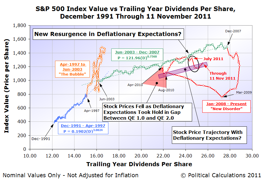
At first, investors appeared to have shared the Fed's assessment that it had successfully combatted the deflationary forces that had appeared set to overrun the U.S. economy, as stock prices continued to rise for nearly a month after the end of QE1. But over the next several months, expectations for deflationary conditions in the U.S. re-established themselves, sending stock prices approximately 10-15% lower. The Fed responded to the resurgence of deflationary expectations by launching a new round of quantitative easing, now known as QE2.
- I. 10 August 2010
The FOMC agrees to keep constant the Federal Reserve’s holdings of securities at their current level by reinvesting principal payments from agency debt and agency mortgage-backed securities in longer-term Treasury securities. The Committee will continue to roll over the Federal Reserve’s holdings of Treasury securities as they mature.
- J. 27 August 2010
Federal Reserve chairman Ben Bernanke states that "The committee is prepared to provide additional monetary accommodation through unconventional measures if it proves necessary, especially if the outlook were to deteriorate significantly", and that he believes "that additional purchases of longer-term securities, should the FOMC choose to undertake them, would be effective in further easing financial conditions."
The Fed's first announcement was aimed at reassuring investors that the Fed wouldn't seek to immediately unload the securities it had bought up in its first round of quantitative easing, which could negatively impact markets in that a sudden increase in the supply of these securities being unloaded would push their prices downward.
But that wasn't enough to assure investors, which eventually led Fed Chairman Ben Bernanke to firmly commit to a new round of quantitative easing.
Here, it appears that the announcement that the Fed would indeed initiate a new round of quantitative easing had a strong effect upon stock prices, leading them higher well before the program actually went into effect. The lack of a similar effect when the Fed first announced it would initiate QE1 might be attributable to the unfamiliarity of investors at the time with what the Fed might be able to achieve with such a program, which had never previously been attempted in the United States. The Fed's apparent "success" with its previous round of quantitative easing gave it credibility among investors ahead of the second round, who responded positively.
Resuming the timeline:
- K. 3 November 2010
The FOMC announces its decision to expand its holdings of securities in order to promote a stronger pace of economic recovery and to help ensure that inflation, over time, is at levels consistent with its mandate. The Committee will maintain its existing policy of reinvesting principal payments from its securities holdings and to purchase a further $600 billion of longer-term Treasury securities by the end of the second quarter of 2011, a pace of about $75 billion per month.
- L. 22 June 2011
The FOMC announces that "The Committee continues to anticipate that economic conditions--including low rates of resource utilization and a subdued outlook for inflation over the medium run--are likely to warrant exceptionally low levels for the federal funds rate for an extended period. The Committee will complete its purchases of $600 billion of longer-term Treasury securities by the end of this month and will maintain its existing policy of reinvesting principal payments from its securities holdings. The Committee will regularly review the size and composition of its securities holdings and is prepared to adjust those holdings as appropriate.
- M. 30 June 2011
QE2 ends, with no immediate plans for a third round of quantitative easing.
Since QE2 ended, stock prices have been fairly volatile, with the S&P 500 ranging from a high of 1353.22 on 7 July 2011 to a low of 1099.23 on 3 October 2011. At present, they're approximately 10% below where they were shortly after the end of QE2, as the S&P 500 closed at 1192.55 on 28 November 2011.
The Fed's "turning on" and "turning off" of its quantitative easing programs gives us the ability to measure how much they've affected stock prices in the United States. Judging by how much stock prices have changed from the "on" to "off" conditions, we estimate that the Federal Reserve's quantitative easing programs, which have affected investors' expectations of future inflation, contributed approximately 10-15% to the value of stock prices when "on".
One interesting observation we have is that it appears that investors "buy into" the Fed's initial assessment that there's no additional need for its quantitative easing programs for up to about a month afterward. And then, they adjust their perceptions to reflect changing conditions.
It would be interesting to observe the stock trades of Federal Reserve officials to see if they have the same kind of investing "luck" as the members of the U.S. Congress or their staffs.
Labels: SP 500, stock market
How dependent has the United States government under President Barack Obama become upon borrowing money from foreign sources to support its spending?
Would you believe the answer is: "enough to exclude a long-time U.S. manufacturer from consideration for a defense contract in favor of a foreign-based manufacturer, despite the U.S. manufacturer having invested considerable time and profits earned from their other products to develop a product that specifically satisfies the government's needs?"
AINonline's Chris Pocock reports:
The U.S. Air Force has apparently chosen the Embraer Super Tucano to meet the Light Air Support (LAS) requirement. Hawker Beechcraft's AT-6 was the other contender. No official announcement has yet been made, but Hawker Beechcraft said it received a letter from the USAF that excluded the AT-6 from the hotly contested competition. The company is protesting the decision to the U.S. Government Accountability Office (GAO).
The LAS competition was designed to produce an alternative to jet combat aircraft for counter-insurgency operations. The Air Force planned to buy 15 aircraft for a training school at Eglin AFB, Fla., but had not confirmed plans to equip any of its own squadrons.
However, the U.S. was expected to supply or sell LAS aircraft to various countries, starting with 20 for Afghanistan. It was this potential that led Hawker Beechcraft and partners to spend “more than $100 million to meet the Air Force's specific requirements,” the company said.
Last month, Hawker Beechcraft completed weapons drop tests with the AT-6, a modification of the successful T-6 primary trainer on which all U.S. military pilots graduate.
Meanwhile, Embraer teamed with Sierra Nevada Corp to offer the EMB-314 Super Tucano, and said it would assemble the aircraft in a new facility at Jacksonville, Fla.
Manufacturing.net carries the Associated Press' article, which describes the size of the contract, as well as the Hawker Beechcraft's investment in its AT-6 program (emphasis ours):
WICHITA, Kan. (AP) -- The Air Force has notified Hawker Beechcraft Corp. that its Beechcraft AT-6 has been excluded from competition to build a light attack aircraft, a contract worth nearly $1 billion, the company said.
The company had hoped to its AT-6, an armed version of its T-6 trainer, would be chosen for the Light AirSupport Counter Insurgency aircraft for the Afghanistan National Army Corps. The chosen aircraft also would be used as a light attack armed reconnaissance aircraft for the U.S. Air Force.
The piston planes are designed for counterinsurgency, close air support, armed overwatch and homeland security, The Wichita Eagle reported (http://bit.ly/ud7FDM).
Hawker Beechcraft officials said in a news release that they were "confounded and troubled" by the Air Force's decision. The company said it is asking the Air Force for an explanation and will explore all options.
Hawker Beechcraft said it had been working with the Air Force for two years and had invested more than $100 million to meet the Air Force's requirements for the plane. It noted that the Beechcraft AT-6 had been found capable of meeting the requirements in a demonstration program led by the Air National Guard.
It's all the more remarkable because the U.S. company has been laying off its workers given the current economic climate.
By contrast, Hawker Beechcraft's competition for the defense contract, Brazil's Embraer, is under investigation by the SEC into possible corrupt practices. The Wall Street Journal's Paulo Winterstein reports:
Brazil's Embraer SA, the world's No. 4 aircraft maker, said Friday that an investigation by the U.S. Securities and Exchange Commission into possible corrupt practices shouldn't hurt the company's chances of selling planes to the U.S. military.
The company said Thursday that it was subpoenaed by the SEC, but Chief Executive Frederico Curado said Friday the investigation in itself shouldn't affect its ongoing bid to sell Super Tucano aircraft to the U.S. Air Force. Mr. Curado said he expects the government to announce a decision within "weeks" on a contract reportedly valued at $1.5 billion.
"This is a new process for us but as far as we understand it, the investigation won't have an impact," he said in a conference call with journalists. "Restrictions in dealings with the U.S. government would come only after a conviction."
Embraer said that the SEC and U.S. Justice Department are investigating possible breaches of the U.S. Foreign Corrupt Practices Act, which prohibits company officials from making payments to government officers to get or keep business. The company declined to give details beyond saying that the investigation is related to Embraer business dealings in three countries.
So how does the United States' federal government's need to borrow large amounts of money from foreign sources perhaps come into play in stacking the deck against of a mid-size U.S. manufacturer against the fourth-largest maker of aircraft in the world for a U.S. defense contract?

As the fifth largest major foreign holder of U.S. debt, one whose share of that debt has been growing consistently for several years, the Obama administration may well have made a strategic decision to favor Brazil's Embraer company as a reward for Brazil's growing ranking among all foreign holders of U.S. government-issued debt.
With a good portion of Embraer's Super Tucano aircraft being manufactured outside the United States, the move will increase the U.S.' trade deficit in goods and services with Brazil, which in turn, will be balanced by the U.S. government's "export" of U.S. Treasury securities to Brazil.
The move is strategic because developing Brazil as a major holder of U.S. government-issued debt would offset China's outsize influence over the United States given its status as the largest foreign holder of U.S. Treasury securities. Since China has previously flexed its muscles with respect to its interests through the markets for U.S. Treasuries, the Obama administration is likely seeking to reduce its potential influence.
That influence is substantial. Through the end of September 2011, the U.S. Treasury reports that China holds $1.15 trillion in U.S. government-issued securities directly, and another $109 billion indirectly through Hong Kong. Meanwhile, a very large portion of the United Kingdom's reported U.S. government debt holdings of $421.6 billion are actually controlled by Chinese interests. The figure currently recorded for the U.K. is largely a consequence of the nation's position as a major international banking center, which will be revised in several months time to reflect actual holdings by nation.
The bottom line is that if a comparatively small U.S. manufacturer of airplanes with a major investment in its future to develop an aircraft that can do what the U.S. government wants and can demonstrate that's the case needs to be pushed aside in favor of a foreign manufacturer with considerable ethical issues regarding its business practices, and if doing so will help it borrow more money to spend, then that's what the Obama administration will do.
Labels: business, national debt
The U.S. Bureau of Economic Analysis has revised its initial estimate of GDP in the third quarter of GDP downward. We've adjusted our GDP forecast for the fourth quarter of 2011 accordingly.
Using our preferred Modified Limo method for forecasting GDP, we anticipate that U.S. GDP for the fourth quarter of 2011 has roughly a 68% probability of being between $13,252.9 billion and $13,533.7 billion in terms of constant 2005 U.S. dollars. It has a 99.7% probability of falling between $12,972.5 billion and $13,814.5 billion. The midpoint for our forecast range for GDP in 2011-Q4 using the data available to us now is $13,393.3 billion, in terms of constant 2005 U.S. dollars.

Looking at where U.S. GDP for the third quarter of 2011 has now been adjusted, we note that the midpoint of our forecast range for this quarter is now within 0.28% of where the BEA has revised its GDP estimate.
There will be one more scheduled revision of GDP data for this quarter. We will update our forecast for 2011-Q4 GDP accordingly when this third estimate is released.
Looking backward, our GDP temperature gauges show how the United States' economy has performed over the past three to four quarters with respect to its historical performance since 1980.

|
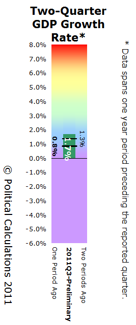
|
In these charts, the temperature spectrum runs from the "cold" purple range, indicating recessionary conditions, through the "cool" blue range, the "comfortable" green range, which indicates solid economic growth, and on through the more "heated" yellow range on up to the "overheated" red range, which are self-explanatory.
Of these two charts, the Two-Quarter GDP Temperature Gauge provides the better indication of how the U.S. economy has performed over time. We present the One-Quarter GDP Temperature Gauge since its data corresponds to the annualized GDP growth rates reported for each quarter in the media.
Here, the Two-Quarter GDP Temperature Gauge, which covers the two-quarter long intervals of 2010-Q3 through 2011-Q1 (two periods ago), 2010-Q4 through 2011-Q2 (one period ago) and 2011-Q1 through 2011-Q3 (the most recent period) reveals that the U.S. economy over the past year has ranged from recessionary levels, as indicated by the very "cold" purple color to near-recessionary levels, as indicated by the "cool" blue color, which are characterized by lackluster economic growth.
Since the U.S. economy's performance is largely driven by inertia, we anticipate that this lackluster performance will continue well into 2012.
Labels: gdp, gdp forecast
It's the age old American dilemma of what to do with the remains of the bird following the Thanksgiving holiday, while not doing any more to continue sending your Body Mass Index in the wrong direction. This year, we're featuring Cooking Light's recipe suggestions for what to do with all that's left behind!
Turkey burnout is insidious. One minute your bird is beautiful and fragrant, floating majestically to the table, its crisp skin glistening. You could eat every last bite all by yourself. But in a twinkling―or, to be exact, after a couple of servings―the feast loses its luster. By the time the candles have been snuffed, the good china put away, and the wine glasses washed, what's left of your 20-pounder looks like just one more responsibility. Worse, the week ahead looms with the dreary prospects of turkey hash, turkey supreme, and turkey a la king. For a moment, you consider getting a really big dog.
Not to sound unsympathetic, but snap out of it! Strip that bird straightaway with a sharp knife, and quickly refrigerate the white and dark meat in separate airtight containers (for up to five days or freeze for up to two months). Don't labor over the bones and fatty "parson's nose," telling yourself you'll boil them down into soup stock―you know you won't be in the mood for that anytime soon. Toss 'em, and be done with it. Feel better? You should. You've cleared the slate for a fresh approach to this versatile, forgiving meat and stocked a ready-to-use supply.
These recipes give your leftovers a new life, without ever resorting to a turkey-noodle surprise.
Cooking Light's recipe suggestions include:
- Curried Turkey Soup
- Chutney-Turkey Salad on Focaccia
- The Classic Hot Brown
- Cheddar Cheese Sauce
- Creamy Triple-Mushroom Bisque with Turkey
- Fiery Turkey-Pâté Crostini
- Devil in Your Pocket
- White Turkey Chili
Enjoy!
Labels: thanksgiving
We couldn't resist sharing the following image, stolen from here, which brings our love of food, math and Thanksgiving all together:

Have a Happy Turkey Day!
Labels: food, math, none really, thanksgiving
What happens when State Farm gets together with William Shatner to create a "turkey fryer fire cautionary tale"?
If you're planning to deep fry your turkey this Thanksgiving, the answer is public service announcement magic!
Have a Happy Thanksgiving!
Labels: thanksgiving
How can a 1.2% decline in the number of turkeys produced result in a 21.9% increase in their price?
That's the question we're tackling today as we continue to survey the post-Turkey apocalypse world. Here, we're going to look at the pre-apocalyptic world of 2007 and compare it with the post-apocalyptic world of 2010. The animated chart below shows what we find when we look at the production of "Big Turkey" (aka "America's 20 largest turkey producers") in before and after snapshots:

In this chart, we can see that turkey production has largely just shifted among the 20 largest producers in the United States between 2007 and 2010.
In fact, if we add up the number of pounds of live turkeys processed by each of the Top 20 turkey producers, we find that this figure increased for "Big Turkey" from 2007 to 2010, from 6,858 million pounds to 6,971 million pounds, an increase of just 1.6% over those four years. So clearly, "Big Turkey" isn't responsible for the decline in the number of turkeys produced in the United States.
But the decline in the number of pounds of turkeys processed by "Combined Smaller Producers" is! Here, we find that these smaller turkey producers account for a decline of 568 million pounds of annual production between 2007 and 2010, as their combined total fell from 704 million pounds in 2007 to 136 million pounds in 2010.
Basically, the fallout from the 2007 recession significantly hurt small turkey producers who, in addition to having to deal with reduced demand for their products from people whose economic livelihoods were most affected by the recession, have also been hit by rising costs of production, especially in the form of higher prices for feed corn, thanks to the government's increasing ethanol mandates.
This double whammy is responsible for hurting the ability of smaller turkey producers to remain in business, as many have been squeezed out of the market for turkeys altogether. And in the absence of competition from those smaller businesses, "Big Turkey" has the ability to significantly hike its prices to American consumers, most of which goes to cover their own increased costs of operations.
That situation could be easily reversed. It only takes a President who pays more than lip service to the needs of typical Americans and small businesses, instead of being out to stack the deck against them!
Labels: business, thanksgiving
It's time once again for Political Calculations' week-long celebration of the most American of American holidays: Thanksgiving!
But this year, we're looking over a grim scene following the aftermath of what we described as the Turkey Apocalypse last year. Has the situation for America's Thanksgiving holiday gotten any better in the following year?

Let's start by looking at the number of turkeys produced in the United States through 2010. Here, we find that the number of turkeys fell by 3 million, or 1.2%, to 244 million, the lowest level recorded since 1989, the year for which our National Turkey Federation first provides data.
That's a small drop compared to the previous year's decimation, which was the largest ever recorded over a single year period of time.
Let's next look at how much America's turkey farmer's are getting per turkey.

Here, after looking at both nominal and inflation-adjusted prices, we find that U.S. turkey producers raked in more money per turkey produced in 2010 than ever before, with the dollar amount of income from each turkey produced rising in real terms by $3.22, from $14.69 to $17.91. That's a 21.9% year over year increase!
Using our Supply or Demand tool, the combination of that apparent increase in price with a decrease in quantity tells us that the price of turkeys has increased in 2010 due to a relative decrease in their supply.
But how can a 1.2% decline in the number of turkeys produced result in a 21.9% increase in their price? We'll tackle that question in our next Thanksgiving week post!
Labels: economics, thanksgiving
How much demand can there be for a machine that's utterly useless?
Believe it or not, more than you might ever have thought, because Brett Coulthard, the hobbyist who devised the contraption depicted in the video above, is making the leap into entrepreneurship by launching the Frivolous Engineering Company (HT: Core77).
And like many entrepreneurs, he's encountering many challenges as he gets set to introduce a new, improved version of the original useless device, the "Ultimate Useless Machine":
The good news is that all the parts have arrived and production of Version 2 of the Useless Machine has begun, and our on-line store should be up and running in the next few days.
Bad news: Now that production has started we're getting a better idea of the actual labor costs for making the machines and we've had to bump up the price for the 'pre-soldered' Machines from $40 to $45.
The big problem Frivolous Engineering has right now is a shortage of qualified labor. I'm trying to hire someone who is good at soldering but until then (and depending on demand) the pre-soldered machines will most likely be produced only in limited quantities.
Hopefully, he'll get those problems straightened out soon - keep your eyes posted on the new company's website for more details on how to buy the ultimate useless machine for that special someone this holiday season!
Labels: business, none really
According to Forbes, Oprah Winfrey earned approximately $290 million in 2010.
That is, quite possibly, the highest income earned by any American in 2010. Going by data from the Social Security Administration, only 81 people in the United States had wage or salary income above $50 million in 2010. Since we can safely assume that most of those individuals at this highest end of the income spectrum would be clustered near the $50,000,000 mark, the odds that Oprah Winfrey actually earned the highest income of anyone in the U.S. in 2010 are very good.
It's all the more remarkable because of how Oprah Winfrey derives her income: by developing and providing entertainment media that successfully targets American women. In a sense, Oprah's annual income represents the direct transfer of the income earned by lower-earning women to her.
To get a sense of the scale of that transfer, we've tapped the U.S. Census' data on the total money income distribution of women in the United States in 2010. Our results are presented in the chart below:

If you're one of the 125,084,000 American women Age 15 or older who earned income of any type in 2010, you can see how you compare with all other women by entering your 2010 income into the tool below. Our tool will tell you what percentage of American women earn as much, or less than you!
The default income entered in the tool is the approximate median total money income for all women Age 15 or older in the U.S, regardless of whether they work full or part time, or even if they don't work at all or simply volunteer and earn no income. As the estimated median point, half of all women in the United States will have incomes below this mark, while half will have incomes above that amount!
Of course, if you're Oprah, you'll find that 100% of American women earned as much, or less than you. Make that "much less" than you!
We'll close with one final tidbit of information. Oprah Winfrey's estimated $290 million income in 2010 represents 0.0092% of all the income earned by women in the United States in 2010.
Image Sources
The inset images on our chart were taken from the U.S. government's Homelessness Resource Center and Girlshealth.gov web sites!
Labels: income distribution, tool
Last week, the U.S. Census Bureau issued the latest data it collects on the balance of trade of goods and services between the United States and China. The chart below shows what we find when tracking the year-over-year growth in the amount of U.S. imports from China and U.S. exports to China from January 1985 through September 2011, which provides an indication of the relative economic health of both nations.
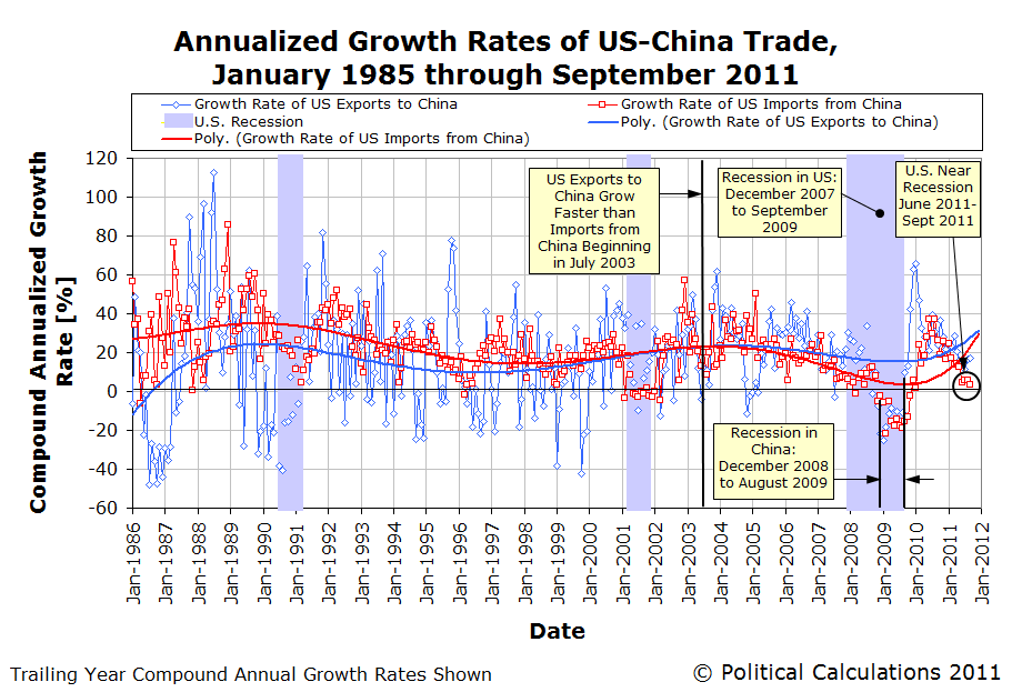
What we find in the chart above is that the rate of growth of what the U.S. imports from China was very low in September 2011, at what we would describe as being "near-recessionary" values, continuing the pattern we've been observing since June 2011.
This indicates that the economic sluggishness most people perceived during the summer of 2011 was real, because a growing economy would tend to pull in more imports.
But we also see that China's economy is also going through its own slowdown, although it appears to still be growing more strongly than the U.S. economy.
Switching over to our doubling rate charts, we see that U.S. exports have sustainably doubled in value four times since January 1985, and are nearing the fifth doubling line:

We observe that the pattern of U.S. export to China since 2008 is very different from the preceding 23 years - it appears as though U.S. exports to China have begun following a seasonal pattern, with the peak in exports occurring in December.
Meanwhile, we find that China's exports to the United States have been growing at a much slower pace since 2008:

The U.S.' imports from China typically follow a seasonal pattern, with the peak occurring between the months of August through October, which coincides with the stocking of consumer goods for the Christmas shopping season in the United States. Although the value of the goods and services the U.S. imports from China is at near record levels (they hit an all-time high in August 2011), the quantity of goods being imported from China into the U.S. is falling.
So how can the value of what the U.S. imports from China be near its all-time record while the volume of goods being shipped is falling? Easy! It's because the value of the U.S. dollar is falling with respect to the value of China's currency:

To put it bluntly, the falling value of the dollar is making it relatively more expensive to buy imports from China than it was a year ago. And that's why U.S. port traffic is down, and U.S. port employees are working less, even though the U.S. appears to be spending more money on Chinese imports this year as compared to last.
And most paradoxically, President Obama is demanding China do more to allow the U.S. dollar to fall with respect to the Chinese yuan, even though it's clearly already happening and is producing the effects he desires.
But then, it's not like President Obama pays much attention to serious economic matters of any kind, unless they reinforce his mispreconceptions.
Image Credit: The Economist
Labels: trade
Which age group in the U.S. has the greatest amount of income inequality among its members? The choices are:
- Age 15-24
- Age 25-34
- Age 35-44
- Age 45-54
- Age 55-64
- Age 65-74
- Age 75 and older
We won't keep you in suspense - the chart below reveals the answer!
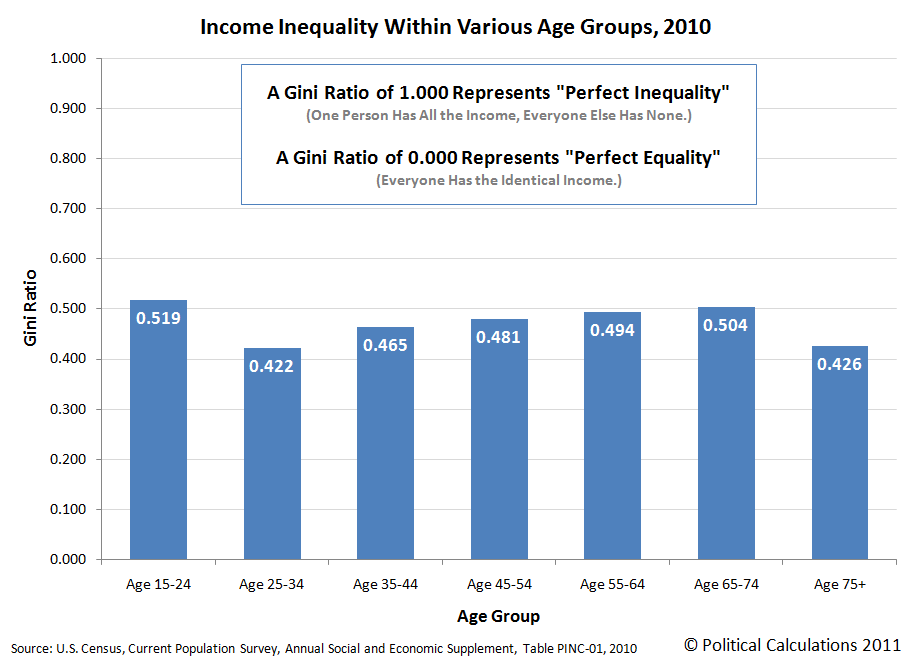
Are you surprised to see that teens and young adults between that ages of 15 and 24 have the greatest amount of income inequality, as measured by the Gini Coefficient?
If it helps understand why, consider that this age group really represents the point at which Americans enter into their first jobs. It covers everyone from those who haven't graduated from high school, but are working in part-time, minimum wage level jobs on up through recent college graduates in difficult, high paying disciplines like petroleum engineering.
Meanwhile, we see that the level of income inequality drops dramatically for adults between the ages of 25 and 34, which corresponds to individuals who have fully entered into their careers. The amount of income inequality by age group then increases through Age 65-74.

To a large extent, what you're seeing here is the effect of education level upon the lifetime earnings of individuals, where those with higher levels of education tend to have greater income growth over time.
But that doesn't explain it all. Most individuals hit their peak earning years in their mid-to-late 40s, which wouldn't explain why income inequality continues to increase for older individuals.
Here, we need to consider the role of investment income. Assuming that the most successful income earners also consistently save or invest a portion of their income over time, if they realize positive rates of return, they can continue boosting their income above and beyond what they earn through wages and salaries.
That's a big reason why we see that individuals Age 65-74 have the second greatest amount of income inequality by age group - the most successful individuals are benefiting from a lifetime of saving and investing, while others within this age group earn much lower amounts of income, or none, through investing.
We next see that income inequality falls dramatically from Age 65-74 to Age 75 and older. This drop largely corresponds to the depletion of retirement savings that individuals set aside during their working years, which reduces the amount of income they might receive from the reduced principal they have invested.
Meanwhile, for this age group, individuals who were less successful in establishing retirement savings benefit from government income transfer programs like Social Security, which provides disproportionately large benefits to the people who earned the lowest incomes during their working years.
We'll close by sharing Payscale.com's chart showing the typical incomes earned by individuals just graduating college with degrees in the top-paying fields of 2011:
 |  Methodology Annual pay for Bachelors graduates without higher degrees. Typical starting graduates have 2 years of experience; mid-career have 15 years. See full methodology for more. |
Data Source
U.S. Census. Current Population Survey. Annual Social and Economic Supplement. Table PINC-01. Selected Characteristics of People 15 Years Old and Over by Total Money Income in 2010, Work Experience in 2010, Race, Hispanic Origin and Sex. Accessed 13 November 2011.
Labels: income inequality
Since our last update, the S&P 500 has largely continued to move on track:
We can confirm however that investors appear to have shifted their attention to the fourth quarter of 2012, rather than 2012-Q3, in setting their forward-looking focus for setting today's stock prices:

Given small increases in the expected rate of growth of dividends per share in the fourth quarter of 2012 that have occurred since our last public update, we can expect stock prices to run to the high side of the forecast range shown on our first chart (as the purple zone). We may adjust this zone accordingly to account for that change in our next update.
Since is this the first time in a while that we've shown both these charts together, we'd like to point out that it they seem to provide a pretty good evidence demonstrating what's called the "unit root hypothesis" in economics, where the effect of a shock (in this case, the emergence of deflationary expectations at specific points of time from April-August 2010, and later in March-April 2011, and more significantly in July 2011), resulted in a significant, and so far, permanent shift in stock prices.
Overall, the trajectory of stock prices with respect to their underlying dividends per share over time more resembles a Lévy flight than they do the result of Brownian motion.
Labels: chaos, SP 500, stock market
Try this math at 11:11 AM today!
Take the last 2 digits of the year you were born, then add the age you will be this year.
If the result creeps you out, well, that's because you're an idiot. Before you feel insulted by this 411 though, don't you have bigger things to worry about?....
Labels: none really
Pretend for a moment that you've just been elected to public office and that you now have the power to choose whose income you're going to tax to pay for all the vital government programs you believe should be supported. If you want to keep those vital government programs on a sound financial footing, without jeopardizing the well-being of the people who rely on those programs in hard economic times, upon whose income should you most rely for your income tax revenue?
- The Top 50%'s income.
- The Top 1%'s income.
- The Top 0.1%'s income.
Before you answer, consider the following chart, which is based on data from the IRS, as collected by the Tax Foundation:
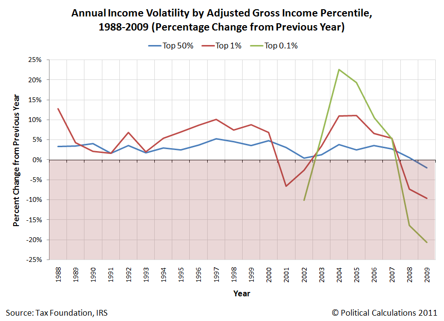
The answer should be obvious, unless perhaps you're a member of the California State Legislature. Fortunately, the Tax Foundation has a golden opportunity just for you! Jumping straight to the conclusion:
A state that faces economic decline and an exodus of population has two choices. One is to ramp up state spending on education and infrastructure and offer targeted tax incentives for selected industries, and hope that these inducements will lure people back. All state governments do this to some extent, notwithstanding the risk. At best, however, these investments will take decades to pay off. At worst, the fate of Michigan could be more common: people take their degrees from the excellent state schools and use the excellent roads to drive to other states where there are jobs.
The other choice is to reduce reliance on burdensome and volatile revenue sources, prioritize state services and pare back on the non-essential, and set out a welcome mat of a simple, transparent, neutral, and stable state tax system for all. If tax increases have to occur, structure them in a way that spreads the burden and addresses spending growth. Such a choice will not generate billions of dollars immediately to recover from years of borrowing and spending beyond means. But it will lay the groundwork for long-term economic growth and ensure that the Golden State's tarnished decade will not continue forever.
P.S. U.S. Congress members - the same rules apply at the federal level!
Labels: taxes
Environmental Economics' John Whitehead greedily sharpened his old pencil following a statement Texas governor and GOP presidential candidate Rick Perry made in New Hampshire:
Rick Perry in the Union Leader:
We can create hundreds of thousands of jobs and increase our oil output by 25 percent if we fully develop oil and gas shale formations in the Northeast, mountain West and Southwest. I also support drilling in Alaska’s Arctic National Wildlife Refuge coastal plain (ANWR), offshore expansion in the Beaufort and Chukchi Seas, and development of the National Petroleum Reserve in Alaska, all of which would maintain the Trans-Alaska Pipeline System. This will create more than 185,000 U.S. jobs. ...
Additionally, our families, communities and employers will benefit from more affordable energy prices as we increase the domestic supply. American manufacturing will experience a tremendous boost if we control electricity prices and get a handle on the cost of fuel for transportation fleets.
Doing the back of the envelope (and not worrying about whether the 25% increase in oil output is realistic) with these data:
daily world oil production = Q = 89,123,026 [barrels]
25% of daily U.S. oil production = dQ = 2,422,000
oil price = P = $90
demand elasticity = ed = -0.1
supply elasticity = es = 0.2
dp = ((P*dQ)/Q)/(-ed + es)The world price of a barrel of oil would fall by $8.20 as a result of a 25% increase in U.S. production. If gas prices are about 70% due to the price of oil and gas costs $3.35 per gallon, then the oil price share of gas is about $2.35. Cross-multiplication tells me that the oil price share of the price of a gallon of gas would fall to $2.13 and we'd enjoy and $0.22 drop in the cost per gallon. Filling up a 20 gallon tank you'd save about $4. Doing this every week you'd save about $200/year.
In the interest of saving what's left of the pencil nub that John uses for his back-of-the-envelope math, not to mention sparing the world of yet another disturbing display of greed-driven pencil sharpening, we've built our latest tool to do John's quick math for estimating how much the price of a barrel of oil might change if the supply of oil being produced were suddenly changed!
Just update the data below or substitute your own values as you see fit!
If you're playing along at home, John offered the following updates and insights into his back-of-the-envelope math:
Update at 8:42 a.m.: The price change formula above is for linear demand and supply curves which will lead to an upper bound on the price changes. After reviewing Hahn and Passell, I tried the formula for constant elasticity demand and supply curves and find a similar result. The price of a barrel of oil falls by $7.70.
Also, I used the short run demand elasticity for gasoline, not oil, and made a guess at the supply elasticity for oil. Using the long run elasticities in Hahn and Passell, ed = -0.48 and es = 0.36 and linear demand and supply, yields a price change of $2.60 per barrel, $0.07 per gallon and savings of about $75/year.
Drop your corrections in the comments section!
See, you've been invited! He'd love to hear from you!
Let's start with some corn facts:

In 2005, the U.S. produced 42 percent of the world’s corn. Over 50 percent of the U.S. crop is produced in Iowa, Minnesota, Nebraska or Illinois. Other states in which corn is grown include Kentucky, Ohio, Indiana, Wisconsin, South Dakota, Wisconsin and Missouri. In 2005, over 58 percent of the U.S. corn crop was used for feed. The remaining U.S. crop was split between exports (25 percent) and food, seed or industrial uses such as ethanol production (17 percent).
How much of the U.S. corn crop is used for feed today?

If the percentage of the U.S. corn crop used for feed has been shrinking over time, where is the rest of the U.S. corn crop going instead?

How might that change have affected the price of corn?

And how might that have affected the cost of meat produced from corn-fed livestock?

Now, who is most responsible for that problem?

Do you suppose the U.S. Congress will propose a "meat transaction tax" to deal with the problem of rising meat inequality instead of actually stopping doing the stupid things that created the problem in the first place?
Previously on Political Calculations
- Subsidies and Shortages
- Are U.S. Ethanol Producers Profitable?
- Booming Ethanol Consumption in the U.S.
- Of Cows, Subsidies and Amtrak
- Turkey-a-Go-Go: The Diminishing Bird
- Comparing MPGs for Alternative Fuel Vehicles
- Turkeymania 2008!
- A Better Ethanol Solution?
Image Credits: The Big Picture, Agri-Pulse, The E-xchange, Soyatech, State of Texas Window on State Government, U.S. State Department.
In terms of jobs gained, October 2011 appeared to be the best month for young adults (Age 20-24) since the United States economy peaked before entering into recession in December 2007.

The October 2011 Employment Situation Report indicates that the number of employed individuals between the ages of 20 and 24 increased to 13,357,000, up 285,000 from the previous month.
In fact, that's the third largest month-over-month increase for Age 20-24 individuals ever recorded. Only January 1990's increase of 864,000 over December 1989 and June 1983's increase of 357,000 over May 1983 are higher.
As such, we strongly suspect that gain in the number of employed is somewhat of a statistical outlier, perhaps strongly affected by sampling errors in the surveyed data. We're not certain however, given that almost all of the improvement in the past several months has been concentrated within this age grouping.
If it is a real phenomenon, we'll have to ask why have individuals in this age range have seemingly and suddenly become so attractive to employers, especially as compared to individuals of all other ages? A ramp up in part-time hiring in advance of the holiday shopping season might explain it, but if that's the case, we can look for lots of disappointment beginning in early 2012 if the economy begins sputtering as expected.
Speaking of individuals in of all those other ages, the October 2011 jobs data for teens (Age 16-19) and adults (Age 25+) was much more lackluster. Teens saw their numbers in the U.S. workforce increase by just 45,000, while adults saw their numbers fall by 53,000.
On the whole, October 2011 saw a net gain of 277,000, with the overall unemployment rate falling to 9.0% from 9.1% in September 2011. We'll know as early as next month if the data for young adults this month is real or if other factors have influenced the recorded data.
Labels: jobs
Via the invaluable Core77:
Elsewhere on the Web
The PR Coach: Infographics: Here's How to Make Them Work Best
SpyreStudios: The Anatomy of an Infographic: 5 Steps To Create A Powerful Visual
Smashing Magazine: The Dos and Don'ts of Infographic Design
Labels: data visualization
In 1831, the National Debt Burden per Capita, or rather the ratio of the United States' national debt per capita and GDP, multiplied by 1 billion), dropped below a value of 3 for the first time in its history [1]. In 2011, the U.S.' National Debt Burden per Capita has risen above that level.
Let's look at what happened to the U.S.' National Debt Burden per Capita in between, shall we?
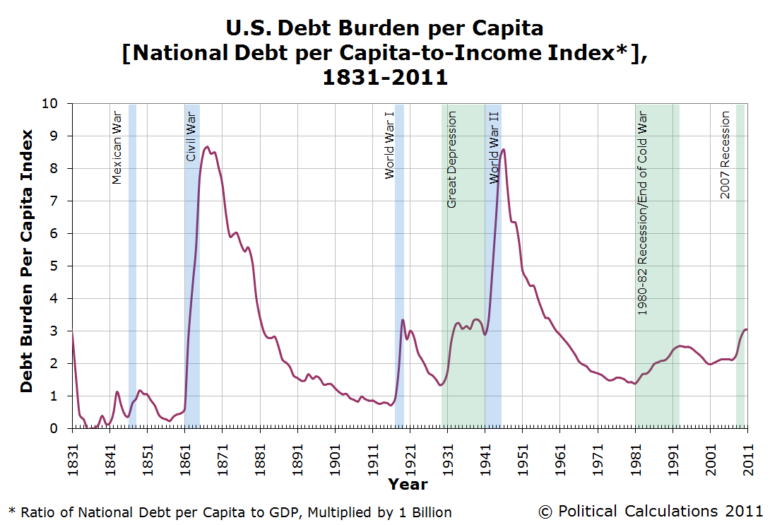
Wars and depressions largely characterize the periods of time where there have been significant run-ups in the level of the U.S. National Debt Burden per Capita, with the debt taken on to support the costs of the U.S. Civil War and World War II being the most significant.
In looking at today's level of the National Debt Burden per Capita, we see that it is perhaps most comparable to the Great Depression.
Throughout all this time, we'll note that the National Debt Burden per Capita has only fallen when the United States government curtailed its elevated level of spending. Typically, that has been solely the result of spending cuts following periods of conflict, rather than tax increases [2].
Political Calculations' The U.S. Economy at Your Fingertips tool puts all this data, and more, at your fingertips, covering the period from 1791 through 2010 (at this writing)!
Notes
[1] Prior to 1831, the national debt burden per capita was considerably higher, thanks largely to the debt taken on by the new nation to pay for the costs of the Revolutionary War and the War of 1812.
[2] Before 1913, there was no income tax in the United States, yet the federal government in those days succeeded in lowering the National Debt Burden per Capita by controlling its spending. That may be a lesson that today's politicians can well afford to learn.
Labels: national debt
Yesterday, in projecting where U.S. GDP will most likely be in the months ahead, we closed our post with the following comment:
Overall, the U.S. economy is continuing to perform as expected. We anticipate that growth will continue at a similar pace to 2011-Q3 through the end of the year, however we expect that the U.S. economy will begin to slow significantly in the second quarter of 2012, based upon dividend futures data for the S&P 500.
The only problem with that comment is the link, where we pointed back to a post from June 2011, which was based on analysis when we only had the dividend futures for the S&P 500 through the end of the second quarter of 2012 available to us.
Since we now have dividend futures data available to us through the fourth quarter of 2012, the chart below updates the future we see:

Typically, when the economy and stock market are growing, quarterly dividends per share will rise from quarter to quarter, peaking each year in the fourth quarter (as a number of companies that pay their dividends annually issue their dividends at this time.)
When there's a deviation in that pattern, it indicates that something else is happening. For example, if you the historical data recorded through this point of 2011, you see that quarterly dividends per share stall out at $6.49 and $6.50 per share between the second and third quarters of 2011. This period of time coincides with what we've previously described as a microrecession, which has been characterized by low economic growth.
We should also note that dividends per share are a bit of a lagging indicator - economy-driven changes tend to show up in the dividend data a quarter later.

Getting back to the present, what's unusual in the chart above is that the dividends currently expected to be paid out in 2012 are deviating from the basic pattern that would be consistent with steady economic growth. There are two places in the chart above that suggest that the road ahead for the U.S. economy will be rocky in 2012, which we see as the dips in the amount of the quarterly dividends expected to be paid in the second quarter of 2012 and again in the fourth quarter of 2012.
What the S&P 500's dividend futures are signaling is that these quarters will be pretty lackluster in terms of overall economic growth. Given the lagging effect of the dividends, we currently expect the U.S. economy to begin slowing significantly in the first quarter of 2012, recover a bit, then fall back in the second half of the year.
If it helps put things into a larger perspective, it's perhaps easier to see what dividends per share look like in good times and not-so-good times by considering the historical data for the S&P 500's quarterly cash dividends per share going back to 1988, which Standard and Poor makes easily available in their Earnings and Estimates spreadsheet (which is available under the "S&P 500 Monthly Performance" section in their Market Attributes Series).

In this chart, we've emphasized the deflation phase of the "Dot Com" stock market bubble - in addition to containing a recession, the period of time following the official end of the recession in November 2001 was characterized by what has been described as a "jobless recovery".
In this case, economic recovery in the U.S. didn't really take hold until the U.S. government acted to correct the imbalance it had created in the markets that led to the formation of the "Dot Com" Bubble in the first place. Both the U.S. economy and the stock market began growing steadily again immediately afterward.
What do you suppose the U.S. government has done now that will apparently have to wait until after 2012 to be corrected?
Labels: dividends, forecasting, SP 500
Welcome to the blogosphere's toolchest! Here, unlike other blogs dedicated to analyzing current events, we create easy-to-use, simple tools to do the math related to them so you can get in on the action too! If you would like to learn more about these tools, or if you would like to contribute ideas to develop for this blog, please e-mail us at:
ironman at politicalcalculations
Thanks in advance!
Closing values for previous trading day.
This site is primarily powered by:
CSS Validation

RSS Site Feed
JavaScript
The tools on this site are built using JavaScript. If you would like to learn more, one of the best free resources on the web is available at W3Schools.com.
Other Cool Resources
Blog Roll


