What if you could hack your brain to boost your IQ? Would you do it? How can you do it?
Garth Sundem, author of Geek Logik, one of our all time favorites, is back in print with Beyond IQ, which taps the expertise of today's top researchers in psychology for how to expand your mental abilities.
And all you need to get started is this book, a 9-volt battery, a couple of wires, a 2 milli-Amp resistor and two moist sponges to attach to your head and your left arm....
Seriously! At least if you're as serious as the U.S. Defense Advanced Research Projects Agency (DARPA), which has used a device that's just a little more sophisticated than the one you could make yourself using the parts we listed above, which just happens to have the capability of doubling the speed at which military recruits learn to recognize and neutralize threats in DARPA's combat simulations.
More seriously, you have to jump ahead to Chapter 6 to get to the part of the book that describes how and why you might want to try that sort of thing out, but that brings us to something else that we've learned in reading Garth's books. You don't have to read them from front to back - in fact, they're often better if you skip from one chapter to another in no particular order, since they often stand on their own.
That reading approach really works well with Beyond IQ because Garth often presents brain-stretching exercises after a short discussion of the main concept in each chapter, where we suggest skipping over the exercises to read the snippets of insights presented at the end of each chapter, then coming back to the exercises when you really want to take a deep dive into a particular concept.
In putting the book together, Garth interviewed over 35 scientists doing real world research into the potential for getting more and better performance out of the human brain and the book also works well as a general introduction into the current state of the art in intelligence research. And in fact, a number of the exercises presented in the book are taken directly from their professional journal papers.
Highly recommended. You'll get smarter if you read it!
Previously on Political Calculations
Tools and posts inspired by Garth Sundem's Geek Logik:
- What Are the Chances Your Marriage Will Last?
- Picking the Right Date for Valentine's Day
- The Indisputable Inter-Age Rule for Dating
- Men: What's Your Sex Appeal?
- Men: Are You Old Enough to Propose Yet?
- Should You Become Intimate with a Coworker?
- Is Your Personal Grooming Adequate?
- How Much Should You Spend on Gifts this Christmas?
- Should You Keep Your New Year's Resolution?
- Should You Call in Sick?
- Five More Minutes?
- Are You Too Good for Your Job?
- Should You Buy Something (or Not)?
- How Many Cups of Coffee Should You Drink This Morning?
- How Many Beers Should You Have at the Company Picnic?
- Earth Live: Walk, Bike or Drive?
- Should You Say It on the Grapevine?
- Should You Start or Stop Procrastinating?
- Should You Apologize?
- Should You Lie?
- Should You Quit Your Job?
- Should You Go Out with the Guys?...
- Are You Whipped?
- Do You Dare Run for Public Office?
- How Many Hours of Sports Can You Watch (Without Her Getting Angry)?
- Should You Stop to Put Gas in the Car?
- How Many Kids Should You Have?
- How Big Should Your Kids' Halloween Bucket Be?
- When Will You Become Obsolete?
- The Robin Hood Morality Quiz
- The Ultimate Mobile App
- Math Formula Explains Geek's Dating Drought
- Happy Valentine's Day!
Our Reviews of Other Books by Garth Sundem
Now that we've established what the relative purchasing power of a dollar is in each of the United States, we're going to apply that information today to solve one of the great problems of our time: how to set the minimum wage in each state in order to achieve purchasing power equality.
After all, it goes against the ultimate liberal ideals of fairness and equality of outcomes if, thanks to nothing other than the relative cost of living in each state, that a minimum wage earner in Mississippi is able to buy more things with their earnings than can a person earning the identical wage in a high cost of living state like New York.
Clearly, in the interest of fairness and of achieving purchasing power equality, the minimum wage in each state needs to be adjusted in such a way that a person who earns the minimum wage in each state can buy no more and no less than the same amount of real goods and services. That's the great problem for society that we'll be solving today.
Let's start by examining the applicable minimum wage that applies to each state in 2012, the year for which we have the relative purchasing power data, which is the greater of either the state's own minimum wage or the federal minimum wage of $7.25 per hour. That data is directly encoded in the interactive map below:
Next, let's calculate what each state's minimum wage would have to be so that the individual's who earn it will have an equal amount of purchasing power, regardless of the state in which they might live. Here, we've used the federal minimum wage of $7.25 per hour as the benchmark for calculating the minimum wage levels in each state that would achieve purchasing power equality across the entire nation.
Finally, we calculated how much each state would need to adjust their minimum wage levels in order to realize the very achievable dream of purchasing power equality for minimum wage earners throughout the United States.
What this exercise demonstrates is that if one really cares about achieving equality, it makes absolutely no sense to impose a national minimum wage, which we observe produces the situation where the minimum wage earners in some states are considerably worse off than individuals earning the same wage in lower cost of living states - the very essence of income inequality and unfairness.
Labels: data visualization, economics, income inequality, minimum wage, satire
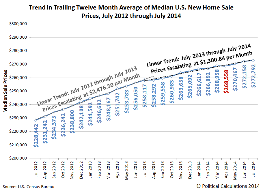
It's a mistake to treat housing prices as if they're a function of time. They're not. But we're going to treat them that way today to illustrate how differently the trend in median new home sale prices has behaved since institutional investors dialed down their year-long buying frenzy after July 2013. The chart below reveals what we find:
The initial inflation phase of the second U.S. housing bubble ran from July 2012 through July 2013. During that time, the trailing twelve month average of the median sale price of new homes sold in the United States increased at an average rate of approximately $2,476.50 per month.
From July 2013 through July 2014, the trailing twelve month average of the median sale price of new homes sold in the U.S. has increased at an average rate of $1,300.84 per month, just under 53% of the average rate recorded during the preceding 12 months.
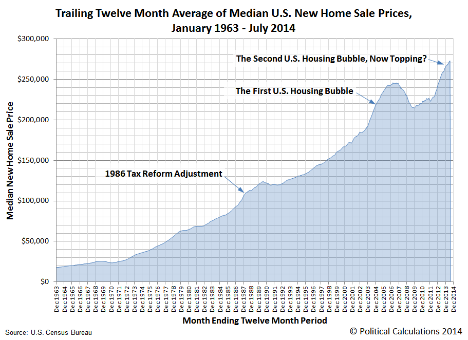
Here's the big picture for the trends in the trailing year average of median new home sale prices since January 1963, which is as far back as the U.S. Census Bureau provides the data:
The current temporal trend growth rate of $1,300.84 per month for median U.S. new home sale prices is still well elevated over the the typical linear growth rate of housing prices observed outside of economic bubbles in the U.S. housing market of roughly $397 per month.
Data Source
U.S. Census Bureau. Median and Average Sales Prices of New Homes Sold in the United States. [Excel Spreadsheet]. Accessed 25 August 2014.
Labels: real estate
The Tax Foundation has provided a wonderful illustration of the relative cost of living in each of the United States:
In the map, the Tax Foundation has adjusted the value of $100 according to its spending power in each state, or rather, for each state's relative purchasing power parity, and in doing so, has shown that 100 U.S. dollars is not worth the same in each state in terms of how much of a defined basket of goods and services that it can buy.
It occurs to us that there's another way can illustrate the data, which might provide the basis for some other interesting analysis. So, to that end, we generated the following interactive map to visualize each state's relative affordability as a percentage of the national average:
We find that Illinois comes closest to the national average, with Mississippi being where money goes the farthest and Washington D.C. as the place where money doesn't go far enough.
Labels: data visualization, economics
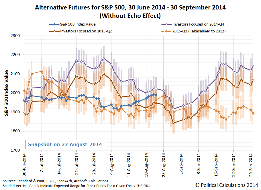
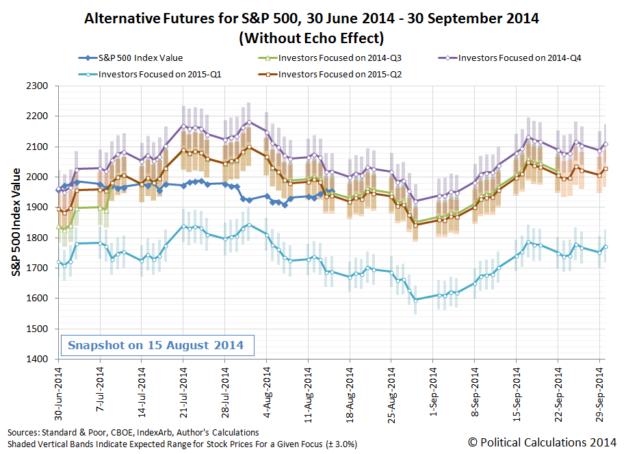
We're trying something new with how we present our forecast alternative trajectories and the actual trajectory of the S&P 500, in that we've trimmed out the seemingly irrelevant alternative futures for 2014-Q3 and 2015-Q1 and overlaid our rebaselined trajectory for 2015-Q2 (which compensates for "echoes" in the historic data we use for our projections):
Overall, what we observe for the actual trajectory of stock prices (solid blue line) over the past week is consistent with investors continuing to primarily focus on 2015-Q2 in setting today's stock prices, as that trajectory falls within the expected range for both our standard model (solid orange line) and our rebaselined model (dashed orange line).
But it would also appear that stock prices are running to the hot side of things with respect to these expected trajectories. What we think is going on is that the positive earnings and economic data released during the past week, such as that for Home Depot (NYSE: HD) and for the housing market, has shifted the attention of some investors toward 2014-Q4 (solid purple line), boosting stock prices above the level that would be fully consistent with a very strong focus on 2015-Q2 in setting stock prices.
But not enough to fully jump trajectories from 2015-Q2 to 2014-Q4. Instead, the dominant factor in setting investor expectations today continues to be the timing of when the Federal Reserve will most likely begin hiking short term interest rates, with the second quarter of 2015 still marking the period of time when investors predominantly believe the Fed will act.
Even though the Fed is apparently having a "real debate" over whether to begin hiking interest rates in the first quarter of 2015.
For now, we'll just note that if investors collectively come to believe that interest rate hikes were to be hiked in 2015-Q1, such a change in expectations would coincide with a rather substantial correction in stock prices, as the currently seemingly irrelevant trajectory for 2015-Q1 would suddenly become highly relevant....
In a long overdue development, Whooshh Innovations has developed a pneumatic transport system for salmon, facilitating their migration upriver around natural and manmade obstacles.
Dams are one of the biggest problems for fish that undertake migrations, like salmon. If a big wall blocks the route to breeding or feeding grounds, that can spell doom for the fish. And the existing mitigation measures, such as fish ladders, aren't very effective solutions.
Enter the salmon cannon. As ridiculous as it sounds, one group of entrepreneurs from a company called Whooshh Innovations thinks that shooting fish down a tube and then firing them into the air could be a solution for helping fish like salmon overcome migration barriers. CNET explains the salmon cannon's methodology:
It works a little like a pneumatic tube. Fish go in one end, and the soft fabric of the tube forms a seal around the body of the fish, creating a vacuum, which in turn propels the fish through the tube at a speed of around 5 metres to 10 metres per second (11 mph to 22 mph).
The tube was originally designed for transporting fruit, but based on successful results from initial tests, CNET continues, the design work just as well on live fish. The salmon don't seem to mind the experience, either. If given the opportunity, CNET writes, the fish will swim into the tube themselves, and when they emerge on the other side, they go about their business as if they hadn't just been fired through the air at 22 mph.
Fortunately, in the YouTube age, there's a video....
Every day, we get a little closer to realizing the ultimate dream for public transportation: the Tube Transport System:
Must we wait another thousand years?
Other Stuff We Can't Believe Really Exists
- Inventions in Everything: The Salmon Cannon
- Powdered Wine: Just Add Water!
- Fail: The Newest Innovation in Ice Cream
- Unlimited Virtual Legos
- Inventions in Everything: The Ultimate Turkey Blind
- Inventions in Everything: Turning Cans Into Sippy Cups
- Inventions in Everything: Anatomical Lego Figures
- It's Not What You Think....
- Inventions in Everything: Soup Bowl Attraction
- Inventions in Everything: Making Life More Difficult
- Inventions in Everything: The Oreo Separator Machine
- Air Shark!
- Markets in Everything: Stormtrooper Motorcycle Suit
- The Bike That Rides You
- One Inventor's Stick-to-itiveness
- High Five!
- Inventions for Everything
- The Best Mousetrap Ever
- An Invention for the True Wine Connoisseur
- Three of Ten Things You Don't Need on St. Patrick's Day
- The Future Just Got a Lot Cooler Than It Used to Be
- The Worst Piece of Design Ever Done
- The Magic Marker of the Future
- Coming Soon, to a Gym Near You!
Labels: technology
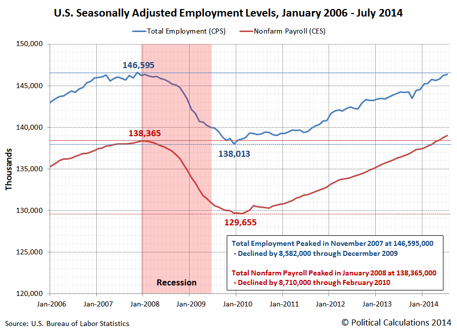
During the December 2007-June 2009 recession, the number of jobs at the margins of the U.S. economy increased significantly through the period of major job loss ending in December 2009, even though total employment and the number of Americans employed by non-farm establishments fell.
Here, even though total employment in the U.S. declined by 8.7 million and the portion of the U.S. civilian labor force employed at non-farm establishments fell by 8.6 million, the number of Americans counted as being employed outside of non-farm establishments increased by 8.8 million. Those kinds of jobs, which include farm work, self-employment, private household workers, and people who work in family businesses who are not paid for their labor, represent employment at the margins of the U.S. economy.
Because that was such a unusual outcome, we thought it would be worthwhile to consider another kind of marginalization where jobs are concerned - the transition from full to part time employment.
Our first chart shows how the number of people employed in full and part time jobs changed in the period from January 2006 through July 2014.
In the chart, we see that full time employment peaked in November 2007 at 121,875,000, before declining 11,316,000 through December 2009, the end of the major period of job loss during the recession. That figure has since increased by 7,930,000 to 118,489,000 through July 2014.
Meanwhile, part time employment started off the recession at 24,758,000, but instead of decreasing as jobs disappeared from the U.S. economy, the number of Americans employed part time increased by 2,721,000 through December 2009.
But that's not all, even after the recovery began, the number of part time jobs continued to increase to peak of 28,184,000 in July 2013, before finally stalling out. Through July 2014, the number of Americans employed part time is still highly elevated at 28,070,000.
On the whole, the total increase in part time employment from November 2007, which marks the peak of total employment in the U.S. prior to the recession, to July 2014 is 3,312,000.
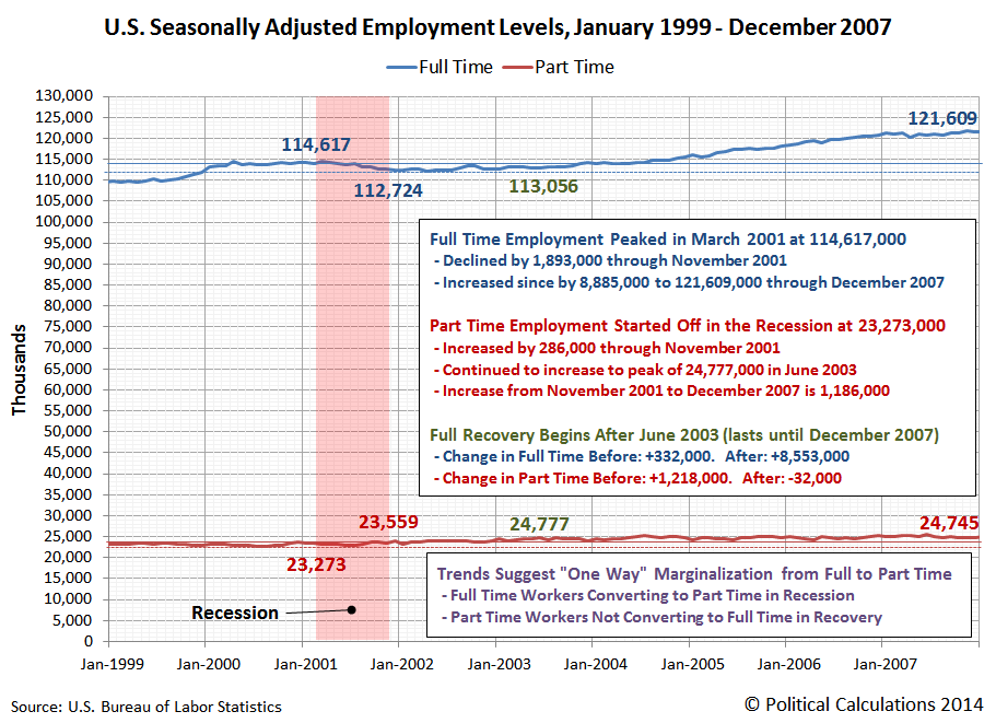
We next thought it would be interesting to compare this outcome to the preceding recession in the U.S., which ran from March 2001 through November 2001. Our chart below shows the period from January 1999 through December 2007.
Once again, we see many of the same patterns in the trends for full and part time employment during this earlier period of economic recession and recovery.
We see that full time employment peaked in March 2001 at 114,617,000, before declining by 1,893,000 through November 2001. Through December 2007, full time employment increased by 8.9 million.
Part time employment started off in the recession at 23,273,000, then increased by 286,000 through November 2001. It then continued to increase to peak of 24,777,000 in June 2003, before the increase in part time employment stalled out as the number of full time jobs being filled began to significantly increase.
That's significant because June 2003 marks the period in which the U.S. economy could be said to have fully entered into a period of recovery following the 2001 recession, which we can mark by the change in the rate at which full and part time jobs were generated before the economy re-entered into recession after peaking in December 2007:
- Change in Full Time Employment Before June 2003: +332,000. After: +8,553,000.
- Change in Part Time Employment Before June 2003: +1,218,000. After: -32,000.
What this data suggests is that recessions represent the one-way marginalization for jobs in an economy. During recessions, workers are pushed from full-time jobs toward part-time employment, but during periods of economic recovery, the number of people in part time employment does not fall, but rather, full time employment increases as part time employment holds steady.
Applying that insight to the December 2007-June 2009 recession, it would not appear that a full economic recovery began for employment until July 2013, when the increasing trend for part time employment following the recession finally stalled out.
Previously on Political Calculations
Labels: jobs
Once a quarter, about halfway through, we take a snapshot of the earnings per share that investors expect to earn in the S&P 500 over the next several quarters. Since our previous snapshot in mid-May 2014, the earnings outlook for investors has eroded somewhat over the last three months:
Through the end of 2014, the level of earnings has dropped to a level between what investors had previously expected back on 15 August 2013 and 14 November 2013, before expectations of higher earnings growth took root in the first quarter of 2014.
Two weeks ago, USA Today's Adam Shell asked: "Is it just a pullback, coming correction or beginning of bear market?"
One week ago, David Rosenberg asked: "Market correction? Was that it?"
So what was it really?
Would you believe a brief reversion to the mean?
And yes, it's over. For now. Hope this helps clear things up for everybody!
Labels: SP 500, stock market
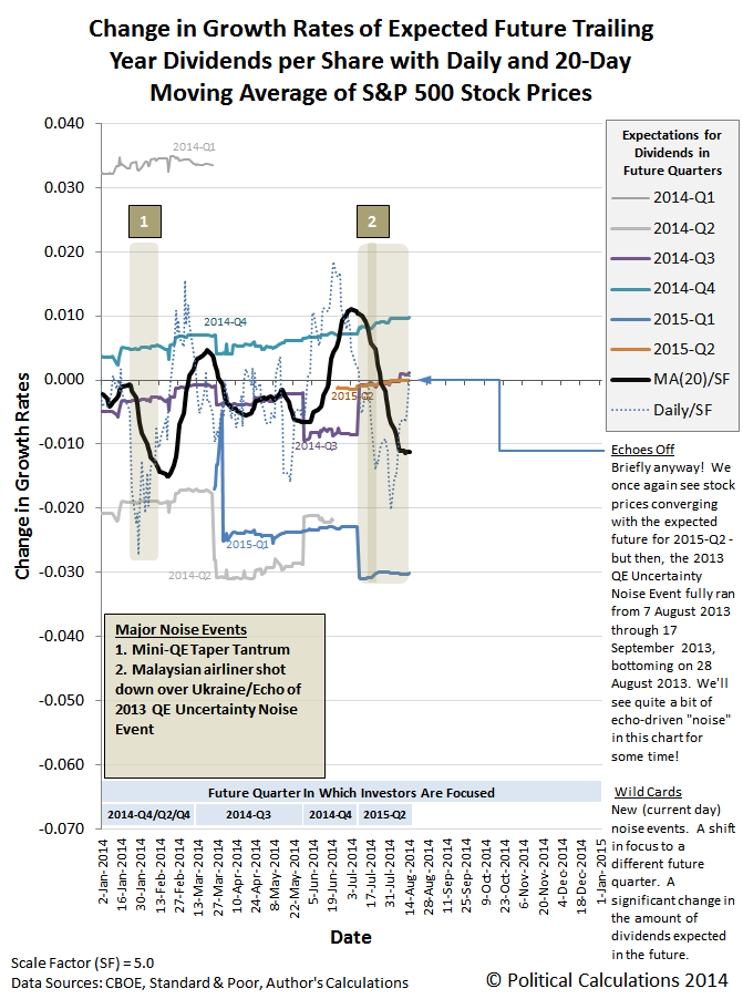
Once again, the change in the growth rate of stock prices has re-converged with the change in the growth rate of dividends expected in 2015-Q2 in our standard baseline model of how stock prices work. Mind the notes in the margin in the latest update of our favorite chart below.
What that means, of course, is that if one recognizes that investors are focused on the future quarter of 2015-Q2 in setting today's stock prices, stock prices are currently just about exactly where they might be expected to be!
Since this is a new description for us, "standard baseline model" refers to our original model, where we've incorporated historic price and dividend data from one year ago as the baseline from which we project each of the alternative trajectories that stock prices today might follow. Those trajectories are then distinguished by the expectations of the changes in the growth rate of dividends that are expected at different points of time in the future. As we've long observed, stock prices will tend to converge with the trajectory that coincides with the expectations associated with the specific point of time in the future to which investors have focused their forward-looking attention as they make investment decisions today.
The data suggests that investors have been and are currently focused upon 2015-Q2 in setting today's stock prices, since this quarter marks the period of time at which the Federal Reserve is most likely to act to increase short term interest rates in the U.S. for the first time in several years.
Since our stock price forecasting method incorporates historic stock price data, its projections of stock prices are subject to the volatility associated with what we describe as past noise events, which we describe as echoes. Noise events are the relatively short duration periods of time during which stock prices can deviate considerable from their forecast trajectory, which often coincide with major events in the news, which we've also observed would also appear to coincide with investors suddenly shifting their forward-looking attention to a different point of time in the future. Those sudden shifts in focus produce volatility in the level of stock prices.
Where our forecasting methods are concerned, the echoes of these past noise events can create apparent deviations between what our model would appear to project for the trajectory of stock prices, which are really just artifacts of our using historic stock price data that include these periods of volatility. They look like new noise events, but they aren't. They're the echoes of past noise events.
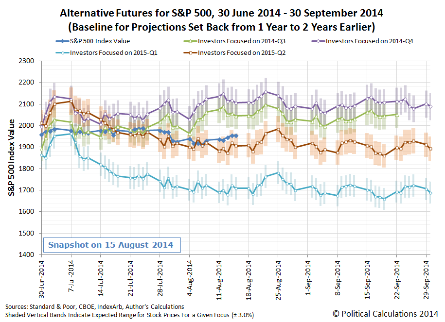
To get around that limitation, we recently adopted the practice of resetting the historic baseline reference points we use for making our future projections to a different point of time in the past. The chart below shows how our model has performed during the current quarter to date after we incorporated the historic stock price and dividend data from two years ago rather than from one year ago as we do in our standard model.
With this baseline reference, which is absent of the effects of the series of echoes that defined the volatility in the period from mid-June through mid-October 2013, we find that stock prices are tracking along with the future trajectory associated with the expectations consistent with 2015-Q2.
It's kind of a curious thing, but we're now in a period where the two projections for 2015-Q2 will track somewhat closely with one another - at least until 12 September 2014. Until then, it would seem that the echoes are off!
"If you build it, he will come."
That line from the film Field of Dreams is one of the most memorable in movie history.
The story told in the motion picture is about an Iowa farmer who hears magical voices that lead him to take a portion of his farm out of production and to instead build a baseball field where he had previously grown corn. Once built, the field attracts the spirits of a number of the most talented professional baseball players from the game's earliest decades, but at a real world price - the farmer risks losing his family's farm because he can no longer grow and sell enough crops to pay back his loans. Ultimately, the fairy tale ends as a stream of people travel to the magical baseball diamond in the middle of Iowa, willing to pay the farmer for the experience of seeing baseball's bygone greats play once again.
Every time a local or state government seeks to use taxpayer dollars or to borrow money by issuing bonds for the sake of building a brand new sports stadium for a professional sports franchise, they are, in essence, trying to recreate the fairy tale told in Field of Dreams. If they build it, they claim, they will reap a financial reward that's far greater than the cost.
How do you suppose that works out in the real world?
Let's tell the story of how the city of Mesa, Arizona built a new baseball stadium complex, which would be the spring training home for the Chicago Cubs in addition to being the focal point of a major urban development project. Let's pick up the story from the stadium's grand opening on Saturday, 22 January 2014:
On Saturday, Mesa takes the wraps off Cubs Park, a 15,000-seat stadium designed to keep the Chicago Cubs in town for at least the next 30 years of spring training.
It’s the centerpiece of a complex whose baseball facilities alone priced out at $84 million in public money for the ballpark, several practice fields and a 70,000-square-foot clubhouse that will serve as the Cubs’ Western headquarters.
Mesa tacked on $15 million for infrastructure in and near the baseball facilities. And, after voters approved park-bond money in 2012, the city added $7.7 million more to turn next-door Riverview Park into a showplace with a play area designed to knock kids’ socks off.
One thing that's important to recognize right off the bat is that Mesa had been the spring training home of the Chicago Cubs since 1952. Building the stadium complex didn't attract the Cubs or their fans to Mesa, because they had been coming for decades.
But would a new stadium attract new fans? New fans who would spend money in Mesa, boosting the city's revenue from sales taxes?
After the team's first spring training at the new field, the numbers are now in:
Day after day this spring, Cubs Park bulged with the biggest crowds ever to attend Cactus League games, with wallets open not just for tickets but for stuff at the next-door Riverview shopping area.
But that did not translate into a citywide boost in sales-tax collections, one of the most closely watched numbers in a city that greatly depends on that source of revenue.
The March sales-tax report showed Riverview pumped $397,000 into the city treasury, a 5.7 percent increase from the same month in 2013.
Citywide, March sales taxes totaled $12.8 million, almost exactly the same as the previous year and $219,000 short of what the city had projected.
Fans did indeed flock to the new stadium, but instead of stimulating Mesa's economy as a whole through their increased spending, what really happened was that they had simply shifted where they were doing their spending within the city. They spent more in the area adjacent to the new facility, but spent less elsewhere in the city. They hadn't boosted their spending at all and the city of Mesa failed to realize their dream of more sales tax revenues from the professional sports field they built.
That outcome is an old lesson, but one that most politicians have repeatedly failed to learn.
It seems that when it comes to professional sports, politicians are just not that bright. But then, they would appear to get a really good deal on really good seats, so maybe that's what really motivates them to support their local fields of schemes.
Labels: sports
Going by the year-over-year growth rate of of the value of trade between the United States and China, which we've adjusted to account for the changing currency exchange rate for each nation's currency, it would appear that the U.S. economy rebounded in June 2014, while China's economy decelerated slightly.
Taking the average of each month's year-over-year growth rate for the first and second quarter of 2014, we find that on average, the value of China's imports to the U.S. in 2014-Q2 grew twice as fast as they did in 2014-Q1, at an average rate of 7.8% versus the first quarter's 3.7%.
At the same time, the growth rate of the value of the U.S.' exports to China grew substantially slower in 2014-Q2 than in 2014-Q1, falling to 3.7% in the second quarter compared to the average 8.3% that the U.S. exports increased in the first quarter.
That recent trend appears set to continue into the third quarter of 2014 according to China's less reliable trade data:
BEIJING—China's exports surged in July on the back of strong demand from the U.S., Europe and Southeast Asia, while imports fell, surprising markets on both counts and resulting in a record monthly trade surplus.
The news was largely welcome in Beijing, as the world's second-largest economy struggles to regain growth- and foreign-trade momentum after this year's weak start, although negative import growth underscores continued weak domestic demand.
According to figures released by the General Administration of Customs on Friday, exports expanded 14.5% year-over-year, nearly double the 8% growth forecast by 15 economists in a Wall Street Journal survey and a sharp increase from the 7.2% year-over-year increase recorded in June.
Imports, meanwhile, fell 1.6% during the same period, following a 5.5% on-year expansion in June. The survey predicted a 3% rise.
The rate of growth of the value of goods imported by a country provides a key indication of its relative economic health. A nation that is experiencing more robust economic growth will tend to import an increasing value of goods, while a nation importing a falling level of goods indicates that its economy is experiencing contractionary conditions.
References
Board of Governors of the Federal Reserve System. China / U.S. Foreign Exchange Rate. G.5 Foreign Exchange Rates. Accessed 11 September 2013.
U.S. Bureau of Labor Statistics. Employment Situation Report Archive. Accessed 11 September 2013.
U.S. Census Bureau. Trade in Goods with China. Accessed 11 September 2013.
Labels: trade
Félicitations à notre lecteur à Metz! Vous l'avez fait à partir du début. Où allons-nous aller?
Ce n'est pas souvent que nous avons quelqu'un de bien lire toutes 2,500+ de nos messages. Nous espérons que vous l'avez trouvé de façon inattendue intrigante!
Labels: none really
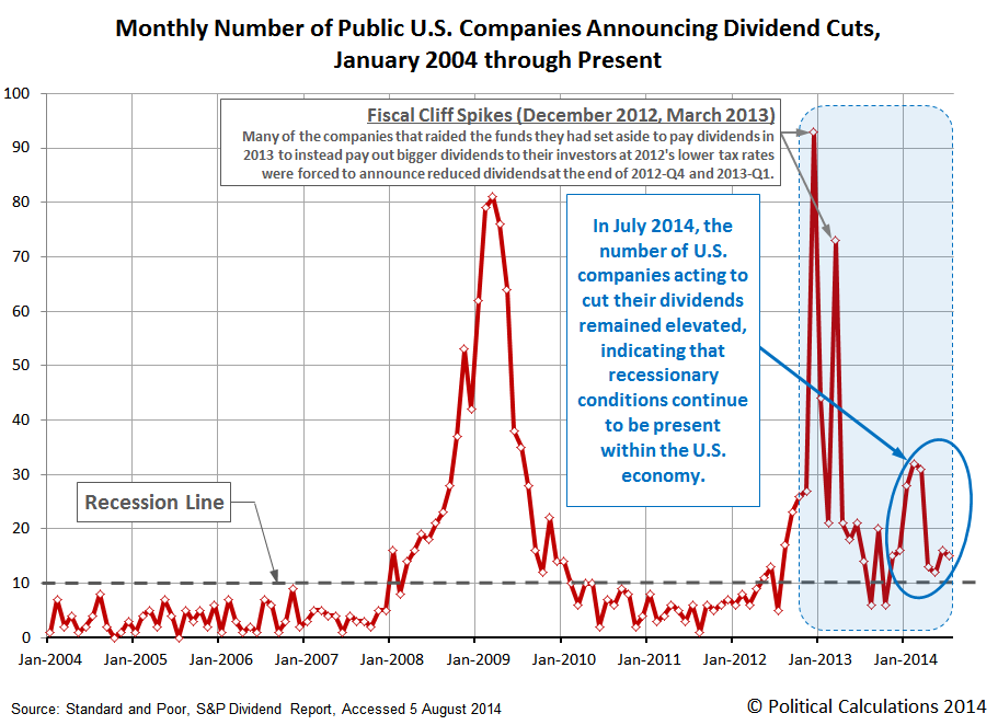
The number of U.S. companies acting to cut their dividends during July 2014 remained elevated at 15, down slightly from the 16 U.S. companies that took similar actions in June 2014, as recessionary conditions continue to be present in the U.S. economy.
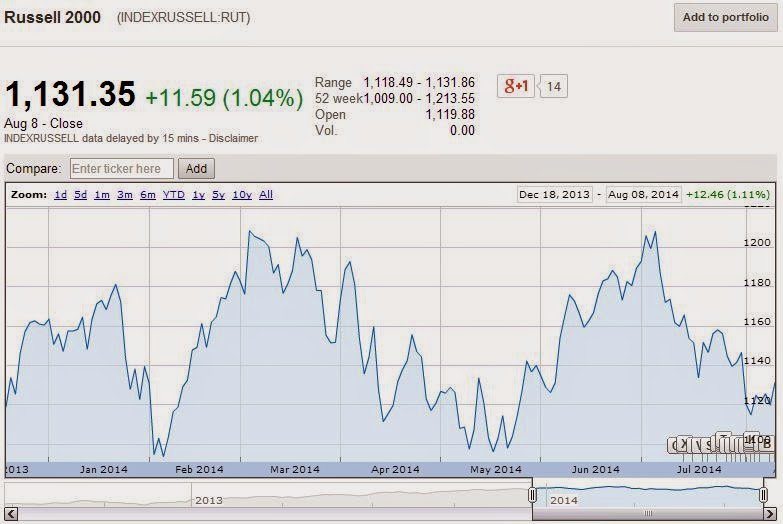
We should note that most of the dividend cutting activity that we've been observing since last year has occurred at companies with comparatively small market capitalizations, such as the companies that make up the Russell 2000 stock market index. Financial Services represents the largest single industrial sector within the Russell 2000, accounting for 24.1% of the index' market capitalization.
Approximately one-third of that weighting is represented by Real Estate Investment Trusts, which we've previously recognized as being especially sensitive to the interest rate hikes that came in anticipation of the Federal Reserve's statement that it would progressively scale back its purchases of U.S. Treasuries and Mortgage-Backed Securities in 2014.
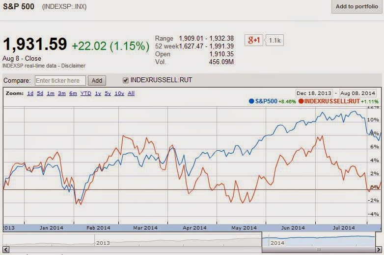
As you can imagine, with such a large portion of the Russell 2000 stock market index being negatively impacted by the increase in interest rates that accompanied the anticipation and realization of the Fed's tapering of its quantitative easing programs, the index has performed poorly in the months since:
That sensitivity, in turn, accounts for much of the difference in the relative performance of large and small cap companies since the Fed's official statement. Large cap companies, like those of the S&P 500, have performed considerably better since they're less sensitive to the increased costs of doing business associated with higher interest rates.
Since 18 December 2013, the S&P 500 has risen by roughly 8% in value while the change in value of the Russell 2000 has essentially been flat, with a remarkable divergence opening up between the two stock market indices through the year to date. The difference is attributable to the need of a portion of the companies in the Russell to cut their dividends, while those in the S&P 500 have avoided that fate.
Do you suppose the companies that make up the Russell 2000 are the equivalent of canaries in a coal mine? Or are they just telling us the current state of the U.S. economy?
Data Source
Standard & Poor. Monthly Dividend Action Report. [Excel Spreadsheet]. Accessed 4 August 2014.
Labels: dividends, stock market
We didn't set out to solve a mystery, but once again, it appears that we have.
Specifically, we've solved the mystery of what accounts for the recent weakness of the stock market. Better still, we're able to dispose of a competing "theory" that really invokes the animal spirits of financial paganism and the mystic belief system of at least one financial industry sacrificial goat entrail reader/"technical analyst". CNBC explains:
Multiple theories have been put forward for the recent stock market weakness, none of them particularly satisfying.
The notion, then, that a lot of the current upset could be traced back to a so-called Death Cross a few months ago in the 10-year Treasury yield seems as plausible as any.
According to an analysis earlier in the week from Abigail Doolittle at Peak Theories Research, the benchmark note's 50-day moving average "crossed" below its 200-day trend, a move that technical analysts believe represents a substantial turn in sentiment that will lead to further market weakness.
In the case of the 10-year yield, the move actually is bullish for bonds and, as is often the case with the relationship between the two asset classes, negative for stocks and the S&P 500 index in particular.
"After the highly bearish trading action of late July, this is worth considering with the 'what's next' question front and center for most investors. There's little doubt that the slicing of the S&P's six-month uptrend was vicious, but it may be less clear what it will mean going forward," Doolittle wrote in a note clients Tuesday. "This is where the 10-year yield's Death Cross enters the equation as a handy tool—'tell'—on what may be ahead for the S&P."
When laughing hysterically, it often helps to take a short time out to catch your breath before continuing on with the thing that provoked your laughter. You'll want to pause now, because the carefully selected and limited number of spooky coincidences are discussed next....
In four previous instances since 2007, the cross has been harbinger of bad things to come. Successive instances in September 2007 and November 2009 preceded a 58 percent drop in the market; in the spring of 2010 the cross helped foretell a 17 percent drop, and a move in late spring of 2011 came ahead of a 20 percent fall, according to Doolittle's analysis.
We should probably mention Doug Short's bottom line on the value of the "Death Cross" as an indicator of the future: "I find this "ultimate" variant of the 50-200 day moving average -- nominal or real -- to be a strange curiosity and (at the risk of being tediously repetitious) completely worthless as an indicator for the market or the economy."
We point Doug's essential insight out now because it doesn't appear that 2014 has been following the Death Cross script.
So far in 2014, though, the results have been different. Since a cross in April, the market's been on an upward trajectory, with the S&P 500 gaining about 4 percent. However, stocks have been sputtering lately, with the index falling about 3.3 percent over the past month. Wall Street analysts have blamed the market ills on turbulence in Europe and the Middle East as well as concerns over a possible sooner-than-expected rise in interest rates.
Doolittle believes the S&P and Dow industrials have moved on "what charts out as 'noise' (as) some investors have been moving toward safe haven assets and probably for a reason."
Wow! Who would ever have thunk that investors do things for reasons? Unfortunately, while a good detective or analyst might evaluate the means, motives and opportunities of such investors in making their investment decisions before explaining the actions of the market, in the world of technical analysis, having that kind of information before offering any analysis is frowned upon.
"Today there are many reasons why some investors have been moving toward safe haven bonds but from the perspective of the charts, it doesn't matter what the 'what' turns out to be," she said. "It is more important to take notice of this shift on the risk continuum toward safety with the move away from risk likely to come just as it did in 2008 and in the summers of 2010 and 2011."
As is thinking before acting where the role of investors are concerned. All that matters is that certain doom lies ahead and that action must be taken now!
The end result, Doolittle estimates, is a "formal and possibly severe correction" for the S&P, indicating a drop of at least 10 percent, that will mean "the Fed bubble is likely to burst." The latter statement refers to the Federal Reserve's liquidity programs that have helped levitate stock prices about 190 percent from their March 2009 lows.
We have to admit that we've enjoyed engaging in a bit of satire that makes fun of this kind of doomsday prognostication from time to time. But then, we have the actual chops to anticipate where stock prices are likely to go next, which is why we're such detractors of these kinds of "technical omens". What's our secret?
To be sure, technical omens have many detractors who believe that it is fundamentals—profits, the economy and monetary and fiscal policy—that ultimately drive stock prices.
Reality. What a crazy concept! The trick though is to carefully work out the relationships that exist between the things that drive stock prices and stock prices, which is ultimately why technical analysis fails so badly - its practicioners are not aware of any such relationships.
But working out those fundamental relationships to make sound investment decisions is not the business that much of Wall Street is really in, otherwise so many firms wouldn't be involved in so many hyped efforts to provoke investors to make so many commission-loaded transactions.
Which is, of course, the motive for why the crackpot theories associated with technical analysis don't just refuse to die, but instead become part of Wall Street's marketing pitch.
But the Death Cross theory is getting some attention.
Jeffrey Saut at Raymond James believes there could be something to the indicator and on Wednesday specifically cited Doolittle's work as what triggered his interest. Saut, the firm's chief market strategist and a long-term bull who nevertheless predicts a near-term 10 percent to 12 percent market drop, said a friend at the Wharton School sent him a query about the Death Cross and whether it's triggering a legitimate sell signal.
"Whether that proves the case here will play out in the days ahead, but it does foot with many of my other indicators that are counseling for caution on a near-term basis," Saut said.
Now, we said at the beginning that we had solved the mystery of why stock prices were weakening. Simply put, investors today currently expect that the growth rate of dividends (the sustainable portion of profits earned by publicly traded companies) at the specific point of time in the future to which they have focused their forward-looking attention in making their investment decisions today (the end of 2015-Q2, which is when the Federal Reserve will most likely begin hiking the short-term interest rates over which it has the most control), will be weakening.
That's it. That's all the theory it takes to understand why stock prices have been following the trajectory they have been following since mid-July 2014, and pretty much anytime before in the absence of real noise events in the market. If you don't like that trajectory, well, all you need to do is to get investors to collectively shift their forward-looking attention to another point of time in the future to get a different outcome. It's not hard - just be careful which future you pick with respect to the future that comes next.
What we do is complex, but not difficult. And it's all based on fundamentals with a bit of insight on how to quantify investor expectations of the future.
It's August, so on what will be one of the hottest days of the year in the northern hemisphere, we thought it was time to start planning ahead for the next polar vortex, where you might want to take advantage of the latest innovations for snowbound personal mobility: collapsible snowshoes!
Flux Snowshoe from Eric Brunt on Vimeo.
The Flux Snowshoe is designed to fully expand to distribute your weight over its maximum surface area when you step down on it, but to shrink back to its smallest dimensions when you lift your foot, making it possible to walk more normally while wearing snowshoes - something you can't do with the traditional variety!
Otherwise, this is the funky skating motion you'll need to learn:
And if it's an emergency, here's what you need to know to make your own pair if you've been stranded out in the snowy woods:
HT: Core77
Labels: technology
We've long been tracking how American teens, who make up the most marginal of workers in the U.S. economy, have fared with respect to older Americans in the U.S. job market since the total employment level last peaked in November 2007. As you can see in the chart below, things have not gone well at all for the least educated, least experienced and least skilled portion of the noninstitutionalized U.S. civilian labor force.
That's all the more remarkable when you consider how the relative number of marginal jobs has changed throughout this period, as measured by the difference between the total employment level in the U.S. and the number of nonfarm payroll jobs. Our next chart shows how these values have changed from January 2006 through July 2014.
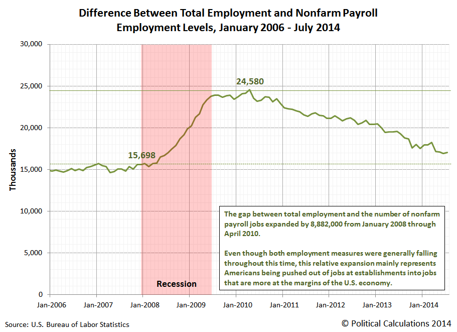
Our next chart shows the difference between these two employment measures over that period of time, which shows the increase in the number of marginal jobs as a result of the recession, which have slowly dwindled as the economy has slowly recovered.
For this span of time, what we're primarily seeing is the change in the number of agricultural workers, self-employed workers whose businesses are unincorporated, unpaid family workers, and private household workers - the employment categories that are represented in the total employment figure but which are excluded from the nonfarm payroll employment figure. These are the kinds of jobs that are, almost by definition, considered to be at the margin of the U.S. economy.
To a much lesser extent, we're also seeing the reduction of employment for people who were working in multiple occupations prior to the recession, since these individuals are counted for each job they hold in the nonfarm payroll measure but are only counted as being employed once in the total employment level.
We say that is to a much lesser extent because the declines in the total employment level and nonfarm payroll employment level during this period of time is roughly equal to one another. But then, we see that the number of marginal jobs in the economy increased by approximately the same amount as these two job measured declined.
That's how we know that Americans who worked at establishments, or rather, established employers, were pushed into more marginal jobs after losing their payroll jobs during the recession. Or perhaps more accurately, after losing their unemployment insurance benefits, which we can observe in the lag between when the biggest job losses occurred during the recession as well as the timing and duration for when marginal employment peaked in the U.S. economy.
Labels: jobs
The U.S. Bureau of Economic Analysis' annual revisions to the Gross Domestic Product data for the nation provides an opportunity to both look backwards and forwards at the United States' GDP as the BEA would have us see it.
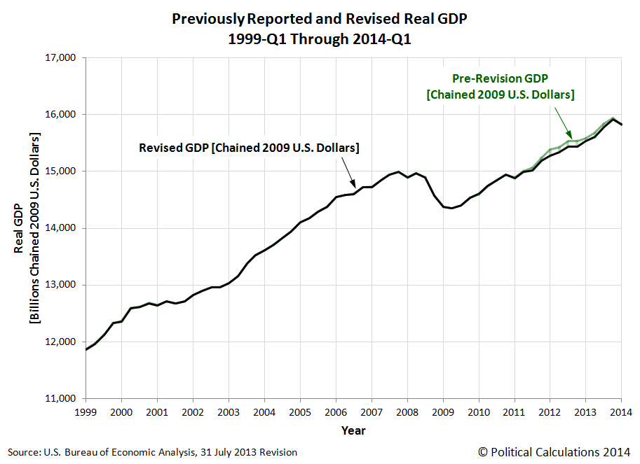
Let's first look backwards at the major changes in the BEA's account of the U.S.' national income. Our first chart shows the differences between how GDP was previously reported and how it is now being recorded as having been.
Although the BEA's revision applied to data going back to the first quarter of 1999, from a practical standpoint, most of the changes were concentrated in the period of time since the first quarter of 2011. What we find after the revision is that the U.S. economy did not grow as strongly as the BEA had previously indicated during this time.
The biggest discrepancies occur in the first, third and fourth quarters of 2012, where real GDP was over $100 billion in terms of constant, inflation-adjusted 2009 U.S. dollars below the figures that had previously been recorded. The U.S. economy was skirting the edge of recession in the fourth quarter of 2012, which was the principal reason why the U.S. Federal Reserve re-initiated its Quantitative Easing economic stimulus programs at that time.
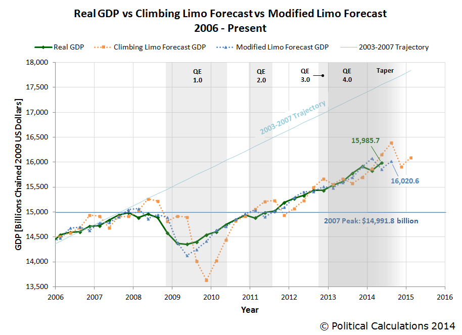
Let's next look forward as we'll apply our inertia-based forecasting methods for where the U.S.' real GDP will go next:
Looking at the just completed quarter of 2014-Q2, we see that our modified limo forecasting technique would set real GDP for the recently expired quarter at $15,857.7 billion, about $128 billion or 0.8% below the BEA's first estimate of GDP for the quarter of $15,985.7 billion in terms of constant 2009 U.S. dollars.
Since the BEA will revise its estimate of this quarter's real GDP two more times before finalizing it pending its annual data revisions, we would anticipate that the BEA's initial estimate will be revised downward.
Looking ahead to the next quarter, 2014-Q3, our modified limo forecasting method would anticipate that GDP will rise in real terms to $16,020.6 billion. Our forecast figure however is partially based on the GDP's first estimate of GDP for 2014-Q2 and will be subject to revision as that figure is itself revised.
But for measuring the current state of the U.S. economy, you can't do much better than our GDP temperature gauges - in particular, our two-quarter gauge:
With an average annualized two-quarter growth rate of 0.9% for each of the last two quarters, the U.S. economy falls into the recessionary "cold" zone of the gauge.
Labels: gdp, gdp forecast
How differently would the U.S. economy have performed without the Federal Reserve's efforts to stimulate the economy through its most recent Quantitative Easing (QE) programs?
Those programs were first initiated back in September 2012, when the Fed announced that it would act for the third time to offset a weakening economy by buying up large quantities of Mortgage Backed Securities (MBS) at a rate of $40 billion per month, which we've previously described as QE 3.0. Three months later, the Federal Reserve announced that it would expand its efforts to boost the U.S. economy to avoid falling into recession by buying up large quantities of U.S. Treasury securities at the rate of $45 billion per month, which we've subsequently identified as QE 4.0 to distinguish that effort from the continuing QE 3.0.
We first tackled the question in September 2013, in which we found that the Fed's QE efforts boosted the performance of the U.S. economy by roughly one dollar for each dollar it used to buy MBS and U.S. Treasuries in its QE programs, which was more than enough to avoid what otherwise would have been a major Greek or Spanish-style contraction in the U.S. economy from the large tax hikes that took effect in the U.S. in 2013.
By the third quarter of 2013, the Federal Reserve was coming to the conclusion that it would not need to continue its QE programs, as the U.S. economy suddenly seemed to achieve some degree of organic growth that had previously been absent, above and beyond what the Fed was able to achieve. That strength continued into the fourth quarter and the Federal Reserve announced that it would begin reducing its QE-related purchases of MBS and U.S. Treasuries. The Fed has since tapered their purchases of these securities every six weeks by $5 billion per month for each type, which would see their buying activity end sometime in the fourth quarter of 2014.
We haven't discussed this data since December 2013, so now that the BEA has released its annual revision of the United States' Gross Domestic Product (GDP) , we're going to put our Keynesian-style GDP multiplier tool to the test once more and incorporate all the revised and updated GDP data we now have, which covers the period through the first estimate of GDP in the second quarter of 2014. The chart below reveals the results of our newest counterfactual exercise.
Before we continue, we should note a major change in our assumptions regarding the impact of the 2013 tax increases. Here, with the increase in payroll, income, investment and Affordable Care Act taxes implemented so early in 2013, we assume that in 2014, Americans have largely adapted to their higher tax burdens enough so that the negative shock from these increased taxes is no longer weighing against the growth of GDP. Their negative impact is now best described as a permanent loss to the U.S. economy.
What we observe now is that the organic growth that first appeared in the third quarter of 2013 had evaporated by the first quarter of 2014. That makes sense when you realize that this growth was really the effect of a record bumper crop for almost every agricultural crop grown in the U.S., which benefited from ideal growing conditions through much of 2013. Those record crops were harvested in the third quarter of 2013, accounting for much the apparent boost in economic growth in that quarter, and then into the fourth quarter of 2013, as much of the harvested crops were subsequently exported from the U.S. to other markets, such as China.
By the time the first quarter of 2014 rolled around, all that additional economic activity resulting from the bumper crops of 2013 was gone. Consequently, GDP fell back to the level that it would otherwise have been without the benefit of those bumper crops for the economy. The level that would be predicted after considering the fiscal drag from previous tax hikes, minor government spending cuts begin offset dollar for dollar by the Fed's QE programs.
We next observe that the first estimate of GDP in the second quarter of 2014 is above the level that would be expected in our counterfactual model. That could be due to the economy showing some small signs of hopefully more sustainable organic growth once again, or perhaps could be due to the BEA overestimating GDP growth in its first estimate of GDP for the quarter once again, as it originally did by a substantial margin for the first quarter of 2014. The BEA will revise its estimates of GDP for the second quarter of 2014 twice more during the next two months.
These observations suggest that the U.S. economy is still very dependent upon the Fed's QE programs to realize economic growth, even after assuming that 2013's tax hikes are no longer continuing to negatively impact the U.S. economy. Even with its tapering of those programs, we find that the U.S. economy would have contracted much more severely during the first quarter of 2014 and would have further contracted in the second quarter of 2014 in the absence of the Fed's QE-related activities.
As the Fed's tapering of its MBS and U.S. Treasury purchases continues, we can expect a lessening positive contribution from that activity. That means that economic growth in the U.S. throughout the rest of 2014 is likely to be muted at best given how it has performed outside of what now clearly appears to have been exceptional circumstances.
About the GDP Multipliers Used in Our Counterfactual Analysis
 We featured a discussion of the fiscal multipliers for government spending and tax policies in our previous discussion of Spain's disastrous economic choices of 2012. At present, we're continuing to assume that the fiscal multiplier for the Fed's quantitative easing programs is approximately 1.0, in the absence of data that might contradict that figure. As yet, there really isn't any data to contradict this estimate, although with the latest GDP revision, the data suggests the multiplier rounds down to that figure.
Data Sources
Board of Governors of the Federal Reserve System. All Federal Reserve Banks - Total Assets, Eliminations from Consolidation. [Text Document]. Accessed 4 August 2014.
Cloyne, James. What Are the Effects of Tax Changes in the United Kingdom? New Evidence from a Narrative Evaluation. [PDF Document]. CESIFO Working Paper No. 3433. April 2011.
Owyang, Michael T., Ramey, Valerie A. and Zubairy, Sarah. Are Government Spending Multipliers Greater During Periods of Slack? Evidence from 20th Century Historical Data. [PDF Document]. Federal Reserve Bank of St. Louis. Economic Research Division. Working Paper 2013-004A. January 2013.
Romer, Christina D. and Romer, David H. The Macroeconomic Effects of Tax Changes: Estimates Based on a New Measure of Fiscal Shocks. [PDF Document]. March 2007.
U.S. Bureau of Economic Analysis. National Income and Product Accounts, Gross Domestic Product: Second Quarter 2014 (Advance Estimate), Annual Revision: 1999 through First Quarter 2014. [Text Document]. 30 July 2014.
Labels: data visualization, economics, gdp
Welcome to the blogosphere's toolchest! Here, unlike other blogs dedicated to analyzing current events, we create easy-to-use, simple tools to do the math related to them so you can get in on the action too! If you would like to learn more about these tools, or if you would like to contribute ideas to develop for this blog, please e-mail us at:
ironman at politicalcalculations
Thanks in advance!
Closing values for previous trading day.
This site is primarily powered by:
CSS Validation
RSS Site Feed
JavaScript
The tools on this site are built using JavaScript. If you would like to learn more, one of the best free resources on the web is available at W3Schools.com.


